

Overview
Real-time messaging
Send and receive messages instantly with streaming support
AI agent integration
Connect to workflows powered by AI agents
Session management
Automatic session handling and persistence across page refreshes
Customizable UI
Themeable components with independent styling for agent and user messages
Adding to a UI Flow
1
Navigate to UI Flows
Open your project and go to UI Flows from the left navigation menu.
2
Select or create a UI Flow
Select an existing UI flow or create a new one.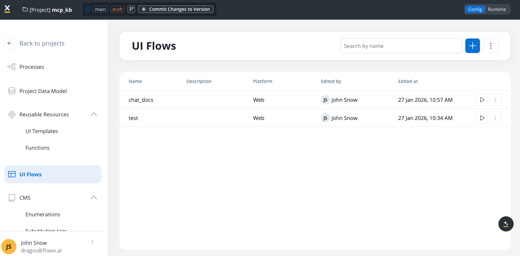
3
Open UI Assets panel
In the left sidebar, expand the UI Assets panel. Find Chat alongside Table, Collection, and other components.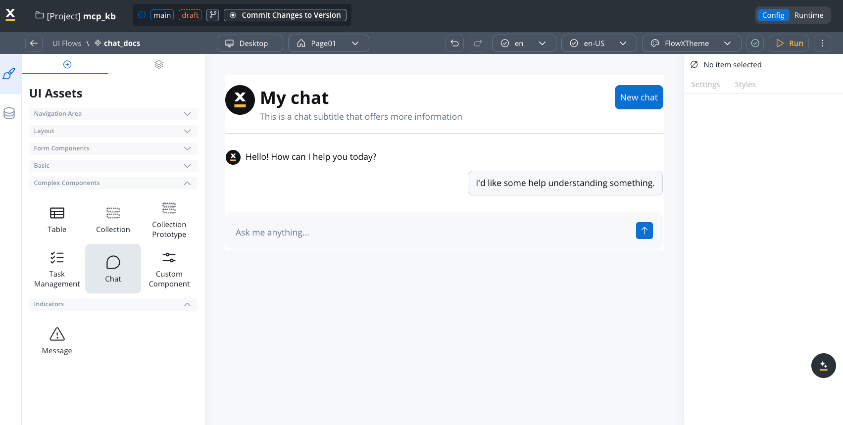
4
Add and configure
Drag Chat onto the canvas, then configure properties in the right panel.
Configuration
Required settings
Component hierarchy
The Chat component has configurable sub-components: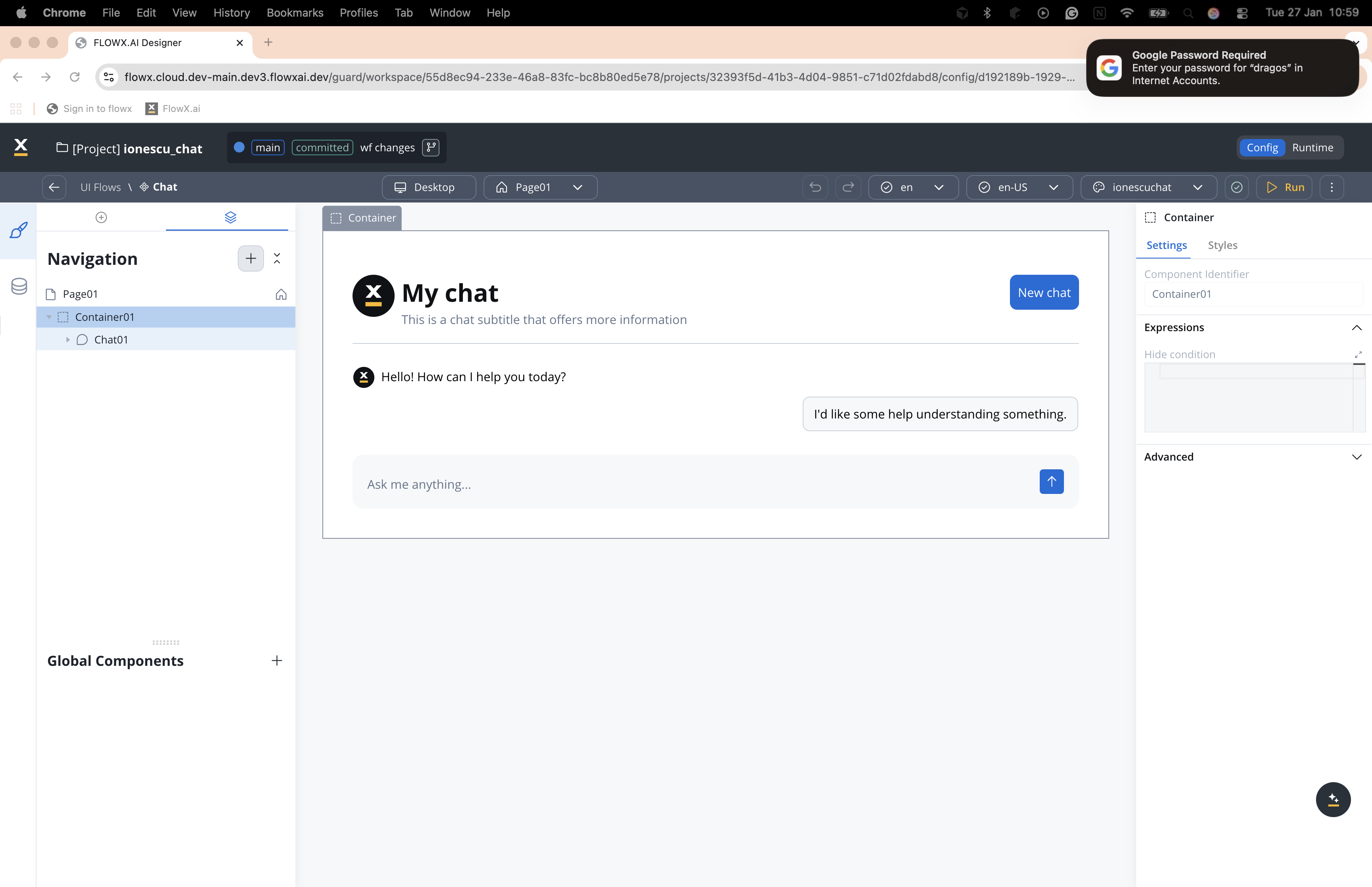
Settings by sub-component
Chat (root)
Chat (root)
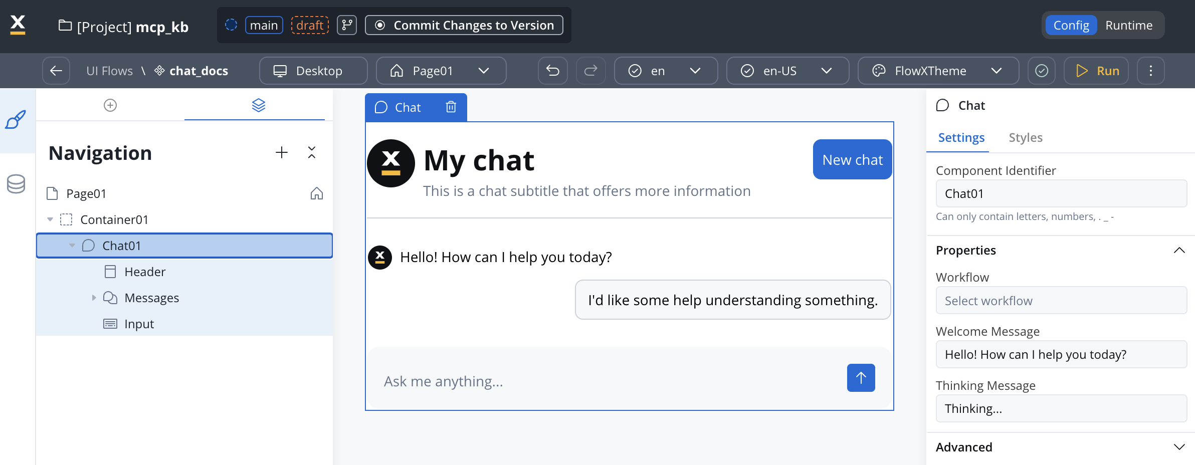
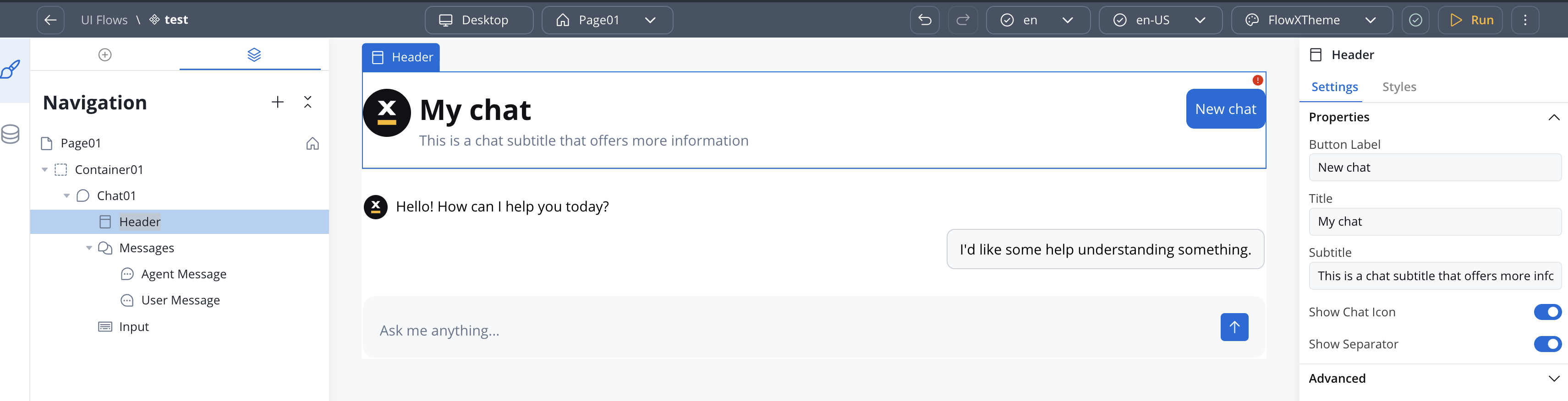
Header
Header
Chat History
Chat History
SaaS ·
Available on SaaS with FlowX.AI . This feature is live on managed (SaaS) deployments now. Self-hosted deployments will receive it with the next LTS release family.
Conversation previews in the list can show raw Markdown characters such as
# and * when an agent reply contains them. Rendering Markdown in the preview line is not yet supported.Agent Message
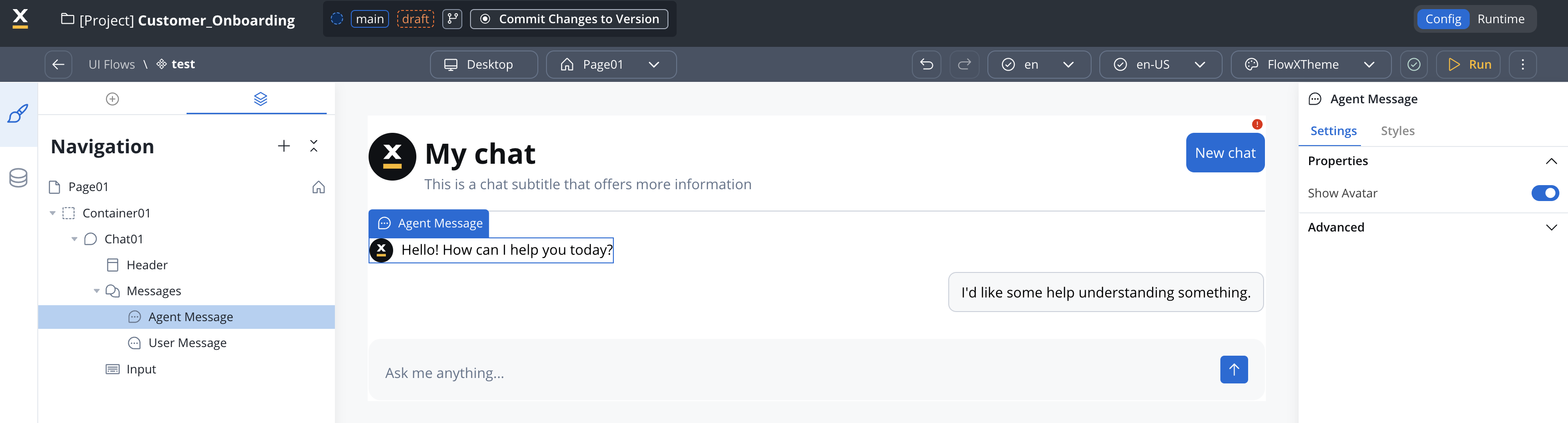
Agent Message
Input
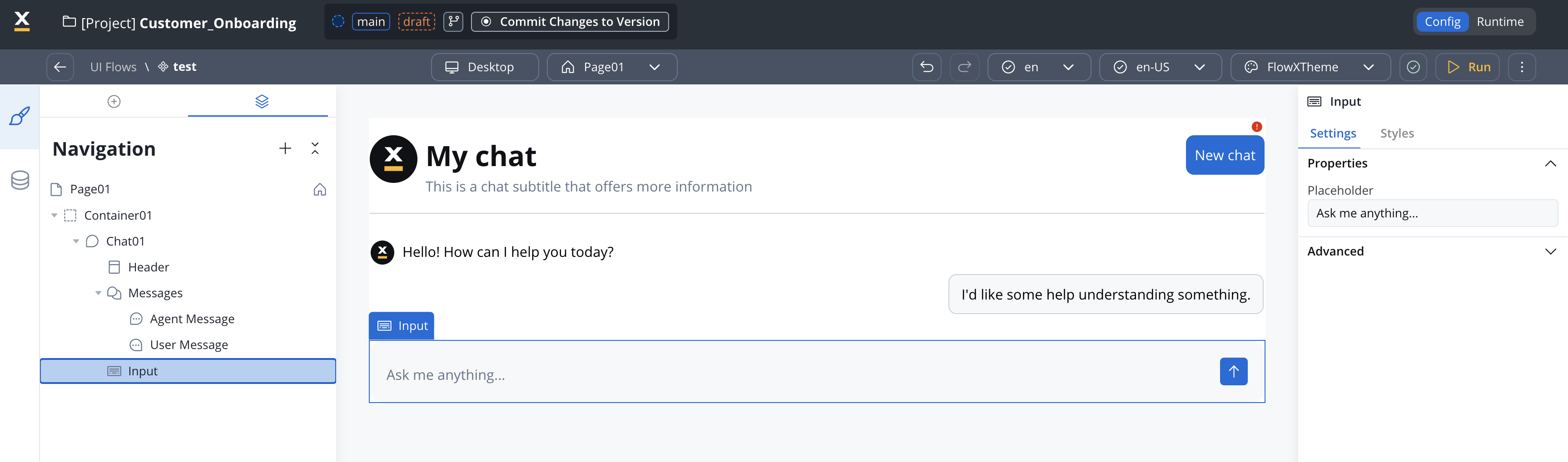
Input
Available on SaaS with FlowX.AI . This feature is live on managed (SaaS) deployments now. Self-hosted deployments will receive it with the next LTS release family.
Suggested Prompts
Suggested Prompts
Displays pre-configured prompt suggestions before the user types. Child of Messages (alongside Agent Message and User Message).
Clicking a suggestion sends it as the user’s message. Long prompts are truncated and revealed via tooltip.
File Attachments
File Attachments
SaaS · Lets end users send files together with a text message. Turn on Enable File Attachments on the Input sub-component to activate it, then configure the accepted files and the error copy here.Hierarchy is Chat → Input → File Attachments → File Item. Files the user has already sent appear under Messages → Attached Files → File Item.
Available on SaaS with FlowX.AI . This feature is live on managed (SaaS) deployments now. Self-hosted deployments will receive it with the next LTS release family.
File Item has no properties of its own. It is the per-file row, and it carries its own default and error styling.For upload behavior, error handling, and how uploaded files reach the agent, see File attachments in the Chat component reference.
Styling
Configure visual styling through Theme Admin (Design Assets → Themes → Components → Chat).Themeable elements
Display modes
The Chat component supports four display modes, including mobile chat and per-mode theme configuration.
You can change the display mode after creation if needed.
Sizing defaults
Floating action button (FAB)
Floating and FullScreen modes include a Floating Action Button that triggers the chat. The FAB is configurable in the style panel:Notification dot
SaaS ·Available on SaaS with FlowX.AI . This feature is live on managed (SaaS) deployments now. Self-hosted deployments will receive it with the next LTS release family.
The dot does not survive a page refresh. If a user reloads the page before opening the chat, the dot clears even though the agent reply is still unread.
Theming per display mode
Theme values are configured independently per display mode and per platform (Web, Android, iOS) through Design Assets → Themes → Components → Chat. Supported properties include padding and margin for each mode. For complete runtime details, see the Chat component reference.Advanced documentation
For comprehensive documentation including runtime behavior, session management, custom persistence workflows, SDK integration, and troubleshooting:Chat component - Full reference
Complete technical documentation in AI Platform section
Related resources
Chat interface concepts
High-level chat integration patterns
AI Triggers
Launch chat-driven workflows with structured trigger messages
Knowledge bases
Ground AI responses in your data
AI in FlowX
AI capabilities overview