

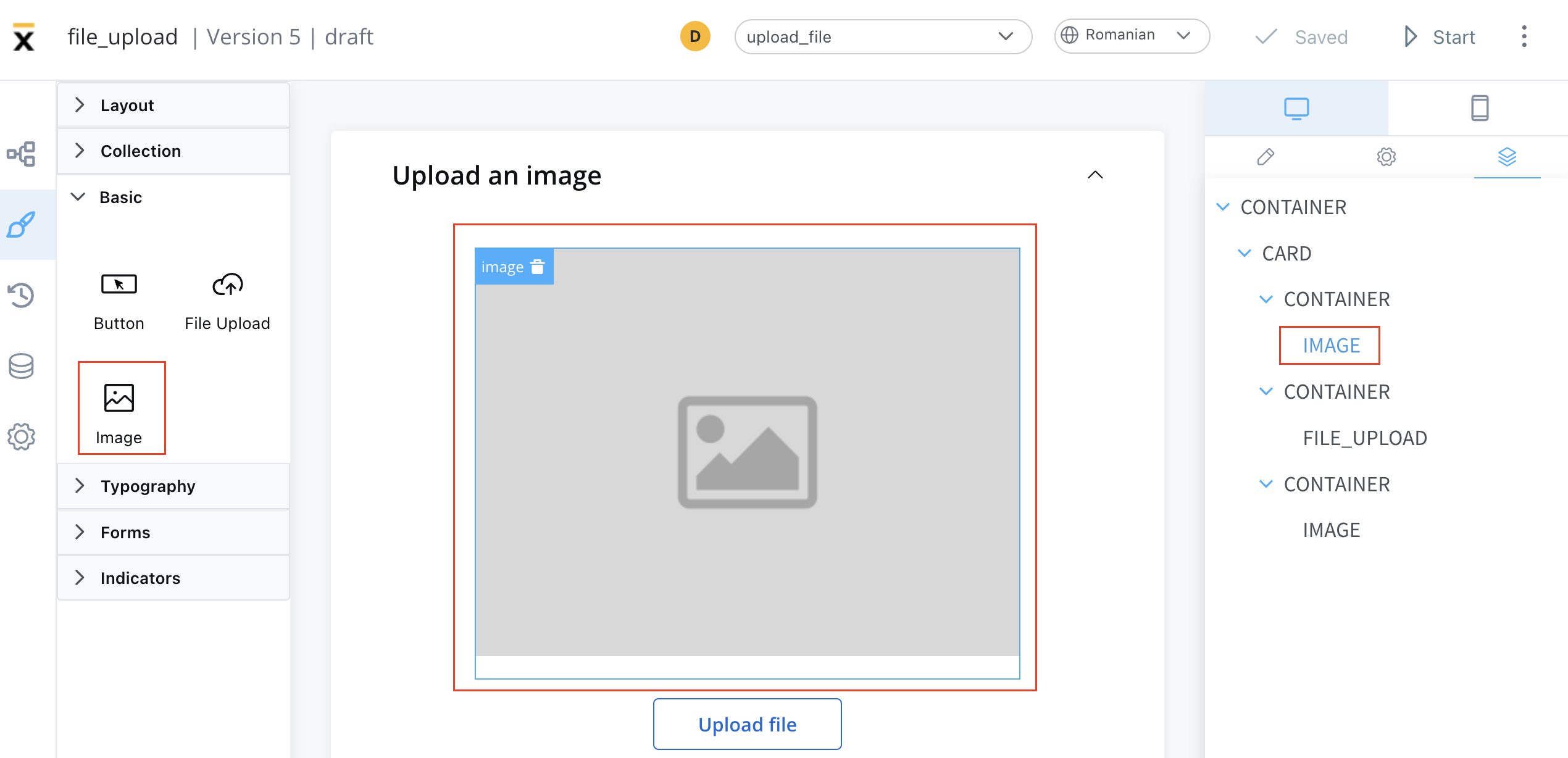
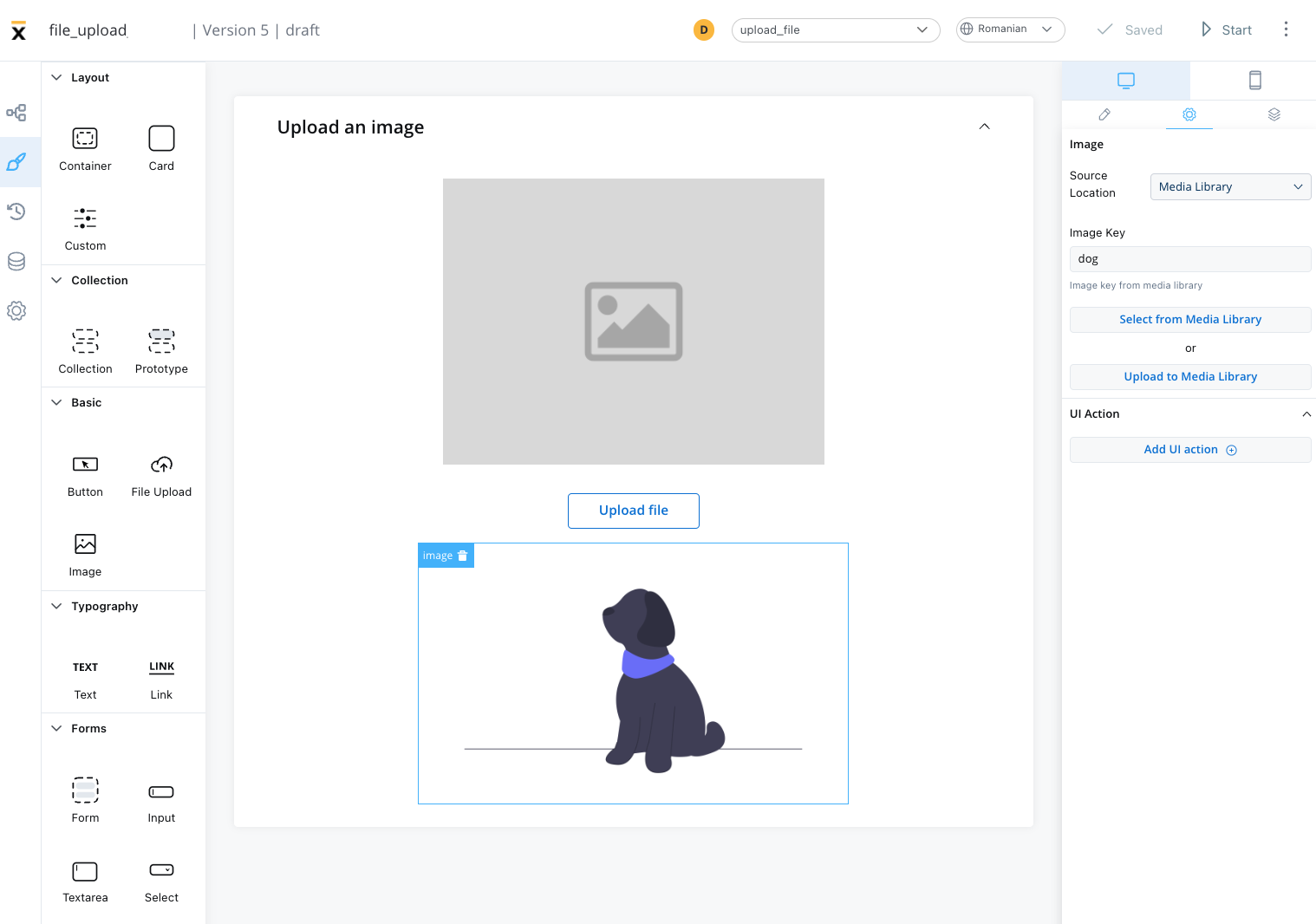
Configuring an image
Configuring an image in the UI Designer involves specifying various settings and properties. Here are the key aspects of configuring an image:Image settings
The image settings consist of the following properties:- Source location - the location from where the image is loaded:
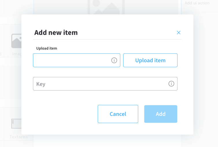
Media library
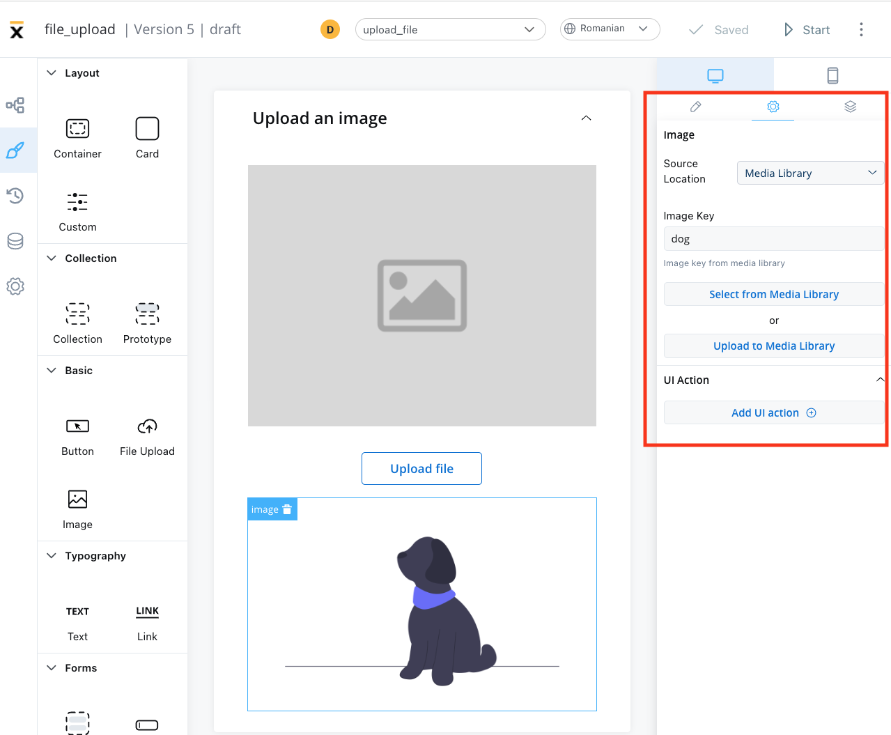
- Image key - the key of the image from the media library
- Select from media library - search for an item by key and select it from the media library
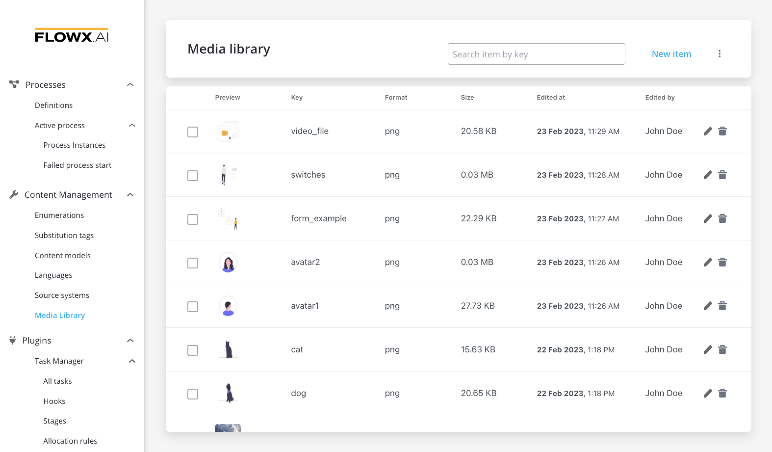
- Upload to media library - add a new item (upload an image on the spot)
- upload item - supported formats: PNG, JPG, GIF, SVG, WebP; ❗️(maximum size - 50 MB by default)
- key - the key must be unique and cannot be changed afterwards
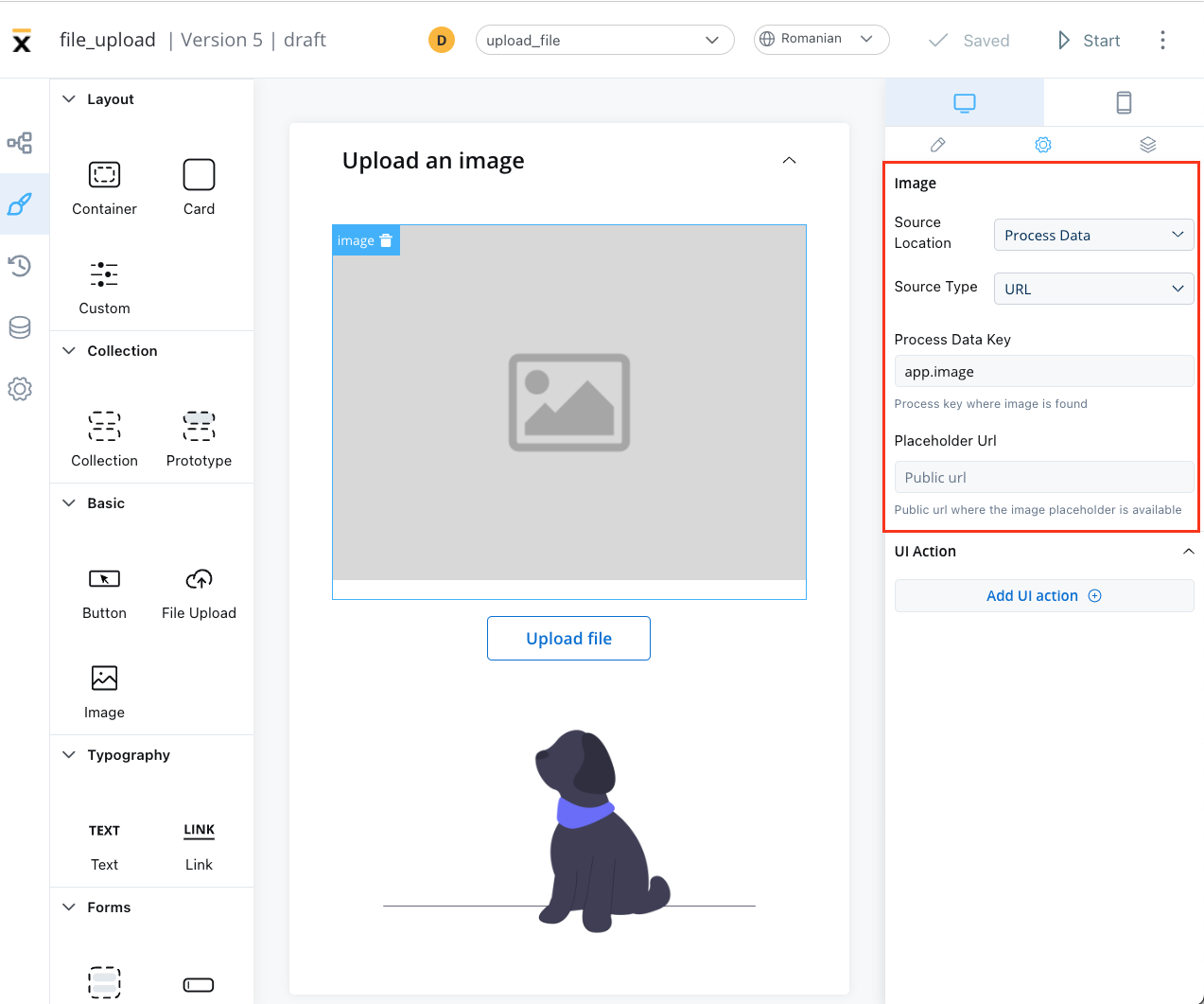
Process data
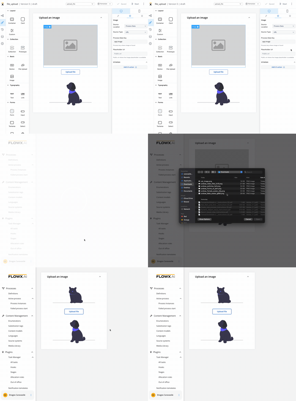
- Identify the Source Type. It can be either a URL or a Base 64 string.
- Locate the data using the Process Data Key. With URL, the value at that key is used as-is, so it must be a complete, absolute URL. The renderer attaches the user’s access token only when the URL ends in
download. To show a file uploaded through the Documents plugin, build the URL from the upload reply’sdownloadPathin a business rule, as shown in Preview an uploaded file. - In a UI Flow, where this location is labeled Local Variables, Source Type also offers Document plugin. Point the key to an object that contains
downloadPath, such as an upload reply, and the renderer builds the URL. - If using a URL, provide a Placeholder URL for public access. This is the URL where the image placeholder is available.
Available on SaaS with FlowX.AI 5.13. This feature is live on managed (SaaS) deployments now. Self-hosted deployments will receive it with the next LTS release family.
downloadPath and the renderer builds the URL, so no business rule is needed. For how the shared file sources work, see File sources in FlowX.AI 5.13.
External
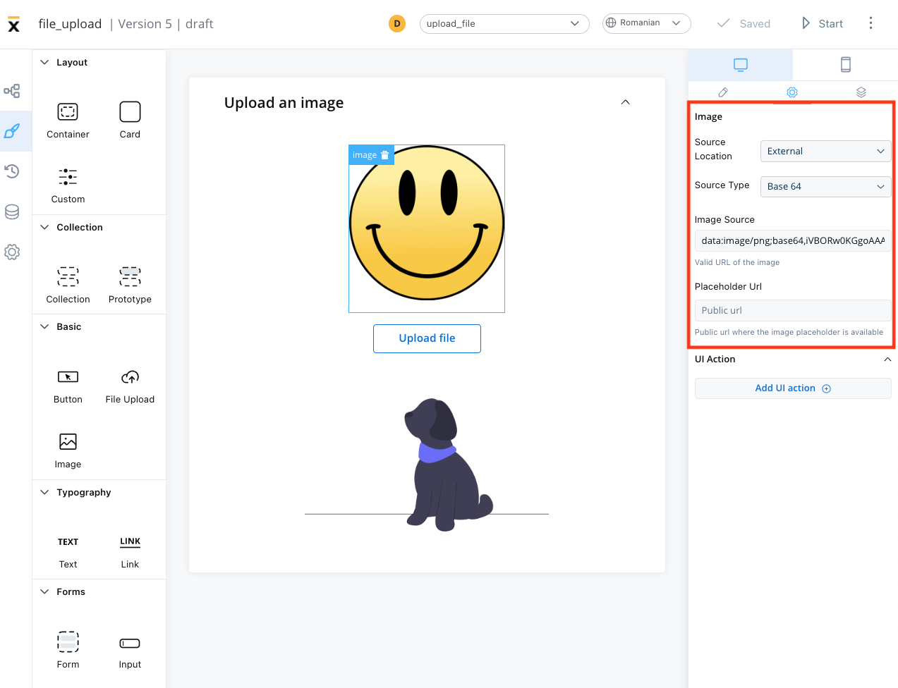
- Source Type: it can be either a URL or a Base 64 string
- Image source: the valid URL of the image.
- Placeholder URL: the public URL where the image placeholder is available
Event handlers
The event handlers property allows you to add an event handler, which must be configured on the same node. For more information, see the Event Handlers documentation.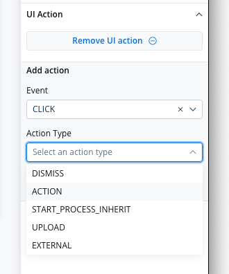
Image styling
The image styling property allows you to add or to specify valid CSS properties for the image. For more information, see the styling documentation.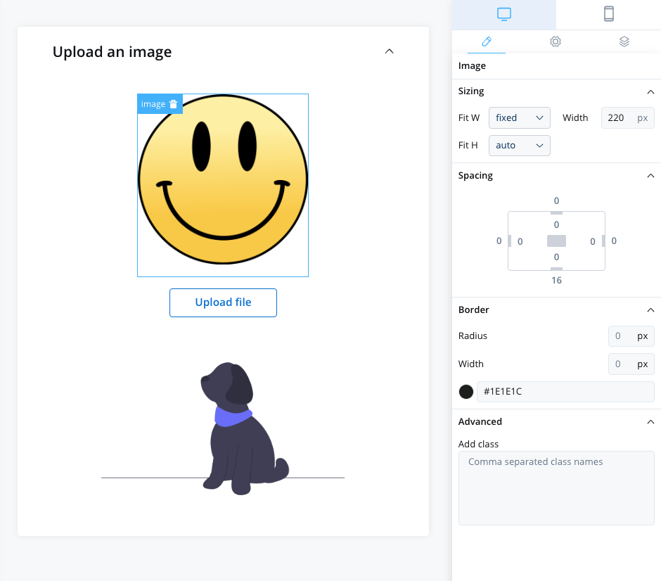
Color
SaaS · 5.10Available on SaaS with FlowX.AI 5.10. This feature is live on managed (SaaS) deployments now. Self-hosted deployments will receive it with the next LTS release family.