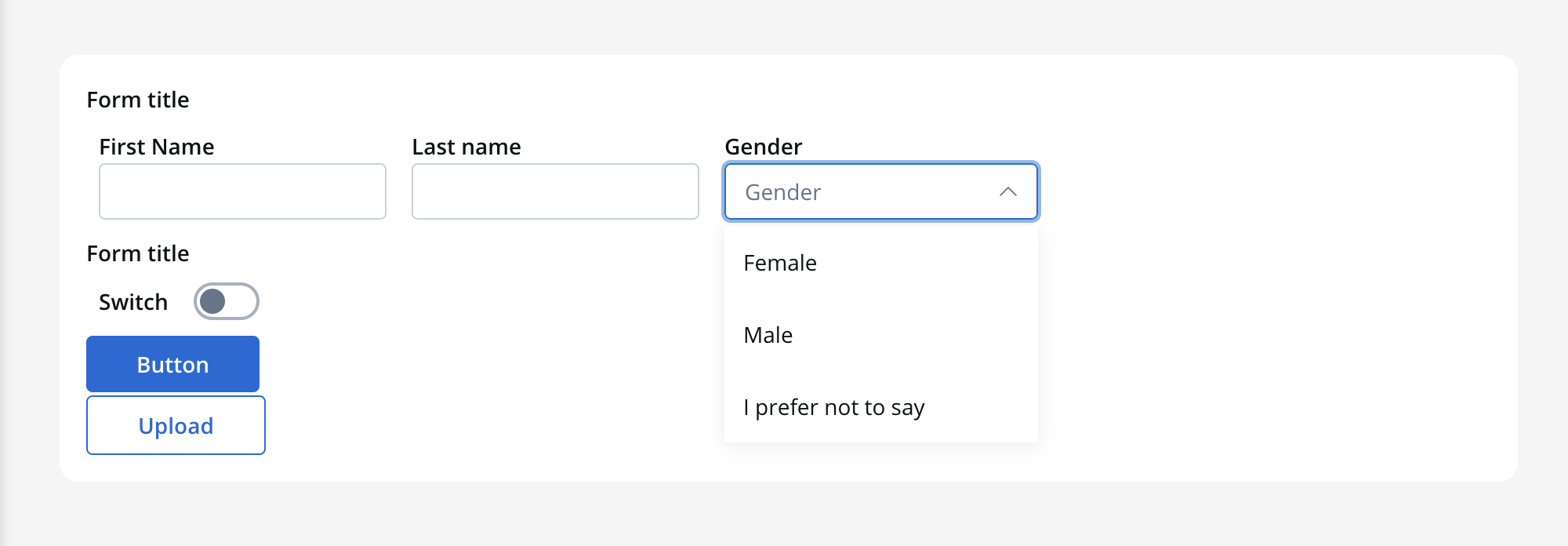
The Select form field is an element that enables users to make a choice from a list of predefined options. It consists of multiple values, each of which is defined by a label that is displayed in the dropdown menu, and a code that is saved.
For instance, you could have a label of “Female” with the value “F” and “Male” with the value “M”. This means that when a user selects “Female” in the process instance, the value “F” will be stored for the “Select” key.
Configuring the Select element
Select Settings
These allow you to customize the settings for the Select Field:
General
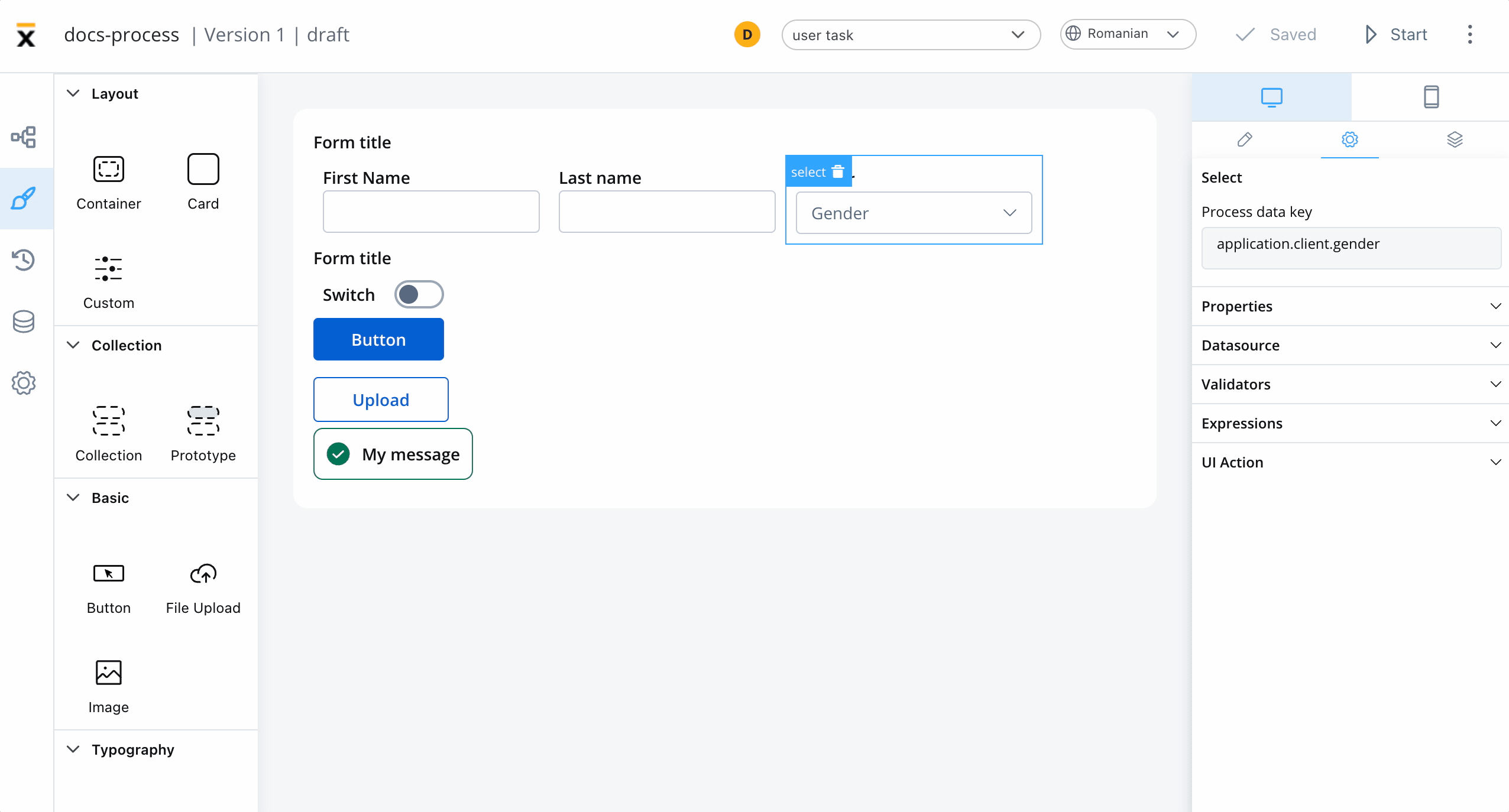
- Process data key - creates the binding between form element and process data so it can be later used in decisions, business rules or integrations
Properties
- Label - the label of the select
- Placeholder - placeholder when the field has no value
- Empty message - text displayed for custom type when no results are found
- Search for options - displays a search to filter options
- Helpertext - additional information about the select field (can be hidden inside an infopoint)
Datasource
- Default value - autofill the select with this value. Going back to the example with Woman label with F value and Man with M to have a default value of Woman we need to configure here F
- Source Type - it can be Static, Enumeration, or Process Data
- Add option - label - value pairs can be defined here
Validators
There are multiple validators can be added to a select (more details here).
Expressions
The select field’s behavior can be defined using JavaScript expressions for hiding or disabling the element. The following properties can be configured for expressions:
- Hide - JavaScript expression used to hide the Select Field when it returns a truthy value
- Disabled - JavaScript expression used to disable the Select Field when it returns a truthy value
It’s important to make sure that disabled fields have the same expression configured under the path expressions → hide.
UI actions
UI actions can be added to the select element to define its behavior and interactions.
- Event - possible value:
CHANGE - Action Type - select the action type
For more details on how to configure a UI action, click here.
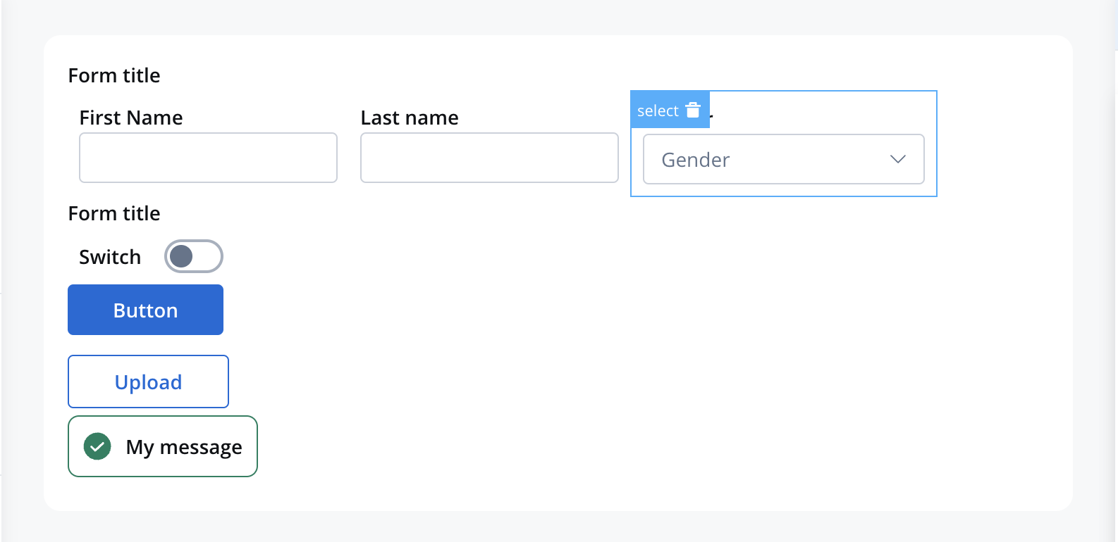
Select styling
Styling the Select field using CSS properties allows you to customize the appearance of the dropdown list and make it more visually appealing and consistent with the overall design of the website or application.
UI Designer styling
For example, a FORM element with a layout configuration including direction of Horizontal and some inputs, and a select element will look like this:
Icons
When customizing the appearance of a Select UI element that includes an icon, you can utilize the following properties:
- Icon Key - the key associated in the Media library, select the icon from the Media Library
- Icon Color - select the color of the icon using the color picker
When setting the color, the entire icon is filled with that color, the SVG’s fill. Avoid changing colors for multicolor icons.
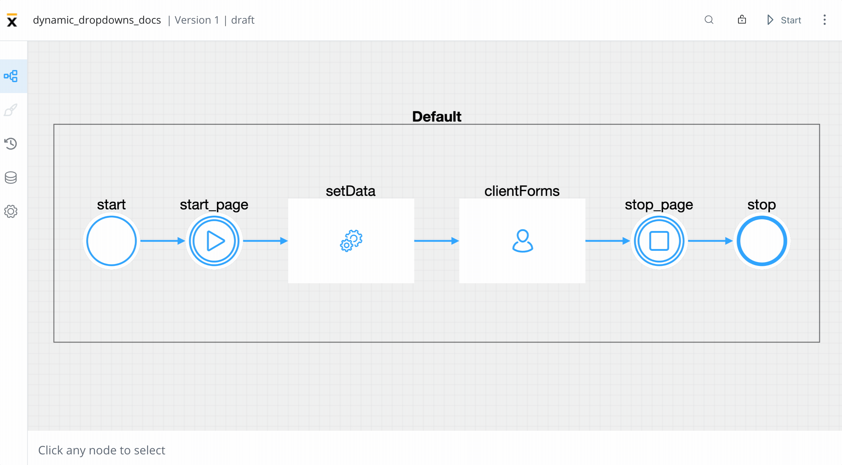
Example - dynamic dropdowns
As mentioned previously, you can create dropdowns including static data, enumerations, or process data. Let’s create an example using process data to create a process that contains dynamic dropdowns.
To create this kind of process, we need the following elements:
- a start node and an end node
- a start milestone and an end milestone node
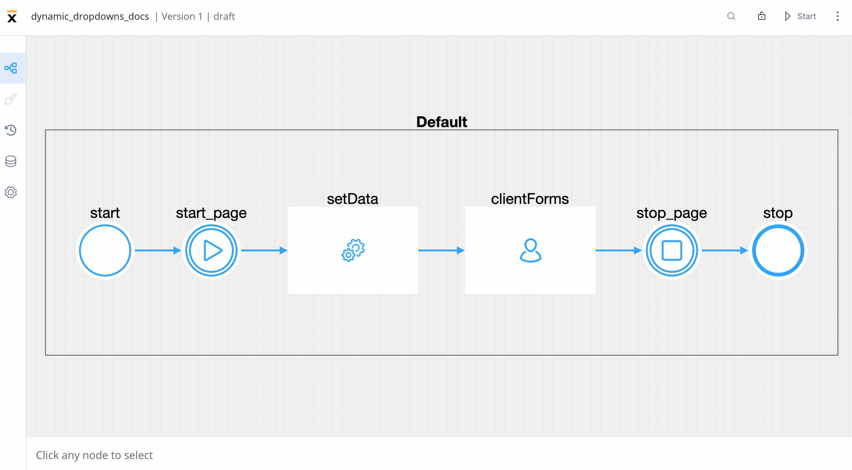
- a task node (this will be used to set which data will be displayed on the dropdowns)
- a user task node (here we have the client forms and here we add the SELECT elements)
Creating the process
Follow the next steps to create the process from scratch:
- Open FLOWX Designer and from the Processes tab select Definitions.
- Click on the breadcrumbs (top-right corner) then click New process (the Process Designer will now open).
- Now add all the necessary nodes (as mentioned above).
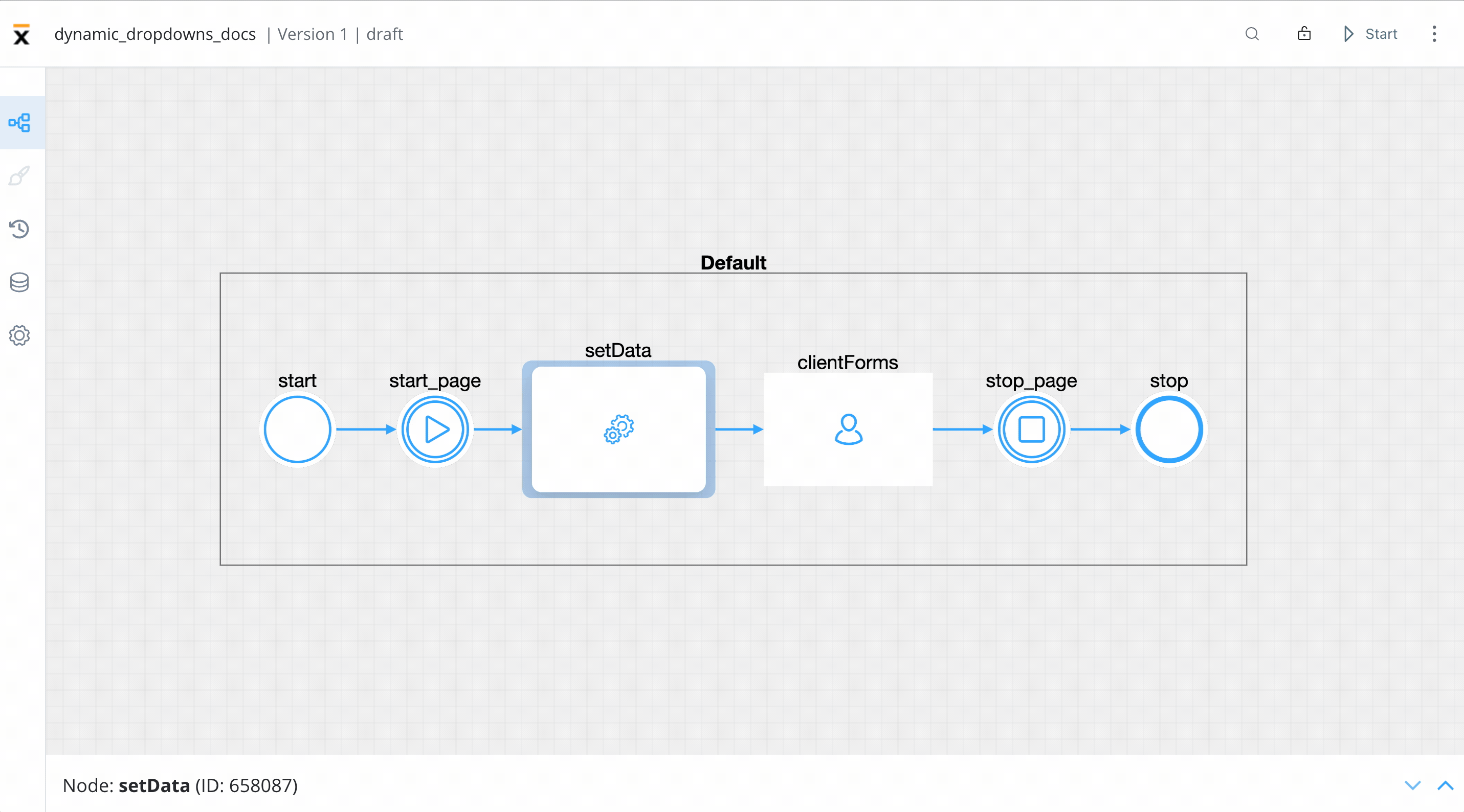
Configuring the nodes
-
On the start milestone node, add a page UI element.
-
On the task node, add a new Action (this will set the data for the dropdowns) with the following properties:
- Action type - Business Rule
- Automatic
- Mandatory
- Language (we used an MVEL script to create a list of objects)
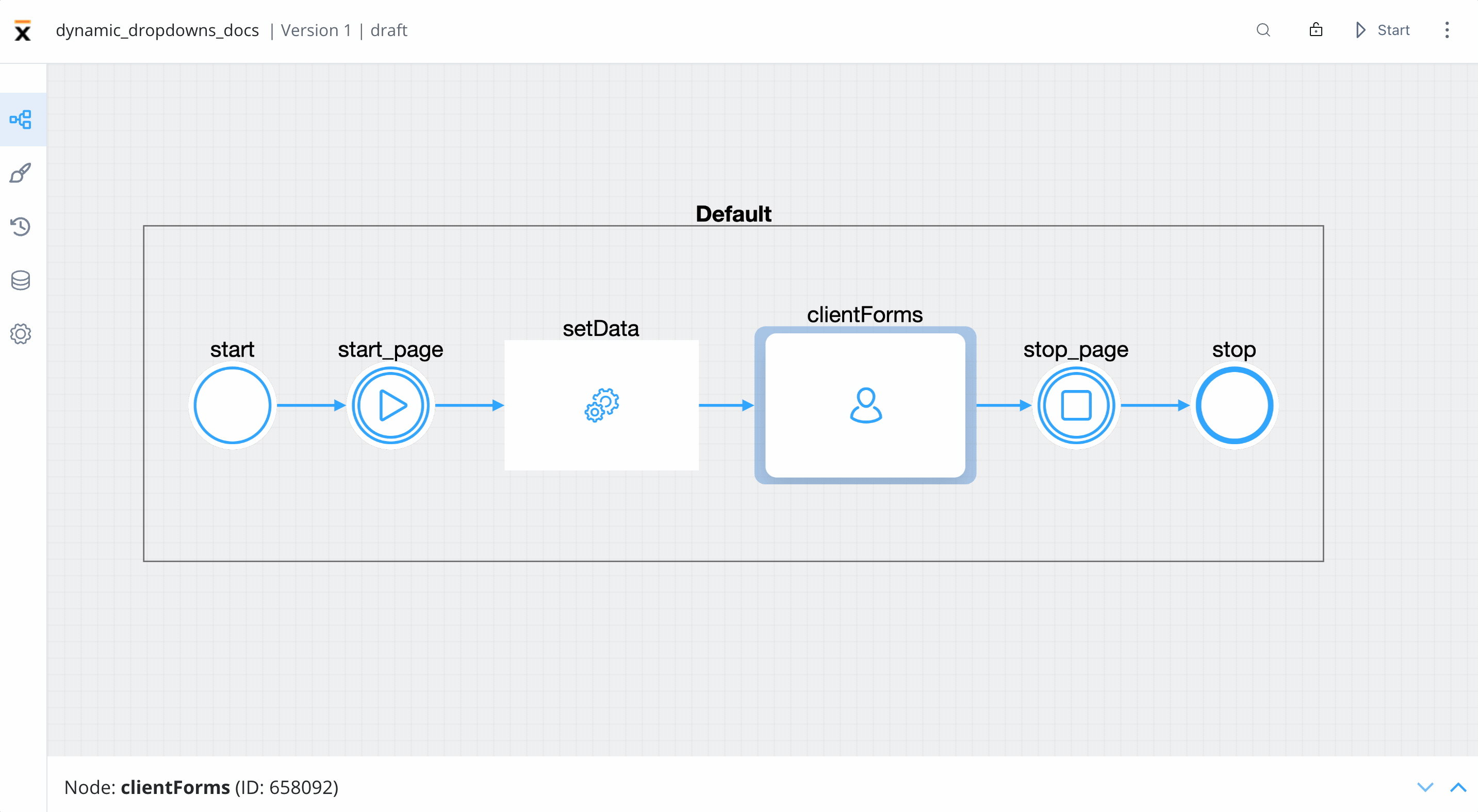
-
On the user task node, add a new Action (submit action, this will validate the forms and save the date) with the following properties:
- Action type - Save Data
- Manual
- Mandatory
- Data to send (the key where the data will be sent) -
application
Below you can find the MVEL script used in the above example:
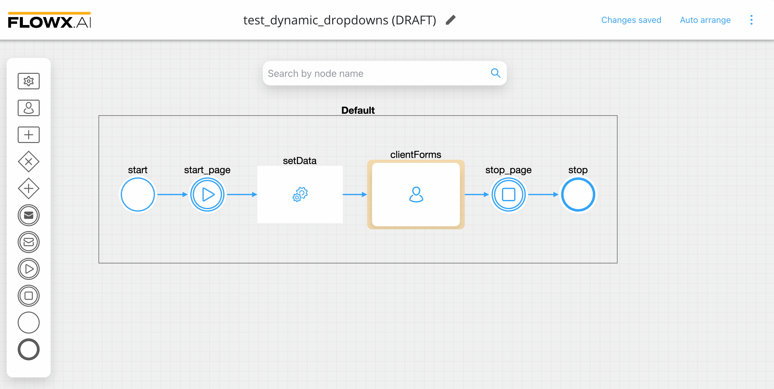
Configuring the UI
Follow the next steps to configure the UI needed:
- Select the user task node and click the brush icon to open UI Designer.
- Add a Card UI element as a root component (this will group the other elements inside it) with the following properties:
- Message -
{"application": ${application}} - Title - Customer Contract
- Message -
- Inside the card, add a form element.
- Inside the form add two select elements, first will represent, for example, the Customer Name and the second the Contract ID.
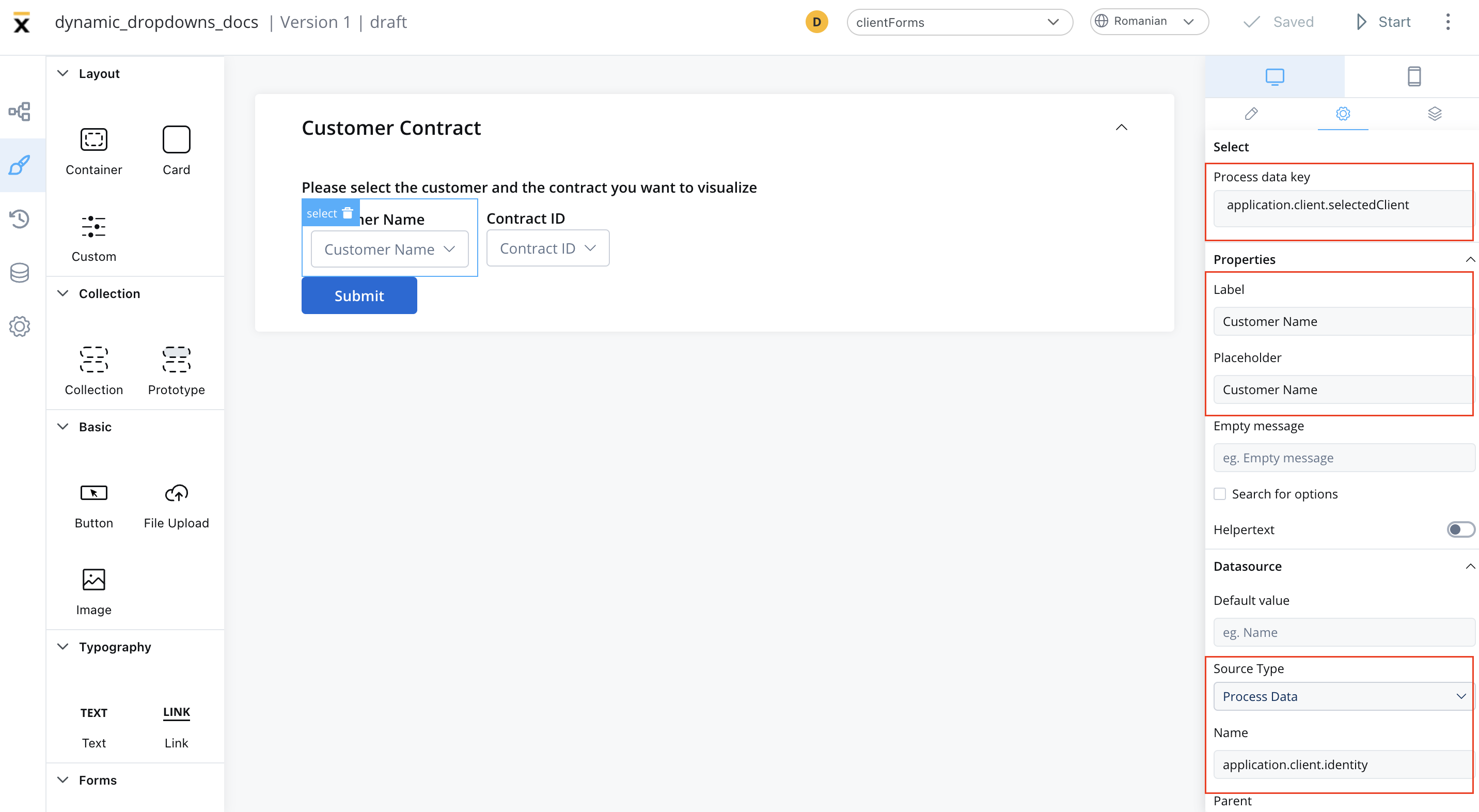
- For first select element (Customer Name) set the following properties:
- Process data key -
application.client.selectedClient - Label - Customer Name
- Placeholder - Customer Name
- Source type - Process Data (to extract the data added in the task node)
- Name -
application.client.identity
- Process data key -
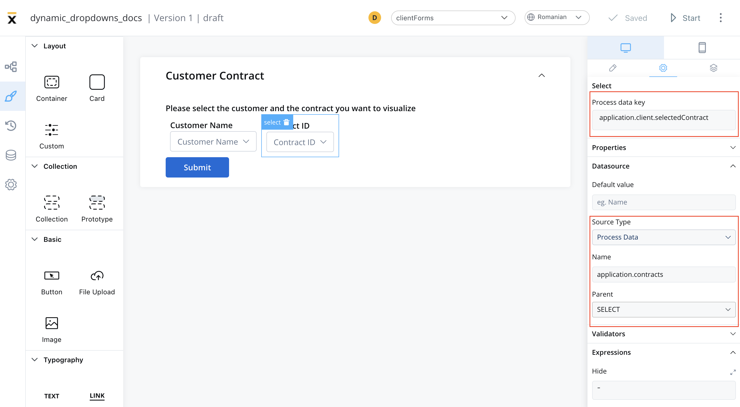
- For the second select element (Contract ID) set the following properties:
- Process data key -
application.client.selectedContract - Label - Contract ID
- Placeholder - Contract ID
- Source Type - Process Data
- Name -
application.contracts - Parent -
SELECT(choose from the dropdown list)
- Process data key -
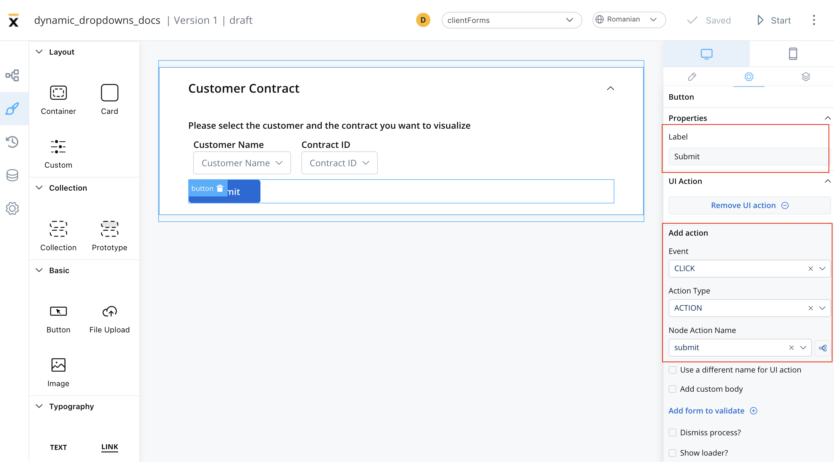
- Add a button under the form that contains the select elements with the following properties:
- Label - Submit
- Add UI action - add the submit action attached earlier to the user task node
- Test and run the process by clicking Start process.