Datepicker
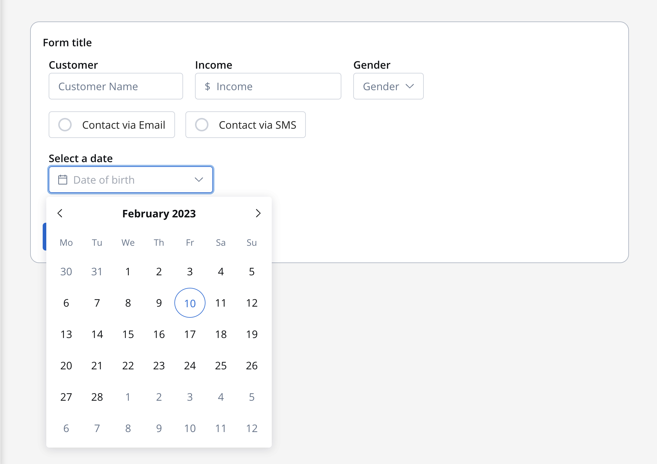
The datepicker (Calendar Picker) is a lightweight component that allows end users to enter or select a date value.
 The datepicker (Calendar Picker) is a lightweight component that allows end users to enter or select a date value.
The default datepicker value is
DD.MM.YYYY.Configuring the datepicker element
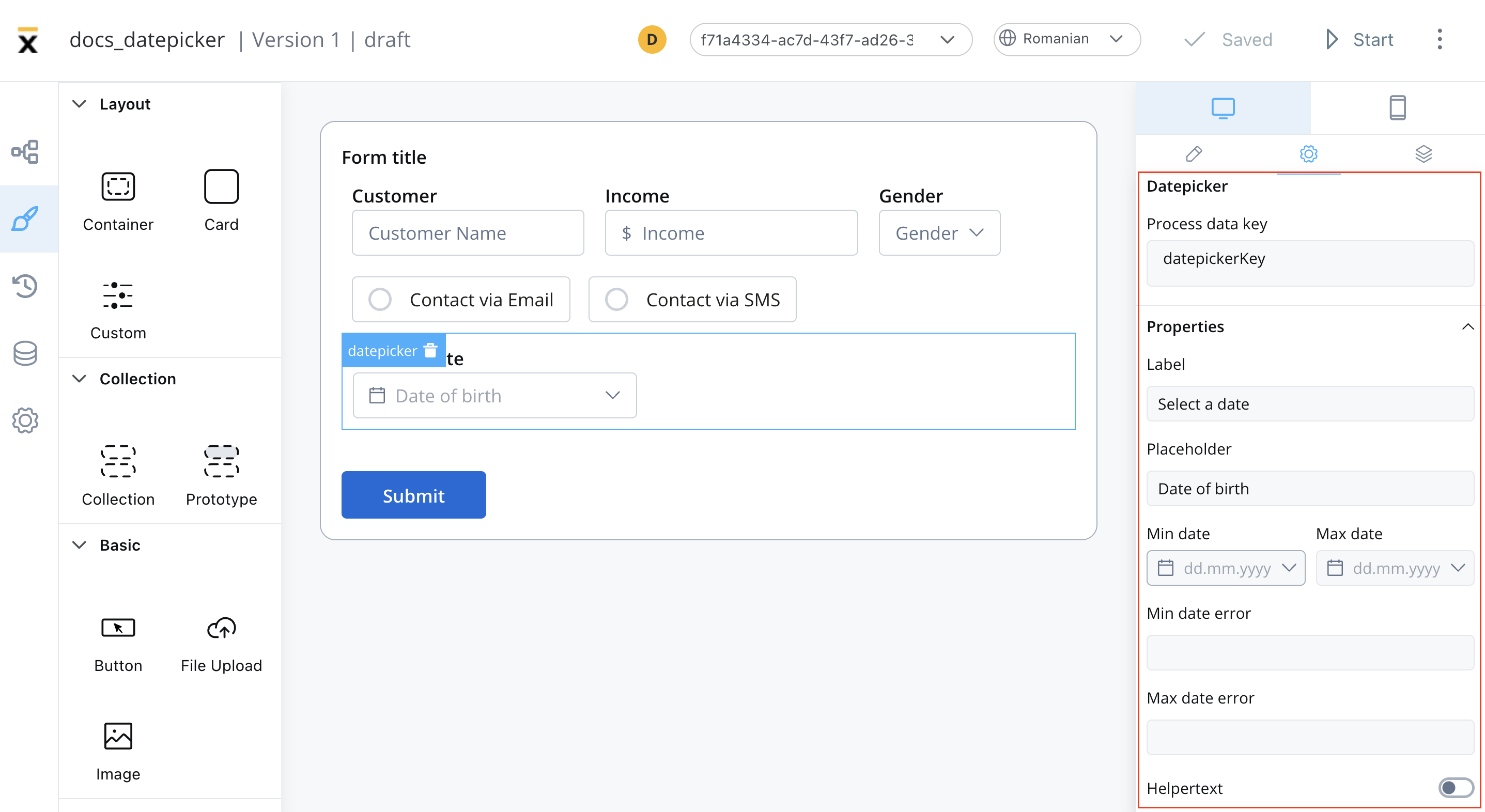
Datepicker settings
The available configuration options for this form element are:General
- Process data key - creates the binding between form element and process data so it can be later used in decisions, business rules or integrations
Properties
- Label - the label of the datepicker
- Placeholder - placeholder when the field has no value
- Min Date - set the minimum valid date selectable in the datepicker
- Max Date - set the maximum valid date selectable in the datepicker
- Min Date, Max Date error - when a date is introduced by typing, define the error message to be displayed
- Helpertext - additional information about the input field (can be hidden inside an infopoint)
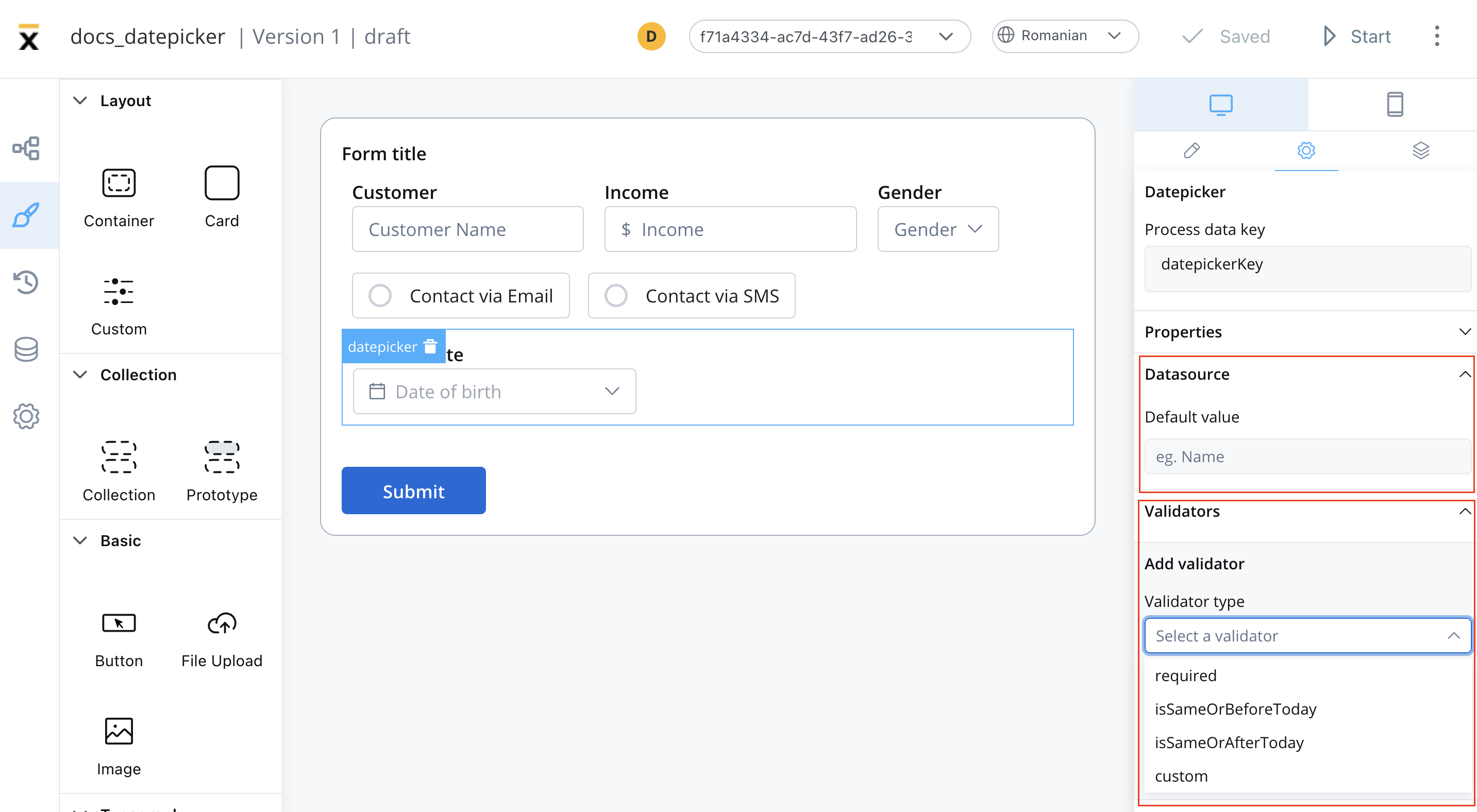
Datasource
- Default Value - the default values of the datepicker element, this will autofill the datepicker when you will run the process
Validators
The following validators can be added to a datepicker:required, custom, isSameOrBeforeToday or isSameOrAfterToday (more details here).
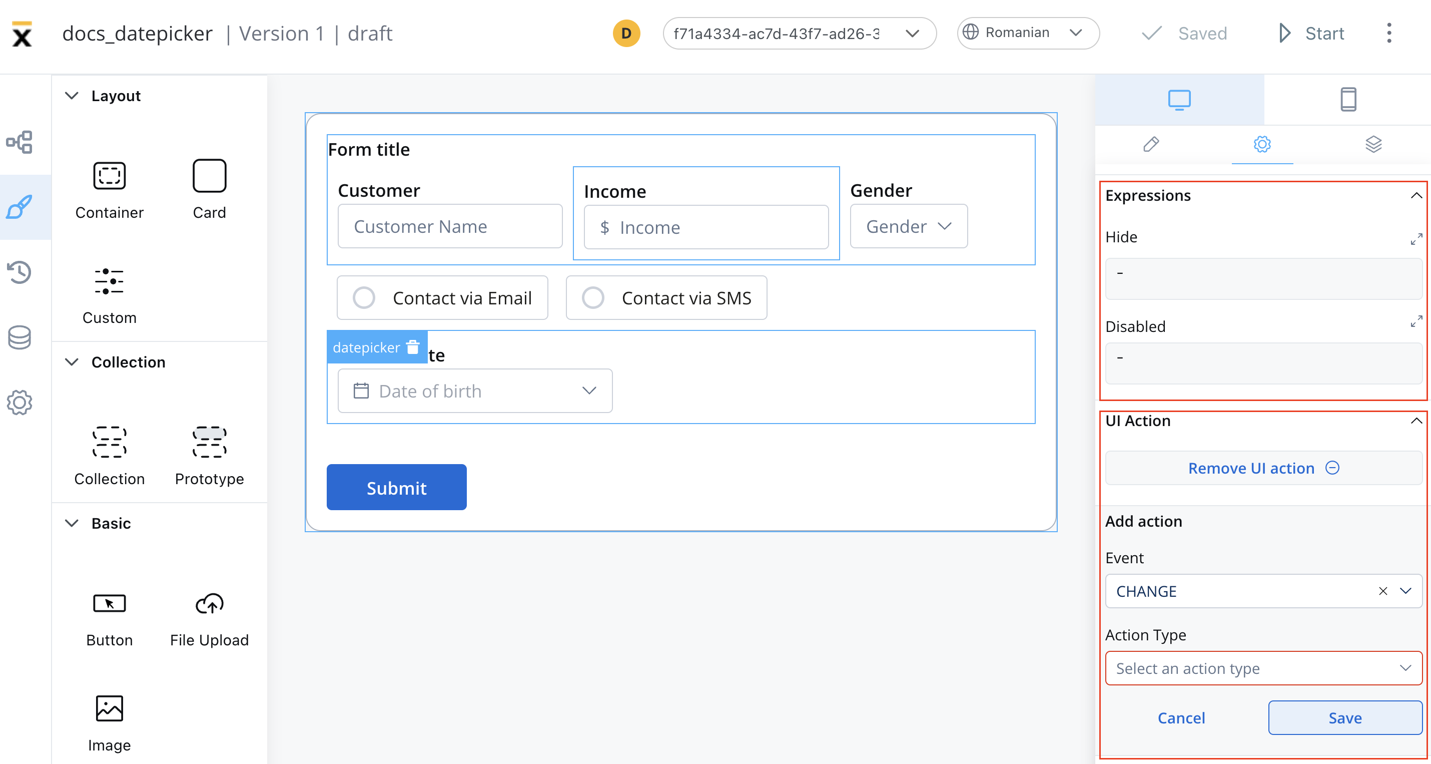
Expressions
The datepicker behavior can be defined using JavaScript expressions for hiding or disabling the element. The following properties can be configured for expressions:- Hide - JavaScript expression used to hide the datepicker when it returns a truthy value
- Disabled - JavaScript expression used to disable the datepicker when it returns a truthy value
It’s important to make sure that disabled fields have the same expression configured under the path expressions → hide.
UI actions
UI actions can be added to the datepicker element to define its behavior and interactions.- Event - possible value:
CHANGE - Action Type - select the action type
For more details on how to configure a UI action, click here.
Datepicker styling
The styling of a datepicker element can be customized in various ways using CSS properties like typography color, border-radius/width, or advanced CSS params. This allows you to create a datepicker that fits seamlessly with the overall design of the application you are developing.For more valid CSS properties, click here.