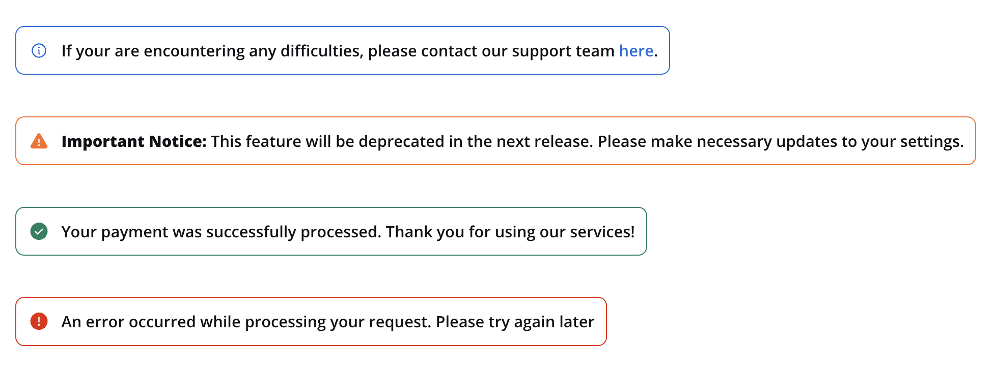
Messages can be categorized into the following types:
- Info: Used to convey general information to users.
- Warning: Indicates potential issues or important notices.
- Error: Highlights errors or critical issues.
- Success: Communicates successful operations or completion.
Properties
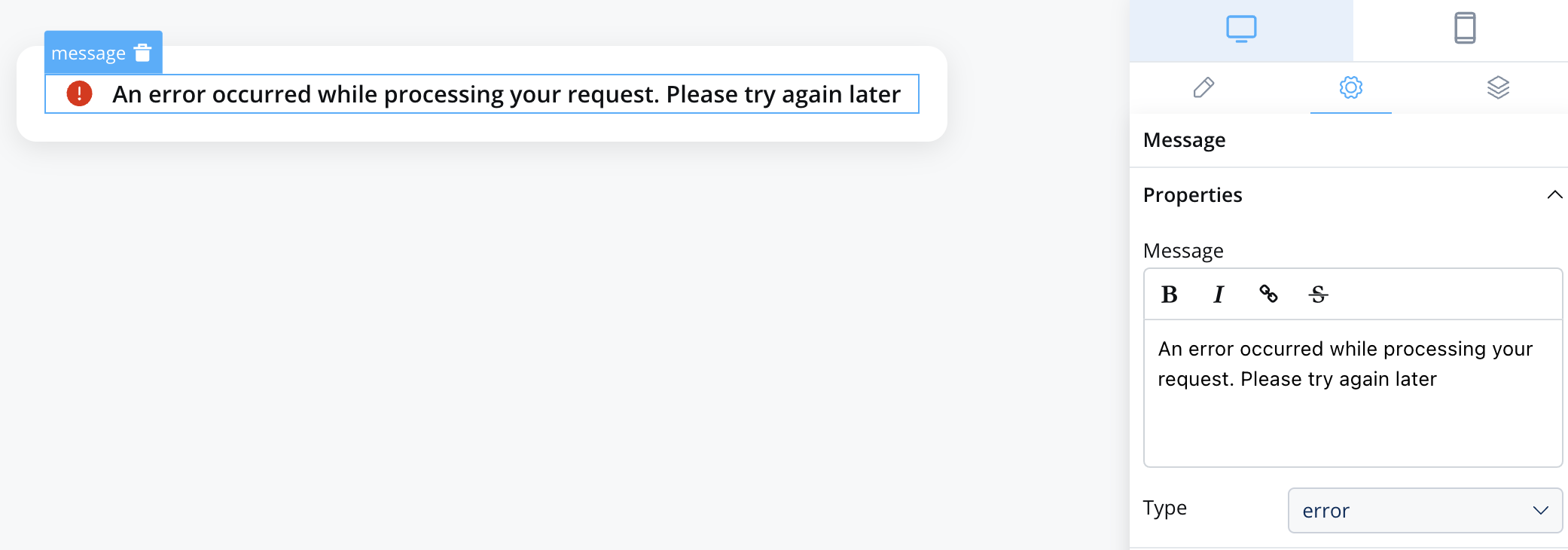
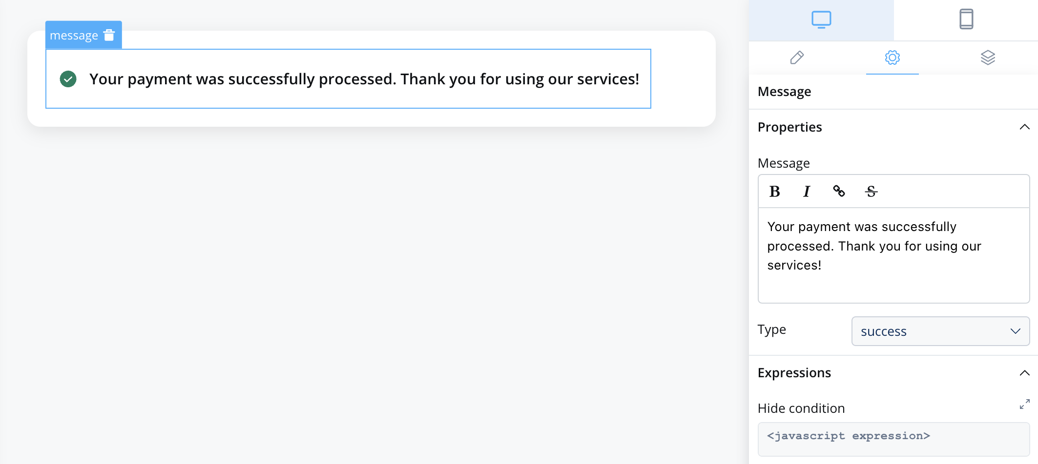
When configuring a message, you have the following properties:
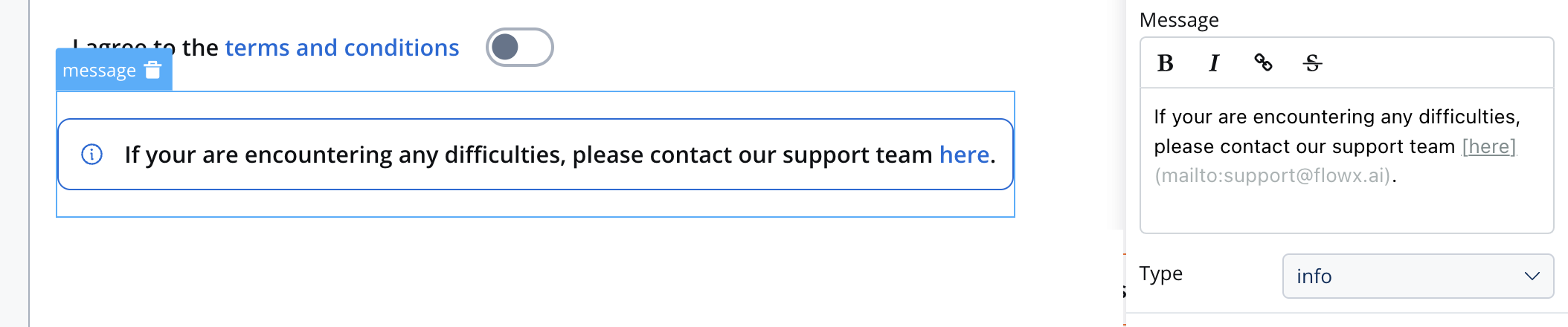
- Message: The content of the message body, this property supports markdown attributes such as: bold, italic, bold italic, strikethrough and URLs, allowing you to format the content of the message.
- Type: as mentioned above, there are multiple indicators: info, warning, error, success
- Expressions: you can define expressions to control when the message should be hidden. This can be useful for dynamically showing or hiding messages based on specific conditions.
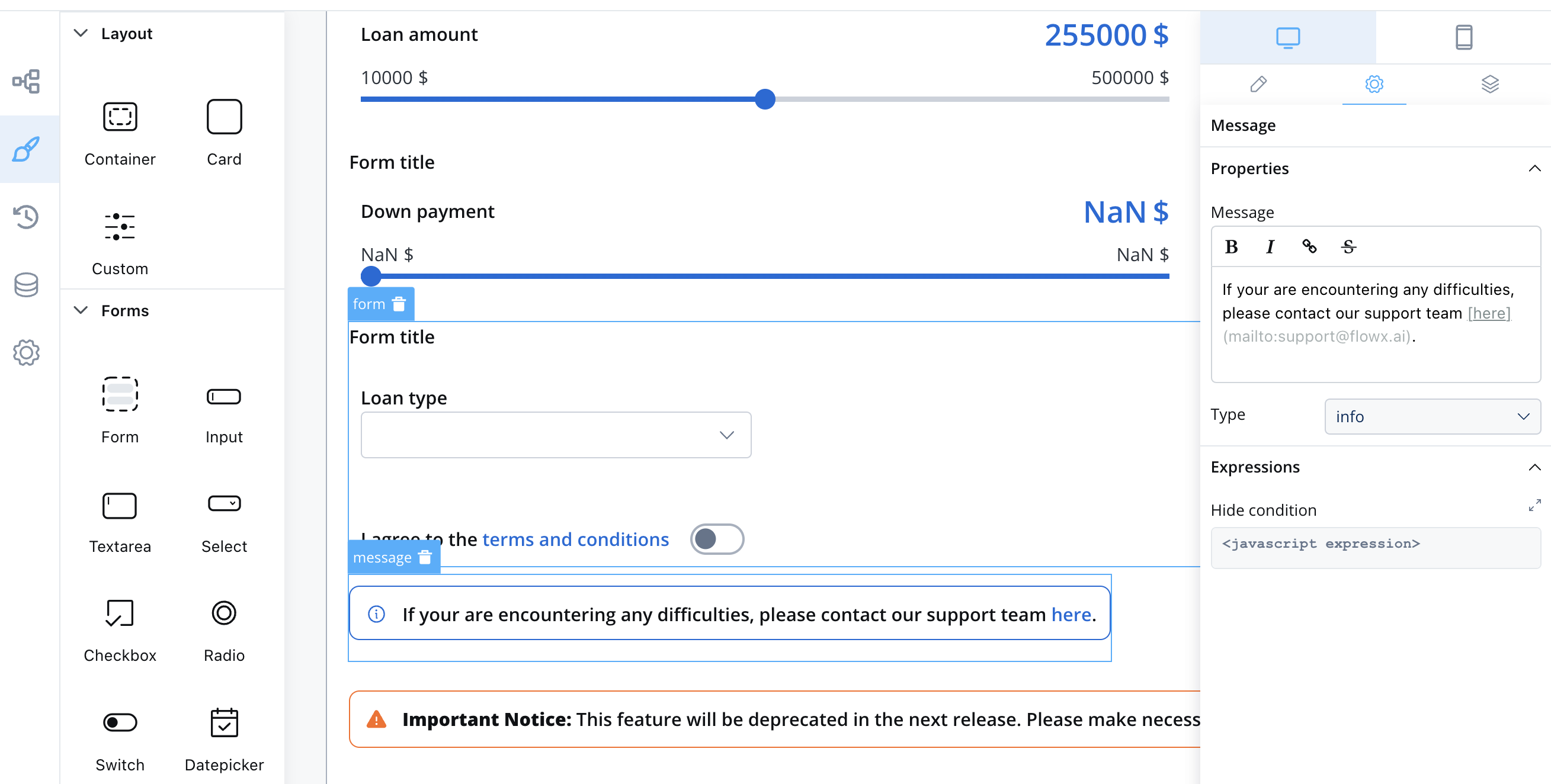 Info example with markdown:
If you are encountering any difficulties, please [contact our support team](mailto:[email protected]).
Types and Usage
Here’s how you can use the Message UI element in your UI design:
Info
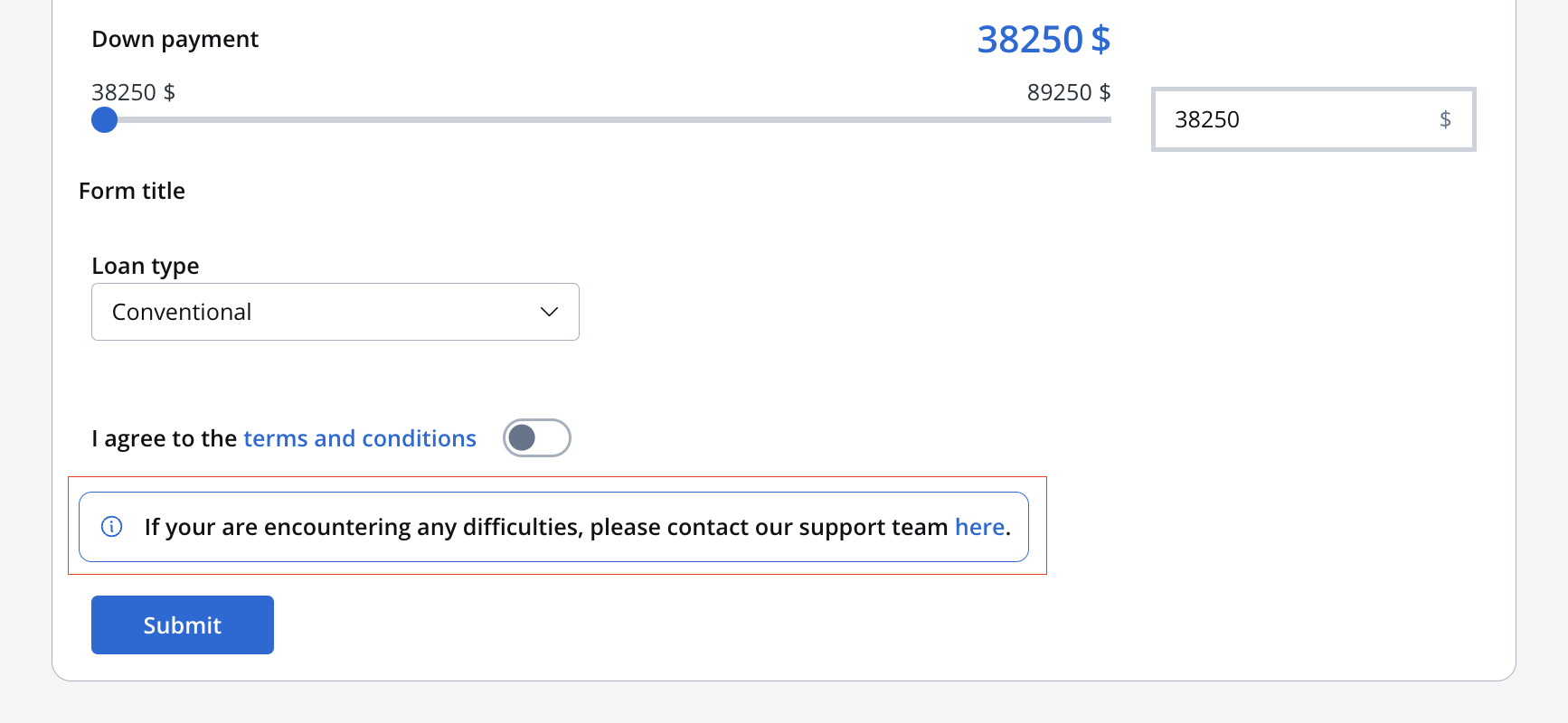
If you are encountering any difficulties, please contact our support team.
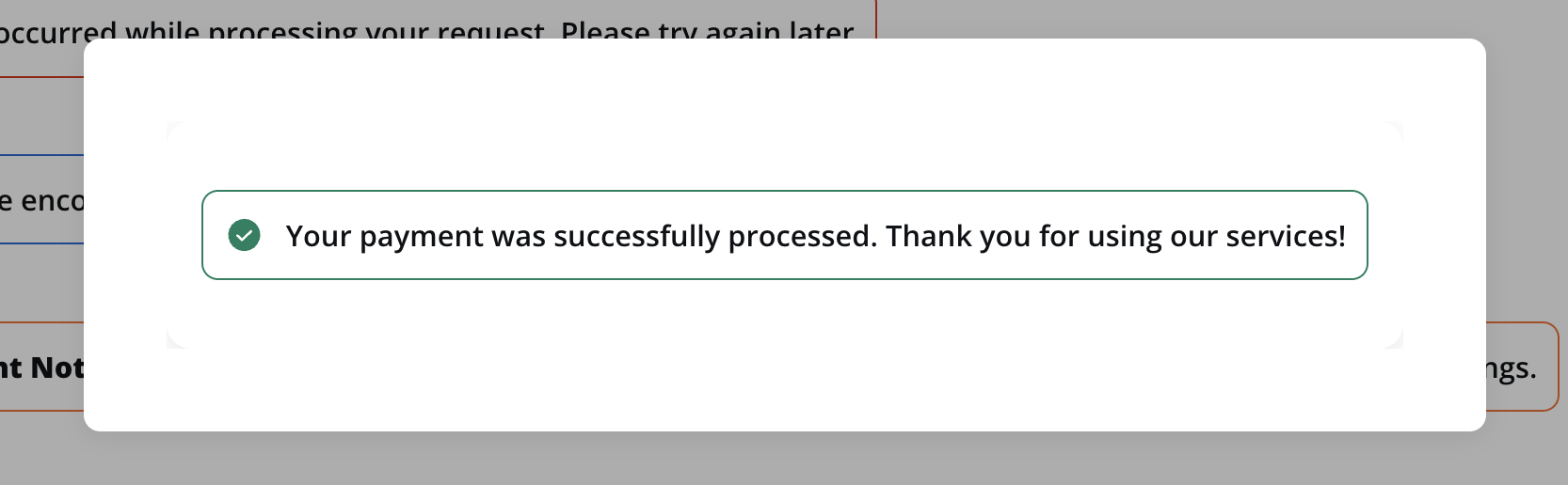
Error
An error occurred while processing your request. Please try again later.
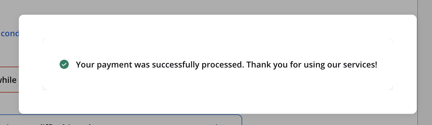
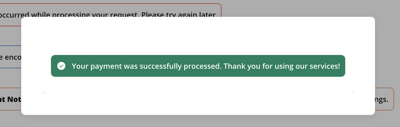
Success
Your payment was successfully processed. Thank you for using our services!
Indicators styling
To create an indicator with specific styling, sizing, typography, and color settings, you can use the following configuration:
Style
The Style section allows you to customize the appearance of your indicator UI element. You can apply the following style to achieve the desired visual effect:
- Text: Displays only the icon and the text.
- Border: Displays the icon, the text and the border.
- Fill: It will fill the UI element’s area.
For more valid CSS properties, click here. Last modified on January 26, 2026