Configuring a File preview element
A File Preview element can be configured for both mobile and web applications.File preview properties (web)
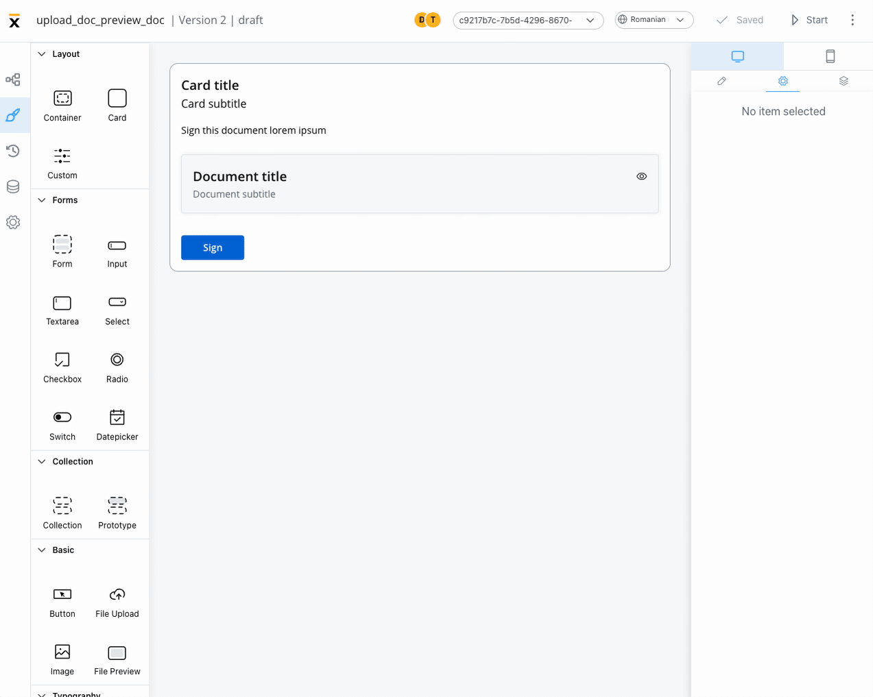 The File Preview element settings consist of the following properties:
- Title - the title of the element (if it is downloaded or shared - the file name should be the title used in preview component)
- Has subtitle - the subtitle of the element
- Display mode - depending on the selected display method the following properties are available:
-
Inline → Has accordion:
false- display preview inline, without expand/collapse optiontrue- Default View: Collapsed - display preview inline, with expand/collapse option, by default collapsedtrue- Default View: Expanded - display preview inline, with expand/collapse option, by default expanded
- Modal → view icon is enabled
-
Inline → Has accordion:
- Source Type -
- Process Data - process key where the document is found (creates the binding between the element and process data)
- Static - URL of the document
File preview properties (mobile)
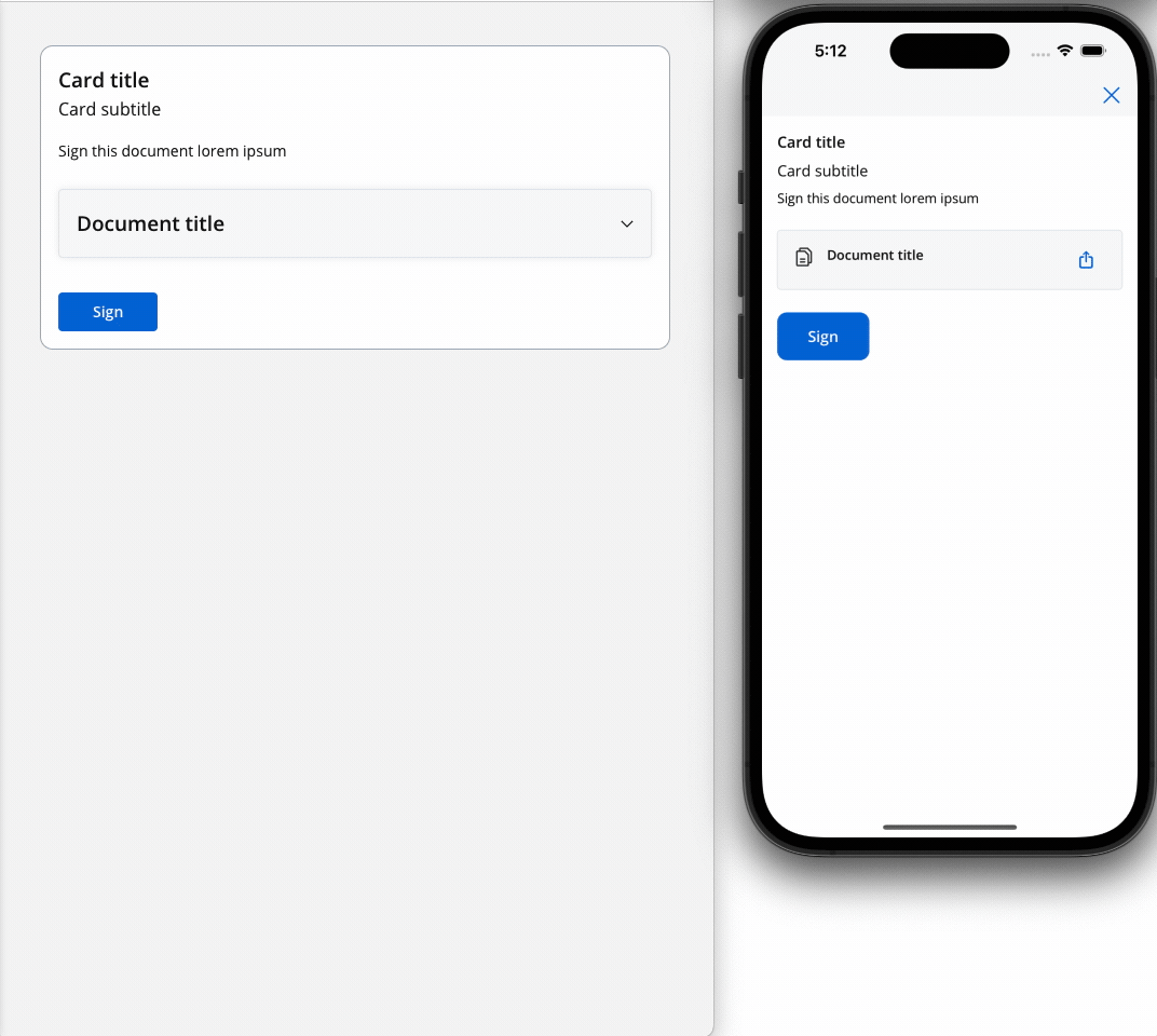
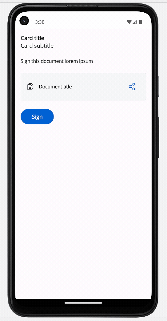
Both iOS and Android devices support the share button.
iOS
Android
File preview styling
The File Preview styling property enables you to customize the appearance of the element by adding valid CSS properties, for more details, click here. When drag and drop a File Preview element in UI Designer, it comes with the following default styling properties:Sizing
- Fit W - auto
- Fit H - fixed / Height - 400 px
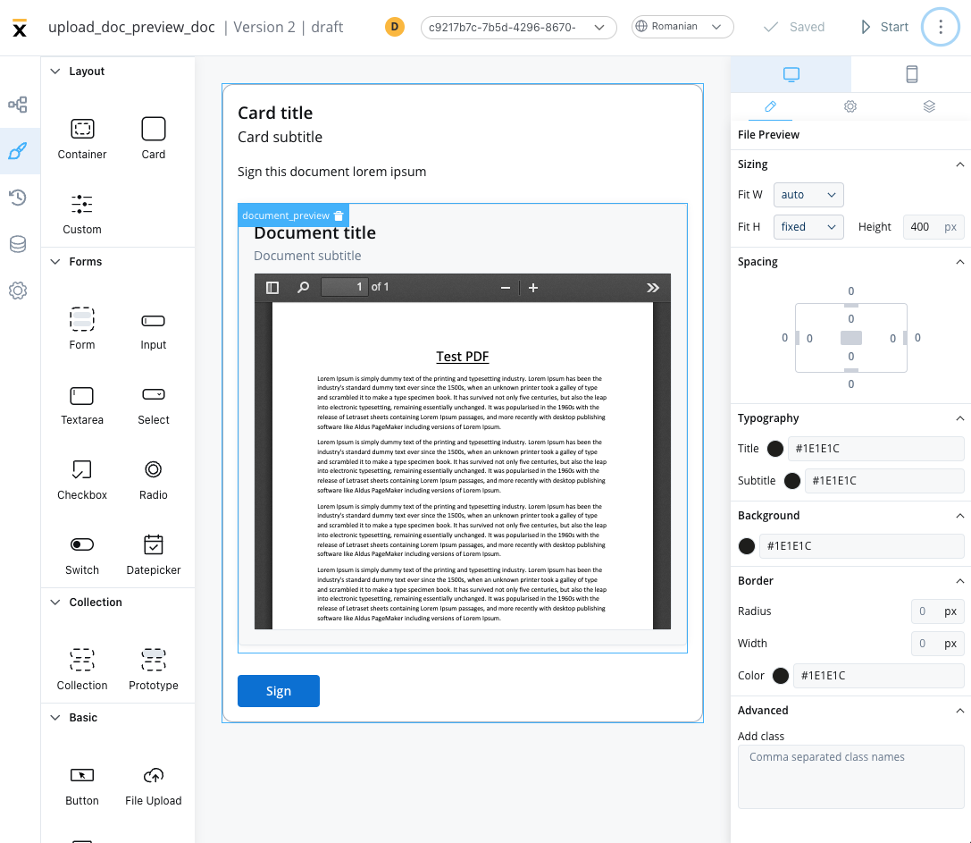
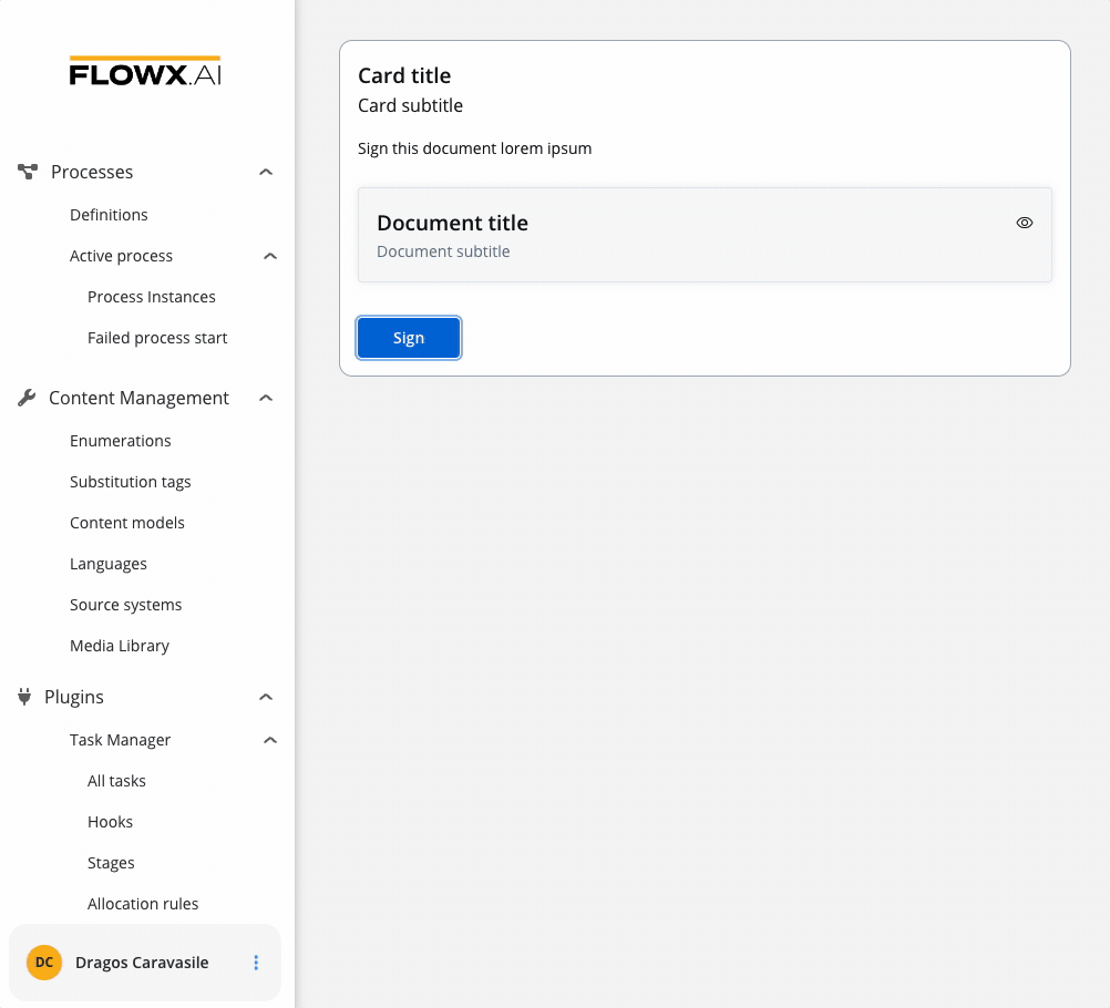
File Preview example
Below is an example of a File Preview UI element with the following properties:- Display mode - Inline
- Has accordion - True
- Default view - Expanded
- Source Type - Static