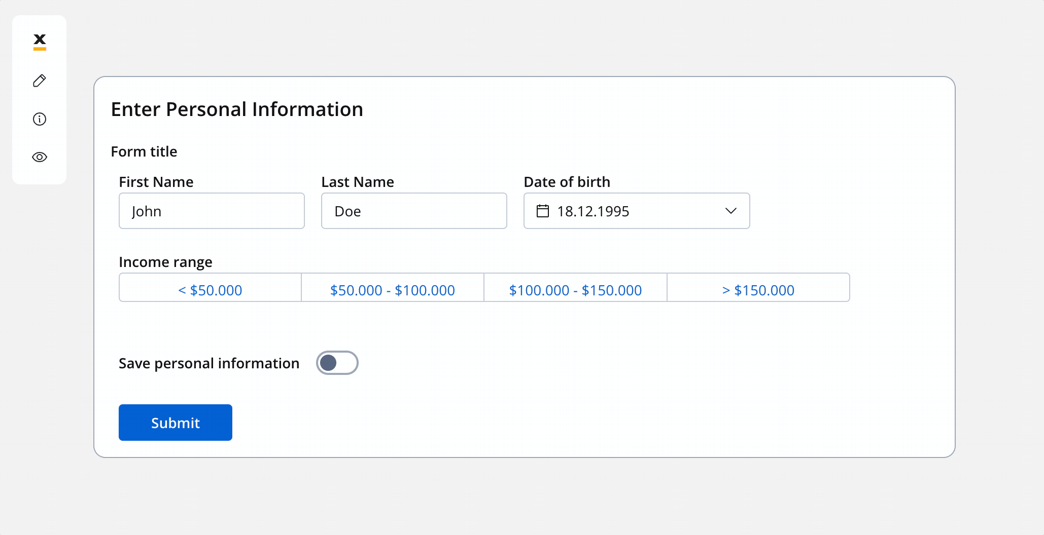
Configuring the segmented button
Segmented button settings
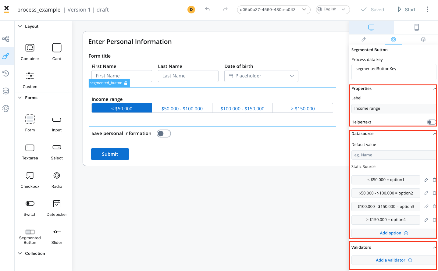
The available configuration options for this form element are:General
- Process data key - creates the binding between form element and process data so it can be later used in decisions, business rules or integrations
Properties
- Label - the label of the segmented button
- Helpertext - additional information about the segmented button (can be hidden inside an infopoint)
Datasource
- Default Value - the default value of the segmented button (it can be selected from one of the static source values)
- Source Type - it is by default Static
- Add option - value/label pairs can be defined here
Validators
The following validators can be added to a segmented button:required and custom (more details here).
UI actions
UI actions can be added to the segmented button element to define its behavior and interactions.- Event - possible value: CHANGE
- Action Type - select the action type
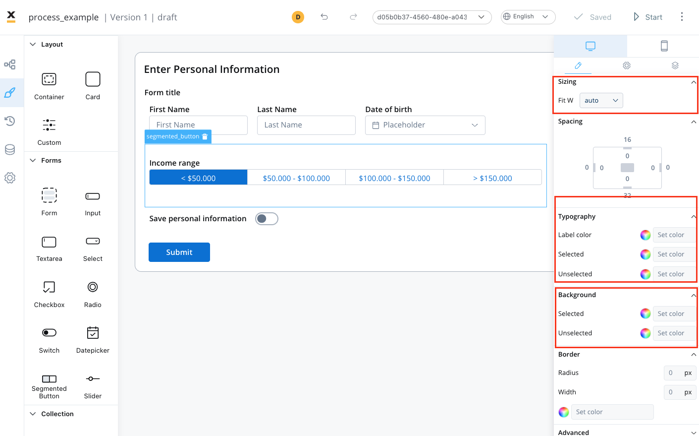
Segmented button styling
To create a segmented button with specific styling, sizing, typography, and color settings, you can use the following configuration:Sizing
- set the width of the button - fill/fixed/auto
Typography
Choose an appropriate font family, size, and weight for the button label text.- Label Color - set the color of the button label text
- Selected State - set the color of the label text when the button is selected
- Unselected State - set the color of the label text when the button is not selected
Background
- Selected state - set the background color of the button
- Unselected state - set the background color of the button