 It is an important tool for creating intuitive and effective conversational interfaces that can collect and process large amounts of user input.
Configuring the text area element
Text area settings
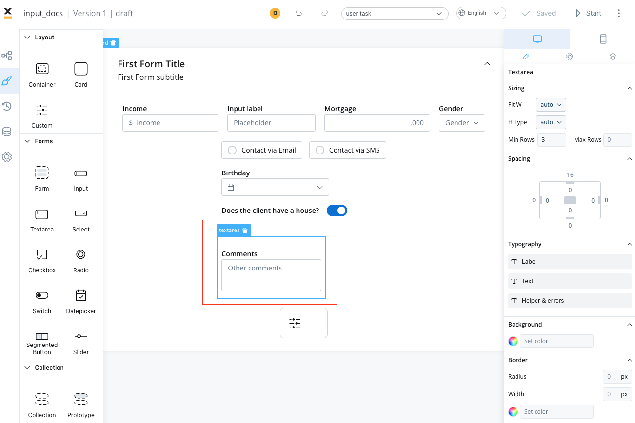
The text area offers the following configuration options:General
- Process data key - creates the binding between form element and process data, so it can be later used in decisions, business rules or integrations
Properties
- Label - the label of the text area
- Placeholder - the placeholder text that appears in the text area
- Has clear - content clear property
- Helpertext - additional information about the text area field (can be hidden inside an infopoint)
Datasource
The default value for the element can be configured here, this will autofill the text field when you will run the process.Validators
There are multiple validators can be added to a text area element (more details here).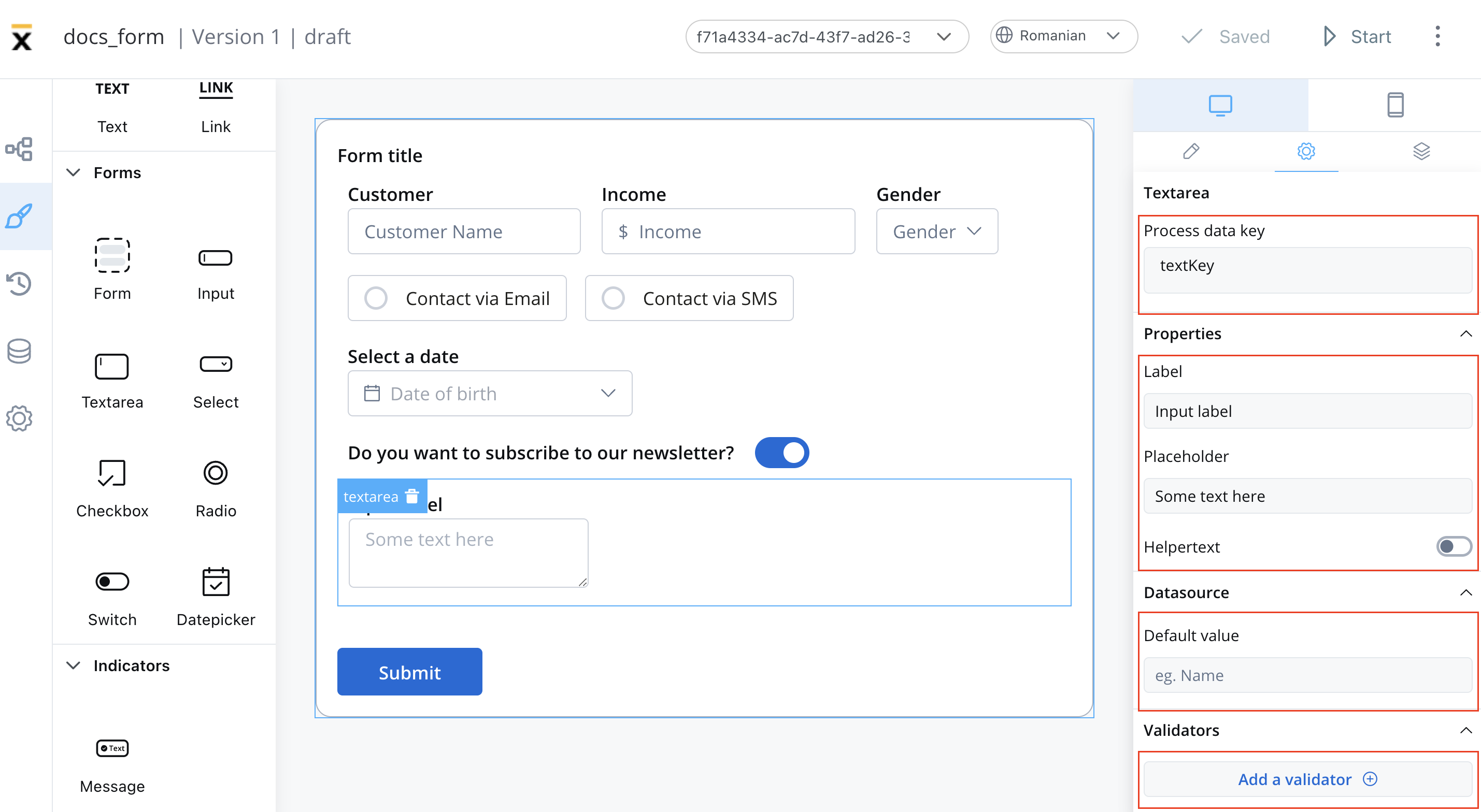
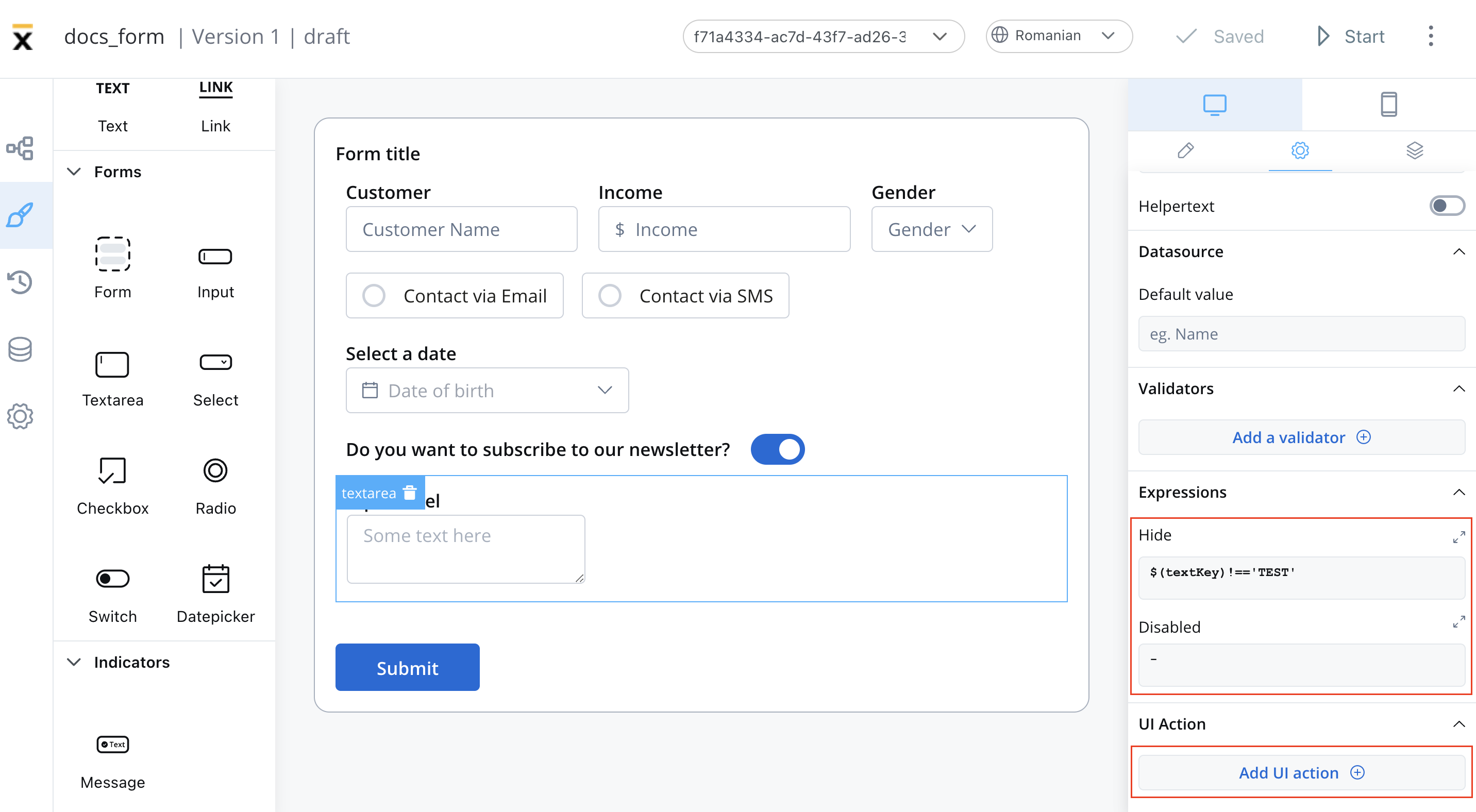
Expressions
The text area’s behavior can be defined using JavaScript expressions for hiding or disabling the element. The following properties can be configured for expressions:- Hide - JavaScript expression used to hide the text area when it returns a truthy value
- Disabled - JavaScript expression used to disable the text area when it returns a truthy value
It’s important to make sure that disabled fields have the same expression configured under the path expressions → hide.
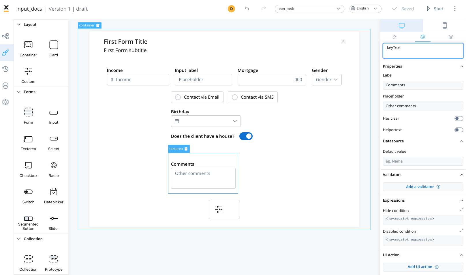
UI actions
UI actions can be added to the text area field to define its behavior and interactions.- Event - possible value:
CHANGE - Action Type - select the action type