Radio
Radio buttons are normally presented in radio groups (a collection of radio buttons describing a set of related options). Only one radio button in a group can be selected at the same time.
Configuring the radio field element
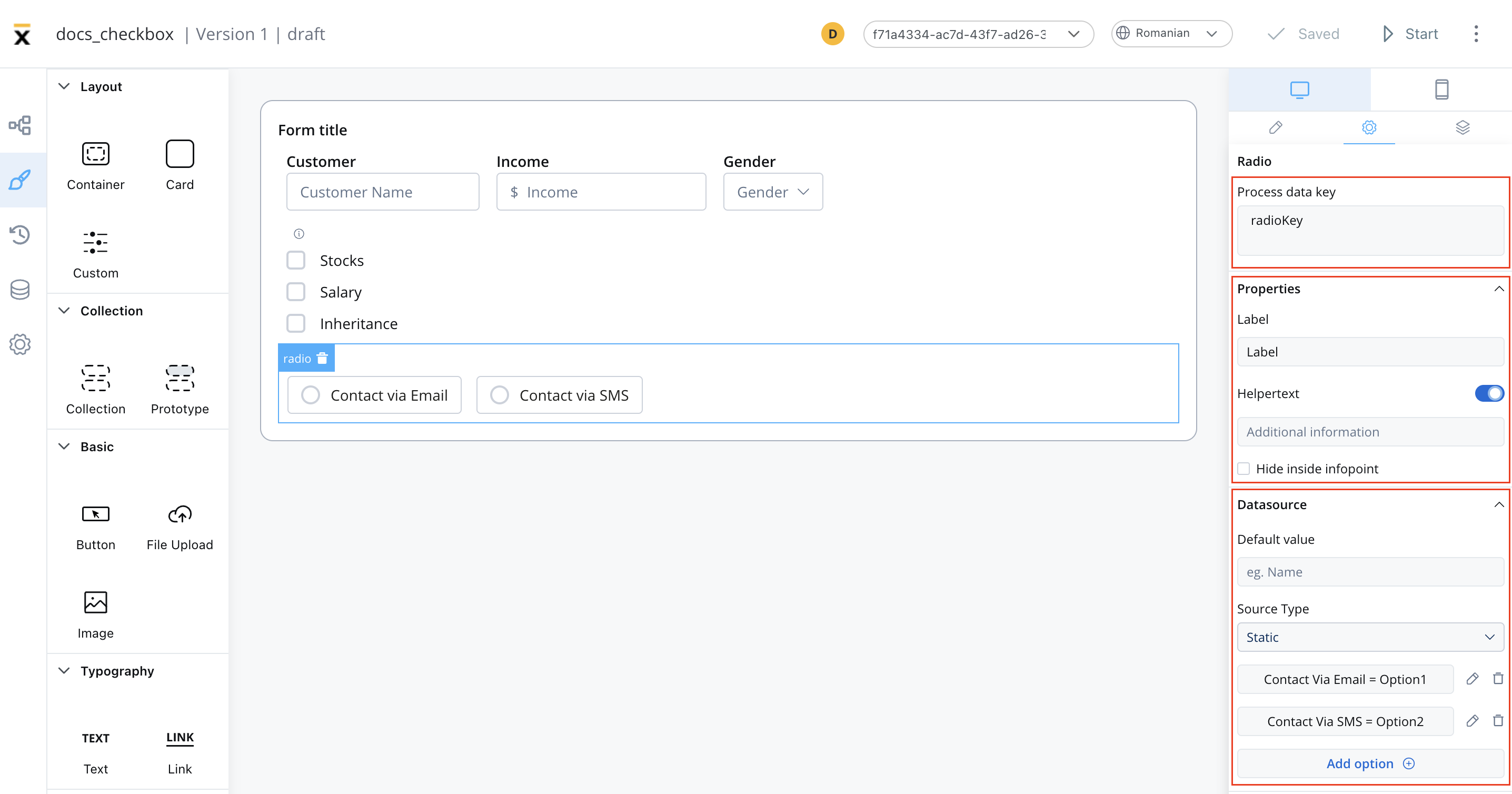
Radio settings
The available configuration options for this form element are:
General
- Process data key - creates the binding between form element and process data so it can be later used in
Properties
- Label - the label that appears on the radio
- Helpertext - additional information about the radio (can be hidden inside an infopoint)
Datasource
- Default Value - the default values of the radio element
- Source Type - it can be Static, Enumeration, or Process Data
- Add option - label - value pairs can be defined here
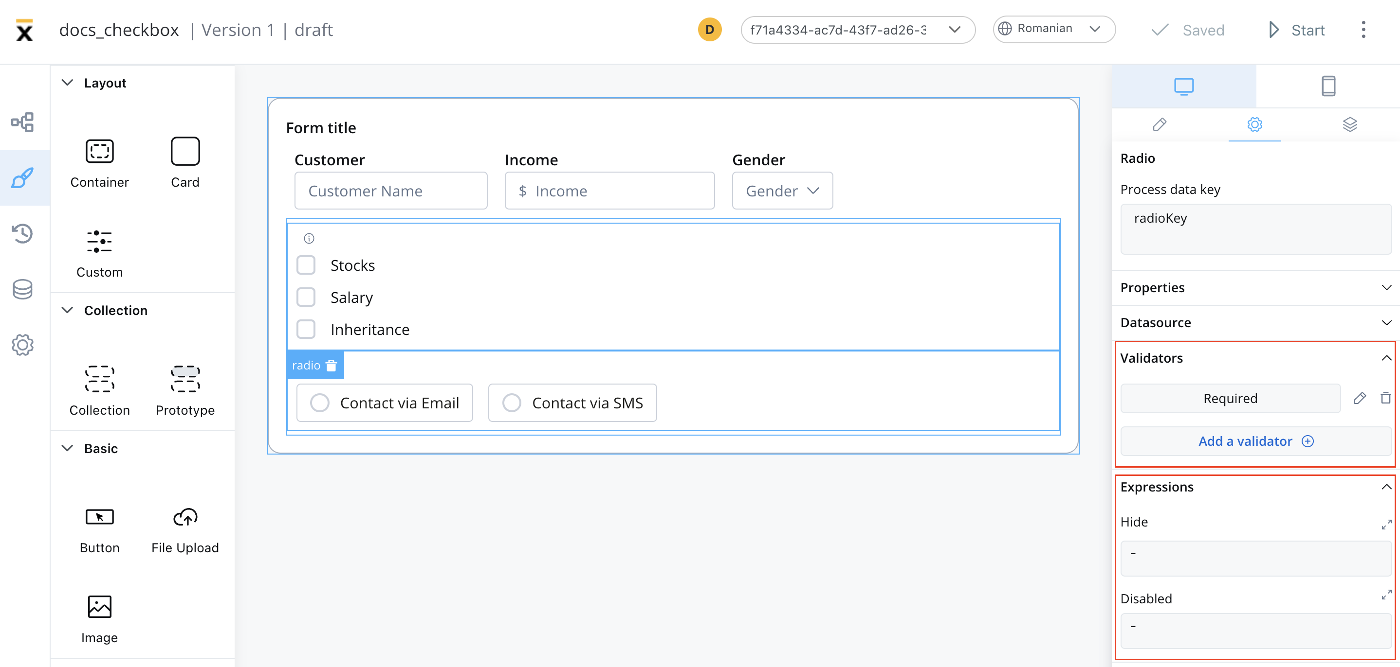
Validators
The following validators can be added to a radio: required and custom (more details here).
Expressions
The radio’s element behavior can be defined using JavaScript expressions for hiding or disabling the element. The following properties can be configured for expressions:
- Hide - JavaScript expression used to hide the Radio element when it returns a truthy value
- Disabled - JavaScript expression used to disable the Radio element when it returns a truthy value
It’s important to make sure that disabled fields have the same expression configured under the path expressions → hide.
UI actions
UI actions can be added to the radio element to define its behavior and interactions.
- Event - possible value:
CHANGE - Action Type - select the action type
For more details on how to configure a UI action, click here.
Radio styling
Properties
The type of the radio can be selected by using the styling tab in UI Designer, possible values:
- clear
- bordered
Typography
You can customize the typography for the following properties:
- Label
- Options
- Helper & errors

For more details on how to upload and manage fonts, check the following section:
Font management
For more valid CSS properties, click here.
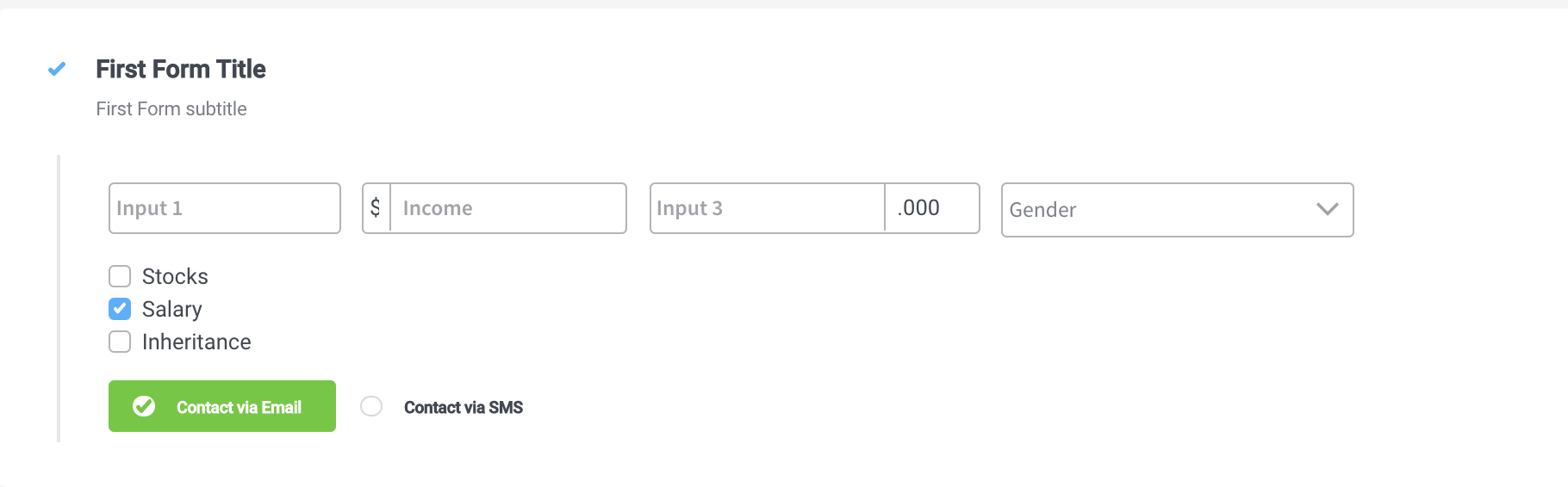
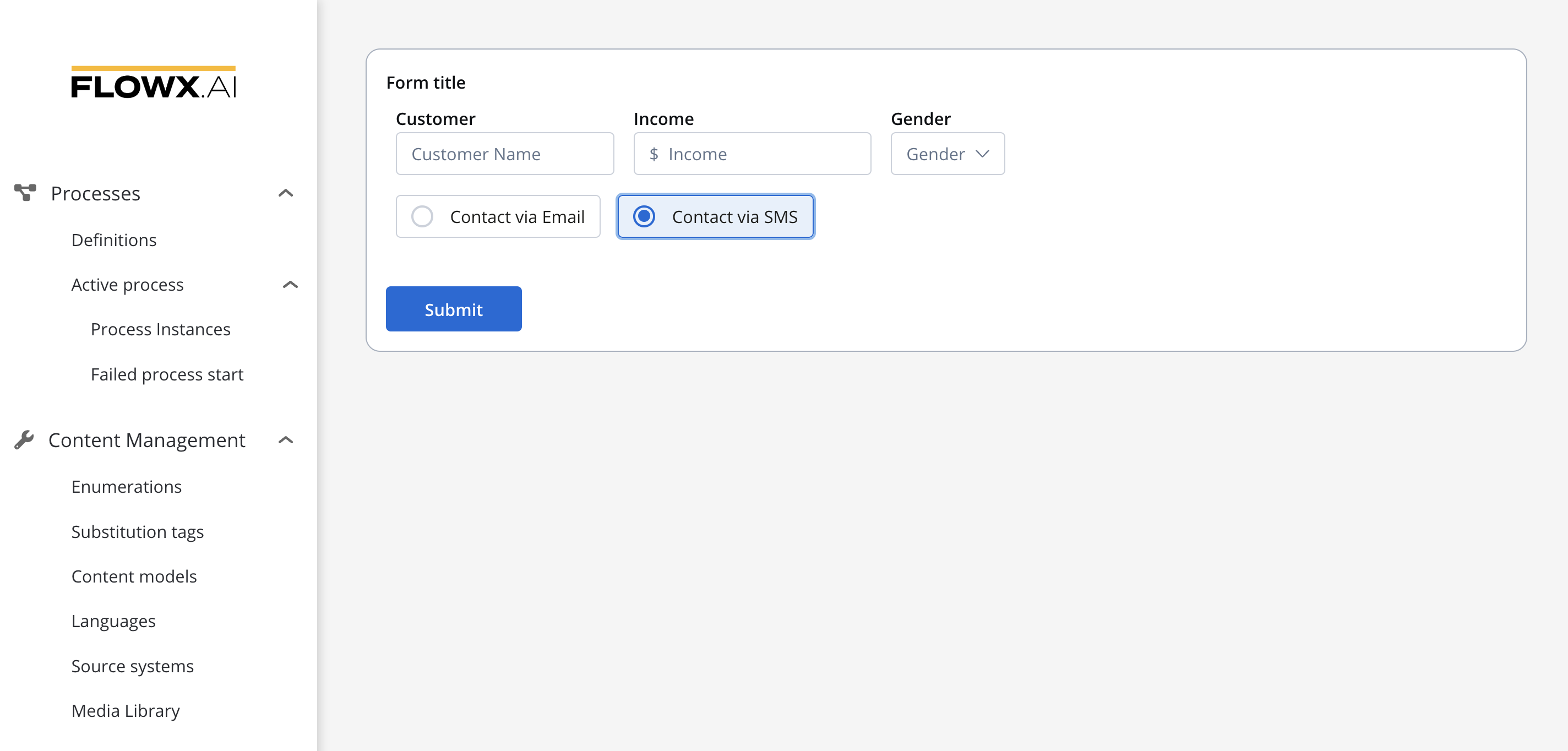
A Radio element with two options added, and with a layout configuration set to horizontal will look like as it follows: