Configuring a user task node

General Config
- Node name - the name of the node
- Can go back - setting this to true will allow users to return to this step after completing it. When encountering a step with
canGoBackfalse, all steps found behind it will become unavailable. - Flow Names - leave this field empty if the node should be included in all flows

When encountering a step with
canGoBack switched to false, all steps found behind it will become unavailable.- Swimlane - choose a swimlane (if there are multiple swimlanes on the process) to make sure only certain user roles have access only for certain process nodes- if there are no multiple swimlanes, the value is Default
- Stage - assign a stage to the node
Response Timeout
- Response timeout - can be triggered if, for example, a topic that you define and add in the Data stream topics tab does not respect the pattern, the format used for this is ISO 8601 duration format (for example, a delay of 30s will be set up like
PT30S)

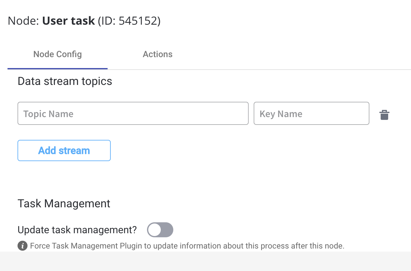
Data stream topics
- Topic Name - the topic name where the process engine listens for the response (this should be added to the platform and match the topic naming rule for the engine to listen to it) - available for UPDATES topics (Kafka receive events)
A naming pattern must be defined on the process engine configuration to use the defined topics. It is important to know that all the events that start with a configured pattern will be consumed by the Engine. For example,
KAFKA_TOPIC_PATTERN is the topic name pattern where the Engine listens for incoming Kafka events.- Key Name - will hold the result received from the external system, if the key already exists in the process values, it will be overwritten
Task Management
- Update task management - force Task Management plugin to update information about this process after this node
Configuring the UI
The FlowX Designer includes an intuitive UI Designer (drag-and-drop editor) for creating diverse UI templates. You can use various elements from basic buttons, indicators, and forms, but also predefined collections or prototypes.Accessing the UI Designer
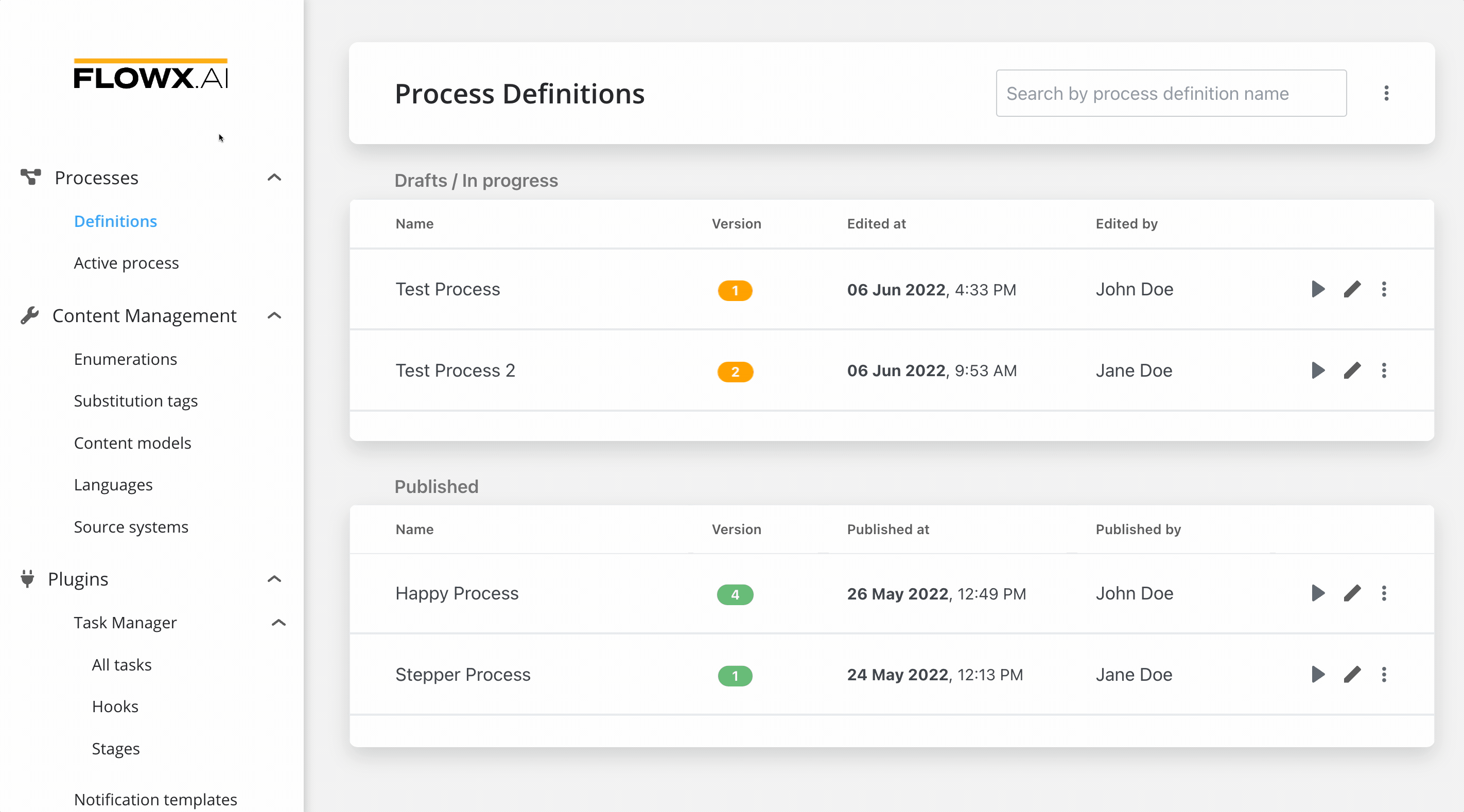
To access the UI Designer, follow the next steps:- Open FLOWX Designer and from the Processes tab select Definitions.
- Select a process from the process definitions list.
- Click the Edit process button.
- Select a user task node from the Pro dcess Designer then click the brush icon to open the UI Designer.
Creating a user interface
Predefined components
UI can be defined using the available components provided by FLOWX, using the UI Designer available at node level. Predefined components can be split in 3 categories:Root components
Root components
These elements are used to group different types of components, each having a different purpose:
- Card - used to group and configure the layout for multiple form elements.
- Container - used to group and configure the layout for multiple components of any type.
- Custom - these are Angular components developed in the container application and passed to the SDK at runtime, identified here by the component name
Root components
UI components
UI components
The root component can hold a hierarchical component structure.Available children for Card and Container are:
- Container - used to group and align its children
- Form - used to group and align form field elements (inputs, radios, checkboxes, etc)
- Image - allows you to configure an image in the document
- Text - a simple text can be configured via this component, basic configuration is available
- Hint - multiple types of hints can be configured via this component
- Link - used to configure a hyperlink that opens in a new tab
- Button - Multiple options are available for configuration, the most important part being the possibility to add actions
- File Upload - A specific type of button that allows you to select a file
Component types
Form elements
Form elements
This type of elements are used to allow the user to input data, and can be added only in a Form Component. They have have multiple properties that can be managed.
- Input - FLOWX form element that allows you to generate an input form filed
- Select - to add a dropdown
- Checkbox - the user can select zero or more input from a set of options
- Radio - the user is required to select one and only one input from a set of options
- Datepicker - to select a date from a calendar picker
- Switch - allows the user to toggle an option on or off
Form elements
Custom components
These are components developed in the web application and referenced here by component identifier. This will dictate where the component is displayed in the component hierarchy and what actions are available for the component. To add a custom component in the template config tree, we need to know its unique identifier and the data it should receive from the process model. More details in the following section:Custom
- Message - configure what data will be pushed to the frontend application
- Input keys - used to define the process model paths from which the components will receive its data
- UI Actions - actions defined here will be made available to the custom component. Multiple actions can be configured on a custom component and mapped to different triggers when developing it. Naming each action suggestively is important so the frontend engineer developing the component knows what actions should be triggered by certain events.
Displaying a UI element
When a process instance is started the web application will receive all the UI elements that can be displayed in that process. When the process instance token will reach a User Task, a web socket message will be sent informing the SDK to display the UI element associated with that user task Example:- Start a process: POST
{{processUrl}}/api/internal/process/DemoProcess/start
The provided instruction involves initiating a process by making a
POST request to the specified URL ({{processUrl}}/api/internal/process/DemoProcess/start). This API call triggers the start of a process named “DemoProcess” by sending relevant data to the server.- ProgressUpdateDto will trigger the SDK to search for the UI element having the same nodeId with the one in the SSE event.
-
Additionally, it will ask for data and actions that are required for this component via a GET request
{{processUrl}}/api/process/db573705-71dd-4216-9d94-5ba2fb36ff2a/data/42062