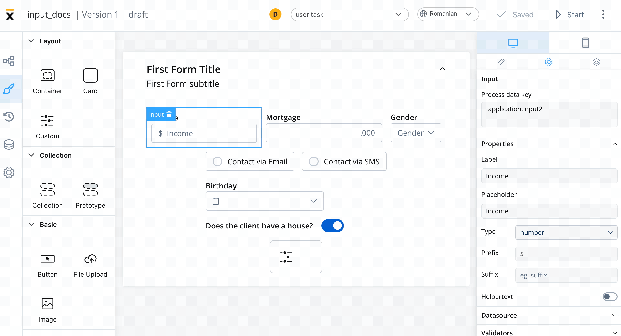
Configuring the input element
Input settings
The Input Field offers the following configuration options:General
- Process data key - creates the binding between form element and process data, so it can be later used in decisions, business rules or integrations
Properties
- Label - the label that appears on the input field
- Placeholder - the placeholder text that appears in the input field when it is empty
- Type - the type of data that the input field can accept, such as text, number, email, or password
- Prefix - a label that appears as a prefix to the input field
- Suffix - a label that appears as a suffix to the input field
- Has clear -
- Helpertext - additional information about the input field (can be hidden inside an infopoint)

Datasource
The default value for the element can be configured here, this will autofill the input field when you will run the process.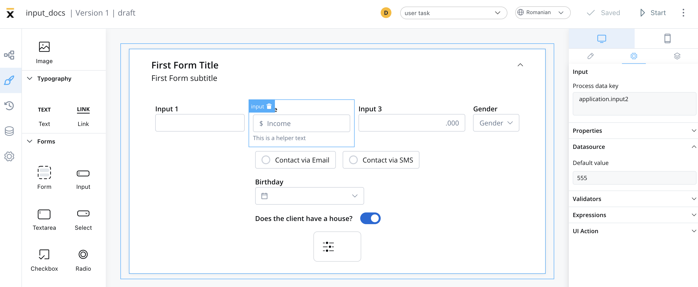

Computed datasource value
To add a computed value, you have to explicitly check “Computed value” option (represented by thef(x) icon), which will transform the desired field into a JavaScript editor.
Check the following example:
Computed values
Validators
There are multiple validators can be added to an input (more details here).
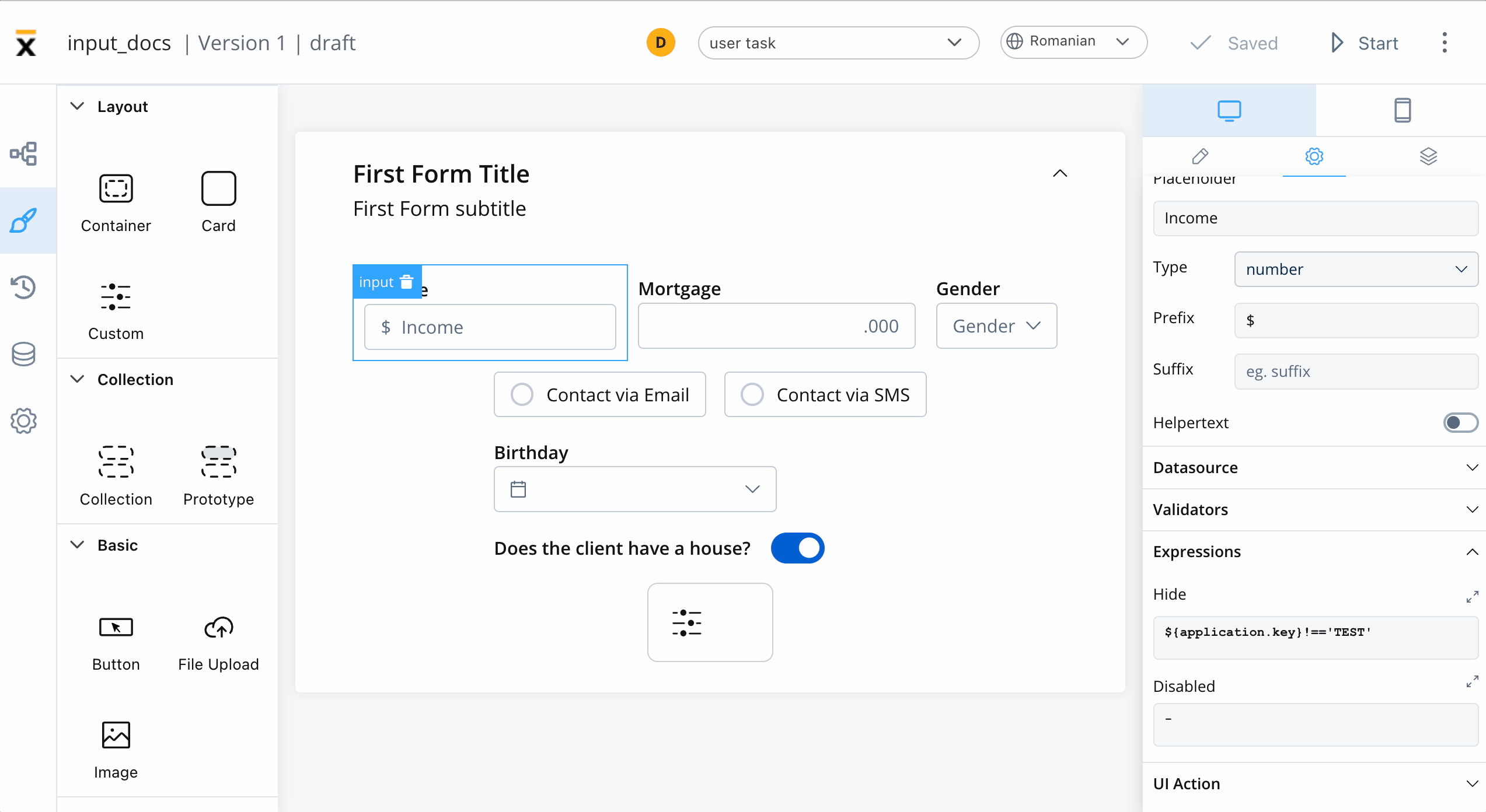
Expressions
The input field’s behavior can be defined using JavaScript expressions for hiding or disabling the element. The following properties can be configured for expressions:- Hide - JavaScript expression used to hide the Input Field when it returns a truthy value
- Disabled - JavaScript expression used to disable the Input Field when it returns a truthy value
It’s important to make sure that disabled fields have the same expression configured under the path expressions → hide.

UI actions
UI actions can be added to the Input Field to define its behavior and interactions.- Event - possible value:
CHANGE - Action Type - select the action type
For more details on how to configure a UI action, click here.
Input styling
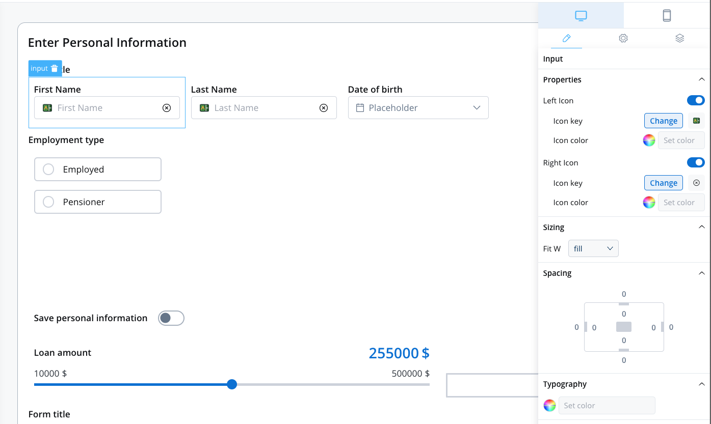
Icons
- Icon Key - the key associated in the Media library, select the icon from the Media Library
- Icon Color - select the color of the icon using the color picker
When setting the color, the entire icon is filled with that color, the SVG’s fill. Avoid changing colors for multicolor icons.
- Left Icon: You can include an icon on the left side of the Input element. This icon can serve as a visual cue or symbol associated with the input field’s purpose or content.
- Right Icon: Same as left icon.
Typography
You can customize the typography for the following properties:- Label
- Text
- Helper & errors
 For more details on how to upload and manage fonts, check the following section:
Font management