Configuration overview
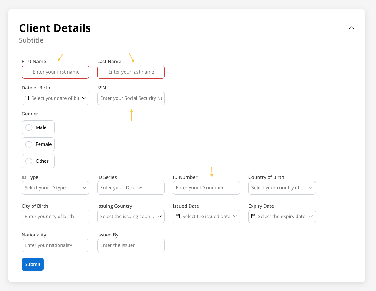
Configure your input field using these main sections:Basic Settings
Process data binding, labels, and input types
Data & Validation
Default values, validators, and data formatting
Behavior
Hide/disable conditions and UI actions
Styling
Visual appearance and platform-specific overrides
Basic configuration
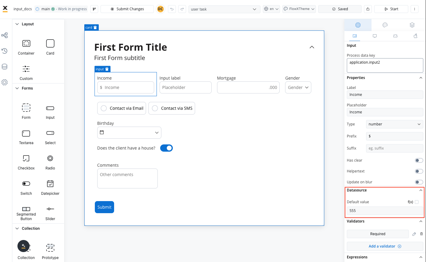
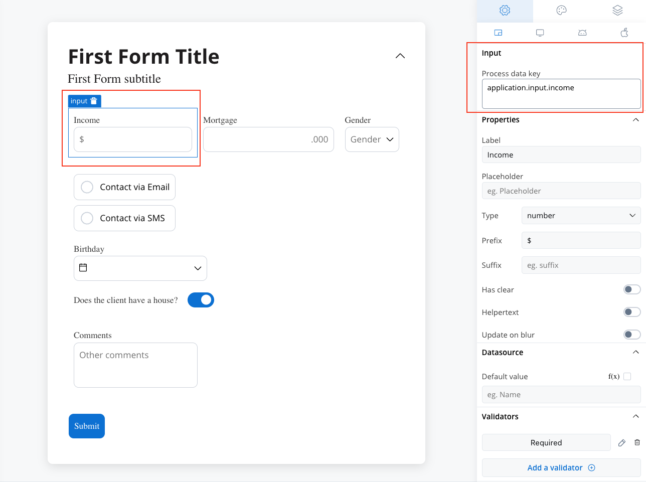
Process data key
The process data key establishes the binding between the input element and process data, enabling its later use in:Core properties
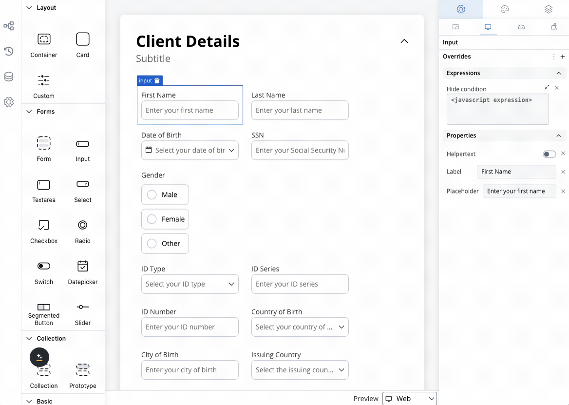
Label
Label
Purpose: The visible text displayed above or alongside the input fieldFeatures: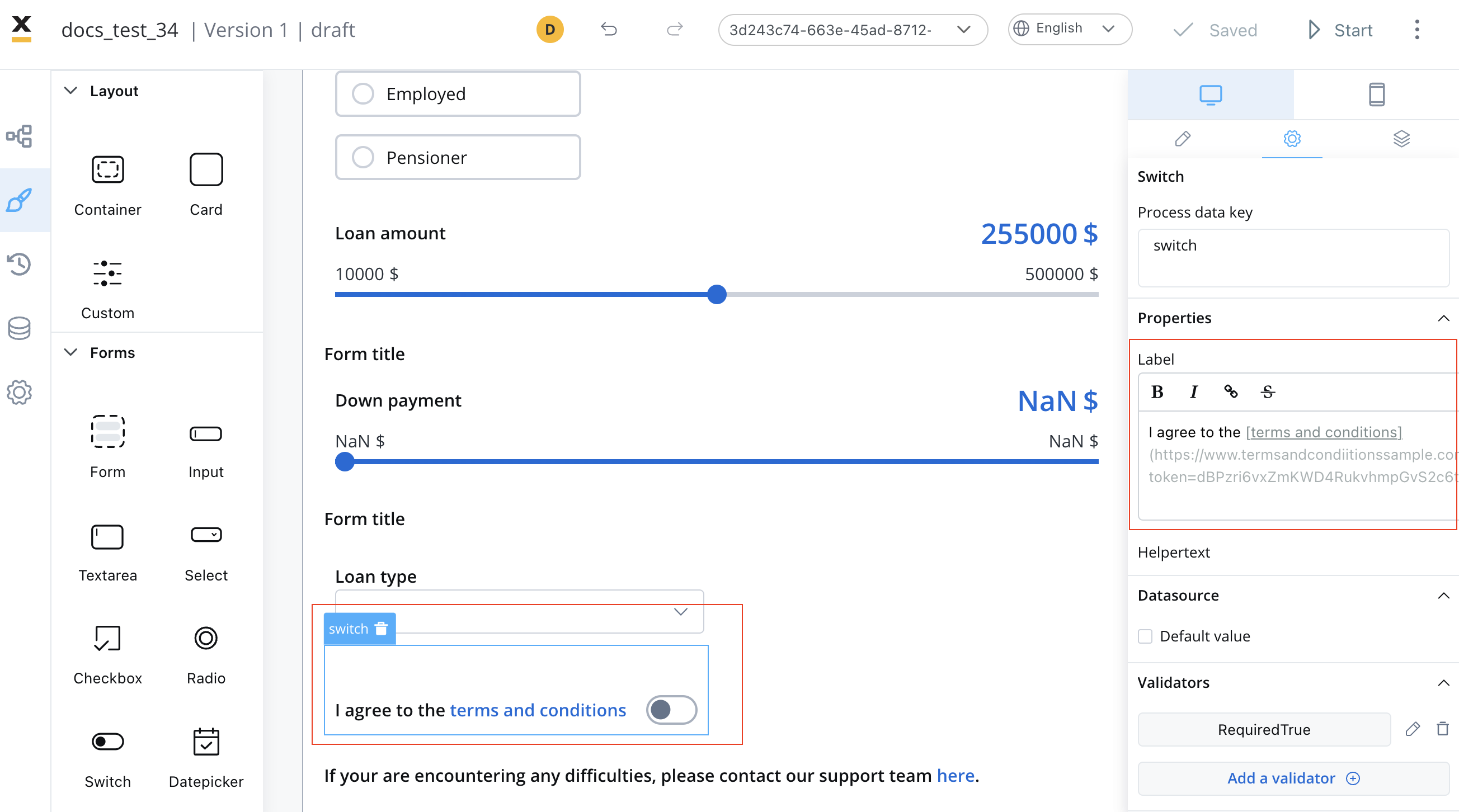
- Supports full Markdown syntax for rich formatting
- Can include links, emphasis, and other Markdown elements
- Responsive across all platforms
Input Types
Input Types
Choose the appropriate input type for your data:
Code Type Technical Details:
| Type | Description | Validation Features | Best Used For |
|---|---|---|---|
| Text | General text input | Length, pattern matching | Names, titles, descriptions |
| Number | Numeric values only | Min/max values, decimals | Quantities, prices, scores |
| Email address format | Built-in email validation | Contact information | |
| Password | Masked text input | Strength requirements | Authentication, security |
| Code | Digits-only input | Only digits allowed | OTP codes, PIN numbers, postal codes, verification codes |
The Code input type accepts only digit characters during input and stores the value as a string (not as a number). This is ideal for numeric codes that should be treated as text, such as OTP codes, PIN numbers, postal codes, or verification codes where leading zeros or string formatting is important.
- Input behavior: Only allows digits (0-9) to be typed
- Data storage: Saves the value as a string data type
- Data model support: String data model types only
- Value formatting: No automatic formatting is applied to the displayed value
- Common use cases: OTP validation, PIN entry, postal codes, verification codes
Placeholder Text
Placeholder Text
Purpose: Provide hints or examples of expected inputBest Practices:
- Keep it concise and helpful
- Show format examples (e.g., “john@example.com”)
- Avoid using placeholder as primary label
- Consider accessibility for screen readers
Prefix & Suffix
Prefix & Suffix
Prefix: Text or symbols appearing before the input
- Currency symbols ($, €, £)
- Protocol indicators (https://, @)
- Unit prefixes
- Units of measurement (kg, cm, %)
- Domain extensions (.com, .org)
- Contextual indicators
Additional Features
Additional Features
Has Clear: Adds an ✕ button to quickly clear the input content
- Improves user experience on mobile devices
- Useful for search fields and optional inputs
- Can be displayed as regular text below the field
- Can be hidden within an expandable info point
- Supports Markdown formatting
- Triggers validation when user leaves the field
- Optimizes performance by reducing frequent updates
Data configuration
Datasource configuration
Configure the data source and default values for your input field: Default Value: Set the initial value when the field is first displayed- Static values for consistent defaults
- Dynamic values from process data
- Calculated values from expressions
Validation rules
Ensure data quality with comprehensive validation options:- Basic Validators
- Numeric Validators
- Date Validators
- Custom Validators
| Validator | Purpose | Configuration |
|---|---|---|
| Required | Ensures field is not empty | Error message customization |
| Min Length | Minimum character count | Specify minimum number |
| Max Length | Maximum character count | Specify maximum number |
| Valid email format | Works with email input type | |
| Pattern | Custom regex validation | Define regex pattern |
Behavior configuration
Hide/disable expressions
Define the input field’s behavior using JavaScript expressions to control its visibility or disablement:- Hide condition: A JavaScript expression that hides the input field when it evaluates to the specified result.
- Disabled condition: A JavaScript expression that disables the input field when it returns a truthy value.
Hide expression example
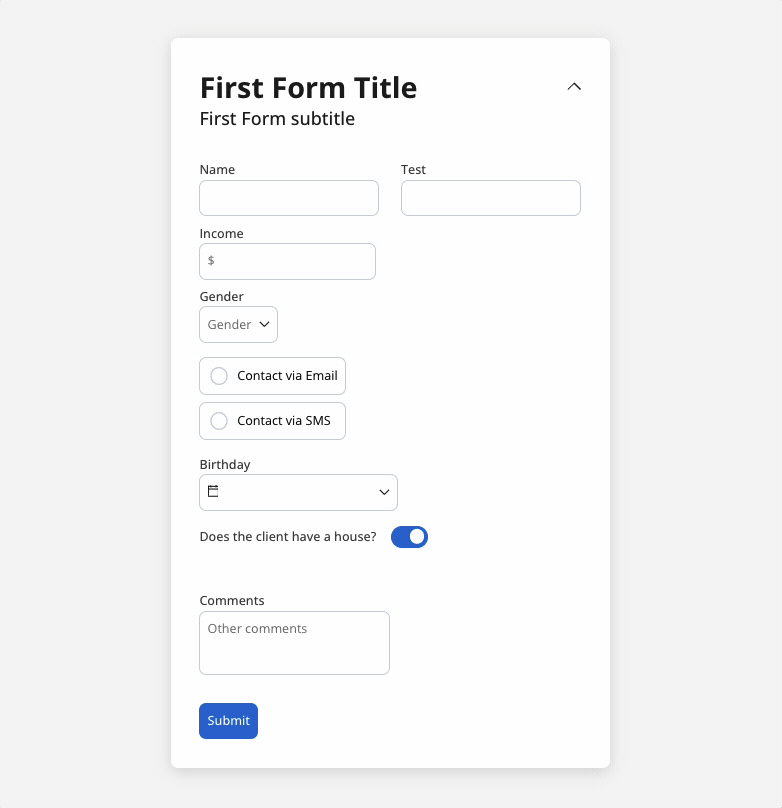
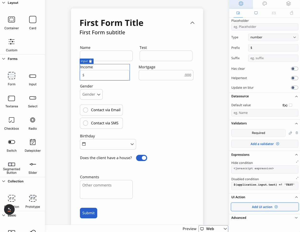
We can use a rule to hide an input field if another field has a null value (it is not filled). For example, the “Mortgage” input field, which remains hidden until users fill in the “Income” field: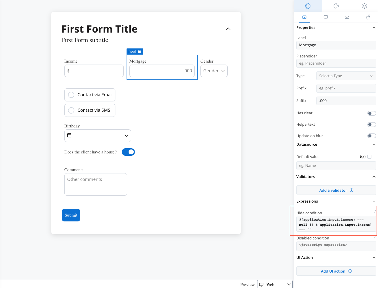
Disable example
You can use a disabled condition to disable an input element based on values from other fields. When you type ‘TEST’ in the first input (Name) the second input (Test) will be disabled: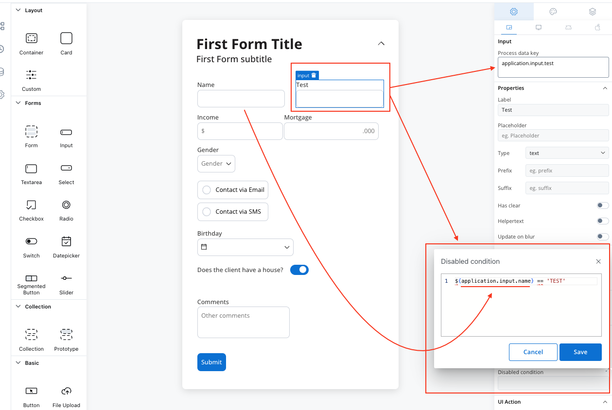
It’s important to make sure that disabled fields have the same expression configured under the path expressions → hide.
UI actions
Configure interactive behaviors for your input field:| Event | Description | Common Use Cases |
|---|---|---|
| CHANGE | Triggered when input changes | Update related fields, trigger calculations, show/hide elements |
| FOCUS | When field receives focus | Load dynamic data, show helper content |
| BLUR | When field loses focus | Validate input, save data, format display |
- Navigate to different pages
- Execute business rules
- Call external services
- Update other form elements
- Trigger process actions
Platform customization
Settings overrides
Customize your input field differently across platforms:- Web Applications
- Mobile Apps
Override Options:
- Label text for desktop terminology
- Placeholder text optimized for keyboard input
- Helper text with extended descriptions
- Prefix/suffix for web-specific formatting
- Keyboard shortcuts integration
- Advanced formatting options
- Enhanced validation messages
Override settings can be imported and pushed between platforms, saving configuration time and ensuring consistency.
Visual styling
Layout options
- Web Styling
- iOS Styling
- Android Styling
Icon Integration
Icon Integration
Left Icon: Visual cue at the start of the input
- Search icons for search fields
- User icons for name fields
- Lock icons for password fields
- Clear buttons (×)
- Validation status (✓ or ⚠)
- Dropdown arrows
- Select from Media Library
- Custom icon keys
- Platform-specific icons
Responsive Sizing
Responsive Sizing
| Option | Behavior | Best For |
|---|---|---|
| Fill | Expands to use available space | Full-width forms |
| Fixed | Maintains specified width | Consistent layouts |
| Auto | Adjusts based on content | Dynamic forms |
Theme customization
Override default styling for complete visual control:Input Field Styling
Input Field Styling
Border & Background:
- Border colors for different states
- Background color customization
- Border radius and thickness
- Font family and size
- Text color for different states
- Placeholder text styling
- Default, focused, disabled, error states
- Hover effects for web
- Touch feedback for mobile
Label & Helper Styling
Label & Helper Styling
Label Customization:
- Typography controls
- Color options
- Positioning and alignment
- Font styling
- Color coordination
- Tooltip appearance
Validation Styling
Validation Styling
Error States:
- Error message styling
- Input border color changes
- Icon integration
- Success indicators
- Positive feedback styling
- Completion animations
Best practices
Accessibility
- Provide clear, descriptive labels
- Use appropriate input types for better mobile experience
- Include helper text for complex fields
- Set an accessibility label when the input has no visible label
User Experience
- Choose appropriate input types for the data
- Provide helpful placeholder text and examples
- Use validation that guides rather than frustrates
- Consider progressive disclosure for complex forms
- Implement auto-save functionality where appropriate
- Group related inputs logically
Data Management
- Use meaningful process data keys
- Plan for data validation early in development
- Consider data format consistency across platforms
- Implement proper error handling
- Document validation rules for maintenance
- Test with real-world data scenarios
Common use cases
| Scenario | Input Type | Validation | Additional Features |
|---|---|---|---|
| Contact Form | Text, Email | Required, Email format | Clear buttons, helper text |
| Login Form | Text, Password | Required, Min length | Security indicators |
| Search Field | Text | Min length | Auto-complete, clear button |
| OTP codes | Code | Pattern matching | |
| Numeric Input | Number | Min/max values | Prefix/suffix for units |
| Address Entry | Text | Format validation | Auto-complete integration |