The Chat component provides a conversational interface for AI-powered interactions. It enables real-time messaging between users and AI agents within your FlowX applications.Documentation Index
Fetch the complete documentation index at: https://docs.flowx.ai/llms.txt
Use this file to discover all available pages before exploring further.
Overview
Real-time messaging
Send and receive messages instantly with streaming support
AI agent integration
Connect to workflows powered by AI agents
Session management
Automatic session handling and persistence across page refreshes
Customizable UI
Themeable components with independent styling for agent and user messages
Adding to a UI Flow
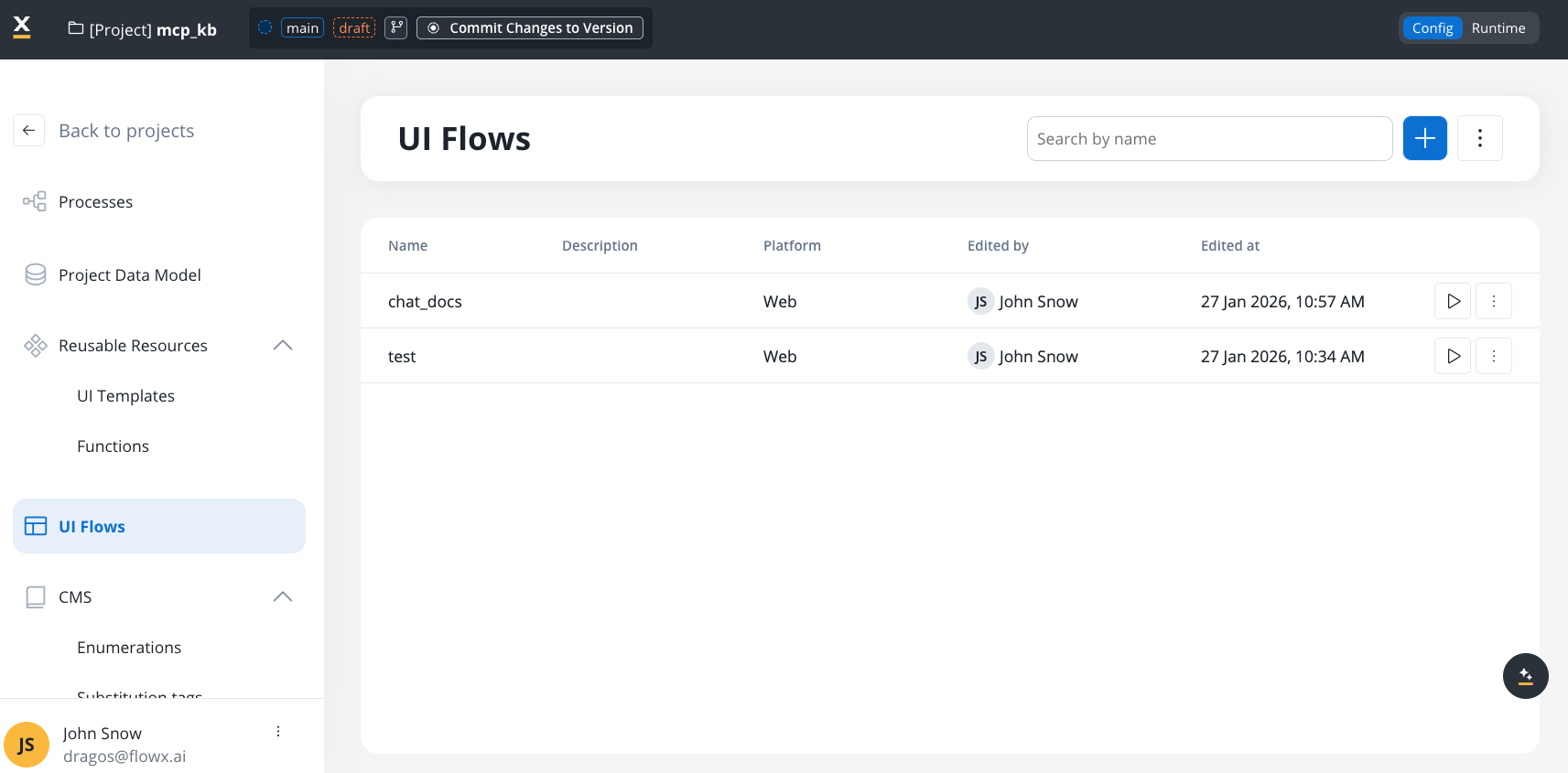
Open UI Assets panel
In the left sidebar, expand the UI Assets panel. Find Chat alongside Table, Collection, and other components.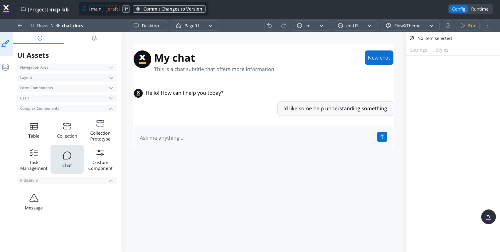
Configuration
Required settings
| Property | Description |
|---|---|
| Workflow | The agent workflow that handles chat interactions (required) |
| Welcome Message | Initial greeting shown when chat opens |
| Thinking Message | Text displayed while agent processes (default: “Thinking…”) |
Component hierarchy
The Chat component has configurable sub-components: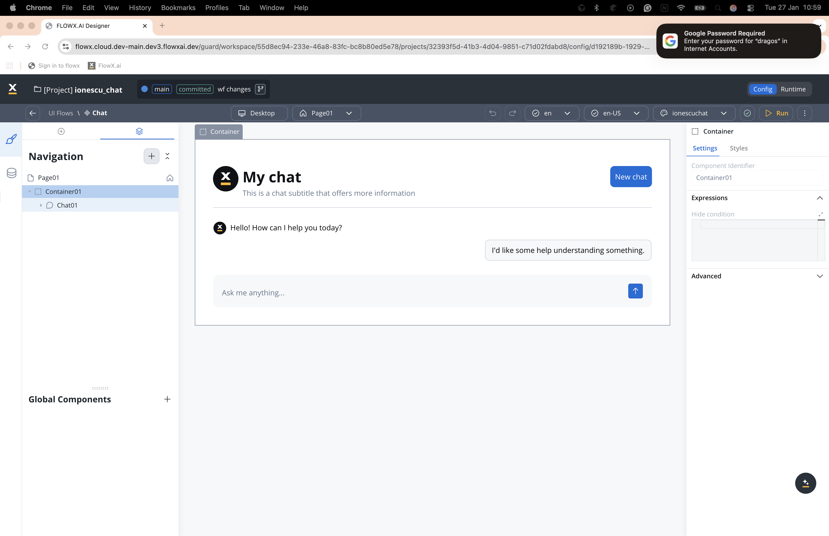
Settings by sub-component
Chat (root)
Chat (root)
| Property | Description |
|---|---|
| Workflow | Select the workflow handling chat interactions |
| Welcome Message | Initial greeting (supports variables: ${customerName}) |
| Thinking Message | Text shown during processing |
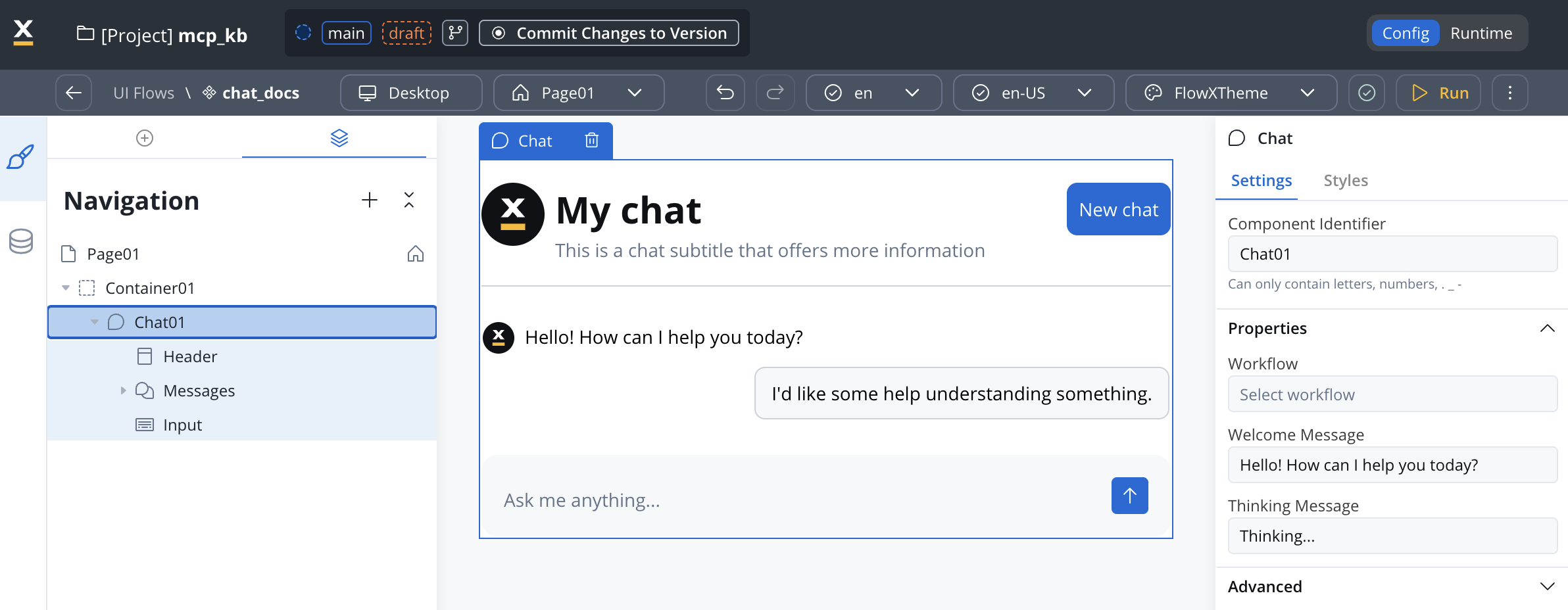
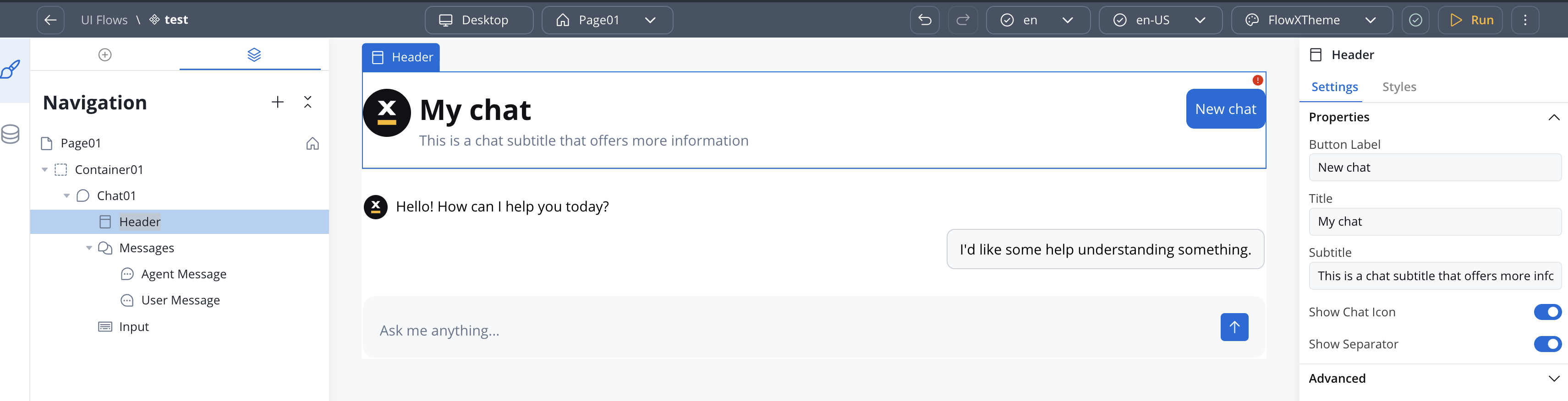
Header
Header
| Property | Description |
|---|---|
| Button Label | ”New chat” button text |
| Title | Main header text |
| Subtitle | Secondary text below title |
| Show Chat Icon | Toggle avatar icon visibility |
| Show Separator | Toggle separator line |
Chat History
Chat History
Available starting with FlowX.AI 5.6.0
| Property | Description |
|---|---|
| Title | Heading displayed on the chat history panel |
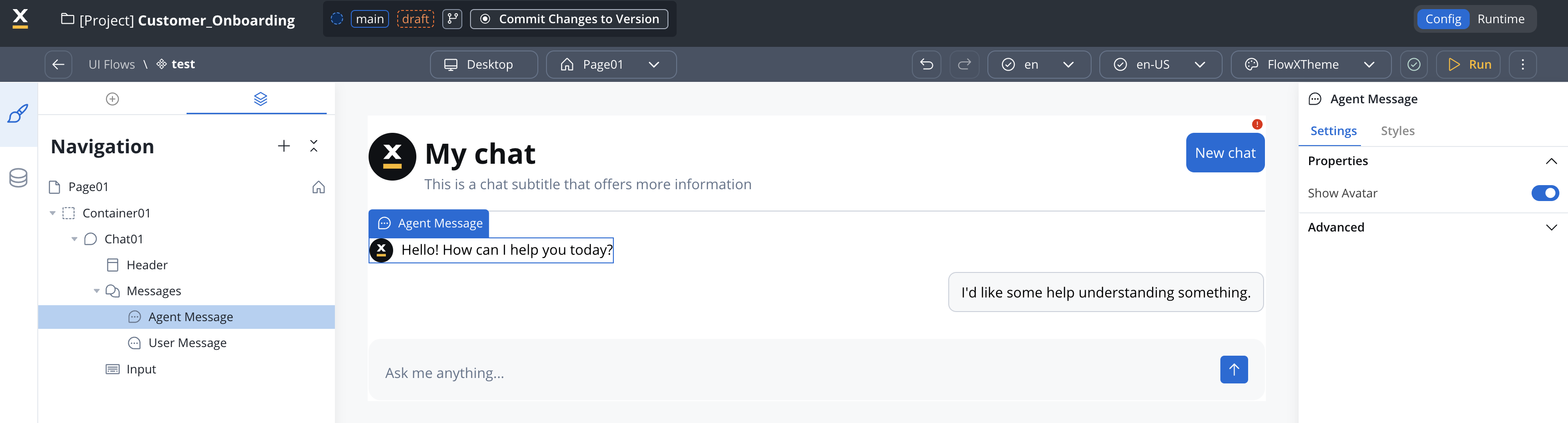
Agent Message
Agent Message
| Property | Description |
|---|---|
| Show Avatar | Toggle agent avatar visibility |
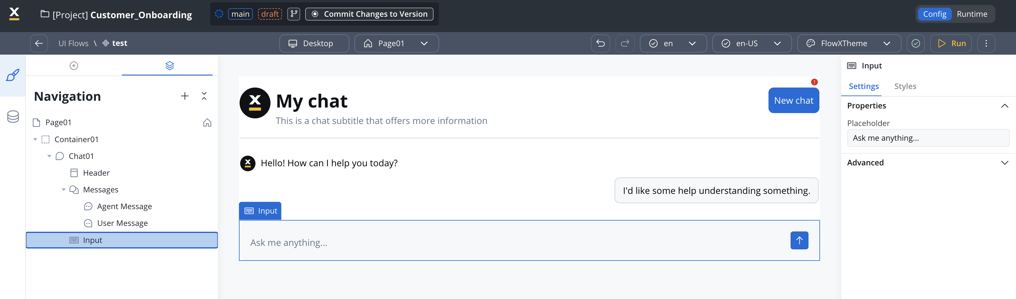
Input
Input
| Property | Description | Default |
|---|---|---|
| Placeholder | Hint text (e.g., “Ask me anything…”) | — |
| Enable Voice Input | Show the microphone button so users can send voice messages. Available starting with FlowX.AI 5.7.0. | Off |
Suggested Prompts
Suggested Prompts
Available starting with FlowX.AI 5.6.0
| Property | Type | Default | Description |
|---|---|---|---|
| Title | string | "Suggested Prompts" | Heading text displayed above the suggestions |
| Prompts | string[] | — | List of prompt strings shown as clickable suggestions |
Styling
Configure visual styling through Theme Admin (Design Assets → Themes → Components → Chat).Themeable elements
| Element | Key properties |
|---|---|
| Chat container | Padding, border, background, shadow |
| Header | Title/subtitle text styles, separator |
| Messages area | Padding, gap between messages |
| Agent Message | Avatar icon, text style, background |
| User Message | Bubble border, radius, background, text |
| Suggested Prompts | Title text style, prompt chip appearance, hover state |
| Input area | Border, background, send icon |
Display modes
Updated in FlowX.AI 5.6.0The Chat component now supports four display modes. Mobile chat support and per-mode theme configuration were also added in this release.
| Display mode | Description | Placement |
|---|---|---|
| Inline | Renders in place within the page layout (default) | Child of any container or card |
| Overlay | Positioned overlay panel with minimize and expand controls | Child of Page or Root Zone |
| FullScreen | Takes over the full viewport | Child of Page or Root Zone |
| Floating | Floating panel triggered by a FAB (Floating Action Button) | Child of Page or Root Zone |
You can change the display mode after creation if needed.
Sizing defaults
| Display mode | Default width | Default height | Notes |
|---|---|---|---|
| Inline | Fill (parent) | Fill (parent) | Supports Fill or Fixed sizing |
| Overlay | Configurable | Configurable | Positioned over content |
| FullScreen | Full viewport | Full viewport | No sizing controls |
| Floating | 420px (fixed) | 640px (fixed) | FAB at right: 24px, bottom: 24px |
Floating action button (FAB)
Floating and FullScreen modes include a Floating Action Button that triggers the chat. The FAB is configurable in the style panel:| Property | Default | Description |
|---|---|---|
| Width | 56px | FAB button width |
| Height | 56px | FAB button height |
| Position | Right: 24px, Bottom: 24px | Fixed position on screen |
Theming per display mode
Theme values are configured independently per display mode and per platform (Web, Android, iOS) through Design Assets → Themes → Components → Chat. Supported properties include padding and margin for each mode. For complete runtime details, see the Chat component reference.Advanced documentation
For comprehensive documentation including runtime behavior, session management, custom persistence workflows, SDK integration, and troubleshooting:Chat component - Full reference
Complete technical documentation in AI Platform section
Related resources
Chat interface concepts
High-level chat integration patterns
AI Triggers
Launch conversational workflows with structured trigger messages
Knowledge bases
Ground AI responses in your data
AI in FlowX
AI capabilities overview