The Chat component enables interactive AI agent conversations with end-users within FlowX apps. This page covers runtime behavior, session management, and advanced integration patterns.Documentation Index
Fetch the complete documentation index at: https://docs.flowx.ai/llms.txt
Use this file to discover all available pages before exploring further.
For UI configuration, settings, and styling, see the Chat component in UI Designer.
Key features
Real-time messaging
Send and receive messages instantly with streaming support
AI agent integration
Connect to workflows powered by AI agents
Session management
Automatic session handling and persistence across page refreshes
Message history
Retrieve and display conversation history on refresh
Knowledge Base integration
Ground AI responses in your organization’s data using RAG capabilities
Reasoning transparency
Show AI reasoning steps to users for trust and transparency
Flexible display modes
Inline, Overlay, FullScreen, and Floating modes with per-mode theming for Web, Android, and iOS
Display modes
Updated in FlowX.AI 5.6.0The Chat component now supports four distinct display modes, replacing the previous Fill/Overlay model. Mobile chat support was also added in this release.
| Display mode | Description | Placement |
|---|---|---|
| Inline | Renders in place within the page layout (default) | Child of any container or card |
| Overlay | Positioned overlay panel with minimize and expand controls | Child of Page or Root Zone |
| FullScreen | Takes over the full viewport | Child of Page or Root Zone |
| Floating | Floating panel triggered by a FAB (Floating Action Button) | Child of Page or Root Zone |
You can change the display mode after creation if needed.
Mode details
- Inline
- Overlay
- FullScreen
- Floating
Renders within the parent component, filling the available space. This is the default mode.
- Can be a child of any container or card
- Embeds directly into the page layout
- Best for dedicated chat pages or inline chat experiences
- Width and height follow the parent container; supports Fill or Fixed sizing
Sizing defaults
| Display mode | Default width | Default height | Notes |
|---|---|---|---|
| Inline | Fill (parent) | Fill (parent) | Supports Fill or Fixed sizing |
| Overlay | Configurable | Configurable | Positioned over content |
| FullScreen | Full viewport | Full viewport | No sizing controls |
| Floating | 420px (fixed) | 640px (fixed) | FAB at right: 24px, bottom: 24px |
Theming per display mode
Theme values can be set independently for each display mode and per platform (Web, Android, iOS) through Design Assets → Themes → Components → Chat.| Platform | Configurable modes |
|---|---|
| Web | Inline, Floating, FullScreen |
| Android | Inline, Floating, FullScreen |
| iOS | Inline, Floating, FullScreen |
Chat header button and URL synchronization
The chat header includes a state-aware button that adapts based on the current display mode (for example, toggling between fullscreen and overlay views). Chat session state is also synchronized to the browser URL viapopstate, so navigating back or refreshing the page restores the correct session context.
Global component
Available starting with FlowX.AI 5.5.0
- The chat appears in the Global Components section of the left navigation panel
- It persists as users navigate between pages in the UI Flow
- You can attach or detach the chat from specific pages to control where it appears
- The chat maintains its conversation state across page navigation
Sizing
The Chat component and floating action button support fixed sizing, allowing you to set a specific width and/or height value for precise control over the chat container dimensions.Subcomponents
Enhanced in FlowX.AI 5.5.0The Chat component includes specialized subcomponents for reasoning display, error handling, and message regeneration.
| Subcomponent | Description |
|---|---|
| Header | Configurable header with avatar, title, subtitle, new chat button, fullscreen toggle, and dock/collapse controls |
| Messages | Message display with sender/receiver differentiation, markdown rendering, and avatar support |
| Chat History | Conversation history list showing past chat sessions grouped by time, with the ability to resume previous conversations |
| Suggested Prompts | Pre-configured prompt suggestions displayed before the user types, allowing quick-start interactions |
| Reasoning | Displays AI reasoning steps (thinking indicators) during response generation |
| Input | Message input field with configurable placeholder and multiline support. Includes a Stop button to cancel an in-progress agent response. |
Reasoning display
The reasoning subcomponent shows users how the AI agent is processing their request. When enabled, a thinking indicator appears while the agent works through its reasoning steps.| Property | Description |
|---|---|
| reasoning | Toggle to show/hide reasoning steps in the chat |
| thinkingMessage | Custom message to display during reasoning (e.g., “Thinking…”) |
Error handling and regeneration
When a message fails to generate, the chat displays an error state with an option to retry:| Property | Description |
|---|---|
| errorMessage | Custom error message to display on failure |
| canRegenerate | Enable the regenerate button on failed messages |
| regenerateLabel | Custom label for the regenerate button |
Chat History
Available starting with FlowX.AI 5.6.0The Chat History subcomponent lets users browse and resume past conversations.
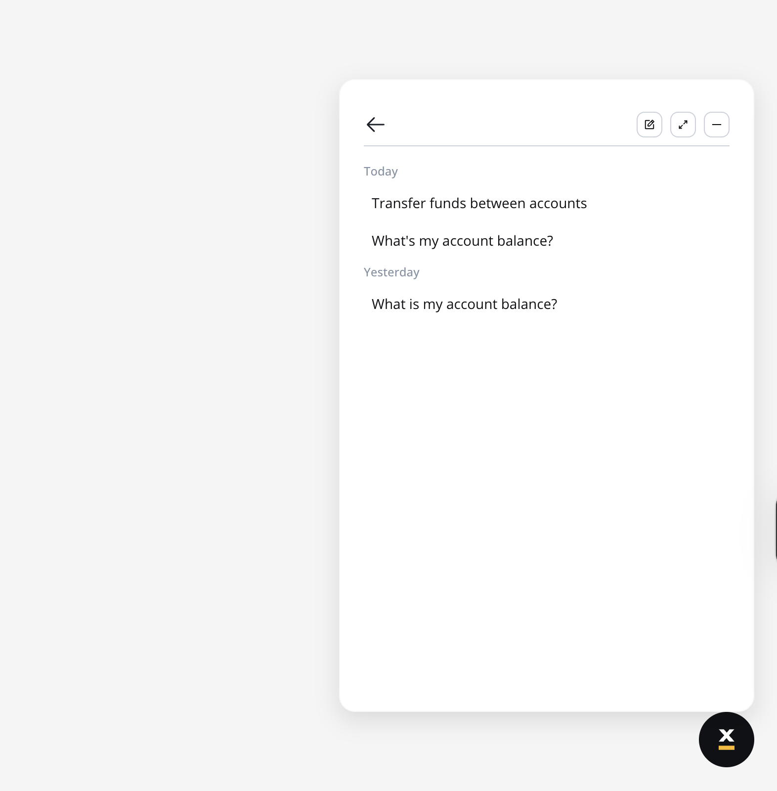
Behavior
- The chat history button is always visible in the chat header
- When opened, the list shows each conversation with its title and timestamp (displayed in a tooltip)
- Available actions: New chat, Expand/Minimize, Dock (hide chat)
- Opening a conversation from the list resumes the session:
- Messages are prefilled with the last exchanged messages
- Scrolling up loads older replies
- New messages continue on the same session ID
- Conversations are per-user — attempting to access another user’s history shows an access denied error and redirects to a new chat session
Theming
Chat History adds three new themed elements configurable per display mode (Inline, Floating, FullScreen) and per platform (Web, Android, iOS) through Design Assets → Themes → Components → Chat:| Theme element | Description |
|---|---|
| Chat History | Container for the conversation list (padding, empty state font/color, gap) |
| Chat History Section | Time-group headers like “Today” or “Previous 7 Days” (title font/color, gap) |
| Chat History Item | Individual conversation entry with hover state (padding, font, border radius, background color) |
sys_ChatHistory and sys_ChatBack.
Localization
Chat History uses system substitution tags for all labels. Override these in CMS → Substitution Tags to customize or localize:| Substitution tag | Default (EN) |
|---|---|
sys_chat_tooltip_chat_history | Chat History |
sys_chat_tooltip_new_chat | New chat |
sys_chat_tooltip_expand | Expand |
sys_chat_tooltip_minimize | Exit full screen |
sys_chat_tooltip_dock | Hide chat |
sys_chat_tooltip_back | Back |
sys_chat_time_group_today | Today |
sys_chat_time_group_yesterday | Yesterday |
sys_chat_time_group_previous_7_days | Previous 7 Days |
sys_chat_time_group_previous_30_days | Previous 30 Days |
sys_chat_time_group_older | Older |
sys_chat_conversations_empty_state | No Conversations yet |
sys_chat_forbidden | Access denied. This chat history belongs to another user. |
Markdown rendering in messages
Available starting with FlowX.AI 5.6.0Chat messages now render Markdown formatting in AI-generated responses.
| Syntax | Renders as |
|---|---|
**bold** | Bold text |
*italic* | Italic text |
# Heading through ###### Heading | Heading levels 1–6 |
`inline code` | Inline code |
``` code block ``` | Fenced code block |
- item or 1. item | Unordered and ordered lists |
[text](url) | Hyperlink (opens in a new tab) |
| Single newline | Line break (<br/>) |
Suggested Prompts
Available starting with FlowX.AI 5.6.0The Suggested Prompts subcomponent is a child of
CHAT_MESSAGES, alongside Agent Message, User Message, and Error Message.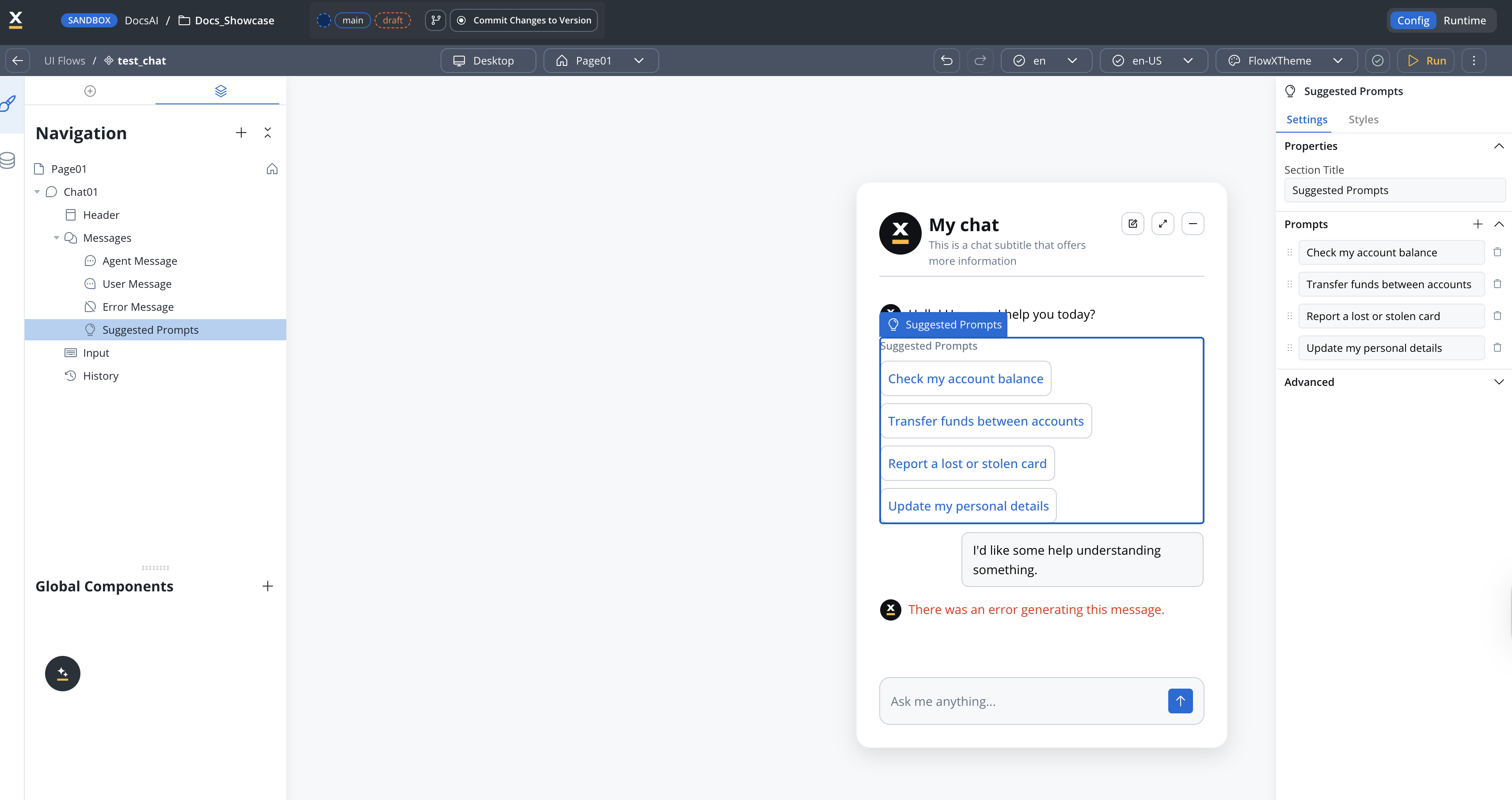
Props
| Property | Type | Default | Description |
|---|---|---|---|
title | string | "Suggested Prompts" | Section heading displayed above the prompt list |
prompts | string[] | — | Array of prompt strings to display as suggestions |
Behavior
- The subcomponent only renders when at least one prompt is provided in the
promptsarray. If the array is empty or not set, the section is hidden entirely. - Clicking a suggestion sends that prompt text as the user’s input, triggering the chat workflow as if the user typed and submitted the message.
- Long prompt strings that exceed the display area are truncated and shown in full via a tooltip on hover.
Theming
Full theming support is available in both Angular and React SDKs. Styles can be configured per display mode (Inline, Floating, FullScreen) and per platform (Web, Android, iOS) through Theme Admin (Design Assets → Themes → Components → Chat → Suggested Prompts).AI-generated prompt suggestions
Available starting with FlowX.AI 5.7.0
| Static suggested prompts | AI-generated suggestions | |
|---|---|---|
| Source | Configured on the chat component | Generated by Custom Agent node per reply |
| When shown | Empty state or as configured | After each agent reply that includes suggestions |
| Content | Fixed text | Dynamic, context-aware |
| Configuration | Chat component settings | Custom Agent node satellite panel |
label is displayed as the user’s message while the full content is sent as input to the next workflow run.
For configuration details, see the Custom Agent node documentation.
Voice input
Available starting with FlowX.AI 5.7.0
Enabling voice input
Voice input is configured on the Chat Input sub-component in UI Designer:| Property | Description | Default |
|---|---|---|
| Enable Voice Input | Toggle the microphone button in the chat input | Off |
Runtime behavior
- Recording limit: 2 minutes per message. Longer recordings stop automatically.
- Blocked during replies: The microphone is disabled while the agent is streaming a response (SSE in progress) to prevent interleaved turns.
- Single player: Only one audio message can play at a time — starting a new playback pauses any other voice message.
- History: Voice messages are persisted with the rest of the conversation and replayed with a progress bar when the user scrolls back.
Stop agent response
Available starting with FlowX.AI 5.7.0While an agent response is being generated, the Send button in the chat input is replaced by a Stop button. Pressing Stop cancels the in-progress response.
- The running conversational workflow is cancelled. If cancellation happens before any AI node executes, the user prompt is persisted as cancelled and no AI call is made. If it happens while an AI node is executing, the in-flight AI call is stopped and any partial response is discarded.
- The chat receives a
chatCancelledSSE event on theCHAT_WORKFLOW_RESPONSEchannel, signalling the UI to exit the streaming state. - The user message is stored with a
cancelled: trueflag on the chat message record.
Theming
The Stop button uses a system icon registered asstopResponseIcon under each chat input area. Defaults preloaded by cms-core:
| Theme content | Property | Default value |
|---|---|---|
chatInputArea, chatInputAreaFloating, chatInputAreaFullScreen (Web) | stopResponseIcon | sys_ChatStopResponse |
chatInputArea (iOS) | stopResponseIcon | sys_ChatStopResponse |
chatInputArea (Android) | stopResponseIcon | sys_ChatStopResponse |
stopResponseIcon in the active theme to swap the icon, the same way you would override sendMessageIcon or voiceInputIcon.
Localization
The chat input action labels are configurable via system substitution tags. Thea11y variants are used as accessibility labels (screen reader text); the non-a11y variants are used as visible labels and tooltips.
| Substitution tag | Purpose | Default English value |
|---|---|---|
sys_chat_cancel_request | Stop button label | Stop generating response |
sys_a11y_chat_cancel_request | Stop button accessibility label | Stop generating response |
sys_chat_submit_message | Send button label | Send message |
sys_a11y_chat_submit_message | Send button accessibility label | Send message |
Chat configuration
ThechatConfig object controls the behavior and appearance of the chat:
| Property | Type | Description |
|---|---|---|
welcomeMessage | string | Initial message shown when the chat opens |
thinkingMessage | string | Message displayed during AI reasoning |
title | string | Header title text |
subtitle | string | Header subtitle text |
showChatIcon | boolean | Show/hide the chat icon |
showSeparator | boolean | Show/hide the separator between messages |
newChatLabel | string | Label for the new chat button |
errorMessage | string | Message shown on errors |
canRegenerate | boolean | Enable message regeneration on failure |
regenerateLabel | string | Label for the regenerate button |
inputPlaceholder | string | Placeholder text for the input field |
maxInputRows | number | Maximum number of rows for multiline input |
historyTitle | string | Title text displayed on the chat history panel |
Runtime behavior
Starting a chat
The initial system message can be configured in the workflow to provide a customized greeting or conversation starter.
Message exchange
- Sending messages
- Receiving messages
- User types message in input field
- Message is sent to the workflow via Chat Input node
- Workflow processes the message through AI nodes
- Response is returned to the chat interface
Session management
Session persistence
sessionIdstored in browser session/local storage- Enables conversation continuity across page refreshes
- Session data includes message history
Message history retrieval
- On page refresh, system loads existing
sessionId - Retrieves and displays previous messages
- Restores conversation state automatically
Data storage
Chat sessions are persisted in the FlowX Database:Each chat session is stored as a document containing the complete chat history. The chat component works with the FlowX Database to save chat sessions, where each session document contains the full conversation record.
| Data Element | Storage Location | Description |
|---|---|---|
| Session ID | Browser storage + Database | Unique identifier linking client to server-side session |
| Message history | FlowX Database | Complete record of all messages in the conversation |
| Session metadata | FlowX Database | Timestamps, workflow reference, user information |
Conversation history API
FlowX provides REST API endpoints for retrieving conversation history programmatically. These are useful for building custom dashboards, analytics, or integrating conversation data into external systems.List conversations
Retrieve all conversations for the current authenticated user within a workspace and app.| Parameter | Type | Description |
|---|---|---|
workspaceId | UUID | The workspace identifier |
appId | UUID | The app identifier |
| Parameter | Type | Description |
|---|---|---|
startDate | ISO 8601 timestamp | Filter conversations created after this date |
endDate | ISO 8601 timestamp | Filter conversations created before this date |
businessCaseId | UUID | Filter by business case identifier |
page | integer | Page number for pagination |
size | integer | Number of conversations per page |
Fetch a single conversation
Retrieve a single conversation with its full message history.| Parameter | Type | Description |
|---|---|---|
workspaceId | UUID | The workspace identifier |
appId | UUID | The app identifier |
conversationId | UUID | The conversation (chat session) identifier |
| Parameter | Type | Description |
|---|---|---|
page | integer | Page number for message pagination |
size | integer | Number of messages per page |
| Status | Description |
|---|---|
404 | Conversation not found |
403 | User does not have access to this conversation |
These endpoints return conversations owned by the authenticated user only. The workspace must belong to the user’s organization.
Custom chat persistence workflow
For advanced use cases where you need full control over chat session storage, you can build a custom workflow that manages chat persistence using FlowX Database. This approach allows you to:- Customize the chat data model
- Add additional metadata to chat sessions
- Integrate with external systems
- Implement custom session management logic
Workflow overview
The chat persistence workflow handles two main scenarios:- Loading chat history - When a user returns to an existing chat session
- Processing new messages - When a user sends a new message
Setting up the FlowX database data source
Create the data source
Navigate to Integrations → Data Sources → Add New Data Source and select FlowX Database.
Configure the collection
Name the collection (e.g.,
chat) and define the schema based on your data model.Building the workflow
Create the workflow
Create a new workflow in Integration Designer with the following input parameters:The
action parameter determines whether to load history (LOAD_HISTORY) or process a new message.Add Get chat session node
Add a Database Operation node to retrieve the existing session:
| Property | Value |
|---|---|
| Operation | db.chat.findOne |
| Description | Chat session history |
| Parameter: chatSessionId | ${chatSessionId} |
| Response Key | chatSession |
Add action type condition
Add a Condition node to check the action type:
- If true: Route to the “Return chat history” end node
- Else: Continue to message processing
Add Return chat history end node
For the
LOAD_HISTORY branch, add an End Flow node that returns the chat history:Add session exists condition
For new messages, add another Condition node to check if the session exists:
Add Create chat session node
If the session doesn’t exist, add a Database Operation node to create it:
| Property | Value |
|---|---|
| Operation | db.chat.insertOne |
| Description | Create chat session |
| Parameter: chatSessionId | ${chatSessionId} |
| Parameter: history | [{ "actor": "human", "message": "${humanMessage}" }] |
| Response Key | responseKey |
Add Update chat session node
Add a Database Operation node to save the updated history:
| Property | Value |
|---|---|
| Operation | db.chat.updateOne |
| Description | Update chat session |
| Parameter: chatSessionId | ${chatSessionId} |
| Parameter: history | ${updatedHistory} |
| Response Key | responseKey |
Chat session data model example
UI Flow integration
The Chat component integrates with UI Flows: Chat Component Wrapper- Chat component is embedded within UI Flow structure
- Follows UI template hierarchy
- Shares session context with other components
Event-based communication
Event-based communication
- Components emit and listen for custom events
- Enables loosely coupled interactions
- Example: Chat triggers process start event
On-demand communication
On-demand communication
- Direct component-to-component calls
- For tightly integrated features
- Example: Chat updates task management state
Audit and debugging
UI Flows audit
Chat sessions tracking
All chat sessions are logged in UI Flow audit:
- Track when chats are started
- Monitor active and completed sessions
- View session duration and message count
Console logging
Access detailed execution information:
- View workflow execution logs
- Debug conversation flow
Debug interface
UI Flow Sessions Console Access comprehensive debugging tools through the UI Flow Sessions panel:- Nodes
- Logs
- Input/Output
Track workflow execution with node-by-node timing:
| Node | Typical Duration |
|---|---|
| Start | 0 ms |
| Get chat session | ~133 ms |
| Check action type | ~52 ms |
| Return chat history | ~60 ms |
SDK integration
The Chat component is available through the FlowX SDKs for both Angular and React applications.Angular SDK
Use the
FlxChatRendererComponent in Angular applicationsReact SDK
Use the
FlxChatRenderer component in React applicationsKey SDK parameters
| Parameter | Description | Required |
|---|---|---|
apiUrl | Your base FlowX API URL | ✅ |
authToken | Authorization token from auth provider | ✅ |
projectId | The FlowX project ID | ✅ |
workspaceId | The workspace ID | ✅ |
source | Source object with workflow type and ID | ✅ |
chatConfig | Chat configuration object (welcome message, title, etc.) | ❌ |
themeId | Theme identifier for styling | ❌ |
language | Language for localization | ❌ |
For the complete list of parameters and usage examples, see the respective SDK documentation pages linked above.
Best practices
Workflow design
Do
- Keep chat workflows focused on a single use case
- Use clear, natural language prompts
- Test with various user inputs
- Handle errors gracefully with helpful messages
Don't
- Don’t create overly complex conversation flows
- Don’t send responses from multiple Custom Agent nodes
User experience
Do
- Provide clear initial greeting messages
- Show typing indicators during processing
- Display helpful error messages
- Allow users to restart conversations
Don't
- Don’t make users wait too long for responses
- Don’t use technical jargon in agent messages
- Don’t lose conversation context
Performance
Do
- Optimize workflow execution time
- Cache frequently accessed data
- Limit message history retrieval
Don't
- Don’t load entire conversation history every time
- Don’t make unnecessary API calls
Troubleshooting
Chat not loading
Chat not loading
Possible causes:
- Workflow is not properly configured
- Workflow is not published
- UI Flow has incorrect agent ID/workflow name
- Verify the workflow is properly configured
- Check that the workflow is published and active
- Ensure UI Flow has correct agent ID/workflow name
Messages not sending
Messages not sending
Possible causes:
- Network connectivity issues
- Workflow is in error state
- Configuration errors
- Check network connectivity
- Verify workflow is not in error state
- Review workflow console logs for errors
Session lost on refresh
Session lost on refresh
Possible causes:
- sessionId is not persisted in storage
- Browser storage permissions issues
- Ensure sessionId is persisted in storage
- Check browser storage permissions
- Verify session management configuration
Knowledge Base integration
The Chat component can use Knowledge Bases to provide contextual, grounded AI responses.How it works
Create Knowledge Base
Set up a Knowledge Base as a Data Source in Integration Designer and upload relevant content
Supported file formats
| Format | Description |
|---|---|
| Standard PDF documents | |
| Markdown | .md files with formatted text |
| Word | Microsoft Word documents (.docx) |
| Excel | Spreadsheet data (.xlsx) |
| PowerPoint | Presentation files (.pptx) |
| Images | Image files with text content |
Configuration options
| Option | Description |
|---|---|
| Minimum relevance | Threshold for chunk relevance scores (0-1) |
| Number of responses | Limit how many relevant chunks are returned to the LLM |
| Content updates | Use workflows to dynamically append, update, or replace content |
Knowledge Bases provide Retrieval-Augmented Generation (RAG) capabilities, ensuring AI responses are grounded in your organization’s actual data.
Knowledge Base Documentation
See the complete Knowledge Base documentation for setup guides and best practices.
Platform availability
- Web
- Mobile
Available in v5.5.0 ✓ · Display modes expanded in v5.6.0 · Voice input added in v5.7.0
- All four display modes: Inline, Overlay, FullScreen, Floating
- Complete feature set including Suggested Prompts, Markdown rendering, and voice input
- Angular and React renderer support
Related resources
Chat UI configuration
Settings, styling, and theme configuration
Chat interface concepts
High-level integration patterns
Custom Agent Node
Custom Agent nodes in Integration Designer
Knowledge Base
Configure knowledge bases for grounded AI responses
Conversational workflows
Build multi-turn chat experiences with session memory and intent routing