For example, consider a scenario where you have options “Sports” with the value “S”, “Music” with the value “M”, and “Reading” with the value “R”. When a user selects both “Sports” and “Music” in the process instance, the values [“S”, “M”] will be stored as an array for the “Multi Select” key.
Configuring the Multi Select element
Multi Select generic settings
These allow you to customize the generic settings for the Multi Select element:Process data key
Process data key establishes the binding between the multi select element and process data, enabling its later use in decisions, business rules or integrations.The Multi Select component stores selected values as an array, similar to how a Checkbox works. This differs from the single Select component, which stores only a single value.
Properties
- Label: The visible label for the multi select element.
- Placeholder: Text that appears within the multi select element when it is empty.
- Empty message: Text displayed for custom type when no results are found.
- Helpertext: Additional information about the multi select element, which can be optionally hidden within an infopoint.
- Show selections: Controls how selected items are displayed. Available display modes:
- Comma separated: Selected values are displayed as a comma-separated text string within the input field (e.g., “Option 1, Option 2, Option 3”)
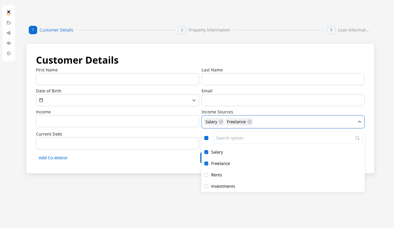
- Chips inside: Selected values appear as chips/badges inside the input field, allowing individual removal with close buttons
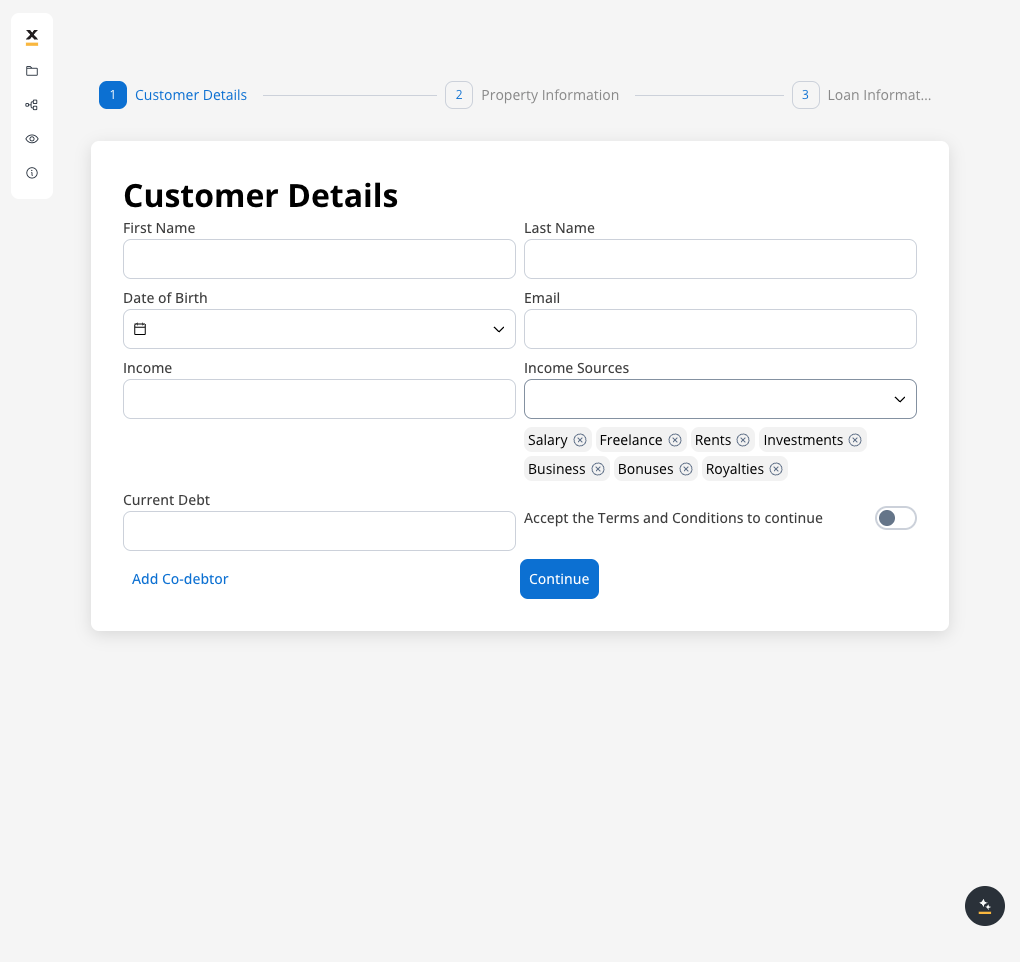
- Chips outside: Selected values are displayed as chips/badges below the input field, keeping the input area clean
- Max. Options Selectable: Sets the maximum number of options that can be selected simultaneously.
Show selections display modes
The “Show selections” property determines how users see their selected options. Each mode offers different benefits depending on your use case:- Comma separated
- Chips inside
- Chips outside
Selected values are displayed as a comma-separated text string within the input field. This mode is space-efficient and works well when you have predictable option lengths.Best for: Simple lists, short option names, read-only display scenarios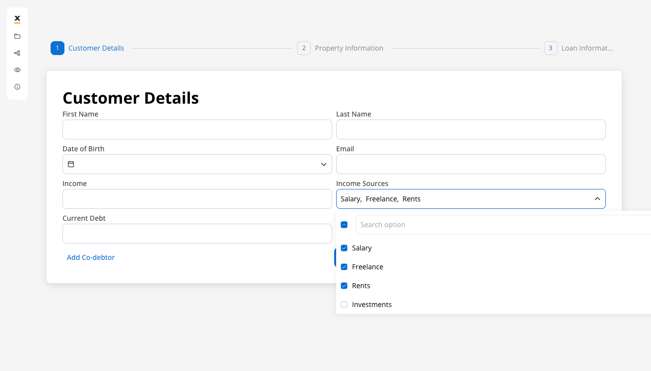
Datasource configuration
- Default value: Autofill the multi select field with these values. You need to specify an array of values from the value/label pairs defined in the Datasource tab.
- Source Type: The source can be Static, Enumeration, or Process Data.
- Add option: Define label and static value pairs here.
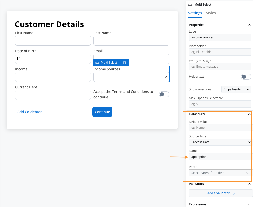
Process Data
When the data source type is set to Process Data, the multi select element will be populated with options from a specific process data key. This approach provides dynamic data loading capabilities, allowing options to be generated, modified, or filtered at runtime through business rules.Configuration steps
- Set Source Type: Select “Process Data” from the Source Type dropdown
- Specify Process Data Key: Enter the key path where your options array is stored (e.g., app.options)
app.options key:
Validators
You can add multiple validators to a multi select field. For more details, refer to Validators. Common validators for Multi Select include:- Required: Ensures at least one option is selected
- Custom: You can add a custom validator to the multi select element.
- Custom Expression: You can add a custom expression to the multi select element.
Hide/disable expressions
The multi select field’s behavior can be defined using JavaScript expressions for hiding or disabling the element. The following properties can be configured for expressions:- Hide condition: A JavaScript expression that hides the Multi Select field when it returns a truthy value.
- Disabled condition: A JavaScript expression that disables the Multi Select field when it returns a truthy value.
It’s important to make sure that disabled fields have the same expression configured under the path expressions → hide.
UI actions
UI actions can be added to the multi select element to define its behavior and interactions.- Event: Possible value -
CHANGE. - Action Type: Select the type of the action to be performed.
For more information, see the UI actions documentation.
Disabled options
You can control the availability of specific options in Multi Select elements by marking them as disabled. This feature is particularly useful for implementing business logic that restricts certain choices based on user permissions, subscription levels, or contextual conditions.Example
The
enabled property is used to control the availability of the option.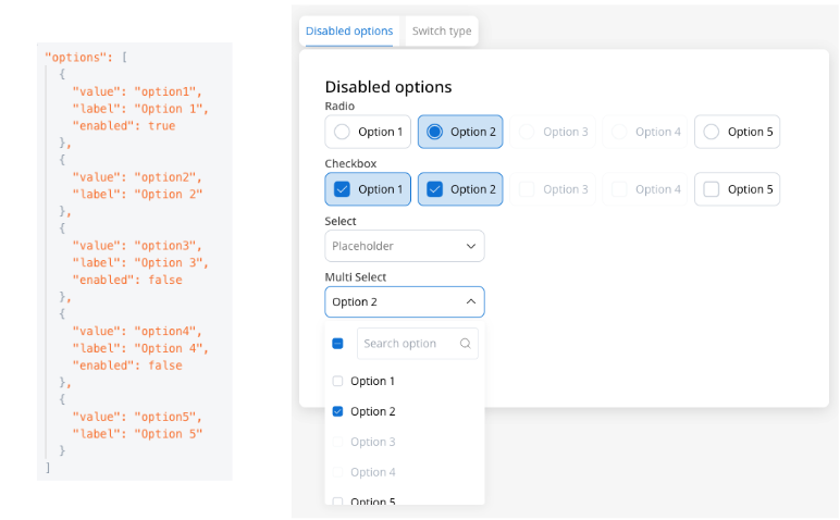
Multi Select settings overrides
There are instances where you may need to tailor settings configured in the Generic settings tab. This proves especially beneficial when you wish to adjust these settings to appear differently across various platforms such as Web, Android, or iOS. Available override settings:Web overrides
- Properties:
- Label: Override the multi select label.
- Helper: Override helper text/info point.
- Placeholder: Override the placeholder.
- Show selections: Override the show selections.
- Expressions:
- Hide: Override the hide expression.
iOS overrides
Same as Web overrides.Android overrides
Same as Web overrides.Overrides can always be imported/pushed from one platform to another: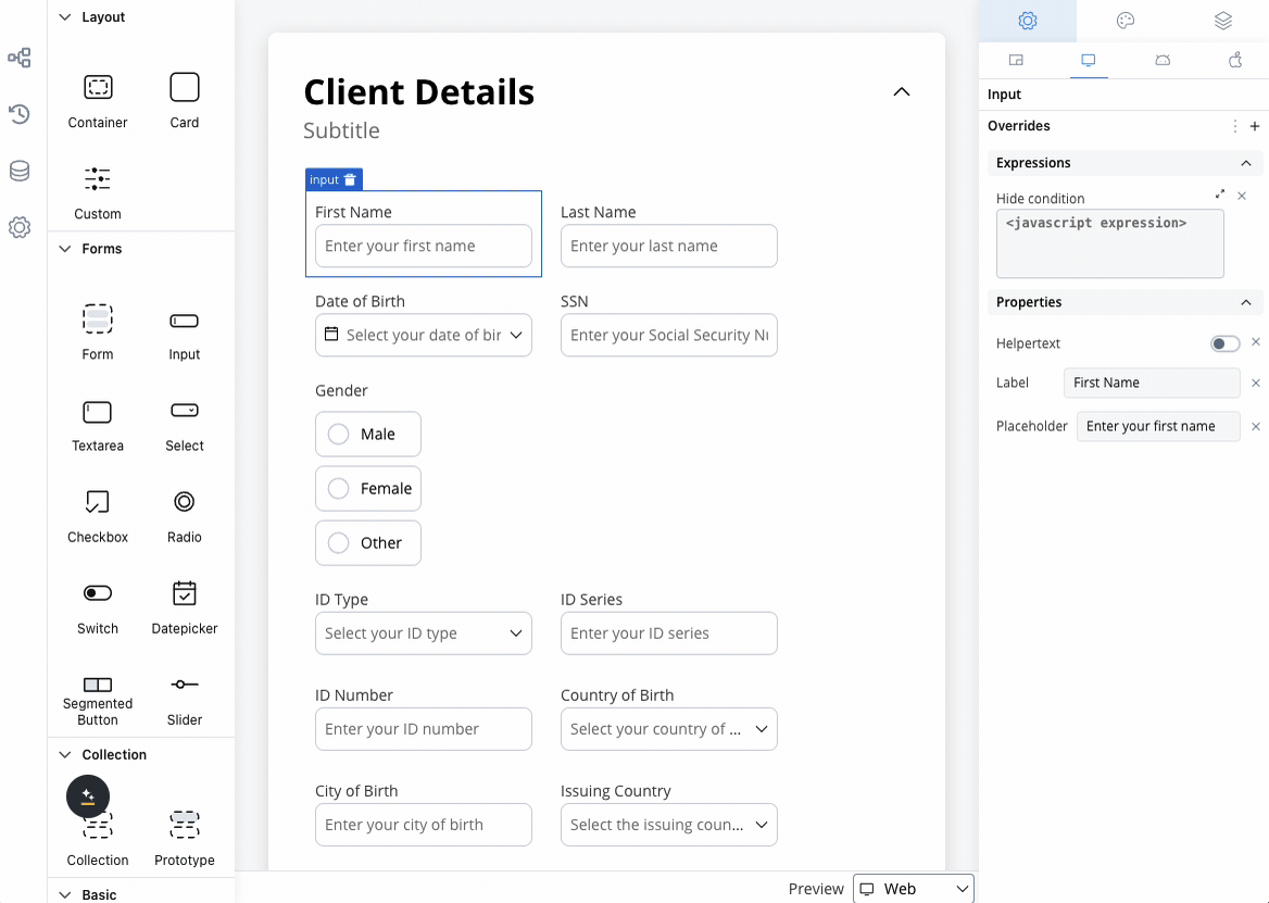
Multi Select styling
- Web
- iOS
- Android
- Max Rows
- Spacing
- Max Rows: Adjust the maximum number of rows of the multi select element.
Multi Select style overrides options
Theme overrides refer to the ability to modify or customize the appearance and behavior of UI components by overriding default theme settings. This can be applied at various levels, such as specific elements or entire sections, and can be platform-specific (Web, iOS, Android). Style options:Common Properties
Common Properties
- Border radius [TEXT]
- Border width [TEXT]
- Text style [FONT]

Label
Label
- Default state
- Text color [COLOR]
- Disabled state
- Text color [COLOR]
- Text style [FONT]

Helper
Helper
- Text color [COLOR]
- Text style [FONT]
- Helper Tooltip
- Text style [FONT]
- Text color [COLOR]
- Background color [COLOR]
- Icon Color [COLOR]

Error
Error
- Text color [COLOR]
- Text style [FONT]

Empty State
Empty State
- Border color [COLOR]
- Background color [COLOR]
- Right icon color [COLOR]
- Left icon color [COLOR]
- Prefix/Suffix color [COLOR]
- Placeholder color [COLOR]

Active State
Active State
- Border color [COLOR]
- Background color [COLOR]
- Text color [COLOR]
- Right icon color [COLOR]
- Left icon color [COLOR]
- Prefix/Suffix color [COLOR]
- Placeholder color [COLOR]

Filled State
Filled State
- Border color [COLOR]
- Background color [COLOR]
- Text color [COLOR]
- Right icon color [COLOR]
- Left icon color [COLOR]
- Prefix/Suffix color [COLOR]
- Placeholder color [COLOR]
- Selected chip background [COLOR]
- Selected chip text color [COLOR]
- Selected chip border color [COLOR]

Disabled State
Disabled State
- Border color [COLOR]
- Background color [COLOR]
- Text color [COLOR]
- Right icon color [COLOR]
- Left icon color [COLOR]
- Prefix/Suffix color [COLOR]
- Placeholder color [COLOR]

Error State
Error State
- Border color [COLOR]
- Background color [COLOR]
- Text color [COLOR]
- Right icon color [COLOR]
- Left icon color [COLOR]
- Prefix/Suffix color [COLOR]
- Placeholder color [COLOR]

Hover State (only for Web configuration)
Hover State (only for Web configuration)
- Border color [COLOR]
- Background color [COLOR]
- Text color [COLOR]
- Right icon color [COLOR]
- Left icon color [COLOR]
- Prefix/Suffix color [COLOR]
- Placeholder color [COLOR]

You can import or push the overrides from one platform to another without having to configure them multiple times.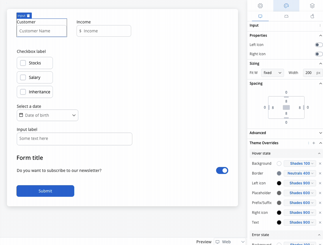
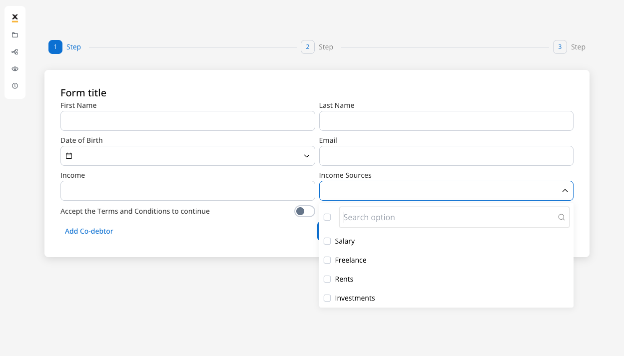
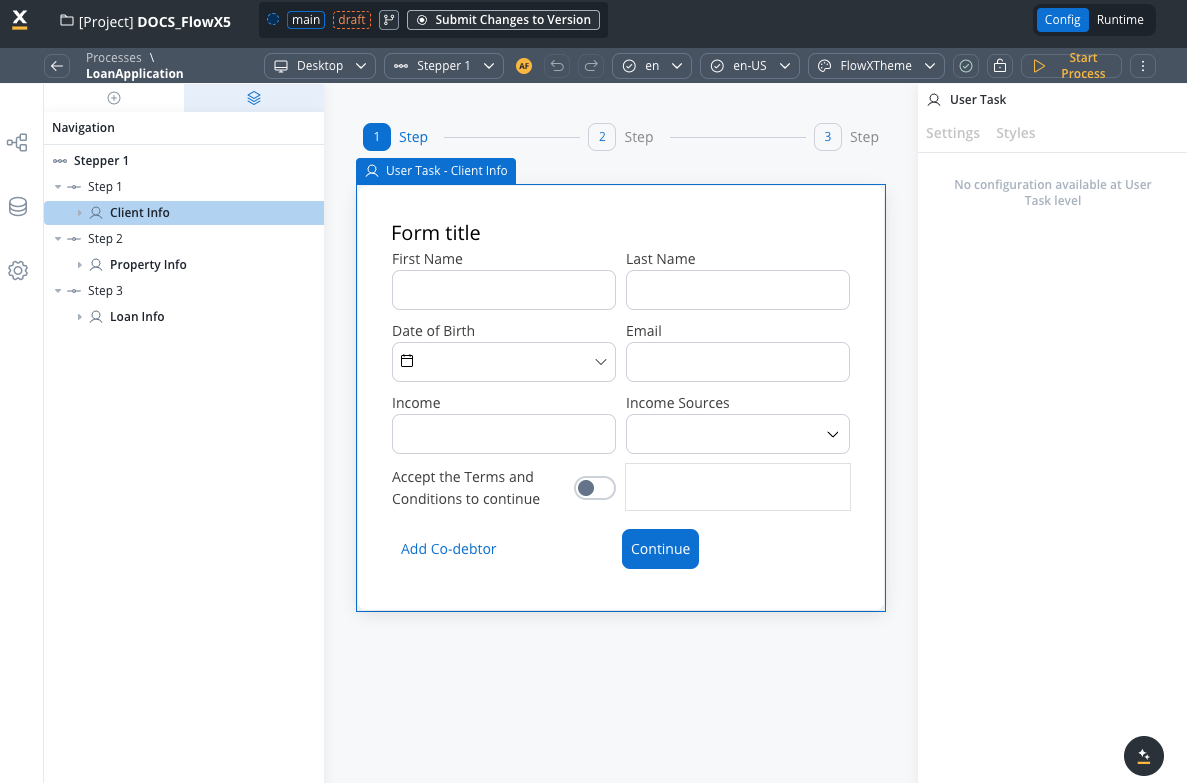
Example - Income sources selection form
Let’s create an example using enumeration data to create an income sources selection form where users can select multiple income sources from a predefined list, as part of a loan application process. To create this kind of process, we need the following elements:- a user task node (here we have the client forms and here we add the MULTI SELECT elements)
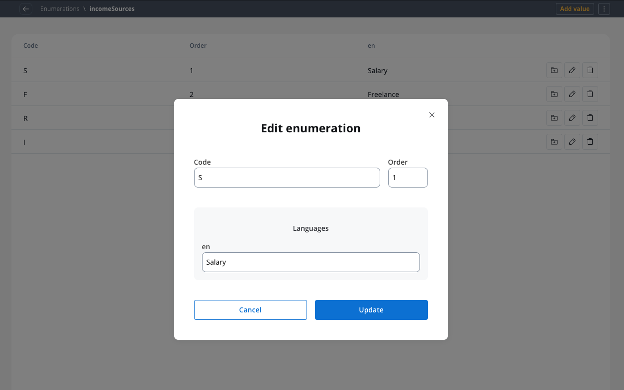
Creating the enumeration
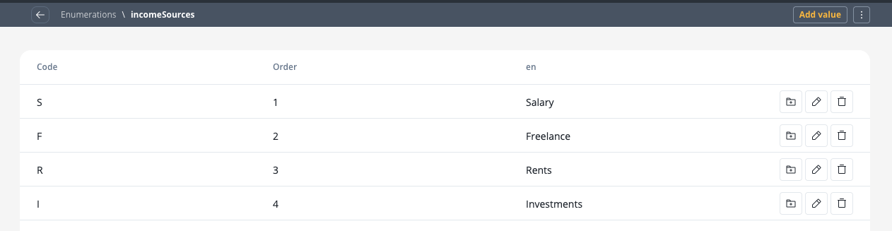
First, we need to create an enumeration for income sources:- Create it on your project or in a library.
- Click on the breadcrumbs (top-right corner) then click New enumeration (the Enumeration Designer will now open).
- Create an enumeration named “ with the following values:
- S - Salary
- F - Freelance
- R - Rents
- I - Investments
Configuring the UI
Follow the next steps to configure the UI needed:- Select the user task node and click the brush icon to open UI Designer.
- Add a Card UI element as a root component (this will group the other elements inside it) with the following properties:
- Generic:
- Title - Loan Application Form
- Inside the card, add a form element.
- Inside the form add the standard form fields (First Name, Last Name, Date of Birth, Email, Income) and then add a multi select element for income sources selection.
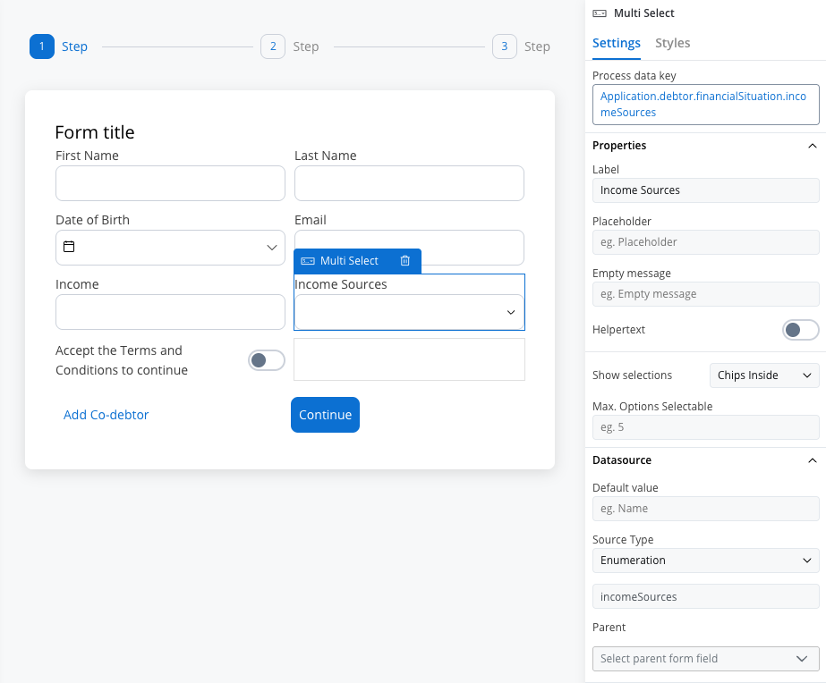
- For the multi select element (Income Sources) set the following properties:
- Process data key -
application.incomeSources
- Process data key -
The attribute 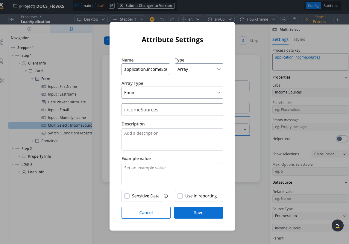
application.incomeSources is the key on which we added income sources selection. It is an array of strings with the source of enumeration.- Label - Income Sources
- Placeholder - Select your income sources…
- Empty message - No income sources found
- Show selections - Comma Separated
- Max. Options Selectable - 4 (reasonable limit for income sources)
- Source type - Enumeration
- Enumeration - Select
incomeSourcesfrom the dropdown
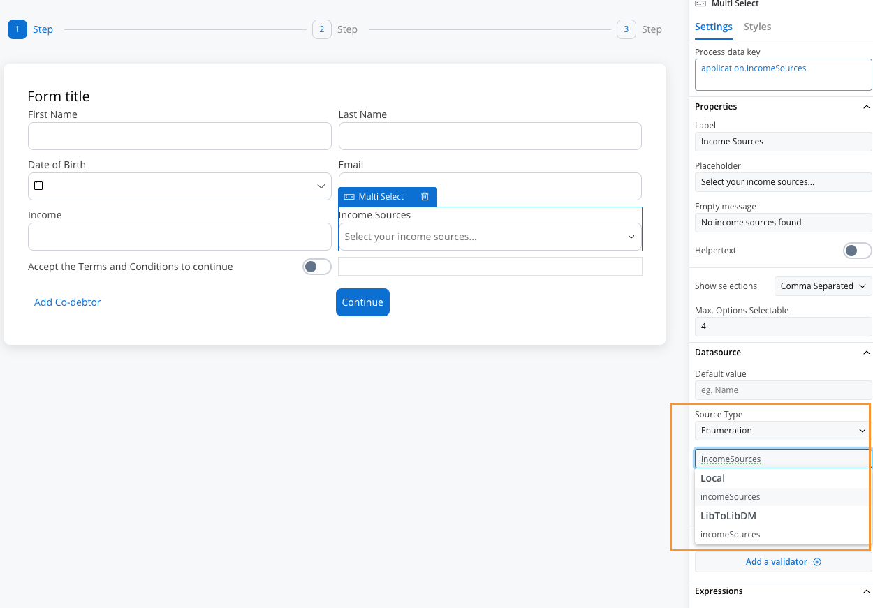
- Test and run the process by clicking Start process.
Data handling and validation
Common validation scenarios
Required income sources validation
Required income sources validation
Ensure at least one income source is selected for loan applications:Error message: “Please select at least one income source to continue with your application.”
Minimum income diversity validation
Minimum income diversity validation
Require at least 2 different income sources for better loan approval chances:Error message: “Please select at least 2 income sources to demonstrate income stability.”
Maximum income sources validation
Maximum income sources validation
Limit to maximum 4 income sources to keep the application manageable:Error message: “Please select no more than 4 primary income sources.”
Primary income validation
Primary income validation
Ensure that salary or business income is selected as a primary source (for certain loan types):Error message: “At least one primary income source (Salary or Business Income) is required for this loan type.”
Best practices
Limit options: Don’t overwhelm users with too many options. Consider grouping or categorizing if you have many choices.
Set maximum selections: Use the “Max. Options Selectable” property to prevent users from selecting too many options.
Provide clear labels: Make option labels descriptive and easy to understand.
Consider mobile experience: Test how selected items display on mobile devices, especially when many options are selected.
Validate selections: Always validate that the user’s selections meet your business requirements using appropriate validators.
Handle empty states: Provide clear messaging when no options are available or when search yields no results.
Differences from Single Select
When migrating from Single Select to Multi Select, remember to update your data model to handle arrays and adjust any business rules or integrations that process the selected values.