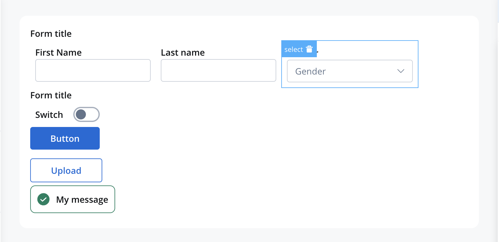
Example: Consider a dropdown with “Sports” (value: “S”) and “Music” (value: “M”). When a user selects “Sports”, the value “S” is stored in the process instance under the Select element’s data key.
Configuration overview
Configure your single select component using these main sections:Basic Settings
Process data binding, labels, and properties
Data Source
Static options, enumerations, or dynamic data
Behavior
Hide/disable conditions and UI actions
Styling
Visual appearance and platform overrides
Basic configuration
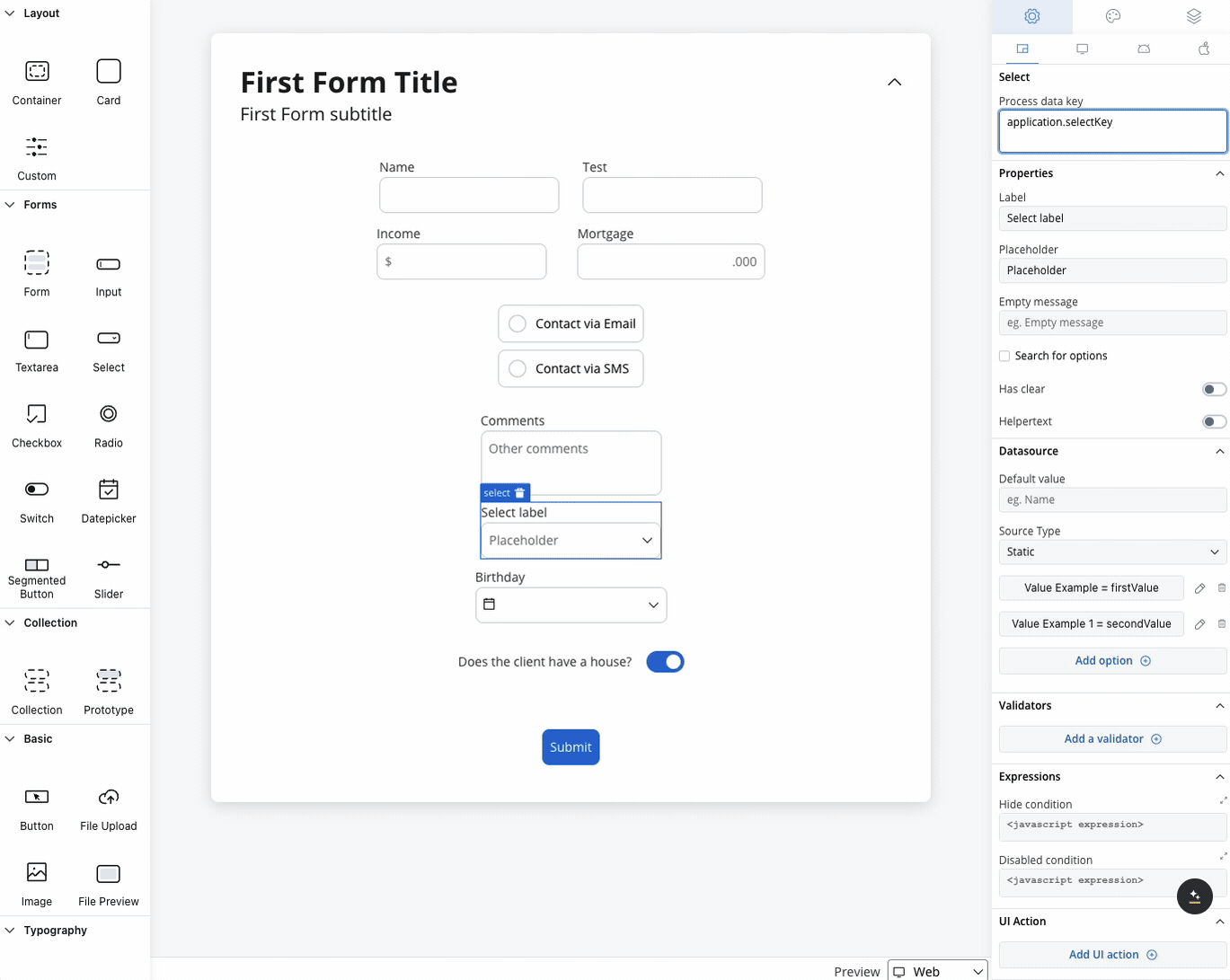
Process data key
The process data key establishes the binding between the select element and process data, enabling its later use in:Core Properties
Label & Display
Label & Display
Label: The visible text displayed above the select element
- Supports Markdown syntax for rich formatting
- Can include links, emphasis, and other formatting
- Responsive across all platforms
- Provides guidance on what to select
- Should be clear and actionable
- Example: “Choose your preferred option…”
- Displayed when search yields no matches
- Helpful for dynamic data sources
- Example: “No matching options found”
Search & Interaction
Search & Interaction
Search for Options: Enable filtering functionality
- Improves usability for long option lists
- Real-time filtering as users type
- Case-insensitive search capabilities
- Particularly useful for large datasets
- Provides users with reset functionality
- Useful for optional fields
- Improves user control and flexibility
- Can be displayed as regular text
- Can be hidden within an expandable info point
- Supports Markdown formatting
Data source configuration
Default value setup
Configure the initial selected option: Default Value: Specify which option should be pre-selected- Must match a value from your data source
- Improves user experience by reducing required interactions
- Consider user context and common selections
Source types
Choose the appropriate data source for your select options:- Static Options
- Enumeration
- Process Data
Purpose: Fixed list of options defined at design timeConfiguration:
- Add Option: Define label/value pairs manually
- Label: User-friendly display text
- Value: Internal identifier stored in process data
- Enabled: Control option availability (see below)
- Fixed categories (Yes/No, Active/Inactive)
- Configuration options
- Simple selection lists
Enhanced option control
When using Process Data, you can control which options are selectable using theenabled property:
How It Works:
enabled: trueor missing: Option is selectable (default)enabled: false: Option appears but is disabled
Disabled options support theming for both disabled unselected and disabled selected states. An option can be both selected and disabled simultaneously.
Validation
Apply validators to ensure data quality and completeness: Available Validators:- Required: Ensures a selection is made
- Custom: Complex business logic validation
- Conditional: Validation based on other field values
Behavior configuration
Hide/disable expressions
Control the select element’s visibility and interaction using JavaScript expressions:UI Actions
Configure interactive behaviors for your select element:| Event | Description | Common Use Cases |
|---|---|---|
| CHANGE | Triggered when selection changes | Update dependent fields, trigger calculations, show/hide related content |
- Process Actions: Advance workflow based on selection
- Data Operations: Update related form fields
- UI Updates: Show/hide dependent elements
- External Calls: Fetch related data from APIs
Platform customization
Settings overrides
Customize your select element differently across platforms:- Web Applications
- Mobile Apps
Override Options:
- Label: Desktop-optimized terminology
- Helper: Extended descriptions with more context
- Placeholder: Detailed guidance text
- Enhanced search with keyboard shortcuts
- Hover states and advanced animations
- Larger option lists with scrolling
Override settings can be imported and pushed between platforms, saving configuration time and ensuring consistency.
Visual styling
Layout options
- Web Styling
- iOS Styling
- Android Styling
Icon Integration
Icon Integration
Left Icon: Visual cue for the select purpose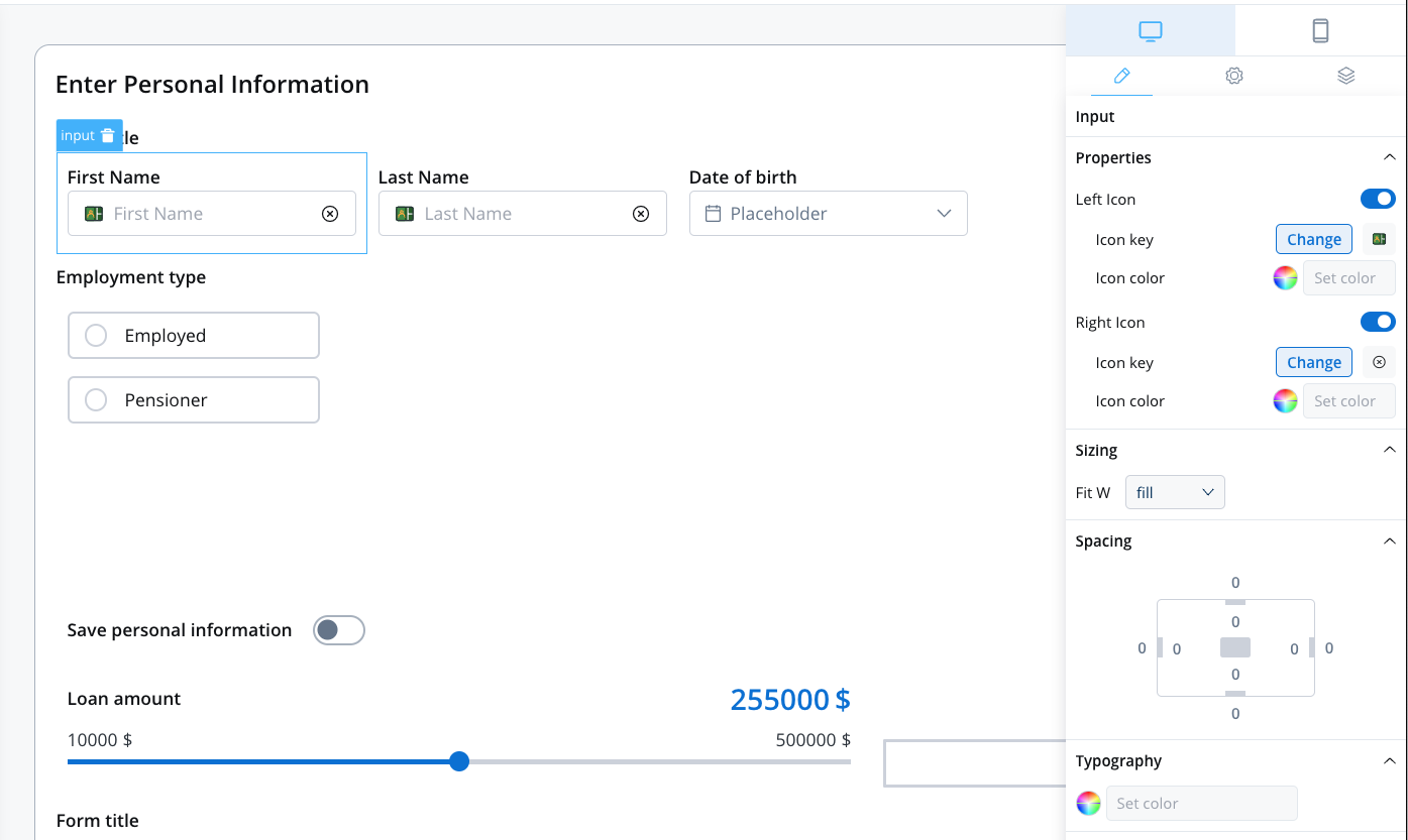
- Category icons (📂, 🏢, 👤)
- Functional indicators (🔍, ⚙️, 📊)
- Status symbols (✓, ⚠️, 🔒)
- Icon Key: Select from Media Library
- Platform-specific optimization
- Consistent with design system
Responsive Sizing
Responsive Sizing
| Option | Behavior | Best For |
|---|---|---|
| Fill | Expands to use available space | Full-width forms |
| Fixed | Maintains specified width | Consistent layouts |
| Auto | Adjusts based on content | Dynamic layouts |
Theme customization
Override default styling for complete visual control: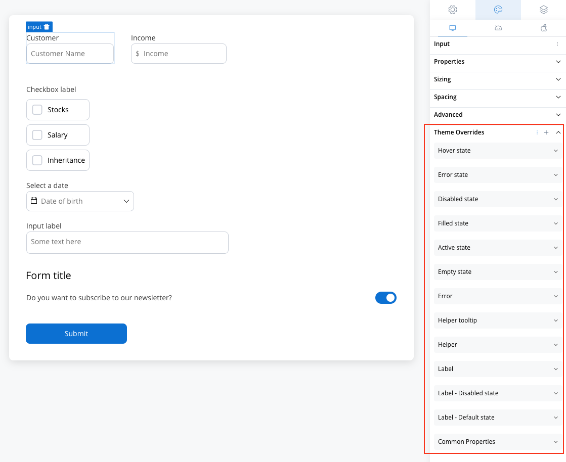
Common Properties
Common Properties
Layout & Structure: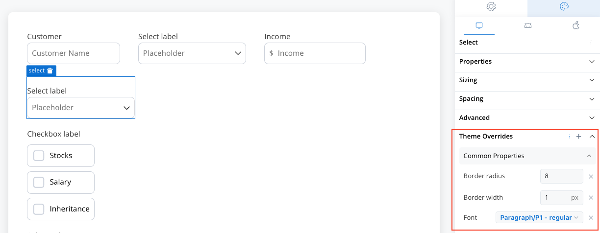
- Border radius for rounded corners
- Border width for outline definition
- Text style for typography consistency
Label Styling
Label Styling
Default State: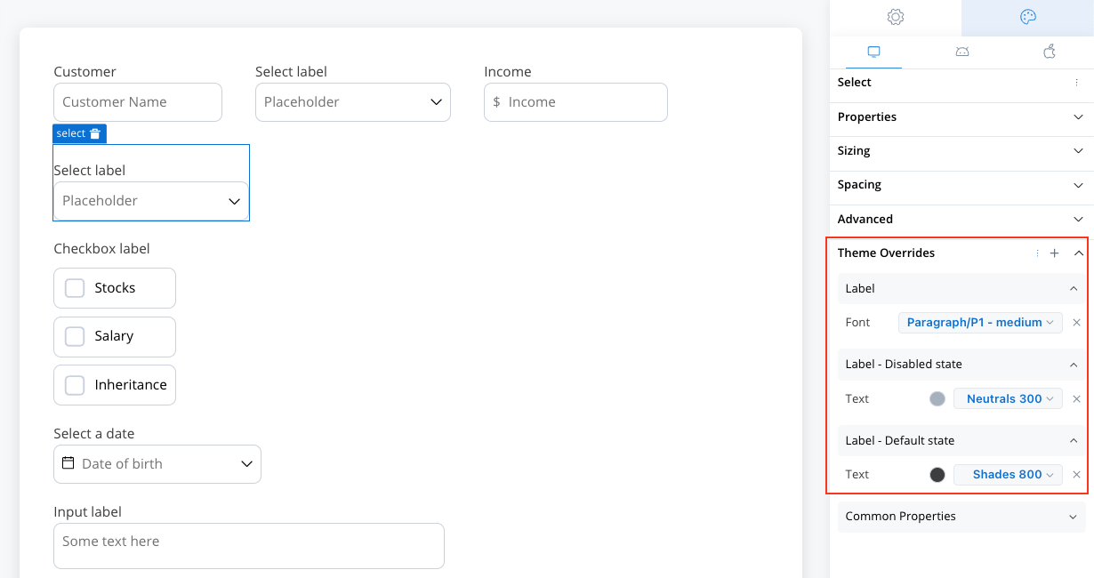
- Text color customization
- Font family and size options
- Dimmed appearance
- Consistent with disabled styling
Helper Text Styling
Helper Text Styling
Standard Helper: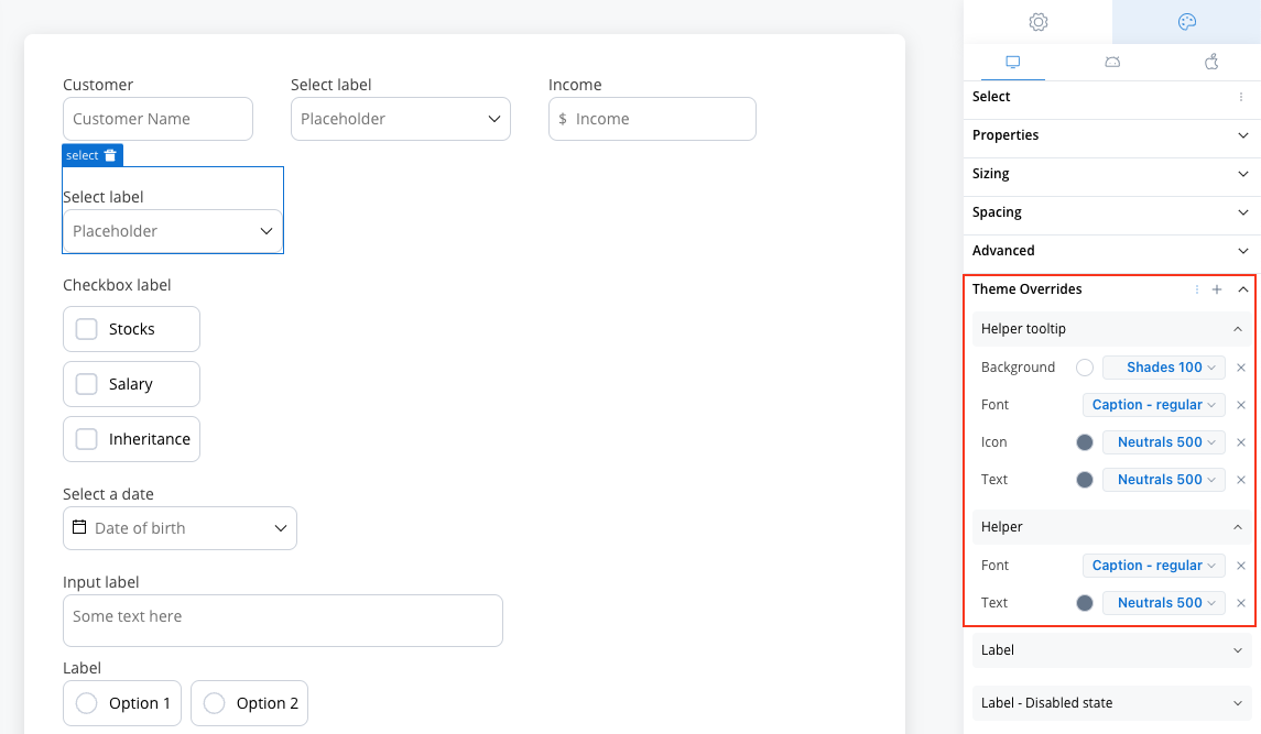
- Text color and font options
- Background color customization
- Icon color options
- Typography controls
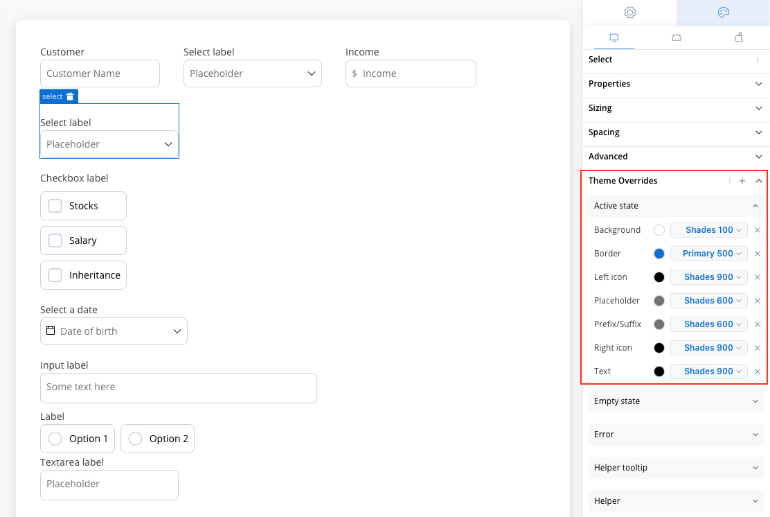
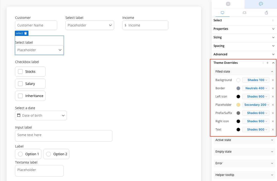
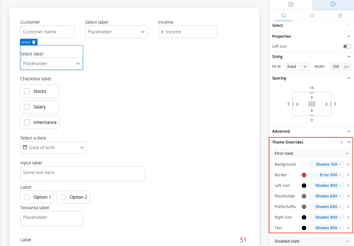
Interactive States
Interactive States
- Empty State
- Active State
- Filled State
- Error & Disabled States
When no option is selected: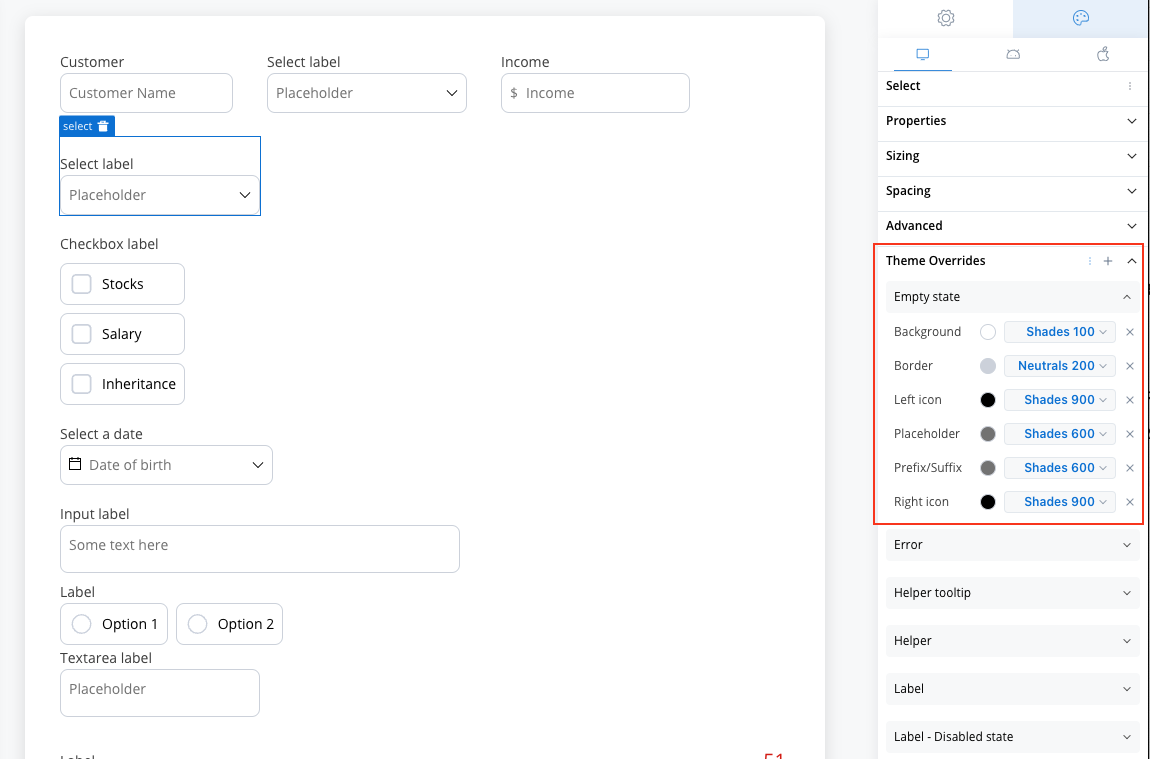
- Border and background colors
- Icon color customization
- Placeholder text styling
Time-Saving Tip: Export your styling configuration from one platform and import it to others to maintain consistency without manual reconfiguration.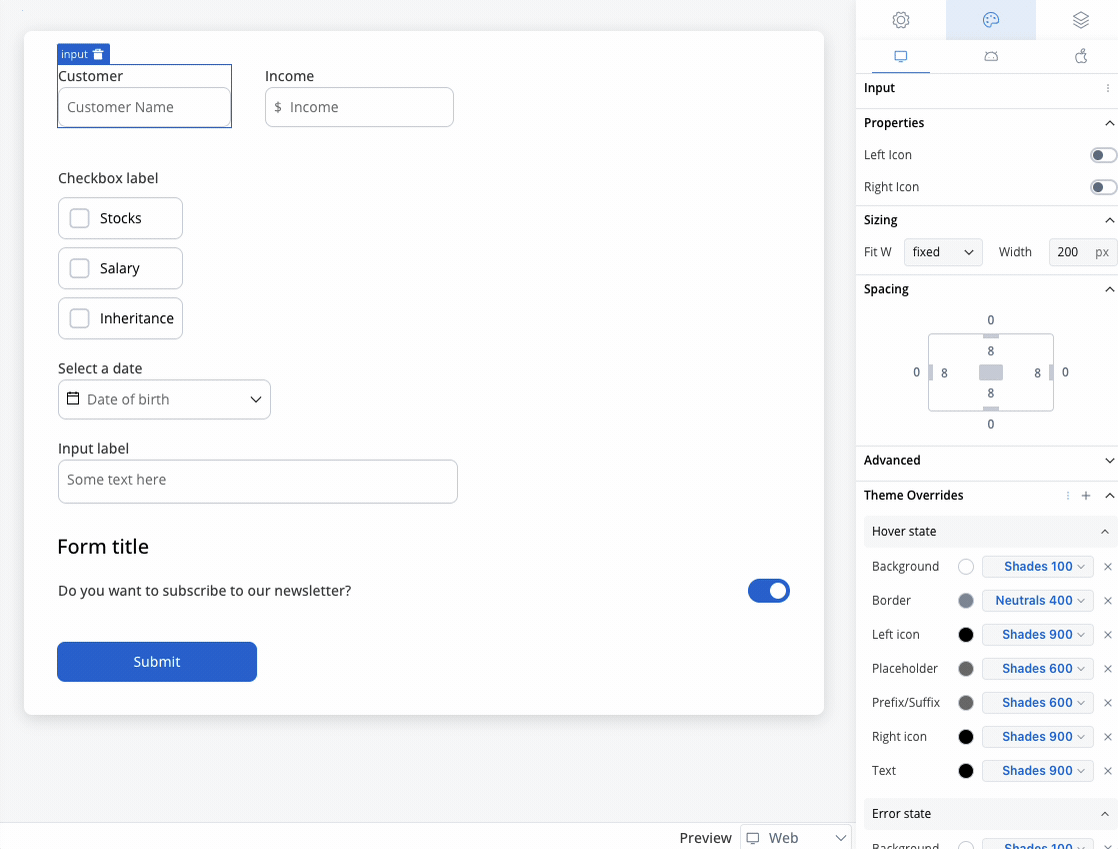
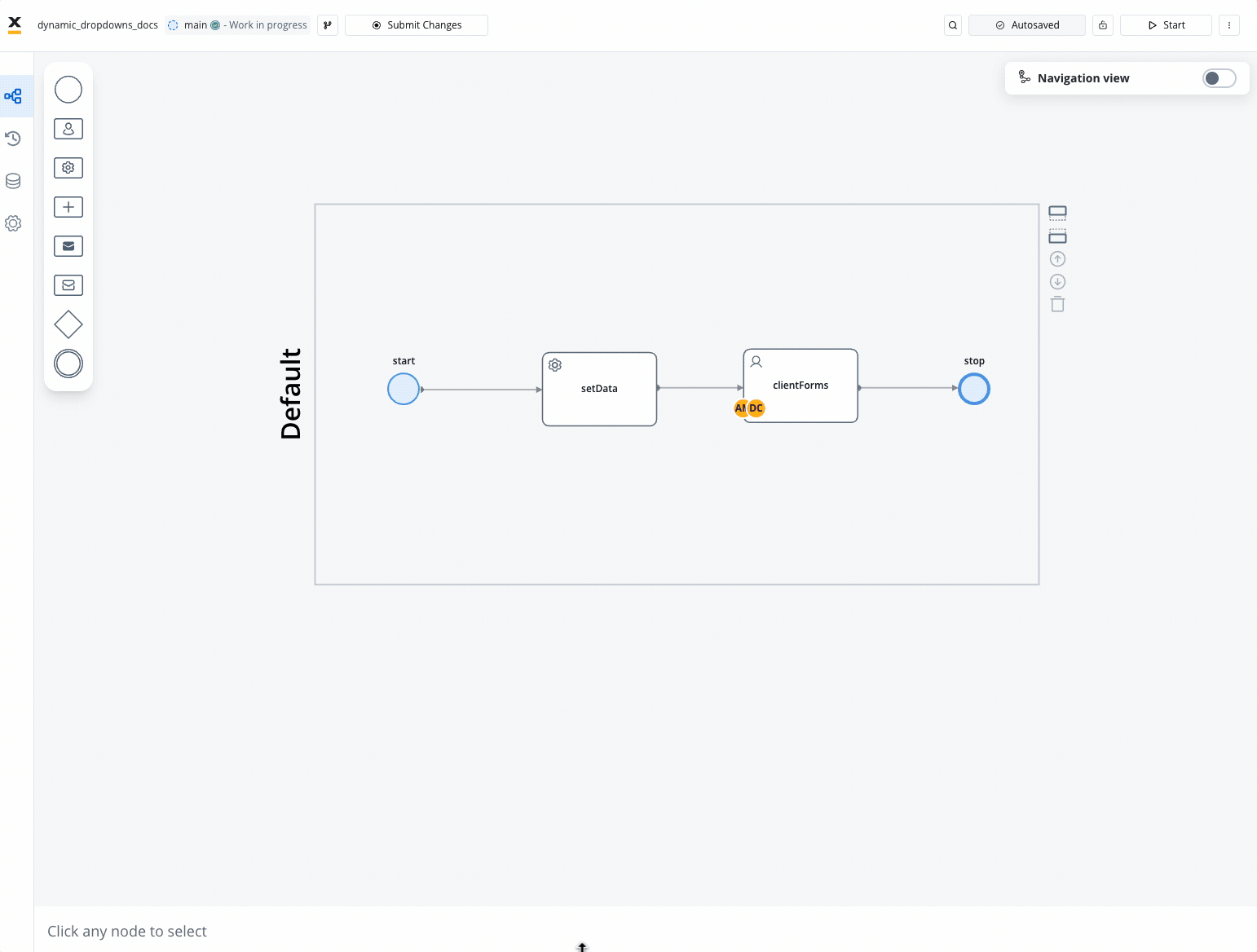
Advanced example: Dynamic dropdowns
Create sophisticated dropdown interactions with dependent selections using process data and business rules.Scenario overview
Build a customer contract selection system where available contracts depend on the selected customer: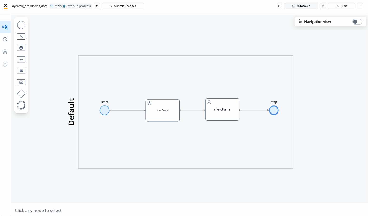
Process structure
Required Elements:- Task Node: Populates dropdown data using business rules
- User Task Node: Contains the select elements and form interface
Implementation steps
Step 1: Process Setup
Step 1: Process Setup
- Open FlowX.AI Designer → Processes → Definitions
- Click New Process to open Process Designer
- Add the required nodes:
- Task node (for data preparation)
- User task node (for user interface)
Step 2: Data Preparation
Step 2: Data Preparation
Task Node Configuration: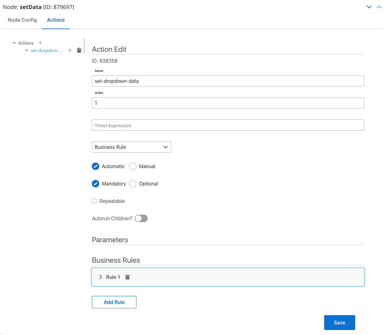
- Action Type: Business Rule
- Execution: Automatic, Mandatory
- Language: MVEL (or your preferred scripting language)
Step 3: User Interface Setup
Step 3: User Interface Setup
User Task Node Configuration: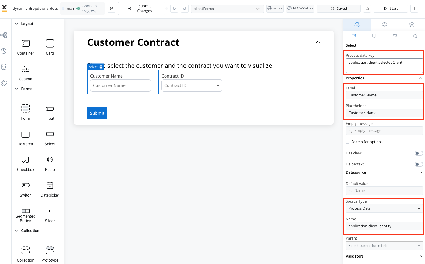
- Action Type: Save Data
- Execution: Manual, Mandatory
- Data to Send:
application
-
Card Element (root component):
- Custom UI Payload:
{"application": ${application}} - Title: “Customer Contract”
- Custom UI Payload:
- Form Element (container for selects)
-
First Select (Customer Name):
- Process Data Key:
application.client.selectedClient - Label: Customer Name
- Source Type: Process Data
- Name:
application.client.identity
- Process Data Key:
-
Second Select (Contract ID):
- Process Data Key:
application.client.selectedContract - Label: Contract ID
- Source Type: Process Data
- Name:
application.contracts - Parent: SELECT (first dropdown)
- Process Data Key:
Step 4: Testing & Validation
Step 4: Testing & Validation
Test Process: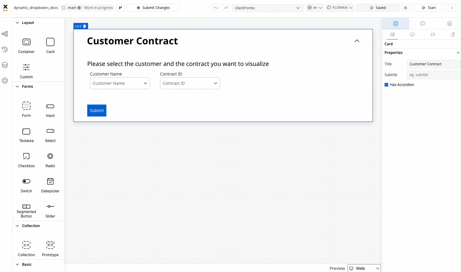
- Click Start Process in the designer
- Select a customer from the first dropdown
- Verify that the second dropdown populates with relevant contracts
- Submit the form to validate data storage
- Customer selection triggers contract list update
- Only contracts associated with selected customer appear
- Form submission stores both selected values
Enhanced dynamic example with disabled options
Extend the previous example to include conditional option disabling:Best practices
Accessibility
- Provide clear, descriptive labels and helper text
- Ensure sufficient color contrast for all states
- Set an accessibility label when the select has no visible label
User Experience
- Keep option lists manageable (under 10 items when possible)
- Use search functionality for longer lists
- Provide clear visual feedback for disabled options
- Consider default selections for common use cases
- Group related options logically
- Show loading states for dynamic data
Data Management
- Use meaningful keys for integration purposes
- Plan for data validation and error handling
- Consider performance impact of large option sets
- Document business rules for option availability
- Test with realistic data volumes
- Implement proper error handling for external data sources
Performance
- Cache frequently used option lists
- Implement lazy loading for large datasets
- Optimize search algorithms for responsiveness
- Consider pagination for very large lists
- Monitor performance with real-world data
- Test on various devices and network conditions
Common use cases
| Scenario | Configuration | Features Used |
|---|---|---|
| Country Selection | Enumeration source | Search, large option list |
| Department Selection | Static options with roles | Conditional enabling based on user role |
| Product Categories | Process data with availability | Dynamic options, disabled out-of-stock items |
| Status Selection | Static with validation | Required validation, status-dependent actions |
| Dynamic Filtering | Dependent dropdowns | Parent-child relationships, real-time updates |