Custom components are developed in the web application and referenced here by component identifier. This will dictate where the component is displayed in the component hierarchy and what actions are available for the component.
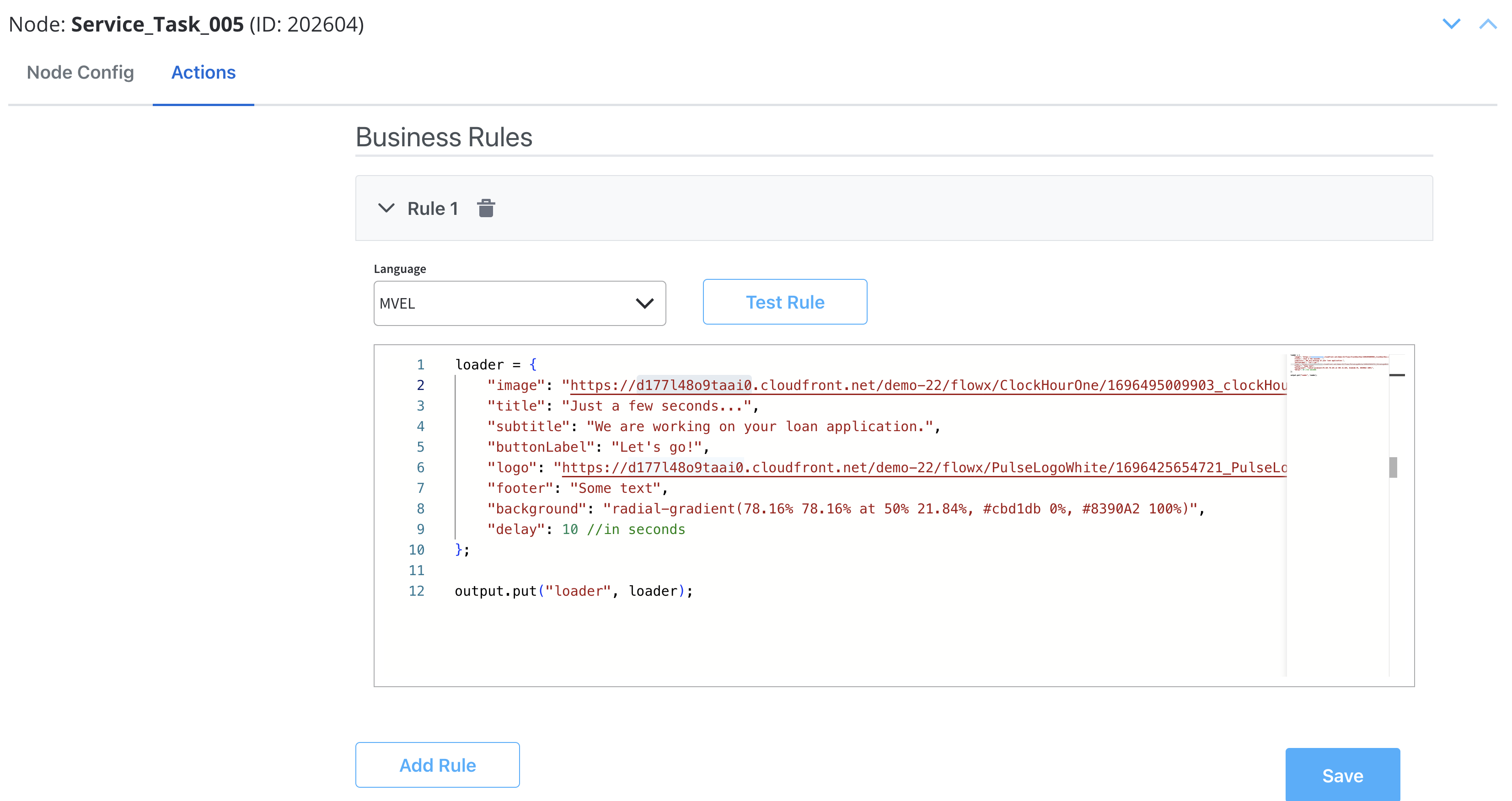
Starting with 3.4.7 platform version, for User Tasks containing UI Elements, when the page is rendered, the Backend (BE) should, by default, send to the Frontend (FE) all available data as process variables with matching keys.If the User Task also includes a custom component, the BE should send, in addition to default keys, objects mentioned in the “Message” option of the root element.
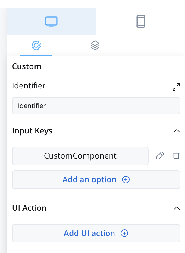
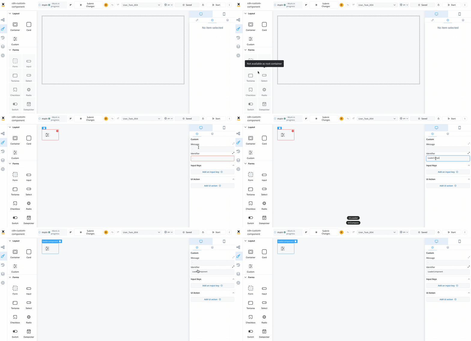
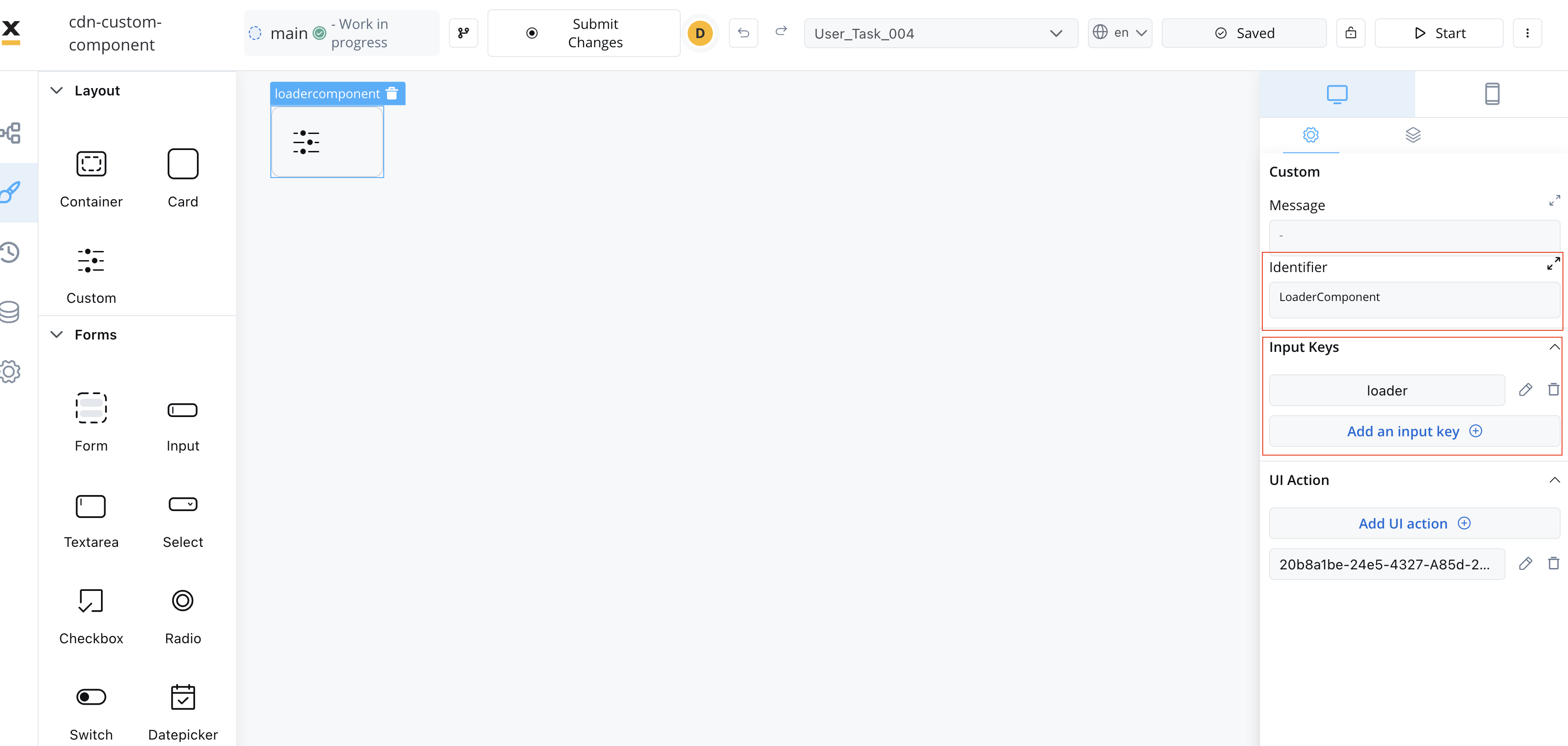
To add a custom component in the template config tree, we need to know its unique identifier and the data it should receive from the process model.The properties that can be configured are as follows:
Identifier - This enables the custom component to be displayed within the component hierarchy and determines the actions available for the component.
Input keys - These are used to specify the pathway to the process data that components will utilize to receive their information.
UI Actions - actions defined here will be made available to the custom component
Angular Knowledge: You should have a good understanding of Angular, as custom components are created and imported using Angular.
Angular CLI: Ensure that you have Angular CLI installed.
Development Environment: Set up a development environment for Angular development, including Node.js and npm (Node Package Manager).
Component Identifier: You need a unique identifier for your custom component. This identifier is used for referencing the component within the application.
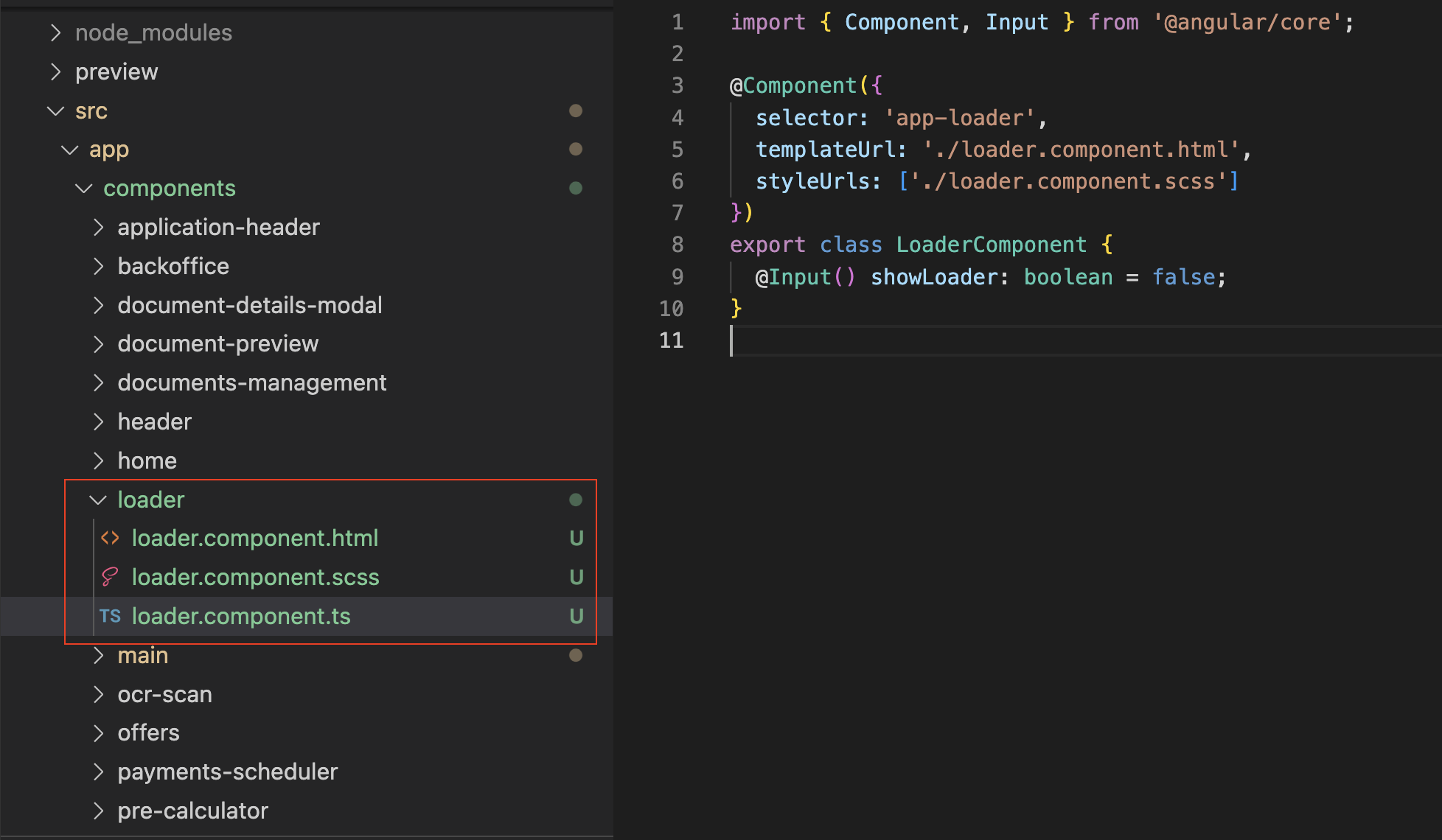
After creating the Custom Component, you need to import it into your application.In your app.module.ts file (located at src → app → app.module.ts), add the following import statement:
`import { YourComponent } from '@app/components/yourComponent.component'`
To make your Custom Component available for use in processes created in FlowX.AI Designer, you need to declare it in FlxProcessModule.In your process.module.ts file (located at src > app > modules > process > process.module.ts), add the following import statement:
import { YourComponent } from '@app/components/yourComponent.component';
Then, declare your Custom Component in the FlxProcessModule.forRoot function:
The Custom Component accepts input data from processes and can also include actions extracted from a process. These inputs and actions allow you to configure and interact with the component dynamically.
There are multiple ways to extract data from processes to use within your Custom Component. You can utilize the data provided by the process or map actions from the BPMN process to Angular actions within your component.
Make sure that the Angular actions that you declare match the names of the process actions.
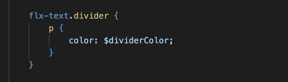
To apply CSS classes to UI elements within your Custom Component, you first need to identify the UI element identifiers within your component’s HTML structure. Once identified, you can apply defined CSS classes to style these elements as desired.Example:
Naming Conventions: Be consistent with naming conventions for components, identifiers, and actions. Ensure that Angular actions match the names of process actions as mentioned in the documentation.
Component Hierarchy: Understand how the component fits into the overall component hierarchy of your application. This will help determine where the component is displayed and what actions are available for it.
Documentation and Testing: Document your custom component thoroughly for future reference. Additionally, testing is crucial to ensure that the component behaves as expected in various scenarios.
Security: If your custom component interacts with sensitive data or performs critical actions, consider security measures to protect the application from potential vulnerabilities.
Integration with FlowX.AI Designer: Ensure that your custom component integrates with FlowX.AI Designer, as it is part of the application’s process modeling capabilities.


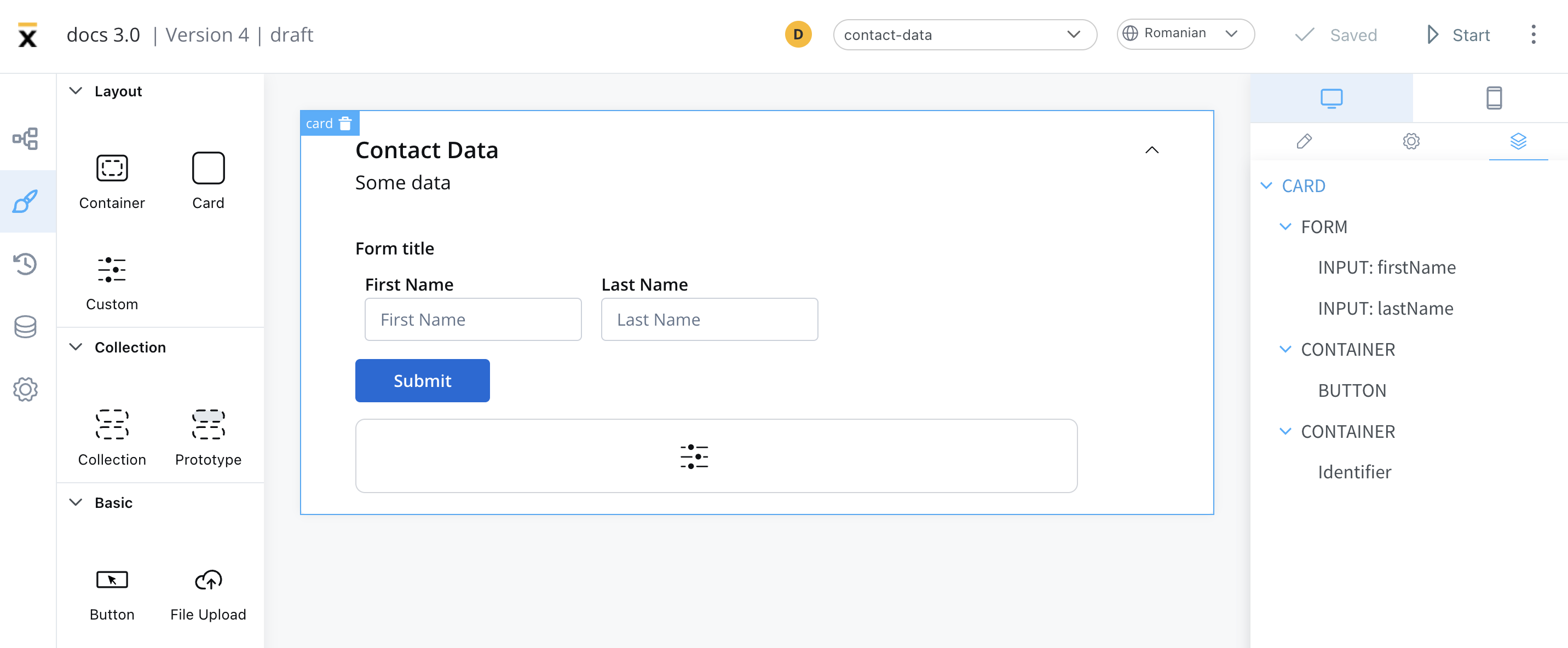 The properties that can be configured are as follows: