Media assets are versioned as part of your project version, not individually. Changes are tracked in the project’s Resources Changed view. To view the change history for a specific asset, right-click it and select View History.
Uploading a new asset
To upload an asset to the Media Library, follow the next steps:- Open FlowX Designer.
- Go to Content Management tab and select Media Library.
- Click Add new item (”+” button in the top-right corner), the following details will be displayed:
- Upload item - opens a local file browser
- Key - the key must be unique, you cannot change it afterwards
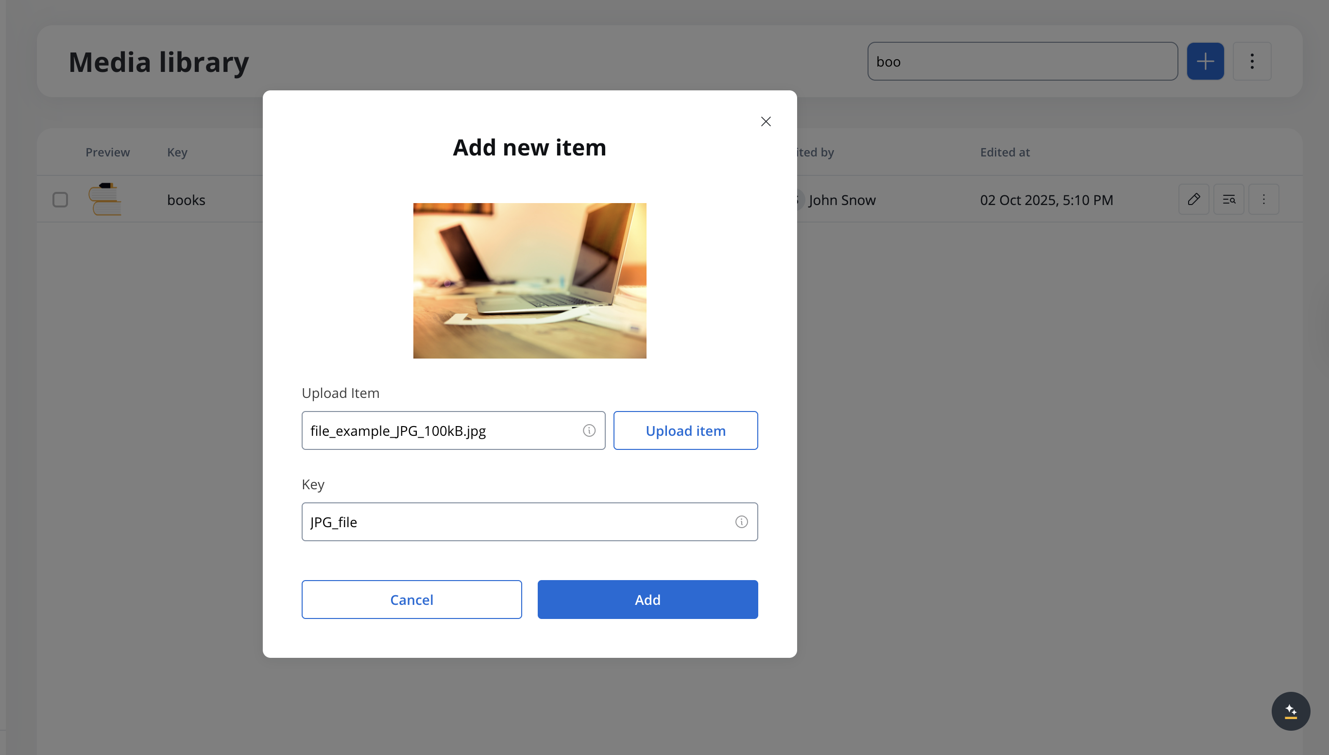
- Click Upload item button and select a file from your local browser.
- Click Add to upload the asset.
You can upload files in PNG, JPEG, JPG, GIF, SVG, WebP, or PDF format. The maximum supported file size is 25 MB for any file type.
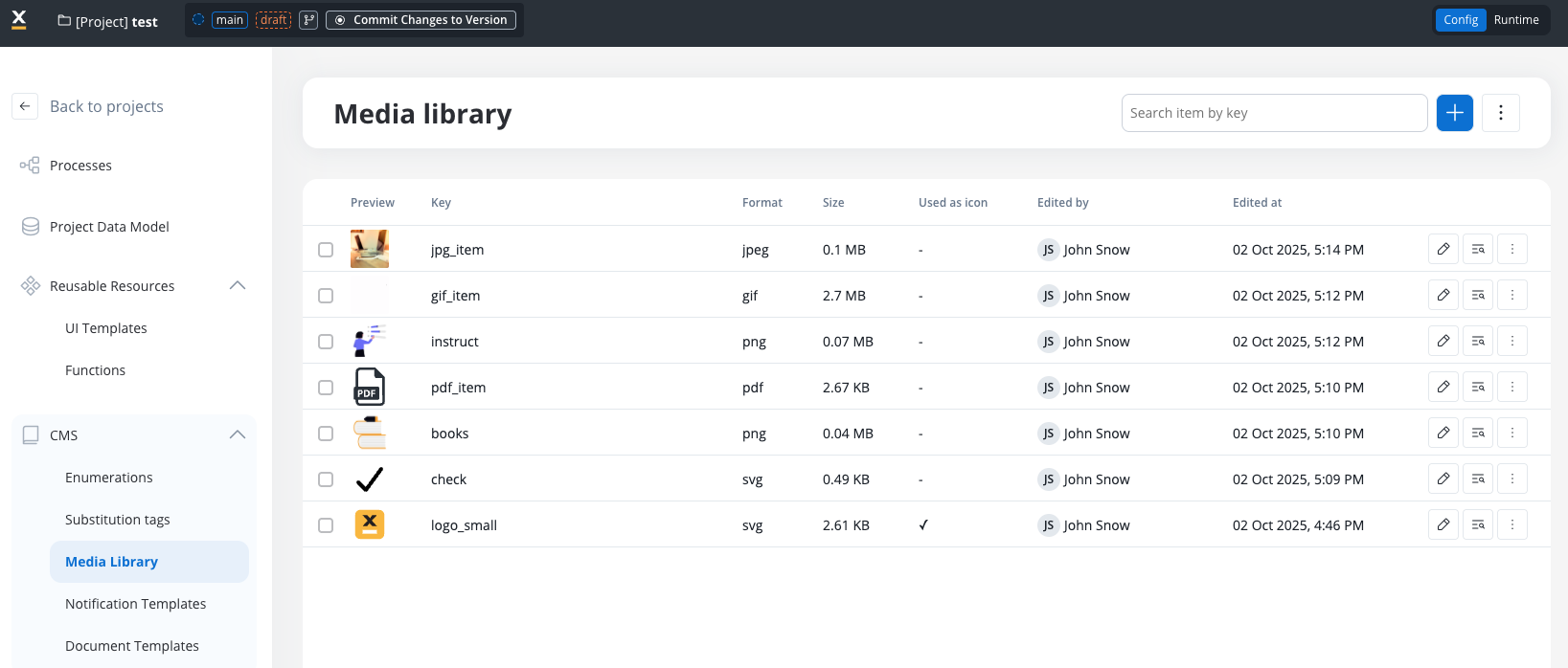
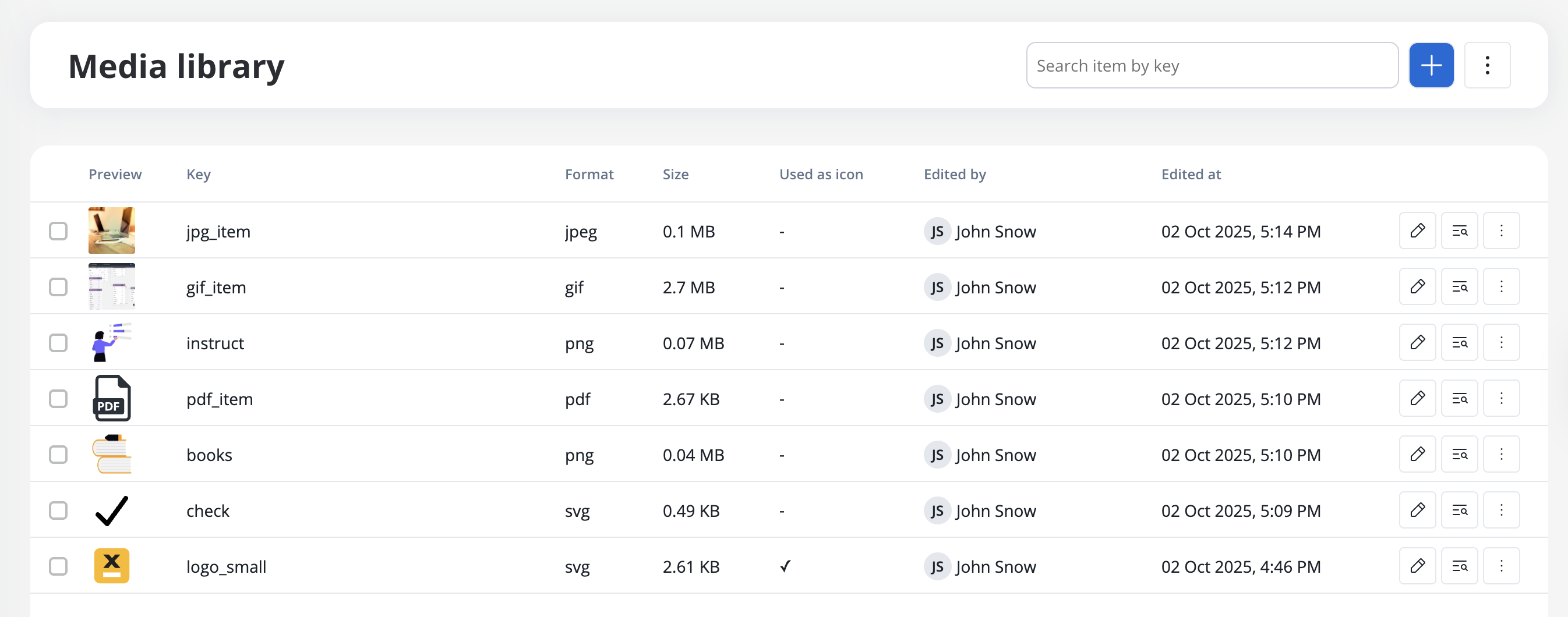
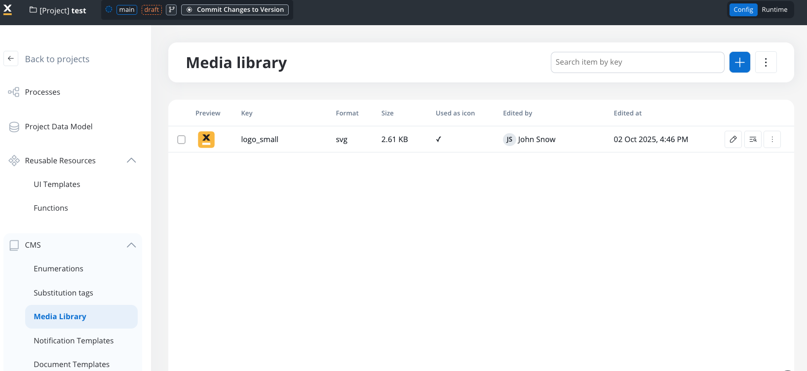
Displaying assets
You can preview all the uploaded assets by accessing the Media Library. You have the following information about assets:- Preview (thumbnail 48x48)
- Key
- Format (”-” for unknown format)
- Size
- Used as icon
- Edited at
- Edited by
Searching assets
You can search an asset by using its key (full or substring).Updating assets
You can replace an item on a specific key (this will not break references to process definitions). To do that, click on the asset and select *Upload item then click Update.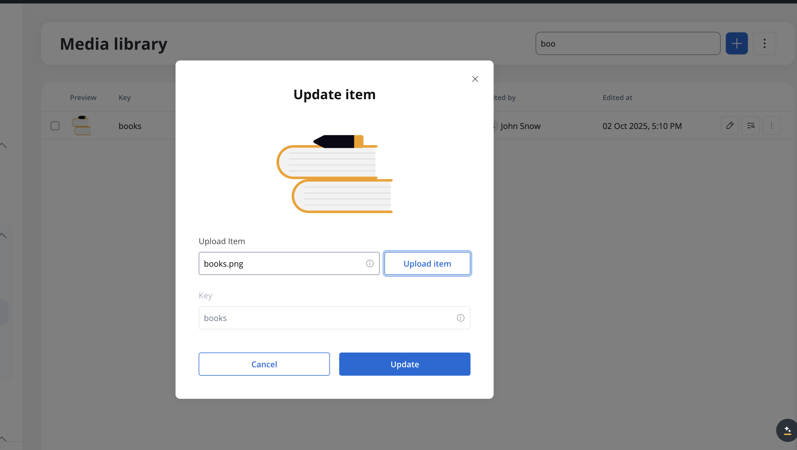
Icons
The Icons feature allows you to personalize the icons used in UI elements. By uploading SVG files through the Media Library and marking them, you can choose icons from the available list in the UI Designer.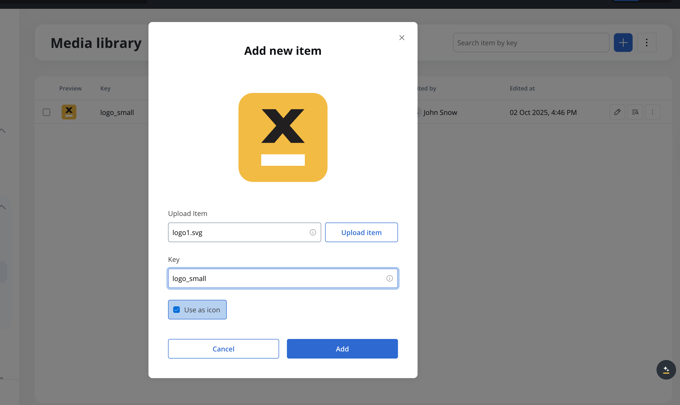
- Use as icon - this will mark the SVG file as an icon and it will be displayed in the UI Designer
When selecting icons in the UI Designer, only SVG files marked as icons in the Media Library will be displayed.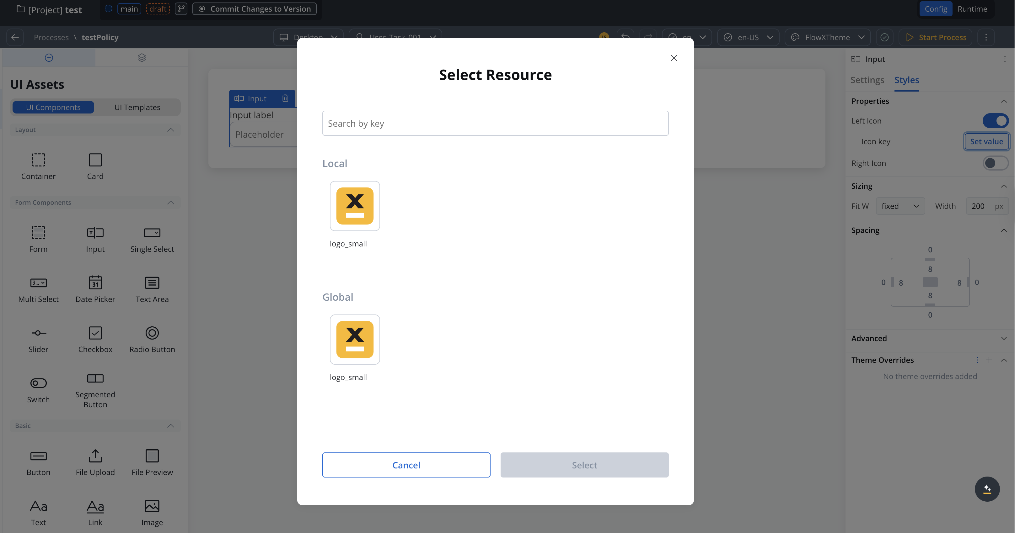
To ensure optimal visual rendering and alignment within your UI elements, it is recommended to use icons with small sizes such as: 16px, 24px, 32px.Using icons specifically designed for these sizes helps maintain consistency and ensures a visually pleasing user interface. It is advisable to select icons from icon sets that provide these size options or to resize icons proportionally to fit within these dimensions.
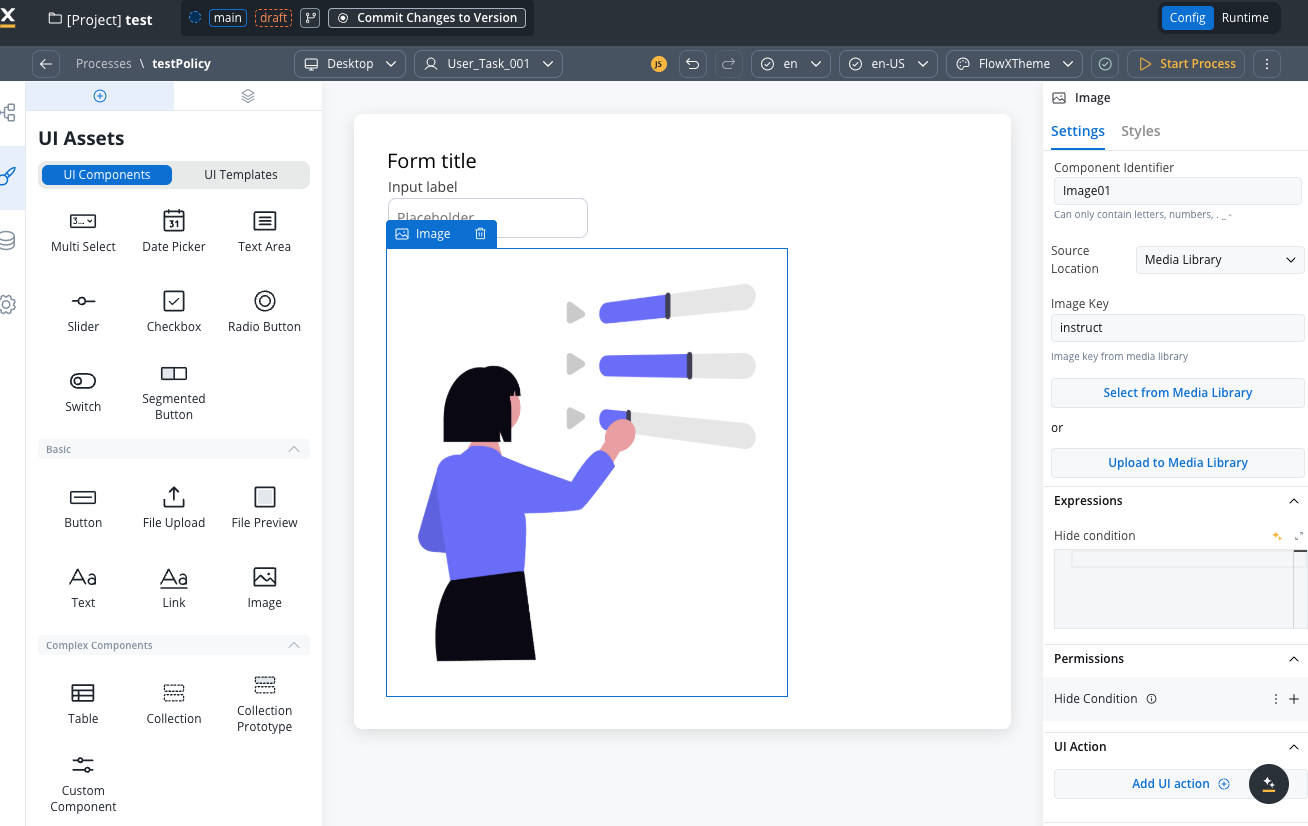
Referencing assets in UI Designer
You have the following options when configuring image components using UI Designer:- Source Location - here you must select Media Library as source location (or directly select “Upload to Media Library” button for on the spot upload)
- Image Key - automatically populated with the key of the asset when selecting an asset from the Media Library
Customization
Content-specific icons pertain to the content of UI elements, such as icons for input fields or send message buttons. These icons are readily accessible in the UI Designer.
Input element
Select element
Buttons
Export and import media assets
You can export and import media assets to transfer them between projects or environments.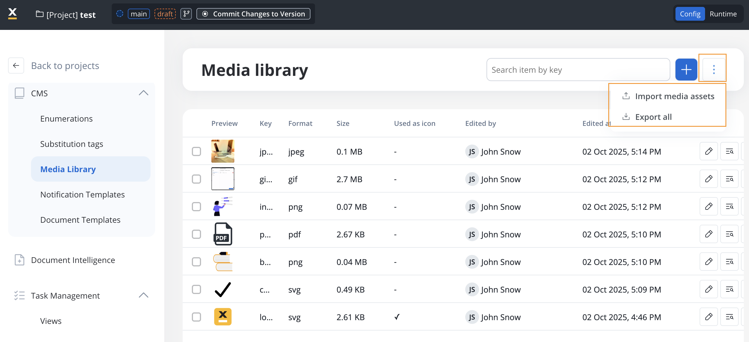
Exporting
To export media assets:- Open the context menu on the Media Library list page
- Select Export
- All media assets in your project are downloaded as a ZIP file
Importing
To import media assets:- Open the context menu on the Media Library list page
- Select Import
- Select the ZIP file exported from another project or environment
- If assets with the same identifiers already exist, a Review Resource Identifiers Conflicts modal appears
- Choose a strategy for each conflicting asset (or use Apply to all):
- Keep both - imports the asset as a new copy alongside the existing one
- Replace - overwrites the existing asset with the imported version
- Skip this one - keeps the existing asset unchanged
- Click Continue to complete the import
Importing is only available for work-in-progress (WIP) project versions. You cannot import into a committed version.