Choosing the right navigation pattern
Picking the correct navigation area type is one of the most impactful decisions in process design. A wrong choice leads to broken flows, inconsistent behavior across platforms, and poor user experience. Use this guide to decide when to use each navigation type and how to combine them correctly.Before you start
The foundational principles and per-rule classification (tier, platform, why, alternative) live on a dedicated page. Read them first, then come back here for practical decisions on how to combine patterns.Process design principles
Guiding principles, modal rules, and subprocess rules with platform tags and examples.
Page vs modal: the core decision
The most common mistake is using a modal when a page is needed, or chaining modals together. Whether modal chaining is acceptable depends on the platform — see Chaining modals for the full rule. Here is how to decide between page and modal:- Use a Page when...
- Use a Modal when...
- The user needs to complete a full step in a flow (data entry, review, confirmation)
- The content is part of the main journey and not an interruption
- The user might need to navigate back to this screen
- The flow involves multiple sequential tasks (use Wizard navigation type)
- The content is complex or long (forms, tables, document reviews)
Quick decision flowchart
Ask yourself these questions in order:Is it a temporary interruption?
If the user will do one thing and return to where they were, consider a Modal.If the user is progressing to a new step in the flow, use a Page (or Step in a Stepper).
Does it lead to another screen?
If finishing a task in a modal leads to navigating to another screen, and not just dismissing the modal, then the modal should be a root navigation area.
Is the content complex?
If the screen has multiple form fields, validation logic, or scrollable content, use a Page.Modals work best for simple, focused interactions (1-3 fields maximum).
Modal rules
For the full set of modal rules (tier, platform, why, and alternatives), see Process design principles → Modal design. A modal should not contain child navigation areas. It can contain user tasks and trigger workflows (including via On Load events), but it is not a container for pages, steppers, or other navigation structures.What “child navigation areas” means
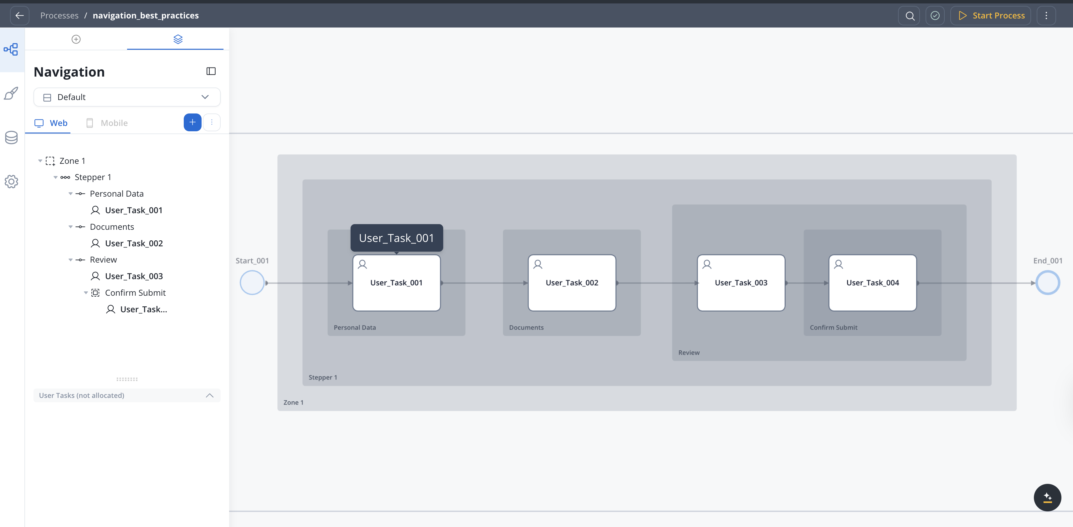
In the Designer’s Navigation view, you build a tree of navigation areas. Child navigation areas are areas nested inside a parent. Here is what a correct vs incorrect navigation tree looks like:- Correct
- Incorrect
How modals fit in the navigation flow
A modal should overlay the current screen as a temporary interruption and return to the same context when dismissed:- Web: opening a second modal replaces the first in the DOM. You cannot return to the first modal. If that loss of back-navigation is acceptable, it is a valid (though discouraged) design.
- Mobile: the OS auto-pops the current modal on forward navigation, so two separate modals cannot coexist. For multi-step interactions inside a modal, put multiple User Tasks inside a single Modal navigation area — mobile renders each User Task as a linked screen within the same modal with a built-in back button. This is the recommended pattern, not a workaround.
In UI Flows, modals are navigation areas that you navigate to using the Navigate To UI action. The modal adds a
modalId to the URL, which supports deep linking and survives page refresh. Use the Dismiss modal option or browser back to close.Valid navigation combinations
Navigation area nesting reference
The table below shows what the Designer allows you to add as child areas, and what you should actually use.| Parent area | Designer allows | Recommended use |
|---|---|---|
| Root (blue +) | Stepper, Tab Bar, Page, Modal, Zone, Parent Process | Web: start with Zone for header/footer layouts, or Page/Stepper for simpler flows. Mobile: Tab Bar must be root for multi-section apps; otherwise Page or Stepper |
| Zone | Zone, Stepper, Tab Bar, User Tasks, Embedded Subprocess | Stepper for multi-step flows, Tab Bar for section-based layouts |
| Stepper | Step | Add one Step per stage in the flow |
| Step | User Tasks, Embedded Subprocess | One User Task per Step on mobile (1 UT = 1 screen) |
| Tab Bar | Tab | One Tab per section |
| Tab | Zone, Modal, Tab Bar, User Tasks, Embedded Subprocess | Zone or Tab Bar for complex tab content (web); on mobile, prefer User Tasks or Modal |
| Page | Modal, Zone, Tab Bar, User Tasks, Embedded Subprocess | Modal for brief interruptions only |
| Modal | Zone, Tab Bar, User Tasks, Embedded Subprocess | Don’t nest navigation areas under modals — treat as leaf |
Patterns that work
Zone with Stepper (web only)
Zone (header/footer) containing a Stepper with Steps. Each Step holds user tasks with form content.Use for: multi-step flows with persistent header/footer on web. Not available on mobile, where Zone is not rendered (treated as a Page).
Stepper with confirmation Modal
Stepper with Steps for each stage. One Step contains a Modal for a brief confirmation before submission.Use for: forms that need an “Are you sure?” prompt before submit.
Page with Wizard navigation (web only)
Single Page area with Wizard navigation type. Displays user tasks one at a time with Next/Back buttons.Use for: sequential data entry without visible step indicators on web. Not available on mobile (Wizard navigation does not exist).
Tab Bar with Tabs
Tab Bar at root level with Tabs for each section. Each Tab can contain its own content and actions.Use for: Multi-section apps where users switch between areas.
Patterns that break
Modal chain (two separate modals)
Two separate Modal navigation areas chained sequentially. On web the second replaces the first in the DOM; on mobile the OS auto-pops the first.Fix on web: use Stepper steps or Wizard pages. Fix on mobile: put multiple User Tasks inside a single Modal navigation area (internal modal navigation).
Modal as flow step
Page → Modal → Page where the modal is a step in the journey, not an interruption.Fix: Replace the modal with a Page or Step.
Modal as loader
Opening a modal to show a loading spinner while a backend operation completes.Fix: Use the loading state properties on UI components (loader overlays, skeleton screens).
Deep nesting
Zone → Stepper → Stepper → Stepper (more than 2 levels of stepper nesting).Fix: Break the flow into separate processes or subprocesses.
Cyclic modal path
A process cycle that loops back into a modal already in the current navigation path.Fix: Resolve the modal before re-entering the loop, or replace the modal with a Page or Step.
Close-modal → open-modal
One event that both dismisses the current modal and opens another.Fix: Split into two user-triggered actions, or replace with a Page/Step transition.
Modal → Call Activity
A modal user task that triggers a Call Activity. The modal is dismissed and not restored when the Call Activity completes.Fix: Resolve the modal first, then transition to the Call Activity from a Page or Step.
Auto-dismissed modal
A modal that closes on a timer, backend event, or automatic flow progression rather than user interaction.Fix: Require an explicit user action (confirm, cancel, dismiss button, backdrop click) to close the modal.
Common scenarios
Phone verification with a sent code
- Recommended
- Avoid
Use a Stepper or Page with Wizard navigation:
- Step 1 (Page): user enters phone number
- Step 2 (Page): user enters the verification code with a resend option
- Step 3 (Page): confirmation, next step in the flow
Confirmation before submission
- Recommended
- Avoid
Use a Modal for the confirmation dialog:
- User completes the form on a Page
- User clicks Submit
- A Modal appears: “Are you sure you want to submit?”
- User confirms → modal dismisses → process continues
Terms and conditions
- Recommended
- Avoid
Use a dismissable Modal:
- User reaches a step that requires accepting terms
- User clicks “View Terms” → a Modal opens with the full text
- User reads and dismisses the modal
- User checks the acceptance checkbox on the Page and continues
Multi-section dashboard
- Recommended
- Avoid
Use a Tab Bar with Pages for each section:
- Tab 1: Account overview (Page)
- Tab 2: Transaction history (Page)
- Tab 3: Settings (Page with Wizard if multi-step)
Navigation selection guide
| Scenario | Navigation type | Why |
|---|---|---|
| Multi-step form with progress | Stepper | Users see where they are and can go back |
| Sequential tasks without step indicators | Page (Wizard) | Guided flow with Next/Back, no visible steps |
| All fields on one screen | Page (Single page form) | Parallel display, use cards to group sections |
| Brief confirmation or acknowledgment | Modal | Quick interruption, single action, dismiss and return |
| Supplementary info (help, terms) | Modal (dismissable) | Read-only content that doesn’t affect the main flow |
| Multi-section app | Tab Bar | Parallel access to different areas |
| Persistent header/footer (web) | Zone | Layout container for branding and global actions |
Related resources
Navigation areas
Configuration reference for all navigation area types.
UI Designer best practices
General best practices for building interfaces.