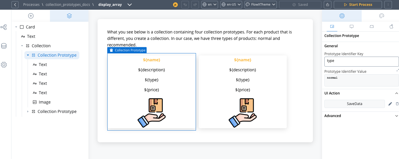
Collection prototypes allow you to display items within a collection using different layouts based on their properties, creating more dynamic and context-aware user interfaces.
What are Collection Prototypes?
Collection prototypes are specialized components that define different display formats for items within a single collection. They act as templates that are applied conditionally based on item properties, allowing you to:- Display collection items with different layouts based on their data properties
- Create visually distinct displays for featured or highlighted items
- Apply specialized formatting for different item types or states
- Integrate custom components for enhanced functionality
- Add interactive features like item selection
Collection prototypes always work as child components within a parent Collection component. While a Collection iterates through a data array, Collection Prototypes determine how each individual item should be displayed.
How Collection Prototypes Work
Core Concepts
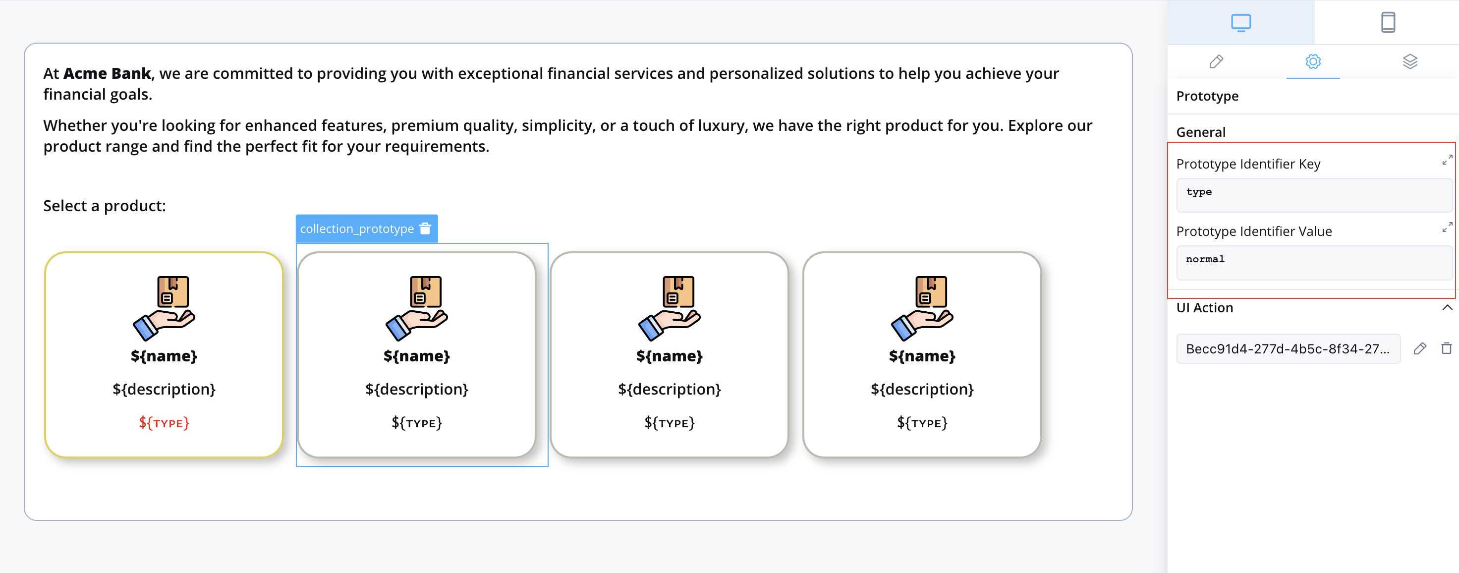
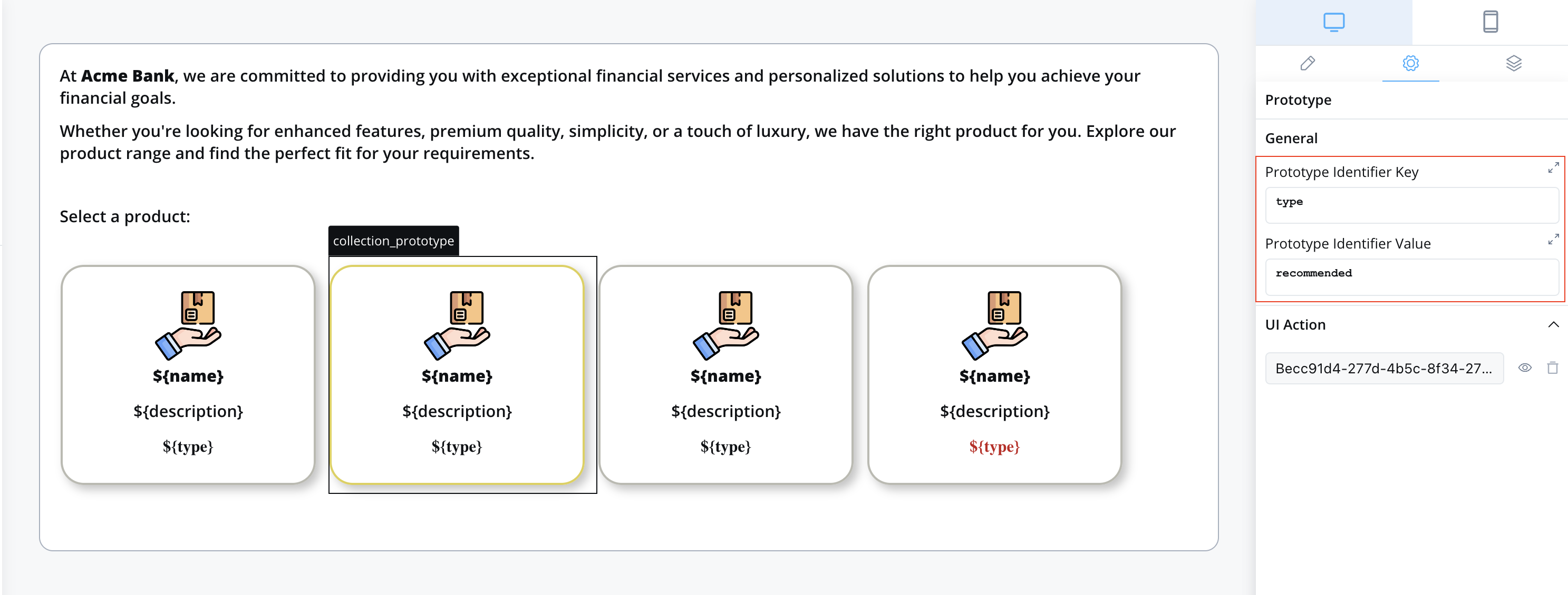
Collection prototypes use a simple but powerful mechanism to determine which layout to apply to each item. The behavior depends on whether you have one or multiple prototypes:Prototype Identifier Key (PIK)
The data property used to determine which prototype to apply (e.g.,
type, status, priority)Prototype Identifier Value (PIV)
The specific value that triggers this prototype layout (e.g.,
featured, active, high)When to Configure PIK and PIV
- Single prototype
- Multiple prototypes
Configuration: PIK and PIV are optional and should not be configured
If you have only one collection prototype, the system will automatically use that prototype for all items in the array, regardless of their properties. In this case, leave both PIK and PIV empty.
Visual Examples
- Single prototype scenario
- Multiple prototypes scenario
Use case: Displaying a list of menu items where all items have the same layoutConfiguration:
- PIK: (leave empty)
- PIV: (leave empty)
Since all items use the same layout, no prototype identification is needed.
Normal product display
Normal product display
Recommended product display
Recommended product display
Implementation Guide
1. Prepare Your Data
Before implementing collection prototypes, you need to prepare the data structure that will determine which prototype applies to each item.Using a Service Task Node
The most common approach is to use a Service Task node with business rules:Add a Service Task Node
In the FlowX.AI Designer, add a Service Task node before your User Task node and connect them with a sequence flow.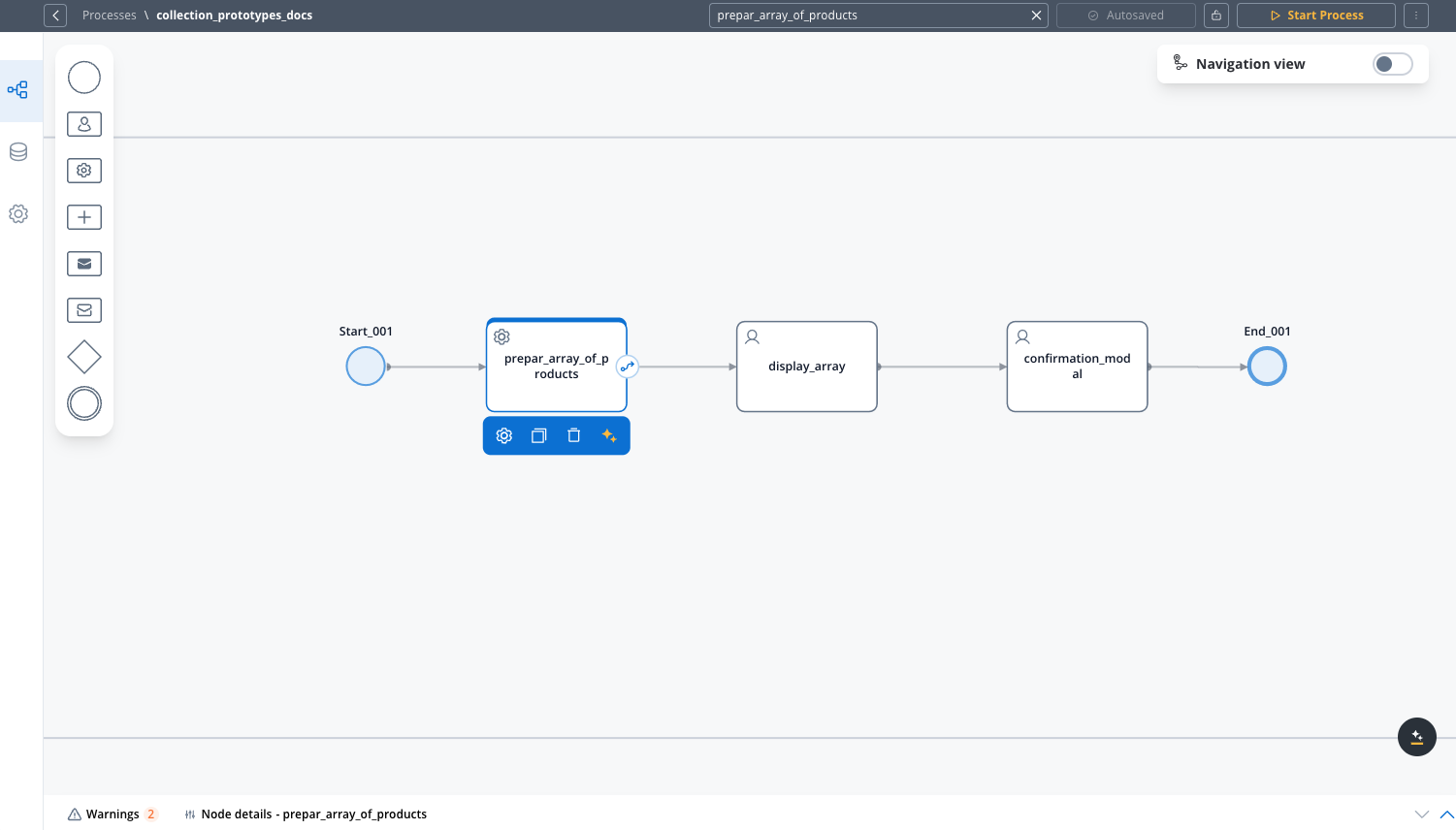
Configure the Business Rule
Select your Service Task node, go to the Business Rules tab, and add a new business rule or edit an existing one.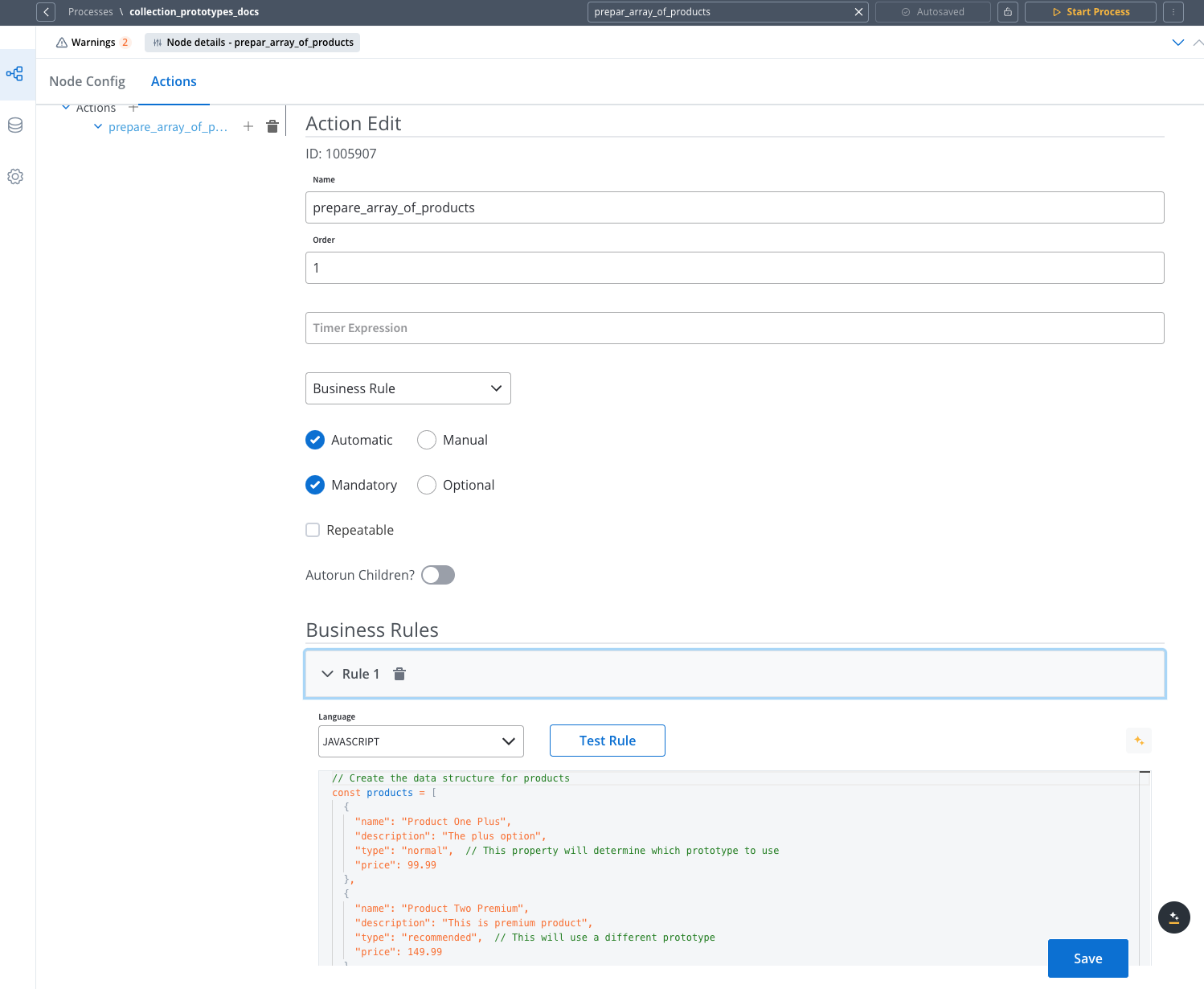
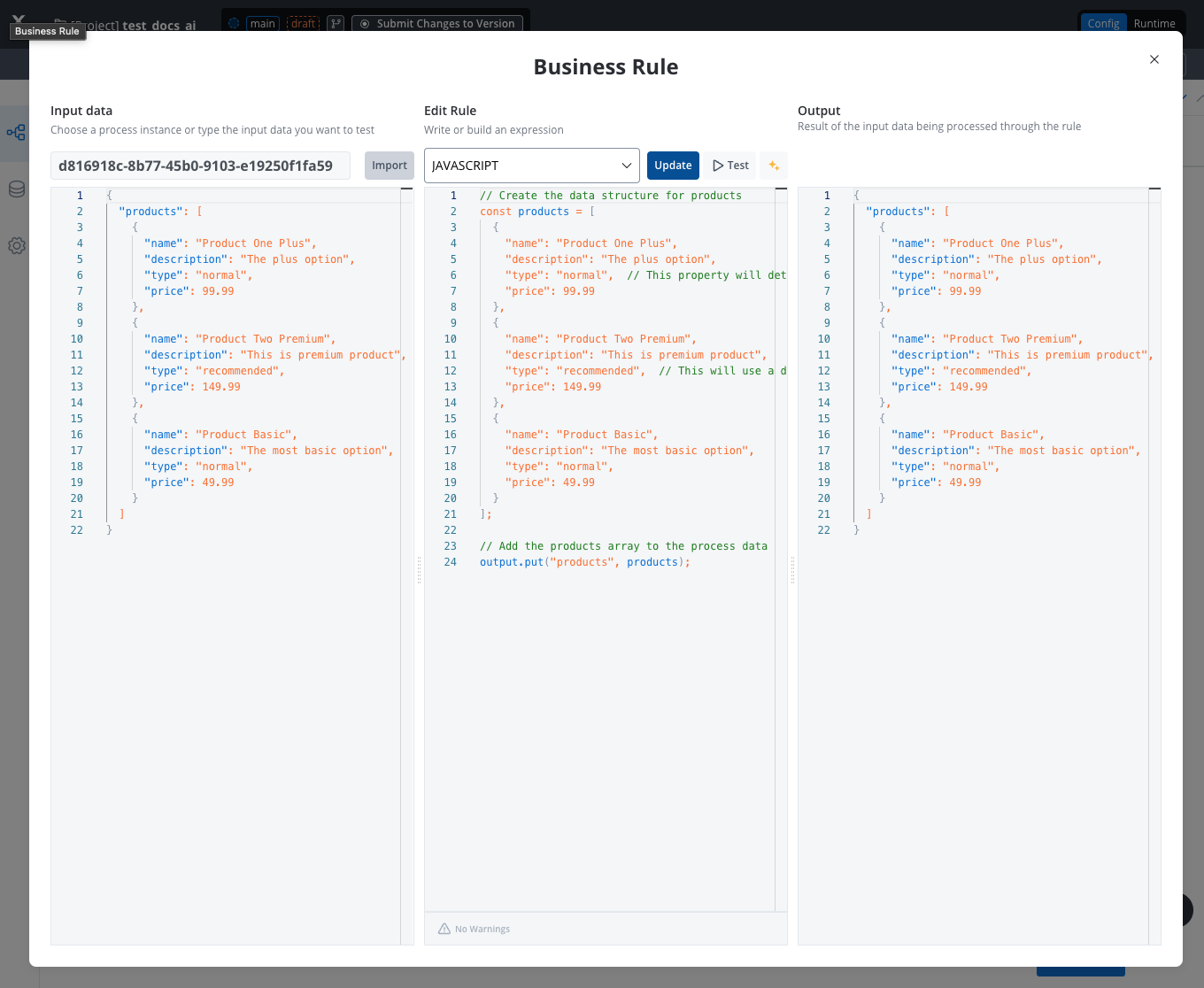
Write the Data Preparation Code
Use JavaScript to create your data structure and assign it to the process context:
2. Create the UI Components
Once your data is prepared, you can implement the collection and its prototypes in the UI Designer:Create a User Task Node
In the FlowX.AI Designer, create or select an existing User Task node in your process and click the brush icon to open the UI Designer.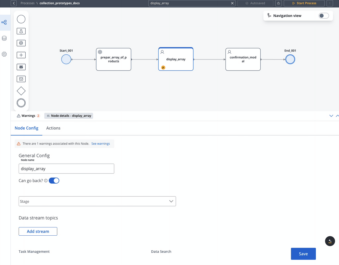
Add a Collection Component
Add a root component (like a Card or Container) to your node, then add a Collection component inside it. Configure the Collection’s source to point to your data array (e.g., 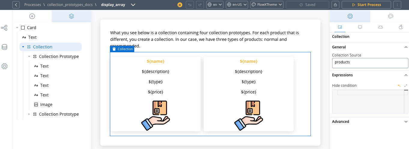
products).The
collectionSource property specifies the process key where your list can be found. It should be a valid array of objects. For example, if your data is at processData.products, you would set the source to products.Add Collection Prototypes
- Single prototype (simple case)
- Multiple prototypes (advanced case)
For a single prototype that applies to all items:
- Click on your Collection component to select it
- Add a Collection Prototype as a child component
- Leave PIK and PIV empty - no configuration needed
- The prototype will automatically apply to all items in the collection
This is the most common scenario when all items in your collection should have the same layout.
Design Each Prototype's Layout
For each prototype, add the UI components that will display your data: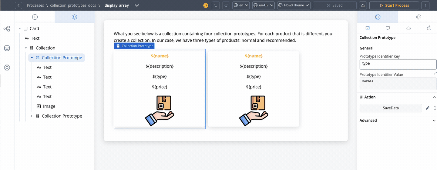
- Select a Collection Prototype
- Add components like Text, Image, Button, etc.
- Configure each component to use relative paths to the collection item data saved in the Data Model:
- Use text UI element with the key
${name} - Use text UI element with the key
${description}
- Use text UI element with the key
Components within a collection use relative paths to the collection source. This means that wherever the collection is found inside the process data, the components inside the collection need their keys configured relative to that collection.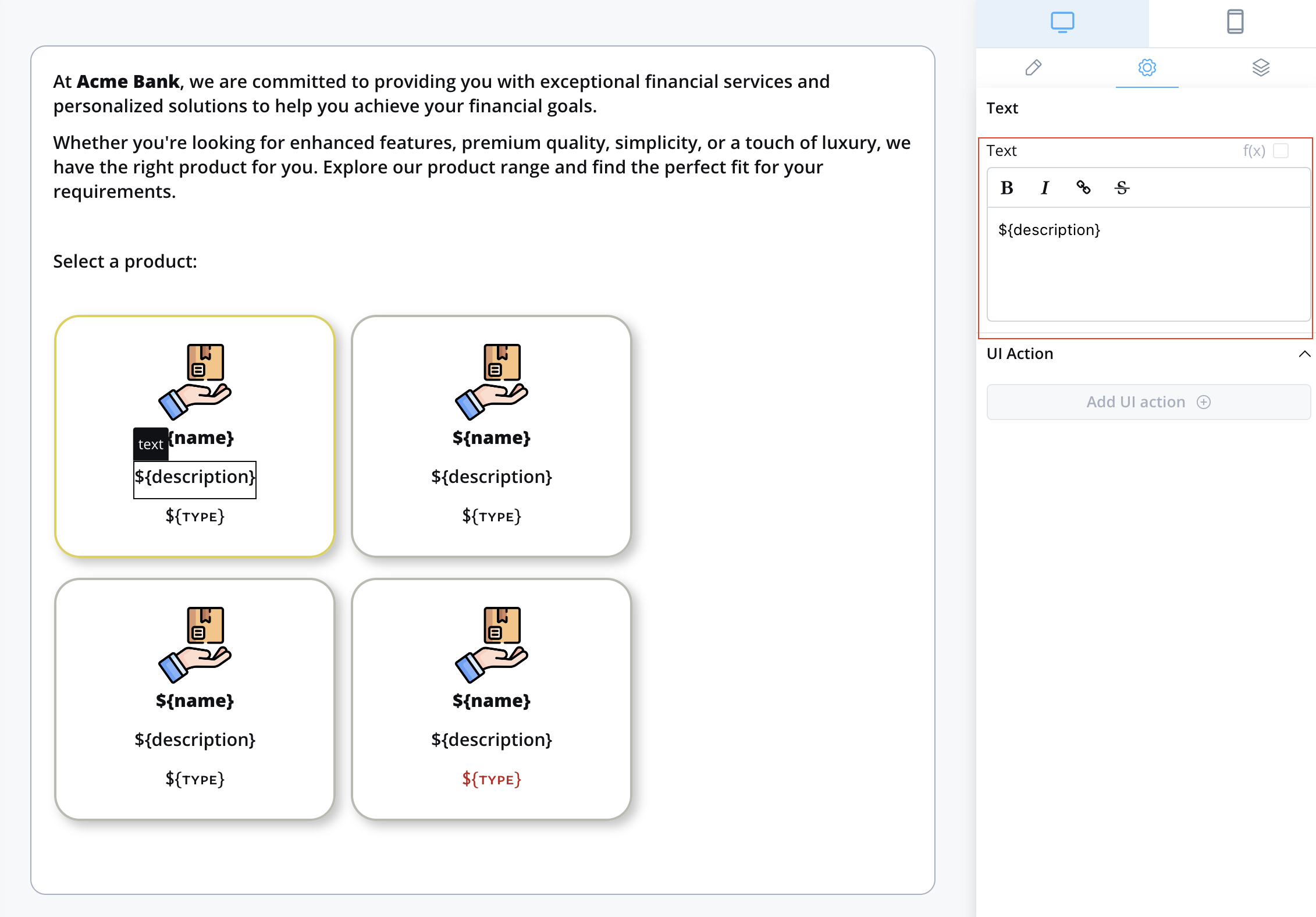
3. Add Interactivity
To make your collection items interactive, such as allowing users to select an item:Create a Node Action
Add an Action to your User task node: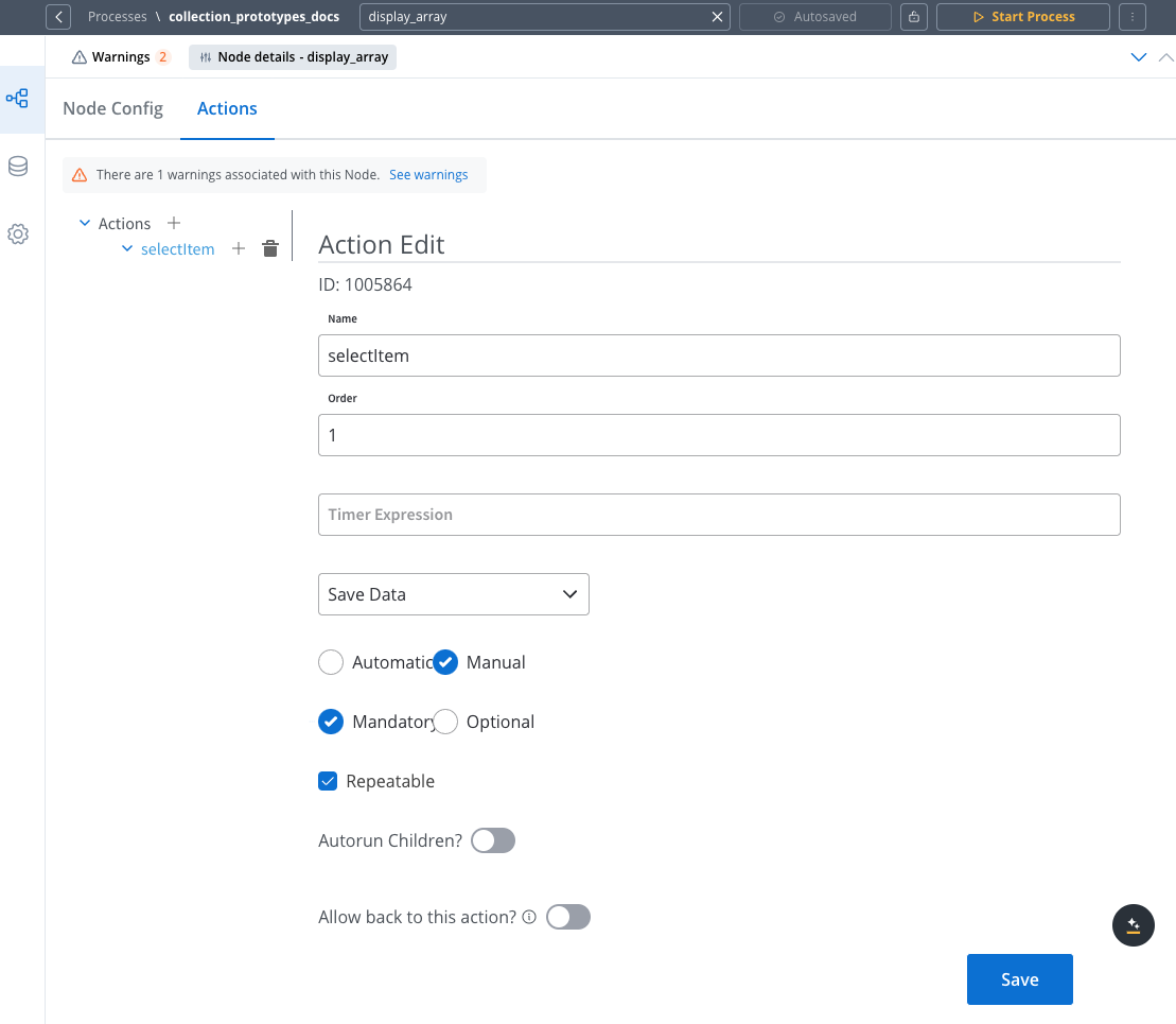 Configuration options:
- Go back to the process designer
- Select your User Task node
- Go to the Actions tab
- Add a new action with:
- Type: Manual
- Name: (e.g.,
selectItem)
- Set as Manual since users trigger it
- Mark as Mandatory if selection is required to proceed
- Enable Repeatable for changeable selections
Configure a UI Action
Add a UI action to your collection prototype: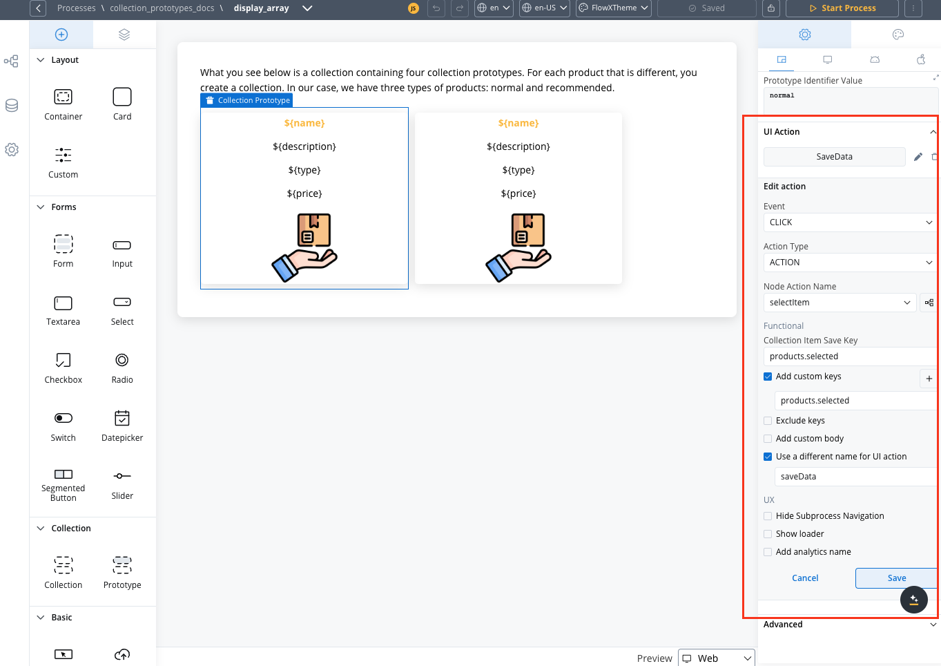
- Return to the UI Designer
- Select the component in your prototype that should trigger the action
- In the Settings panel, add a UI Action
- Add a Collection Item Save Key.
- Add a Custom Key and make sure it matches the Collection Item Save Key.
Best Practices
Working with Custom Components
When integrating custom components into collection prototypes, follow these best practices:
-
Use relative paths for data access
- Configure input keys relative to collection items
- Example: Use
nameinstead ofapp.clients.name
-
Maintain consistent data structures
- Ensure required data exists in collection items
- Follow consistent data patterns across all items
Data Access Patterns
- Outside collections
- Inside collections
Components use full paths from data root:
Performance Optimization
- Limit the number of items in your collection when possible
- Simplify complex prototype layouts
- Consider pagination for large data sets
- Optimize images and other media within prototypes
- Avoid deeply nested components within prototypes
Pro tips:
- Test your collection prototypes with various data scenarios
- Verify data flow through the entire selection process
- Monitor the process data for correct updates
- Ensure your UI provides clear visual feedback when an item is selected
Troubleshooting
When working with collection prototypes, you might encounter some common issues:Common Issues and Solutions
Prototype not displaying correctly
Prototype not displaying correctly
Symptoms:
- Collection items appear with incorrect layouts
- All items use the same prototype regardless of identifier values
- Some items don’t render at all
- Ensure PIK and PIV fields are left empty - they should not be configured
- If you accidentally configured PIK/PIV for a single prototype, clear both fields
- Verify that your Prototype Identifier Key exactly matches the property name in your data
- Ensure the Prototype Identifier Value matches the expected values in your data
- Both PIK and PIV must be configured - partial configuration will not work
- Check for case sensitivity issues in both keys and values
- Validate your data structure using the process debugger
- Confirm that the parent Collection component has the correct source path
UI actions not working
UI actions not working
Symptoms:
- Clicking on items doesn’t trigger the expected action
- Selected data isn’t saved to the process
- No visual feedback when items are selected
- Confirm that the Collection Item Save Key matches exactly with the Data to send field in your node action
- Verify that your node action is properly configured as Manual and Repeatable if needed
- Check that the UI action is attached to the correct element within the prototype
- Ensure the node action has the correct permissions and is properly linked
- Verify that your root UI element includes the necessary Message parameters to pass data
Data binding issues
Data binding issues
Symptoms:
- Components inside prototypes show empty or incorrect data
- Dynamic content doesn’t update properly
- Error messages in the console related to undefined properties
- Remember that components inside collections must use relative paths (e.g.,
nameinstead ofapp.clients.name) - Verify your data structure matches what the components expect
- Use the process debugger to inspect the actual data being passed to the collection
- Check for null or undefined values that might cause rendering issues
- Ensure your data is properly structured as an array of objects
Known Limitations
Debugging Tips
-
Use process data inspection:
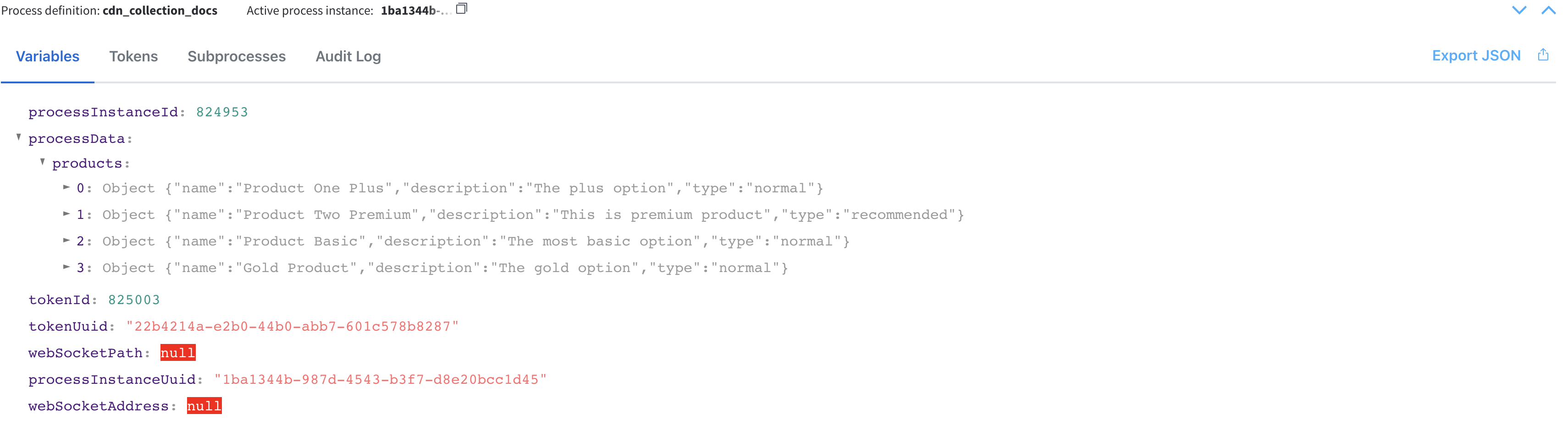
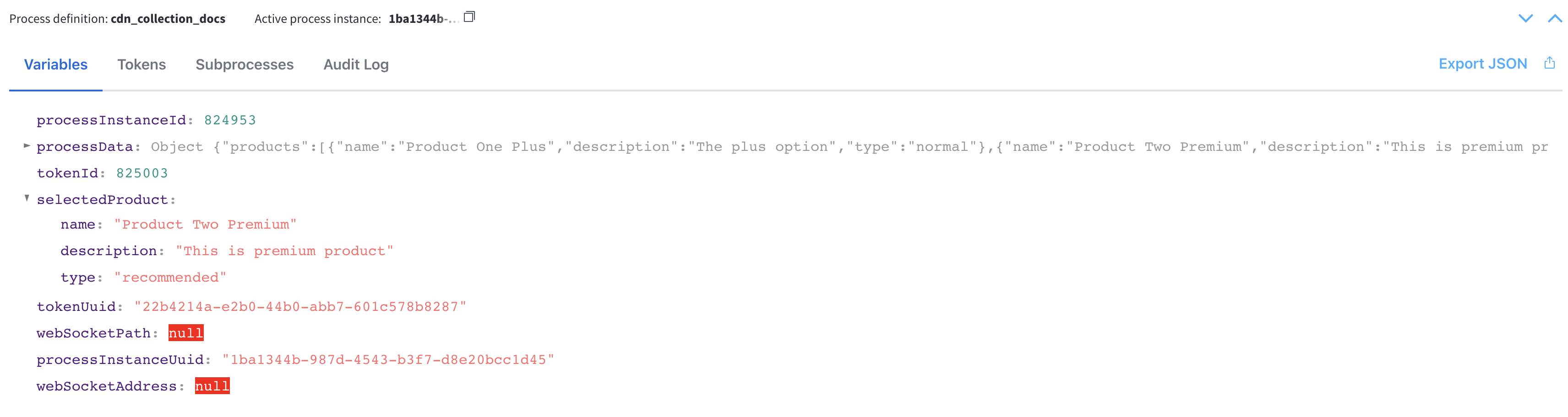
- Monitor the process data before and after interactions with collection prototypes
- Verify that selected items are correctly saved to the expected process data keys
-
Test with simplified data:
- Start with a minimal data set to confirm basic functionality
- Gradually add complexity to identify where issues might occur
-
Isolate components:
- Test individual UI components outside the collection context
- Add components to prototypes one by one to identify problematic elements
Frequently Asked Questions
Can I use different layouts for mobile and desktop?
Can I use different layouts for mobile and desktop?
Yes, you can create platform-specific overrides for your collection prototypes. Configure different layouts, spacing, and styling for Web, iOS, and Android platforms through the platform tabs in the UI Designer.
How do I handle missing identifier values?
How do I handle missing identifier values?
If an item doesn’t have the specified identifier key or value, it won’t match any prototype. Consider adding a default prototype with a common value like “default” and ensure all items have at least this value as a fallback.
When should I configure PIK and PIV vs leaving them empty?
When should I configure PIK and PIV vs leaving them empty?
Leave PIK and PIV empty when:
- You have only one collection prototype
- All items in your collection should use the same layout
- You have multiple collection prototypes
- Different items should display with different layouts based on their properties
- Both fields must be completed for the configuration to work
This logic has been unchanged since 2021 and is a fundamental aspect of how collection prototypes work.
Can I use expressions in prototype identifier values?
Can I use expressions in prototype identifier values?
No, prototype identifier values must be static strings that exactly match the values in your data. However, you can transform your data before it reaches the collection to achieve dynamic prototype selection.
Is there a limit to how many prototypes I can define?
Is there a limit to how many prototypes I can define?
There’s no hard limit on the number of prototypes, but for performance and maintainability reasons, it’s recommended to keep the number reasonable (typically under 5-7 different prototypes).
What's the difference between Collection and Collection Prototype?
What's the difference between Collection and Collection Prototype?
A Collection is a container that iterates through an array of data items, while a Collection Prototype defines how each individual item should be displayed based on its properties. You need at least one Collection Prototype inside a Collection, but you can have multiple prototypes to handle different item types or states.
Code Examples
Different Prototype Layouts Based on Item Status
This example shows how to display items differently based on their status (active, pending, completed):Multiple Identifier Keys for Complex Conditions
You can use multiple collection prototypes with different identifier keys to handle complex display logic:Nested Data Structures
Working with nested data in collection prototypes:Related Components
Collection Component
The parent component that iterates through data arrays and contains Collection Prototypes
UI Actions
Add interactivity to your Collection Prototypes with UI Actions