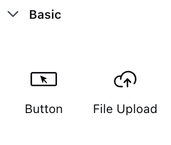
Basic button
File upload button
Basic button
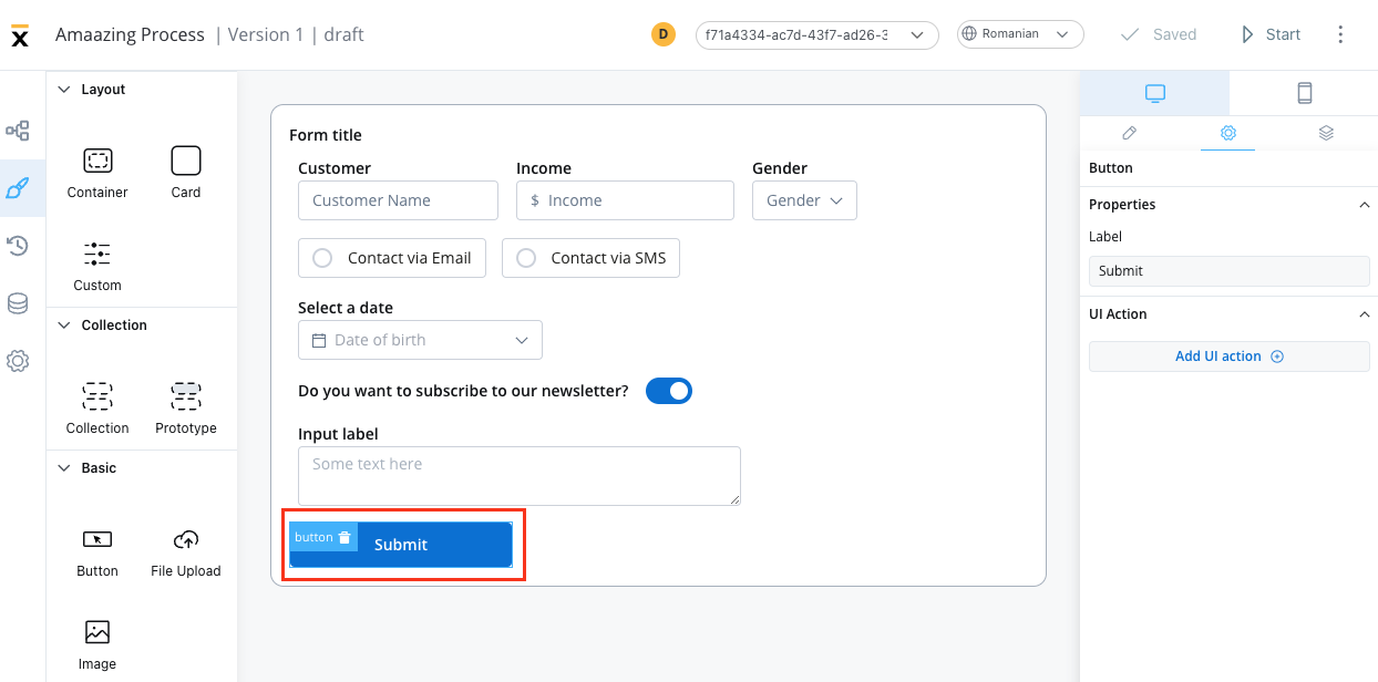
Basic buttons are used to perform an action such as unblocking a token to move forward in the process, sending an OTP, and opening a new tab.Configuring a basic button
When configuring a basic button, you can customize the button’s settings by using the following options: Sections that can be configured regarding general settings:Properties
- Label - it allows you to set the label that appears on the button
UI action
Here, you can define the UI action that the button will trigger.- Event - possible value:
CLICK - Action Type - select the action type
 More details on how to configure UI actions can be found here.
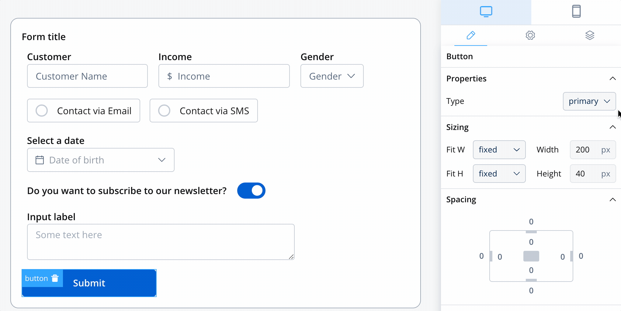
Button styling
Properties
This section enables you to select the type of button using the styling tab in the UI Designer. There are four types available:- Primary
- Secondary
- Ghost
- Text
Icons
To further enhance the Button UI element with icons, you can include the following properties:- Icon Key - the key associated in the Media library, select the icon from the Media Library
- Icon Color - select the color of the icon using the color picker
When setting the color, the entire icon is filled with that color, the SVG’s fill. Avoid changing colors for multicolor icons.
- Icon Position - define the position of the icon within the button:c
- Left
- Right
- Center
When selecting the center position for an icon, the button will display the icon only.
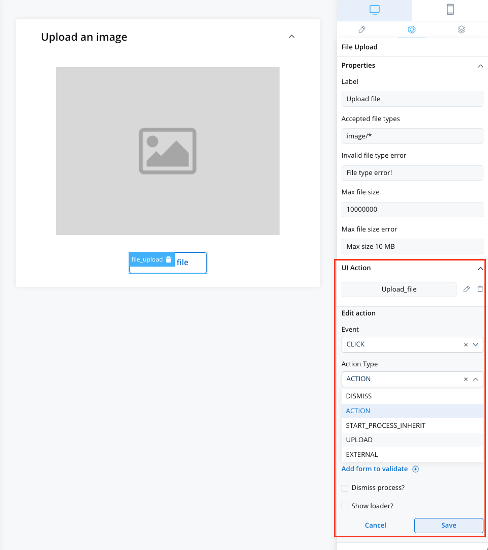
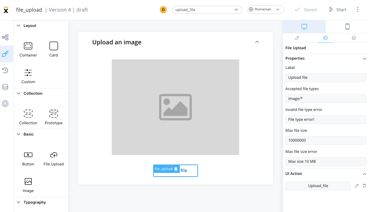
File upload
This button will be used to select a file and do custom validation on it. Only the Flowx props will be different.Configuring a file upload button
When configuring a file upload button, you can customize the button’s settings by using the following options: Sections that can be configured regarding general settings:Properties
- Label - it allows you to set the label that appears on the button
- Accepted file types - the accept attribute takes as its value a string containing one or more of these unique file type specifiers, separated by commas, may take the following forms:
| Value | Defintion |
|---|---|
| audio/* | Indicates that sound files are accepted |
| image/* | Indicates that image files are accepted |
| video/* | Indicates that video files are accepted |
| MIME type with no params | Indicates that files of the specified type are accepted |
| string starting with U+002E FULL STOP character (.) (for example, .doc, .docx, .xml) | Indicates that files with the specified file extension are accepted |
- Invalid file type error
- Max file size
- Max file size error
UI action
Here, you can define the UI action that the button will trigger.- Event - possible value:
CLICK - Action Type - select the action type