- Layout Direction and Alignment: Use these settings to control how content is displayed, ensuring a logical and visually appealing arrangement. For example, a left-to-right layout direction suits languages that read from left to right, while center alignment is ideal for headings or titles.
- Gap, Sizing, and Spacing: Manage the distance between elements to create a sense of hierarchy and balance. Adjusting spacing between paragraphs or sections can improve readability, while resizing elements can prioritize certain components within the design.
- Accessibility Considerations: Customizing layout direction, alignment, spacing, and sizing can enhance the accessibility and inclusivity of your design. For example, adjusting these settings can make content more readable for users with disabilities or those using assistive technologies.
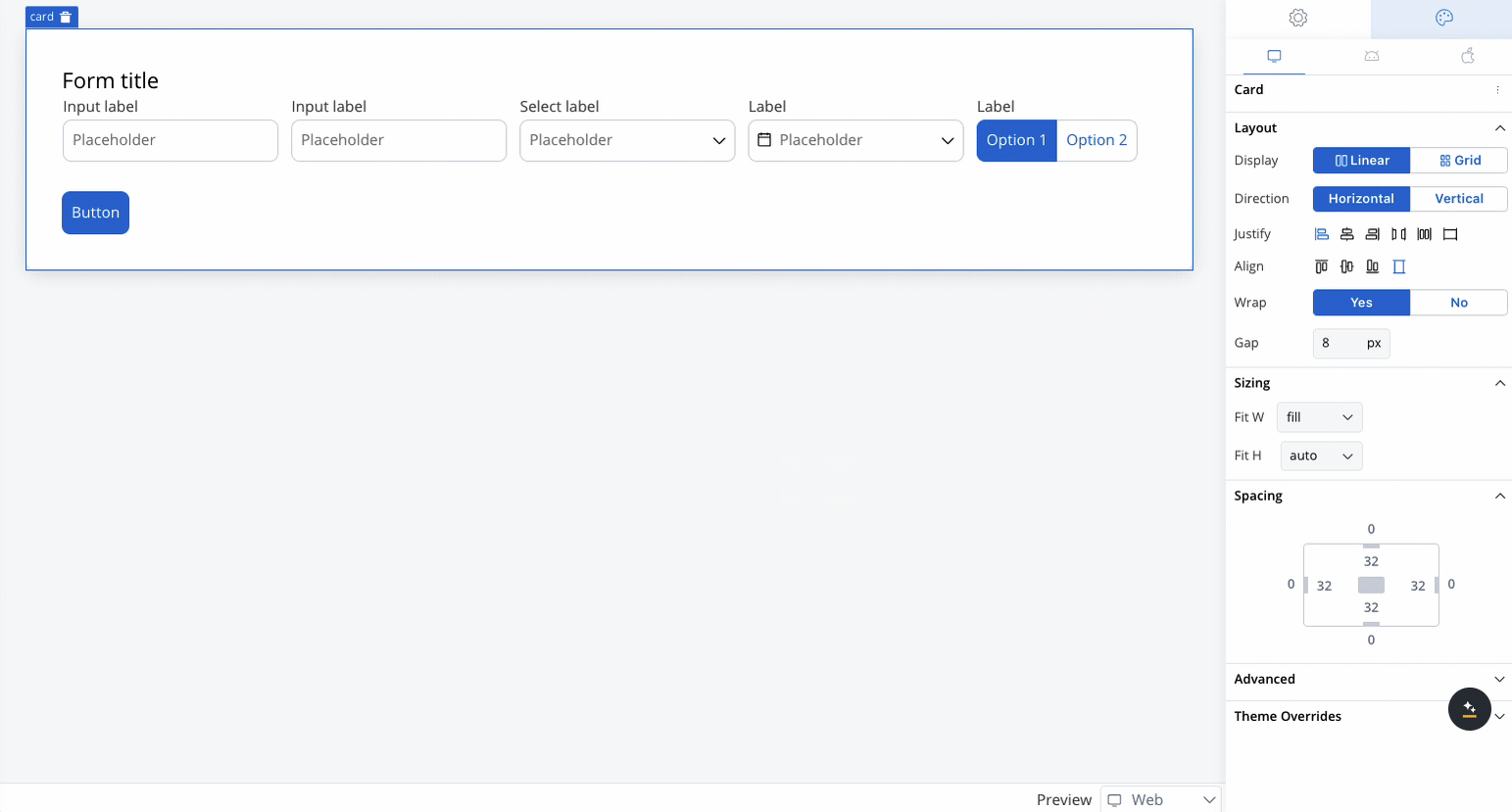
Linear layout
The Linear layout arranges child elements in a single line, either horizontally or vertically.Linear layout configuration properties
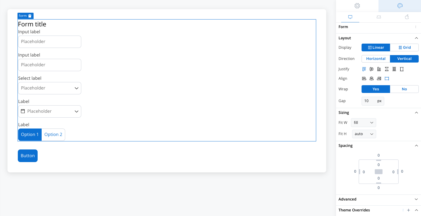
Direction
- Horizontal: Aligns child elements horizontally in a row.
- Vertical: Aligns child elements vertically in a column.
Justify
Controls the alignment of child elements along the main axis (the direction set by Horizontal or Vertical).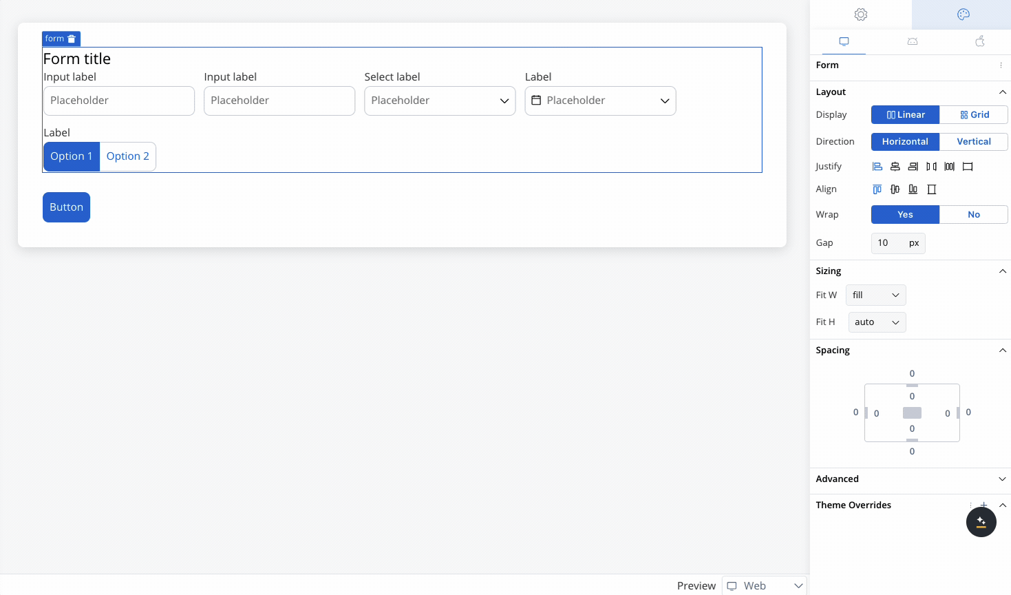 Options include:
- Start: Aligns elements at the start of the container.
- Center: Centers elements along the main axis.
- End: Aligns elements at the end of the container.
- Space Between: Distributes elements evenly with space between them.
- Space Around: Distributes elements with space around them.
- Space Evenly: Distributes elements with equal space around them.
Align
Controls the alignment of child elements along the cross axis (perpendicular to the main axis).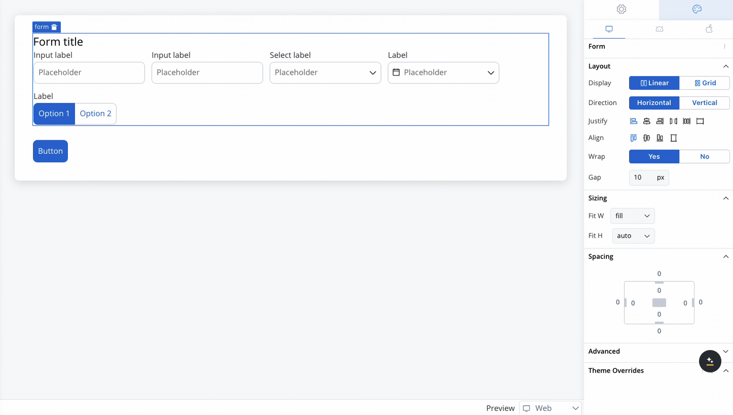 Options include:
- Start: Aligns elements at the start of the cross axis.
- Center: Centers elements along the cross axis.
- End: Aligns elements at the end of the cross axis.
- Stretch: Stretches elements to fill the container along the cross axis.
Wrap
- Enabled (Yes): This option allows elements to wrap onto multiple lines when they exceed the container’s width along the main axis, ensuring a flexible and responsive layout.
- Disabled (No): This option forces all elements to remain on a single line, even if they overflow beyond the container’s width, potentially causing elements to be clipped or hidden.
Layout configuration
Grid layout
In addition to linear (flex-based) layouts, you can configure components using a grid layout. This option is particularly useful for designs requiring a more structured and multi-dimensional arrangement of elements.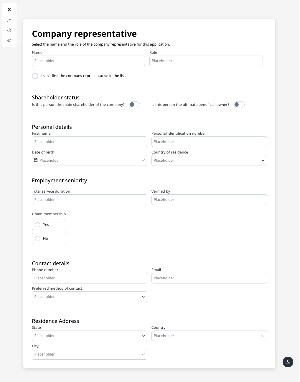
Switching layout types
For components that contain child elements (such as Containers, Cards, and Forms), you can easily switch between a linear layout and a Grid layout using a layout picker. The default layout is linear, but you can select Grid to arrange your content in a more structured way.Platform-specific layouts
You can configure different layout settings for different platforms. For example, you can opt for a grid layout on the web but switch to a linear layout on mobile for a more streamlined user experience. This flexibility ensures that the design is responsive and optimized for each platform, improving usability across different devices.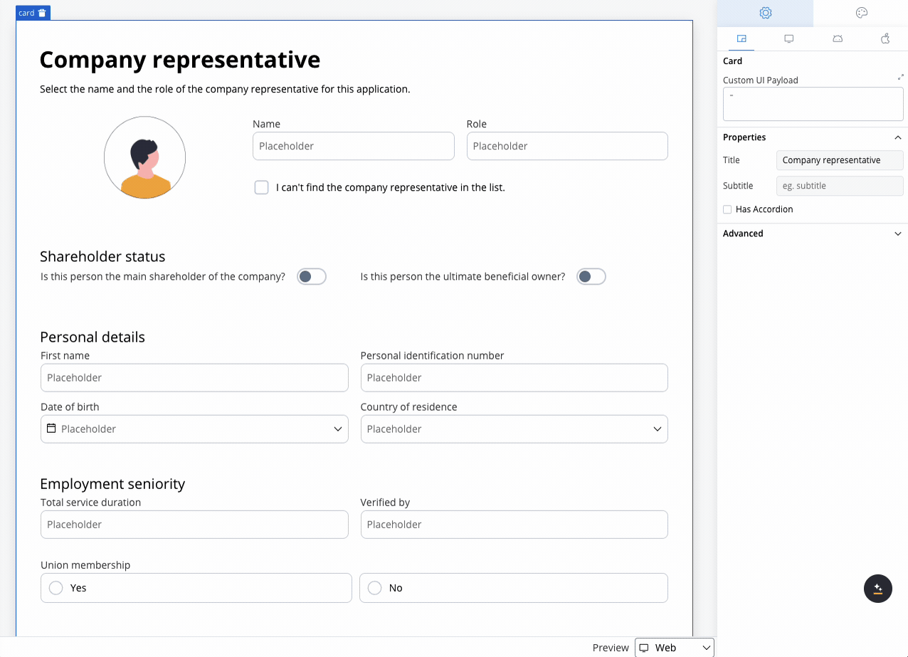
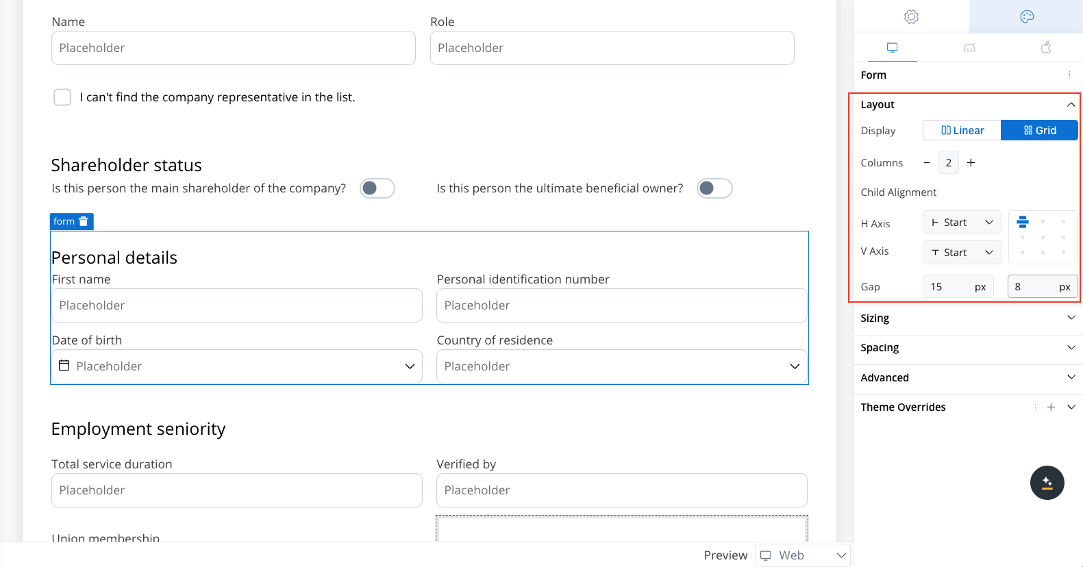
Configuring the grid
Once the Grid layout is selected, you can define the number of columns. Initially, the columns will be distributed equally, meaning all columns will have the same width. Additional customization options include:- Number of Columns: Set the number of columns for the grid. By default, grid will use two columns.
- Alignment: Control how child elements are aligned within the grid. Alignment can be adjusted both horizontally and vertically, ensuring that content is positioned exactly where needed.
- Gap Configuration: Customize the gap between columns and rows. The default gap is inherited from the parent component’s theme settings, ensuring consistency across your design.
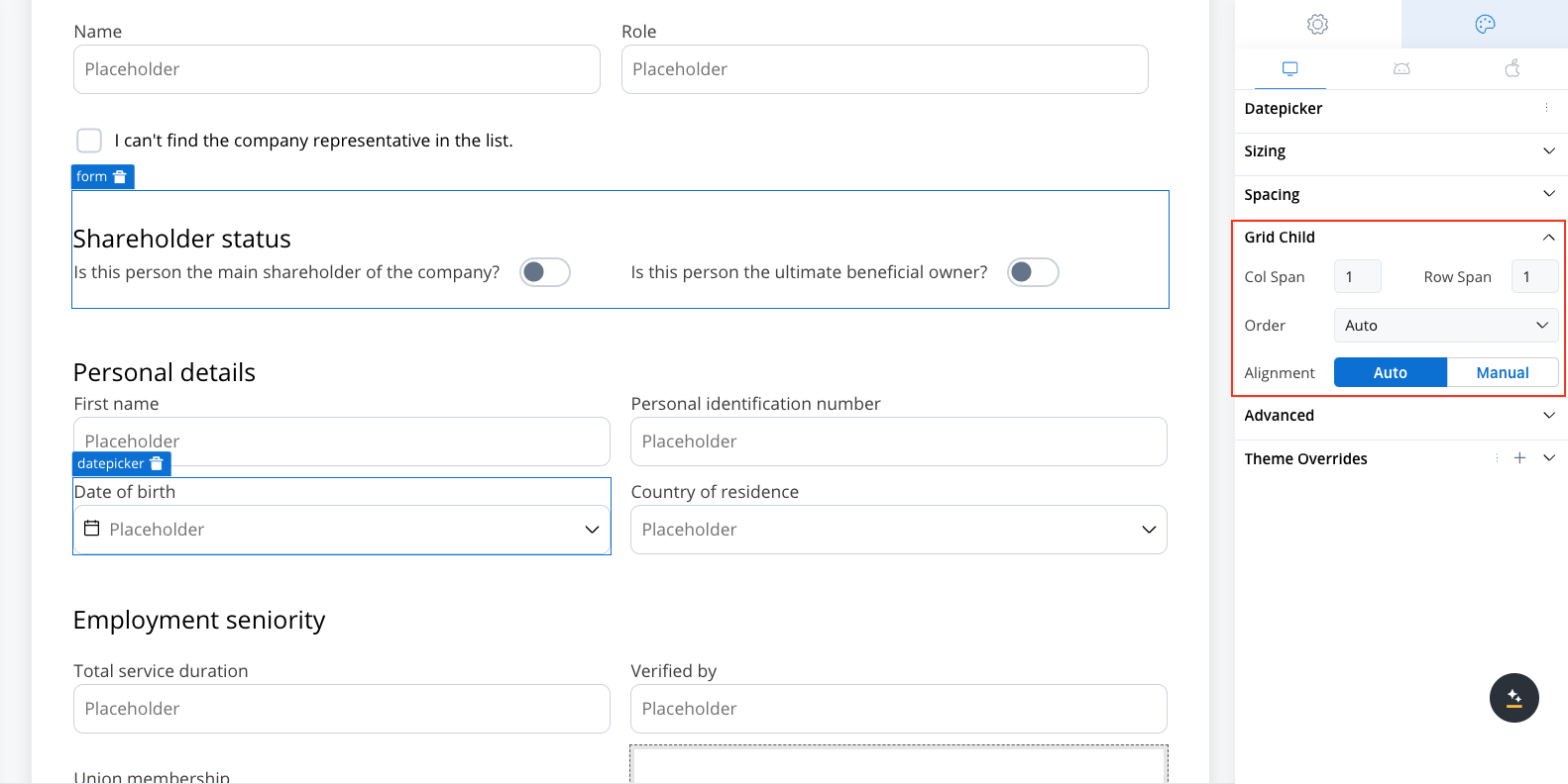
Grid child settings
When configuring a grid, individual child components can be further customized:- Column Span: Set how many columns a child component should span across.
- Row Span (Web Only): Set how many rows a child component should span.
Order property
The Order property controls the arrangement of elements within grid layouts. By default, elements follow the order in which they appear in the parent component’s array. However, this order can be customized using the following options:- Auto: The default setting that retains the order of elements as defined in the array (default value is
0). - First: Moves the element to the first position by setting its order to
-999.
- Last: Moves the element to the last position by setting its order to
999. - Manual: Allows for custom ordering by setting a specific numerical value.
Alignment in grid layouts
Proper alignment within grid layouts is essential, particularly when working with fixed-width columns or rows. By default, child elements will inherit alignment settings from their parent component, ensuring a consistent look and feel. However, you have the flexibility to override these default settings for individual child elements, allowing precise control over horizontal and vertical alignment. This customization is key to achieving the desired visual structure, especially when certain elements need specific positioning within the grid.Component details
- Components with gridLayout Property: The following components support the
gridLayoutproperty: - Components with gridChild Property: All components can have the
gridChildproperty, depending on their parent component’s layout. - Collection gridLayout: Within collections, the
gridLayoutproperty specifies only the number of columns, rowGap, and columnGap. - Collection Prototype: The collection prototype does not include the
gridChildproperty. - Grid and Flex Layout Application: The grid and flex layouts apply exclusively to the layout of child components. Elements such as Card titles, subtitles, and Form titles are excluded from these layout types.
Default style properties
- Grid Layout Defaults:
- Columns: 2
- ColumnGap: Inherited from component theming gap
- RowGap: Inherited from component theming gap
- Position: Start Start (aligning items to the start both horizontally and vertically)
- Grid Child Defaults:
- Position: Start Start (aligned to the start of both axes)
- ColumnSpan: 1 (spans a single column)
- RowSpan (Web): 1 (spans a single row)
- Order: 0 (Auto, maintaining the default order of elements)
Example using grid layout
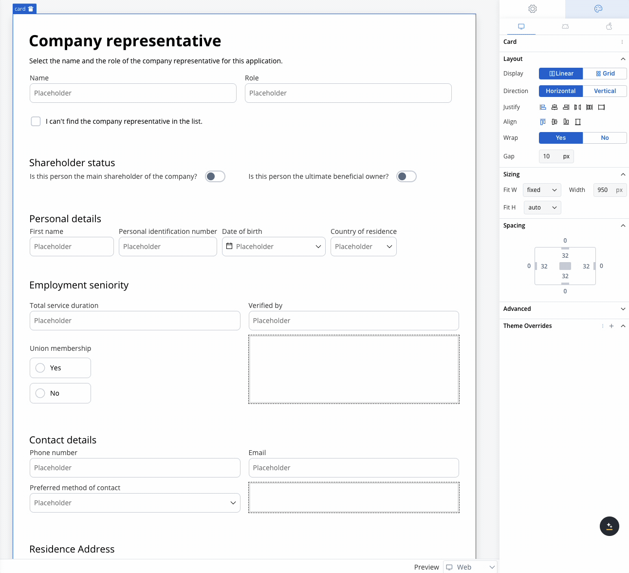
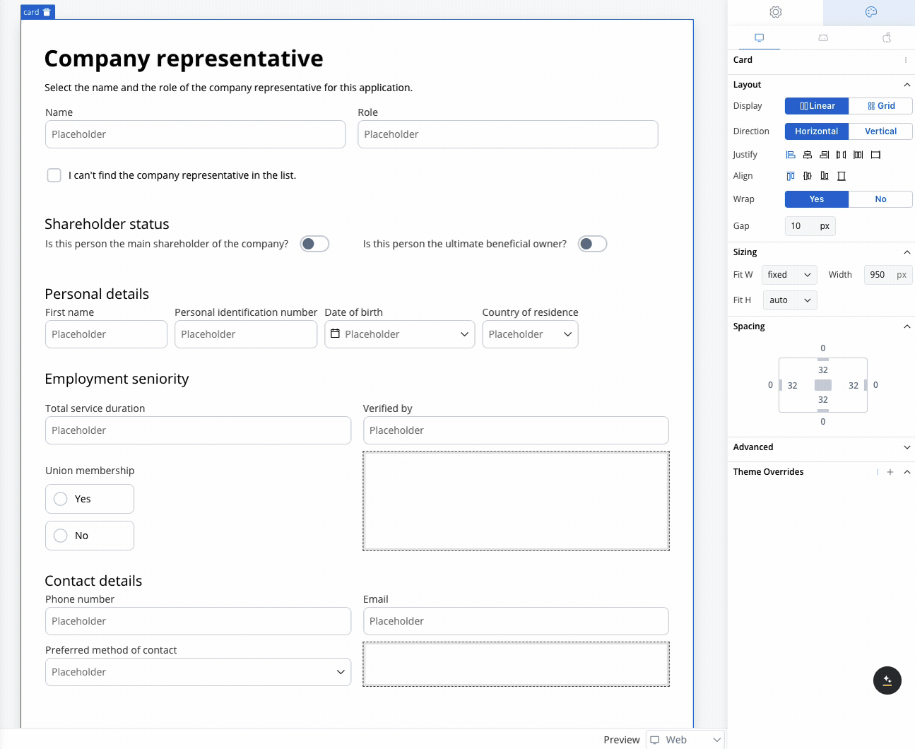
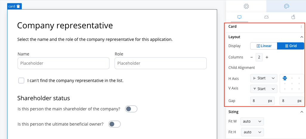
Use case: Customer Information Form This scenario involves a banking application that requires detailed input from a company representative, either during onboarding or for a loan application. Given the need to gather extensive information, a form with a 2-column grid layout is used to ensure clean and consistent alignment of fields.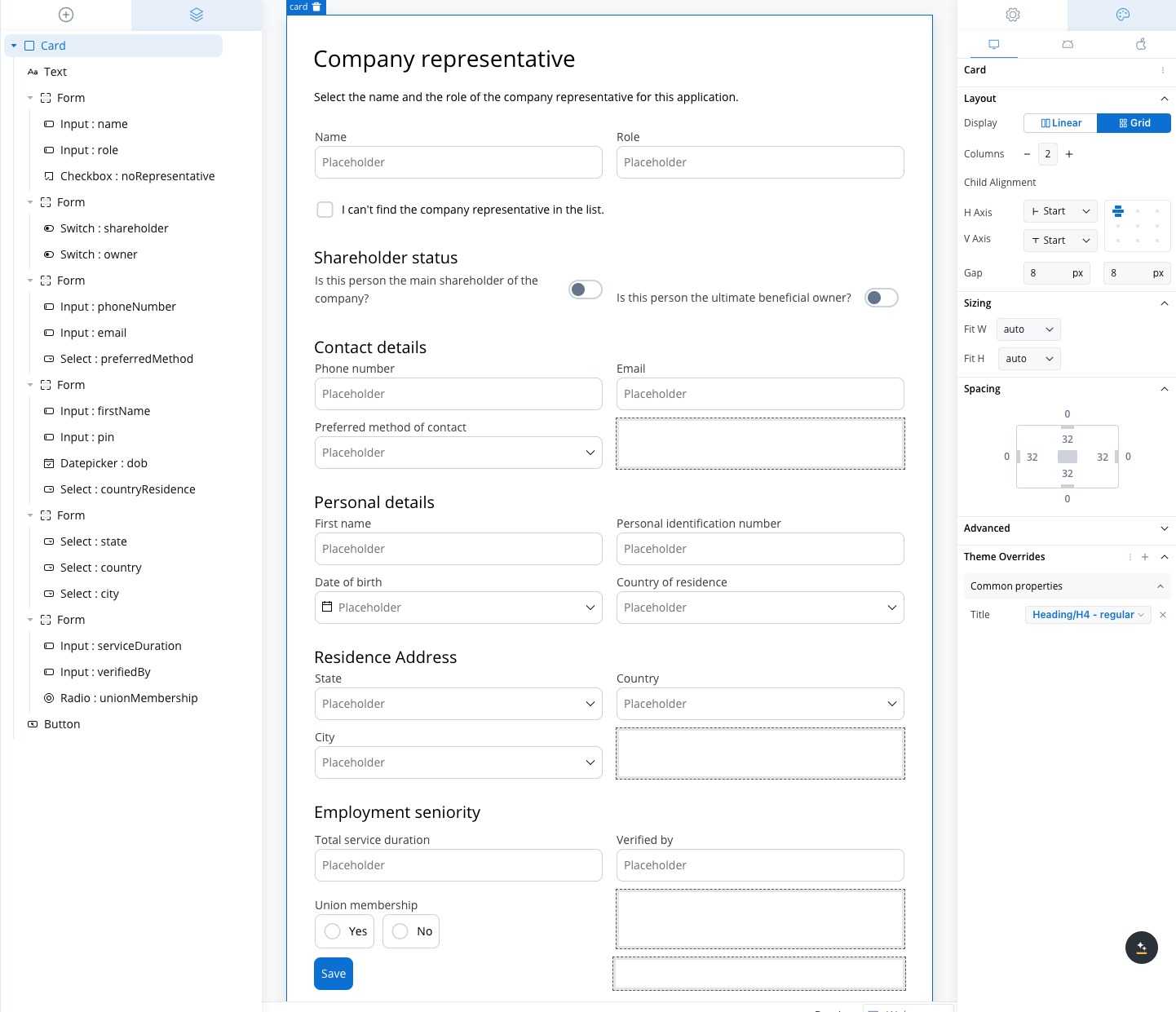
For forms requiring additional inputs, consider adjusting the Columns property to match the number of fields needed. Expanding the form layout will help organize the inputs efficiently and improve user experience.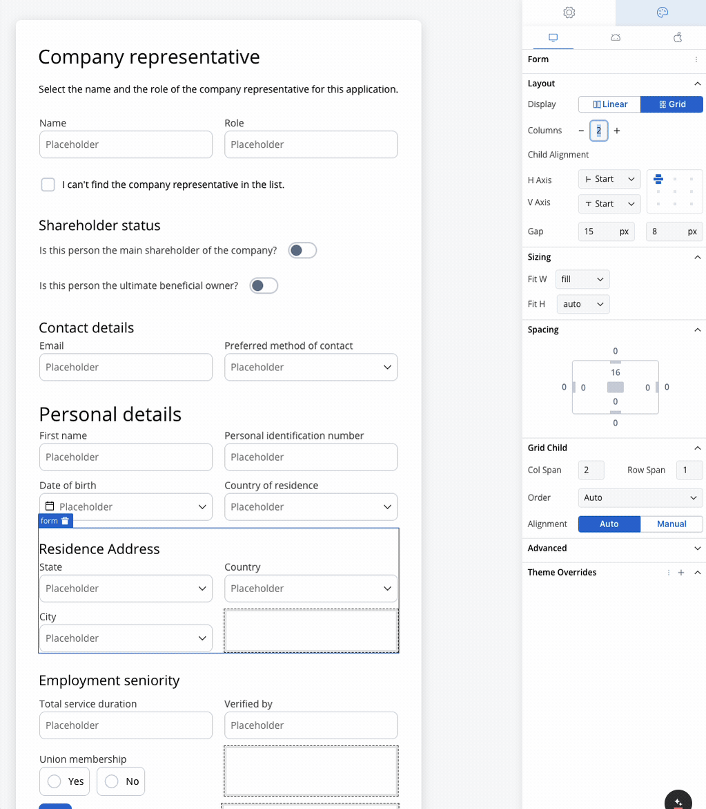
Role and Name
Role and Name
- Collect the company representative’s role and name.
- A 2-column grid layout can display the Role in one column and Name in the other, ensuring fields are aligned and easy to access.
Shareholder Status
Shareholder Status
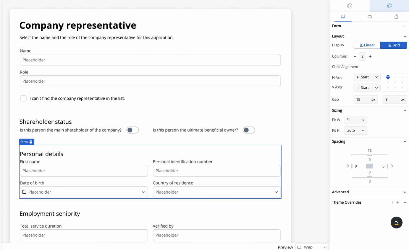
Personal Details
Personal Details
- Fields like First Name, Personal Identification Number, Date of Birth, and Country of Residence are collected.
- The 2-column grid aligns these fields horizontally, with appropriate spacing for readability.
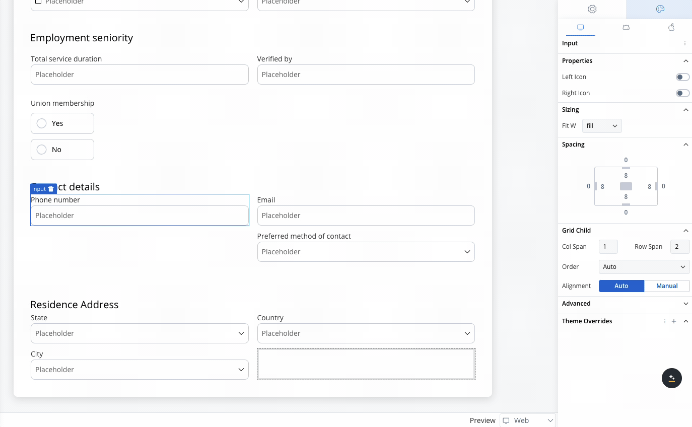
Contact Details
Contact Details
- Collects Phone Number, Email, and Preferred Method of Contact.
- The grid places Phone Number and Email side by side, while the Preferred Method of Contact dropdown spans the row.
Residence Address
Residence Address
- Collect State, Country, and City.
- A 3-column grid displays these fields in a single row, simplifying navigation for the user.
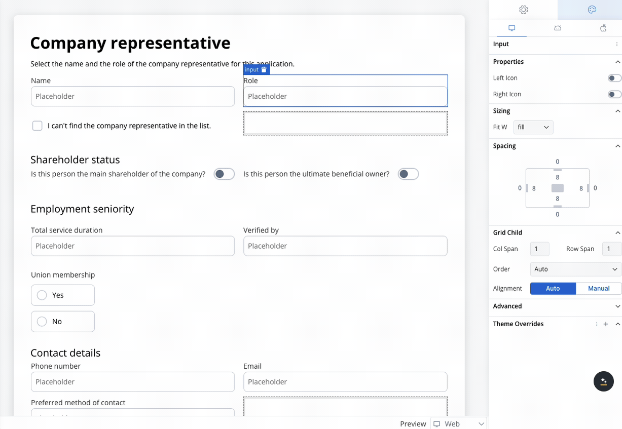
Employment Seniority
Employment Seniority
- Capture employment history such as Total Service Duration and Verified By.
- A 2-column grid aligns these fields for easy comparison, avoiding misalignment or unnecessary gaps.
Union Membership
Union Membership
- A simple yes/no radio button for union membership.
- A grid layout ensures the options are neatly aligned for a clean, straightforward selection.
Best Practices
To ensure an optimal user experience and consistent visual design, consider these best practices when using grid layouts:- Minimize Fixed Widths: Avoid using fixed widths for child components in a grid. Relying on flexible sizing allows the grid to adapt smoothly across different screen sizes and devices. Only use fixed widths when absolutely necessary (e.g., for icons or buttons with defined sizes).
-
Consider Total Width: If you know the width of the screen is
X, ensure that the total width of your fixed-width elements doesn’t exceedX. This prevents layout issues like content overflow or misalignment across different devices. -
Use Column Span Thoughtfully: When setting the
columnSpanfor a grid child, ensure that the total spans across all elements do not exceed the number of columns. This ensures a consistent and predictable layout. -
Avoid Overcrowding: When adding numerous child components to a grid, be mindful of spacing (gaps) between elements. Proper use of
rowGapandcolumnGaphelps maintain clarity and reduces visual clutter. - Leverage Default Inheritance: Utilize the default alignment inheritance from the parent grid to ensure consistency. Only override alignment on child components when specific visual differences are needed.
-
Use
AutoOrder When Possible: Stick with theautoorder setting for most child components, unless a specific element needs to appear first or last. This will help maintain logical reading and visual flow without complex manual ordering. - Always Be Mindful of Mobile Screen Width: When designing for mobile, always consider the narrower screen width. Ensure that grid layouts adapt gracefully, perhaps switching from a grid to a linear layout, or adjusting spacing and sizing to fit within the mobile screen’s constraints without causing overflow or misalignment.
- Test Across Platforms: Given potential differences in behavior between web, iOS, and Android platforms, test your grid layout across these platforms to ensure consistent performance and avoid unexpected behavior like overflow or misalignment.
- Avoid Fixed Widths on Columns: Instead of setting fixed widths on the entire column, apply fixed widths to the individual elements inside the grid cells. This ensures more flexible layouts that adapt to different screen sizes, especially on mobile devices, without causing issues like overflow or misalignment.
FAQs
I have a Grid with 10 elements, and I set one element's order to `5`. Why is it not displayed as the fifth element?
I have a Grid with 10 elements, and I set one element's order to `5`. Why is it not displayed as the fifth element?
A: The order property works relative to other elements. If other elements are set to 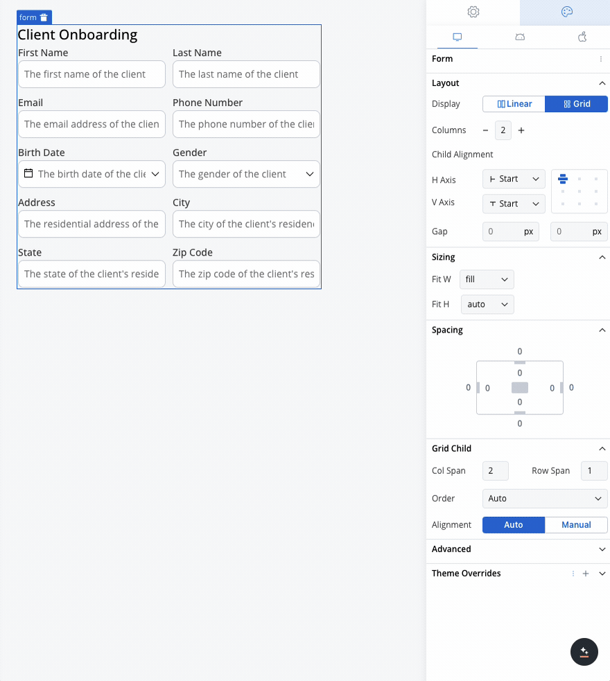
auto (which equals 0), then the element with order 5 will be placed after all the 0 elements, making it appear last.What should I be cautious about when working with a Grid layout?
What should I be cautious about when working with a Grid layout?
A: Be careful with using fixed widths in Grid layouts. Fixed widths can lead to unexpected behavior, especially on different devices. It’s better to use flexible sizing options whenever possible to maintain a responsive and predictable design.