Text
The “Text” UI element serves as a tool dedicated solely to presenting text within your user interface. Whether it’s paragraphs or descriptions, the “Text” UI element. Through manipulation of embedded CSS properties, you’re afforded to edit the visual appearance and formatting of text, aligning it with your design preferences.Markdown compatibility
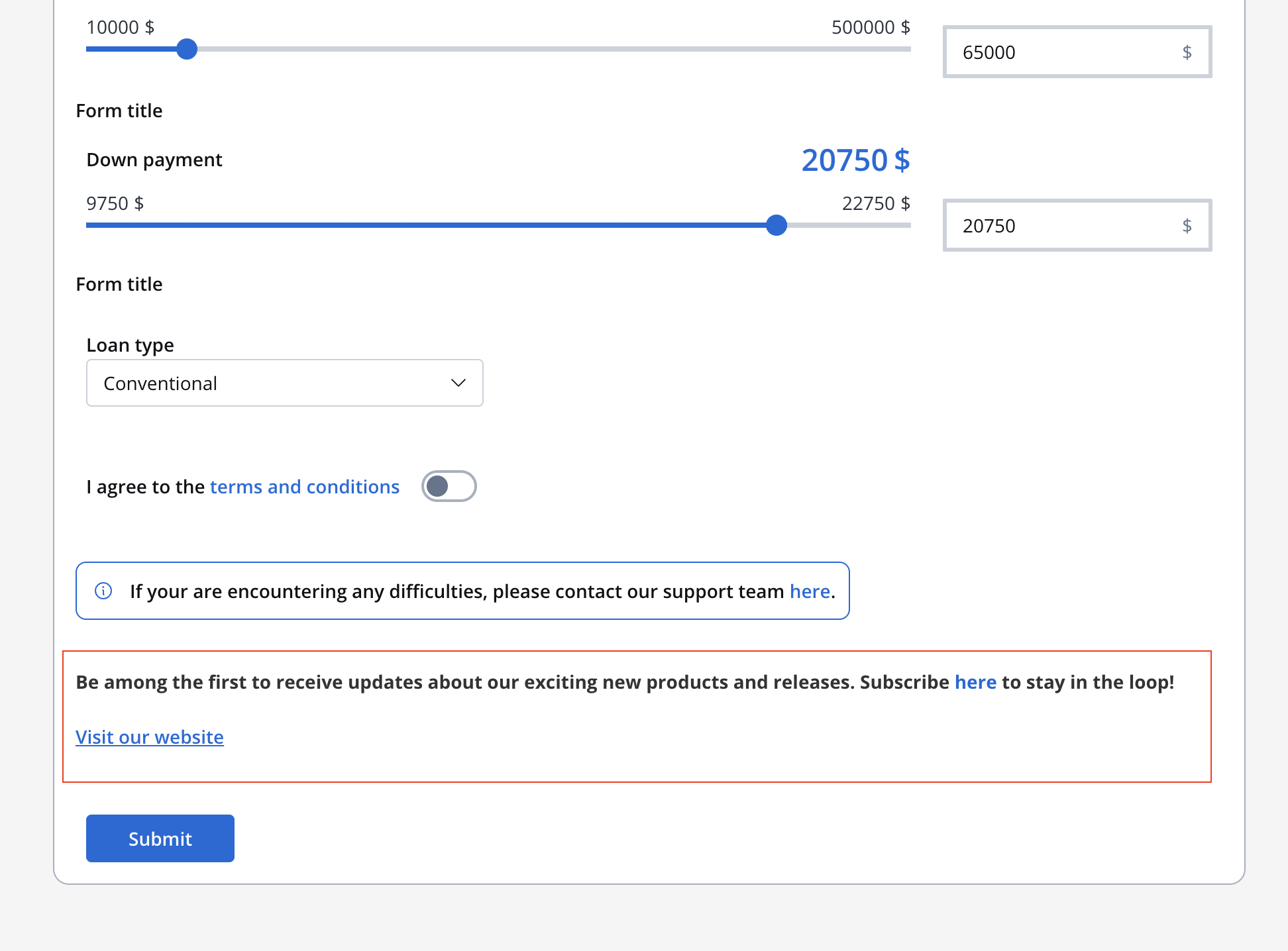
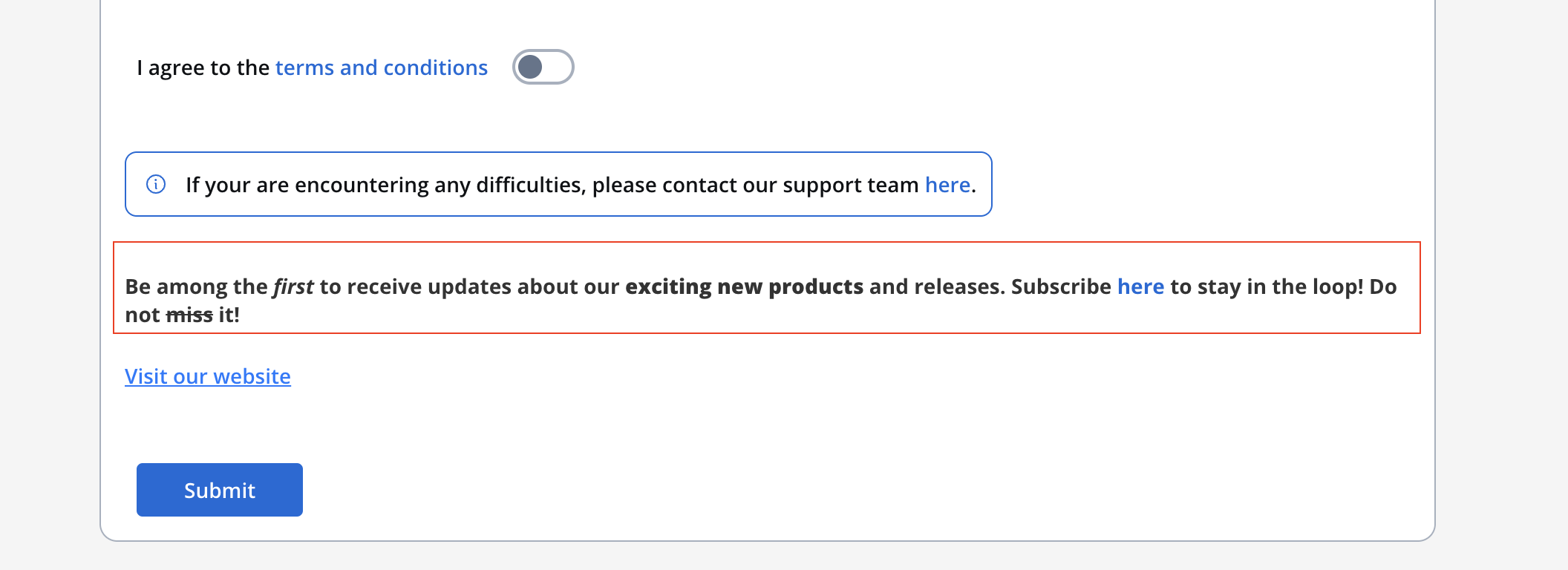
The Text UI element gives you with the flexibility of Markdown formatting. You can enhance your text using various markdown tags, including:- Bold
- italic
- bold italic
- strikethrough
- URL
Text styling
The Styling section provides you with granular control over how your text is displayed, ensuring it aligns with your design vision.Spacing:
Adjust the spacing around your text, setting the margin as follows: 16px 0 0 0 0 0 0 16px.Sizing:
Choose “Fit W” to ensure the text fits the width of its container.Typography
Define the font properties:- Font family: Choose the desired font family.
- Font weight: Define the thickness of the font.
- Font size: Specify the font size in pixels (px).
- Height: Set the line height in pixels (px).
- Color: Determine the text color.
Align
Determine the text alignment.Link
Links are essential for navigation and interaction. The “Link” UI element creates clickable text that directs users to other pages or external resources.Configuring the Link element
The Link component provides a simple way to create hyperlinks in your application interface.Properties
- Label: The visible text for the link that users will click on.
- URL: The destination URL for the link. This property supports:
- Static URLs (e.g.,
https://example.com) - Datastore keys for dynamic URL construction (e.g.,
${application.externalUrl}) - Combination of static text and dynamic values (e.g.,
https://example.com/${application.userId}/profile)
- Static URLs (e.g.,
Starting with version 4.7.9, the Link component supports datastore keys in the URL property across all platforms (Web, iOS, and Android). This allows you to dynamically construct URLs using process data stored in the datastore.
Using datastore keys in URL
You can reference process data in your link URLs by using the${key} syntax:
Example:
If you have process data like:
- URL:
https://docs.example.com/view/${application.documentId} - Label: View Document
https://docs.example.com/view/12345.
Link behavior
- Links open in a new browser tab by default
- The link text can be styled using the standard typography styling options
- Links maintain accessibility standards with proper hover and focus states
Link styling
The Link element supports styling customization similar to the Text element:Typography
- Font family: Choose the desired font family
- Font weight: Define the thickness of the font
- Font size: Specify the font size in pixels (px)
- Color: Determine the link color (default and hover states)