Configurable properties
collectionSource: This property specifies the process key where a list can be found. It should be a valid array of objects.
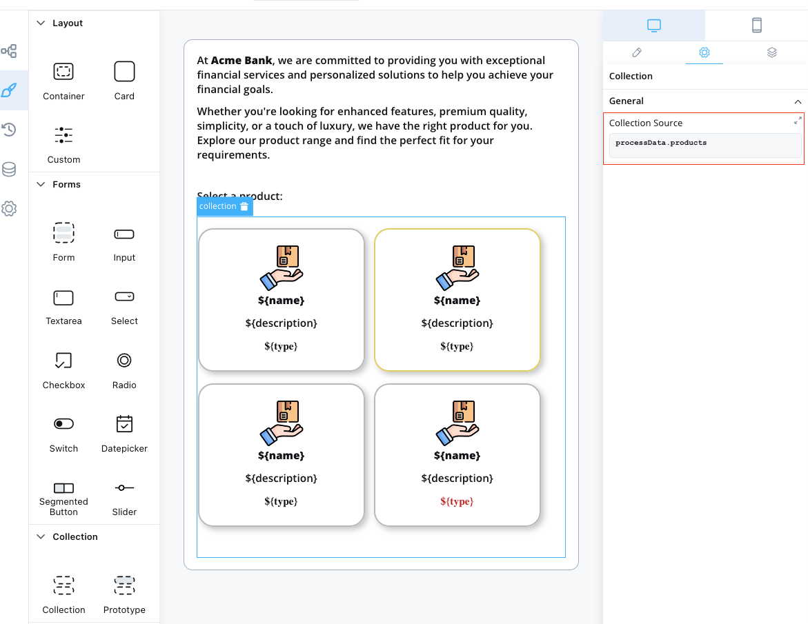
Example usage
Here’s an example of configuring a Collection component to display a list of products: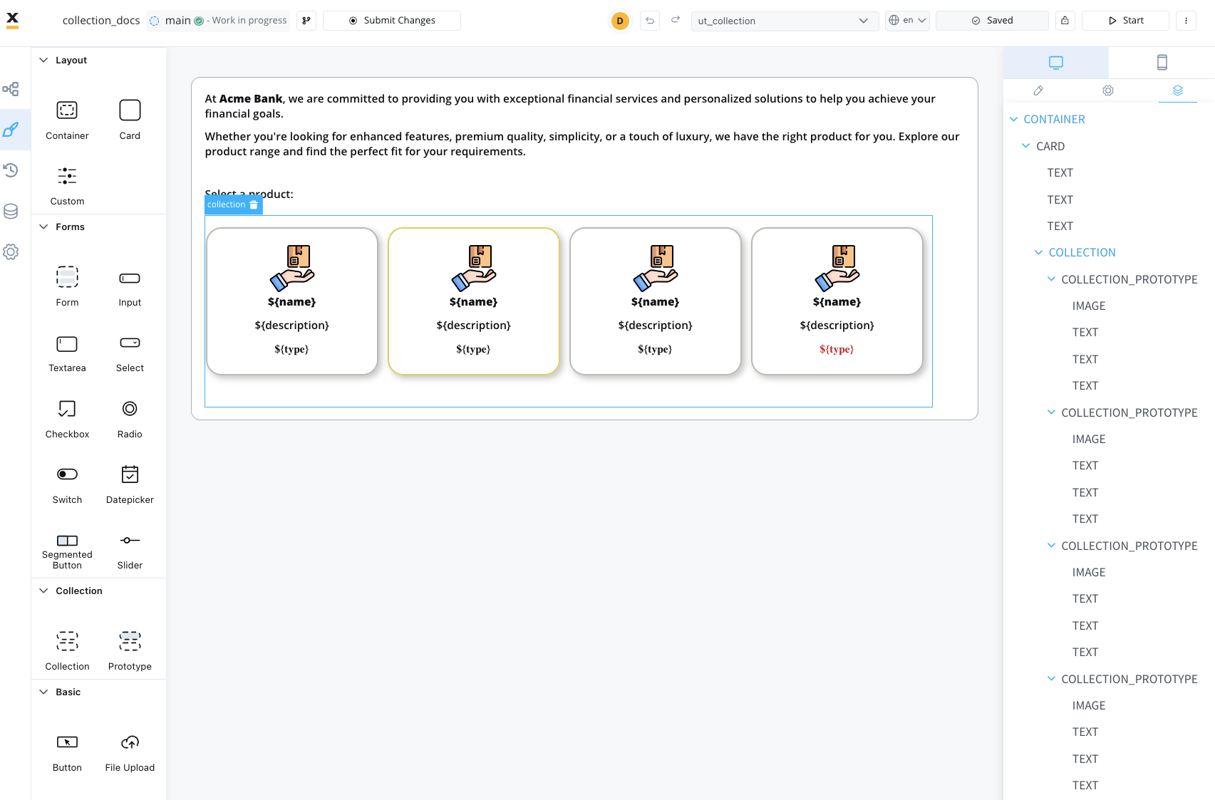
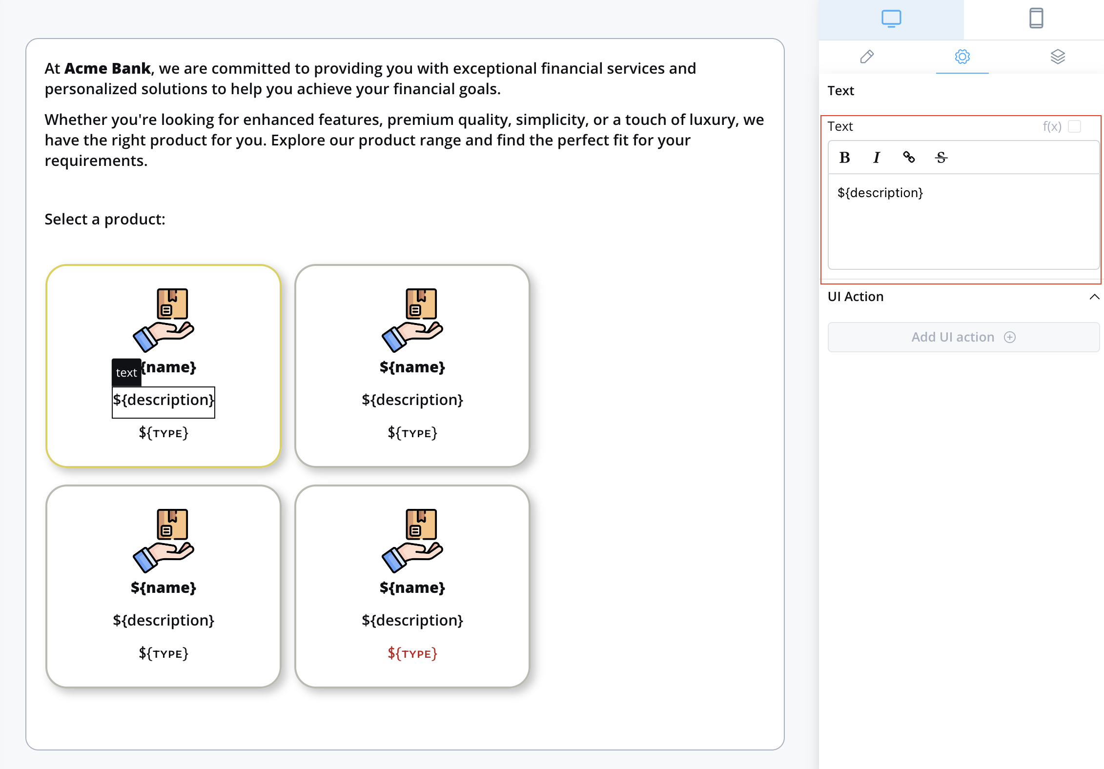
Collection prototype
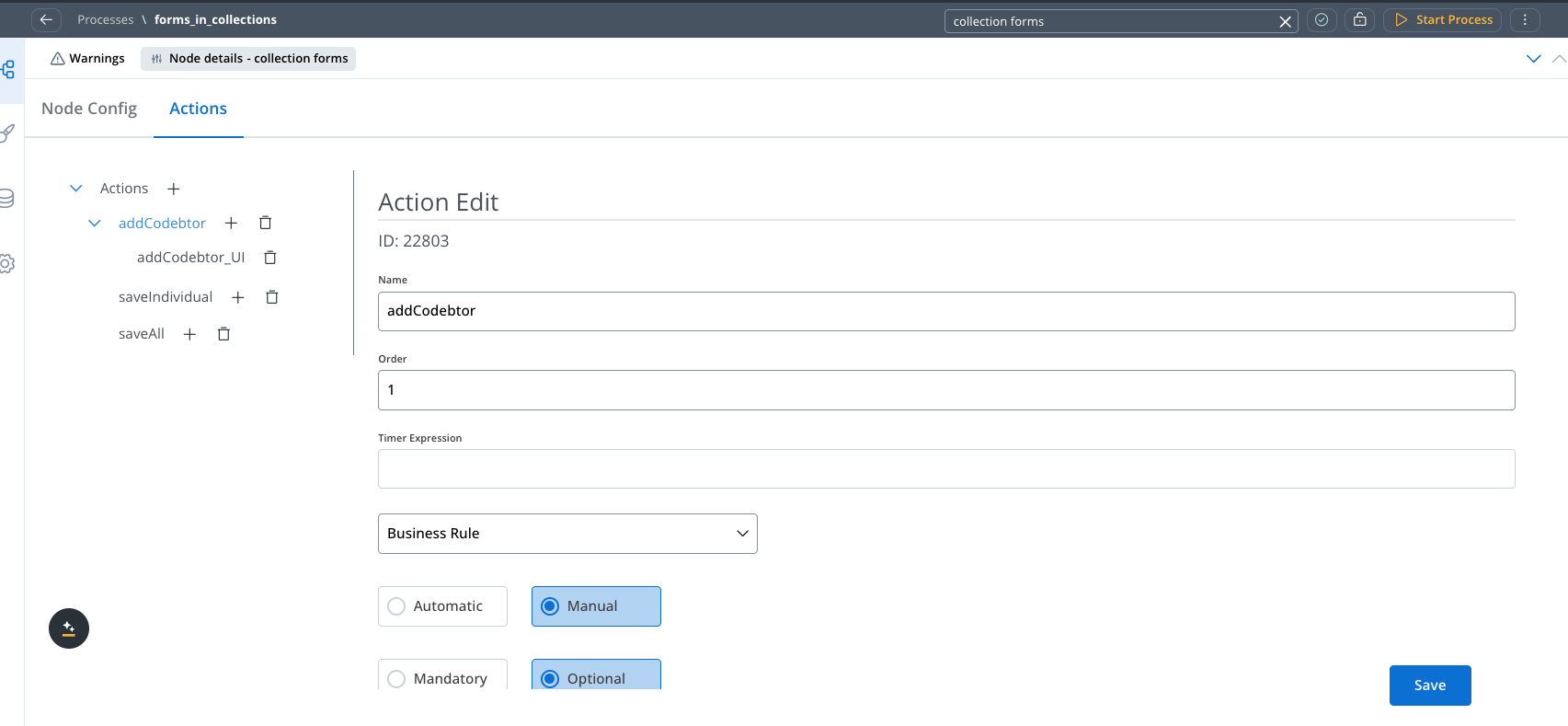
Forms in collections
Overview
Forms in Collections addresses common pain points in form design:- Dynamic Forms: No longer need custom development to support dynamic forms that show different form elements based on certain conditions
- Repeatable Sections: Create forms with repeatable sections like adding co-debtors, comments, or any list of similar items
- Flexible Validation: Support both individual item validation and bulk validation scenarios
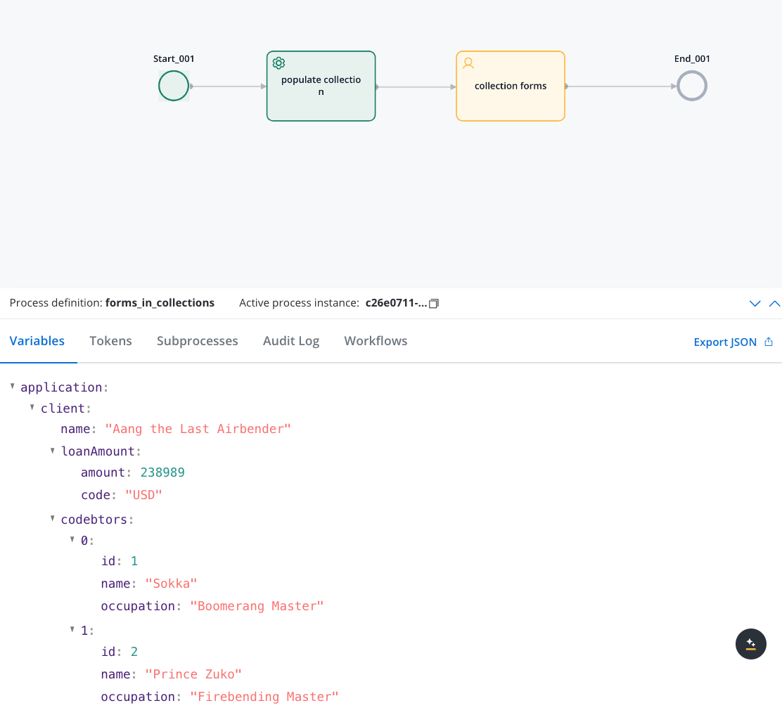
application.clients[0].name).How it works
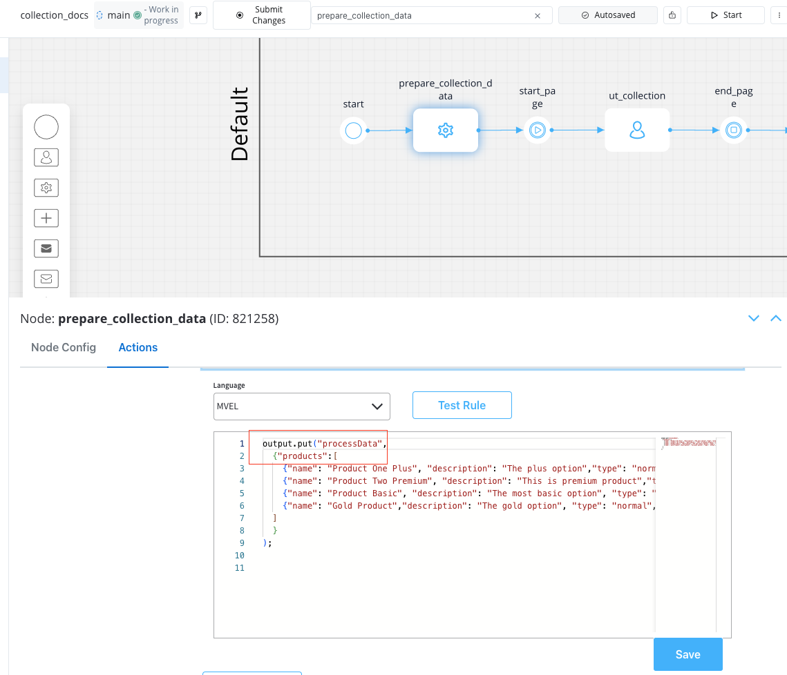
When you add forms to a collection prototype:- Data Structure: Your process data contains an array of objects (e.g.,
application.clients) - UI Configuration: Collection component points to your array, and Form components are placed inside Collection Prototypes
- Key Generation: Form field keys are automatically prefixed with the collection path and item index
- Runtime Behavior: Each collection item gets its own form instance with properly scoped keys
Implementation guide
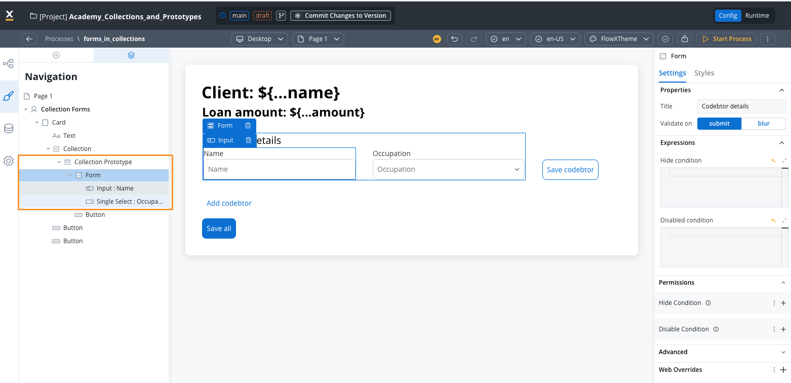
Prepare your data structure
Create the Collection component
- In the UI Designer, add a Collection component
- Set the Collection Source to point to your array (e.g.,
application.client.codebtors) - The collection will iterate through each item in the array
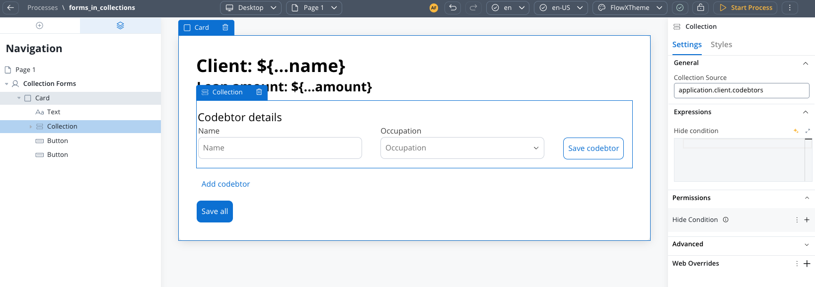
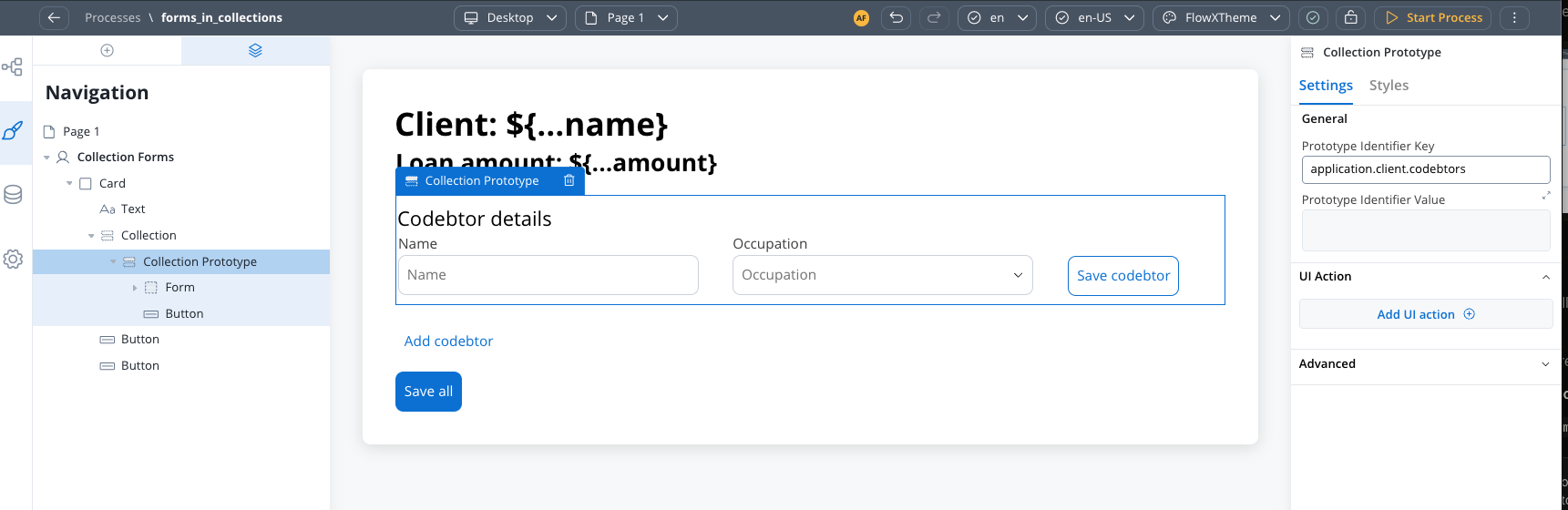
Add Collection Prototype with Forms
- Add a Collection Prototype as a child of your Collection component
- Configure prototype identifier. This is the key that will be used to identify the prototype.
- Drag Form components directly into the Collection Prototype
- Configure form fields with relative keys (e.g.,
name,email)
Configure form fields
- Use keys like
name,email,type(not full paths) - The system automatically constructs the full path at runtime
- Example:
namebecomesapplication.client.codebtors[0].namefor the first item
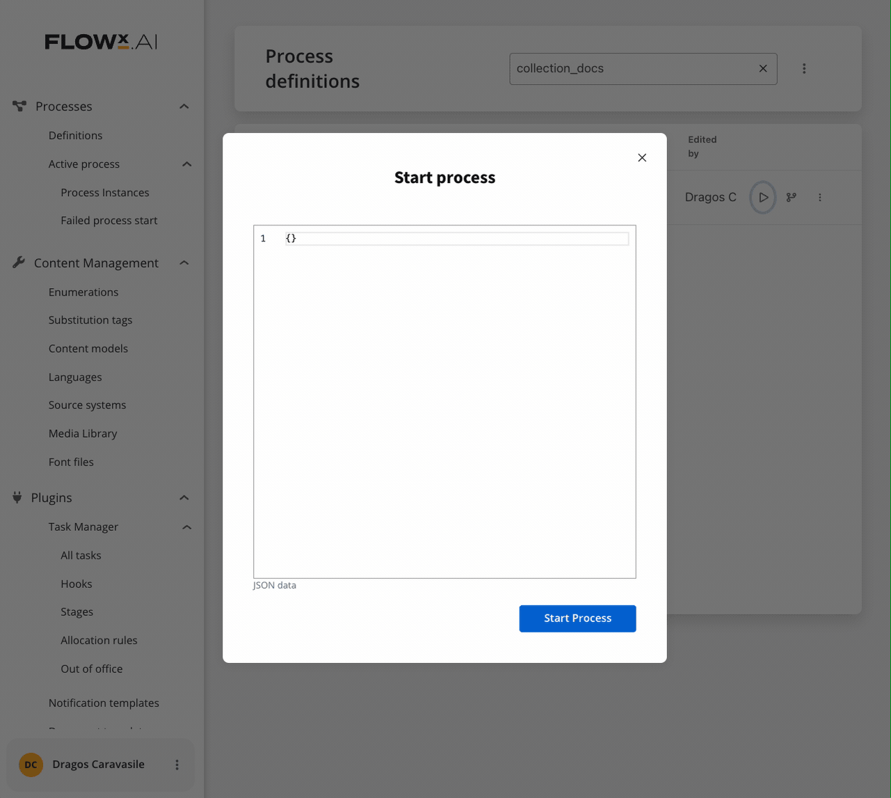
Saving scenarios
Forms in Collections supports two distinct saving approaches, each suited for different use cases:- Individual Item Save (Scenario 1)
- Bulk Save (Scenario 2)
- Place your Save button inside the Collection Prototype
- Configure a Collection Item Save Key on the UI action
- The edited object will be saved to this key
- Add a business rule to update the original array and send it back to the frontend
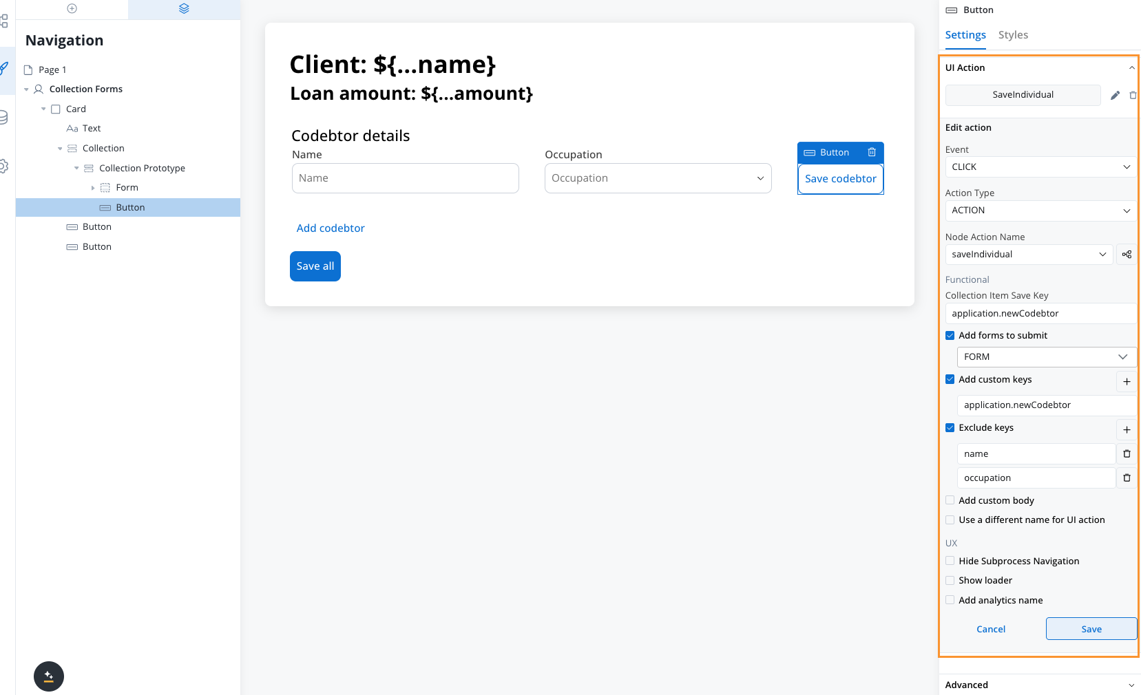
- Validates only the forms for the specific collection index where the action is triggered
- Saves individual items as they are edited
- Requires business rule to sync changes back to the main array
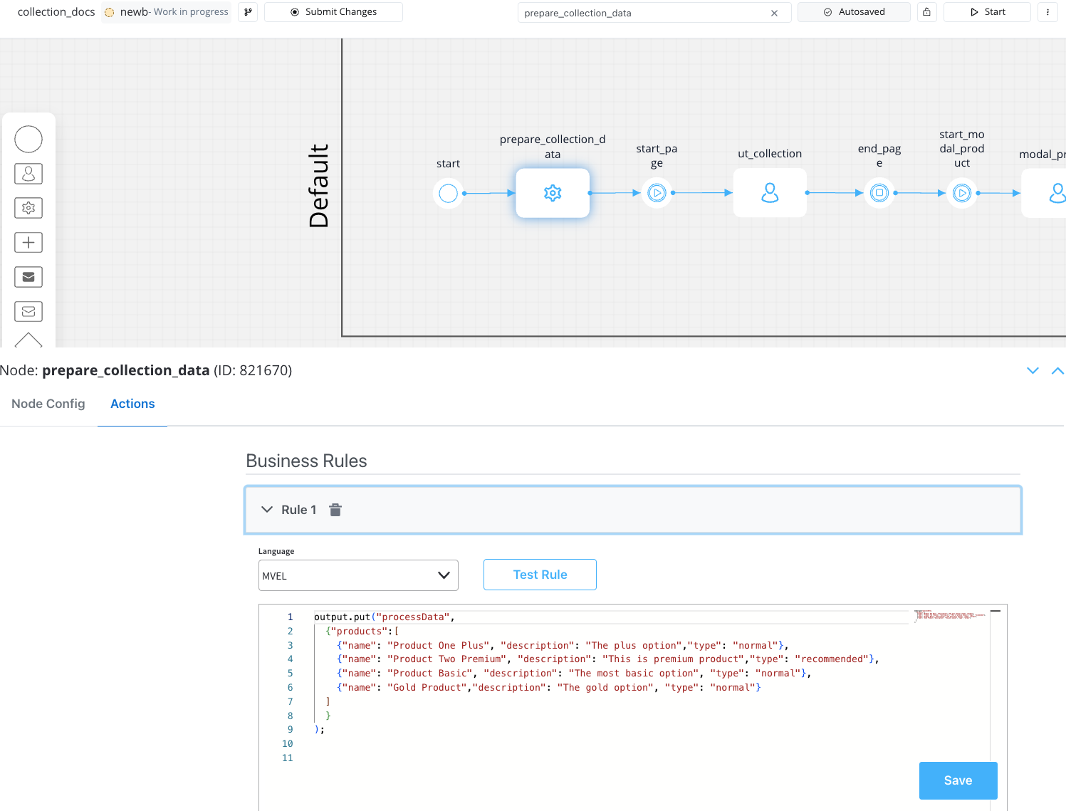
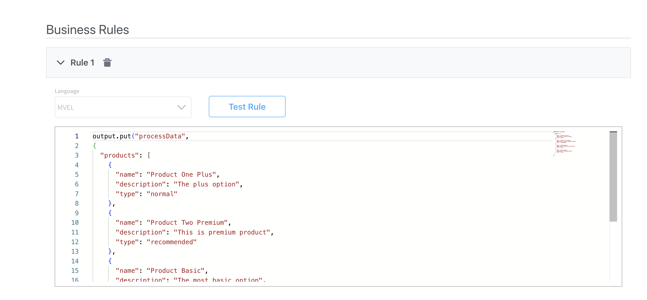
Business rule Examples
Business rule - Add new codebtor in the array
Business rule - Add new codebtor in the array
Send data to the frontend
Send data to the frontend
Key formation and validation
Understanding how keys work in Forms in Collections is crucial for proper configuration:Runtime key construction
Keys are automatically constructed using the full object path:Validation behavior
Individual Save Validation
Individual Save Validation
- Only validates forms for the specific collection index
- Example: If action is triggered on item 2, only
clients[1]forms are validated - Other items in the collection are ignored during validation
Bulk Save Validation
Bulk Save Validation
- Validates all forms across all collection items
- All items must pass validation for the save to succeed
- Comprehensive validation ensures data integrity across the entire collection
Configuration examples
Individual save example
Bulk save example
Troubleshooting
Forms not validating correctly
Forms not validating correctly
- Ensure
formsToSubmitincludes the correct form identifiers - Check that form fields have proper relative keys configured
- Verify the UI action is placed in the correct location (inside or outside prototype)
- For individual saves, confirm the Collection Item Save Key is configured
Data not saving properly
Data not saving properly
- For individual saves: Ensure business rule updates the original array
- For bulk saves: Verify Custom Key configuration captures the full array
- Check key formation by examining the process data structure
- Confirm the Collection Source points to the correct array
Can't hide form elements based on external variables
Can't hide form elements based on external variables
Frequently asked questions
Can I hide form elements based on variables outside the collection?
Can I hide form elements based on variables outside the collection?
What happens to null values in form fields?
What happens to null values in form fields?
How are keys formed at runtime?
How are keys formed at runtime?
name becomes application.clients[0].name for the first collection item.Do I need business rules for both saving scenarios?
Do I need business rules for both saving scenarios?
- Individual Save (Scenario 1): Yes, you need a business rule to update the original array
- Bulk Save (Scenario 2): No, the entire array is saved directly without additional business rules
Best practices
Choose the Right Scenario
Key Management
Validation Strategy
Data Structure
Common patterns
Display a list of plain values (string or number array)
A Collection binds each child component to a key on the current item, so the source must be an array of objects. You can’t bind a raw array of primitives like["Red", "Green", "Blue"] directly, because there is no key to point a component at.
To display a plain array, wrap each value in an object first, then bind a component to that key.
Transform the array into objects
value):[{ "value": "Red" }, { "value": "Green" }, { "value": "Blue" }].Point the Collection at the transformed array
displayed.colors).Bind a component to the wrapper key
value. At runtime it resolves to displayed.colors[0].value, displayed.colors[1].value, and so on.Delete an item from a collection
Collections do not have a built-in delete mechanism. To remove an item, use a business rule triggered from within the collection prototype.Add a delete button inside the Collection Prototype
- Event:
CLICK - Action Type:
ACTION - Node Action Name: your delete business rule
- Collection Item Save Key: a temporary key (e.g.,
itemToDelete) — this saves the clicked item’s data so the business rule knows which item to remove
Create the delete business rule
Send the updated array back to the UI
Add an item to a collection dynamically
To let users add new entries to a collection (e.g., an “Add” button), create a business rule that appends a new object to the source array.ACTION) pointing to this business rule. Then send the data back to the UI with a Send Data to User Interface action.
Filter a collection using form controls
Collections do not have built-in filtering. To filter displayed items based on form selections, use the same pattern as Table cross-component filtering:- Keep the original data in one key (e.g.,
application.clients) - Store the displayed data in a separate key (e.g.,
displayed.clients) - Point the Collection’s Source to the displayed key
- On each filter dropdown’s
CHANGEevent, trigger a business rule that filters the original data and writes the result to the displayed key