Purpose
The FlowX.AI UI Designer is an intuitive interface creation tool for building user interfaces within FlowX.AI processes. It provides a visual editor where you can add, arrange, and configure UI components to create rich web interfaces for your business processes.Key capabilities
Multi-Platform Support
Create interfaces with platform-specific configuration and styling across Web, iOS, and Android
Visual Interface Design
Use a drag-and-drop environment to design diverse UI templates with various elements and components
Real-Time Preview
Preview your designs across different platforms and themes with live feedback
Component Library
Access ready-to-use UI components including form elements, containers, and specialized components
The UI Designer integrates with BPMN process flows, making it available for User Task nodes and Navigation Areas to create contextual user interfaces.
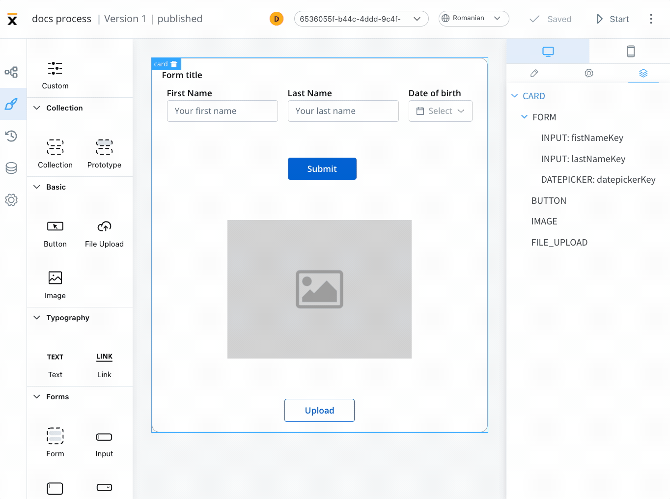
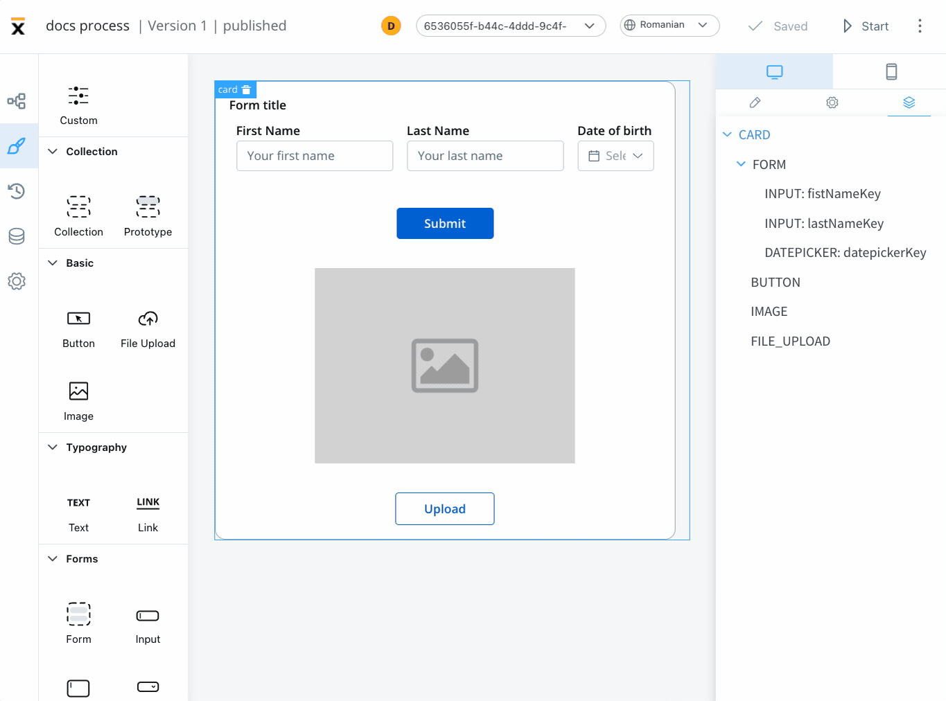
UI Designer Interface
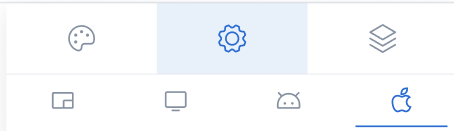
The UI Designer provides a comprehensive interface for creating and configuring user interfaces within your FlowX.AI processes.Platform Selection
The UI Designer supports multi-platform design with dedicated configuration tabs:- Web Platform
- iOS Platform
- Android Platform
Full Feature Support: Complete UI Designer functionality with all component types and navigation features
- All UI component types supported
- Full navigation area capabilities
- Zones with headers and footers
- Single page and wizard navigation types
Configuration Panels
The UI Designer interface consists of configuration sections for comprehensive component setup:Settings Tab
Settings Tab
Generic Configuration: Properties available cross-platform (Web, Android and iOS)Platform-Specific Settings: Override generic properties for specific platforms
- Property overrides (Title, Subtitle, Helper text)
- Expression overrides (Hide conditions)
- Import/export functionality between platforms
Styles Tab
Styles Tab
Theme Integration: Components inherit styling from the active theme by defaultTheme Overrides: Customize component appearance beyond theme settings
- Platform-specific styling
- Conditional styling (for Text, Link, Container elements)
- Import/export styles between platforms
Preview
Preview
Multi-Platform Preview: Switch between platforms to preview designs
- Real-time platform switching
- Theme selection for preview
- Visual estimation for mobile platforms
iOS and Android previews are estimates to help visualize mobile views.
UI Components Available
The FlowX.AI platform offers a variety of ready-to-use UI components for creating rich web interfaces:Root Components
Root Components
Form Elements
Form Elements
Data Collection Components: Essential for collecting user information
- Input: Text input fields
- Textarea: Multi-line text input
- Select: Dropdown menus
- Checkbox: Multiple selection options
- Radio: Single selection from options
- Switch: Toggle controls
- Datepicker: Date and time selection
- Slider: Range and numeric input
- Segmented Button: Multi-option selection
Action and Display Elements
Action and Display Elements
Interactive and Display Components:
- Buttons: Action triggers and navigation
- File Upload: Document and media upload
- Image: Media display
- Typography: Text and links
- Table: Structured data presentation
- Indicators: Status and message display
Collections
Collections
Dynamic Content Components:
- Collection: Dynamic lists of data
- Collection Prototype: Templates for collection items
Component Configuration
After adding a UI component, the right-side menu displays configuration options:- Settings Tab: Configure component properties and behavior
- Styles Tab: Customize appearance and apply theme overrides
- Platform Overrides: Adapt components for specific platforms
Navigation Areas Integration
Navigation areas can be configured through the UI Designer, providing:- Hierarchical navigation structure
- Platform-specific navigation capabilities
- Copy/paste functionality for consistency across platforms
Using the UI Designer
To access the UI Designer and start building interfaces:1
Open FlowX.AI Designer
Navigate to FlowX.AI Designer and select Definitions from the Processes tab.
2
Select Process
Choose a process from the process definitions list.
3
Edit Process
Click the Edit process button to enter editing mode.
4
Access UI Designer
Select a User Task node or a Navigation Area then click the brush icon to open the UI Designer.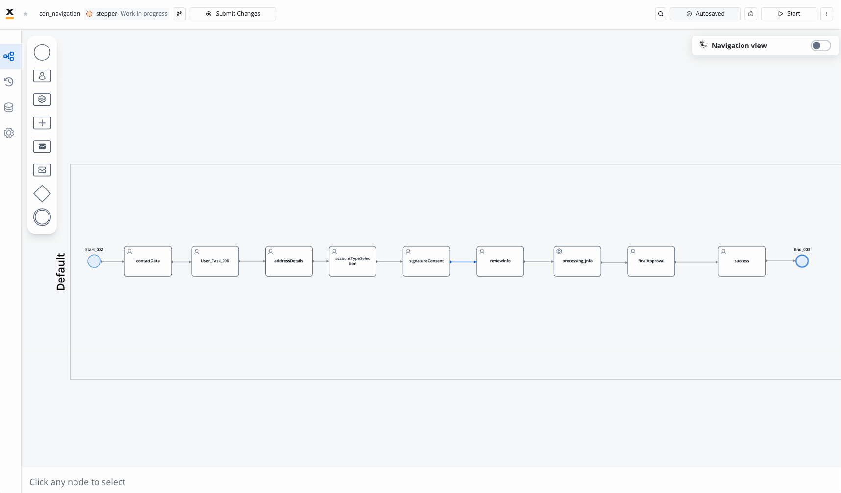
The UI Designer is available for User Task nodes and Navigation Areas elements, providing contextual interface design capabilities.
Productivity Features:
- Undo/Redo: Available within the UI Designer for actions such as dragging, dropping, or deleting elements
- Keyboard Shortcuts: Use keyboard commands for quick access to undo/redo functionality
- Drag and Drop: Support for dragging and dropping elements in the preview section
- Settings Panel: Right-side menu displays configuration options after adding components
Comprehensive Design Guides
Master the UI Designer with our detailed guides covering every aspect of interface creation:Screen Configuration Guide
How to Approach Screen ConfigurationLearn the systematic methodology for creating effective user interfaces:
- User journey definition and analysis
- Navigation pattern selection
- Information architecture planning
- Layout strategy implementation
- Platform-specific adaptations
- Validation and testing approaches
Best Practices
UI Designer Best PracticesEssential guidelines for creating accessible, performant interfaces:
- User-centered design principles
- Information architecture standards
- Component usage excellence
- Accessibility compliance (WCAG 2.1)
- Testing and quality assurance
- Maintenance strategies
Platform Considerations
Platform-Specific GuidelinesComprehensive platform optimization and limitation reference:
- Web, iOS, and Android design patterns
- Performance optimization strategies
- Platform-specific constraints and workarounds
- Security and privacy considerations
- Cross-platform testing protocols
Latest Features
Advanced UI Designer CapabilitiesDiscover the powerful features in FlowX.AI UI Designer:
- Conditional styling for dynamic interfaces
- Platform-specific configuration and overrides
- Advanced form components with validation
- Navigation areas integration
- Flexible layout configuration and reusable templates
Latest Features
FlowX.AI UI Designer includes several advanced features for creating rich, interactive user interfaces:Conditional Styling
Conditional Styling
Dynamic Styling Based on Data
- Apply styles conditionally based on process data
- Available for Text, Link, and Container elements
- Real-time evaluation with priority handling
- Platform-specific styling overrides
- Navigate to Styles tab → Conditional Styling section
- Add expressions and effects using JS Editor
- Define conditions and style overrides
Use conditional styling to highlight data patterns, outliers, or trends directly within the interface, reducing the need for multiple prototypes.
Platform-Specific Configuration
Platform-Specific Configuration
Multi-Platform Design Support
- Universal configuration and styling across Web, iOS, and Android
- Platform-specific property overrides
- Generic settings with targeted customizations
- Import/export overrides between platforms
- Settings tab with platform selection
- Override system for properties and expressions
- Preview across different platforms
- Consistent yet platform-optimized experiences
Advanced Form Components
Advanced Form Components
Rich Form Element Support
- Input fields with validation (required, custom)
- Select components with CHANGE event handling
- Checkboxes and radio buttons with dynamic behavior
- File upload components with platform considerations
- Date pickers and sliders for enhanced input
- Required field validation
- Custom validation rules
- Conditional validation based on other fields
- Real-time validation feedback
Navigation Areas Integration
Navigation Areas Integration
Layout Configuration
Layout Configuration
Flexible Layout System
- Linear layout with direction, justify, align controls
- Grid layout support for complex designs
- Gap settings for proper spacing
- Wrap functionality for responsive behavior
- Available for containers and grouping components
Reusable UI Templates
Reusable UI Templates
Component Reusability
- Create modular UI components for reuse across processes
- Template hierarchy with data model support
- Input/output parameter mapping
- Visual components and layout focus
- Cannot include complex business logic
UI components
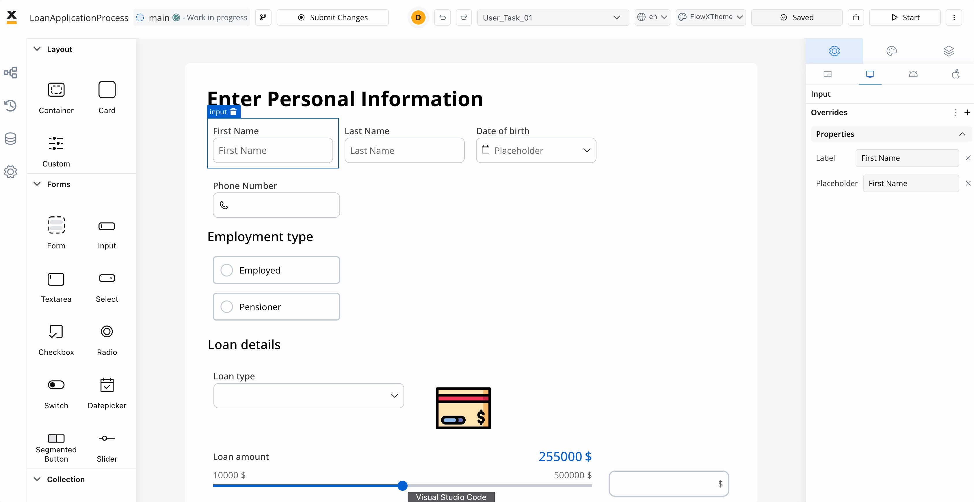
FlowX offers a wide range of UI components that can be customized using the UI Designer. For example, when configuring a card element (which is a root component), the following properties can be customized:Settings tab
Generic tab
This is where you configure the logic and assign process keys, UI actions, and other component settings that are common across all platforms (Web, iOS, Android).Platform-specific settings
For example, on Android, you might want to change the Card title to a shorter one. To override a general property like a title, follow these steps:1
Go to UI Designer
Access the UI Designer and select a UI Element, such as a Card.
2
Access platform-specific settings
From the UI Designer navigation panel, select the Settings tab, then select the desired platform
3
Perform the override
Click the ”+” button (next to “Overrides”) and select Properties -> Title, then input your desired value.
Settings overrides can always be imported/pushed from one platform to another: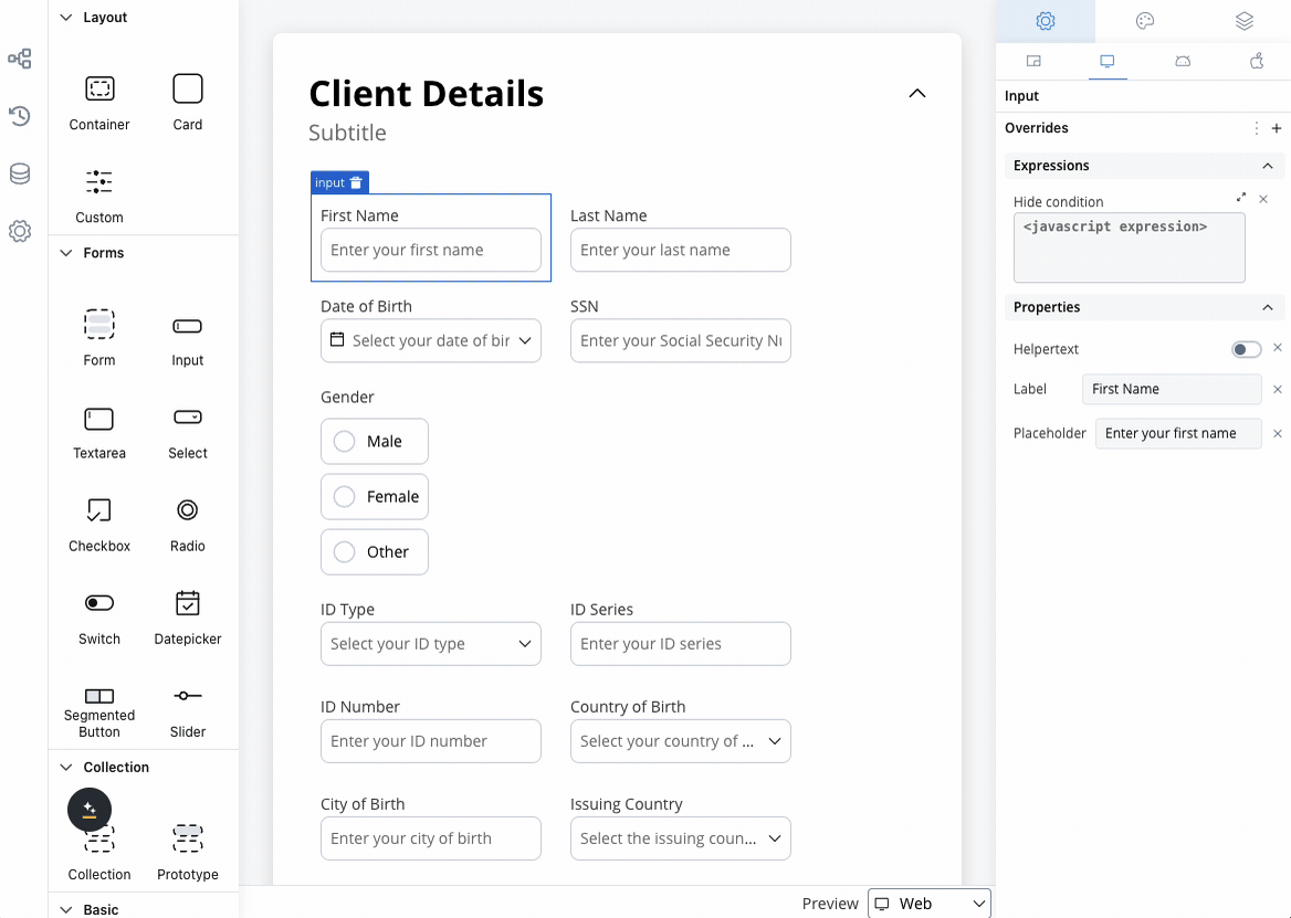
4
Preview your changes
Preview your changes in the UI Designer by navigating from one platform to another or by comparing them.
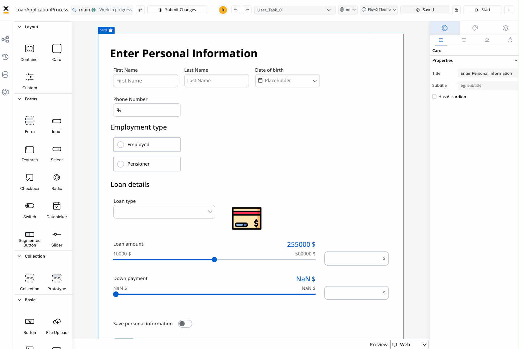
Keep in mind that the preview generated in the UI Designer for iOS and Android platforms is an estimate meant to help you visualize how it might look on a mobile view.
Hide expressions
By utilizing Overrides in the Settings tab, you can selectively hide elements on a specific platform. To achieve this:1
Select a UI component in the UI Designer, then navigate to Settings -> your desired platform -> Overrides (+) -> Expressions -> Hide.
2
Add your JavaScript Hide condition.
Permission-based expressions
UI components support role and username-based expressions for enhanced security and personalization through a structured interface: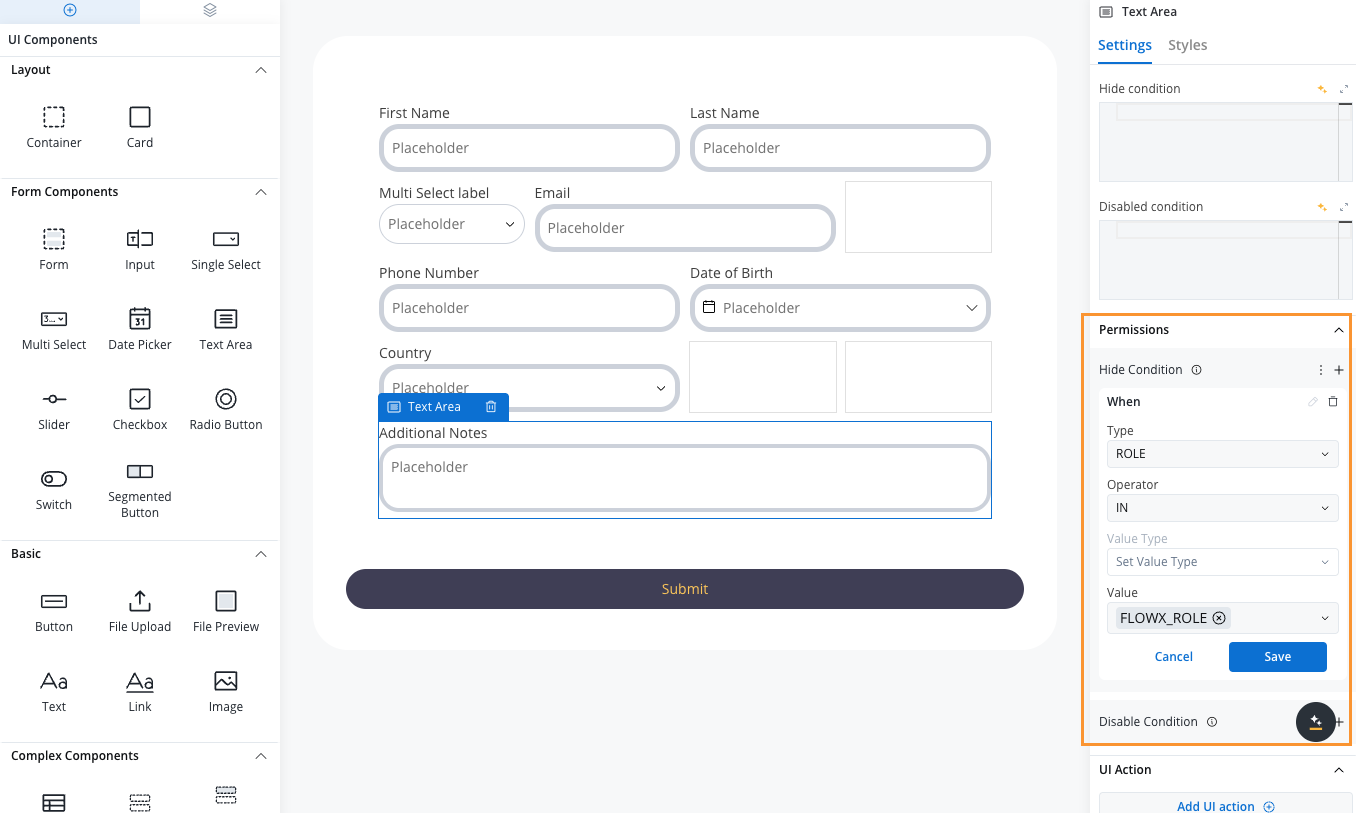
1
Select Component
Choose the UI component in UI Designer.
2
Access Permissions
Expand the Permissions section in the component properties panel.
3
Add Hide Condition
Click the + (plus) button next to Hide Condition.
4
Configure Parameters
Set the condition using the dropdown menus:
- Type: USERNAME, ROLE
- Operator: IN, NOT_IN
- Value Type: SWIMLANE_OWNER, PROCESS_DATA
- Value: Specific values or selections
5
Save Configuration
Click Save to apply the permission settings.
Styling tab
The Styles tab functions independently for three platforms: Web, iOS, and Android. Here, you can customize styles for each UI component on each platform.
Theme overrides can be imported from one platform to another.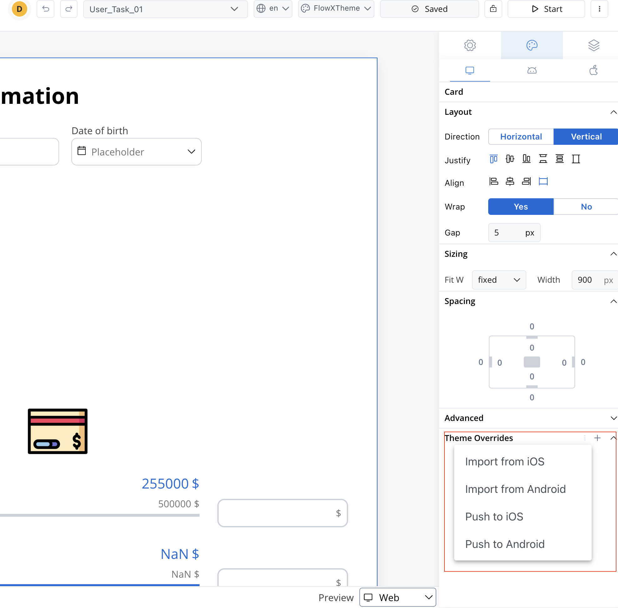
Theme Management
Copy/paste styles
Contextual menu functionality enables efficient style management:- Copy Style: Copy styling properties between compatible components
- Paste Style: Apply copied styles to selected components
- Copy to/from Platform: Share styles across Web, iOS, and Android platforms
- Multiple selection: Apply styles to multiple components simultaneously
- Input-like: Input, Select, Datepicker, Textarea, Multiselect
- Selection: Radio, Checkbox
- Container: Container, Form, Card, Collection, Collection Prototype
- Action: Button, File Upload
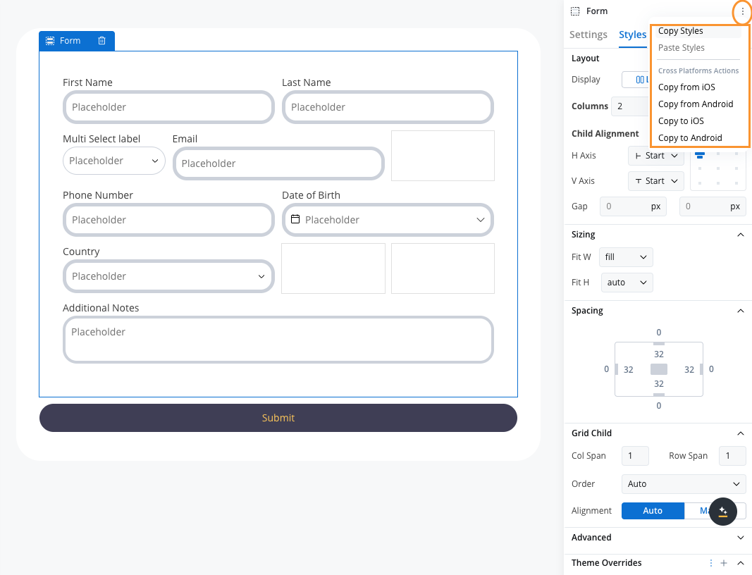
Copy/paste platform actions
Preview
When you are editing a process in UI Designer you have the possibility of having the preview of multiple themes: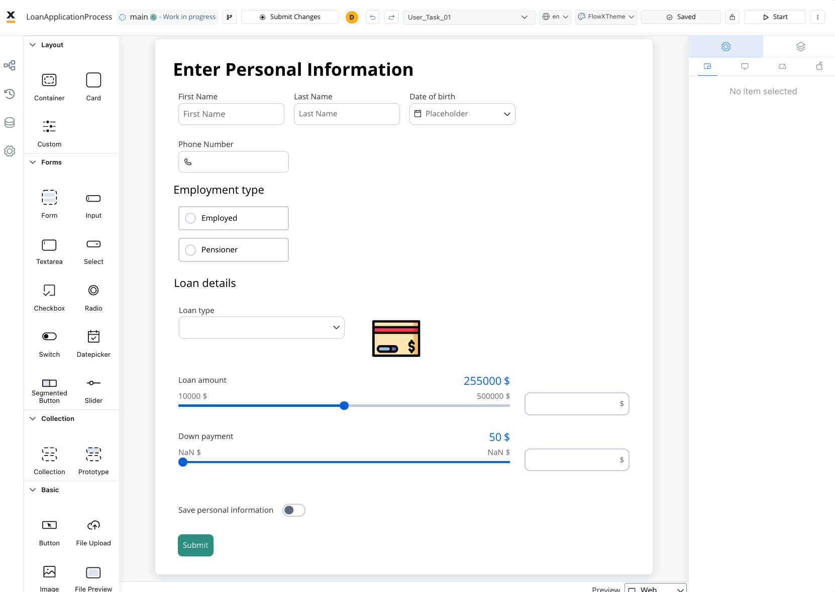
Overrides are completely independent of the theme, regardless of which theme you choose in the preview mode.
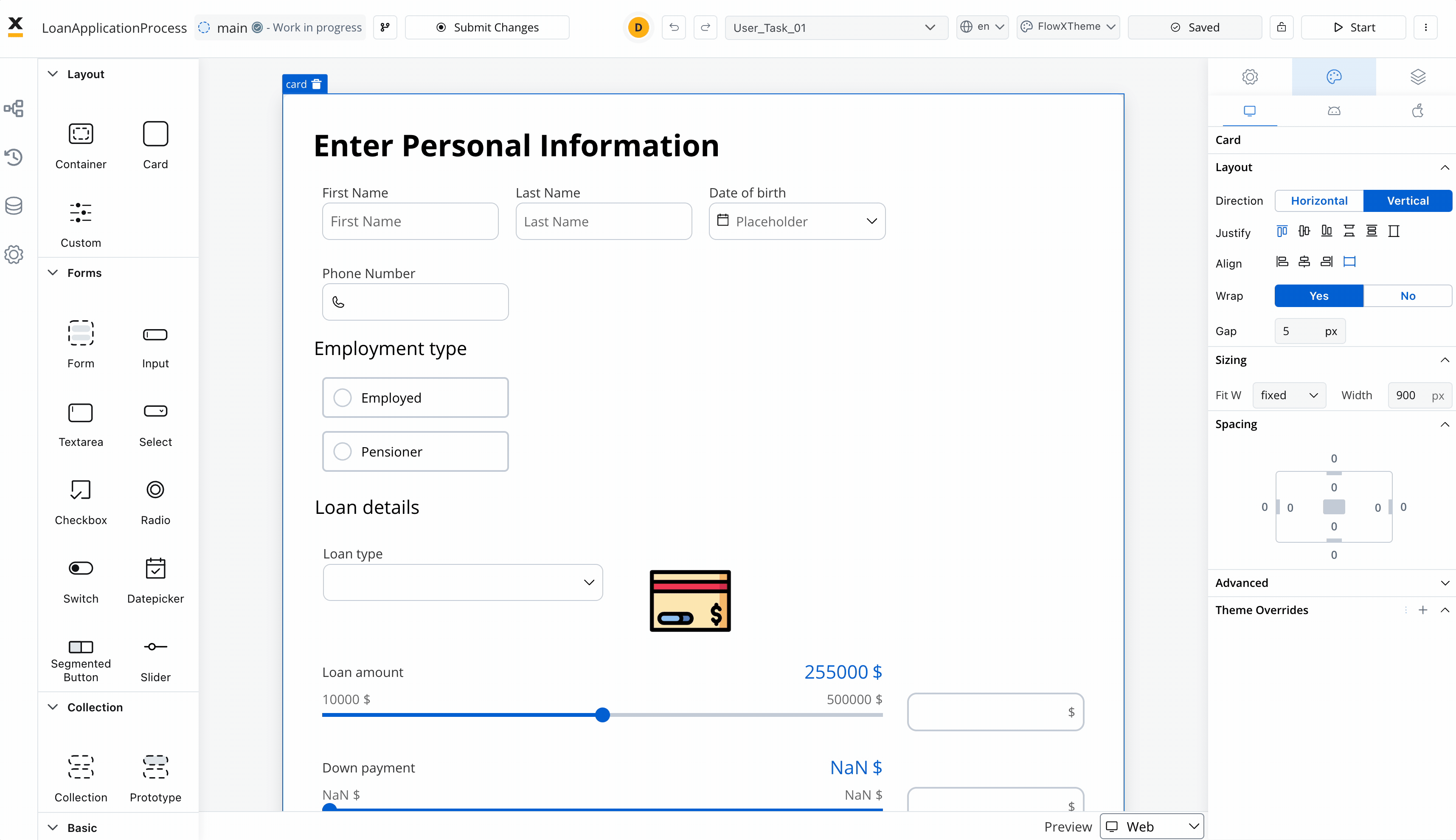
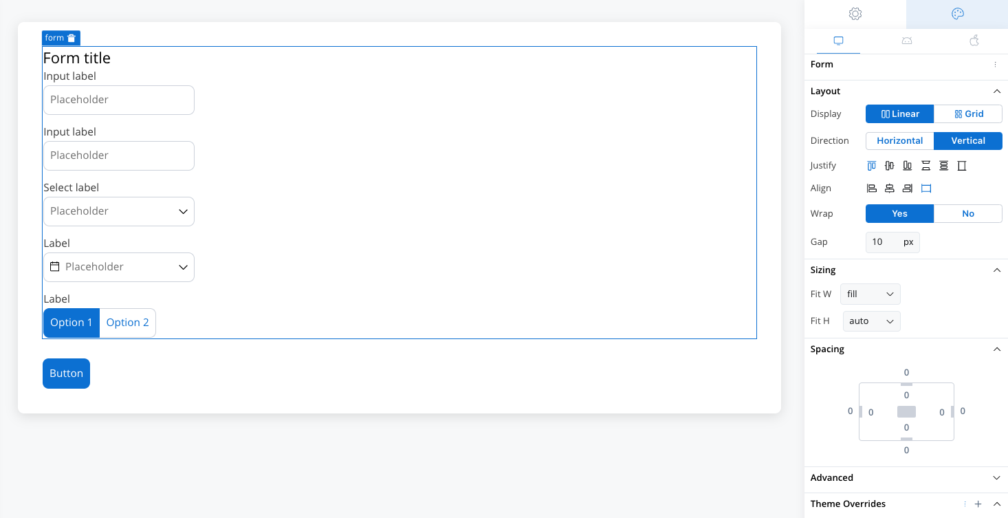
Layout
There are two main types of layouts for organizing child elements: Linear and Grid.- Linear Layout: Arranges child elements in a single line, either horizontally or vertically. Ideal for simple, sequential content flow.
- Grid Layout: Organizes elements into a structured grid with multiple columns and rows, useful for more complex, multi-dimensional designs.
- Platform-Specific Layouts: You can customize layout settings per platform (e.g., Grid on web, Linear on mobile) to ensure optimal responsiveness.
Both layouts offer options to customize direction, alignment, spacing, and wrap behavior for flexibility in design.
Layout
Sizing
By setting desired values for these props, you can ensure that all UI elements on the interface are the desired size and perfectly fit with each other. When adjusting the Fit W and Fit H settings, users can control the size and shape of the elements as it appears on their screen:- Fit W: fill, fixed or auto
- Fit H: fill, fixed or auto
Spacing
Margin and padding are CSS properties used to create space between elements in a web page:- margin - the space outside an element
- padding - the space inside an element
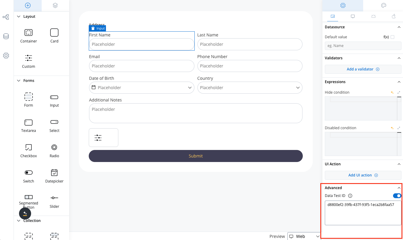
Advanced
- Advanced - for advanced customization, users can add CSS classes to pre-defined components, this option is available under the Advanced section
- Data Test ID - add custom test identifiers for automated testing and element interaction
Data Test ID
The Advanced section includes a Data Test ID field, allowing you to assign custom identifiers to UI components. This feature enhances automated testing by providing meaningful, easily identifiable selectors for UI elements. Key benefits:- Replace auto-generated test IDs with custom, readable identifiers
- Simplify element targeting in test scripts
Tree view
The Tree View panel displays the component hierarchy, allowing users to easily navigate through the different levels of their interface. Clicking on a specific component in the tree will highlight the selection in the editor, making it easy to locate and modify.
UI component types
Different UI component types can be configured using UI Designer. The UI components are available and can be configured only using user task nodes or navigation areas.Depending on the component type different properties are available for configuration.
Collection
Collection
Basic
Basic
Typography
Typography
- Text
- Link
Forms
Forms
Form elements are a crucial aspect of creating user interfaces as they serve as the means of collecting information from the users. These elements come in various types, including simple forms, inputs, text areas, drop-down menus (select), checkboxes, radio buttons, toggle switches (switch), segmented buttons, sliders and date pickers. Each of these form elements serves a unique purpose and offers different options for capturing user input.
Indicators
Indicators
Navigation
Navigation