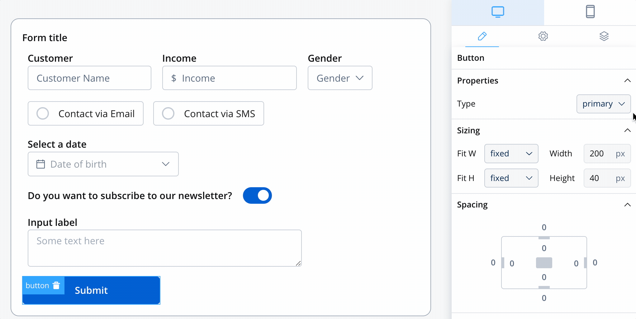
Buttons are essential interactive elements that enable users to trigger actions, navigate between sections, and upload files. FlowX.AI provides two specialized button types, each optimized for specific use cases with extensive customization options.
Button types overview

Button types overview

Choose the right button type for your specific use case:

Basic button

Basic buttons serve as the primary interaction mechanism for users to perform actions within your application. They can trigger process flows, send notifications, navigate to different sections, or execute business logic.

Configuration overview

Properties

Labels and basic settings

UI Actions

Event handling and action types

Styling

Visual appearance and icons

Basic button properties

UI actions configuration

Define the behavior when users interact with your button:
EventDescriptionUse Cases
CLICKTriggered when button is clicked/tappedAll button interactions
While CLICK is the primary event, the action type determines what happens when the event occurs.

Button styling & visual design

Button types

Choose from four distinct visual styles to match your design system:
Purpose: Main call-to-action buttonsCharacteristics:
  • High contrast, prominent appearance
  • Usually one per screen/section
  • Draws immediate attention
Use Cases: Submit forms, confirm actions, proceed to next step
Button type demonstration
For comprehensive CSS styling options, check our Styling Guide.

Icon integration

Enhance your buttons with meaningful icons:

File upload button

File upload buttons provide a specialized interface for file selection with built-in validation and user feedback. They’re essential for document submission, image uploads, and data import workflows.

Configuration overview

File upload buttons share many properties with basic buttons but include specialized file handling features:

File Properties

File type restrictions and validation

Validation

Size limits and error handling

User Experience

Feedback and progress indication

File upload properties

File upload example

Example configuration for an image upload button:
File upload example
Configuration Details:
  • Accepted Types: image/* (all image formats)
  • Max Size: 5 MB
  • Error Handling: Custom messages for type and size violations
  • UI Feedback: Progress indication and preview capabilities

File upload UI actions

File upload styling

File upload buttons have specialized styling options:
TypeAppearanceBest Used For
FillSolid backgroundPrimary upload actions
GhostOutlined styleSecondary upload options
TextText-only appearanceSubtle upload links

Best practices

Accessibility

  • Use descriptive labels that explain the button’s purpose
  • Ensure sufficient color contrast for all button states
  • Provide keyboard navigation support
  • Include ARIA labels for screen readers
  • Test with assistive technologies
  • Consider users with motor impairments (adequate button size)

User Experience

  • Place primary actions prominently and consistently
  • Use loading states for actions that take time
  • Provide clear feedback for successful/failed actions
  • Group related buttons logically
  • Avoid too many competing call-to-action buttons
  • Consider touch targets for mobile users (minimum 44px)

Visual Design

  • Maintain consistent button styling across the application
  • Use button hierarchy to guide user attention
  • Choose icons that are universally understood
  • Test button visibility in different lighting conditions
  • Consider color-blind users when relying on color alone
  • Ensure buttons look clickable and interactive

Performance

  • Optimize file upload handling for large files
  • Implement proper error handling and retry mechanisms
  • Provide progress feedback for long-running actions
  • Cache frequently used icons and styling
  • Test button responsiveness under load
  • Consider offline scenarios for critical actions

Common use cases

Basic button scenarios

Use CaseButton TypeIcon SuggestionAction Type
Form SubmissionPrimary✓ (checkmark)Process advancement
Cancel OperationSecondary✕ (close)Navigation back
Delete ItemGhost🗑 (trash)Data operation
View DetailsText👁 (eye)Navigation
Save DraftSecondary💾 (save)Data operation

File upload scenarios

Use CaseFile TypesSize LimitValidation Notes
Profile Photoimage/*5 MBSquare aspect ratio preferred
Document Upload.pdf,.doc,.docx25 MBOCR processing available
Data Import.csv,.xlsx50 MBColumn validation required
Media Galleryimage/*,video/*100 MBThumbnail generation
Backup Files.zip,.rar500 MBVirus scanning enabled

Platform considerations

Enhanced Features:
  • Drag and drop file upload support
  • Keyboard shortcuts for common actions
  • Hover states and advanced animations
  • Context menus for additional options
  • Multi-file selection capabilities