Configuring the text area element
Text area generic settings
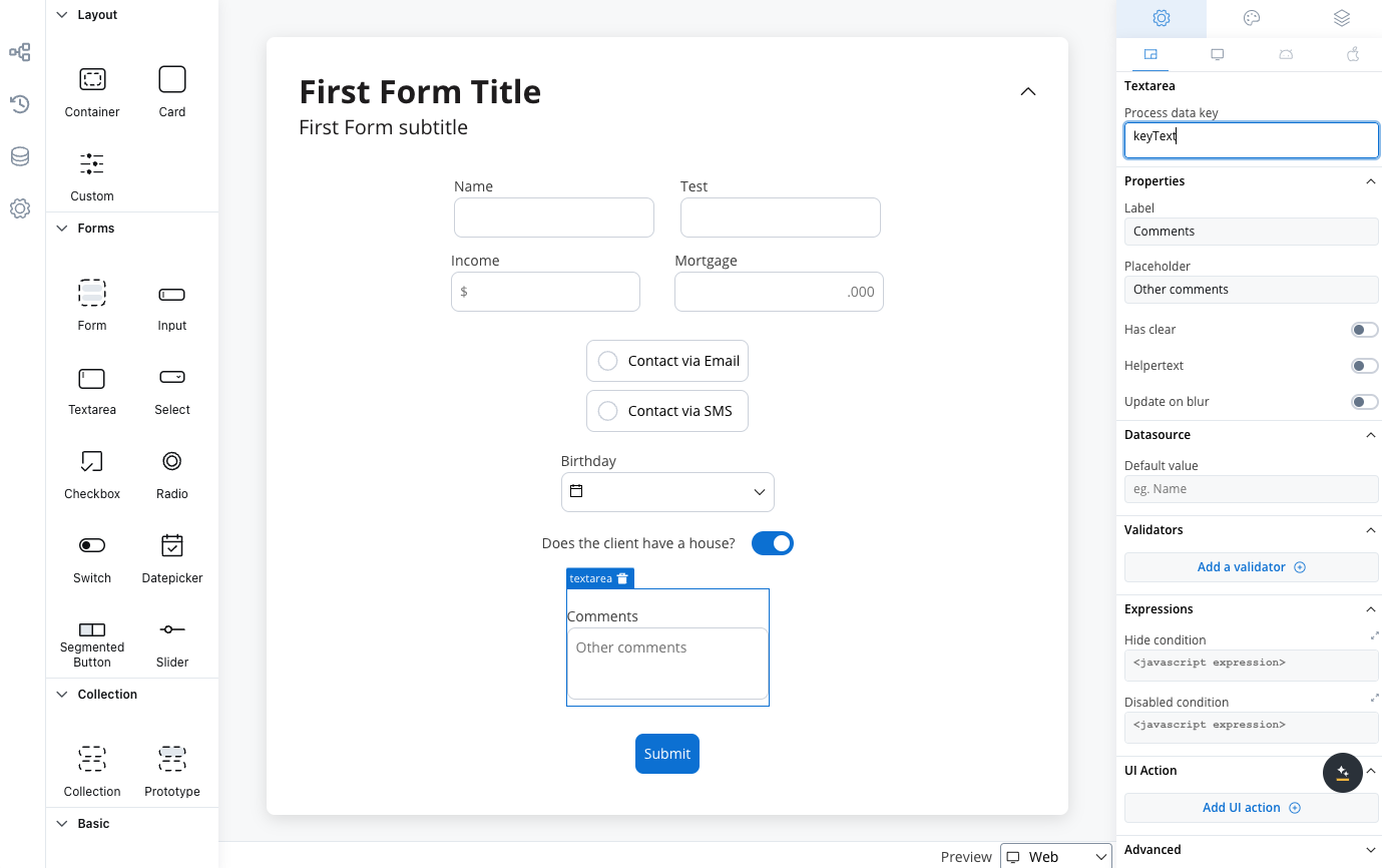
These settings added in the Generic tab are available and they apply to all platforms including Web, iOS, and Android:Prcoess data key
Process data key creates the binding between form element and process data, so it can be later used in decisions, business rules or integrationsProperties
- Label: The visible label for the text area element.
- Placeholder: Text that appears within the text area when it is empty.
- Has Clear: Option to include a content clear mechanism.
- Helpertext: Additional information about the text area field (can be hidden inside an infopoint).
- Update on Blur: Update behavior triggered when the text area loses focus.
Datasource configuration
The default value for the element can be configured here, this will autofill the text field when you will run the process.Validators
You can add multiple validators to a text area field. For more details, refer to Validators.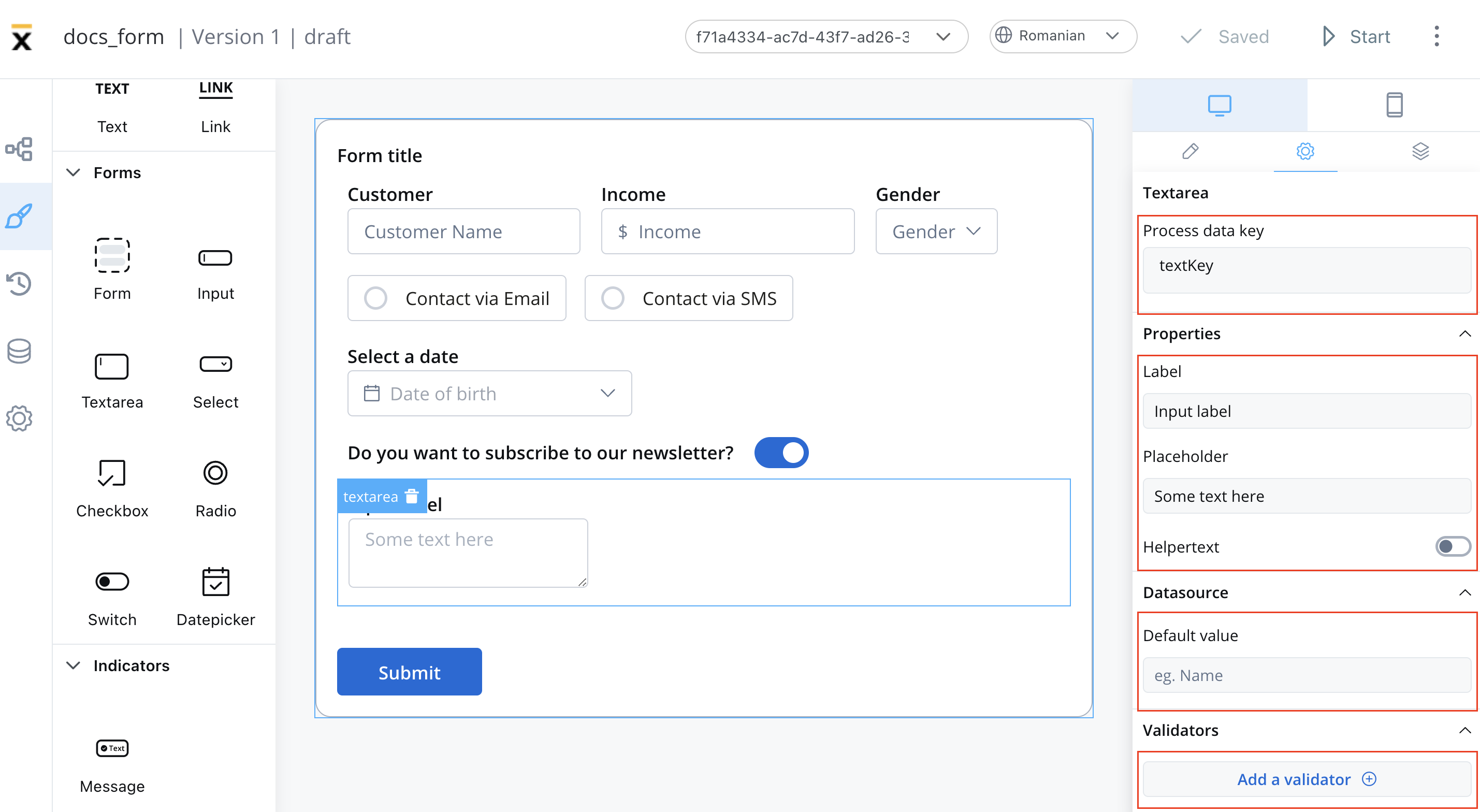
Hide/disable expressions
The text area’s behavior can be defined using JavaScript expressions for hiding or disabling the element. The following properties can be configured for expressions:- Hide condition: A JavaScript expression used to hide the text area when it is evaluated to your desired result.
- Disabled condition: A JavaScript expression used to disable the text area when it returns a truthy value
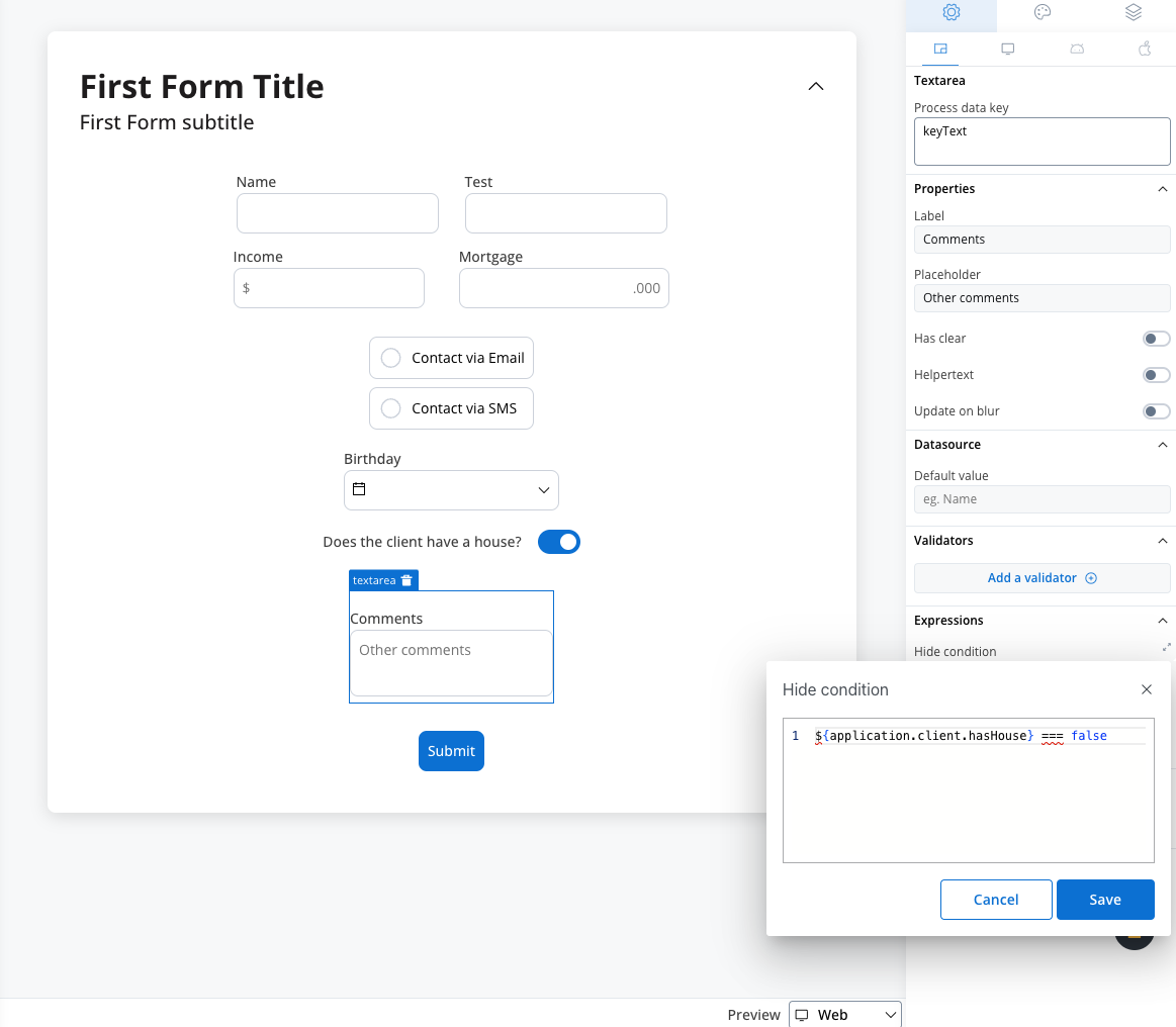
In the example above, we used a rule to hide a text area element if the value of the switch element above is false.
Hide expression example
We will use the key defined on the switch element to create a JavaScript hide condition to hide the text area element: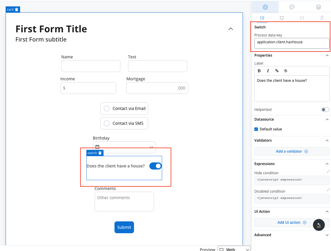
- Rule used:
- Result:
Disable example
For example, you can use a disabled condition to disable a text area element based on what values you have on other elements.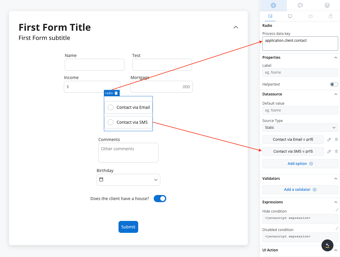
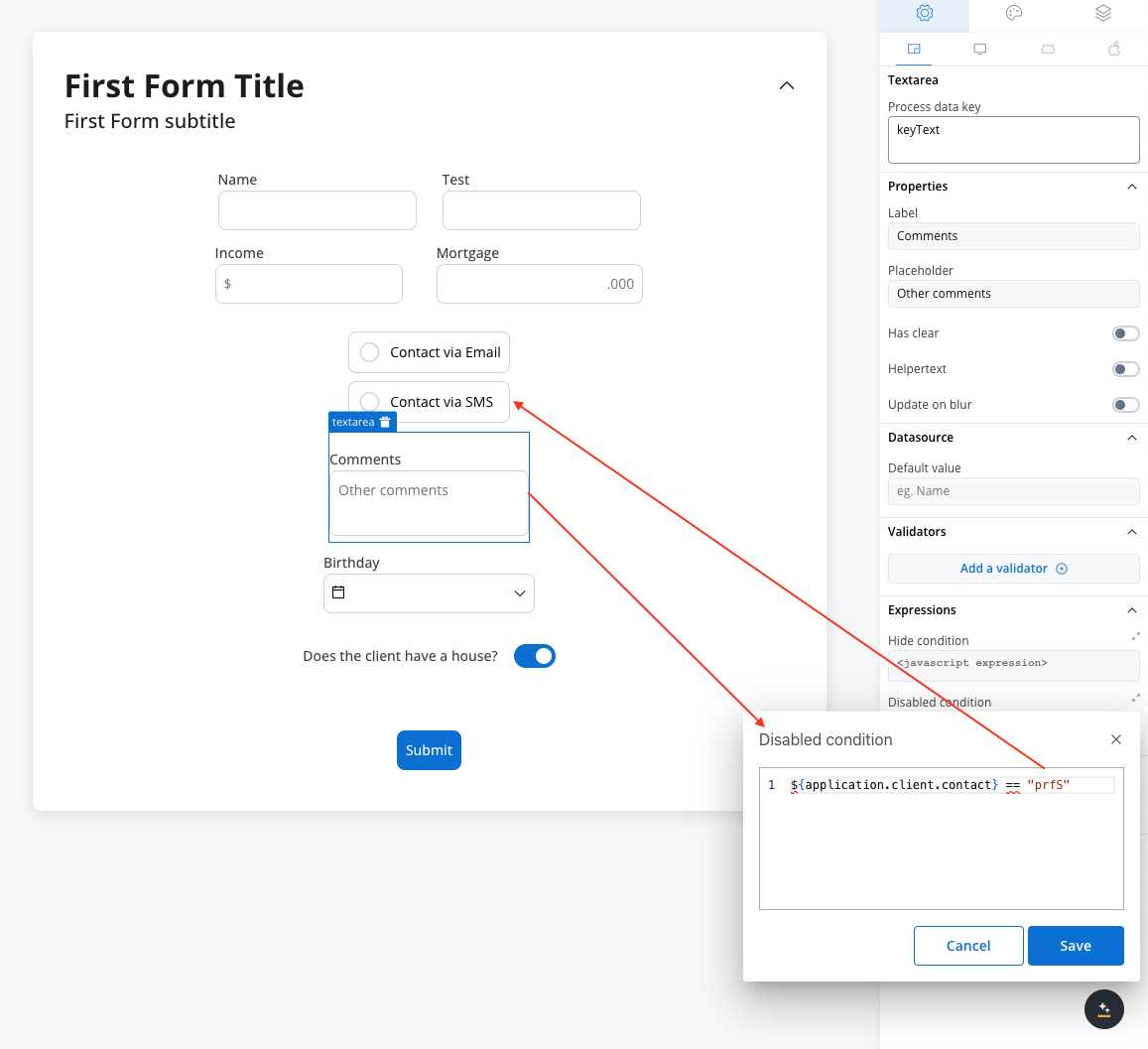
- Rule used:
It’s important to make sure that disabled fields have the same expression configured under the path expressions → hide.
UI actions
UI actions can be added to the text area field to define its behavior and interactions.- Event: Possible value -
CHANGE. - Action Type: Select the type of the action to be performed.
Text area settings overrides
There are instances where you may need to tailor settings configured in the Generic settings tab. This proves especially beneficial when you wish to adjust these settings to appear differently across various platforms such as Web, Android, or iOS. Available override settings:- Properties:
- Label: Override the text area label.
- Helper: Override helper text/info point.
- Placeholder: Override the placeholder.
- Expressions:
- Hide: Override the hide expression.
Overrides can always be imported/pushed from one platform to another: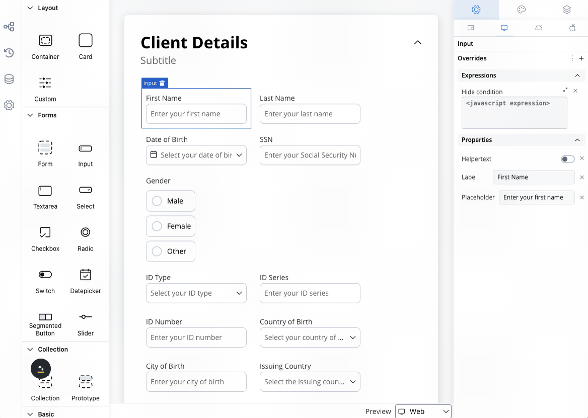
Text area styling
- Web
- iOS
- Android
- Sizing
Fit W (fit width)
Adjusting the size of components is crucial for a responsive design. Fit W (width) offers three options:- fill: Fills the available space.
- fixed: Maintains a fixed width.
- auto: Adjusts the width automatically based on content.
H Type (height type)
- fixed: Maintains a fixed height (pixels)
- auto: Adjusts the height automatically based on the content.
Rows
- Min Rows: Sets the minimum number of rows.
- Max Rows: Sets the maximum number of rows.
Text area style overrides options
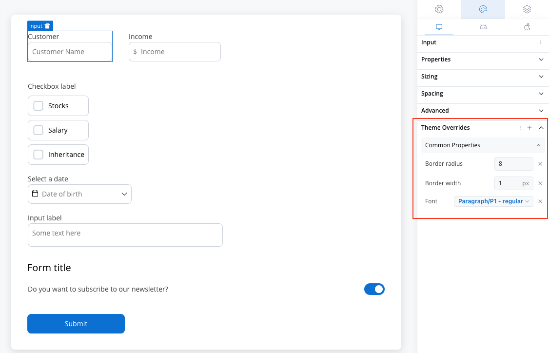
Theme overrides refer to the ability to modify or customize the appearance and behavior of UI components by overriding default theme settings. This can be applied at various levels, such as specific elements or entire sections, and can be platform-specific (Web, iOS, Android).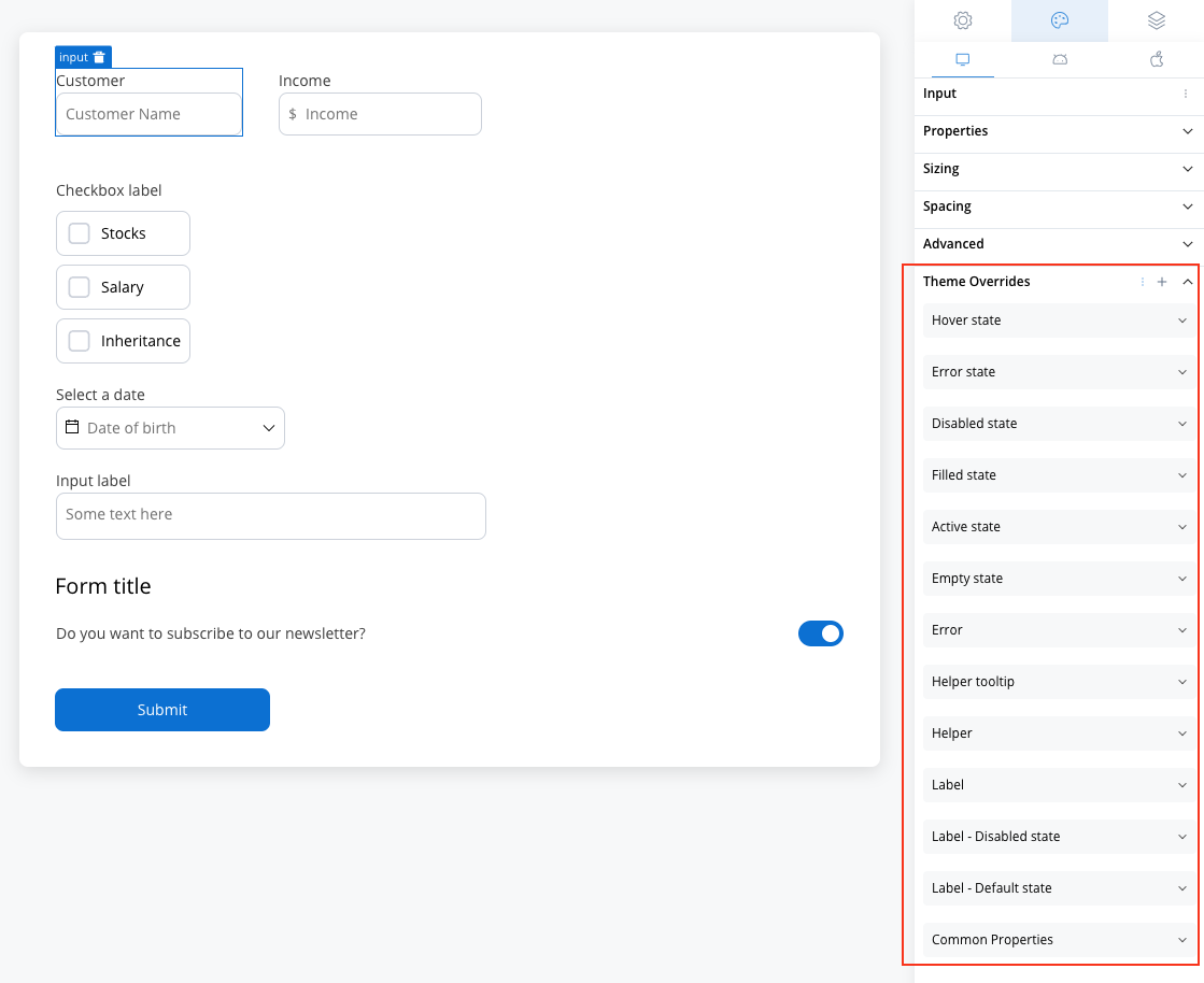
Common Properties
Common Properties
- Border radius [TEXT]
- Border width [TEXT]
- Text style [FONT]
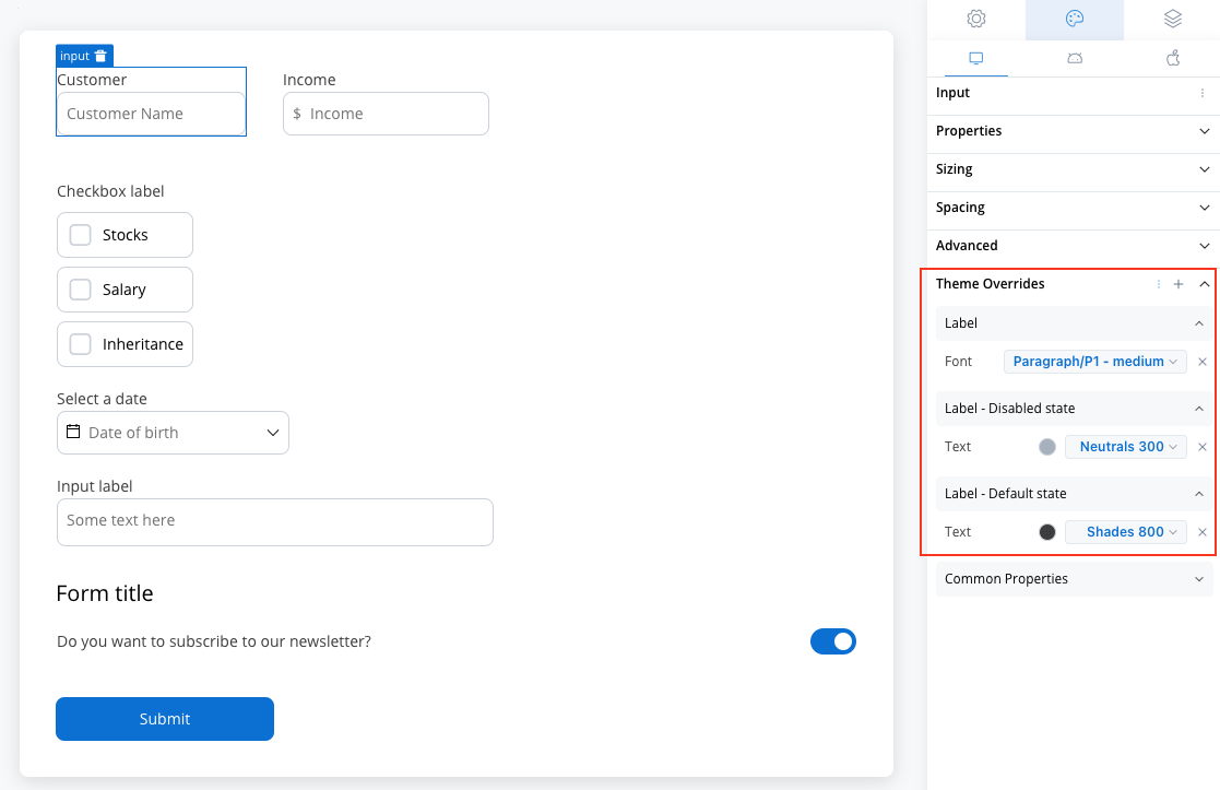
Label
Label
- Default state
- Text color [COLOR]
- Disabled state
- Text color [COLOR]
- Text style [FONT]
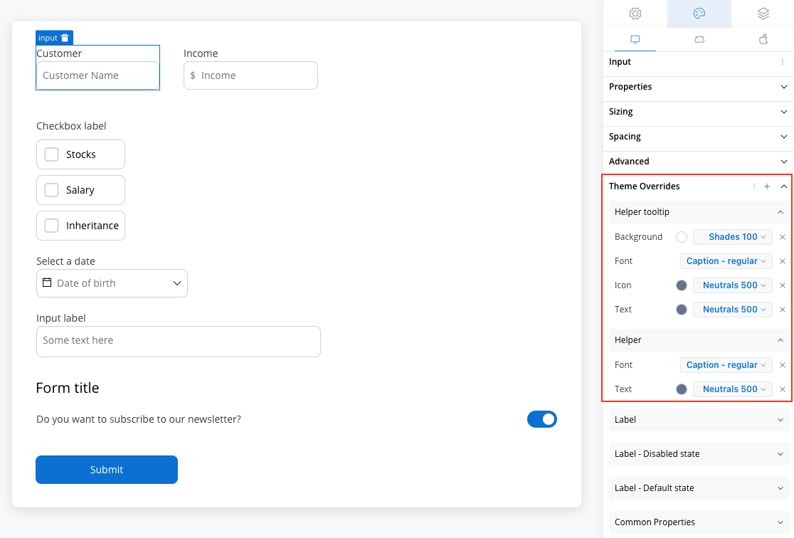
Helper
Helper
- Text color [COLOR]
- Text style [FONT]
- Helper Tooltip
- Text style [FONT]
- Text color [COLOR]
- Background color [COLOR]
- Icon Color [COLOR]
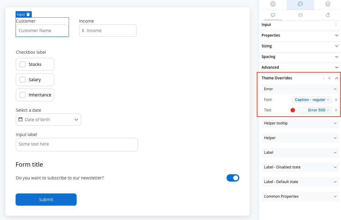
Error
Error
- Text color [COLOR]
- Text style [FONT]
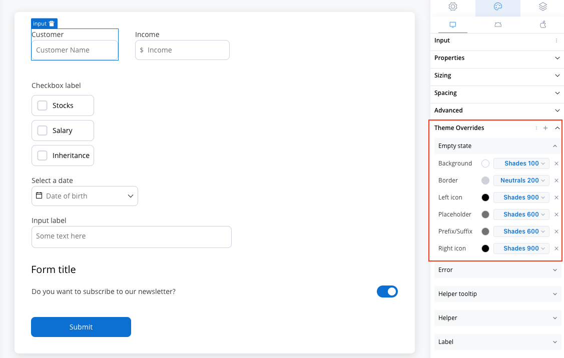
Empty State
Empty State
- Border color [COLOR]
- Background color [COLOR]
- Right icon color [COLOR]
- Left icon color [COLOR]
- Prefix/Suffix color [COLOR]
- Placeholder color [COLOR]
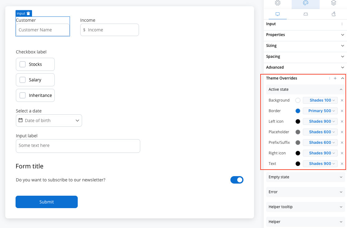
Active State
Active State
- Border color [COLOR]
- Background color [COLOR]
- Text color [COLOR]
- Right icon color [COLOR]
- Left icon color [COLOR]
- Prefix/Suffix color [COLOR]
- Placeholder color [COLOR]
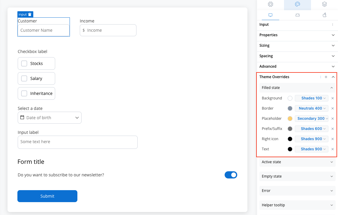
Filled State
Filled State
- Border color [COLOR]
- Background color [COLOR]
- Text color [COLOR]
- Right icon color [COLOR]
- Left icon color [COLOR]
- Prefix/Suffix color [COLOR]
- Placeholder color [COLOR]
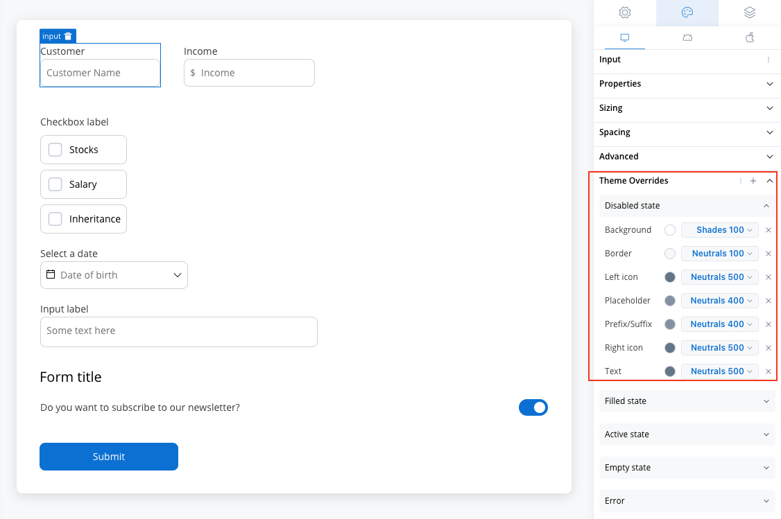
Disabled State
Disabled State
- Border color [COLOR]
- Background color [COLOR]
- Text color [COLOR]
- Right icon color [COLOR]
- Left icon color [COLOR]
- Prefix/Suffix color [COLOR]
- Placeholder color [COLOR]
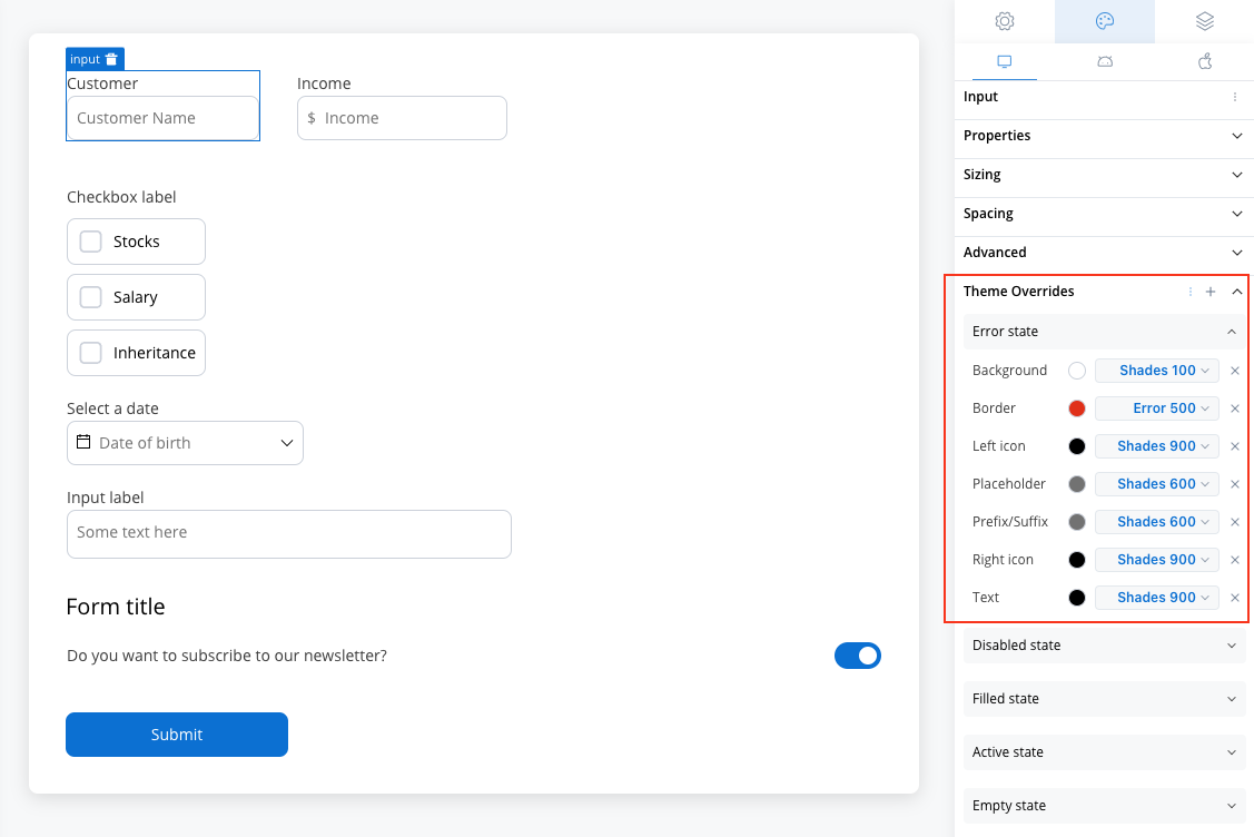
Error State
Error State
- Border color [COLOR]
- Background color [COLOR]
- Text color [COLOR]
- Right icon color [COLOR]
- Left icon color [COLOR]
- Prefix/Suffix color [COLOR]
- Placeholder color [COLOR]
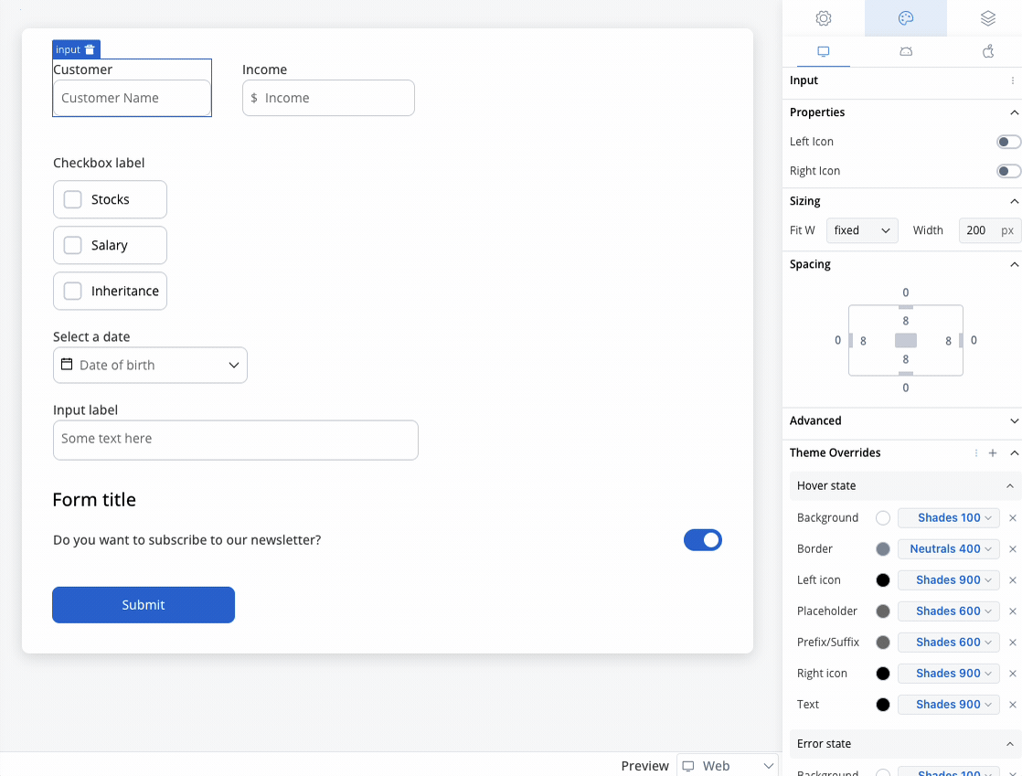
Hover State (only for Web configuration)
Hover State (only for Web configuration)
- Border color [COLOR]
- Background color [COLOR]
- Text color [COLOR]
- Right icon color [COLOR]
- Left icon color [COLOR]
- Prefix/Suffix color [COLOR]
- Placeholder color [COLOR]

You can import or push the overrides from one platform to another without having to configure them multiple times.