Configuration overview
Configure your input field using these main sections:Basic Settings
Process data binding, labels, and input types
Data & Validation
Default values, validators, and data formatting
Behavior
Hide/disable conditions and UI actions
Styling
Visual appearance and platform-specific overrides
Basic configuration
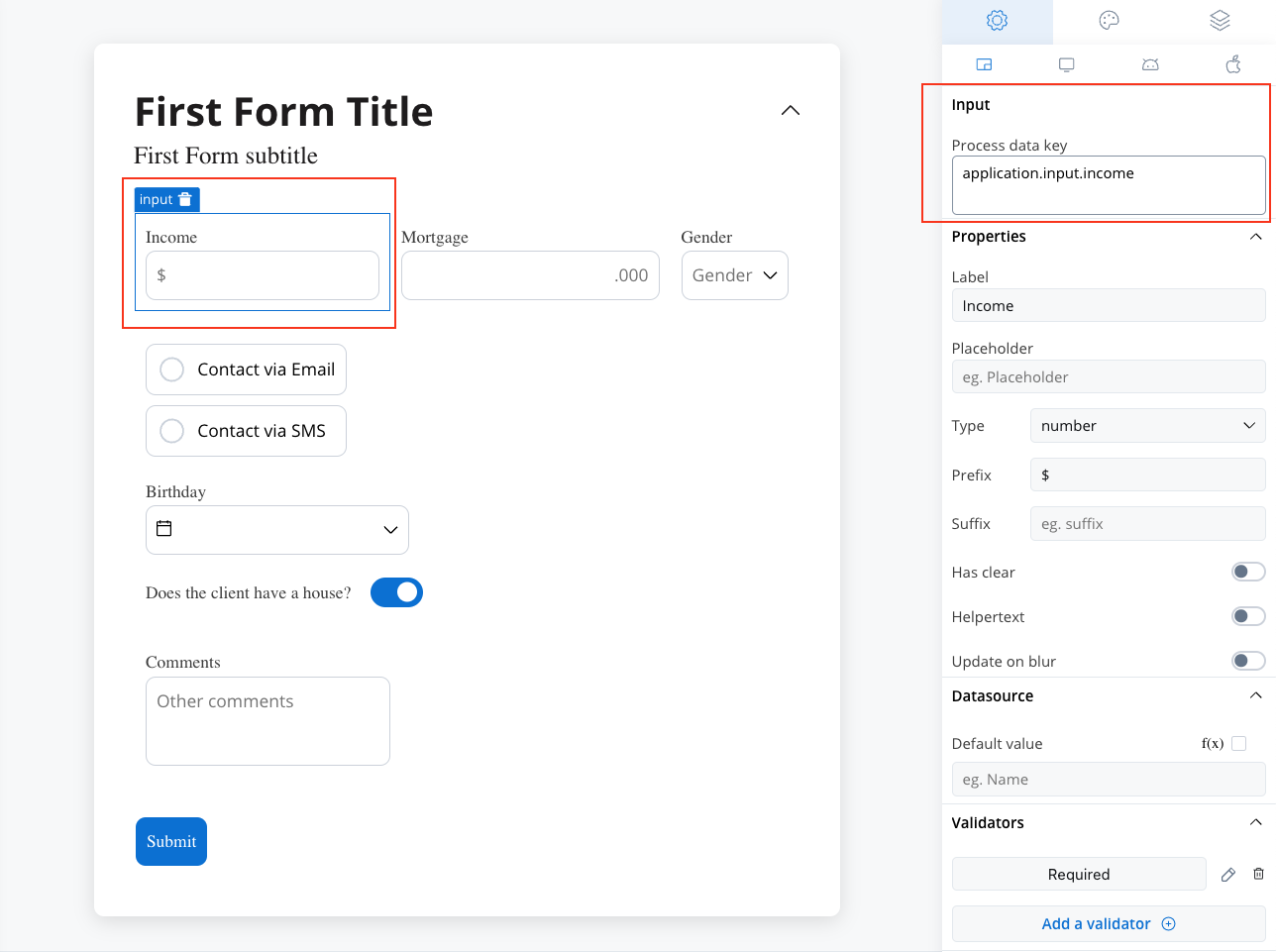
Process data key
The process data key establishes the binding between the input element and process data, enabling its later use in:Core properties
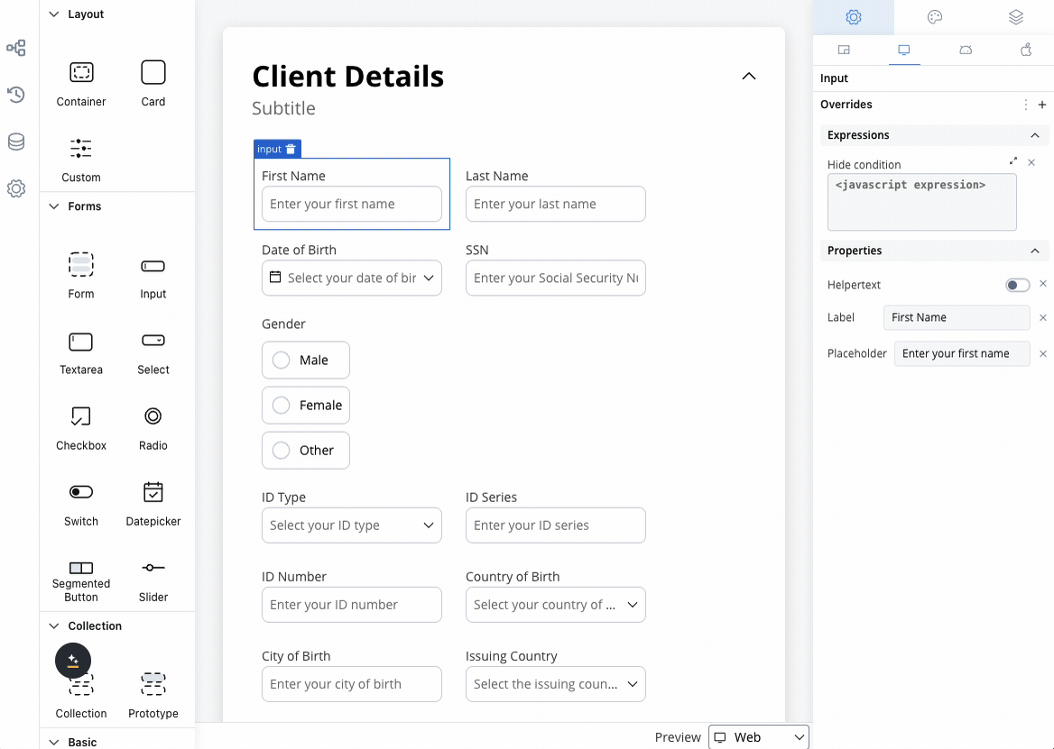
Label
Label
Purpose: The visible text displayed above or alongside the input fieldFeatures: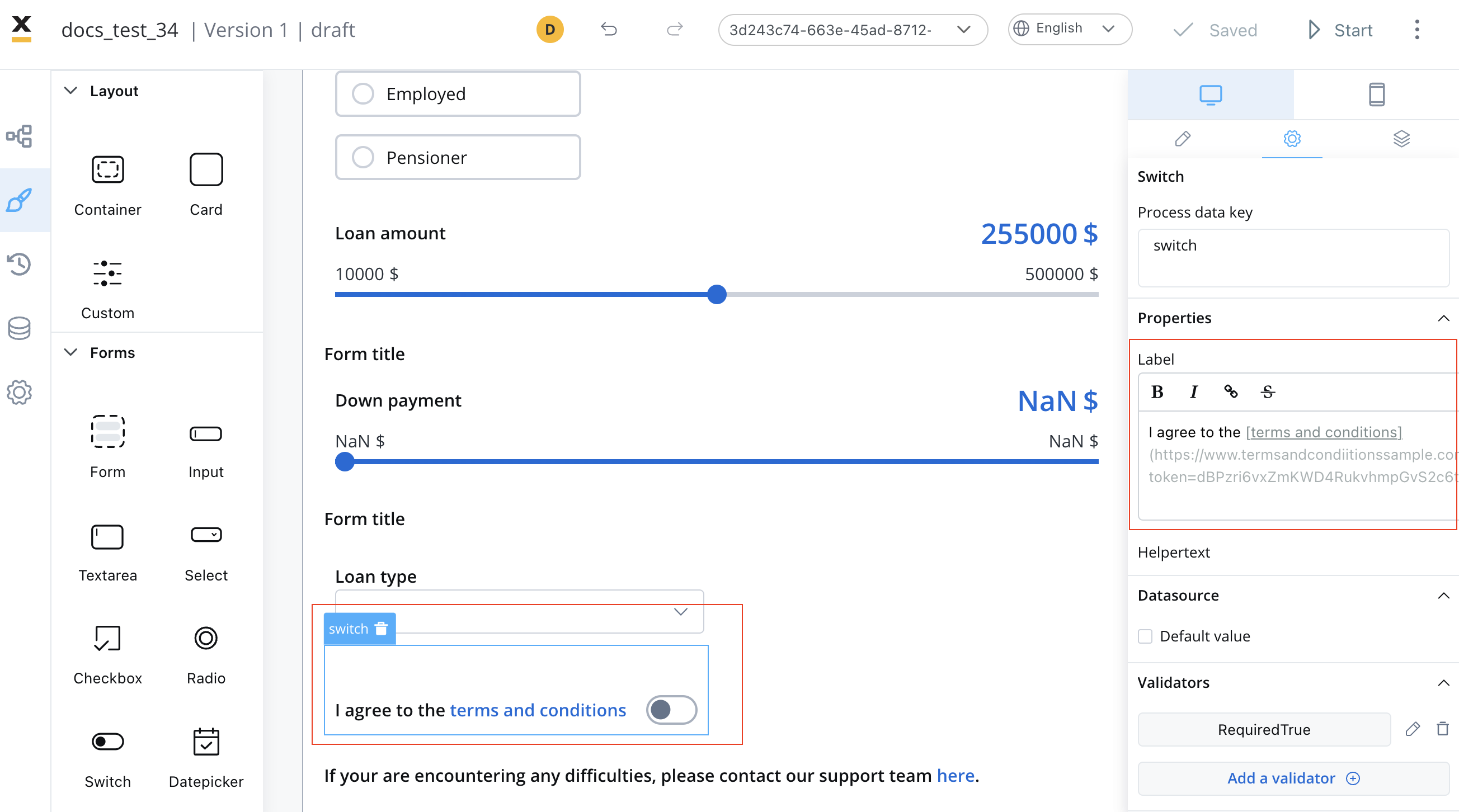
- Supports full Markdown syntax for rich formatting
- Can include links, emphasis, and other Markdown elements
- Responsive across all platforms
Use Markdown to enhance your labels with bold, italic, or linked text.
Input Types
Input Types
Choose the appropriate input type for your data:
| Type | Description | Validation Features | Best Used For |
|---|---|---|---|
| Text | General text input | Length, pattern matching | Names, titles, descriptions |
| Number | Numeric values only | Min/max values, decimals | Quantities, prices, scores |
| Email address format | Built-in email validation | Contact information | |
| Password | Masked text input | Strength requirements | Authentication, security |
| Code | Monospace code formatting | Only digits | Validating OTPs |
The Code type is particularly useful for technical forms where users need to input structured data, configuration settings, or code snippets with proper formatting.
Placeholder Text
Placeholder Text
Purpose: Provide hints or examples of expected inputBest Practices:
- Keep it concise and helpful
- Show format examples (e.g., “john@example.com”)
- Avoid using placeholder as primary label
- Consider accessibility for screen readers
Prefix & Suffix
Prefix & Suffix
Prefix: Text or symbols appearing before the input
- Currency symbols ($, €, £)
- Protocol indicators (https://, @)
- Unit prefixes
- Units of measurement (kg, cm, %)
- Domain extensions (.com, .org)
- Contextual indicators
Additional Features
Additional Features
Has Clear: Adds an ✕ button to quickly clear the input content
- Improves user experience on mobile devices
- Useful for search fields and optional inputs
- Can be displayed as regular text below the field
- Can be hidden within an expandable info point
- Supports Markdown formatting
- Triggers validation when user leaves the field
- Optimizes performance by reducing frequent updates
Data configuration
Datasource configuration
Configure the data source and default values for your input field: Default Value: Set the initial value when the field is first displayed- Static values for consistent defaults
- Dynamic values from process data
- Calculated values from expressions
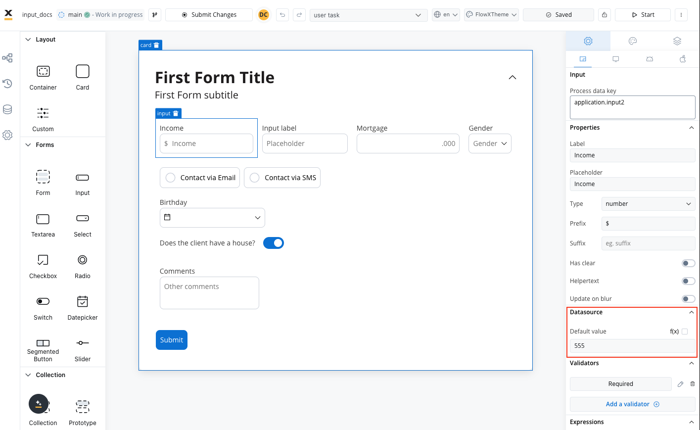
Consider the user experience impact of default values - they should help users rather than create confusion.
Validation rules
Ensure data quality with comprehensive validation options:- Basic Validators
- Numeric Validators
- Date Validators
- Custom Validators
| Validator | Purpose | Configuration |
|---|---|---|
| Required | Ensures field is not empty | Error message customization |
| Min Length | Minimum character count | Specify minimum number |
| Max Length | Maximum character count | Specify maximum number |
| Valid email format | Works with email input type | |
| Pattern | Custom regex validation | Define regex pattern |
Behavior configuration
Hide/disable expressions
Define the input field’s behavior using JavaScript expressions to control its visibility or disablement:- Hide condition: A JavaScript expression that hides the input field when it evaluates to the specified result.
- Disabled condition: A JavaScript expression that disables the input field when it returns a truthy value.
Hide expression example
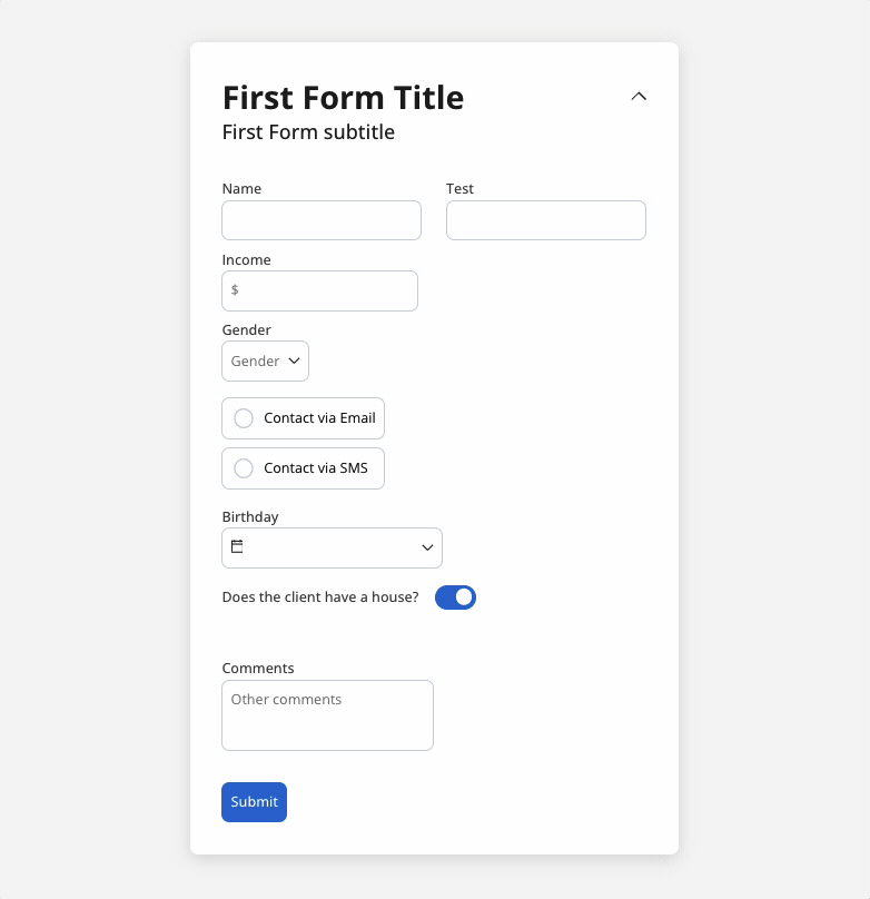
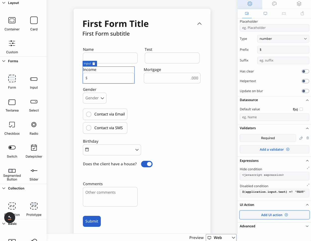
We can use a rule to hide an input field if another field has a null value (it is not filled). For example, the “Mortgage” input field, which remains hidden until users fill in the “Income” field: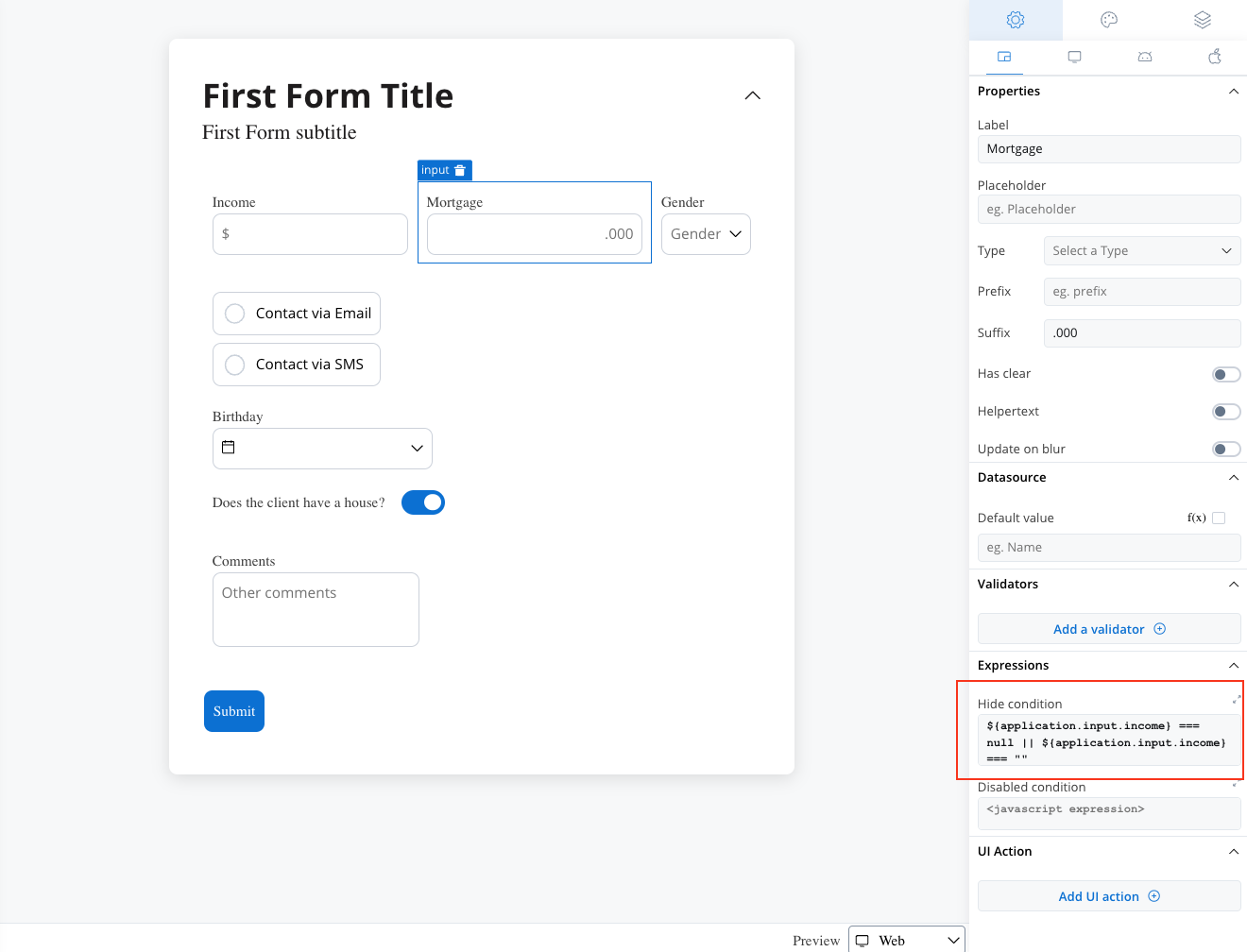
Disable example
You can use a disabled condition to disable an input element based on values from other fields. When you type ‘TEST’ in the first input (Name) the second input (Test) will be disabled: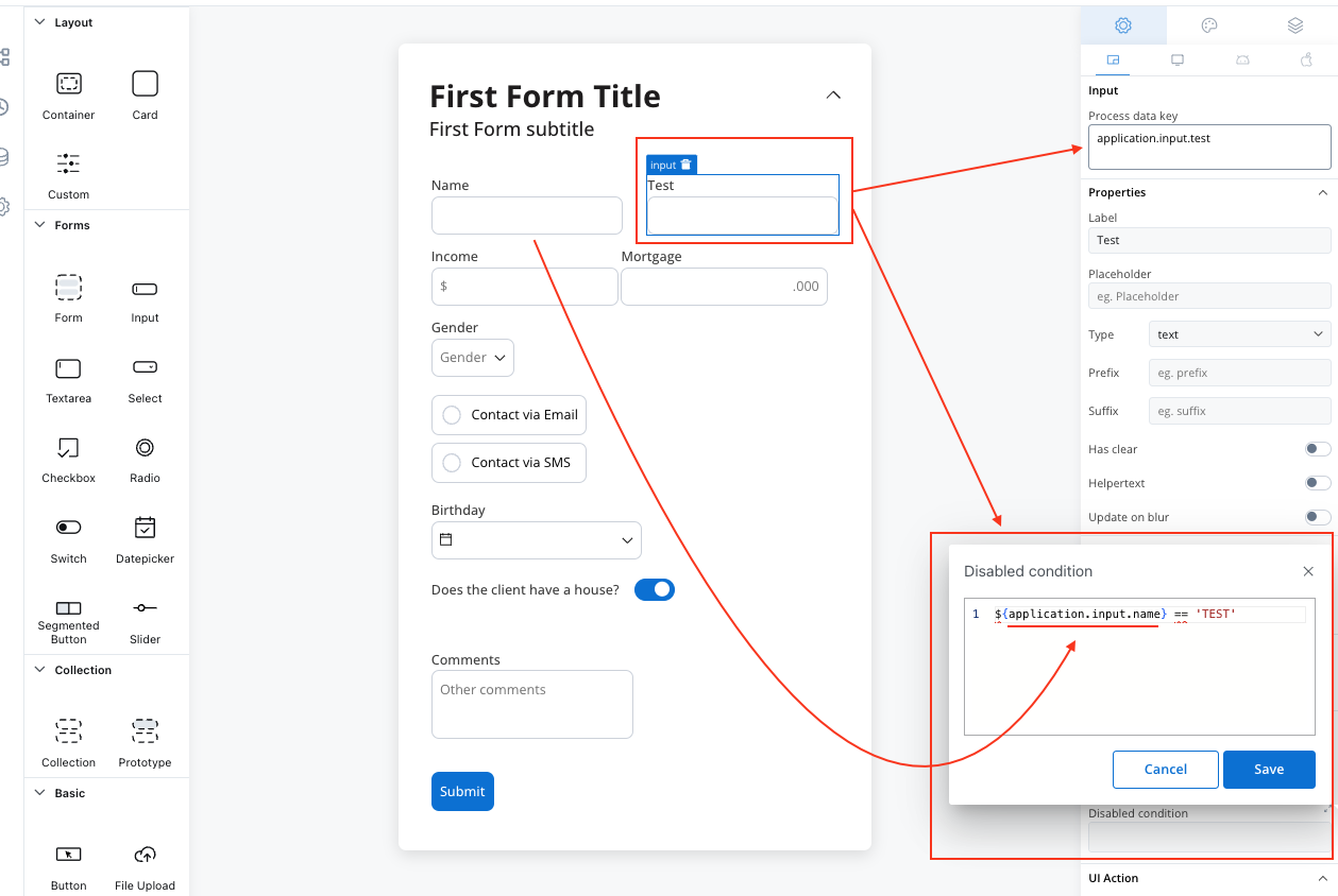
It’s important to make sure that disabled fields have the same expression configured under the path expressions → hide.
UI actions
Configure interactive behaviors for your input field:| Event | Description | Common Use Cases |
|---|---|---|
| CHANGE | Triggered when input changes | Update related fields, trigger calculations, show/hide elements |
| FOCUS | When field receives focus | Load dynamic data, show helper content |
| BLUR | When field loses focus | Validate input, save data, format display |
- Navigate to different pages
- Execute business rules
- Call external services
- Update other form elements
- Trigger process actions
For detailed UI action configuration, see our UI Actions Guide.
Platform customization
Settings overrides
Customize your input field differently across platforms:- Web Applications
- Mobile Apps
Override Options:
- Label text for desktop terminology
- Placeholder text optimized for keyboard input
- Helper text with extended descriptions
- Prefix/suffix for web-specific formatting
- Keyboard shortcuts integration
- Advanced formatting options
- Enhanced validation messages
Override settings can be imported and pushed between platforms, saving configuration time and ensuring consistency.
Visual styling
Layout options
- Web Styling
- iOS Styling
- Android Styling
Icon Integration
Icon Integration
Left Icon: Visual cue at the start of the input
- Search icons for search fields
- User icons for name fields
- Lock icons for password fields
- Clear buttons (×)
- Validation status (✓ or ⚠)
- Dropdown arrows
- Select from Media Library
- Custom icon keys
- Platform-specific icons
Responsive Sizing
Responsive Sizing
| Option | Behavior | Best For |
|---|---|---|
| Fill | Expands to use available space | Full-width forms |
| Fixed | Maintains specified width | Consistent layouts |
| Auto | Adjusts based on content | Dynamic forms |
Theme customization
Override default styling for complete visual control:Input Field Styling
Input Field Styling
Border & Background:
- Border colors for different states
- Background color customization
- Border radius and thickness
- Font family and size
- Text color for different states
- Placeholder text styling
- Default, focused, disabled, error states
- Hover effects for web
- Touch feedback for mobile
Label & Helper Styling
Label & Helper Styling
Label Customization:
- Typography controls
- Color options
- Positioning and alignment
- Font styling
- Color coordination
- Tooltip appearance
Validation Styling
Validation Styling
Error States:
- Error message styling
- Input border color changes
- Icon integration
- Success indicators
- Positive feedback styling
- Completion animations
Best practices
Accessibility
- Provide clear, descriptive labels
- Use appropriate input types for better mobile experience
- Ensure sufficient color contrast
- Include helper text for complex fields
- Test with screen readers
- Use semantic HTML attributes
User Experience
- Choose appropriate input types for the data
- Provide helpful placeholder text and examples
- Use validation that guides rather than frustrates
- Consider progressive disclosure for complex forms
- Implement auto-save functionality where appropriate
- Group related inputs logically
Data Management
- Use meaningful process data keys
- Plan for data validation early in development
- Consider data format consistency across platforms
- Implement proper error handling
- Document validation rules for maintenance
- Test with real-world data scenarios
Common use cases
| Scenario | Input Type | Validation | Additional Features |
|---|---|---|---|
| Contact Form | Text, Email | Required, Email format | Clear buttons, helper text |
| Login Form | Text, Password | Required, Min length | Security indicators |
| Search Field | Text | Min length | Auto-complete, clear button |
| OTP codes | Code | Pattern matching | |
| Numeric Input | Number | Min/max values | Prefix/suffix for units |
| Address Entry | Text | Format validation | Auto-complete integration |