Properties and settings
Settings (applicable across all platforms)
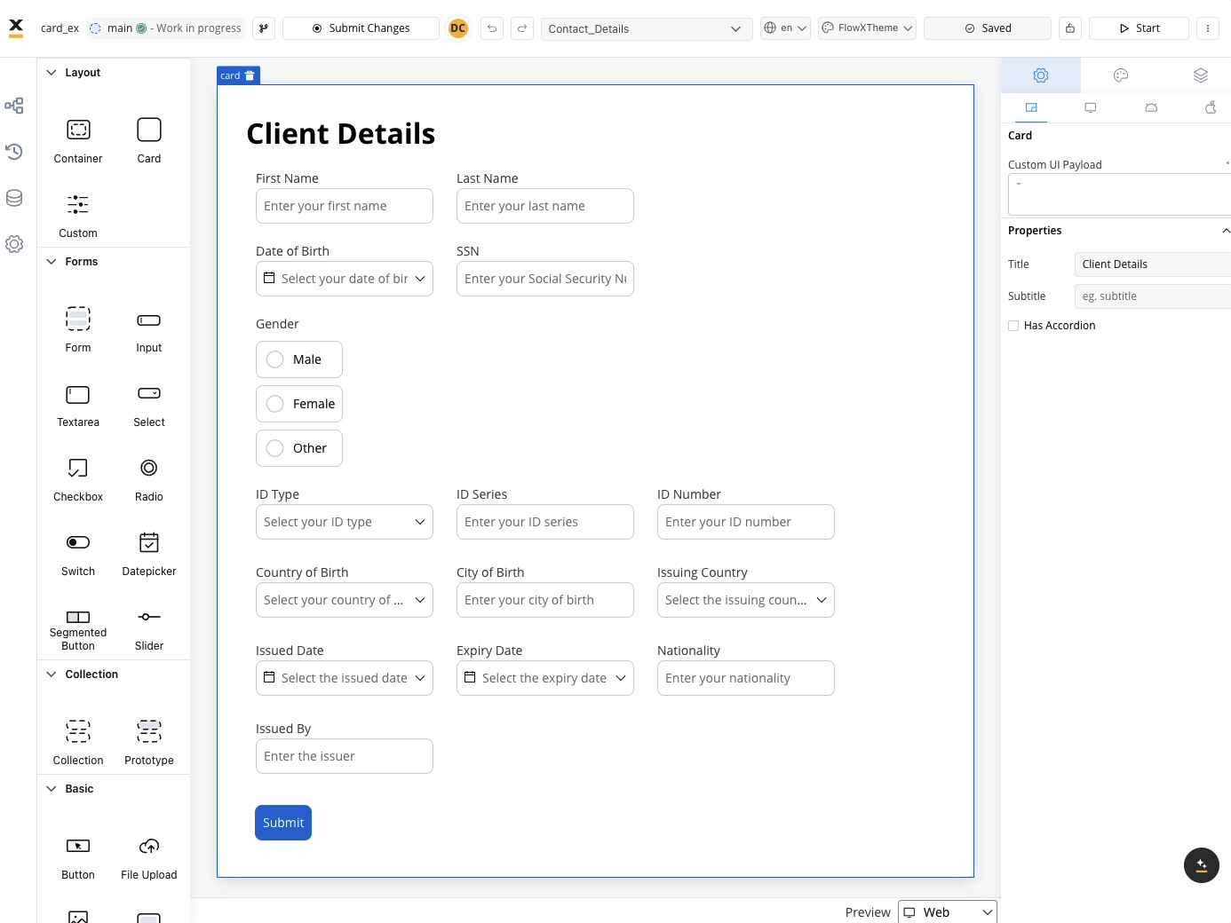
These settings added in the Generic tab are available and they apply to all platforms including Web, iOS, and Android.When used as root
When the Card is utilized as the root component, it offers the following settings:- Custom UI Payload: A valid JSON describing the custom data transmitted to the frontend when the process reaches a specific user task.
- Title: The title displayed on the card.
- Subtitle: Additional descriptive text accompanying the card.
- Has accordion: Introduces a Bootstrap accordion, facilitating the organization of content within collapsible items. It ensures that only one collapsed item is displayed at a time.
The accordion feature is not available for mobile configuration.
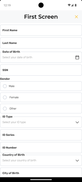
Mobile configuration (iOS & Android)
For mobile configuration (iOS and Android), you can also configure the following property (not available on Web configuration):- Screen title: Set the screen title used in the navigation bar on mobile devices (available only when the card element is set as the root).
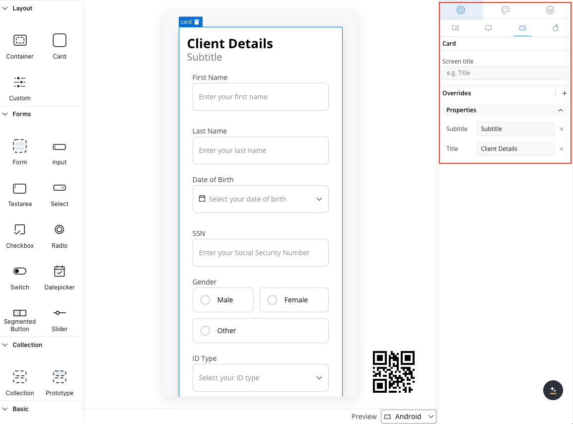
Card settings overrides
You may want to override the card title or subtitle set as Generic to be displayed differently on mobile devices. For example, on the web, titles might be shorter.- Web
- Android
- iOS
Available properties overrides for web (overriding properties set in Generic settings tab):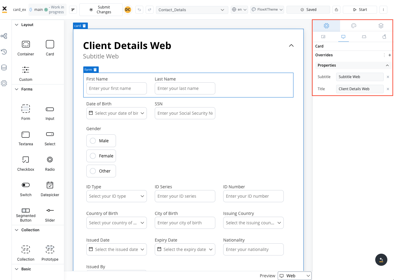
- Title
- Subtitle
When not used as root
When the card is not the root, you can configure: Title, Subtitle, Card Style and Has Accordion. Leverage cards in your designs to organize and present content, enhancing the overall user experience.Styling
- Web
- iOS
- Android
- Layout
- Sizing
When designing for the web, consider the layout options available for the card. These options include:
- Direction: Choose between Horizontal or Vertical alignment to define the flow of components. For example, select Horizontal for a left-to-right layout.
- Justify (H): Specify how content is aligned along the main axis. For instance, select end to align items to the end of the card.
- Align (V): Align components vertically within their card using options such as top, center, or bottom alignment.
- Wrap: Enable wrapping to automatically move items to the next line when they reach the end of the card. Useful for creating multi-line layouts.
- Gap: Define the space between components to control the distance between each item. Adjusting the gap enhances visual clarity and organization.
Theme overrides
Customize the appearance by overriding style options coming from your default theme. Available overrides:- Border width
- Border radius
- Border color
- Background color
- Shadow
- Title
- Title Color
- Subtitle
- Subtitle Color
Layout Demos
Validating elements
To ensure the validation of all form elements within a card upon executing a Save Data action such as “Submit” or “Continue,” follow these steps:- When adding a UI action to a button inside a card, locate the dropdown menu labeled Add form to validate.
- From the dropdown menu, select the specific form or individual form elements that you wish to validate.
- By choosing the appropriate form or elements from this dropdown, you can ensure comprehensive validation of your form data, enhancing the integrity and reliability of your user interactions.

Provide feedback on this page
Provide feedback on this page
Use our feedback form if you would like to provide feedback on this page. You could also raise issues/requests.