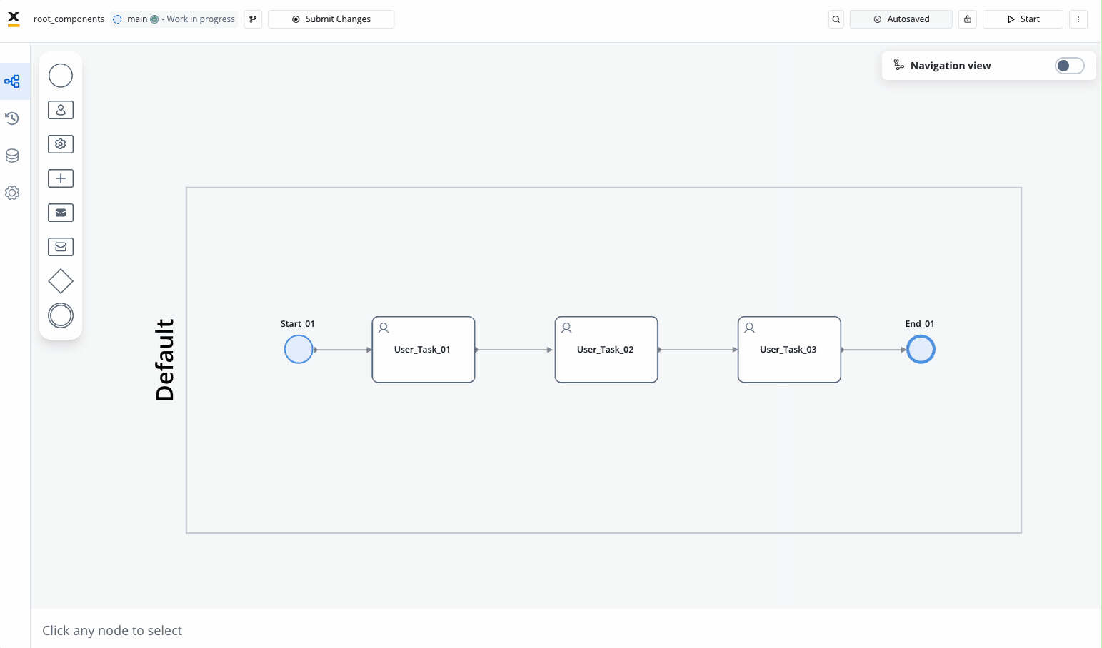 Root components play a crucial role in defining the layout and hierarchy of elements within an application. Here’s an overview of key root components and their functionalities:
Container
The Container component is a versatile element used to group and configure the layout for multiple components of any type. It provides a flexible structure for organizing content within a UI. Learn more about Container components.Custom
Custom components are Angular components developed within the container application and dynamically passed to the SDK at runtime. These components are identified by their unique names and enable developers to extend the functionality of the UI. Explore Custom components for advanced customization options.Card
The Card component functions similarly to a Container component but also offers the capability to function as an accordion, providing additional flexibility in UI design. Discover more about Card components. A card or a container can hold a hierarchical component structure as this example: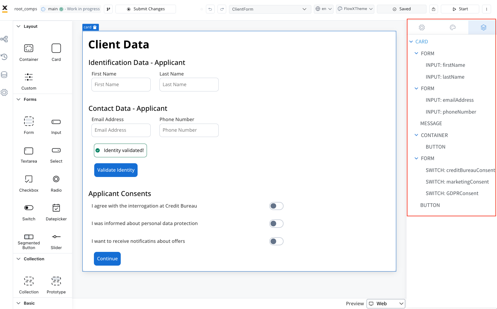
- Form - Used to group and align form field elements (inputs, radios, checkboxes, etc.).
For more information about the form elements, please refer to the Form elements section.
- Image - Allows you to configure an image in the document.
- Text - A simple text can be configured via this component; basic configuration is available.
- Link - Used to configure a hyperlink that opens in a new tab.
- Button - Multiple options are available for configuration, with the most important part being the possibility to add actions.
- File Upload - A specific type of button that allows you to select a file.
- Custom - Custom components.
- Indicators - Message UI elements to display different types of messages.