 The following properties can be configured in the container:
Properties and settings
Settings (applicable across all platforms)
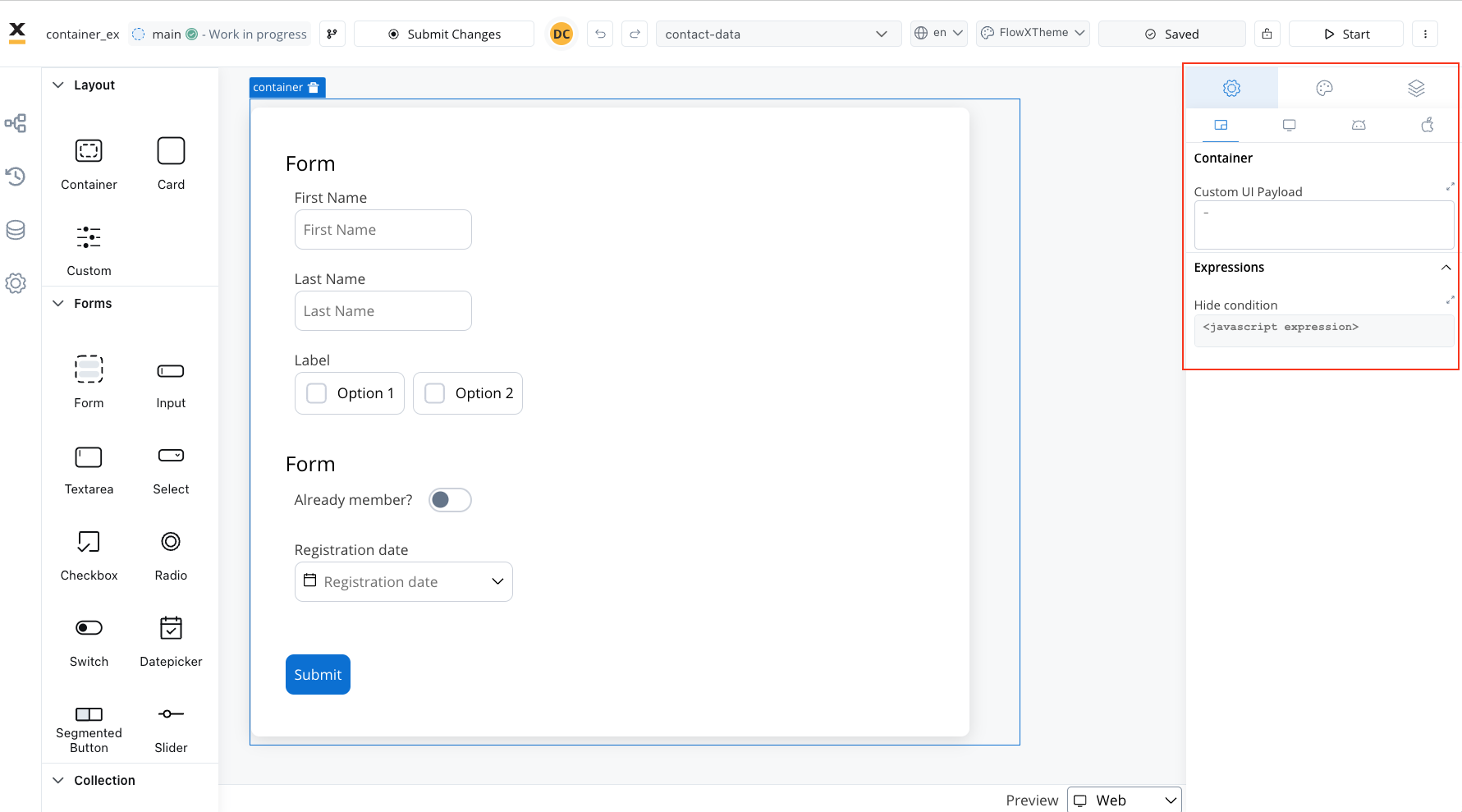
These settings added in the Generic tab are available and they apply to all platforms including Web, iOS, and Android.When used as root
When employed as the root component, the container offers the following settings:- Custom UI Payload: A valid JSON describing the data sent to the frontend when the process reaches a specific user task.
- Expressions (Hide condition): JavaScript expressions utilized to dynamically hide components based on conditions.
When not used as root
When the container is not used as the root, you can configure only the Hide Condition property.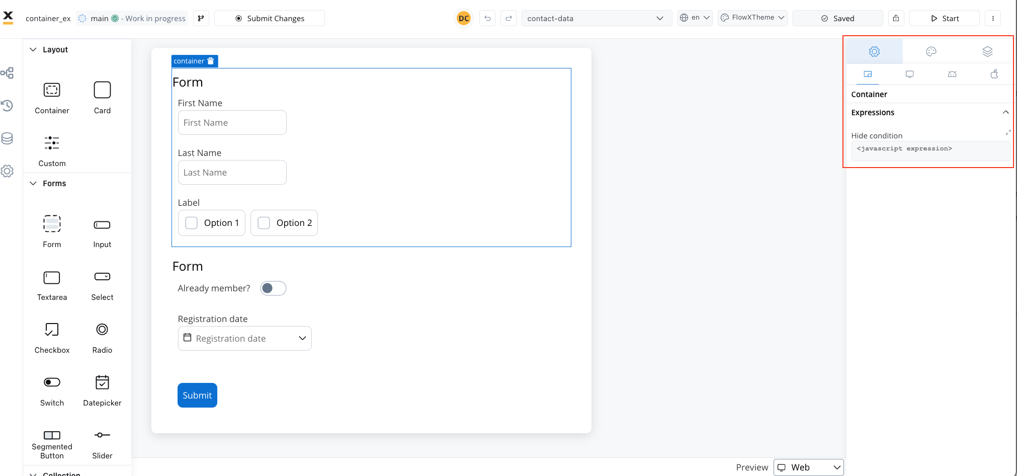 By leveraging containers, you gain the ability to structure your UI elements efficiently, enhancing the overall design and usability of your application.
Container settings overrides
You may want to override settings configured in the Generic tab to be displayed differently on mobile devices.- Hide expressions: Use Overrides in the Settings tab to hide a container on a specific platform.
For instance, you can set a container to appear on all platforms, or create an override to hide it on mobile but show it on web.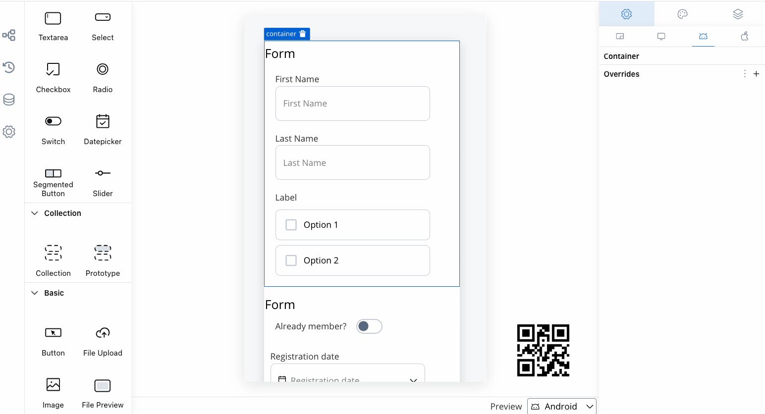
- Select a Container element in the UI Designer, then navigate to Settings -> your desired platform -> Overrides (+) -> Expressions -> Hide.
- Add your JavaScript Hide condition.
Styling
- Web
- iOS
- Android
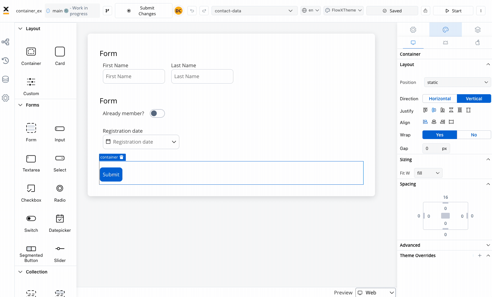
- Layout
- Sizing
When designing for the web, consider the layout options available for the container. These options include: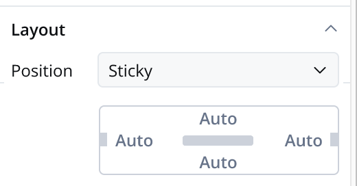
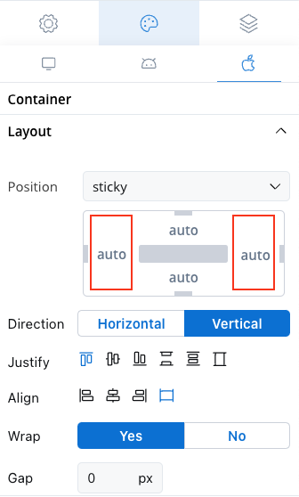
- Position
- Static: The container remains fixed and does not scroll along with the page content.
- Sticky: When the sticky property is enabled, the container maintains its position even during scrolling.
- Sticky layout: You have the option to specify minimum distances between the container and its parent element while scrolling. At runtime, sticky containers will keep their position on scroll relative to top/ bottom/ right/ left margin of the parent element.
- Direction: Choose between Horizontal or Vertical alignment to define the flow of components. For example, select Horizontal for a left-to-right layout.
- Justify (H): Specify how content is aligned along the main axis. For instance, select end to align items to the end of the container.
- Align (V): Align components vertically within their container using options such as top, center, or bottom alignment.
- Wrap: Enable wrapping to automatically move items to the next line when they reach the end of the container. Useful for creating multi-line layouts.
- Gap: Define the space between components to control the distance between each item. Adjusting the gap enhances visual clarity and organization.
Theme overrides
Customize the appearance by overriding style options coming from your default theme. Available overrides:- Border width
- Border radius
- Border color
- Background color
- Shadow
Layout Demos
UI Designer
Provide feedback on this page
Provide feedback on this page
Use our feedback form if you would like to provide feedback on this page. You could also raise issues/requests.