Configurable properties
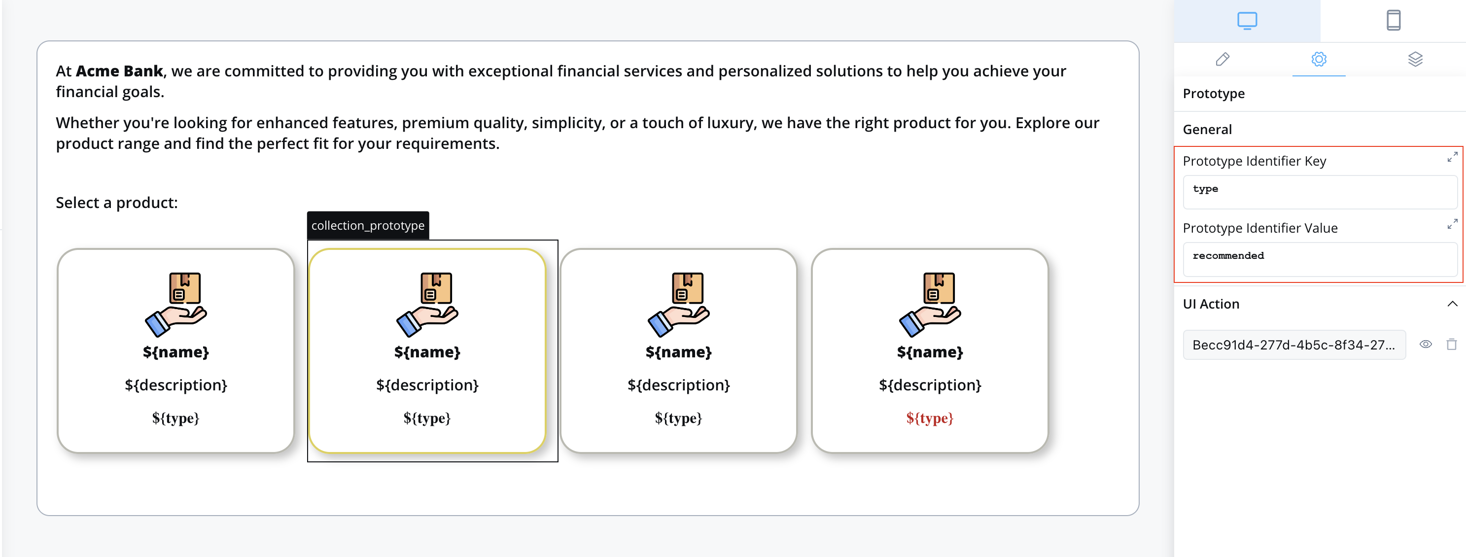
- Prototype Identifier Key - This key instructs the system on where to look within the iterated object to identify the prototype to display. In the example below, the key is “type.”
- Prototype Identifier Value - This value should be present at the Prototype Identifier Key when this
COLLECTION_PROTOTYPEshould be displayed. In the example below, the value can be “normal” or “recommended.”
Example
Let’s revisit the example we used in the Collection section: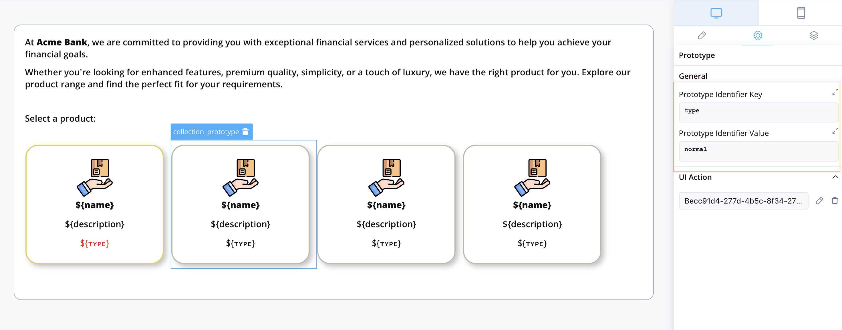
 Sample source collection data for products:
Adding elements with UI Actions
When configuring elements that incorporate UI Actions there are a few considerations to keep in mind. These adjustments are necessary to enable users to select products for further processing in subsequent steps of the workflow.Defining the node action
To facilitate the selection of a product from the list, you must first add an Action to the User task node associated with this UI element: This save-item action is categorized as manual since it is user-triggered and mandatory because product selection is a prerequisite for proceeding to the next Node in the process. Additionally, it is marked as Repeatable to allow users to change their selected product.Pay attention to the Data to send section, which specifies where in the process data the selected product (the one the user clicked on) should be saved. In this example, it is saved under the
This save-item action is categorized as manual since it is user-triggered and mandatory because product selection is a prerequisite for proceeding to the next Node in the process. Additionally, it is marked as Repeatable to allow users to change their selected product.Pay attention to the Data to send section, which specifies where in the process data the selected product (the one the user clicked on) should be saved. In this example, it is saved under the selectedProduct key.Adding the UI action
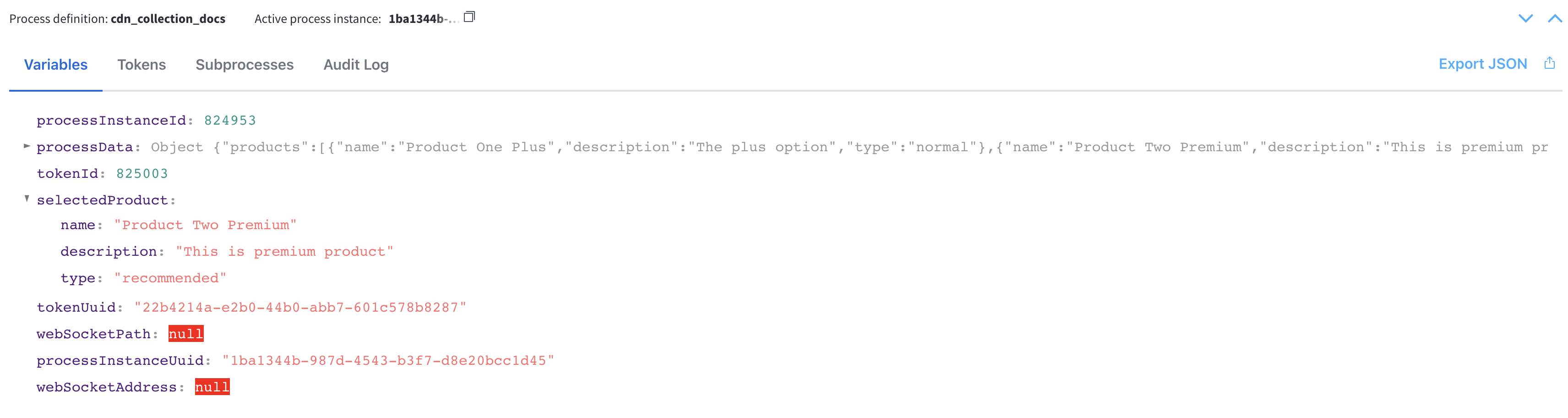
Now that you have a node action defined, you can proceed to add a UI action to the collection prototype. This UI action can be added directly to the collection prototype UI element or other UI elements within it that support UI actions. For more information on UI actions, click here. Collection Item Save Key field has an important role in the UI Action configuration of element with the UI action. This field represents how we pass the value of the Product that the user has selected to the node action that we created in Step 1, named save-item.In our example, we set Collection Item Save Key to be
Collection Item Save Key field has an important role in the UI Action configuration of element with the UI action. This field represents how we pass the value of the Product that the user has selected to the node action that we created in Step 1, named save-item.In our example, we set Collection Item Save Key to be selectedProduct.Result
Before clicking the collection prototype UI element with the attached UI action, this is how the process data appears: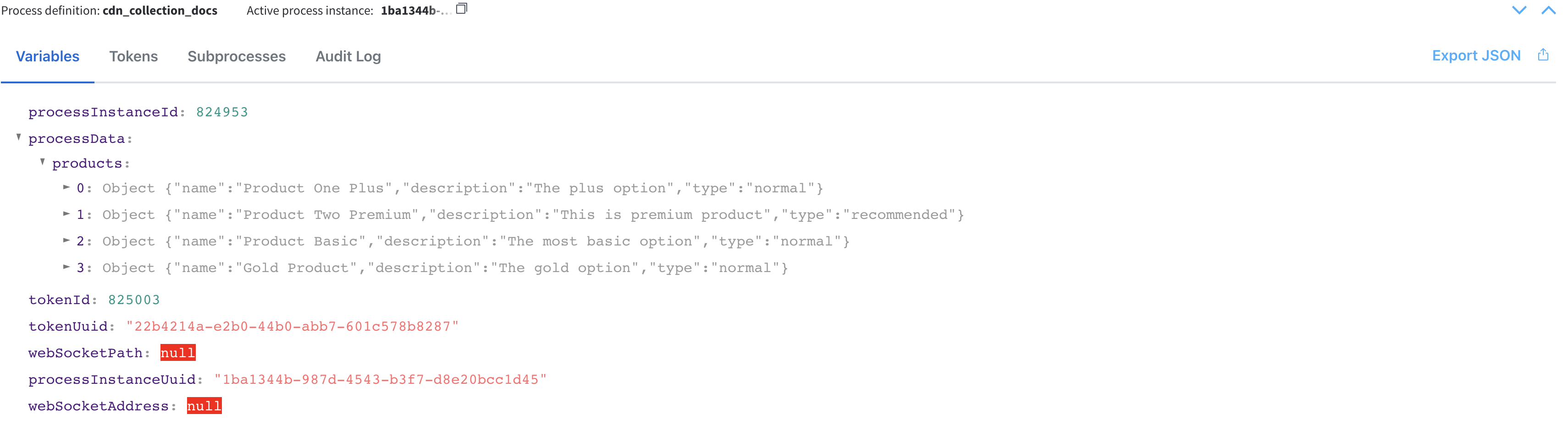 After selecting a product from the list (notice the new field
selectedProduct):