Configurable properties:
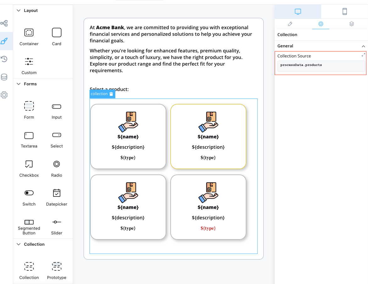
collectionSource - This property specifies the process key where a list can be found. It should be a valid array of objects.
Example
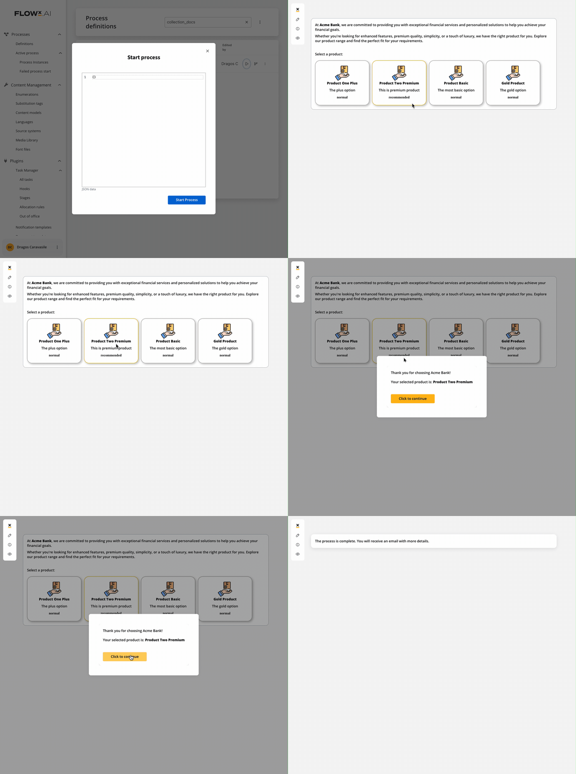
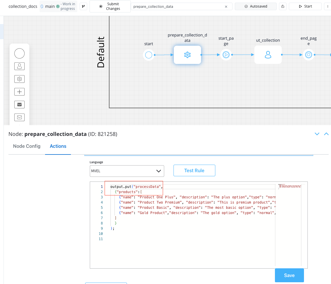
Here’s an example of configuring a Collection component to display a list of products:
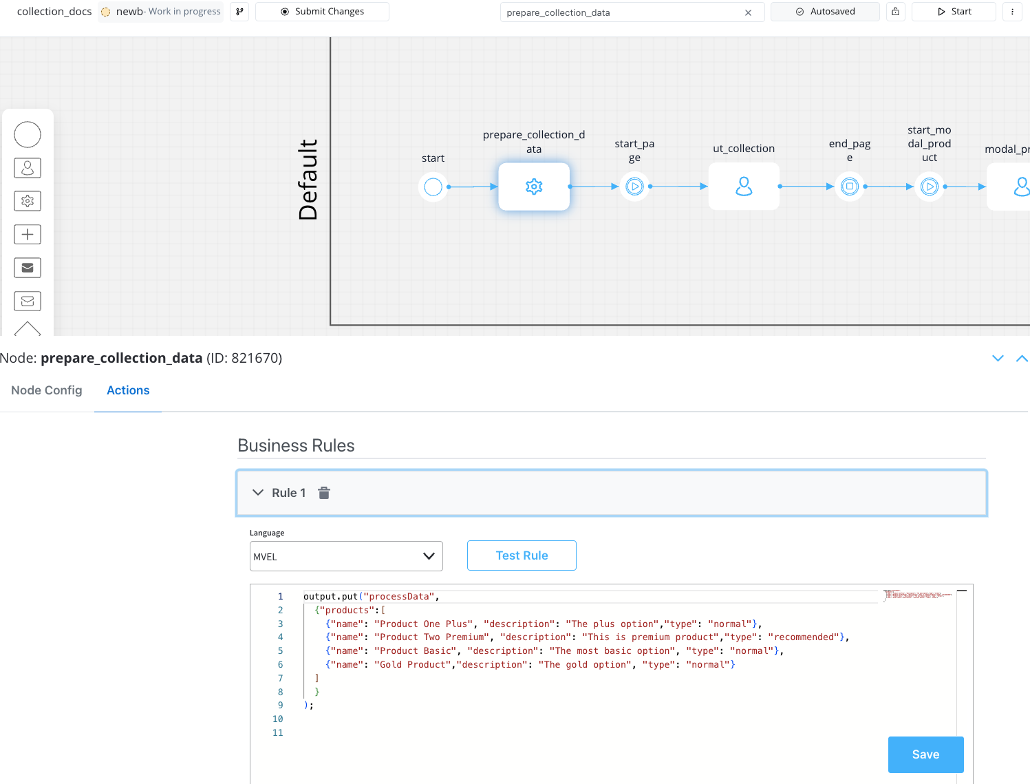
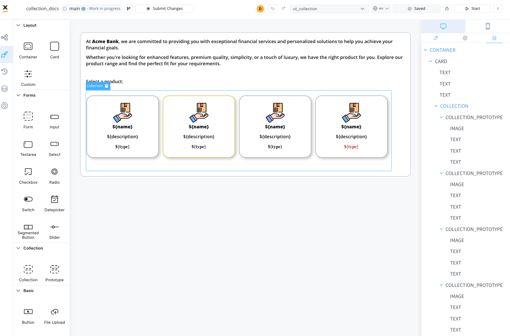 Source collection data example using an MVEL business rule:
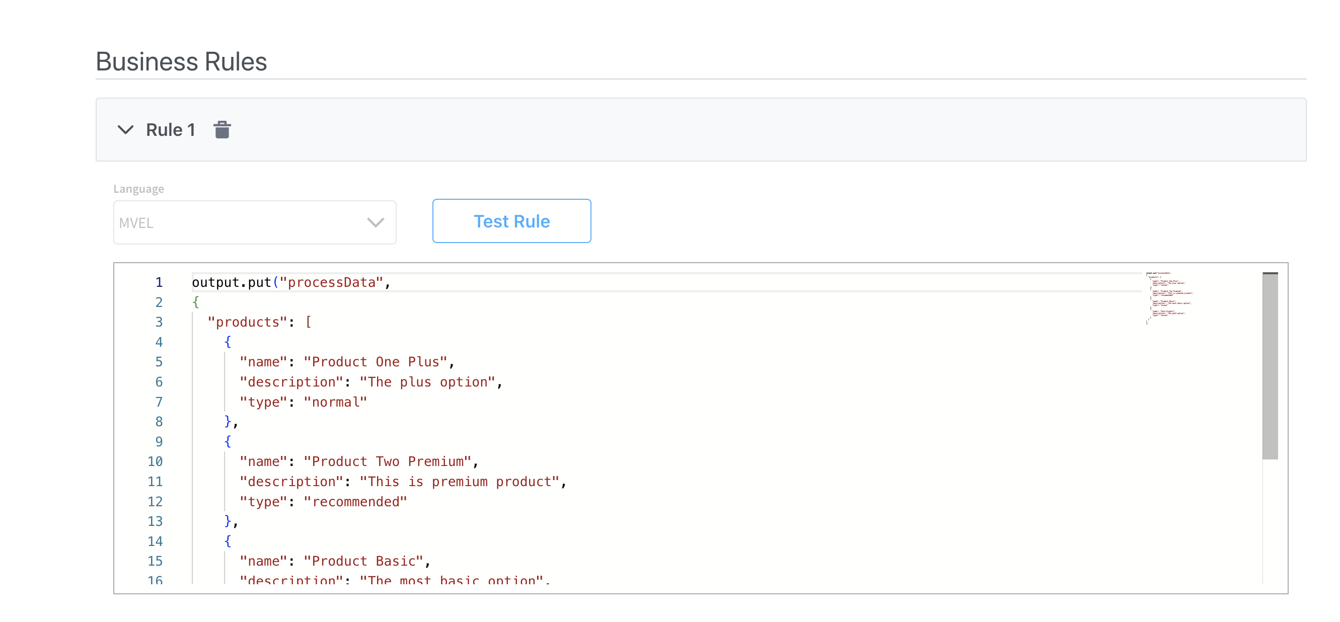
output.put("processData", //this is the key
{
  "products": [ // this is the source that will populate the data on collection
    {
      "name": "Product One Plus",
      "description": "The plus option",
      "type": "normal"
    },
    {
      "name": "Product Two Premium",
      "description": "This is premium product",
      "type": "recommended"
    },
    {
      "name": "Product Basic",
      "description": "The most basic option",
      "type": "normal"
    },
    {
      "name": "Gold Product",
      "description": "The gold option",
      "type": "normal"
    }
  ]
}
);

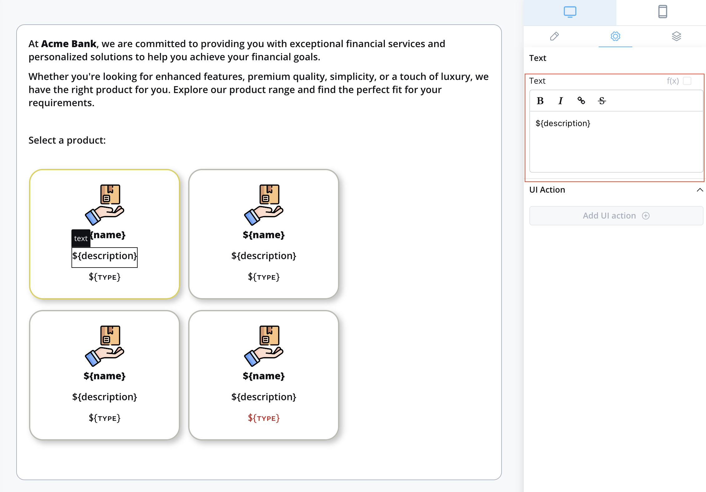
Components used inside a collection use relative paths to the collection source. This means that wherever the collection is found inside the process data, the components inside the collection need their keys configured relative to that collection.

To send and display dynamic data received on the keys you define to the frontend, make sure to include the following data structure in your root UI element using Message parameters. For instance, if you want to include data for the processData key mentioned earlier, your configuration should resemble this:{
"processData": ${processData}
}
Please note that JavaScript expressions for hiding or disabling UI components cannot be applied within elements inside a Collection. Ensure your UI logic accounts for this limitation.
To enable the definition of multiple prototypes for a single Collection and display elements from the same collection differently, an additional container known as a collection prototype is required. For more information on collection prototypes, please refer to the next section:


 Source collection data example using an MVEL business rule:
