Documentation Index
Fetch the complete documentation index at: https://docs.flowx.ai/llms.txt
Use this file to discover all available pages before exploring further.
General - for all components
- All components now support token overrides for color, typography, and shadow settings defined in the theme.
- Styling options are now available for different platforms: web, iOS, and Android.
- Hide expressions can be set platform-specific.
- All icon color settings offer a ‘No Color’ option to retain the original SVG colors.
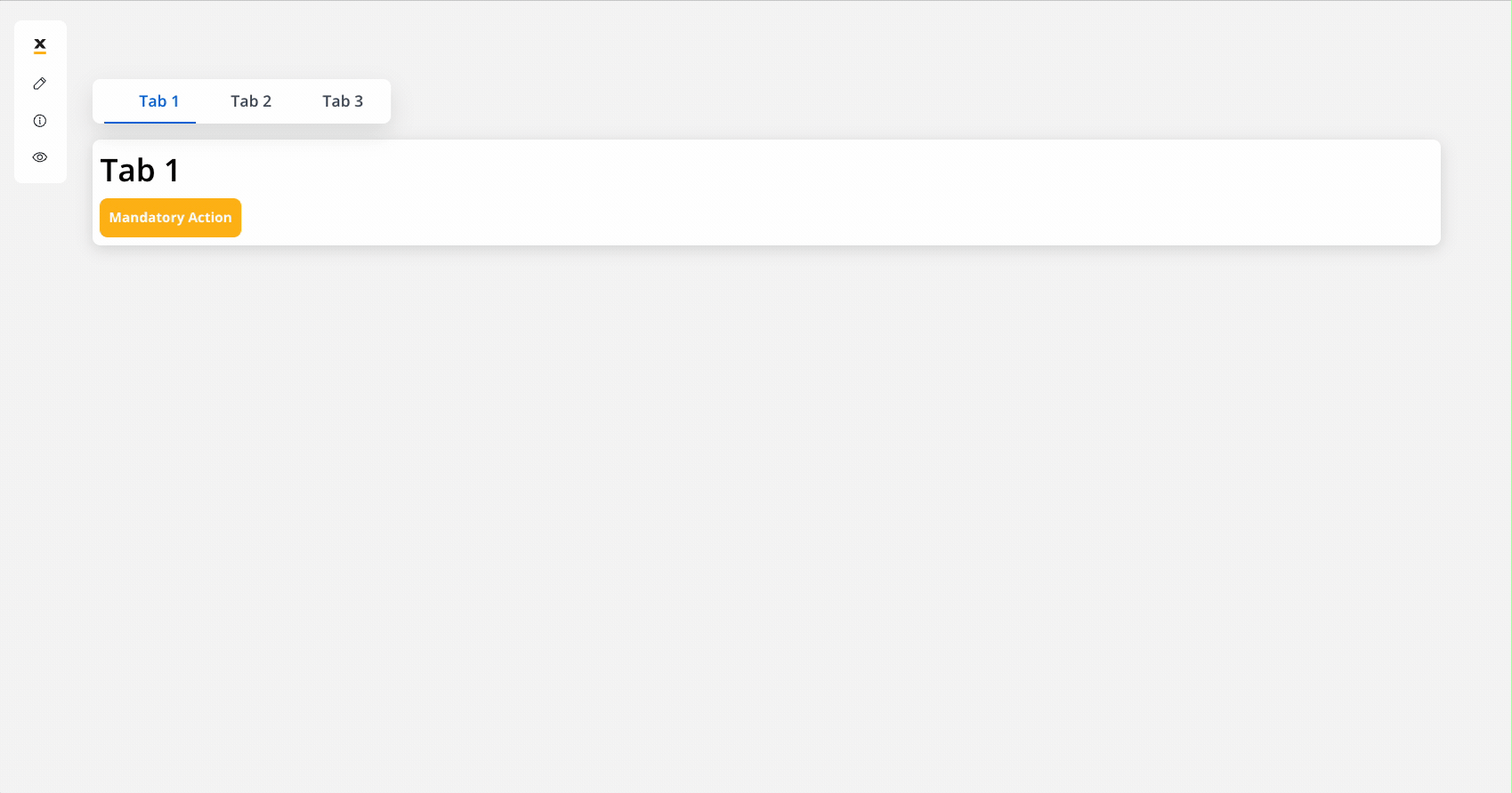
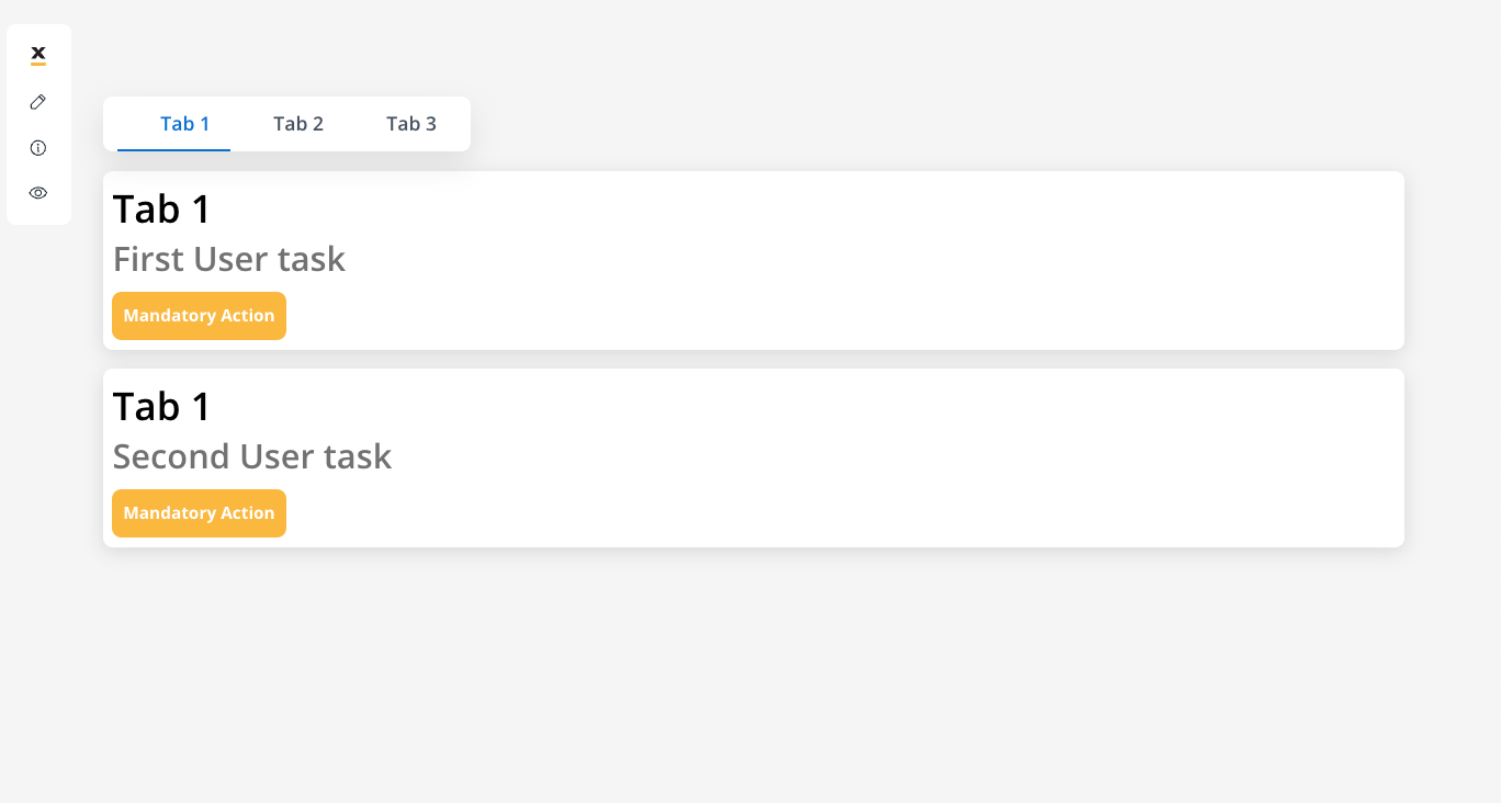
TAB BAR
- New navigation area component. The Tab Bar is a component in user interfaces, facilitating navigation and content organization allowing configuration for parallel zones (using multiple user tasks within the same tab) and for multiple tabs (users can access multiple tabs within the tab bar)
Tab Bar
Learn more
TAB
- New navigation area component. Tabs are clickable navigation elements within the Tab Bar that allow users to switch between different sections or functionalities within an application.
Tab
Learn more
ZONE
- New navigation area component for web. A container-like element grouping specific navigation areas or user tasks, used for oganizing content (ideally used for processes with headers and footers).
Zones
Learn more
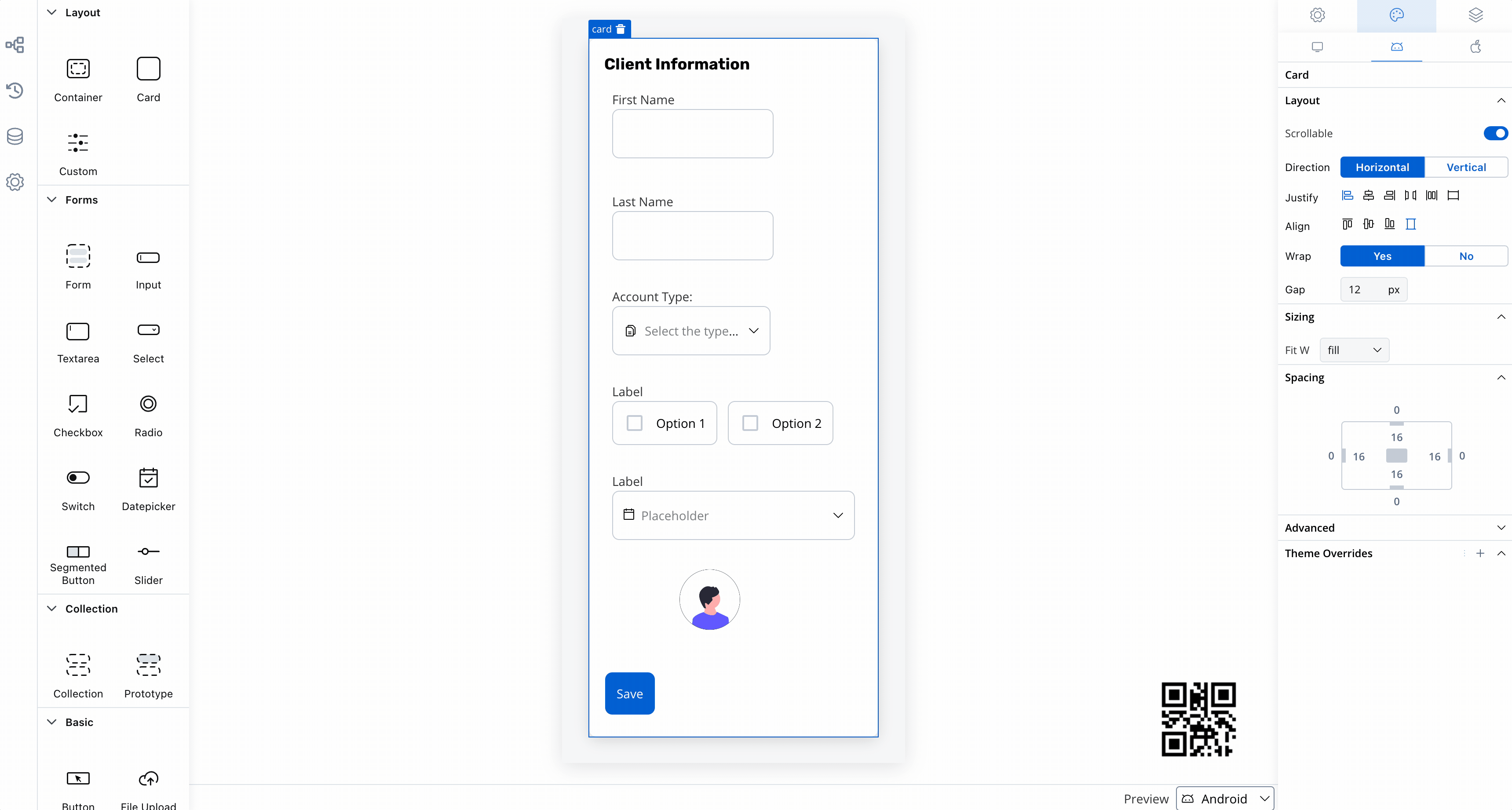
CONTAINER
- Introduced
positionproperty for setting sticky containers:
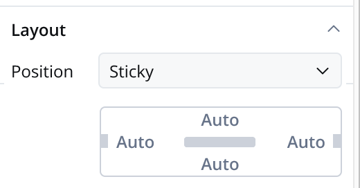
- Position Static: The container remains fixed and does not scroll along with the page content.
- Position Sticky: When the sticky property is enabled, the container maintains its position even during scrolling.
Sticky container
Learn more
- Web supports top, left, bottom, and right sticky positioning.
- iOS and Android support top and bottom sticky positioning within user tasks.
- Added
scrollableproperty for iOS and Android root containers, allowing control over scroll behavior (defaults to true). - Added
screen titleproperty for iOS and Android root containers, defining the navigation bar title.
CARD
- Removed
card type(raised or bordered) property. See more, here. - Added
scrollableproperty for iOS and Android root containers, controlling scroll behavior (defaults to true). - Added
screen titleproperty for iOS and Android root containers.
BUTTON
- Replaced
primaryandsecondarytypes withfill. See more, here. - State-specific properties can now be set for label, icon, background and border colors:
- Web: Default, hover, pressed and disabled states.
- Android: Default and disabled states.
- iOS: Default state.
TEXT
- Added
link colorproperty for markdown link color.
FILE UPLOAD
- State-specific properties can now be set for label, icon, background and border colors:
- web: Default, hover, pressed and disabled states.
- Android: Default and disabled states.
- iOS: Default state.
MESSAGE
- New
link colorproperty for markdown link color.
FILE PREVIEW
- New style properties for document icon and action icon colors.
- Introduced
autoheight type on iOS and Android when scrollable is set to false on the root container/card (when you want the file preview to fill the entire available space vertically). - New source type: Media Library.
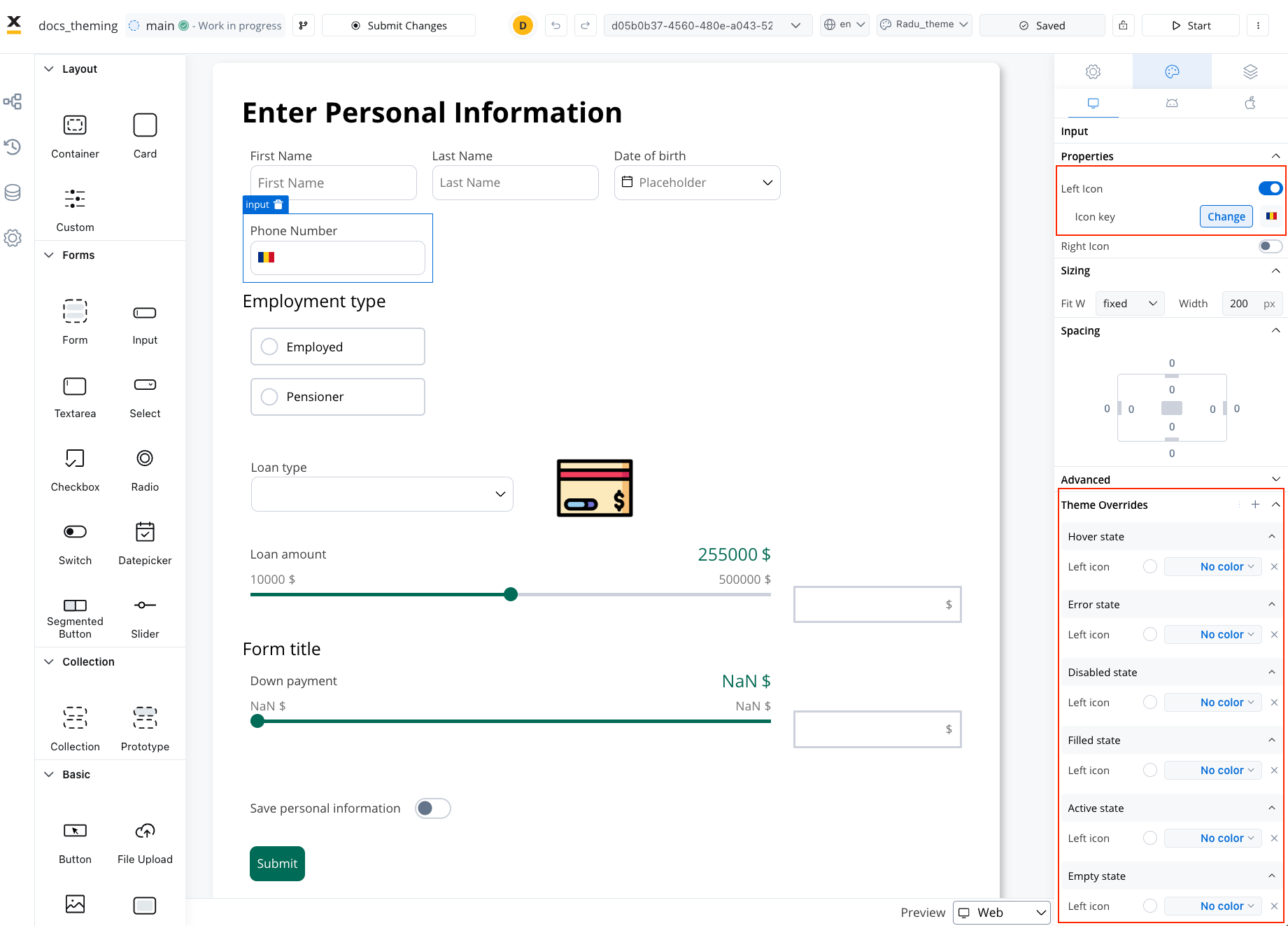
ALL FORM ELEMENTS
- Added style properties for info label, error label, helper label and helper tooltip.
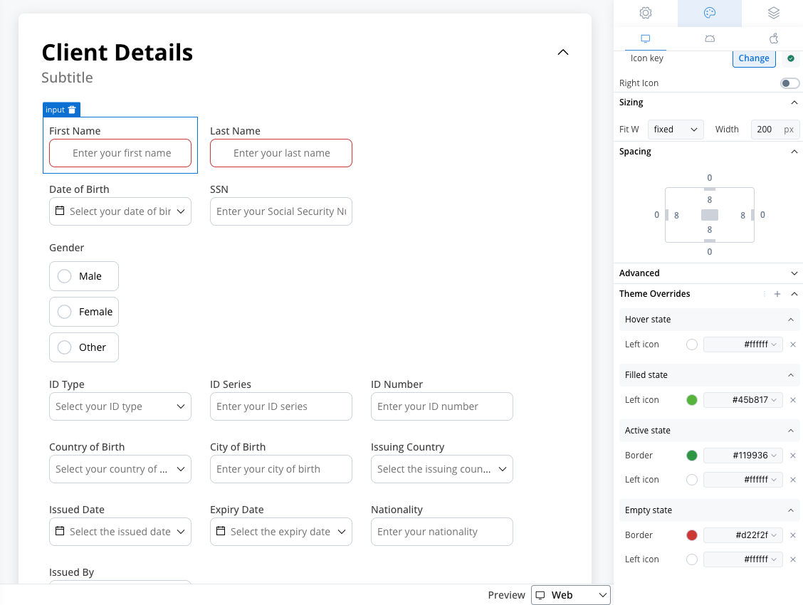
INPUT
- State-specific properties can now be set for border, background, text, right icon, left icon, prefix/suffix and placeholder colors:
- web: Empty, active, filled, disabled, error and hover states.
- Android: Empty, active, filled, disabled and error states.
- iOS: Empty, active, filled, disabled and error states.
TEXTAREA
- State-specific properties can now be set for border, background, text and placeholder colors:
- web: Empty, active, filled, disabled, error and hover states.
- Android: Empty, active, filled, disabled and error states.
- iOS: Empty, active, filled, disabled and error states.
SELECT
- State-specific properties can now be set for border, background, text, right icon, left icon and placeholder colors:
- web: Empty, active, filled, disabled, error and hover states.
- Android: Empty, active, filled, disabled and error states.
- iOS: Empty, active, filled, disabled and error states.
DATEPICKER
- State-specific properties can now be set for border, background, text, right icon, left icon and placeholder colors:
- web: Empty, active, filled, disabled, error and hover states.
- Android: Empty, active, filled, disabled and error states.
- iOS: Empty, active, filled, disabled and error states.
RADIO, CHECKBOX
- State-specific properties can now be set for border, background, text and icon colors:
- web: Unselected, selected, disabled unselected, disabled selected, hover unselected and hover selected states
- Android: Unselected, selected, disabled unselected and disabled selected states
- iOS: Unselected, selected, disabled unselected and disabled selected states
SWITCH
- State-specific properties can now be set for border, background and knob colors:
- web: Unselected, selected, disabled unselected and disabled selected states.
- Android: Unselected, selected, disabled unselected and disabled selected states.
- iOS: Only background color on selected state.
SEGMENTED BUTTON
- State-specific properties can now be set for border, background and text colors:
- web: Unselected, selected, disabled unselected, disabled selected, hover unselected and hover selected states.
- Android: Unselected, selected, disabled unselected and disabled selected states.
- iOS: Only background and text color on unselected and selected states.
SLIDER
- State-specific properties can now be set for limits, value, filled, empty and knob colors:
- web: Default and disabled states.
- Android: Default and disabled states.
- iOS: Default and disabled states. Disabled only with limits and value.