Key Features of Theme Management
-
Theme Management:
- Creation, editing, and management of themes.
- Selection of predefined themes or customization of themes from scratch.
-
Customization Options:
- Modification of color schemes, typography, spacing, and visual effects.
- Upload of custom assets like fonts and icons.
-
Overrides and Variations:
- Ability to override default UI components styles properties on specific elements or sections.
- Creation of different themes to accommodate different users/clients preferences.
-
Platform Consistency:
- Consistency of theme styles across different platforms and devices.
-
Preview:
- Real-time visualization of theme changes.
-
Export/Import Functionality:
- Export of themes for backup, sharing, or reuse across multiple environments (UAT, DEV, etc.).
- Import of exported themes from other environments.
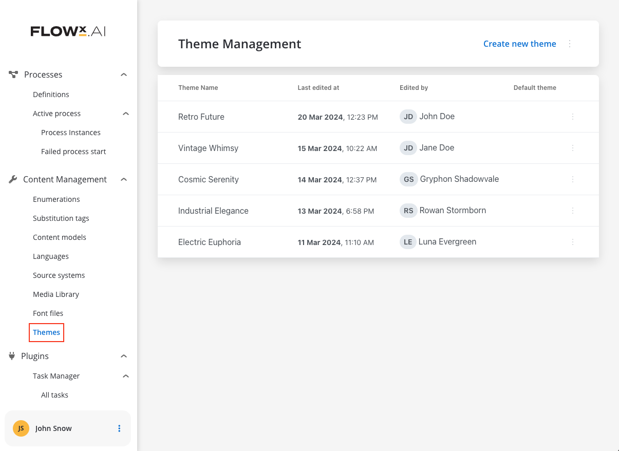
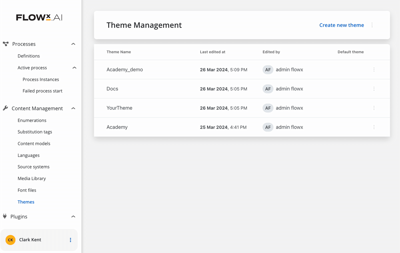
Creating a new theme
You have two options for creating the theme. You can import a theme that was exported from another environment (for example, your UAT/DEV) or to manually create it.
Initiating theme creation
Locate the “Create New” button positioned above the right of the Themes list table.
Inputting theme details
Click the “Create New” button and enter details for your theme:
- Theme Name - pick a name for your theme
- Font Family - select your desired font family, by default, the system provides “Open Sans”
- Choose your primary color - the default color is
#006BD8.
Verify that the color format is in HEX. If not, an error message will indicate “Please insert a HEX color.”

Configuring a new theme
After creating a theme, you must configure it. To configure your theme effectively, follow these steps:Access theme settings
- Navigate to the settings or customization section of your application (in the UI Designer).
- Look for options related to styling and think of an overall design
Customize theme settings
The Themes styles mechanism is based on hierarchy. In this hierarchy we have the following elements: Design Tokens, Global Settings and Components.
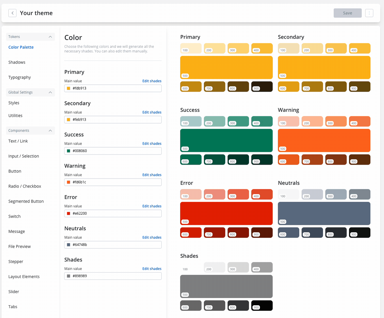
Design Tokens
Design Tokens
The Design Tokens represent values based on which the theme is built.
- Color Palette, Shadows, Typography Tokens: Configure these tokens based on your company’s brand guidelines. They ensure reusability and consistency.
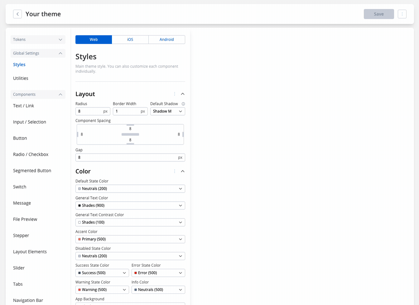
Global Settings
Global Settings
The Global Settings are properties that inherit values from the Design Tokens and sit on the top of the hierarchy. These properties are then inherited by the Components.
- Platform-specific Settings: Configure settings for each platform (web, iOS, Android) based on the global settings you’ve defined.
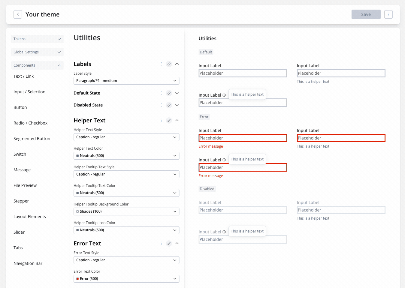
- Styles and Utilities: General settings applying to all components (styles) and labels, errors, and helper text settings (utilities).
Component-level configuration
Component-level configuration
When setting up your theme, remember that different platforms like web, iOS, and Android have their own settings. You need to configure each platform separately. Only color settings are the same across all platforms.
Keep in mind, there are differences between platforms, for example, for button configuration there are different properties available. What you configure on a platform will not be inherited by the others.
Reviewing the changes (multi-platform)
- Before finalizing the theme configuration, it’s crucial to review how the changes will appear across different platforms. This step ensures consistency and allows for platform-specific adjustments if needed.
- You can do that by either using the preview feature from Themes or by using the preview mode in the UI Designer by switching to your preffered platform.
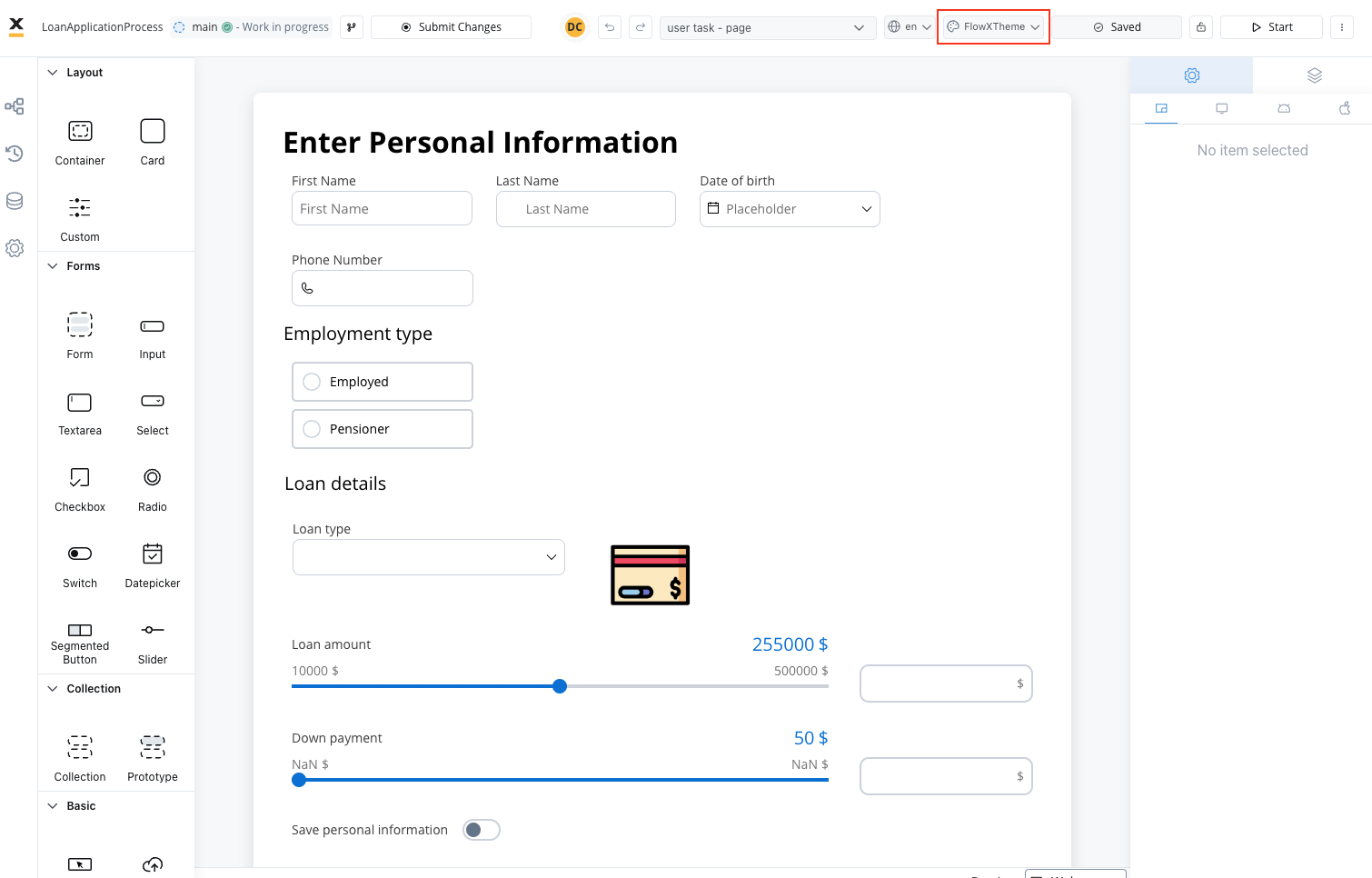
Managing themes - process level (theme overrides)
With the Overrides feature you have now the possibility to override default theme settings on specific elements or sections. Use Theme Overrides in UI Designer to adjust styles or props for specific UI elements based on the desired platform (Web, iOS and Android).All components can now be styled with token overrides, for color, typography and shadow settings defined in the theme.
Theme overrides in UI Designer are applied to the component itself, rather than to specific themes. This means that when switching the view to another theme, the overrides persist and apply to the new theme as well.
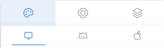
Styles tab
The Styles tab functions independently for three platforms: Web, iOS, and Android. Here, you can customize styles for each UI component on each platform. If you want to customize the appearance of a component to differ from the theme settings, you must apply a Theme Override.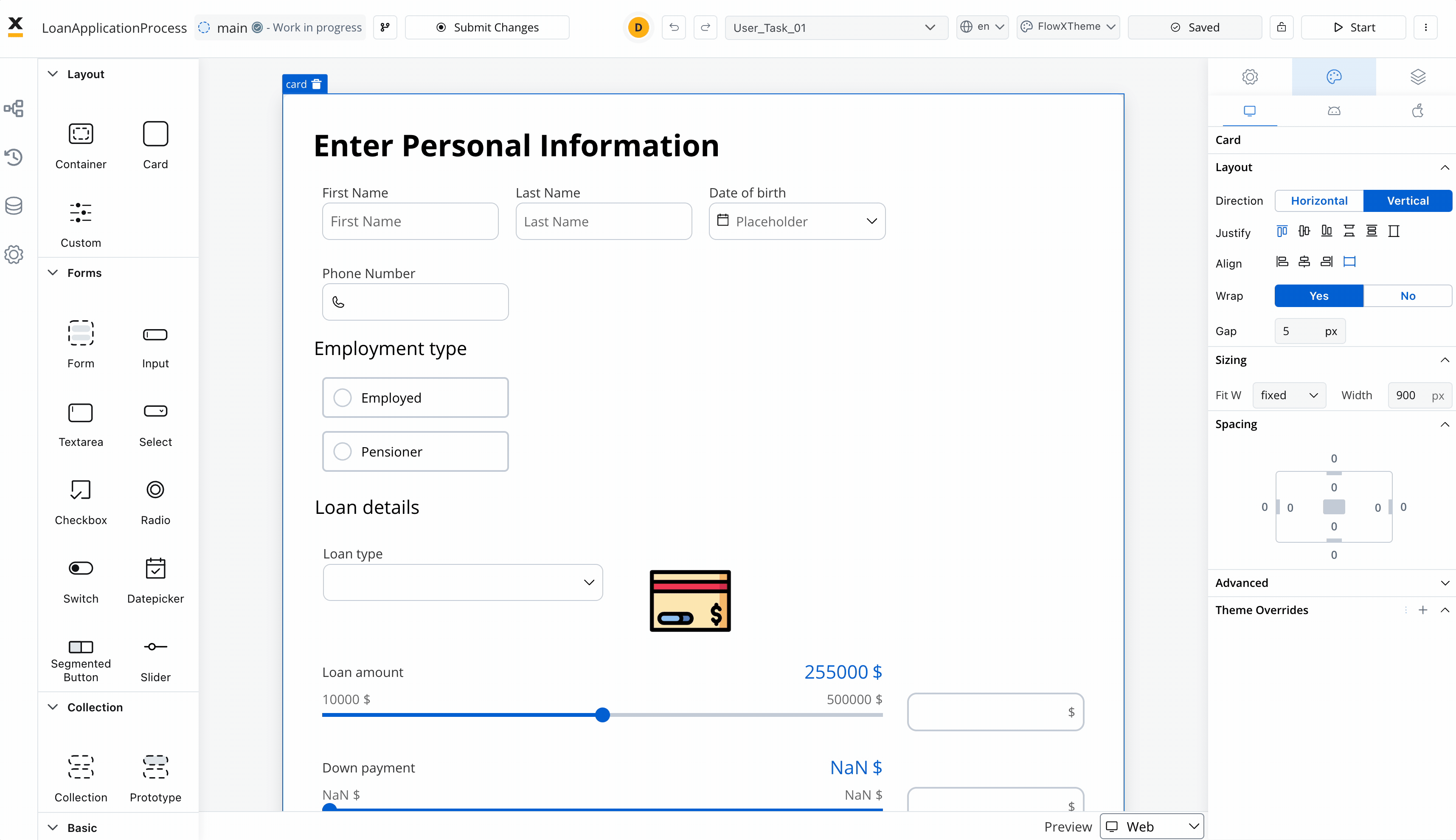
Theme overrides can be imported from one platform to another.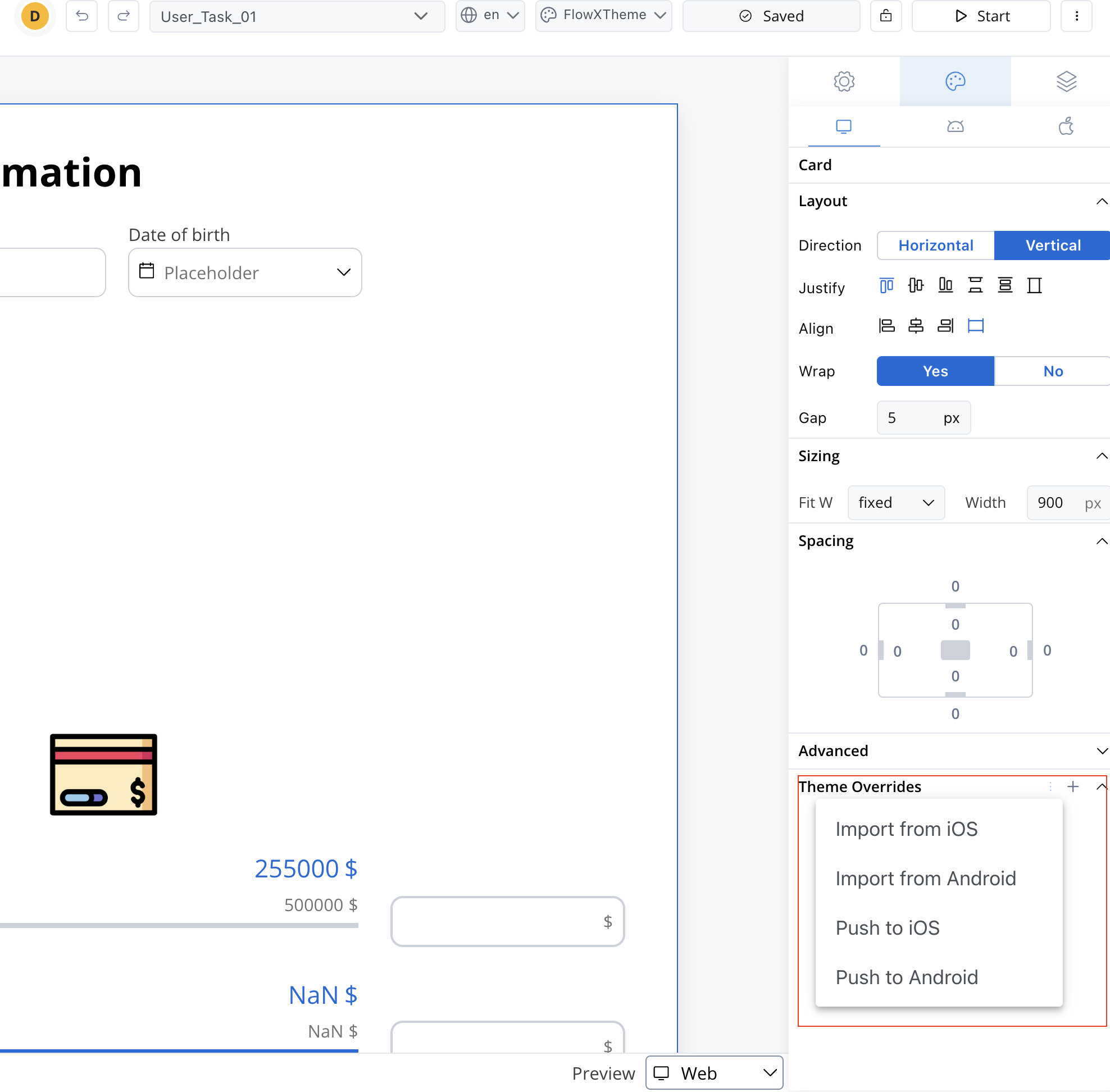
Preview mode: In the UI Designer, overrides are entirely independent of the theme. Regardless of the theme selected in preview mode, you will see the applied override reflected at the UI Designer level.
Preview
When you are editing a process in UI Designer you have the possibility of having the preview of multiple themes: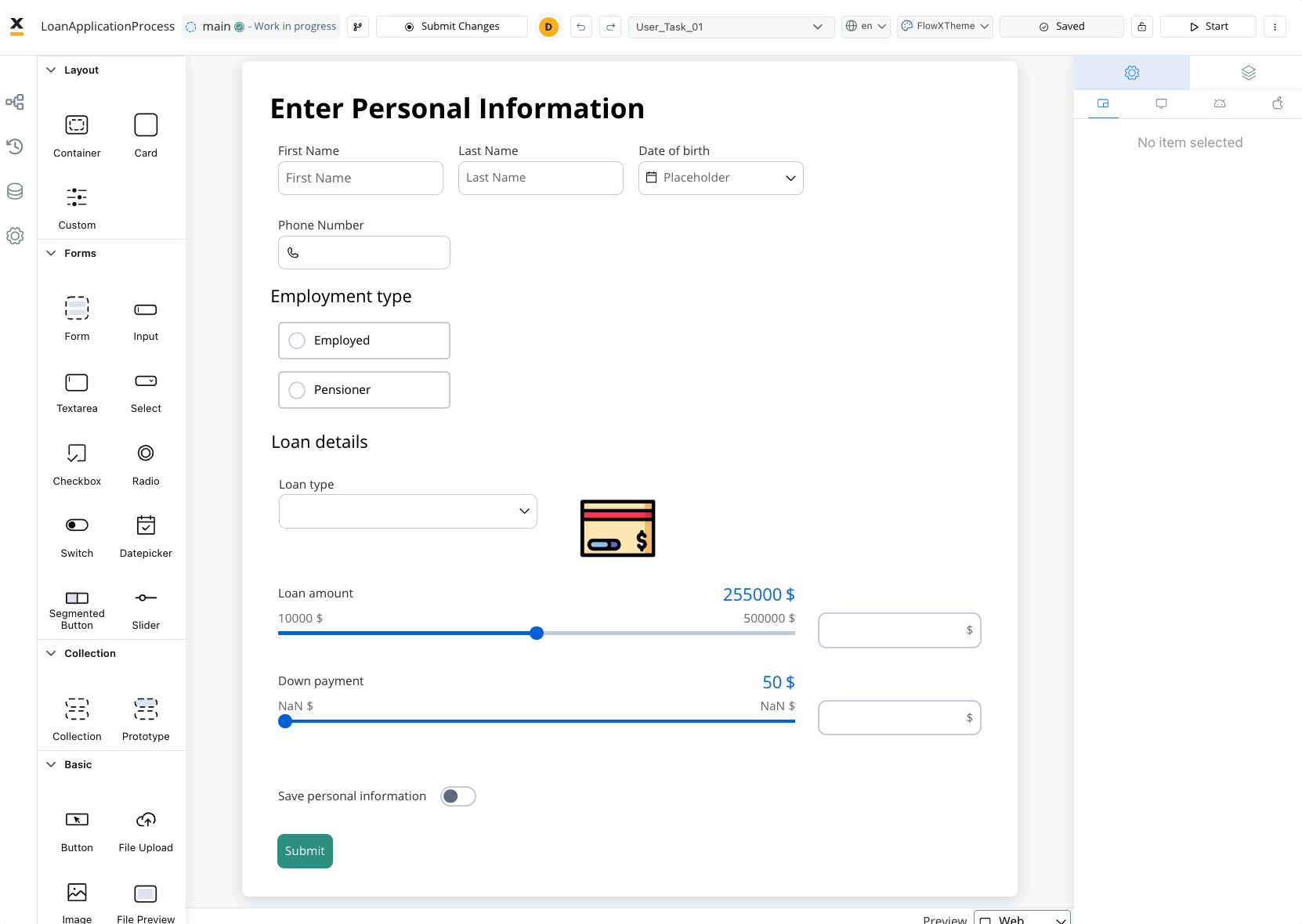
Overrides are completely independent of the theme, regardless of which theme you choose in the preview mode.
Using a Theme in the Container Application
To integrate the theme into your container application, follow these steps:- Copy the unique identifier (UUID) associated with the theme.
- Set the copied UUID within your container application.
- By doing so, ensure that the renderers within your application can recognize and apply the specified theme.
Exporting/importing a theme
The Export/Import functionality in the theme management system allows users to export themes for various purposes such as backup, sharing, or reuse across multiple environments. Additionally, it enables the seamless import of themes previously exported from other environments, facilitating swift integration and continuity across design workflows.Exporting a theme
Importing a theme
Setting a default theme
You can easily establish a default theme by accessing the contextual menu on the right side of a theme and selecting “Set as Default.”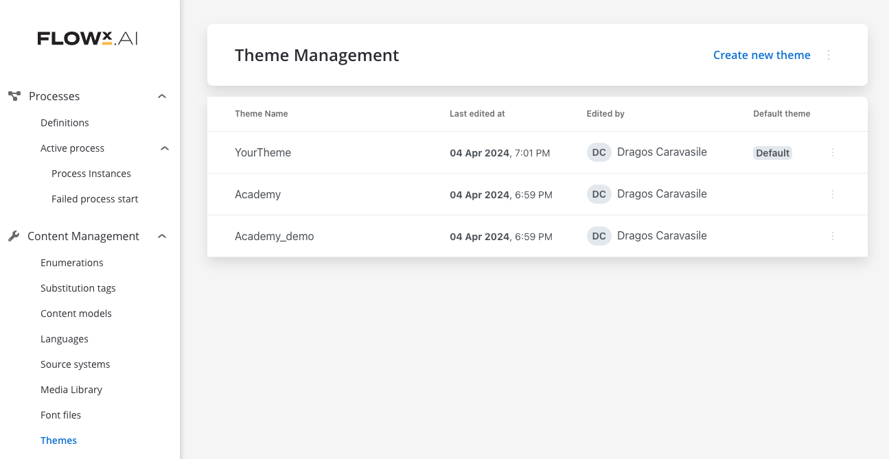
In case you select a specific default theme but later you delete it, the platform will revert to the FlowX theme as the default. This safeguard ensures that there’s always a default theme available, even if you remove your custom selection.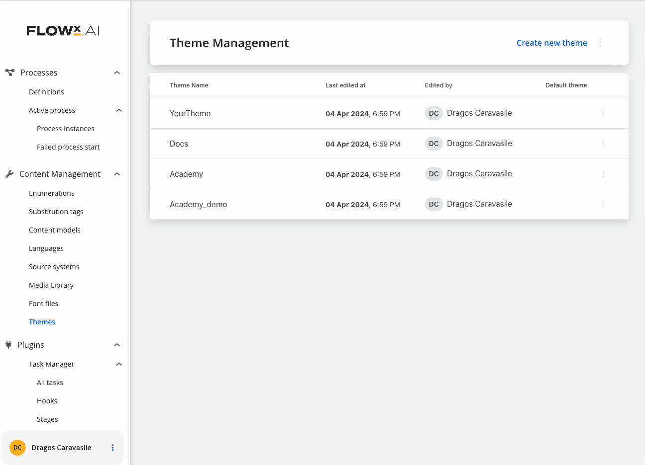
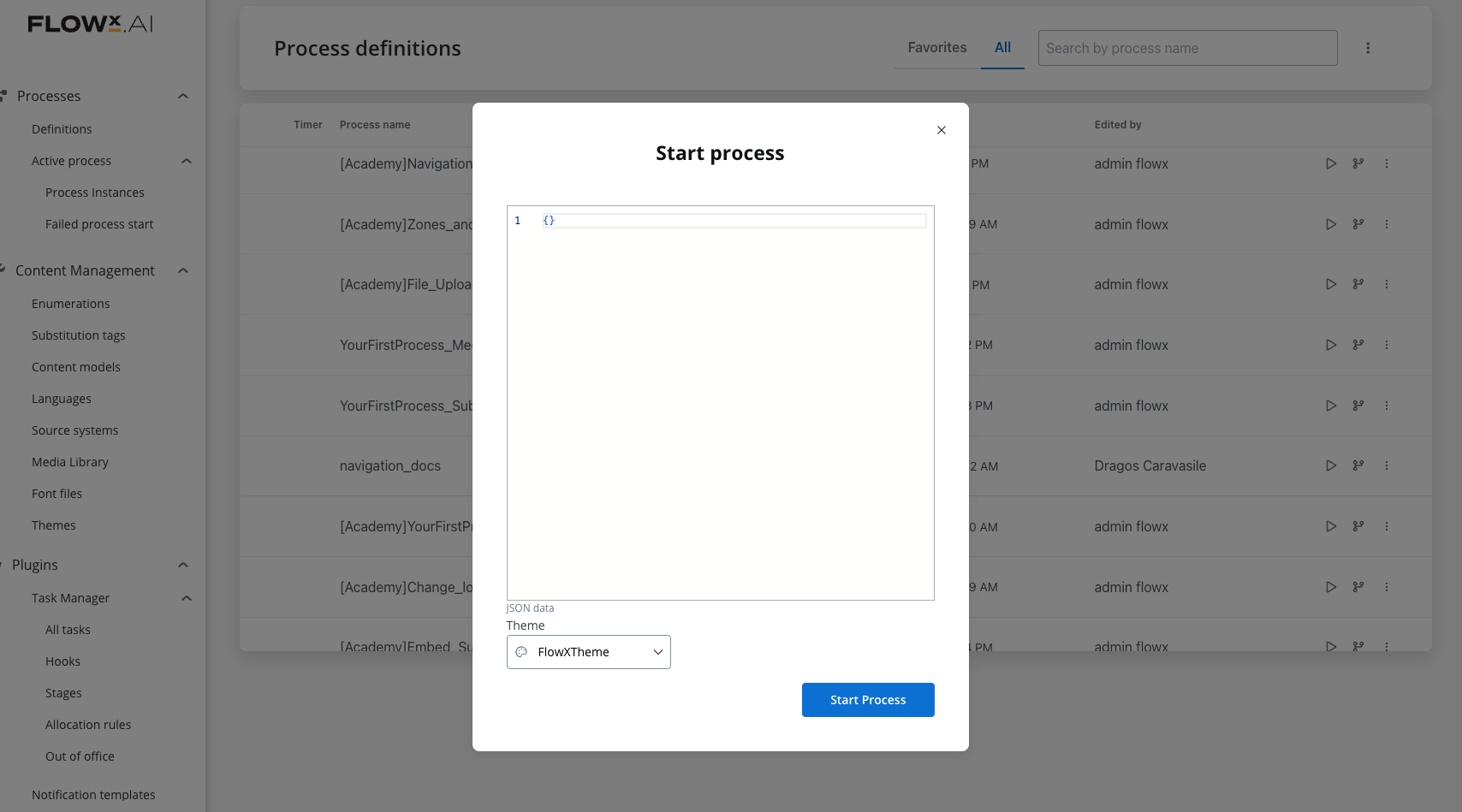
Furthermore, when you start a process definition, the theme switch defaults to the default theme in the run process popup from the process definitions list. This ensures that the default theme is consistently applied during the execution of processes, maintaining visual coherence in user interactions.