Business Rules
output.putmethod is required to generate structured output data when using input to validate or filter incoming data based on certain conditions (commonly used to retrieve information needed for processing)
MVEL Syntax Change: In MVEL 2.5.2.Final, the direct property assignment syntax (input.property = value) is no longer supported. Instead, you must use the output.put method (output.put(“property”, value)) to generate structured output data.
- This represents a fundamental change in how MVEL scripts interact with data
- The input object should be treated as read-only for accessing incoming data*
- The output object with its put method must be used for storing any results or modified values
processInstanceIDandprocessInstanceUUID- This release introduces enhancements aimed at isolating process instance related values from business/configured parameters. Key changes include the removal ofprocessInstanceId,parentProcessInstanceId, andparentProcessInstanceUuidfrom paramValues zone on process instance, relocating them to a distinct location within process instance data - to a new object called “instanceMetadata”.
Business rules - new object “instanceMetadata”
Introducing a new object named “instanceMetadata”. This object will serve as a container for process instance related values, allowing you to access relevant attributes in your scripts more effectively. Key specifications include making certain variables/parameters read-only, controlled by FlowX, and facilitating attribute access through theinstanceMetadata object rather than directly calling attributes.
Configurators will utilize
instanceMetadata to access attributes instead of directly calling them as in version 3.4.x. For example, input.processInstanceId will be accessed through instanceMetadata.processInstanceId.Example of business rule (with Python)
This example is made just to demonstrate the use of the new
instanceMetadata.get object.UI configuration
There are some changes that were brought together with the Theme Management feature to the UI components in 4.0 release that might impact your previous UI configuration.
Root components
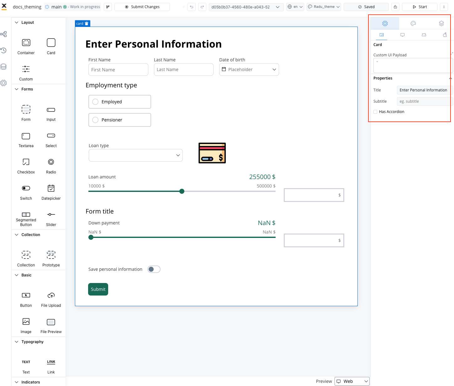
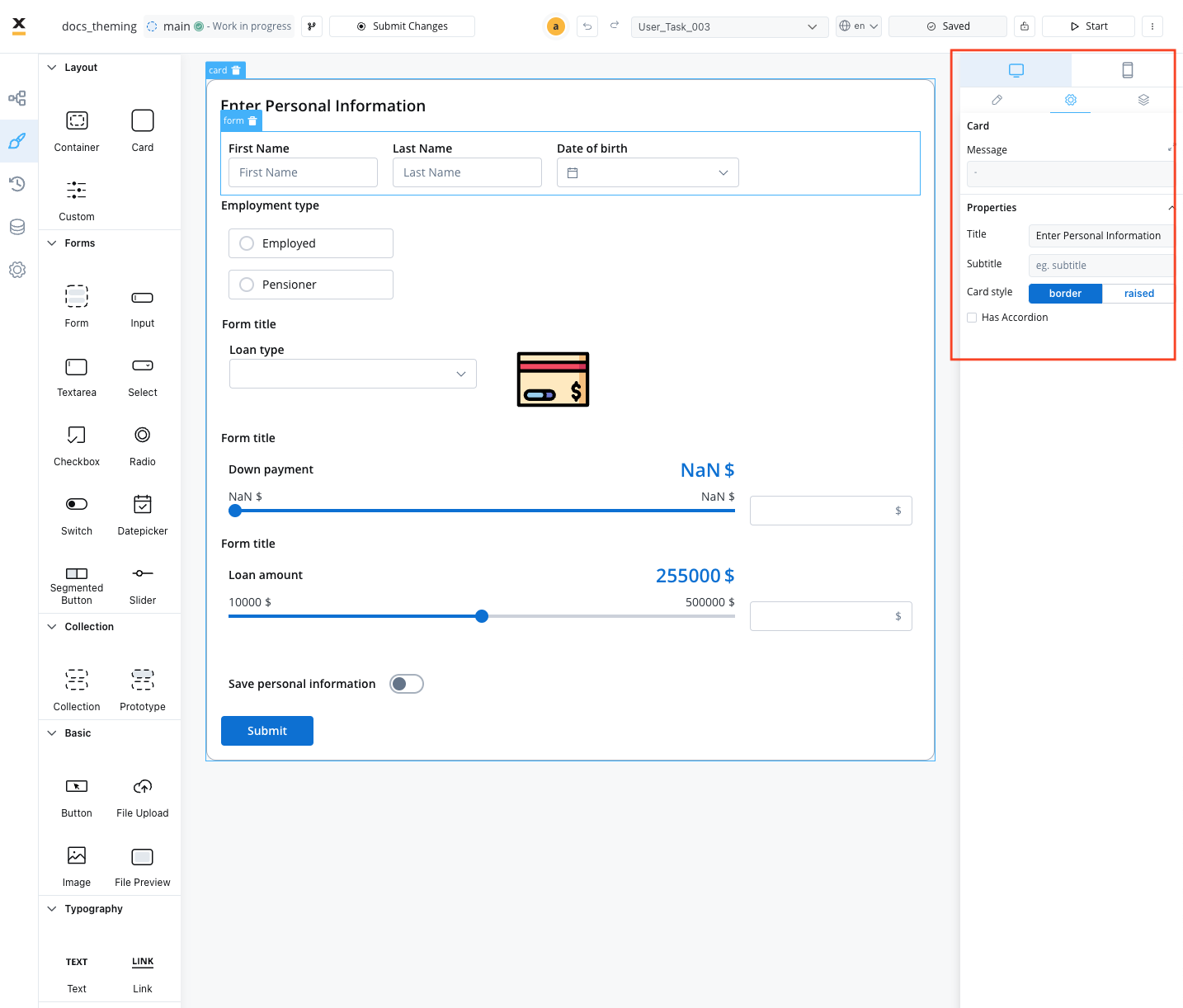
- Card Element: Previously (in v3.4.x) could have set a Card style property: border or be raised.
| Card 4.0 | Card 3.0 |
|---|---|
 |  |
Theme management
Buttons
All primary and secondary buttons, in 4.x they transformed to fill buttons. If there were secondary buttons, once moved to “fill”, they will appear similar to primary ones. You should perform an override in the UI Designer to make them look like secondary buttons as they did initially.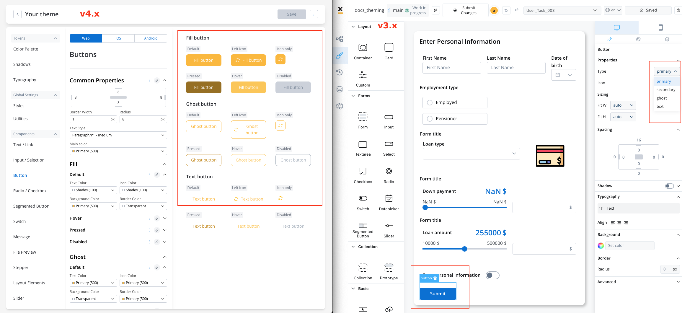
| Version | Primary | Secondary | Ghost | Text | Fill | New States: Pressed, Hover, Disabled |
|---|---|---|---|---|---|---|
| 3.4.x | ✓ | ✓ | ✓ | ✓ | ||
| 4.0.x | ✓ | ✓ | ✓ | ✓ |
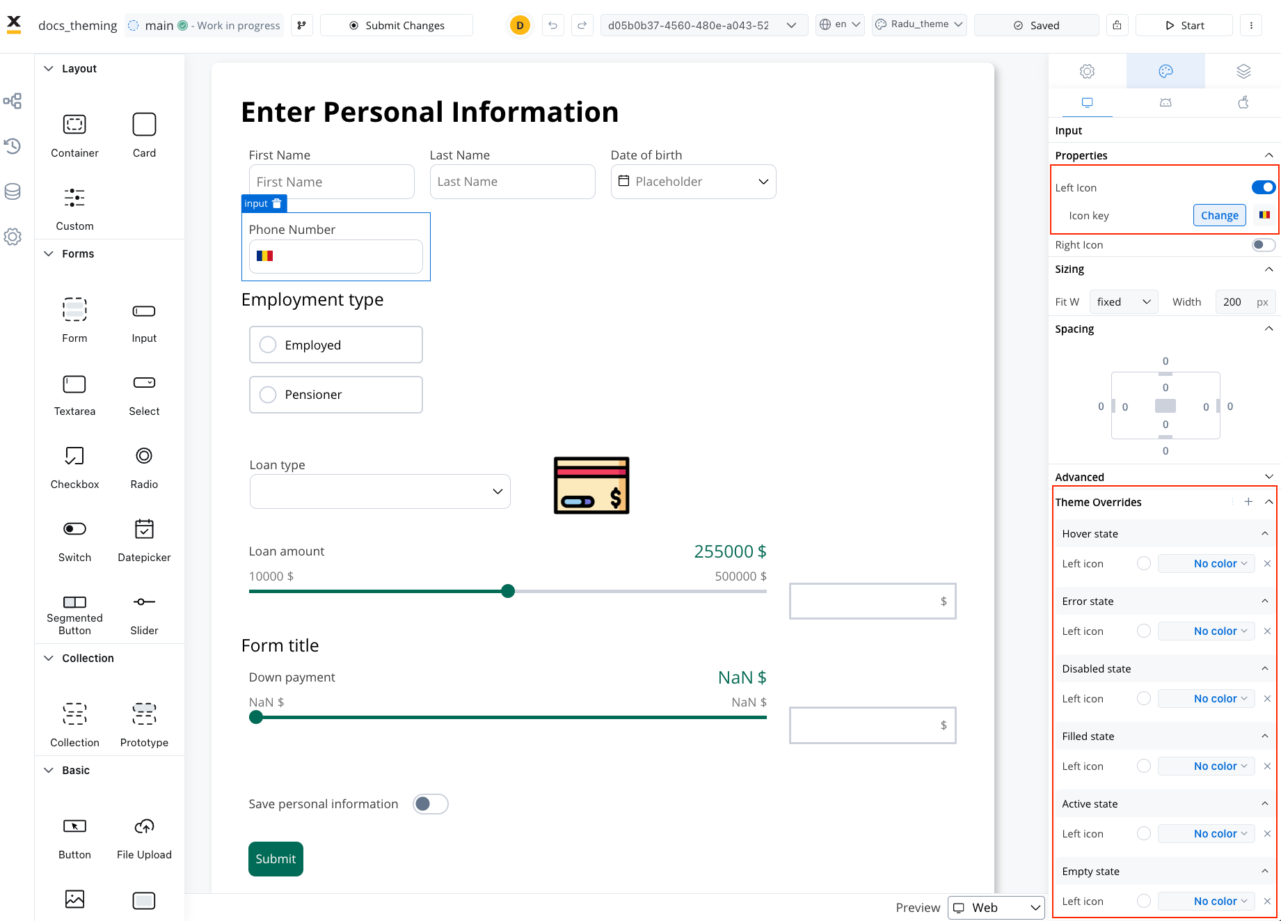
Icons - no color property
Now, all icon color settings have a “No Color” option, which allows the icon (SVG) to be rendered with its original color settings.
Layout
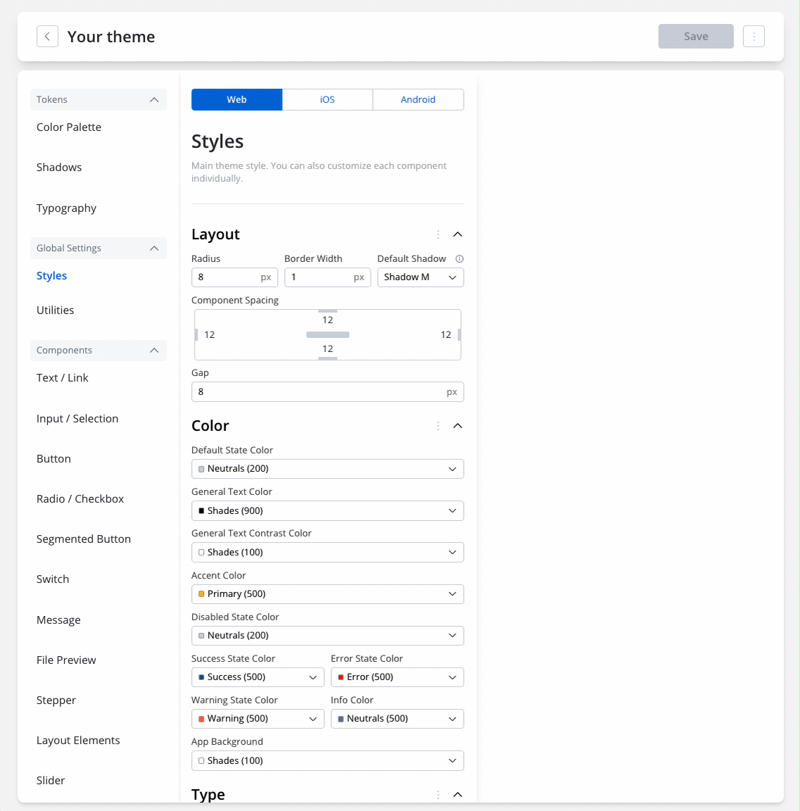
In the context of the Theme Management feature, you can now apply the previously configured paddings directly from the previosuly used theme JSONs within the theme settings. Review the paddings you had set up previously and apply them in the Themes section. Themes → Global Settings → StylesComponents spacing
If you set it in Theme → Global Settings, it will cascade to all the following components:- Input/ Selection
- Buttons
- Radio/Checkbox
- Message
- Segmentted Button
- Stepper
- Tabs
After editing the padding for a component, you can also reset the values and they will be set back to the values you added in Global settings.