Properties and settings
Settings (applicable across all platforms)
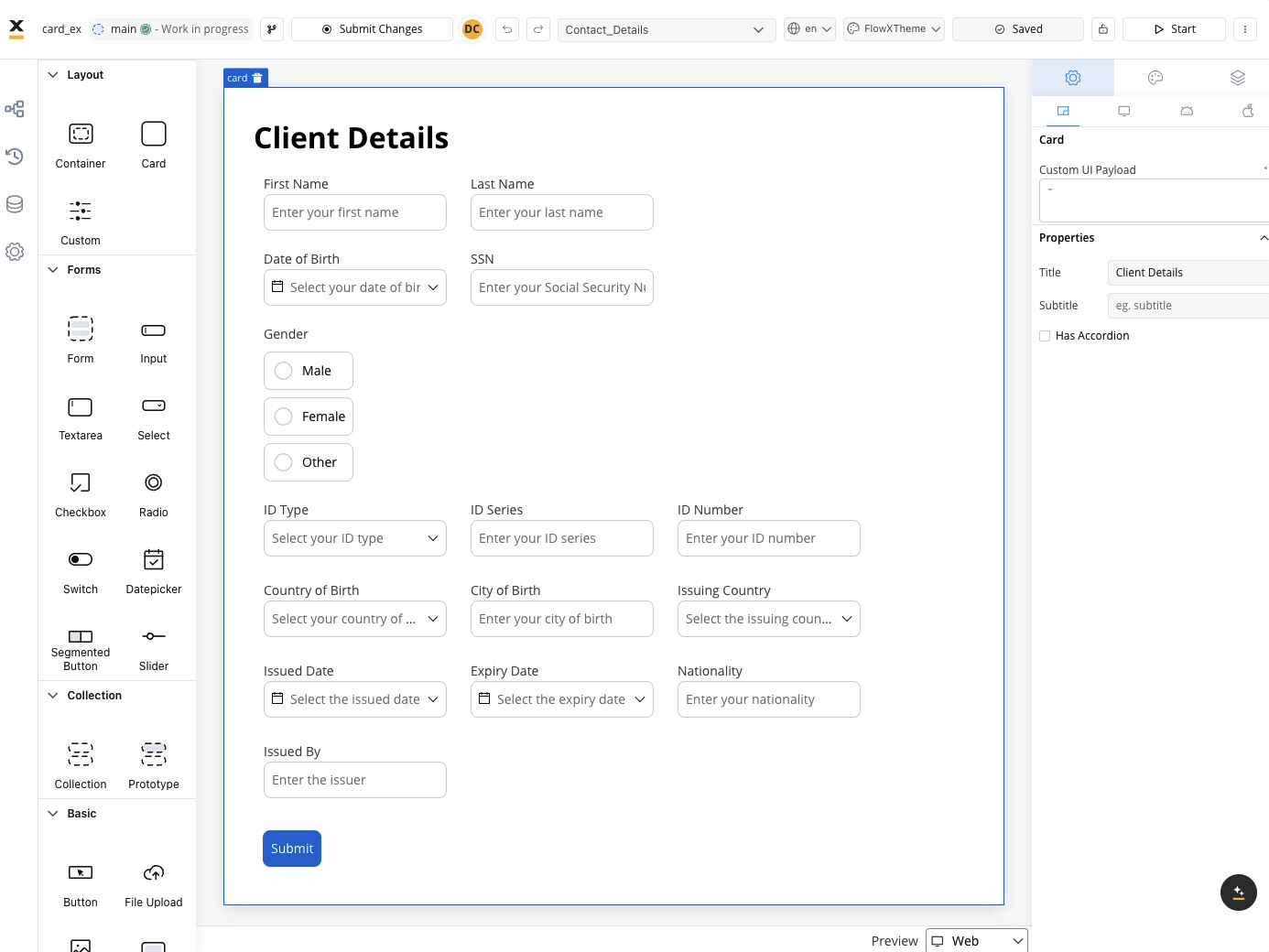
These settings added in the Generic tab are available and they apply to all platforms including Web, iOS, and Android.When used as root
When the Card is utilized as the root component, it offers the following settings:- Custom UI Payload: A valid JSON describing the custom data transmitted to the frontend when the process reaches a specific user task.
- Title: The title displayed on the card.
- Subtitle: Additional descriptive text accompanying the card.
- Has accordion: Introduces a Bootstrap accordion, facilitating the organization of content within collapsible items. It ensures that only one collapsed item is displayed at a time.
- Default collapse state: When accordion is enabled, this property determines whether the card is initially collapsed or expanded when first loaded. Options:
- Expanded (default): The card content is visible when the screen loads.
- Collapsed: The card content is hidden when the screen loads, and users must click to expand it.
The accordion feature is not available for mobile configuration.
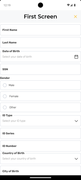
Mobile configuration (iOS & Android)
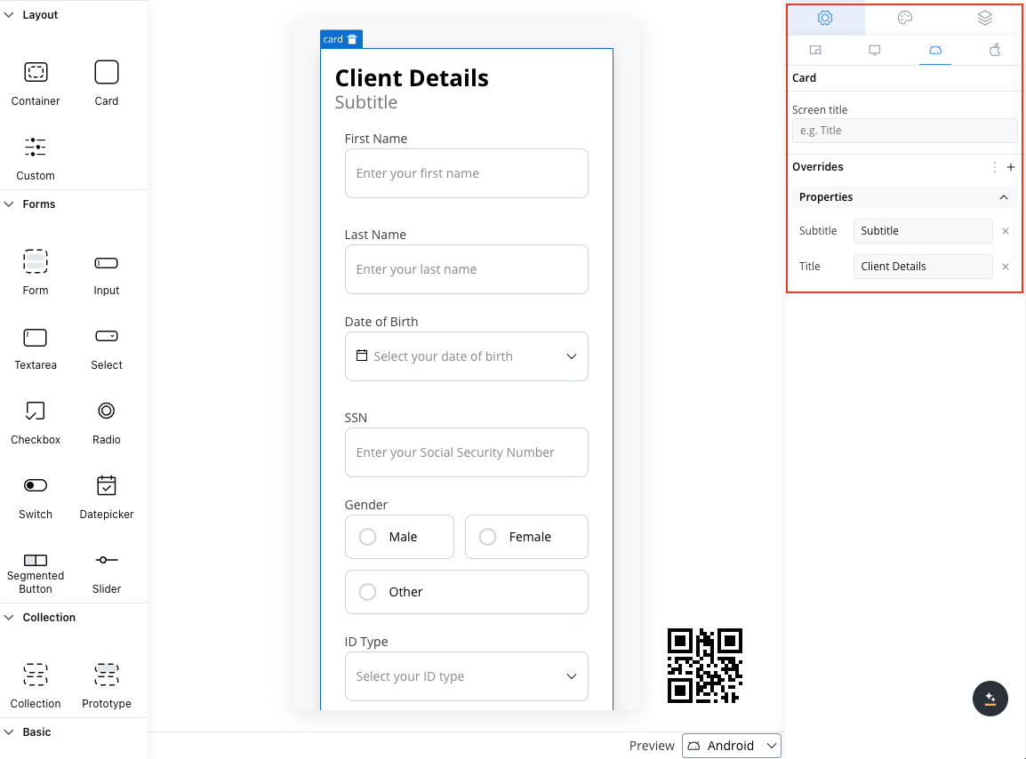
For mobile configuration (iOS and Android), you can also configure the following property (not available on Web configuration):- Screen title: Set the screen title used in the navigation bar on mobile devices (available only when the card element is set as the root).
Card settings overrides
You may want to override the card title or subtitle set as Generic to be displayed differently on mobile devices. For example, on the web, titles might be shorter.- Web
- Android
- iOS
Available properties overrides for web (overriding properties set in Generic settings tab):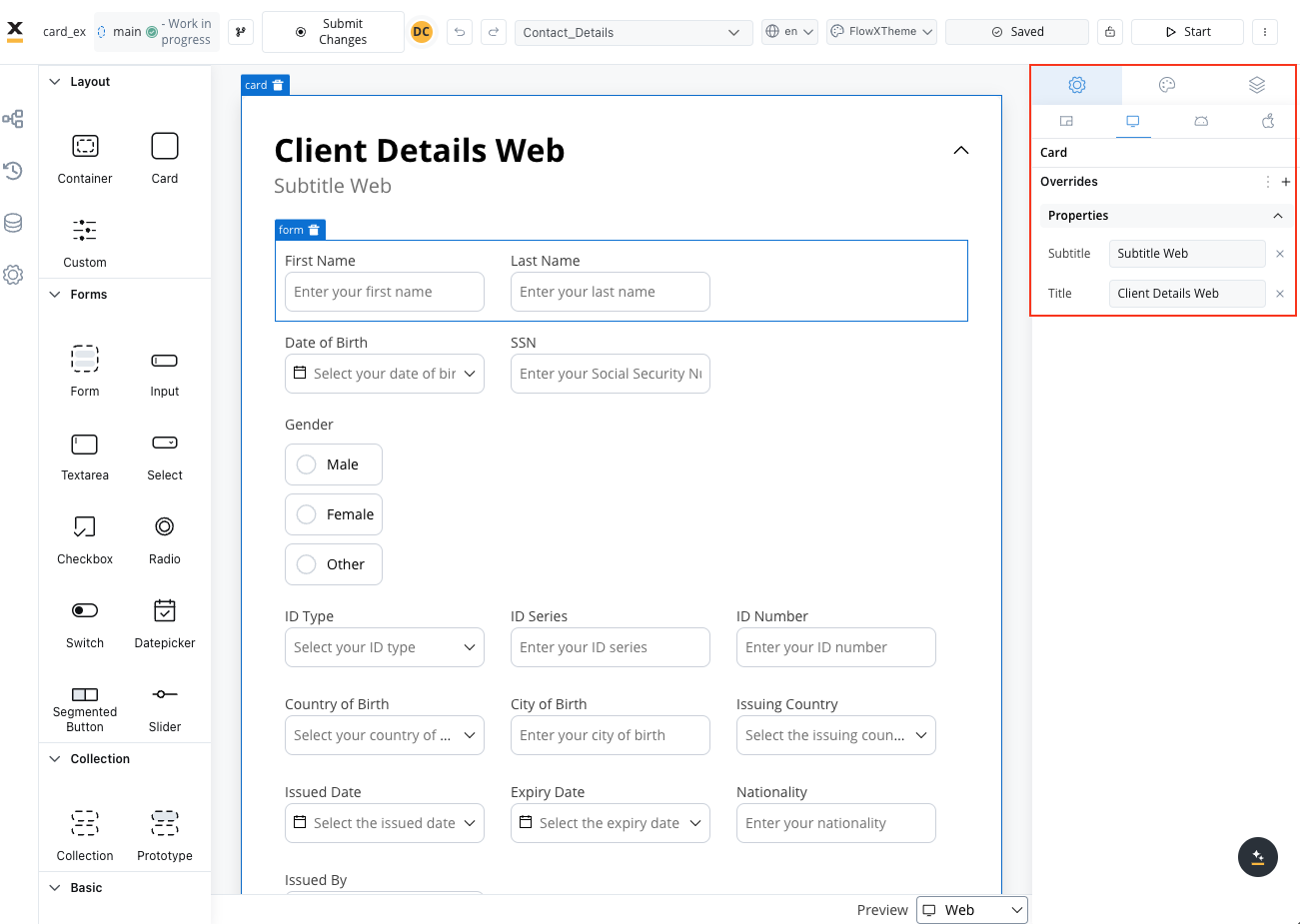
- Title
- Subtitle
When not used as root
When the card is not the root, you can configure: Title, Subtitle, Card Style, Has Accordion, and Default collapse state. Use cards in your designs to organize and present content, enhancing the overall user experience.Styling
- Web
- iOS
- Android
- Layout
- Sizing
When designing for the web, consider the layout options available for the card. These options include:
- Direction: Choose between Horizontal or Vertical alignment to define the flow of components. For example, select Horizontal for a left-to-right layout.
- Justify (H): Specify how content is aligned along the main axis. For instance, select end to align items to the end of the card.
- Align (V): Align components vertically within their card using options such as top, center, or bottom alignment.
- Wrap: Enable wrapping to automatically move items to the next line when they reach the end of the card. Useful for creating multi-line layouts.
- Gap: Define the space between components to control the distance between each item. Adjusting the gap enhances visual clarity and organization.
Theme overrides
Customize the appearance by overriding style options coming from your default theme. Available overrides:- Border width
- Border radius
- Border color
- Background color
- Shadow
- Title
- Title Color
- Subtitle
- Subtitle Color
Layout Demos
Validating elements
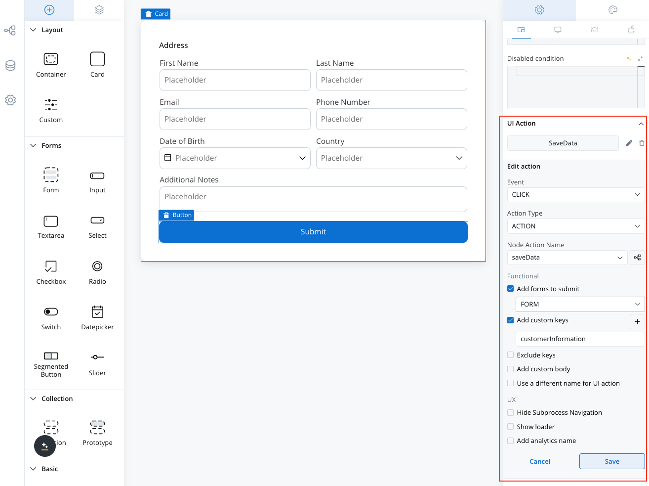
To ensure the validation of all form elements and custom components within a card upon executing a Save Data action such as Submit or Continue, follow these steps:- When adding an event handler to a button inside a card, locate the dropdown menu labeled Add forms to submit.
- From the dropdown menu, select the specific forms, individual form elements, or custom components you wish to validate.
- If you select custom components, ensure they are properly configured to handle validation and data saving responsibilities.
Custom component validation
Event handlers enable validation and data management for custom components alongside form elements. This provides flexibility if you want to design custom components for entire screens, such as custom forms not natively supported by the platform.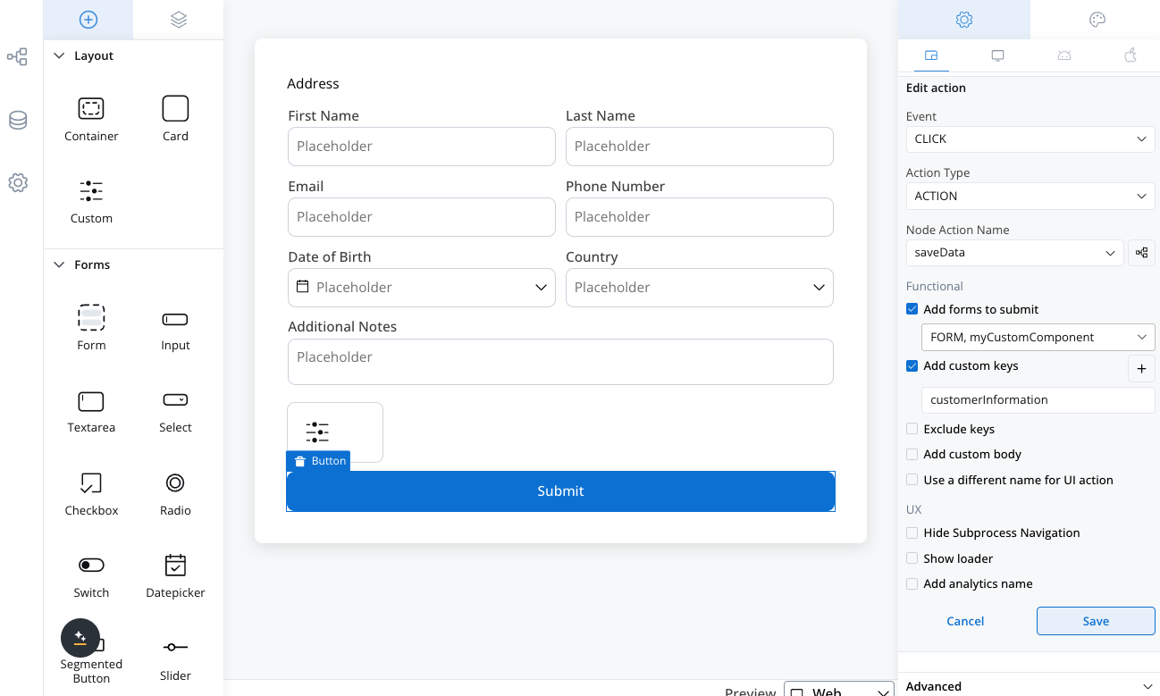
Key features
- Validation API: The renderer provides a public API for validating custom components before triggering an action.
- Custom Component Responsibilities:
- Validate custom forms and return a boolean (
truefor valid,falsefor invalid). - Display validation errors in the UI for invalid data.
- Populate a
saveDataproperty with the structured data to be submitted.
- Validate custom forms and return a boolean (
- Configurator Responsibilities:
- Select custom components in the Add forms to submit dropdown when configuring an event handler.
- Set the custom key to store the data submitted by the custom component.