

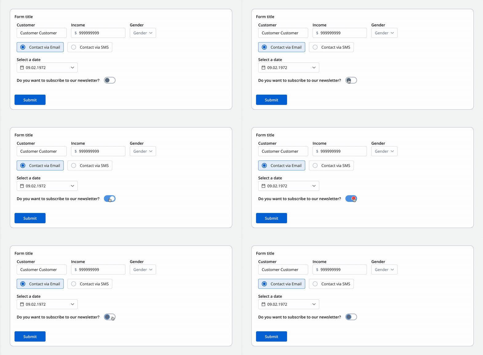
Configuration overview
Configure your switch component using these main sections:Basic Settings
Process data binding, labels, and switch type
Data & Validation
Default values, datasources, and validators
Behavior
Hide/disable conditions and event handlers
Styling
Visual appearance and platform-specific overrides
Basic configuration
Process data key
The process data key creates a binding between your switch component and the process data, enabling you to reference the switch value in:Core properties
Label
Label
Purpose: The visible text displayed alongside the switchFeatures: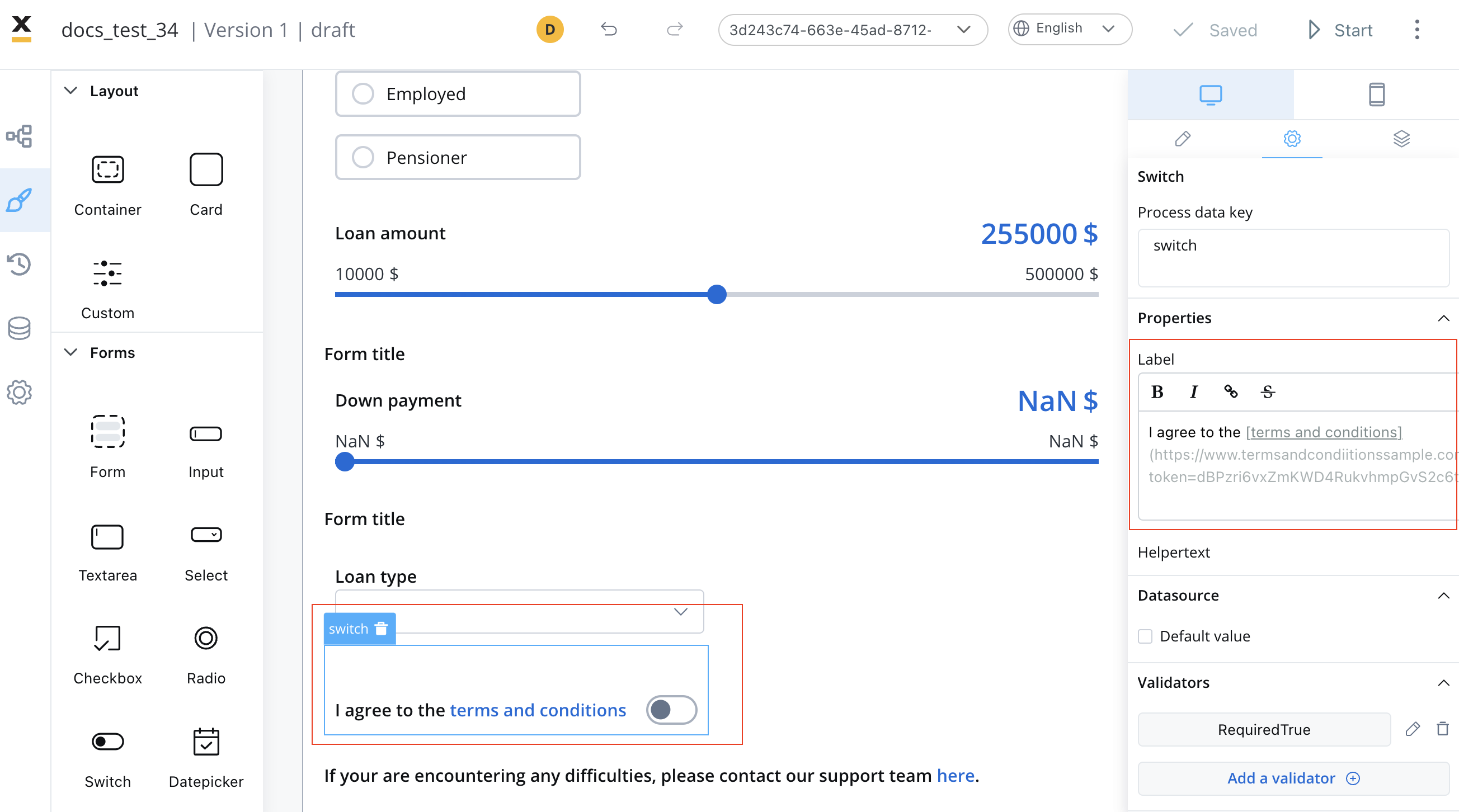
- Supports full Markdown syntax for rich formatting
- Can include links, emphasis, and other Markdown elements
- Responsive across all platforms
Switch Type
Switch Type
Choose the visual representation of your switch:
Helper Text
Helper Text
Purpose: Provide additional context or instructionsOptions:
- Display as regular text below the switch
- Hide within an expandable info point tooltip
- Support for Markdown formatting
Data configuration
Default value
Set the initial state of your switch component:- Default: Switch starts in the “on” position (true)
- Alternative: Configure to start in the “off” position (false)
Validation rules
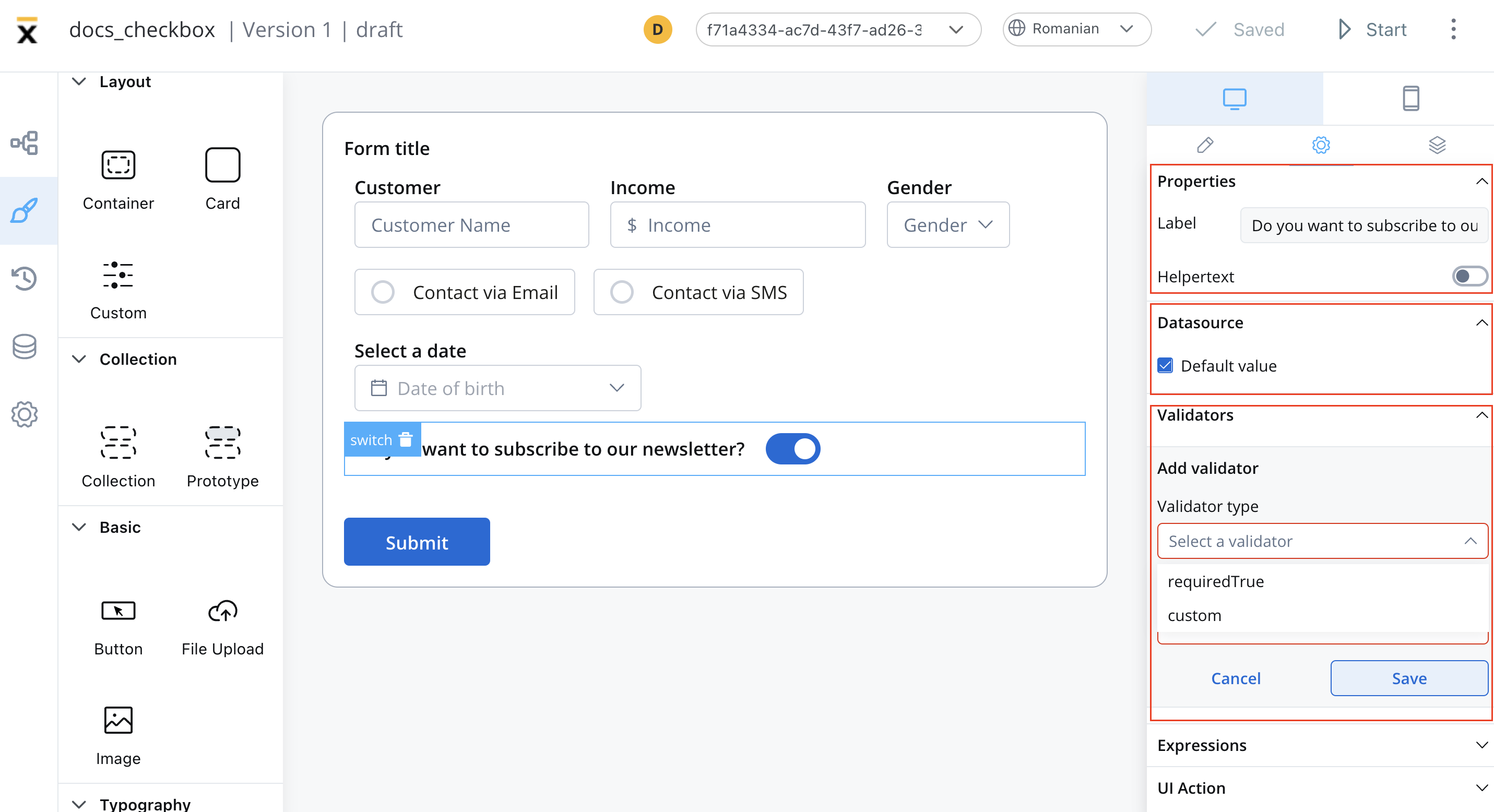
Apply these validators to ensure data quality:- Required True
- Custom Validator
Use case: Force users to accept terms, confirm agreementsBehavior: Switch must be in the “on” position to pass validationError message: Customize the message shown when validation fails
Behavior configuration
Hide/disable expressions
Define the switch element’s behavior using JavaScript expressions to control its visibility or disablement:- Hide condition: A JavaScript expression that hides the Switch element when it returns a truthy value.
- Disabled condition: A JavaScript expression that disables the Switch element when it returns a truthy value.
Hide expression example
We can use a rule to hide a switch element if another field has a null value (it is not filled). For example, the “Terms Agreement” switch, which remains hidden until users fill in the “Email” field: Rule used:Disable expressions
You can use a disabled condition to disable a switch element based on values from other fields or based on permissions.It’s important to make sure that disabled fields have the same expression configured under the path expressions → hide.
Event handlers
Configure interactive behaviors for your switch:
Action Types Available:
- Navigate to different pages
- Execute business rules
- Call external services
- Update other form elements
Platform customization
Settings overrides
Customize your switch differently across platforms:- Web Applications
- Mobile Apps
- Override labels for web-specific terminology
- Adjust helper text for desktop users
- Modify hide/show expressions for web workflows
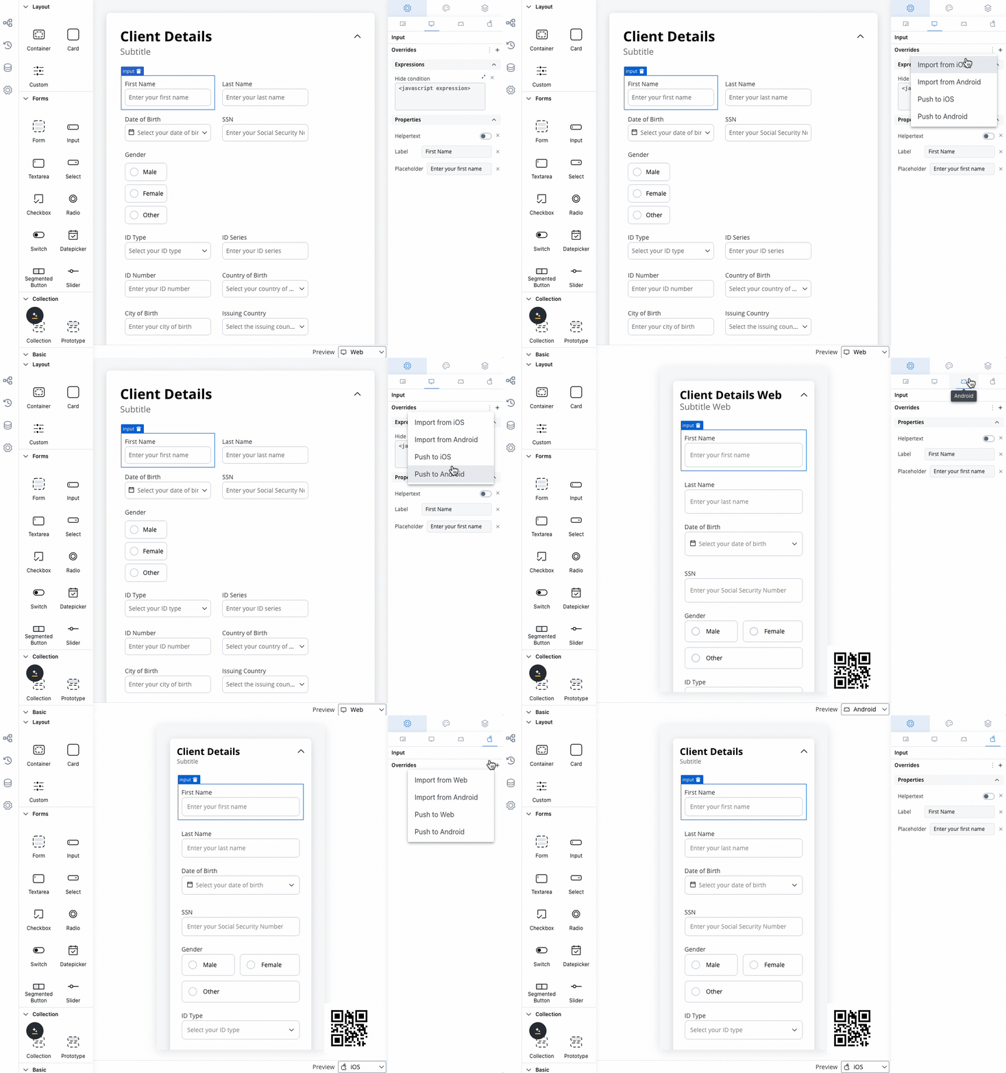
Override settings can be imported and pushed between platforms, saving configuration time.
Visual styling
Layout options
- Web Styling
- iOS Styling
- Android Styling
Label Position
Label Position
Start: Label appears before the switch (left side)
End: Label appears after the switch (right side)
Responsive Sizing
Responsive Sizing
Theme customization
Override default styling for complete visual control: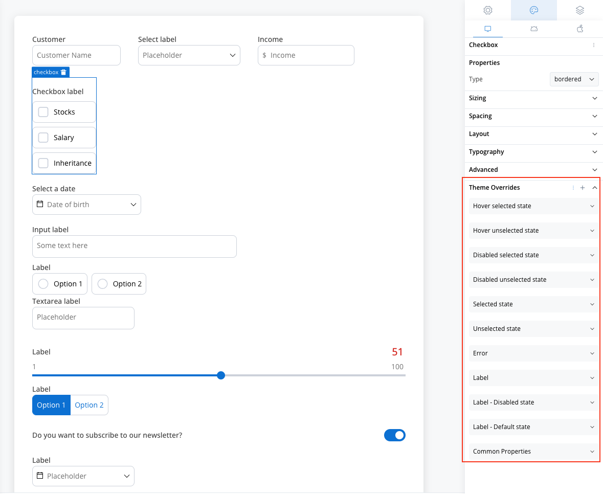
Label Styling
Label Styling
Default State: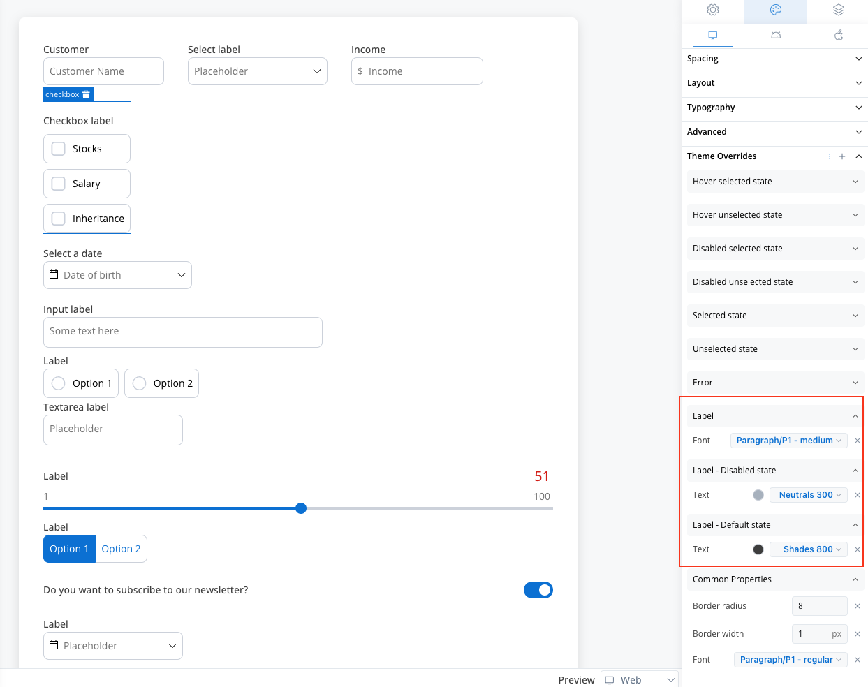
- Text color customization
- Font family and size options
- Dimmed text color options
- Consistent typography
Helper Text Styling
Helper Text Styling
Standard Helper: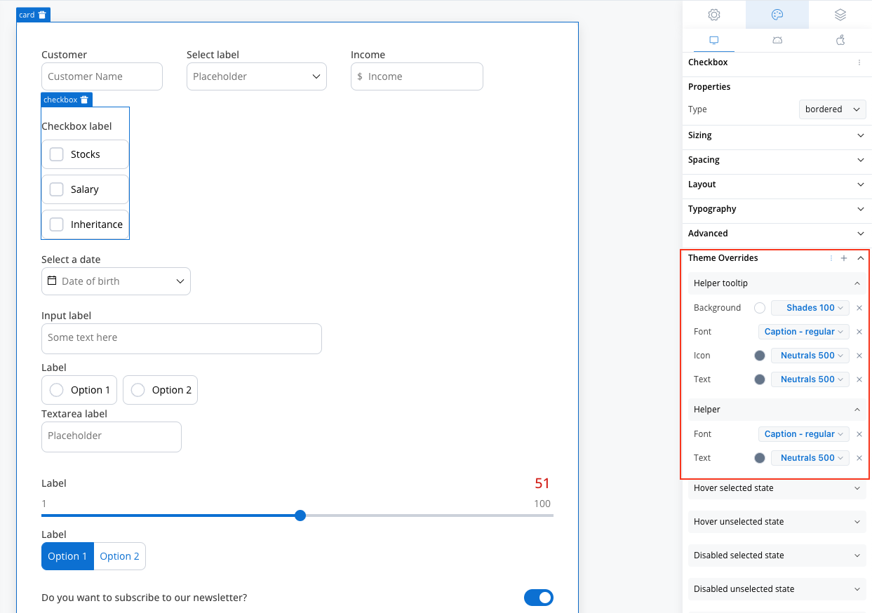
- Text color and font options
- Background color customization
- Icon color options
- Typography controls
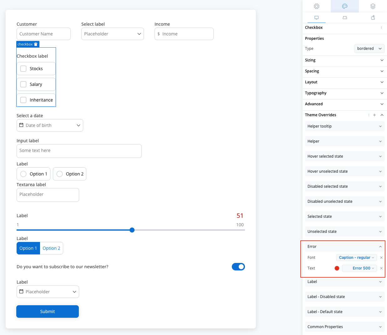
Error State Styling
Error State Styling
- Error message text color
- Font styling for error states
- Consistent error indication
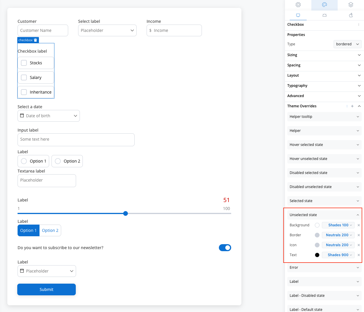
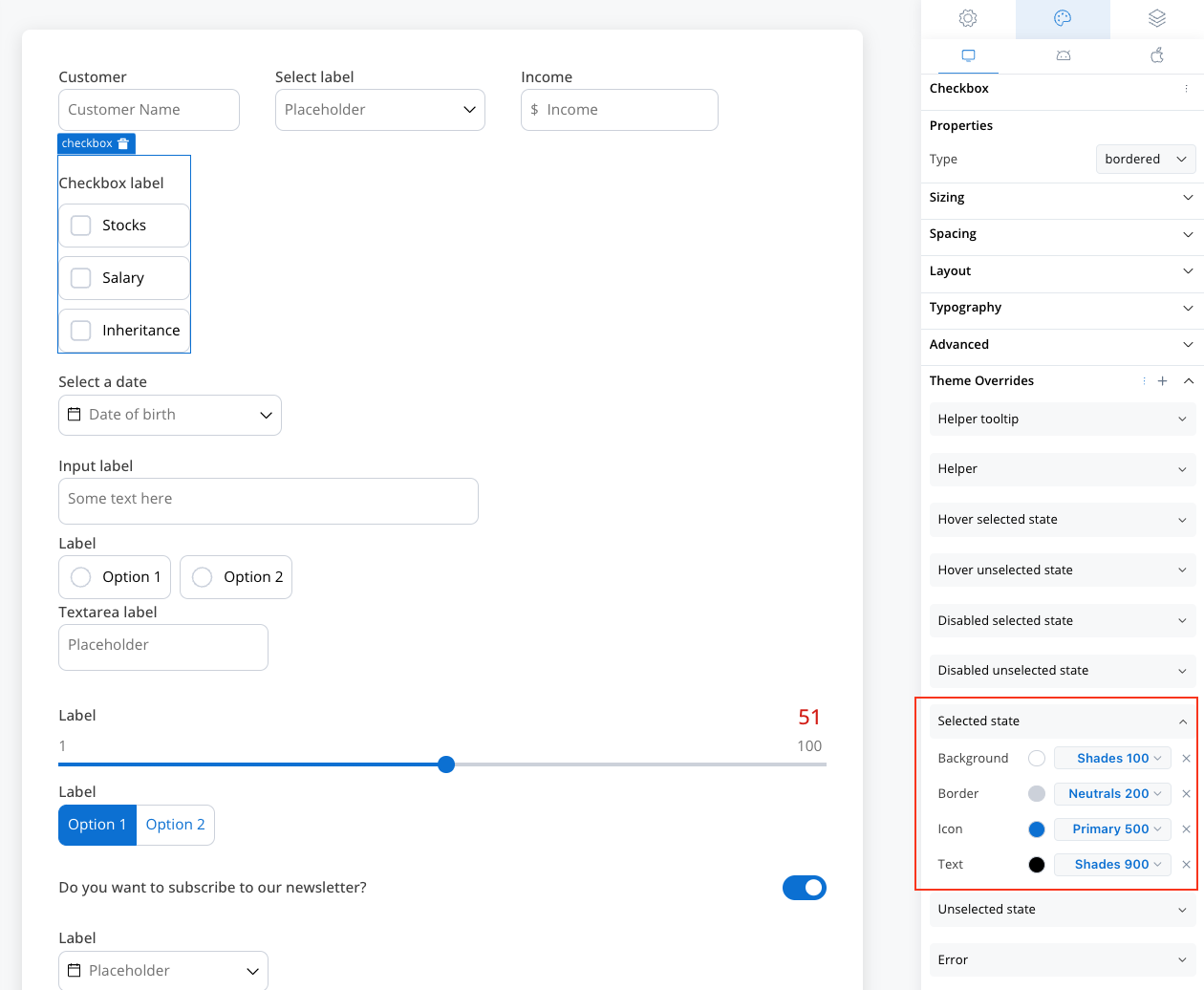
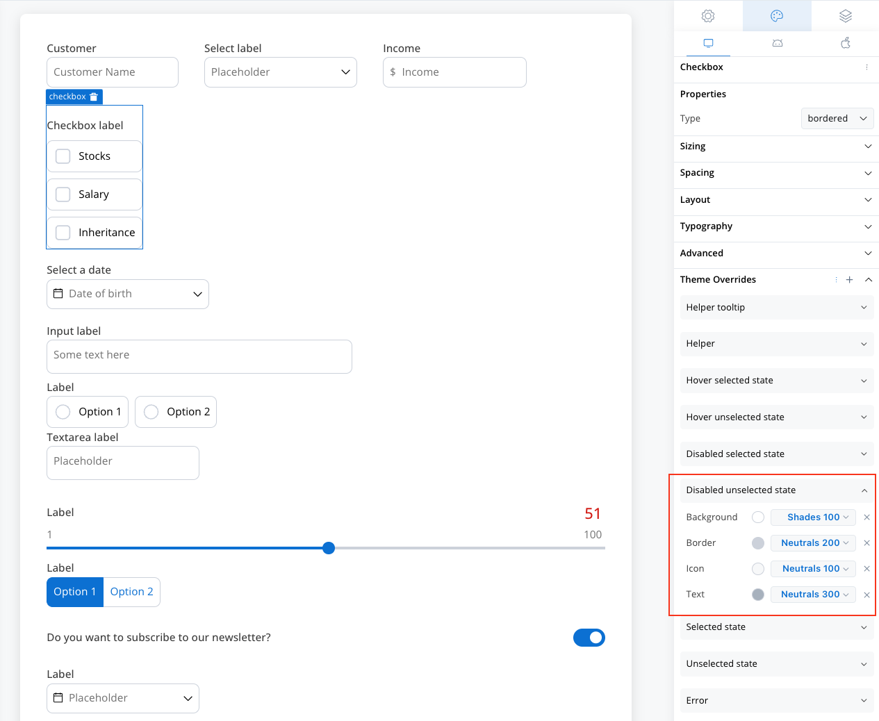
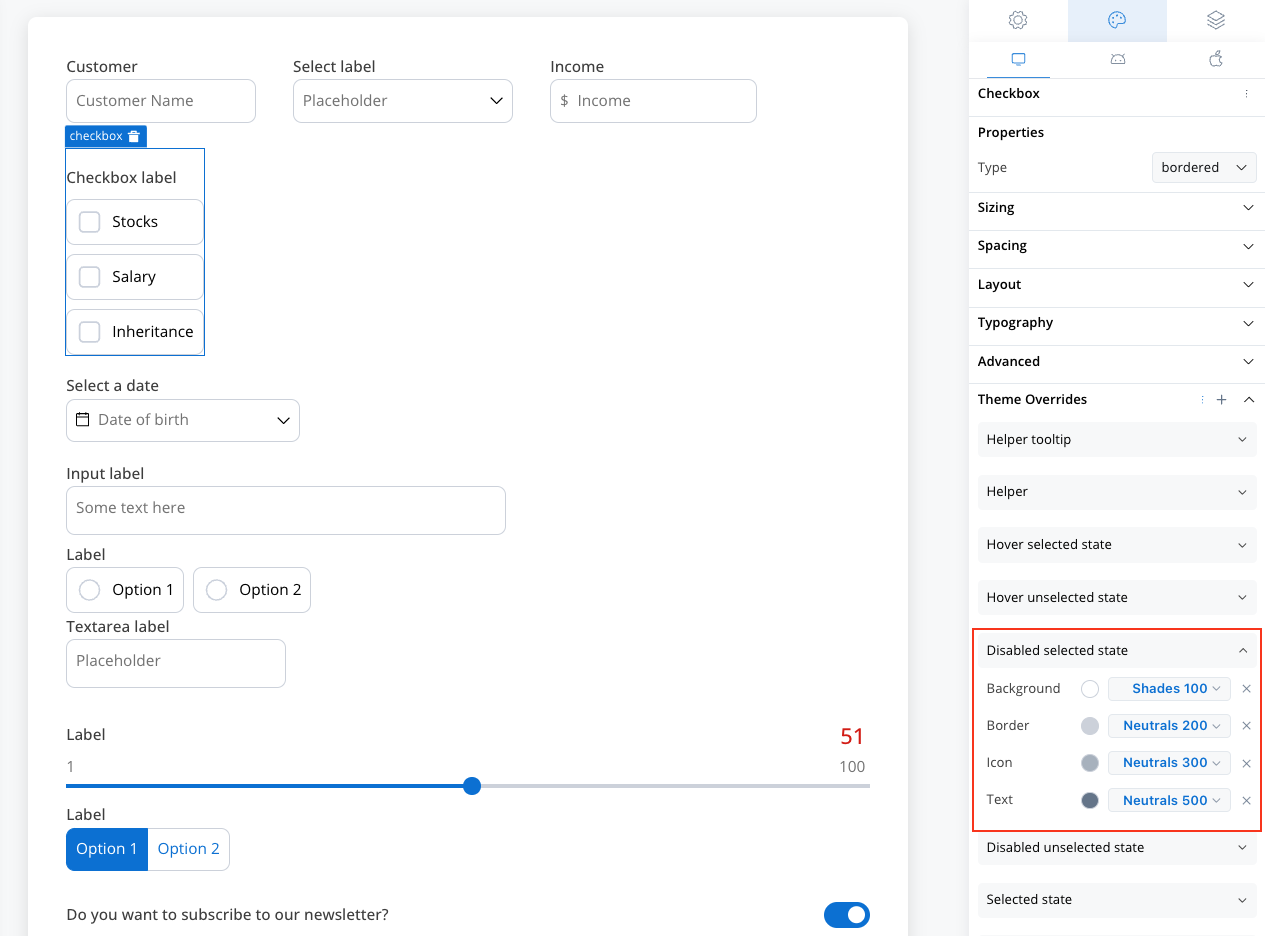
Switch States
Switch States
- Unselected (Off)
- Selected (On)
- Disabled States
- Border color customization
- Background color options
- Switch knob color
Time-Saving Tip: Export your styling configuration from one platform and import it to others to maintain consistency without manual reconfiguration.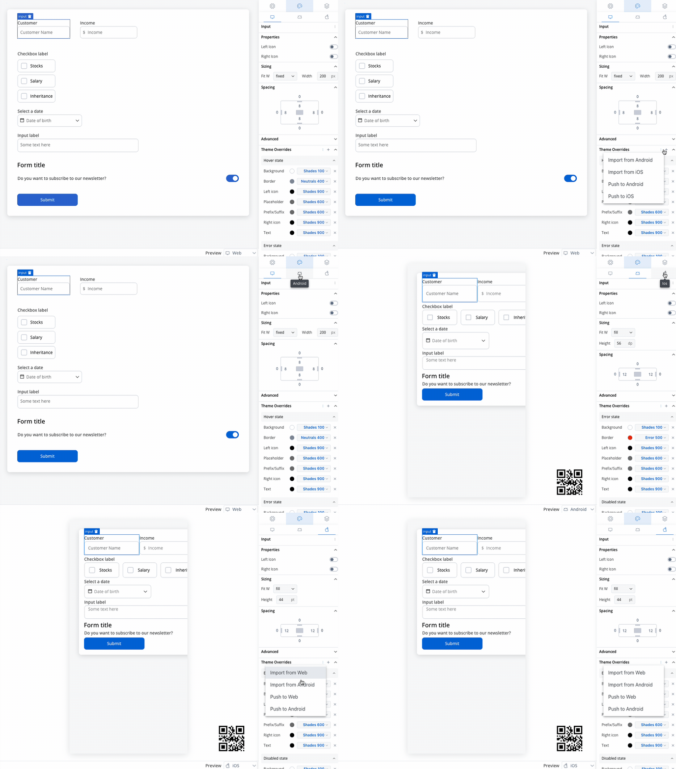
Best practices
Accessibility
- Provide clear, descriptive labels
- Use helper text for complex switches
- Set an accessibility label when the switch has no visible label
User Experience
- Choose appropriate default values
- Provide immediate visual feedback
- Use consistent switch types throughout your application
- Consider the context when placing switches
Data Management
- Use meaningful process data keys
- Plan for boolean value usage in business rules
- Consider validation requirements early
- Document switch behavior for other developers