React project requirements
Your app MUST use SCSS for styling.To install the npm libraries provided by FLOWX you will need to obtain access to the private FLOWX Nexus registry. Please consult with your project DevOps.
The library uses React version react~18, npm v10.8.0 and node v18.16.9.
Installing the library
Use the following command to install the renderer library and its required dependencies:Installing
react and react-dom can be skipped if you already have them installed in your project.Replace
<version> with the correct version corresponding to your platform version.To find the right version, navigate to: Release Notes → Choose your platform version → Deployment guidelines → Component versions.Initial setup
Once installed,FlxProcessRenderer will be imported in the from the @flowx/react-sdk package.
Theming
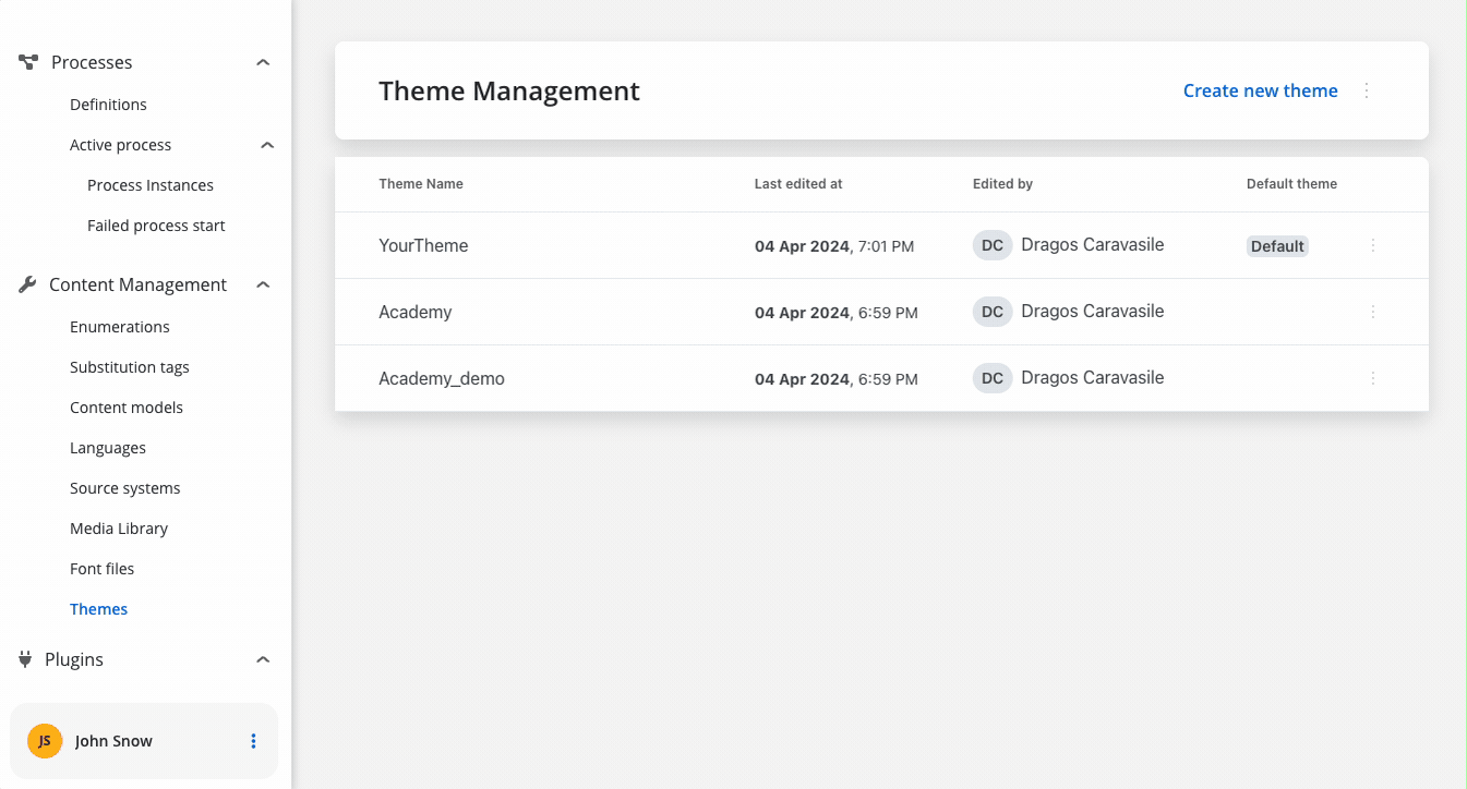
Component theming is done through the@flowx/react-theme library. The theme id is a required input for the renderer SDK component and is used to fetch the theme configuration. The id can be obtained from the admin panel in the themes section.
Authorization
It’s the responsibility of the client app to implement the authorization flow (using the OpenID Connect standard). The renderer SDK will expect the authToken to be passed to the
FlxProcessRenderer as an input.FlxProcessRenderer component is required in the application module where the process will be rendered. The component accepts a props where you can pass extra config info, register a custom component or custom validators.
Custom components will be referenced by name when creating the template config for a user task.
Custom validators will be referenced by name (customValidator) in the template config panel in the validators section of each generated form field.
<FlxProcessRenderer /> component. A list of accepted inputs is found below:
| Name | Description | Type | Mandatory | Default value | Example |
|---|---|---|---|---|---|
| apiUrl | Your base url | string | true | - | https://yourDomain.dev |
| processApiPath | Process subpath | string | true | - | onboarding |
| authToken | Authorization token | string | true | - | ‘eyJhbGciOiJSUzI1NiIsIn…‘ |
| themeId | Theme id used to style the process. Can be obtained from the themes section in the admin | string | true | - | ‘123-456-789’ |
| processName | Identifies a process | string | true | - | client_identification |
| processStartData | Data required to start the process | json | true | - | { "firstName": "John", "lastName": "Smith"} |
| workspaceId | Workspace id | string | true | - | ‘8f52744-8403-4e8d…‘ |
| language | Language used to localize the enumerations inside the application. | string | false | ro | - |
| isDraft | When true allows starting a process in draft state. *Note that isDraft = true requires that processName be the id (number) of the process and NOT the name. | boolean | false | false | - |
| locale | Defines the locale of the process, used to apply date, currency and number formatting to data model values | boolean | false | ro-RO | - |
| projectInfo | Defines which FlowX Project will be run inside the process renderer. | json | true | - | { "projectId": "111111-222222-333333-44444"} |
| customLoader | Custom loader components for different loading scenarios. | object | false | - | { startProcess: <LoaderComponent />, saveData: <ActionLoader /> } |
Analytics
The SDK provides a mechanism for collecting analytics events through a unified
CustomEvent system. These events can be used to track screens and action events.Emitting Analytics Events
Analytics events are dispatched using thepushAnalyticsData(payload: AnalyticsData) method. The SDK defines two event types:
The value property represents the identifier set in the process definition.For ACTION type events there are some additional properties provided:
- component - The type of component triggering the action
- label - The label of the component
- screen - The identifier of the screen containing the component, if set
Listening for Analytics Events
You can subscribe to analytics events using the standard CustomEvent API: Ensure that you remove the event listener on component destruction to avoid memory leaks.
Custom Payload
This functionality, allowing you to capture and send custom data alongside standard analytics events. When analytics custom payload is configured in FlowX Designer, the renderer automatically processes variable substitution and includes the resulting data in analytics events.1
Receive custom payload configuration
The renderer receives the analytics configuration as a JSON string with variable placeholders:
2
Process variable substitution
The SDK replaces variables with actual values from the process data store:
3
Add to analytics event
The processed payload is included in the analytics event under the
customPayload property:Starting a process
Prerequisites
- Process Name: You need to know the name of the process you want to start. This name is used to identify the process in the system.
- FlowX Project UUID: You need the UUID of the FlowX Project that contains the process you want to start. This UUID is used to identify the project in the system.
- Locale: You can specify the locale of the process to apply date, currency, and number formatting to data model values.
- Language: You can specify the language used to localize the enumerations inside the application.
Getting the project UUID
The project UUID can be obtained from the FlowX Dashboard. Navigate to the Projects section and select the project you want to start a process in. The UUID can be copied from the project actions popover.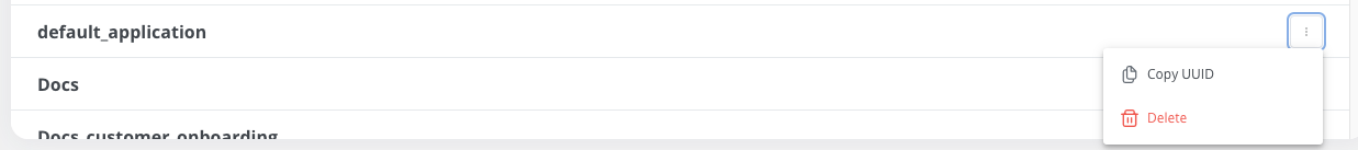
Getting the process name
The process name can be obtained from the FlowX Designer. Navigate to the process you want to start and copy the process name from the breadcrumbs.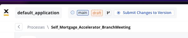
Initializing the process renderer
To start a process, you need to initialize theFlxProcessRenderer component in your application. The component accepts various props that define the process to start, the theme to use, and other configuration options.
Custom components
Custom components will be hydrated with data through the data input prop which must be defined in the custom component. Custom components will be provided through thecomponents parameter to the <FlxProcessRenderer /> component.
The object keys passed in the
components prop MUST match the custom component names defined in the FlowX process.Component data defined through an
inputKey is available under data -> dataComponent actions are always found under
data -> actionsFn key.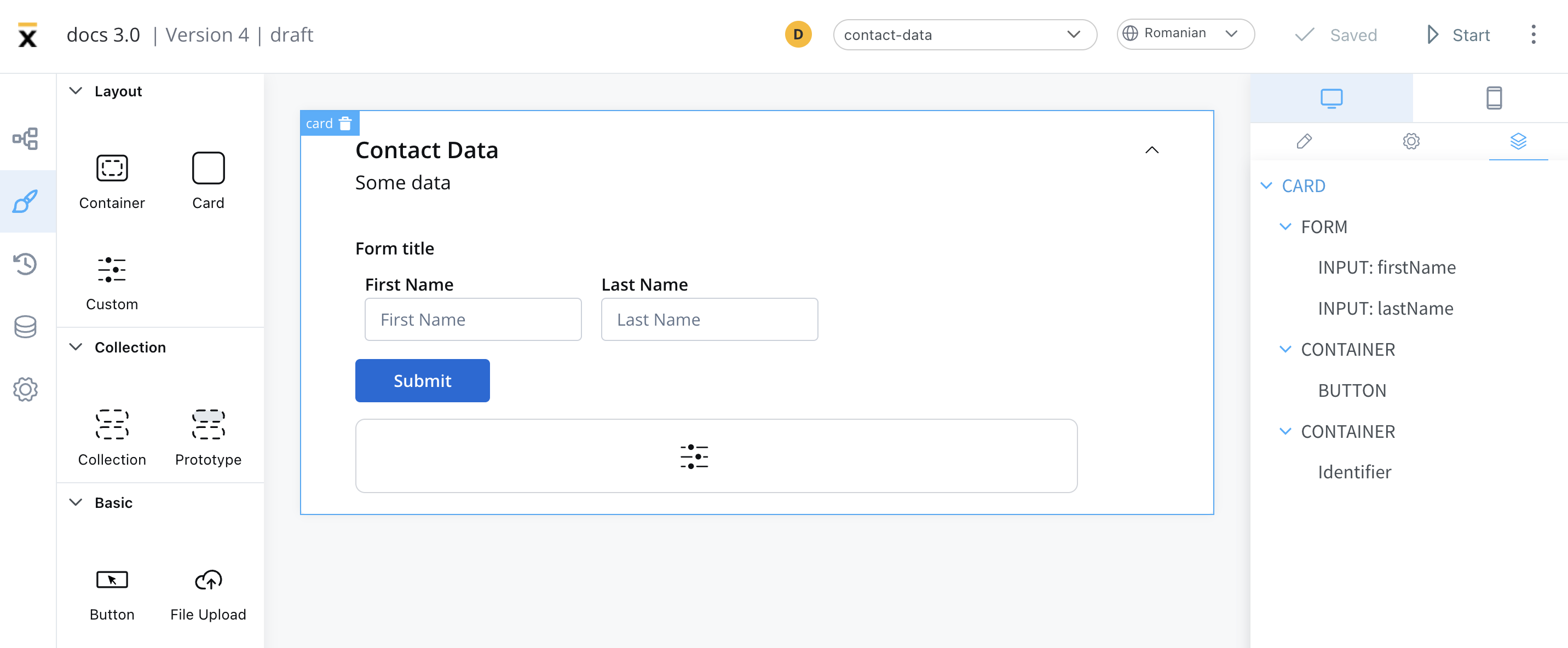
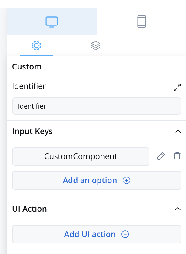
- Identifier - This enables the custom component to be displayed within the component hierarchy and determines the actions available for the component.
- Input keys - These are used to specify the pathway to the process data that components will utilize to receive their information.
- UI Actions - actions defined here will be made available to the custom component
Prerequisites (before creation)
- React Knowledge: You should have a good understanding of React, as custom components are created and imported using React.
- Development Environment: Set up a development environment for React development, including Node.js and npm (Node Package Manager).
- Component Identifier: You need a unique identifier for your custom component. This identifier is used for referencing the component within the application.
Creating a custom component
To create a Custom Component in React, follow these steps:- Create a new React component.
- Implement the necessary HTML structure, TypeScript logic, and SCSS styling to define the appearance and behavior of your custom component.
Importing the component
After creating the Custom Component, you need to import it into your application. In your<FlxProcessRenderer /> component, add the following property:
Using the custom component
Once your Custom Component is declared, you can use it for configuration within your application.
Data input and actions
The Custom Component accepts input data from processes and can also include actions extracted from a process. These inputs and actions allow you to configure and interact with the component dynamically.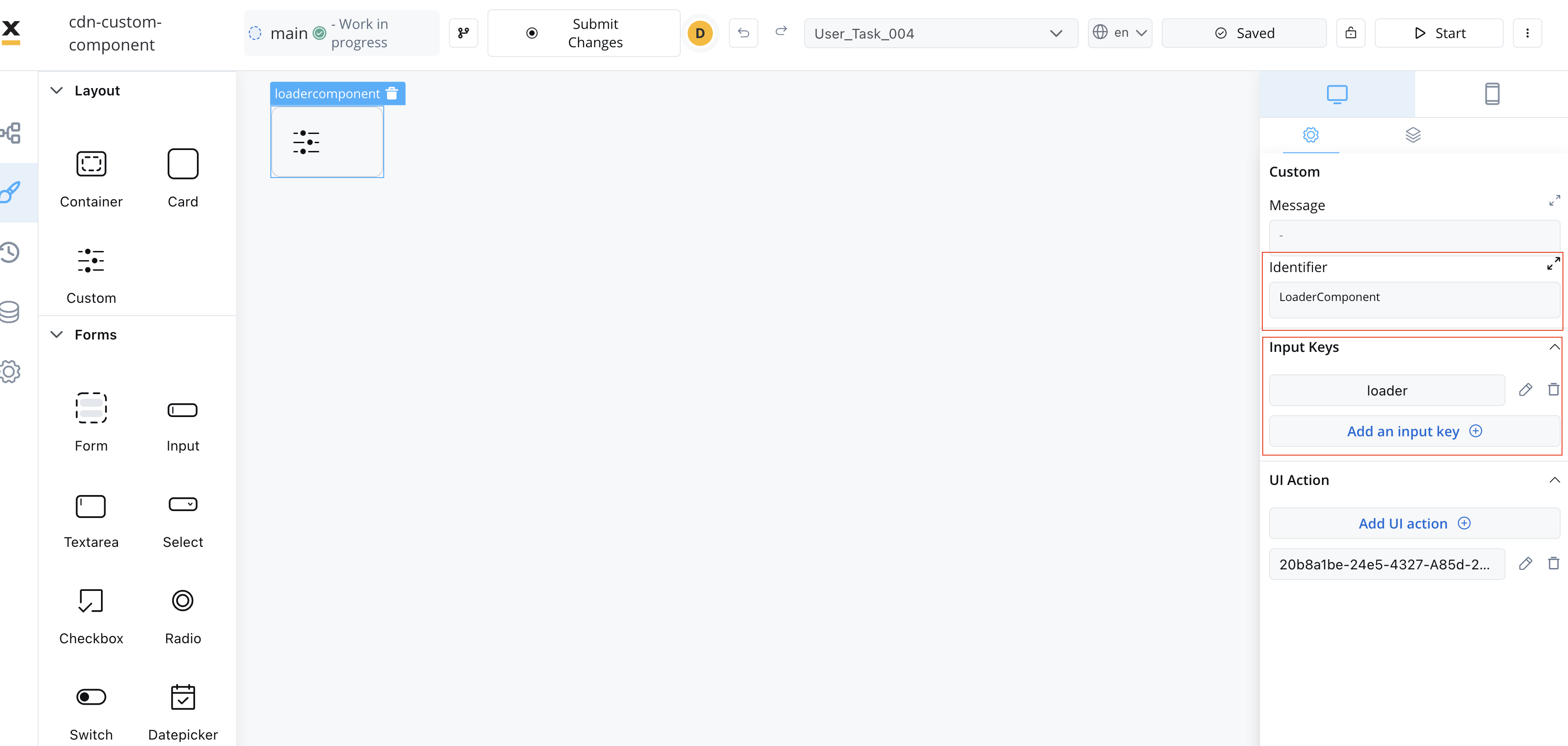
Extracting data from processes
There are multiple ways to extract data from processes to use within your Custom Component. You can utilize the data provided by the process or map actions from the BPMN process to Angular actions within your component.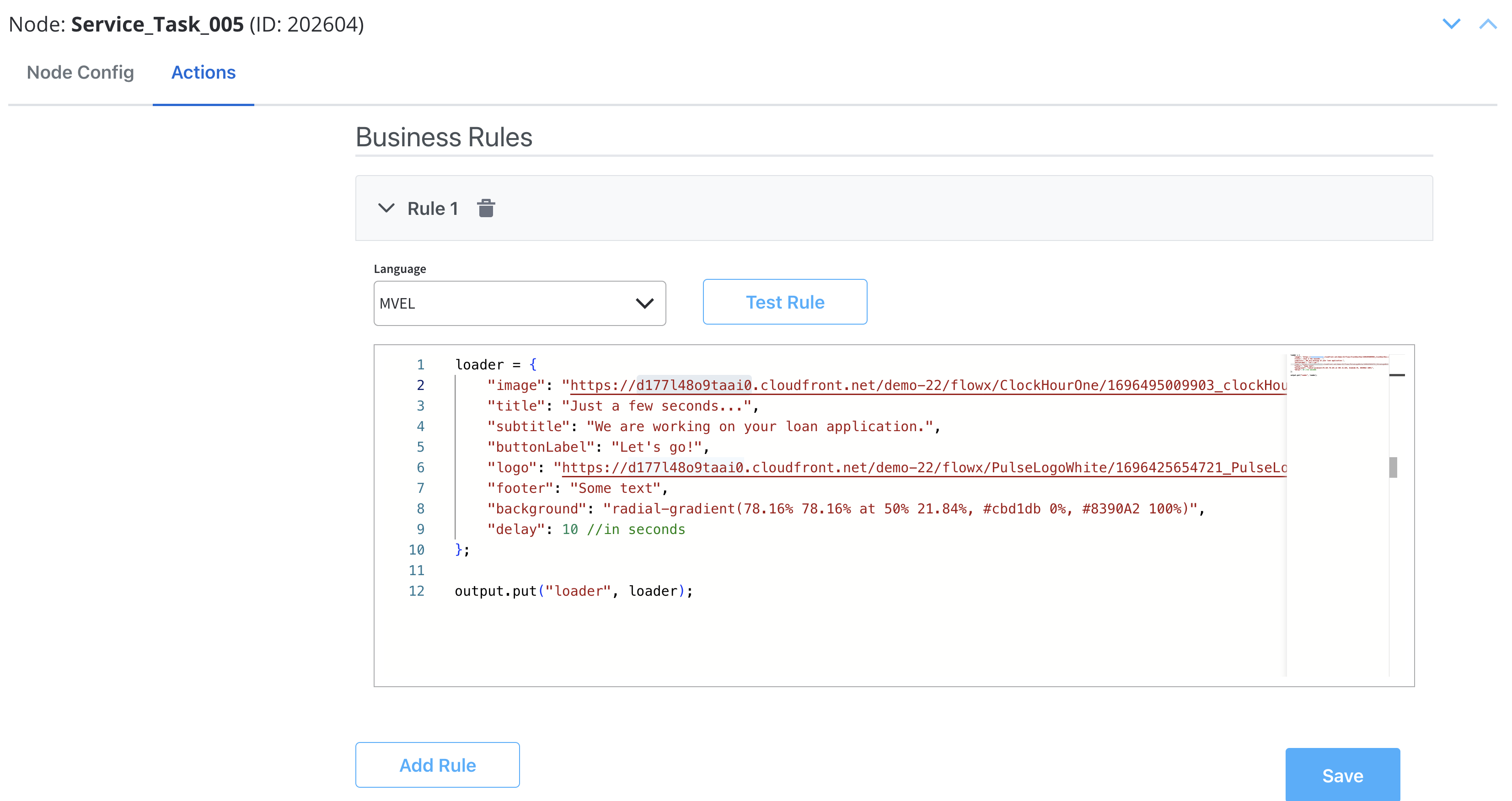
Make sure that the React actions that you declare match the names of the process actions.
Styling with CSS
To apply CSS classes to UI elements within your Custom Component, you first need to identify the UI element identifiers within your component’s HTML structure. Once identified, you can apply defined CSS classes to style these elements as desired. Example: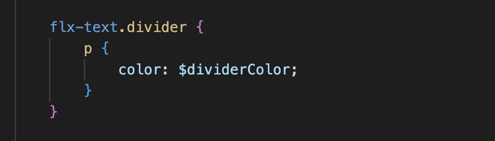
Additional considerations
- Naming Conventions: Be consistent with naming conventions for components, identifiers, and actions. Ensure that Angular actions match the names of process actions as mentioned in the documentation.
- Component Hierarchy: Understand how the component fits into the overall component hierarchy of your application. This will help determine where the component is displayed and what actions are available for it.
- Documentation and Testing: Document your custom component thoroughly for future reference. Additionally, testing is crucial to ensure that the component behaves as expected in various scenarios.
- Security: If your custom component interacts with sensitive data or performs critical actions, consider security measures to protect the application from potential vulnerabilities.
- Integration with FLOWX Designer: Ensure that your custom component integrates seamlessly with FLOWX Designer, as it is part of the application’s process modeling capabilities.
Custom validators
You may also define custom validators in your FlowX processes and pass their implementation through thevalidators prop of the <FlxProcessRenderer /> component.
The validators are then processed and piped through the popular React Hook Form library, taking into account how the error messages are defined in your process.
A validator must have the following type:
The object keys passed in the
validators prop MUST match the custom validator names defined in the FlowX process.Process end handling
The SDK provides a mechanism for container applications to handle process completion events through theonProcessEnded callback. This allows you to implement custom logic when a main process reaches an end state, such as redirecting users or triggering cleanup operations.
The onProcessEnded callback is triggered when the main process (not subprocesses) reaches any terminal state:
FINISHED- Process completed successfullyFAILED- Process encountered an errorABORTED- Process was manually terminated- Other terminal states
Only the main process triggers this callback. Subprocess completions do not trigger the callback to avoid unnecessary interruptions during complex process flows.
Implementation
To handle process end events, pass a function to theonProcessEnded prop of the <FlxProcessRenderer /> component:
Custom loader
The SDK provides a mechanism for container applications to customize the loader UI displayed during process execution. This allows you to replace the default FlowX loader with your own custom implementation based on different loading scenarios.Configuration
To configure custom loaders, pass them through thecustomLoader prop of the <FlxProcessRenderer /> component:
API Specification
The custom loader configuration is a record mapping loader types to React elements:- Configuration type:
Record<string, ReactNode> - Loader types:
startProcess- Displayed when starting or resuming a processsaveData- Displayed when executing actions withblocksUiset totrue
- Value: React element (JSX) that will be rendered as the loader
Fallback Behavior
If no custom loader is provided for a specific type, the SDK will automatically fall back to the built-in FlowX loader. This ensures your application continues to function even with partial custom loader configuration.
You can use any React components, including those with animations, styled components, or media assets, to create rich loading experiences that match your application’s design system.
Task management component
To use theFlxTaskManager component, import the module in your project:
Usage
Include the component in your template:| Name | Description | Type | Mandatory | Example |
|---|---|---|---|---|
apiUrl | Endpoint where the tasks are available | string | ✅ | https://yourDomain.dev/tasks |
authToken | Authorization token | string | ✅ | (retrieved from local storage) |
appInfo | Application information object containing appId | object | ✅ | { appId: "app-123" } |
viewId | The view configuration identifier | string | ✅ | (retrieved dynamically) |
workspaceId | The workspace ID | string | ✅ | (retrieved dynamically) |
themeId | The theme identifier | string | ❌ | (retrieved dynamically) |
language | The selected language | string | ❌ | (retrieved dynamically) |
locale | The localization setting | string | ❌ | (retrieved dynamically) |
buildId | The current build identifier | string | ❌ | (retrieved dynamically) |
staticAssetsPath | Path for static resources | string | ❌ | (set via environment) |
Custom CSS
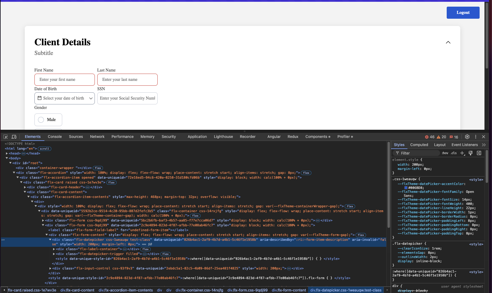
The renderer SDK allows you to pass custom CSS classes on any component inside the process. These classes are then applied to the component’s root element. To add a CSS custom class to a component, you need to define the class in the process designer by navigating to the styles tab of the component, expanding the Advanced accordion and writing down the CSS class.
The classes will be applied last on the element, so they will override the classes already defined on the element.