Documentation Index
Fetch the complete documentation index at: https://docs.flowx.ai/llms.txt
Use this file to discover all available pages before exploring further.
Overview
UI actions establish connections between UI components or custom elements and predefined actions. These connections ensure that processes are executed efficiently while defining the UI’s response. Examples include:- Showing a loader during an action execution.
- Automatically dismissing a modal after a task is completed.
- Sending default data back to the process.
Types of UI actions
UI actions can be categorized into two main types:- Process UI Actions: Directly interact with process nodes and manual actions.
- External UI Actions: Perform actions that link to external URLs or open new tabs.
Process UI actions
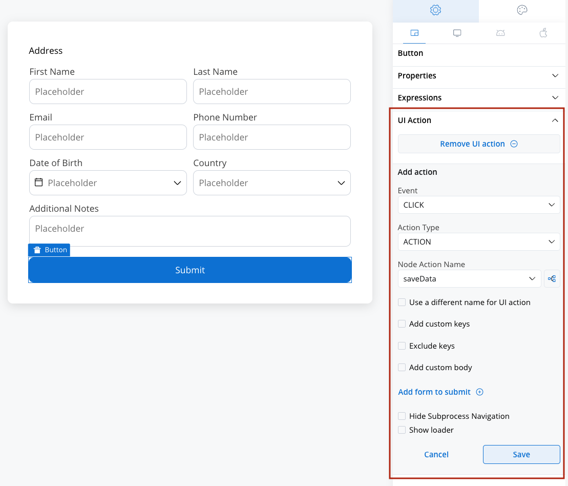
Process UI Actions (labeledACTION) define how a Button, whether generated or custom, interacts with a manual process action. Before configuring a UI action, ensure the corresponding manual action is set up.
Adding a node action
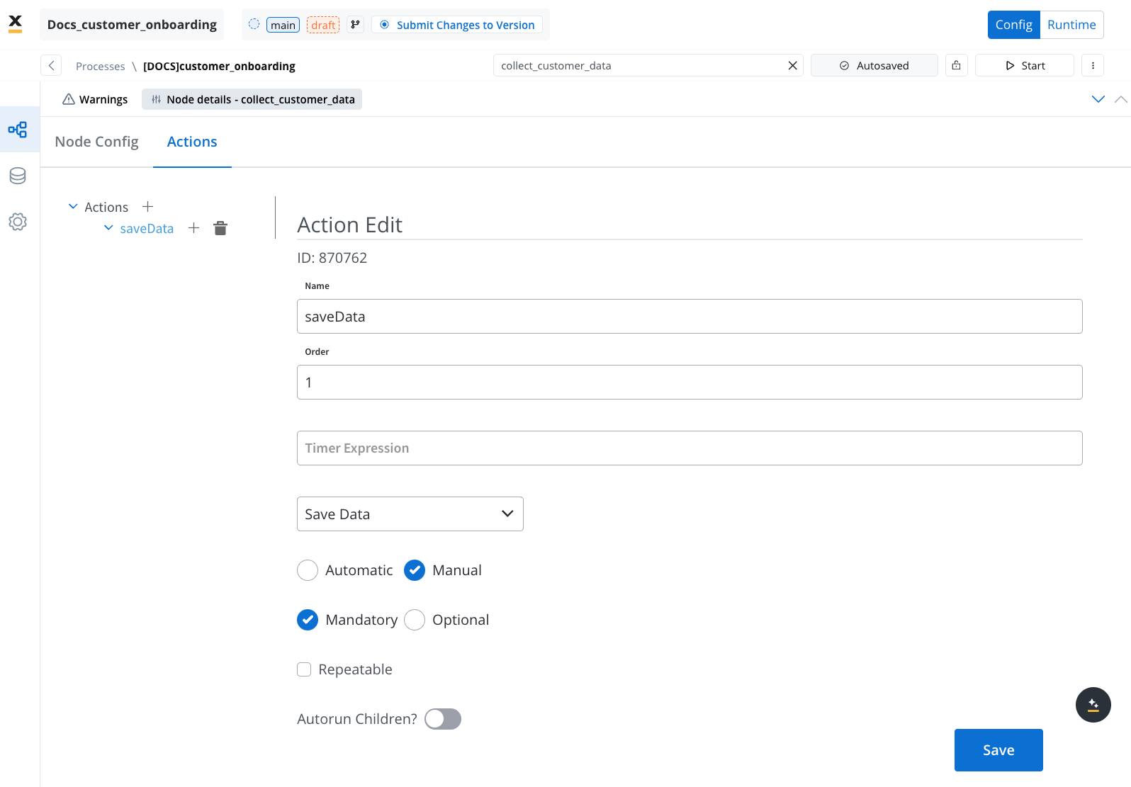
To configure a UI action, first add a node action (type: manual) to a process node. For detailed steps, refer to:Adding an action to a node
- Add an Action: Attach an action to a node.
- Select the Action Type: Choose Save Data, for instance.
- Action Type: Set it to manual.

Both UI actions and node actions must be configured on the same user task node.
Configuring a UI action
Below are the key configuration options for defining a UI action:- Event: Define when the action should trigger (Learn about Events).
- Action Type: Specify the type of action (Explore Action Types).
- Node Action Name: Select the corresponding manual action from the dropdown.
- Use a different name for UI action: Optionally, define a unique name to trigger the action in Custom Components.
- Add custom keys: Add custom keys beyond those in the data model.
- Exclude keys: Specify data keys to exclude.
- Add custom body: Provide a default JSON response, merged with additional parameters during execution.
- Add form to submit: Link the action to specific UI elements for validation.
- Hide Subprocess Navigation: Disable navigation to subprocesses.
- Show loader: Display a loader until a server-side event (SSE) updates the data or screen.

UI actions elements
Events
Events define how user interactions trigger UI actions. The available event types are:- CLICK: Triggered when a button is clicked.
- CHANGE: Triggered when input fields are modified.
Events are not applicable for UI actions on Custom Components.
Action types
The Action Type dropdown includes several predefined options:- DISMISS: Closes a modal after the action is executed.
- ACTION: Links a UI action to a manual node action.
- START_PROJECT: Initiates a new project instance. This action type is used to trigger a completely new process flow within a different project or application, based on the selected project and process configurations.
- UPLOAD: Initiates an upload action.
- EXTERNAL: Opens a link in a new browser tab or window.
External UI actions
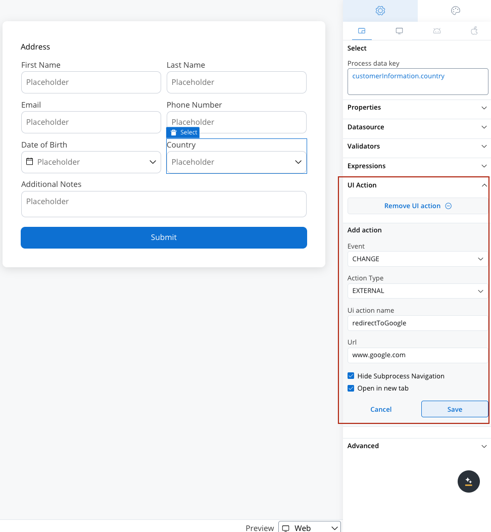
External UI Actions enable linking to external URLs and opening links in a new tab or the same tab. When configuring an external UI action, additional options become available:- URL: Specify the web URL for the action.
- Open in New Tab: Choose whether to execute the action in the current tab or a new tab.


