Overview
The Table component is available only for Web, built to deliver a consistent design through FlowX.AI’s theming framework. It closely mirrors the Collection component functionality, offering dynamic data handling and flexible row/column configurations.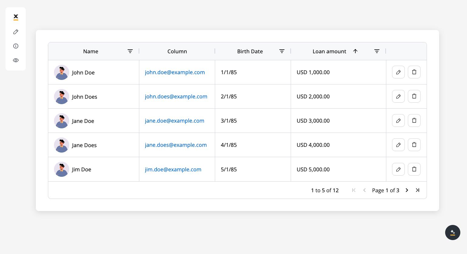
Web-only UI Component: The Table component is designed specifically for web applications and includes theming options for consistent design across the platform.
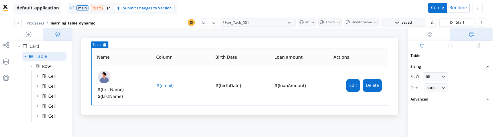
Table elements
-
Table Header (
th)
Displays column labels, typically onethelement per column. -
Rows (
tr)
Each row represents a single data entry from the source array. Rows automatically repeat based on your data size. -
Cells
Cells hold data points within each row. You can place multiple UI elements (text, image, link, buttons) inside a cell. -
Actions Column
If you enable row deletion or editing, an actions column is automatically created to handle row-level features (delete icon, edit icon, etc.).
By default, when you create a new Table, three columns and a matching set of cell placeholders are generated automatically.
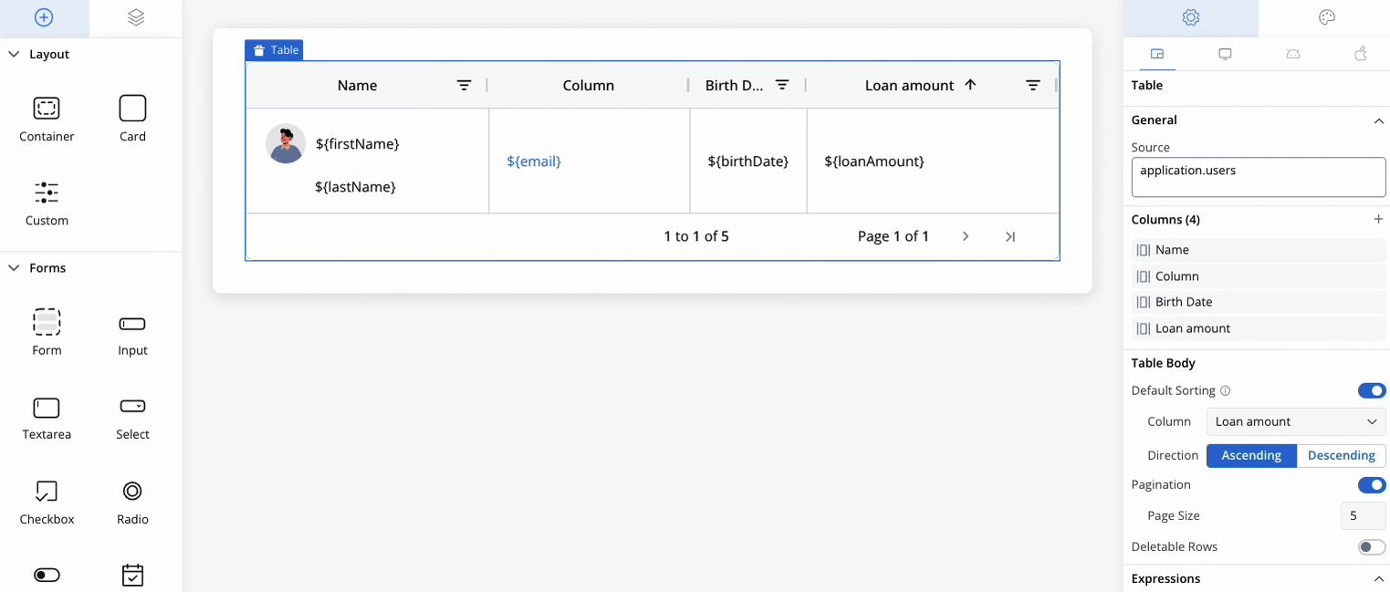
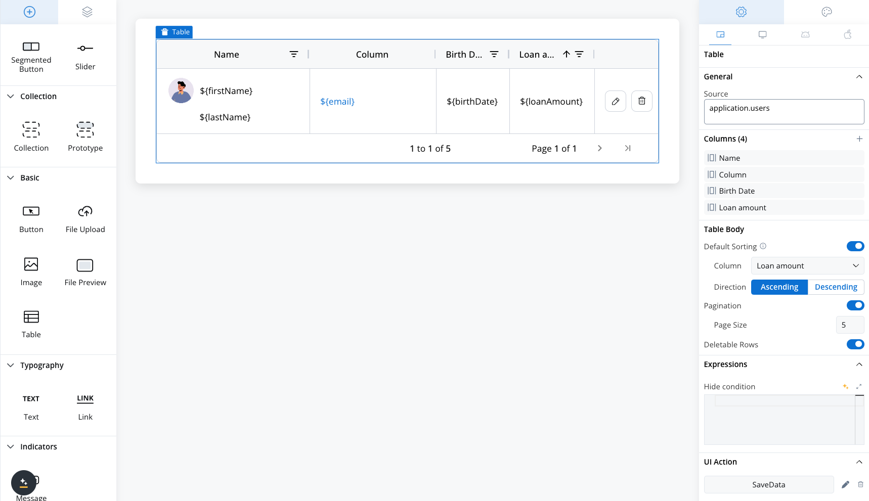
Configuring the table
When building a Table, you’ll primarily interact with:- Generic Settings (source key, columns, table body, expressions, styling)
- Cell-Specific Settings (sorting, filtering, editing, validators)
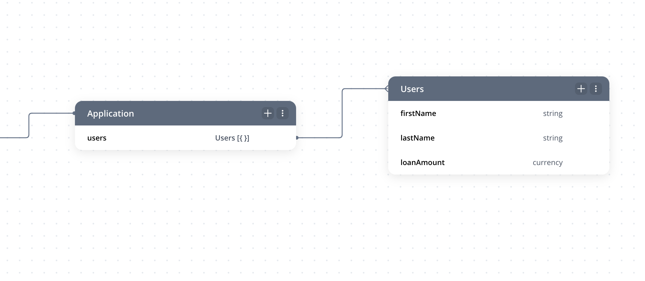
Below is an example of a JavaScript business rule that populates the Table with mock data. The 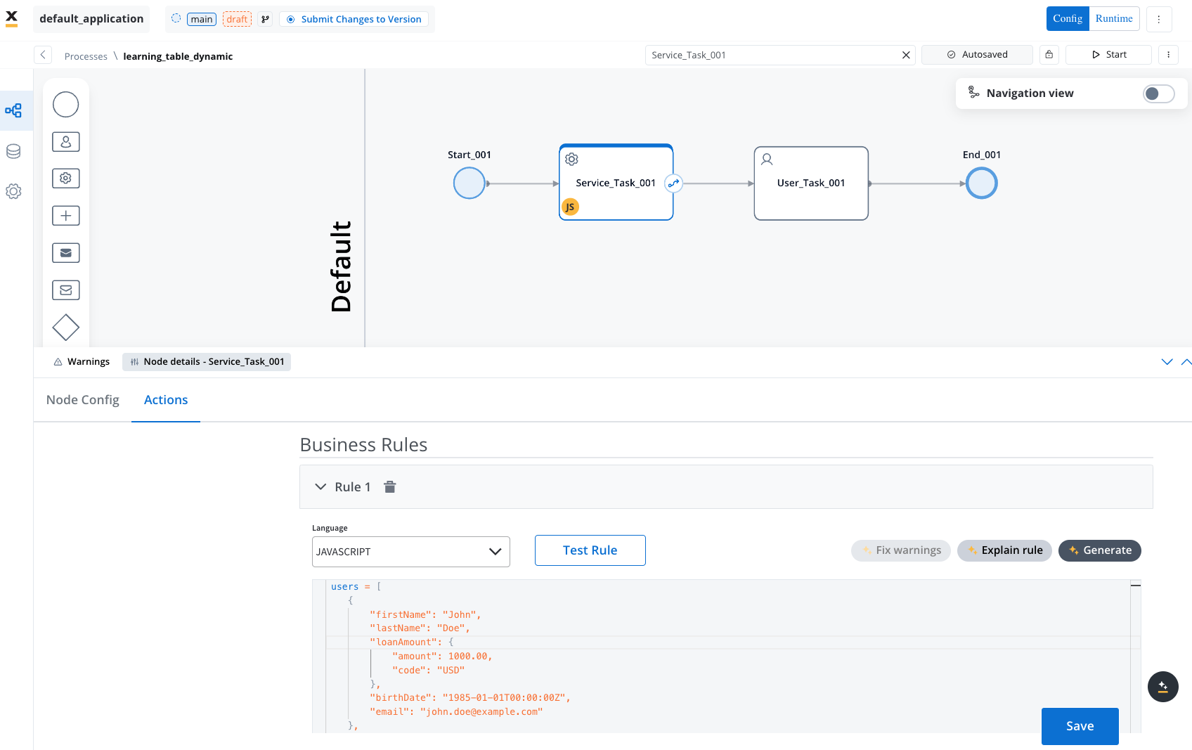
users array is assigned to application.users, which serves as the Table’s source.Business rule exmaple
Business rule exmaple
When creating a table, three columns with one corresponding cells are added by default.
Table generic settings
The following generic settings are found in the Generic tab and apply to all platforms (Web, iOS, and Android):Source key
- Specify an array of objects (e.g.,
application.users), enabling dynamic row creation based on your data structure. - Similar to the Collection component.
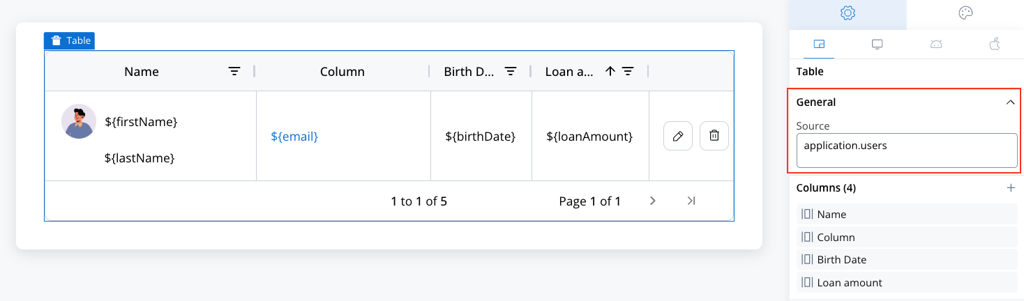
Columns
- Customize the Table’s columns: add, delete, rename, or reorder.
- Each column automatically includes a corresponding th (header cell) and td (body cell).
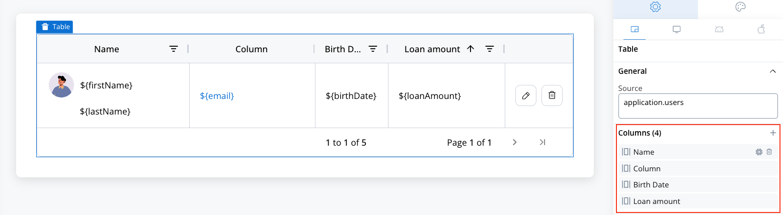
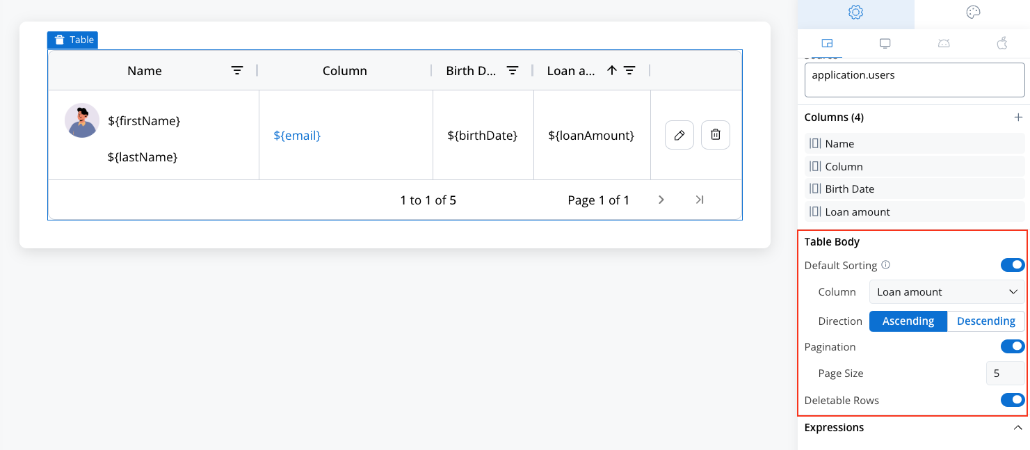
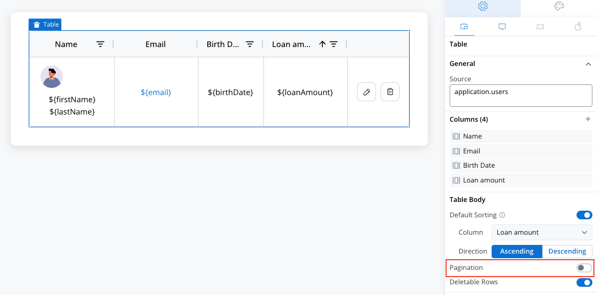
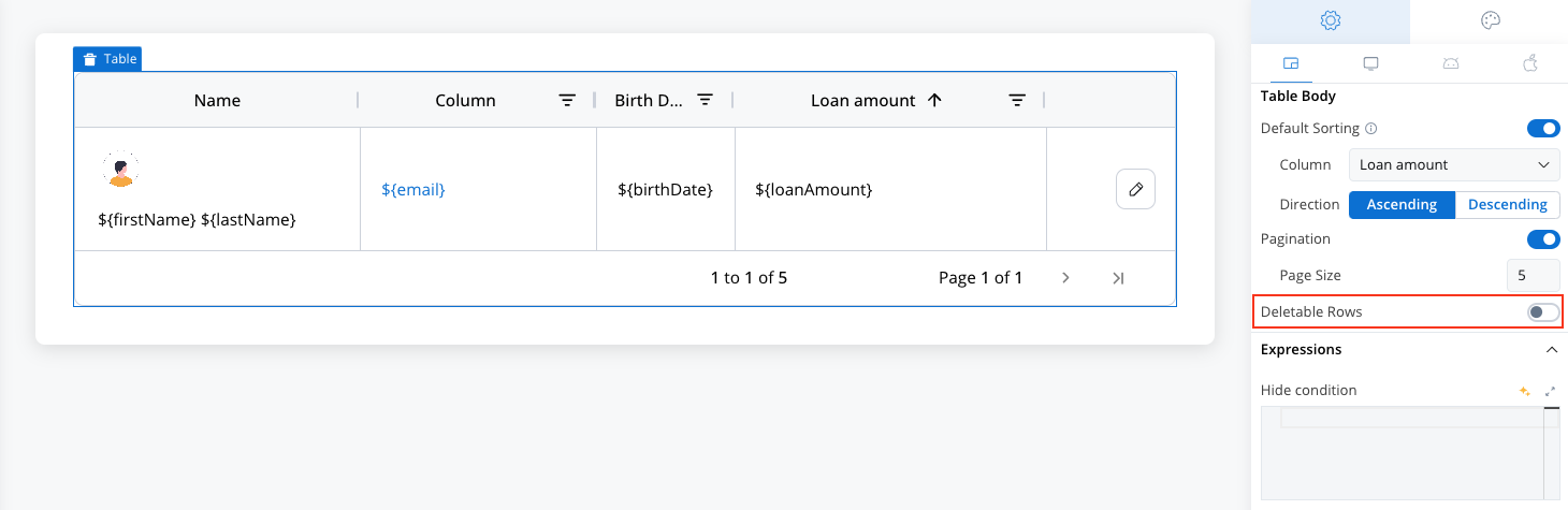
Table body
- Default Sorting: Sortable option must be enabled for the selected column for default sorting to work.
- Column: Select the desired column.
- Direction: Set the sort direction (Ascending or Descending).
- Pagination: Control how data is displayed by configuring pagination or enabling scrolling.
- Page Size: Set the maximum number of entries displayed per page.
- Scrollable: Disable pagination to enable continuous scrolling through data.
- Deletable Rows: Enable row deletion.
Hide condition
- Optionally hide the entire Table based on a JavaScript expression including the data key from another component.
- Useful for conditional flows (e.g., only show the Table if certain conditions are met).
Feature highlights
Default sorting
- Enable default sorting in table body settings.
- Select the desired column and sort direction (ascending by default).
Sortable option must be enabled for the selected column at cell level for default sorting to work.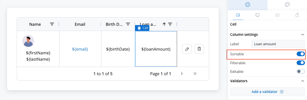
Pagination & scrolling
Define how many rows appear on each page using Pagination feature.- Scrolling: Disable pagination to allow continuous scrolling.
Editable rows
Enable row editing in cell-level → column settings.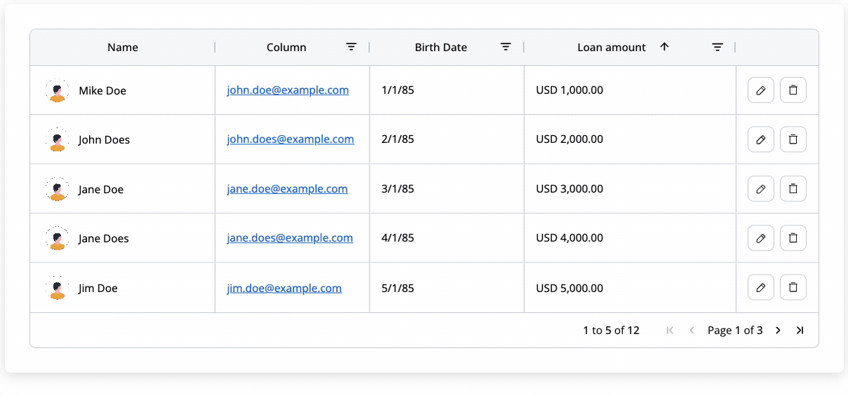
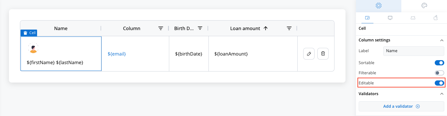
- Editing can be triggered by double-click or the dedicated Edit button icon.
Make sure each editable cell references a valid data model key to facilitate edit.
- Edits are validated and saved row-by-row.
Deletable rows
Toggle Deletable in Table settings to enable row deletion.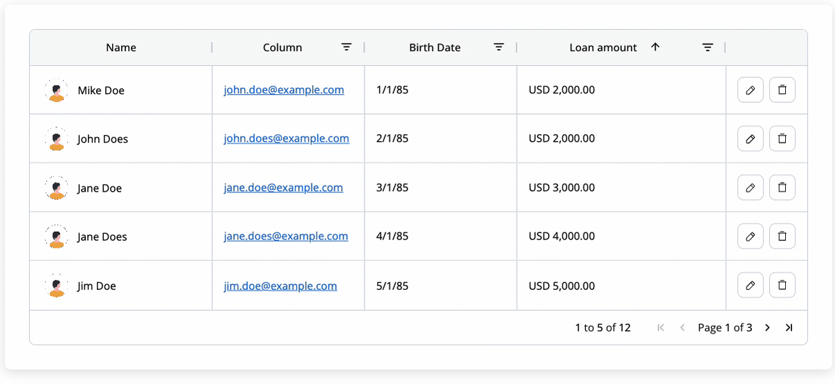
Filters
Mark columns as filterable to enable filtering icons.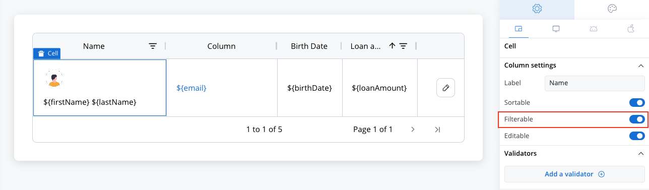
- Filter type automatically matches the column data type (string, number, date, boolean, or currency).
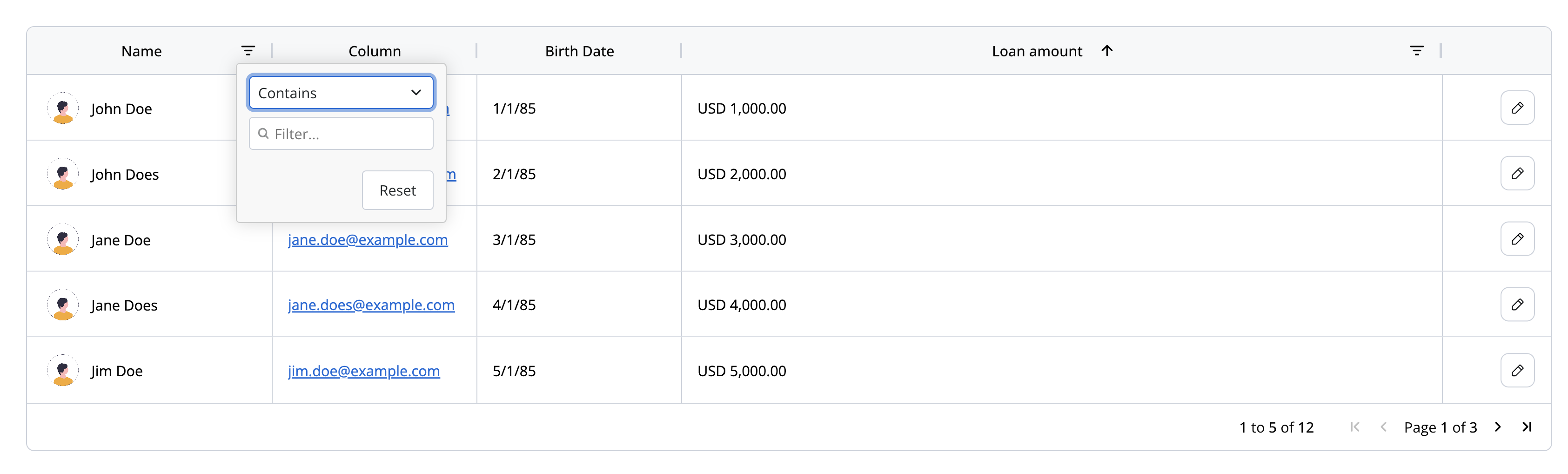
Table styling
Sizing
- Fit Width: By default, the Table stretches to occupy available width.
- Fit Height: Grows automatically based on content height.
Cell styling
Layout Options:- Direction: Horizontal (default).
- Justify: Space-around (evenly spaces elements within each cell).
- Align: Start (left-aligned).
- Wrap: Enables text wrapping.
- Gap: 8px spacing between cell elements.
- Width Fit Options:
- Fill: Fills available container space.
- Fixed: Keeps a fixed column width.
- Auto: Adjusts column width to fit content.
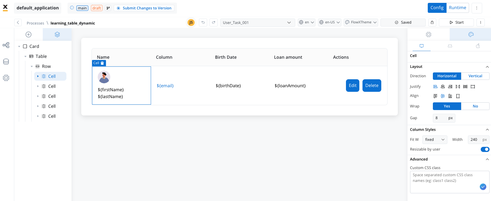
- User Resizable Columns: Adjust column width by dragging the column edges in the header, enhancing customization.
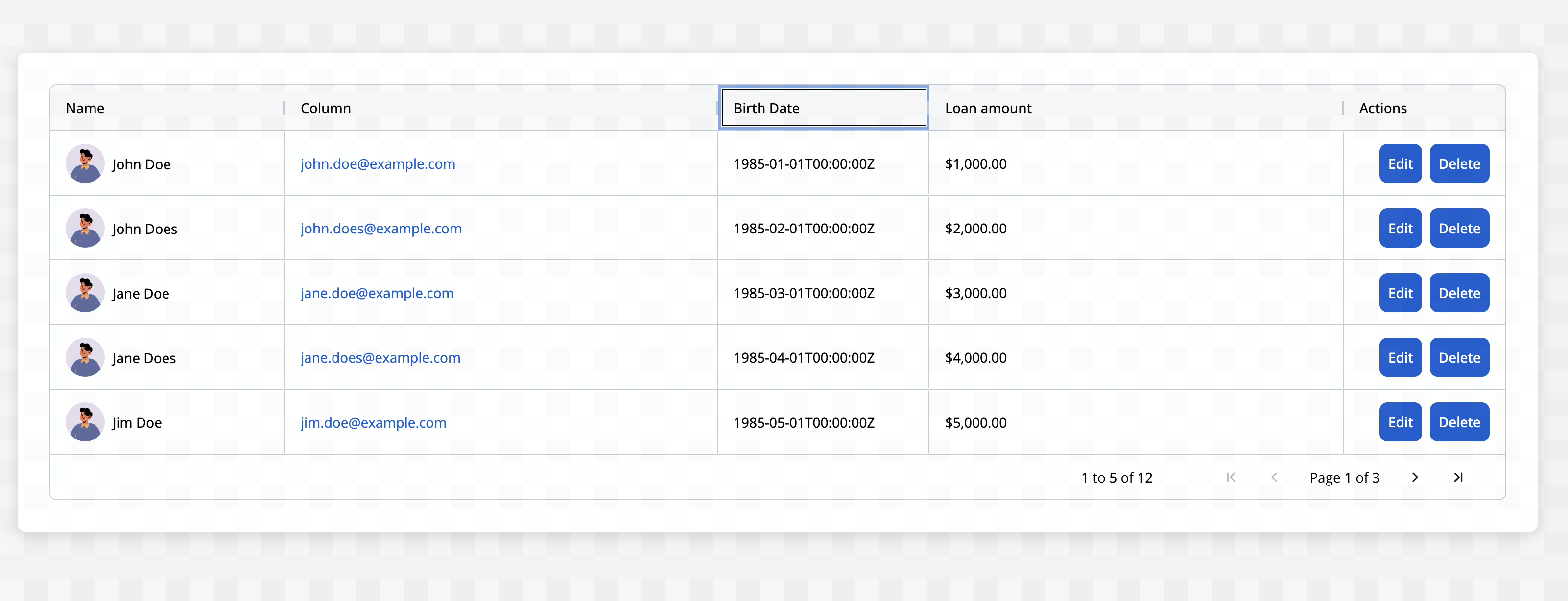
Table UI action
Append a saveData action to the table and configure the UI action’s custom keys with the same key used as source for the table, in order for the backend to take into consideration the updated array. See User Task configuration section for more details.Actions in table cells
When configuring actions within a Table component, each action is bound to a unique table item key, ensuring that interactions within each cell are tracked and recorded precisely. The key allows the action to target specific rows and store results or updates effectively.- Table Item Save Key:
- This key is essential for identifying the exact cell or row where an action should be executed and saved.
- It ensures that data within each cell remains distinct and correctly mapped to each table entry.
- Custom Key for Data Saving:
- Important: To properly send the data from a selected cell/row to the backend, you must configure both a Custom Key (in your
SaveDataaction) and a Table Item Save Key (in your column/cell configuration) using the same value. - Having only a
Table Item Save Keyis not sufficient to propagate the updated information. The matching Custom Key in the SaveData action tells the system which row/cell data to capture and transmit.
- Important: To properly send the data from a selected cell/row to the backend, you must configure both a Custom Key (in your
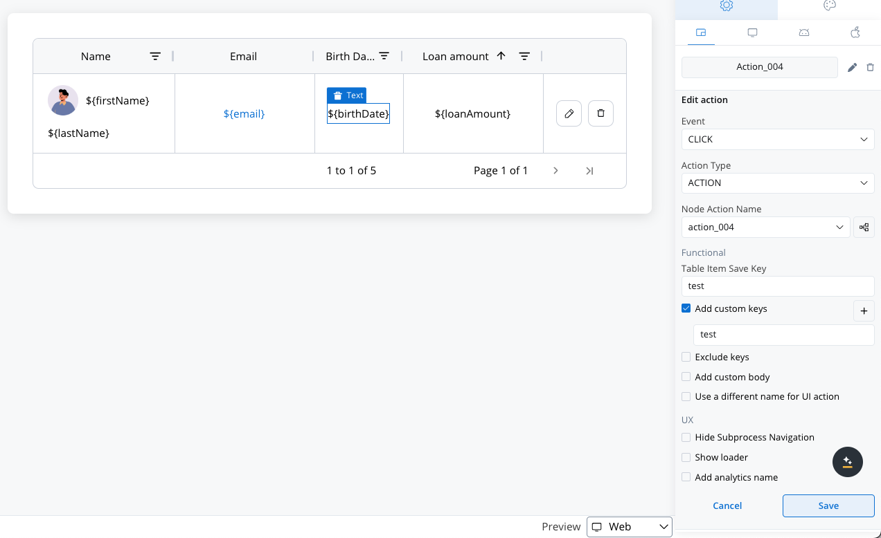
- Supported Action Types - Available actions include:
- Action: Initiates predefined actions within the cell.
- Start Process Inherit: Enables workflows inherited from process configurations to be triggered.
- Upload: Allows file or data uploads directly within a table cell.
- External: Used to create an action that will open a link in a new tab.
User Task configuration
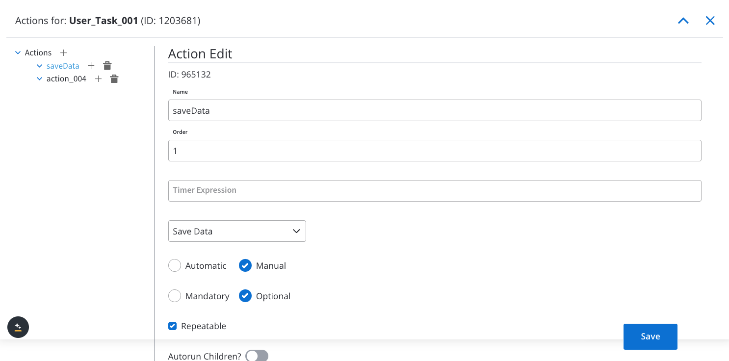
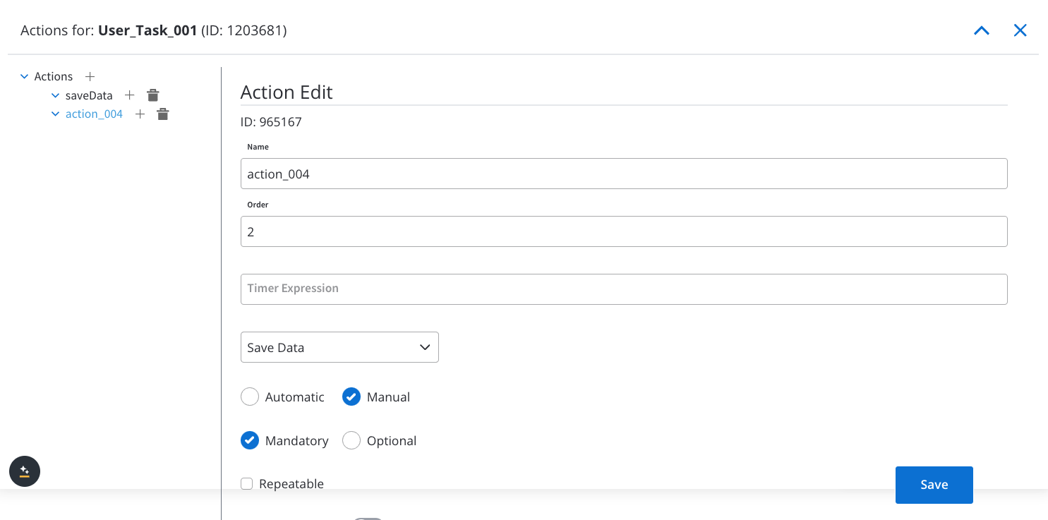
When configuring a screen in User Task containing table, you must configure the following node actions:Configure SaveData Action
- The
SaveDataaction must be:- Manual: Requires user initiation.
- Optional: Not mandatory for task completion.
- Repeatable: Can be executed multiple times.
- Execution Order Constraint:
- The
SaveDataaction can only be executed before mandatory actions. - The UI is built by configurators to ensure the correct execution order of actions.
- The
- Add an UI action to the table by assigning the previously created node action.
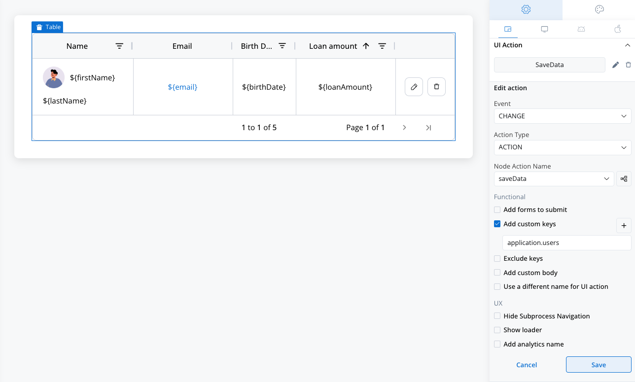
It is important to also add a custom key that is exactly the source key of the table so the platform will be able to know where to save the edits applied in the table.
Add Another Manual and Mandatory Action
- An additional manual and mandatory action should be included.
- This ensures that the token remains within the user task where the table is rendered.
FAQs
What is the `table item key` used for in Table actions?
What is the `table item key` used for in Table actions?
The
table item key is essential for identifying specific rows and cells within a table. When actions are triggered in table cells, this key ensures that the action applies to the correct item, allowing data to be saved accurately in the intended cell or row. Without this key, actions may not track or save data correctly.How does the Table component differ from Collection?
How does the Table component differ from Collection?
While the Table component shares structural similarities with Collection, it is tailored specifically for tabular data. Unlike Collection, it supports easy customization of columns, row pagination, and in-place editing (in future versions), streamlining the handling of tabular data.
Can I use conditional styling in Table cells?
Can I use conditional styling in Table cells?
Conditional styling is a planned feature for version 5.0.0. Once available, it will allow you to apply specific styles to cells or rows based on conditions, such as highlighting critical items or overdue entries.
Does the Table component support nested tables?
Does the Table component support nested tables?
No, nested tables (tables within other tables) are currently unsupported and are not planned for future updates. This limitation keeps the Table component optimized for its intended use without overcomplicating its structure.
What actions can I use within Table cells?
What actions can I use within Table cells?
Table cells support various actions:
- Action: Executes a predefined action within the cell.
- Start Process Inherit: Triggers workflows based on inherited process configurations.
- Upload: Allows direct file or data uploads within a cell.
Each of these actions requires a
table item keyto ensure data accuracy.
How is pagination configured in the Table component?
How is pagination configured in the Table component?
Pagination can be customized to control the number of entries displayed per page. Alternatively, you can enable scrollable view mode by disabling pagination, which provides a continuous, scrollable data view.
Can I edit data directly within the Table cells?
Can I edit data directly within the Table cells?
Direct in-place editing is scheduled for version 4.6.0, allowing users to edit data directly within table cells. This feature will improve efficiency for workflows requiring frequent table data updates.
Are there specific data sources required for populating a Table?
Are there specific data sources required for populating a Table?
Yes, the Table component requires a source in the form of an array of objects. The source allows the Table to dynamically populate cells based on the data structure, ensuring rows and columns align with your data set.
What if I need to add custom actions within the Table?
What if I need to add custom actions within the Table?
Custom actions can be configured using the UI Designer. Each action added to a cell will leverage the
table item key to perform tasks such as saving edits, initiating workflows, or uploading files directly from the table.Can I hide specific columns or rows based on conditions?
Can I hide specific columns or rows based on conditions?
Yes, the Table component supports JavaScript expressions to control visibility dynamically. By setting up expressions, you can create conditions that hide certain columns or rows when specific criteria are met.