FlowX.AI 4.6.0 Release Notes
Welcome, FlowX fam! The 4.6.0 update is here, and it’s packed with features designed to save you time, boost efficiency, and maybe even make you chuckle. Let’s dive into the details, feature by glorious feature. 🎉
What’s new? 🆕
Projects: Order out of chaos
The new Project concept introduces a streamlined approach to managing and deploying complex projects within FlowX. By grouping all related resources—such as processes, enumerations, integrations, and assets—into a single, organized workspace, projects provide a cohesive view for efficient development and deployment.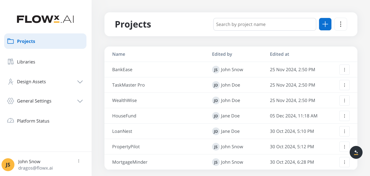
- Unified Workspace: Group related processes, integrations, assets, and configurations into one tidy space.
- Version Control: Manage multiple builds and versions effortlessly. Rollbacks? No sweat.
- Resource Sharing: Reuse processes and configurations across projects like a boss.
Why you’ll love it: It’s like going from a messy desk to an organized digital office.
Projects
For more details, check out this section
🛠 Config vs Build Mode
Config Mode: Tinker, tweak, and perfect.- Config mode is the environment where you set up, adjust, and manage your project’s resources, processes, and configurations. It’s the workspace where you fine-tune every aspect of the project before it’s ready for deployment. Think of it as the design phase, where the focus is on setup, organization, and preparation.
- Build mode is the stage where the configurations you’ve set up are packaged into a deployable form. This is the runtime-ready version of your project, containing everything needed for it to function in a production environment. A build includes a snapshot of the project’s state at a given point, ensuring stability and predictability when deployed.
Configuration
For more details, check out this section
Runtime
For more details, check out this section
Integration Designer: Connect like a pro
It’s like a dating app for your systems: drag, drop, connect, and let the workflows flow.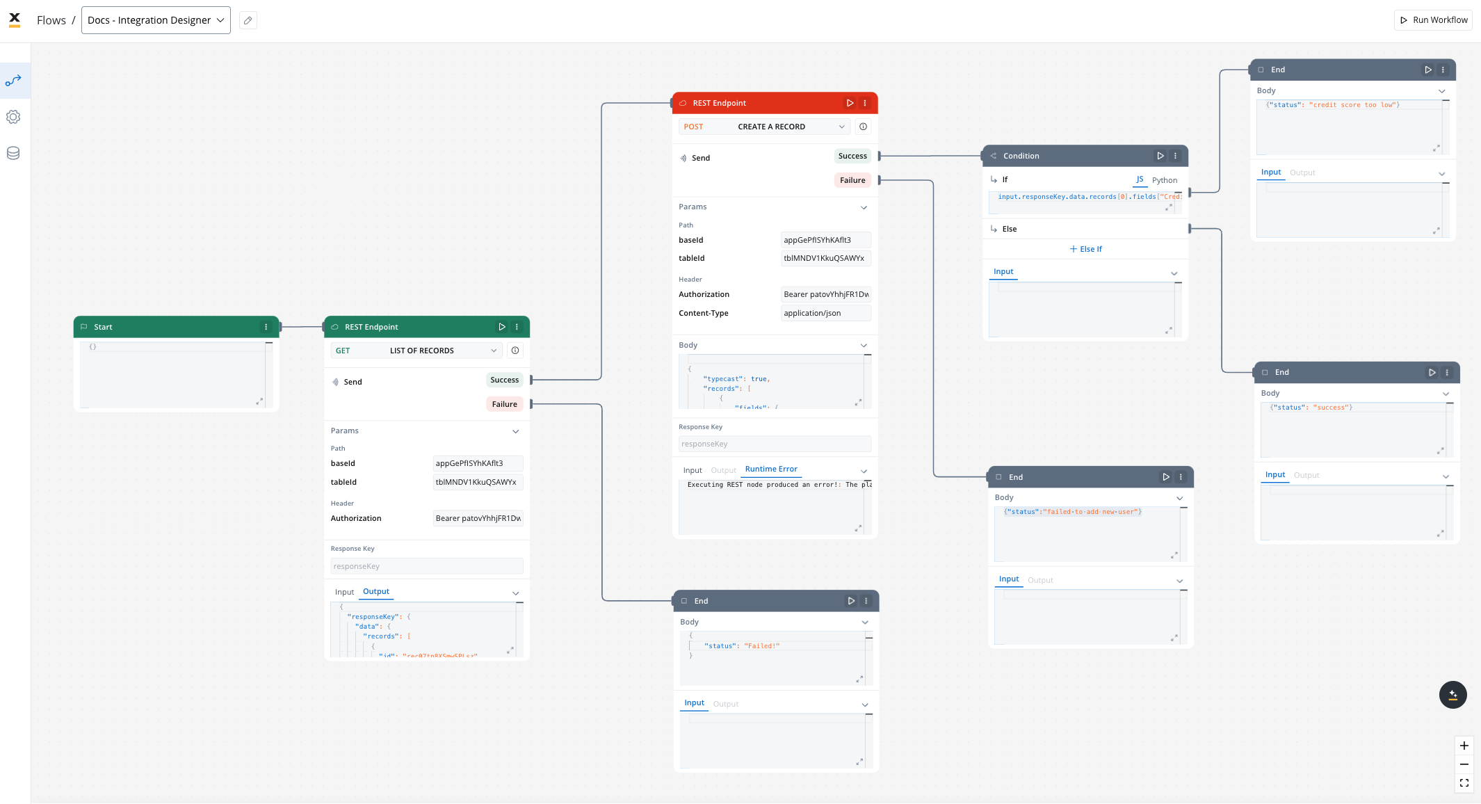
- Drag-and-Drop Interface: Map data, define workflows, and configure endpoints like a breeze.
- Flexible Authorization: Use Service Tokens, Bearer tokens, or go authentication-free.
- Error Management: Built-in tools ensure your integrations don’t ghost you.
Fun Fact: Integration Designer doesn’t just test APIs (we love you, Postman❤️). It automates workflows, saving you tons of time.
Integration Designer
For more details, check out this section
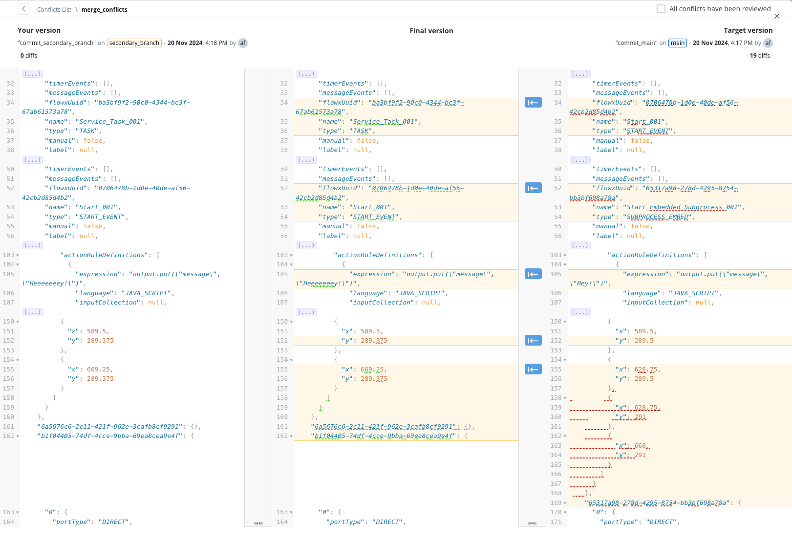
Merge Conflicts 2.0: Merge without the drama
Merging branches? We’ve overhauled the process to make it faster, smarter, and far less painful.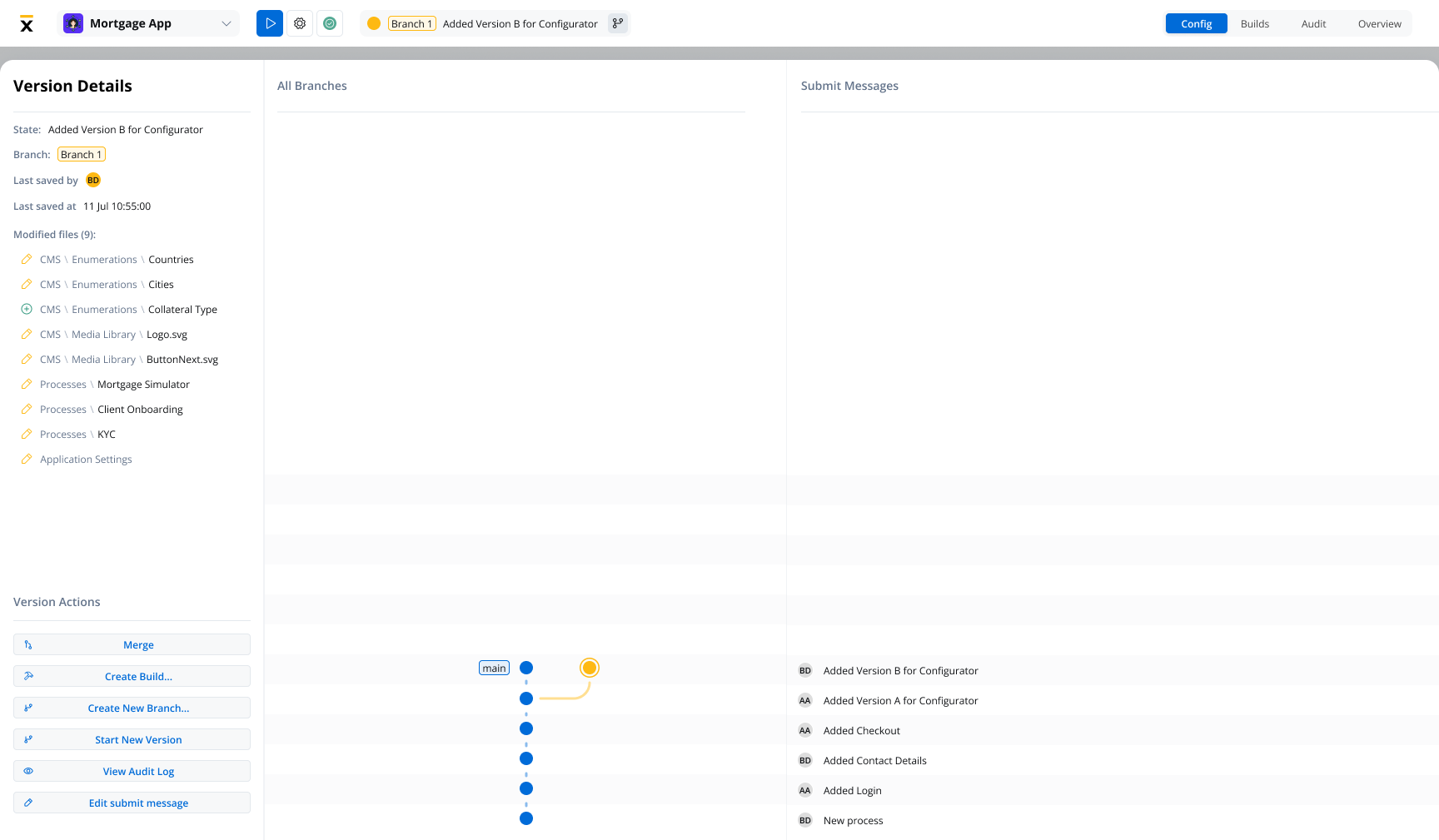
- Advanced Conflict Detection: Pinpoint issues by resource type (Processes, Enumerations, Media, etc.).
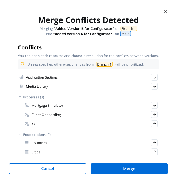
- Resource-Level Resolution: Resolve conflicts directly in the UI with:
- JSON comparisons (color-coded for clarity!).
- Navigation tools to jump between differences.
- Progress tracking for reviewed items.
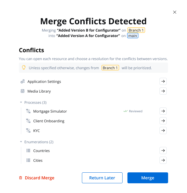
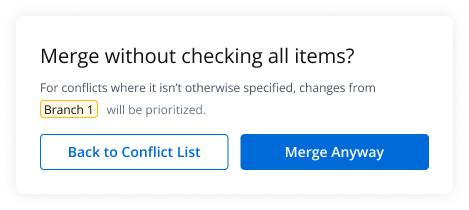
Pro Tip: Use the “Merge Anyway” option if you need to override unresolved conflicts (but use it wisely!).
- A confirmation modal explains how unresolved conflicts will be handled (e.g., prioritizing source branch changes).
- Allows merging to continue even when some conflicts remain unresolved.
Merge conflicts
AI Agents: Smart, adaptable, always ready to help
FlowX AI Agents bring automation to your fingertips, powered by a flexible, LLM-agnostic core. 🤖 Why It’s Cool:- Works with both open-source and private language models.
- Secure, on-premise deployments available.
- Automates business processes and interactions.
Localization and Internationalization
FlowX is now more global-friendly with enhanced localization features.Flexible Date, Time, Number, and Unit Formatting
Enhanced formatting options for dates, times, numbers, and currencies with support for various international standards including short, medium, long, full, and custom formats.
Currency Customization
Support for currency formatting with options to display values using ISO codes or symbols, adapting to user-selected locales and regional preferences.
Locale-Based Configurations
Comprehensive settings for pluralization, capitalization, alignment, and sorting that adapt to regional requirements, helping cater to a diverse global user base.
Enhanced UI Component Formatting
New options in the UI Designer to override general settings for text, messages, links, and form elements based on locale and region.
Document Localization
Static and dynamically generated legal documents can now be customized based on regional and locale settings, improving compliance and communication with local audiences.
Localization and internationalization
For more details, check out this section
Data Model 2.0: Data handling, but make it fashion
In this release, we’ve introduced Data Model 2.0, a major upgrade designed to simplify and enhance data handling. Key improvements include the introduction of reusable objects, a visual representation of complex data structures, and dynamic data binding, all aimed at creating a more reliable and intuitive experience. The new model ensures references are automatically updated when changes are made, streamlining data management across the platform. Highlights:- New Root Element: Provides a structural basis without impacting business logic, ensuring a clear and organized data structure.
- Enhanced Data Binding: Expanded to more areas, with dynamic updates based on changes in the data model.
- Localization: Added handling mechanism for locale-specific formatting, ensuring accurate data representation.
Data model
For more details, check out this section
Task management 2.0
We’ve enhanced Task Management capabilities, making it easier to create, track, and manage tasks efficiently. The updated Task Management features include customizable views and advanced filtering and sorting options for task data. Additionally, users can now implement both low-code and full-code solutions for a tailored Task Management experience, ensuring maximum flexibility for different business needs.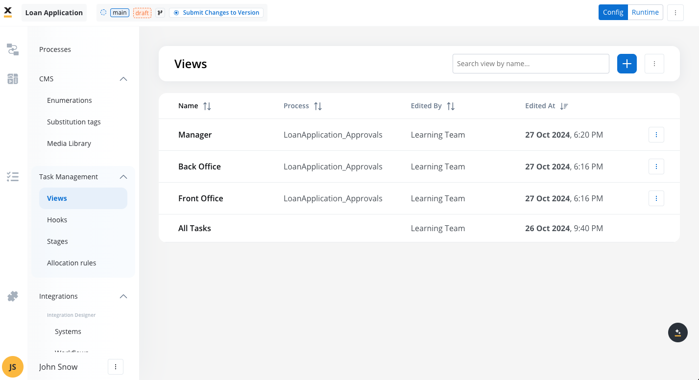
Task Management
For more details, check out this section
UI Designer
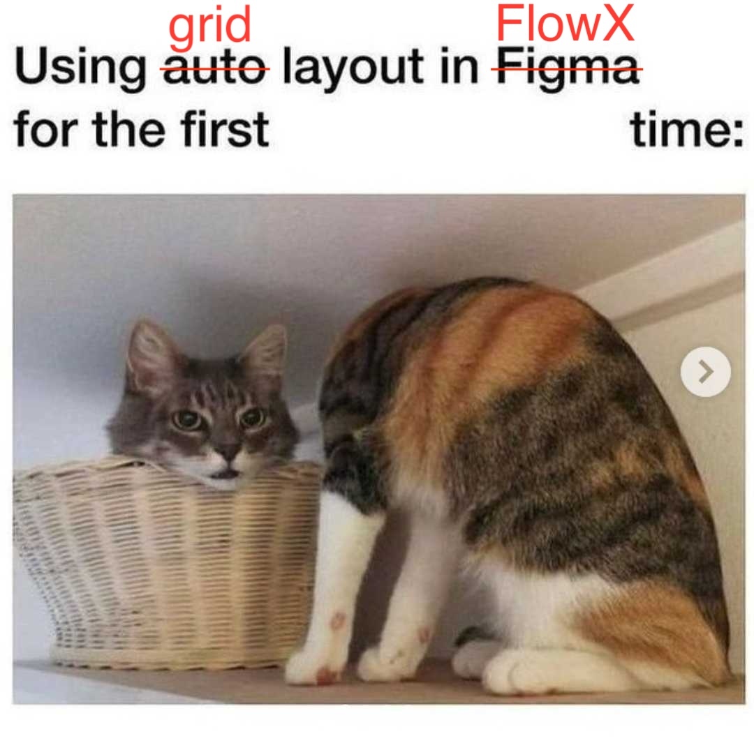
Grid layout
We are excited to introduce the Grid Layout feature in this release, enhancing the flexibility and usability of the UI Designer for creating structured and responsive layouts. With the new Grid Layout, users can organize form elements, tables, and other components using a multi-column and row system, allowing for more complex, bidirectional designs compared to the previous flex-based layout.This might happen after using it for the first time:
This might happen after using it for the first time:
Table
The Table component is a simple and flexible way to display data in web applications. It lets you customize columns, add pagination, sort and filter data, and apply your own styling. You can resize columns, scroll through data, and even add actions like editing or deleting rows directly in the table. It’s easy to set up, with default columns and rows generated automatically based on your data.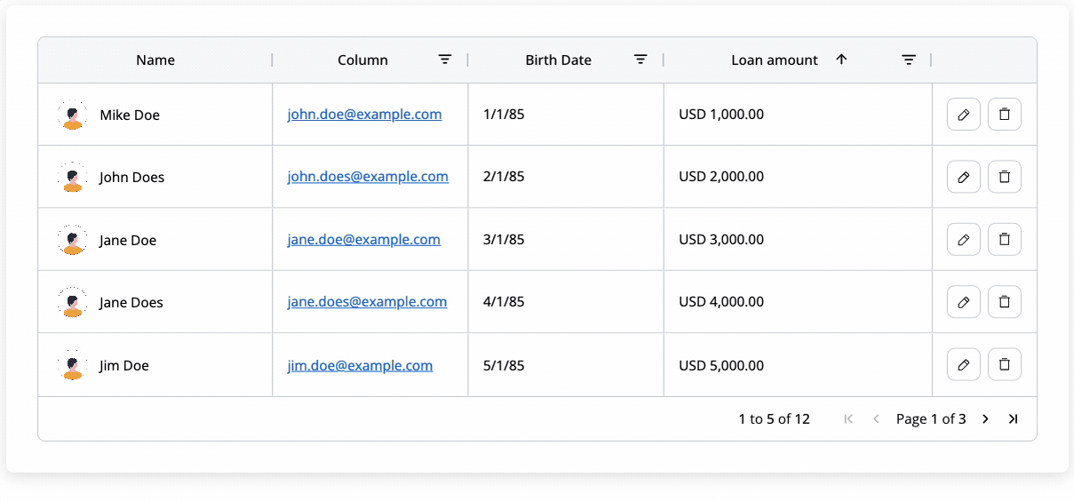
Table
For more details, check out this section
FlowX.AI UI Designer new navigator
We are thrilled to introduce the new and improved UI Designer Navigator, a major update designed to streamline your UI design process.Enhanced UI Layer Panel Design and Functionality
The UI layer panel has been redesigned for a more intuitive experience, making it easier to manage and navigate through your design elements.
Improved Drag and Drop Experience
Dragging and dropping components in the preview is now smoother and more precise, allowing for faster and easier creation of UIs.
Flexible Root Component Management
You can now change the root component from a form group to a container or vice versa, offering greater flexibility when copying nodes or resolving configuration problems.
Clearer Component Hierarchy
It is now simpler to identify where you are placing a component within the hierarchy, thanks to the enhanced drag/reorder functionality in the right panel.
Conditional formatting for UI elements
Dynamically update styling and properties of UI elements based on conditions, reducing the need for multiple prototypes.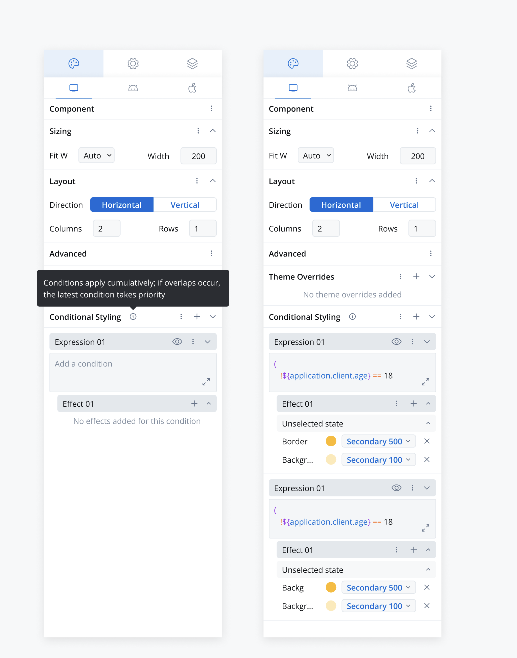
Conditional styling is available for text, link, and container UI elements based on specific conditions.
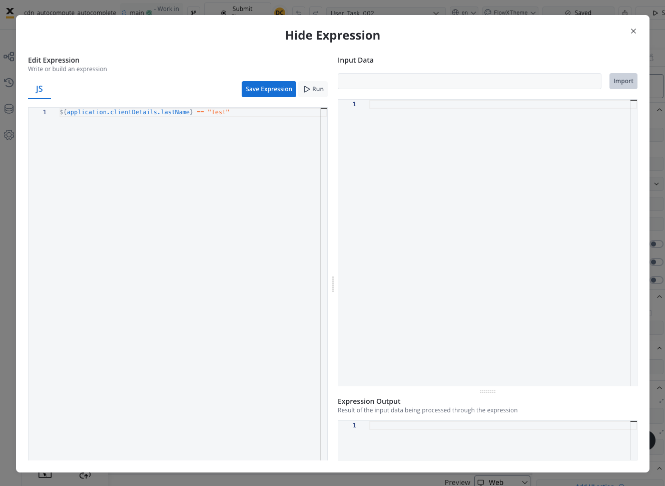
Hide expressions enhancements
Expanded hide expressions functionality to include:- Cards
- Collection prototypes and children
- Table cell children (e.g., texts, images, buttons, links)
UI actions
- Added a new UI action Start new project instance
- Removed the Start Process Inherit UI action type.
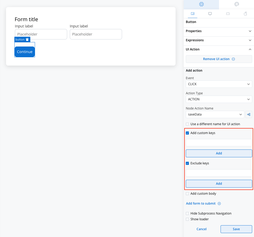
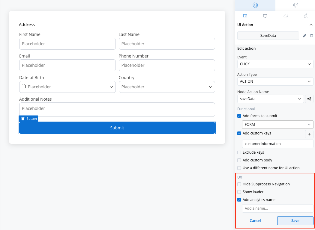
UI action form updates
- Introduced Functional and UX sections for all action types, with a checkbox for Add Analytics Name in the UX section.
- Simplified custom and exclude key management.
Start new project instance action
We’ve introduced the Start New Project Instance node action, enabling users to initiate a completely new process from within an ongoing one. This functionality is perfect for scenarios where isolated use cases are managed across different projects or environments.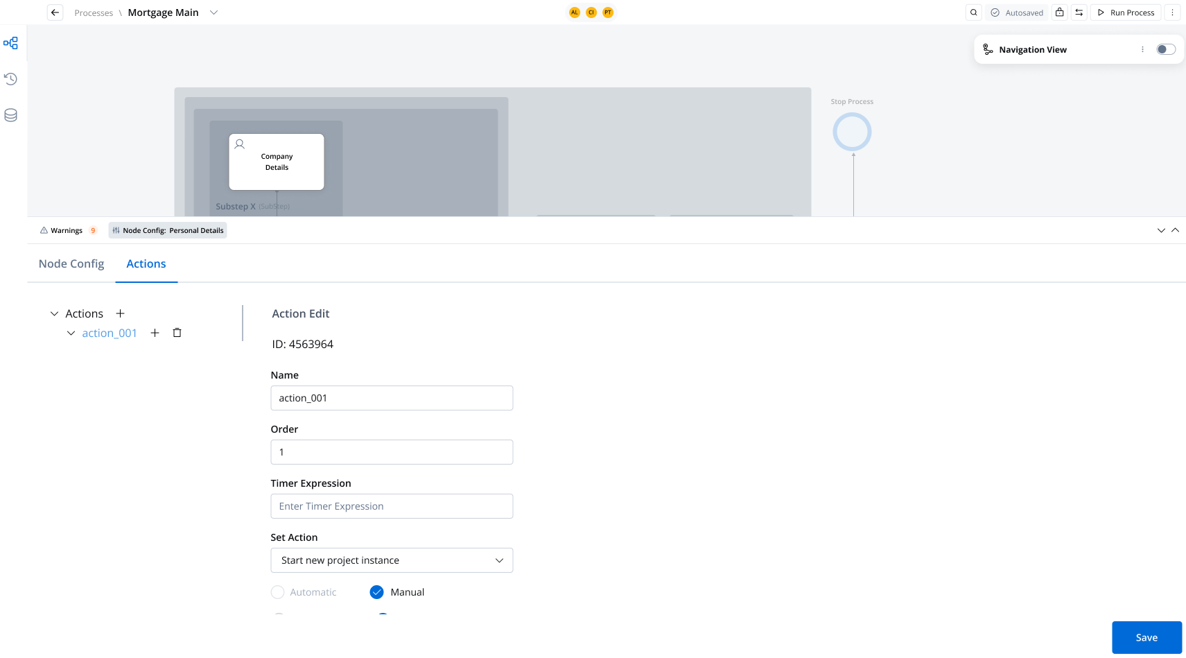
Start new project instance action
Custom components validation
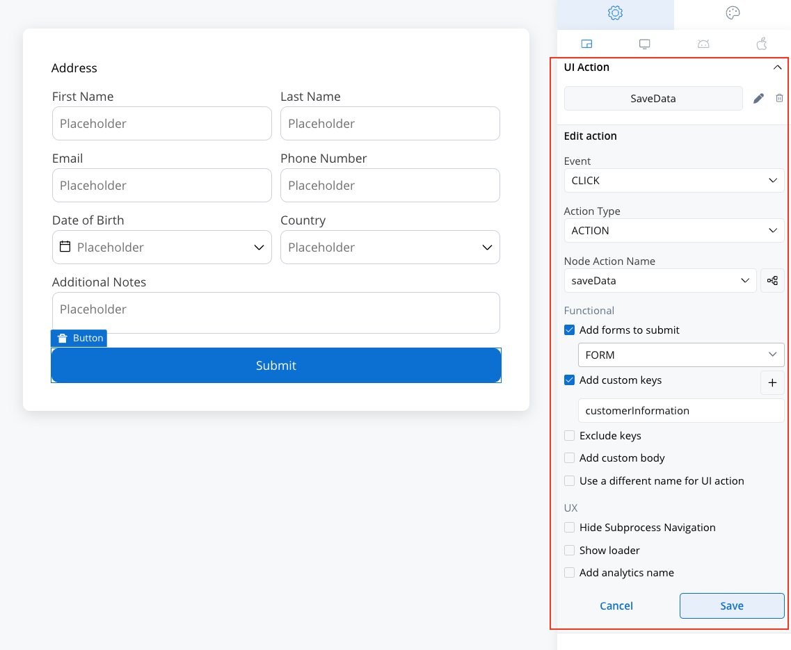
You are able to validate and retrieve data from a generated screen, including data from a custom form section. Additionally, you’ll have the ability to trigger and manage data directly within that section. This will be a major benefit for clients who have chosen to create custom components for the entire screen (for example, a form that isn’t supported natively by the platform).Validating elements
Autocomputed data to send
In previous platform versions, when creating your UI screens and working with data, you had to ensure that all the data stored in your process keys was saved in the process instance. This required adding an extra parameter called “Data to send” to the “Save Data” node action. Older versions vs v4.6.0:

You no longer need to add “Save Data” node actions, but make sure to include “Forms to Validate” on the UI Actions. This helps ensure that data is submitted correctly and automatically activates any added validators where they exist.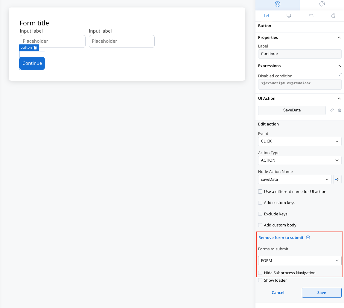
Scripting UX Improvements: Write code like a wizard
- Autocomplete: Get tailored suggestions based on your data model.
- New Editors: JSON and hide/disable expressions editors now include examples, syntax help, and better visual feedback.
React & Angular SDKs
Dev friends, we heard you. FlowX now integrates smoothly into your React and Angular apps. It’s like peanut butter and jelly, but make it code.React SDK
With the 4.6.0 release, we’re excited to announce the launch of the FlowX React SDK! This new SDK empowers developers to seamlessly integrate FlowX.AI capabilities into React applications, making it easier than ever to build highly interactive, responsive, and dynamic user experiences. To get started, simply install the FlowX React SDK via npm and check our documentation for examples and best practices!React SDK
New Angular SDK
We’re excited to announce new releases for FlowX packages to support web applications:@flowx/core-sdk@flowx/angular-sdk@flowx/angular-theme@flowx/angular-ui-toolkit@flowx/core-theme
We recommend upgrading to the latest versions of all @flowx packages to take full advantage of these new features and improvements. Check the deployment guidelines for version details.
Angular SDK migration guide
Analytics integration for Container Apps
Container apps now support tracking “Screen Displayed” and “Action Executed” events, configurable in the UI Designer to improve insights into user interactions. UI Designer updates- Analytics Screen Name: Configurable under Root UI components (Cards and Containers) to enable tracking in analytics platforms like Google Analytics.
“Screen Displayed” events support user task-based reporting, such as when a user task screen is shown.
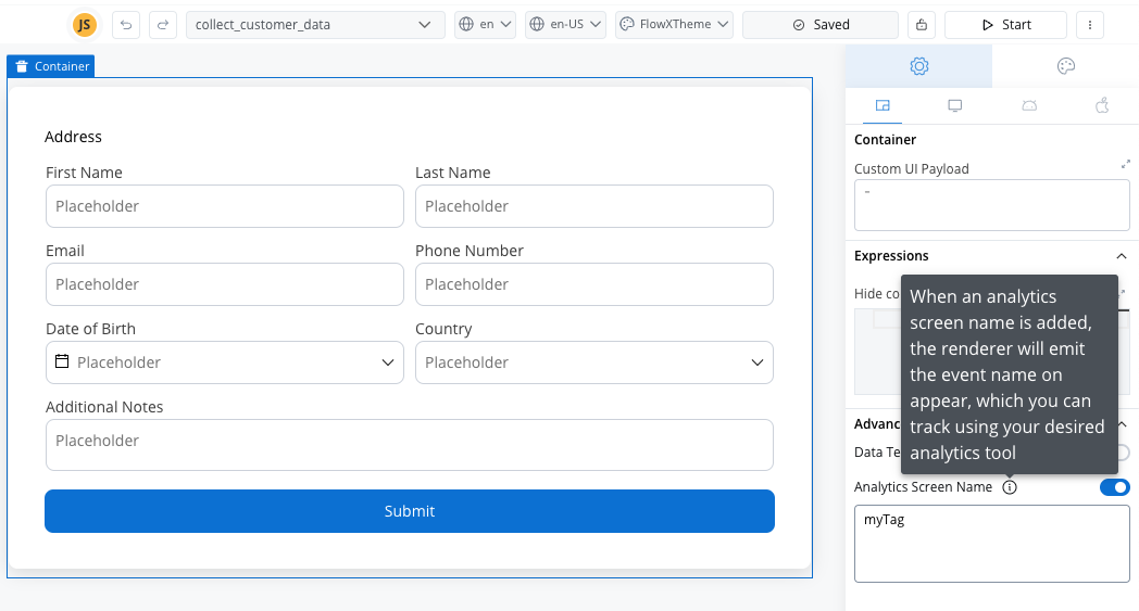
The configured values are stored in
flowxProps.analytics, making them accessible for integration with analytics tools.- Action Analytics: Tracks user actions (e.g., button clicks) with tags set directly in the UI Action Form.
Added analytics configuration in the UX Section for all UI action types.
Values are saved in
params.analytics via the PATCH /actions request.- Screen Events: Triggered on user task display, using
flowxProps.analytics. - Action Events: Triggered on action execution, using
params.analytics.
Plugin updates
Notifications and Documents plugins have been integrated as project resources.Scheduled Processes: Timer management reimagined
We’ve completely redesigned how you manage timer-triggered processes. Before 4.6.0, timer activation was managed through a quick actions menu in process definition headers; now it’s handled via dedicated UI section in the Runtime tab under Scheduled Processes.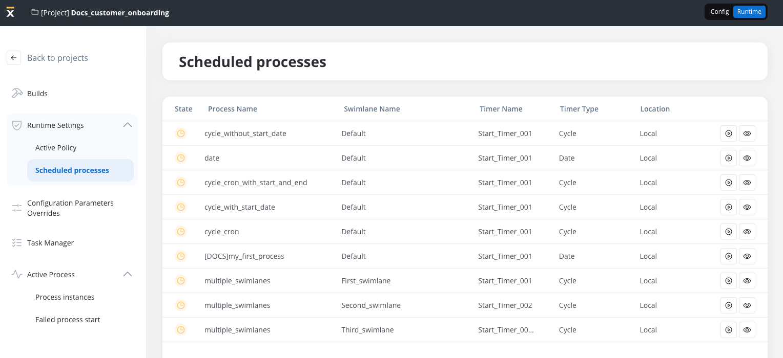
- Centralized Timer Management: All process timers are now visible and manageable in one dedicated location
- Persistent Settings: Timer configurations persist across build exports/imports
- Environment Control: Activate or deactivate timers without redeploying your application
Scheduled Processes
Bug fixes 🐞
Rendering
- Default Value Initialization for UI Elements: Resolved an issue where certain UI elements were initialized with incorrect default values.
- Improved Security for Hidden Fields: Fixed a vulnerability where hidden fields could be accessed through browser developer tools.
- Form Validation Reset on UI Dismissal: Addressed an issue where form validation errors persisted after the UI was closed.
- Keybinding Issues on Windows: Fixed a bug where pressing specific keys triggered unintended operations in the designer.
- Input Field Validation for Number Type: Corrected the validation logic for number input fields to ensure consistent behavior.
- Improved Datepicker Popup Positioning: Resolved an issue where the datepicker popup overlapped the associated input field.
- Manual Date Entry in Datepicker: Fixed an issue where manually entering a date after selecting one from the datepicker caused errors.
- Enhanced Update Mechanism for Custom Components: Improved the reliability of updates for custom components to reflect changes consistently.
Known issues 😢
We’re aware of a few quirks during merge conflicts and are working to fix them. Here’s a quick rundown:Processes
Processes
- After a merge, sequences without a connection to an end node may appear on the canvas in cases of conflicts related to deleted nodes in one of the versions. This may occur because the merge mechanism does not detect that a sequence needs to be deleted if, in the final version, the node remains deleted.
- Navigation areas – After a merge, inconsistencies in the navigation areas hierarchy calculated during merging may result in navigation areas being hidden in the final merged version.
- No merge conflict detected if a user task node is deleted in the source branch and its UI is modified in the destination branch.
- Nodes may end up having two different outgoing sequences in certain scenarios: When a node is not connected to another node, and both the source and target branches define different sequences to different nodes, the merged version may contain both sequences. In particular, this may cause inconsistencies for boundary nodes, which cannot have multiple outgoing sequences.
- Gateway nodes may lose some of their configurations during merging when conflicts arise.
- Conflicts arising from moving nodes to different swimlanes in both the source and target branches are not detected correctly and result in a merge error.
Enumerations
Enumerations
- Duplicate content values can be created during merging: Merging branches with enumeration updates can result in duplicate content values or child enums with the same code. This occurs when identical names are added to the same enum in different branches, bypassing backend validation. Instead of flagging a conflict, the merge proceeds, creating duplicate entries. This issue disrupts the expected uniqueness constraint for enumeration values.
- Enum content values might not save correctly in some cases: In specific scenarios involving transformations of content values into child enums across branches, content values added in one branch may not appear after merging. Despite accepting changes from the branch where the content value was added, the merged version omits it, leading to incomplete or inconsistent enumeration data.
Conflict Detection Gaps
Conflict Detection Gaps
- New substitution tags with the same name on different branches aren’t flagged: Merging branches that include new substitution tags with identical names on different branches does not trigger a conflict. Instead, both tags are retained, resulting in duplicate substitution tags with the same name but different values. This issue bypasses expected conflict detection and can lead to inconsistencies in substitution tag usage.
- Adding values to deleted data model keys does not raise conflicts: When values are added to a data model key in one branch and the same key is deleted in another, merging does not generate a conflict. Instead, the added values from the first branch are silently lost in the merged version. This issue bypasses expected conflict detection, leading to data loss and inconsistencies in the resulting data model.
Media Library
Media Library
- Branches with media library assets sometimes fail to merge into the main branch: Merging branches with media library assets can result in a 500 Internal Server Error when changes to the same asset occur across multiple branches. This issue typically arises when one branch is merged into another, and then the combined branch is merged into the main branch. The failure occurs due to null parameter handling during the merge process, preventing the merge from completing successfully.
Notification and document templates
Notification and document templates
- Branches with notification and document templates fail to merge into the main branch
UI/UX
UI/UX
- After a successful merge, the merged version is not selected in the versioning modal.
- Some entries in the merge conflicts tree may show numbers instead of specific identifiers (e.g. forms);
- Unnecessary scrollbars appear in the merge modal for single items: The merge conflict modal displays unnecessary scrollbars when only a single item is present in the list. This occurs in scenarios where media library assets with long keys are involved, creating a layout issue that affects the user interface. While functionality is not impacted, this visual inconsistency can reduce the overall user experience during conflict resolution.
- Fields like
originalCreationTimestampandflowxUuidare incorrectly flagged as conflicts: The merge conflict modal displays unnecessary scrollbars when only a single item is present in the list. This occurs in scenarios where media library assets with long keys are involved, creating a layout issue that affects the user interface. While functionality is not impacted, this visual inconsistency can reduce the overall user experience during conflict resolution.
Changes 🔧
- Web Renderer Caching: Improved resource caching with browser mechanisms keyed to build IDs.
- Process Designer: Enhanced drag-and-drop functionality for node placement.