> ## Documentation Index
> Fetch the complete documentation index at: https://docs.flowx.ai/llms.txt
> Use this file to discover all available pages before exploring further.
# FlowX.AI 5.7.0 Release Notes
> Single-org on-premises deployment, custom React components, AI providers self-service, chat-based UI Flows, voice input, end-user access management, and advanced query builder.
**Deployment models:**
* Self-Hosted Features for self-hosted (on-premises) deployments
* All Deployments Features available in both self-hosted and SaaS
FlowX.AI 5.7.0 makes on-premises deployment a first-class experience. **Single-org deployment** is now the default mode — configure your organization once, connect to FlowX licensing, and you're running. For builders, **Custom Components** let you write React code directly in the Designer, **AI Providers** configuration gives organizations self-service control over their LLM setup, and **Chat-based UI Flows** simplify conversational experiences. For organization admins, **End-user access management** separates runtime users, roles, and groups from Designer users.
Single-org deployment, license service, organization setup flow
Custom React components, AI provider config, chat-based UI Flows, voice input
End-user access management, runtime roles, and groups
### What changed since 5.6.0
| 5.6.0 | 5.7.0 |
| ----------------------------------------- | --------------------------------------------------------------------------------------------------------------------------- |
| SaaS-focused deployment | + **Single-org on-premises** as the default mode |
| Built-in UI components only | + **Custom React Components** with code editor and dependencies |
| AI models configured by FlowX | + **AI Providers self-service**: OpenAI (FlowX Managed or BYOK), custom URL, Defaults & Fallbacks per workspace type |
| Chat workflow set per component | + **Chat-based UI Flows**: set one workflow for the entire UI Flow |
| Text-only chat input | + **Voice input** for chat conversations |
| No audio processing in workflows | + **Speech to Text** node for transcription and text-to-speech |
| Runtime users mixed with Designer users | + **End-user access management**: separate org-level lists for end-users, roles, and groups, with CSV bulk invite |
| Basic query filters | + **Advanced Query Builder** for database operations |
| MongoDB-only database data sources | + **Oracle Database** as a new data source type with schema-aware SQL editor |
| Fixed search strategy for KB retrieval | + **Context Retrieval**: configurable search type (Hybrid/Semantic/Keyword) and re-ranking |
| Equality-only metadata filters, AND logic | + **Knowledge Base filter builder** with typed operators and AND/OR grouping; **Content Sources** tab renamed to **Stores** |
| Basic merge modal | + **Merge conflicts UX**: redesigned modal, diff viewer theme, keyboard support |
***
**What's new?**
FlowX 5.7.0 introduces single-org deployment as the default mode for on-premises installations, with self-service licensing, organization management, and runtime access controls.
🏢 [**Single-org deployment**](#single-org-deployment) - On-premises deployment with automatic organization setup\
🔑 [**License service**](#license-service) - Connect to FlowX SaaS for license validation and usage reporting\
👥 [**End-user access management**](#end-user-access-management) - Org-level end-users, roles, and groups, separate from Designer users
{/* ============================================================ */}
{/* ============================================================ */}
### **Single-org deployment**
Self-hosted deployments now run as single-organization systems by default. FlowX registers your organization in the SaaS licensing infrastructure, provides an Organization ID, and your deployment connects to FlowX for license validation and usage reporting. The Designer guides you through a setup flow on first launch: enter a token, name your environment, and create your admin user.
See the Organization Manager setup guide.
Designer walks you through organization registration on first launch
Mandatory on all services for Liquibase migrations on upgrades
On-premises license service connects to FlowX SaaS for validation and usage
Registration, org selection, and org switching are not available on-prem
Designer and Runtime URLs are configured via dedicated on-prem env vars on organization-manager, replacing hard-coded org-code lookup
Major Feature
Self-Hosted
***
### **License service**
The License service is the bridge between your self-hosted deployment and FlowX SaaS. It validates your platform license, reports usage data, and ensures your subscription is active. Configure it with the license key and server URLs provided by FlowX during organization registration.
See the License service setup guide.
Continuous license sync with FlowX SaaS
AI node execution consumption reported to FlowX
Listens to organization lifecycle events via Kafka
Complete setup guide with PostgreSQL, Kafka, Redis, and SpiceDB configuration
Self-Hosted
***
### **End-user access management**
Organization admins can now manage the people who use published solutions separately from Designer users. A new **Access Management** section at the organization level holds three lists — **End-Users**, **End-Users Roles**, and **End-Users Groups** — each with its own permissions. Invite end users individually or import many at once from a CSV template, define roles that describe runtime access, and organize users into groups with custom attributes for filtering.
See the End-user access management setup guide.
End-Users are kept distinct from Designer users, with their own read/write permissions
Define named roles that describe runtime access at the organization level
Group users by department, region, or any attribute, and assign roles to the whole group
Invite many users at once from a CSV template with names and attributes
All Deployments
***
Self-service AI provider configuration, chat-based UI Flows, AI Triggers, and voice input for conversational experiences.
🤖 [**AI Providers**](#ai-providers) - Organization-level LLM provider and model configuration\
💬 [**Chat-based UI Flows**](#chat-based-ui-flows) - Set a conversational workflow for the entire UI Flow\
🎤 [**Voice input**](#voice-input) - Speech-to-text input in chat conversations\
⏹️ [**Stop agent response**](#stop-agent-response) - Cancel an in-progress agent reply from the chat input\
🗣️ [**Speech to Text node**](#speech-to-text-node) - Transcription and text-to-speech workflow node\
⚡ [**AI Triggers**](#ai-triggers) - Named message templates for launching conversational workflows with context\
🧩 [**UI Flow Context**](#ui-flow-context) - Pass UI state from a Page to a conversational workflow\
🎯 [**Recommended prompts**](#recommended-prompts) - AI-generated follow-up suggestions in chat conversations\
🔎 [**Context Retrieval enhancements**](#context-retrieval-enhancements) - Configurable search type and re-ranking\
📚 [**Knowledge Base enhancements**](#knowledge-base-enhancements) - Stores rename, typed metadata filters, AND/OR grouping\
🌐 [**Web Page Extractor enhancements**](#web-page-extractor-enhancements) - URL filtering, crawl depth, and file downloads
{/* AI PROVIDERS */}
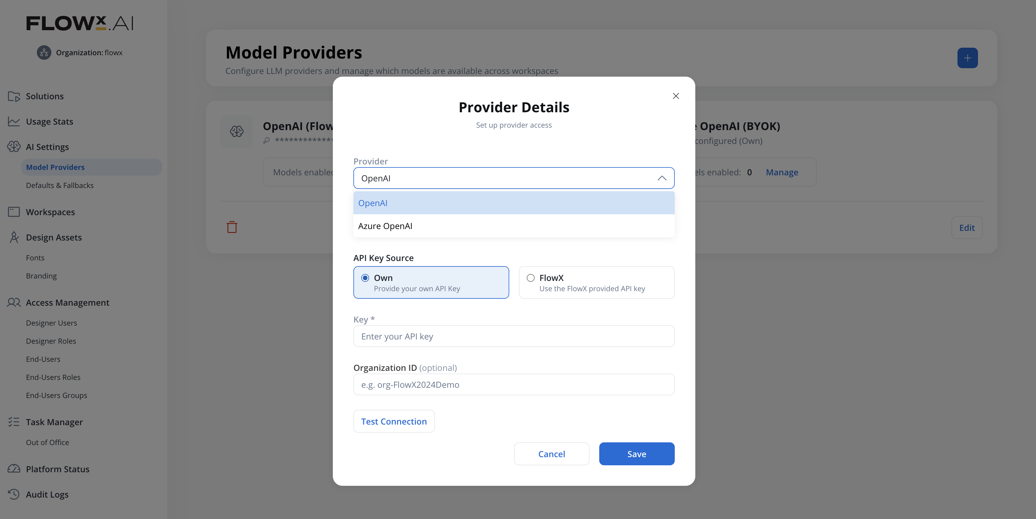
### **AI Providers**
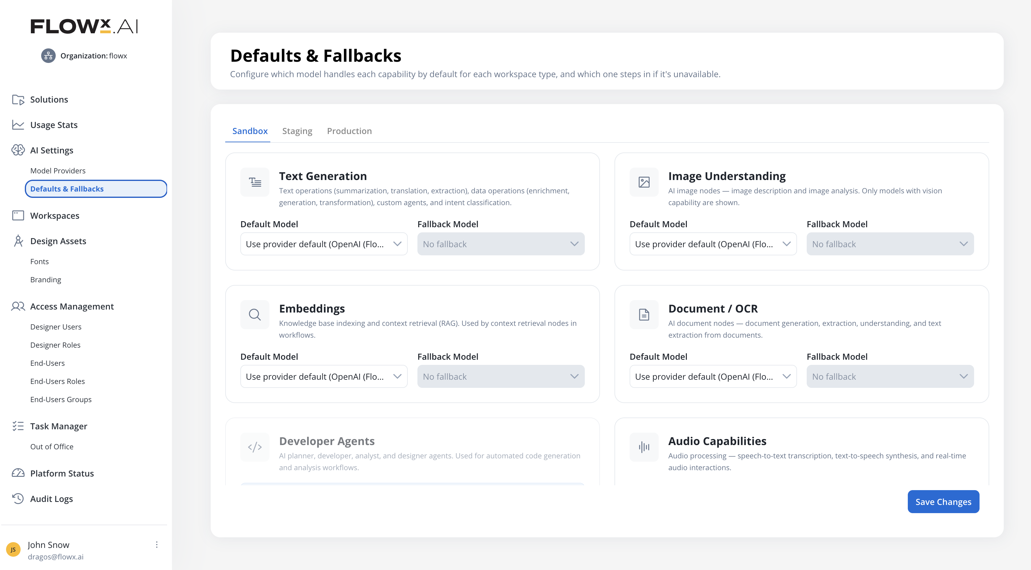
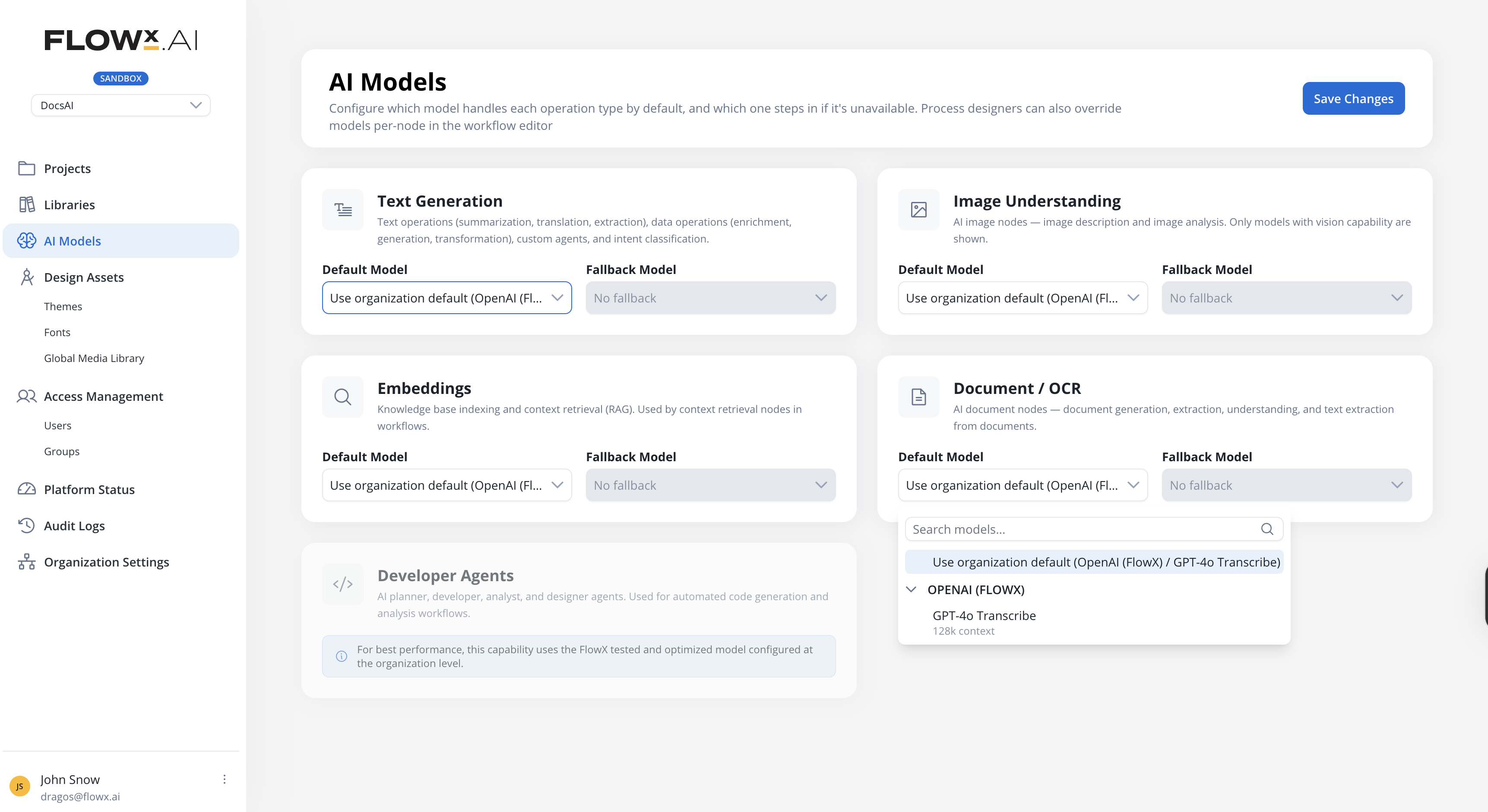
Organizations can now configure their own AI providers and assign models at the organization level. Configure **OpenAI** (Bring Your Own Key or FlowX Managed) or **Azure OpenAI** for deployment-based access to GPT models, enable specific models, and assign default and fallback models per AI capability and workspace type (Sandbox, Staging, Production). **Defaults & Fallbacks** now includes an **Audio Capabilities** row used by the Speech to Text node, with `whisper-1` available in the OpenAI model catalog.
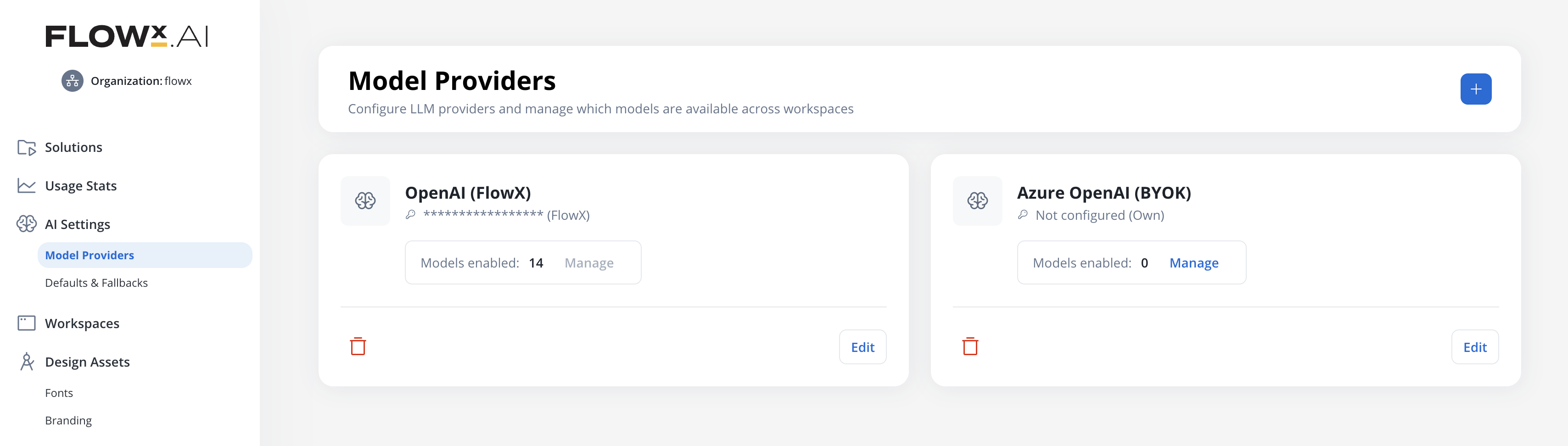
See the AI providers and model configuration documentation.
Add and manage AI providers with API keys and connection settings
Connect to Azure-hosted OpenAI deployments with a base URL and API version
Add models manually for providers that use deployment names (Azure) or non-public catalogs
New row in Defaults & Fallbacks for transcription and speech synthesis, used by the Speech to Text node
Assign default and fallback models per AI capability and workspace type
Set fallback models on different providers for resilience
Major Feature
All Deployments
***
### **Chat-based UI Flows**
UI Flows now support two experience types: **Flow-Based** (traditional) and **Chat-Based** (conversational). Chat-Based UI Flows connect to a conversational workflow at the UI Flow level, so all Chat components in the flow use the same workflow by default. A new Settings page with a Chat Options tab lets you configure or change the workflow after creation.
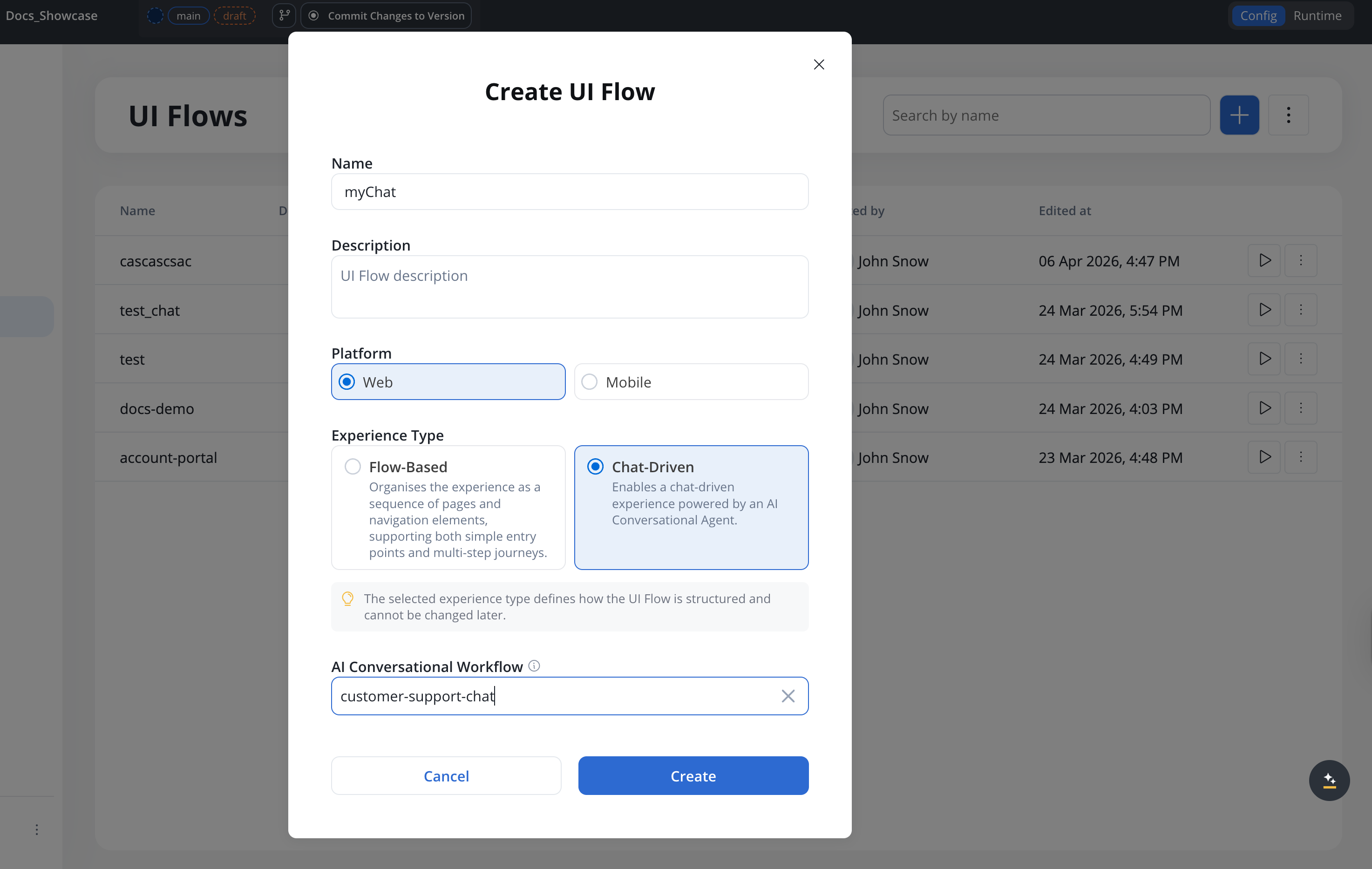
See the UI Flows documentation.
Choose Flow-Based or Chat-Based when creating a UI Flow
New Settings page with Chat Options tab for workflow configuration
Chat components only show conversational workflows in the selector
AI can open specific screens with parameters from a conversation
All Deployments
***
### **Chat improvements**
Configure which parts of the chat header are visible on a per-component basis. The Chat component (when display type is **Fill**) gains a **Show Header** toggle in its Properties panel, and the Chat Header component gets a new **Available Actions** accordion with toggles for **New Conversation** and **History**. Conversation history now loads in pages, with a **Load more** action, and conversations are sorted by creation date with the most recent first.
All Deployments
***
### **Voice input**
Chat components now support voice input, allowing users to record audio messages directly in the chat. Users can record, preview with an audio player, and send voice messages within conversations.
Voice input captures and sends audio recordings. When paired with the [Speech to Text](/5.9/ai-platform/agent-builder/speech-to-text) workflow node, voice messages are automatically transcribed and processed as text in conversational workflows.
See the Chat component documentation.
Record voice messages directly in the chat input
Preview recordings with a built-in audio player before sending
All Deployments
***
### **Stop agent response**
The chat input now shows a **Stop** button in place of Send while an agent reply is streaming. Pressing Stop cancels the conversational workflow instance: any in-flight AI call is aborted, partial output is discarded, and the user prompt is persisted with a `cancelled` flag so the chat history reflects what happened.
See the Chat component documentation.
Available on Web (Standard, Floating, Full Screen), iOS, and Android
New `stopResponseIcon` slot in `chatInputArea` themes; preloaded by cms-core
New system substitution tags for Stop and Send labels with a11y variants
All Deployments
***
### **Speech to Text node**
A new workflow node that converts between audio and text. **Transcribe** converts audio files (MP3, WAV, M4A, AAC, OGG) into text with language detection and confidence scores. **Text to Speech** generates audio files from text with configurable voice, speed, and format. In conversational workflows, the node processes voice messages from the chat UI automatically.
See the Speech to Text node documentation.
Convert audio to text with language detection and confidence scores
Generate audio from text with configurable voice, model, speed, and format
Automatically transcribes voice messages in conversational workflows
Read from Document Plugin, S3, or chat input
The transcription model is resolved from the organization's **Audio** capability default, configured in **AI Settings** under [Defaults & Fallbacks](/5.9/ai-platform/ai-providers).
All Deployments
***
### **AI Triggers**
Define named message templates with parameters on conversational workflows, so different UI Flow pages can launch the same workflow with different starting contexts. Triggers are configured in a dedicated side nav tab and selected on the Start node or sent from the Chat component at runtime.
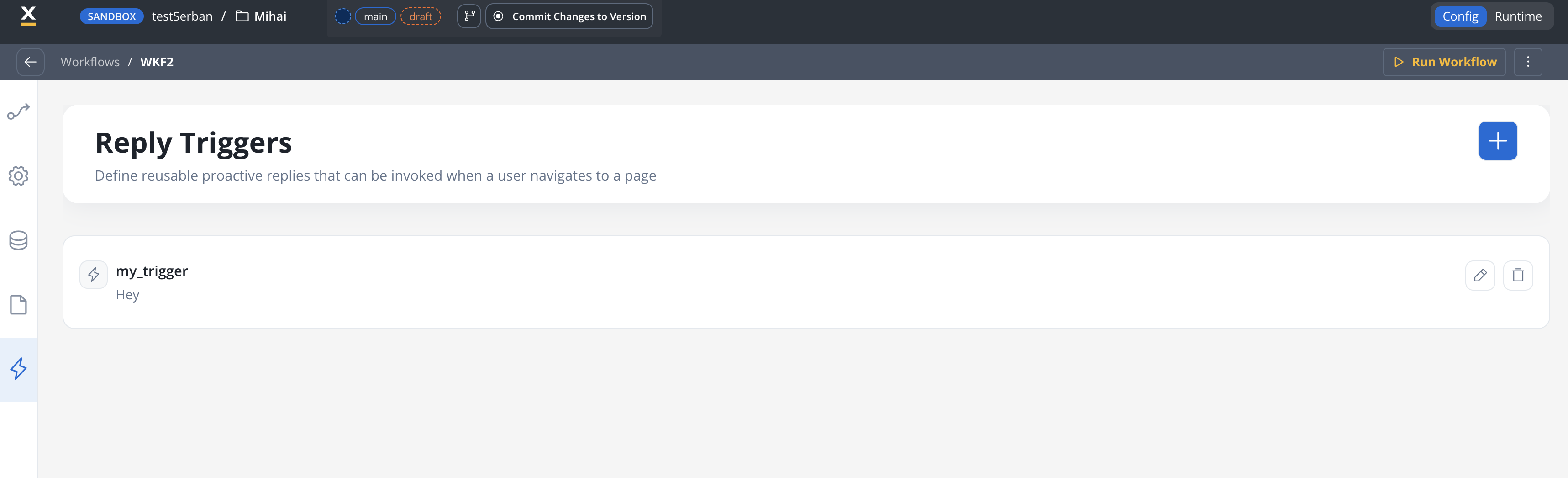
See the Conversational workflows documentation for configuration details.
Message templates with `${paramName}` placeholders resolved at runtime
Different pages launch the same workflow with different context
Toggle between Text and AI Trigger modes on the Start node
Trigger messages saved to conversation memory but hidden from chat history
All Deployments
***
### **UI Flow Context**
Conversational workflows can now receive a JSON context alongside the user message. A new **Conversation Context** property on UI Flow Pages lets you define the Parameters payload (with `${expression}` resolution), and the Start node exposes it as a collapsible **UI Flow Context** editor — also available in the Run Workflow test modal for manual runs.
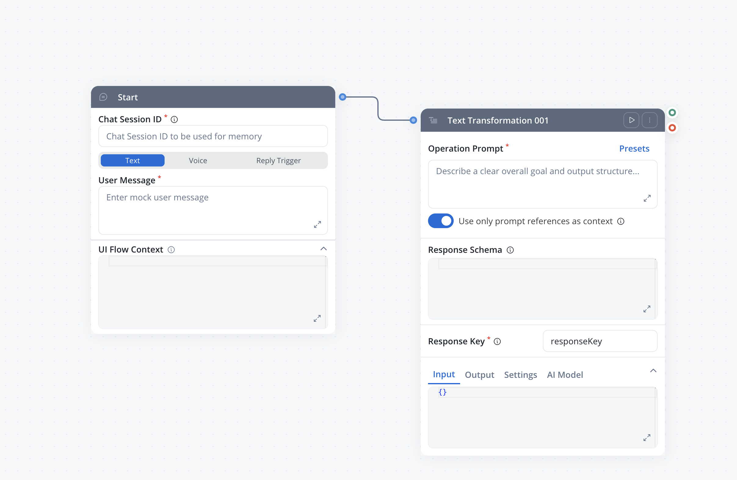
See the Conversational workflows documentation for configuration details.
Pages attach a JSON payload to conversational runs without hard-coding it in the workflow
Parameters support `${expression}` syntax to bind live UI Flow data at runtime
Collapsible UI Flow Context editor on the Start node for both runtime and manual testing
Invalid JSON is rejected before the run starts, surfacing a clear error
All Deployments
***
### **Recommended prompts**
Custom Agent nodes can now generate follow-up prompt suggestions alongside their chat replies. When enabled via the new **Prompt Suggestions** satellite panel on a Custom Agent node, the agent includes recommended next questions or actions in its response. These appear as clickable suggestions in the chat UI, guiding users toward relevant follow-up interactions.
See the Custom Agent node documentation for configuration details.
Configure prompt suggestions directly on Custom Agent nodes in the workflow editor
Agent generates contextual follow-up prompts based on the conversation
Suggestions render as tappable chips in the chat UI
Works with send-as-reply mode in conversational workflows
All Deployments
***
### **Context Retrieval enhancements**
**Custom Agent** and **Context Retrieval** nodes now support configurable **search type** and **re-ranking** for Knowledge Base retrieval. Choose between Hybrid (default), Semantic, or Keyword search strategies depending on your use case. Turn on re-ranking to apply a secondary relevance model that reorders retrieved chunks for higher-quality results.
See the Context Retrieval node documentation.
Choose Hybrid, Semantic, or Keywords search for Knowledge Base retrieval on Custom Agent and Context Retrieval nodes
Apply a re-ranking model to reorder results by relevance to the query — available on both Custom Agent and Context Retrieval nodes
All Deployments
***
{/* KNOWLEDGE BASE ENHANCEMENTS */}
### **Knowledge Base enhancements**
The Knowledge Base data source gets a refreshed workspace and a more powerful metadata filter builder. The **Content Sources** tab is now called **Stores**, and the Chunks tab gains a structured query builder for metadata filters with typed operators, AND/OR logic, and grouping — replacing the previous equality-only filters.
See the Knowledge Base content management guide.
The Content Sources tab is renamed to Stores. Same concept, clearer label.
Operators per metadata type: equals, not equals, contains, in, not in, before, after, exists, size equals, and more
Combine conditions with AND or OR and nest them in groups for non-trivial logic
Test retrieval with Search Type (Hybrid/Semantic/Keywords), Use Re-rank, and the new filter builder
All Deployments
***
### **Web Page Extractor enhancements**
The Web Page Extractor node now supports **URL filtering** to include or exclude specific URL patterns during crawling, **configurable crawl depth** for more control over how deep the crawler follows links, and **file downloads** to retrieve attached files from crawled pages.
Include or exclude URLs matching specific patterns during crawling
Configure how many levels deep the crawler follows links
Download attached files from crawled web pages
When file downloads are enabled, the document type auto-sets to **Bulk** so a single crawl can return multiple documents
All Deployments
***
Custom React components, advanced query builder, and merge conflict improvements.
🧩 [**Custom Components**](#custom-components) - Write React code in Designer and use in UI Flows\
🔍 [**Advanced Query Builder**](#advanced-query-builder) - Visual query builder for database operations\
⏹️ [**Stop Run for workflows**](#stop-run-for-workflows) - Cancel a running workflow instance from the editor\
🔀 [**Merge conflicts UX**](#merge-conflicts-ux) - Improved merge modal and conflict resolution experience
{/* CUSTOM COMPONENTS */}
### **Custom Components**
Create custom React components directly in FlowX Designer. Write JSX, CSS, and use pre-defined packages (React, Emotion, Lodash, Axios, date-fns). Components receive process data through input keys and can trigger process actions. Define once in Reusable Resources, use across multiple User Tasks.
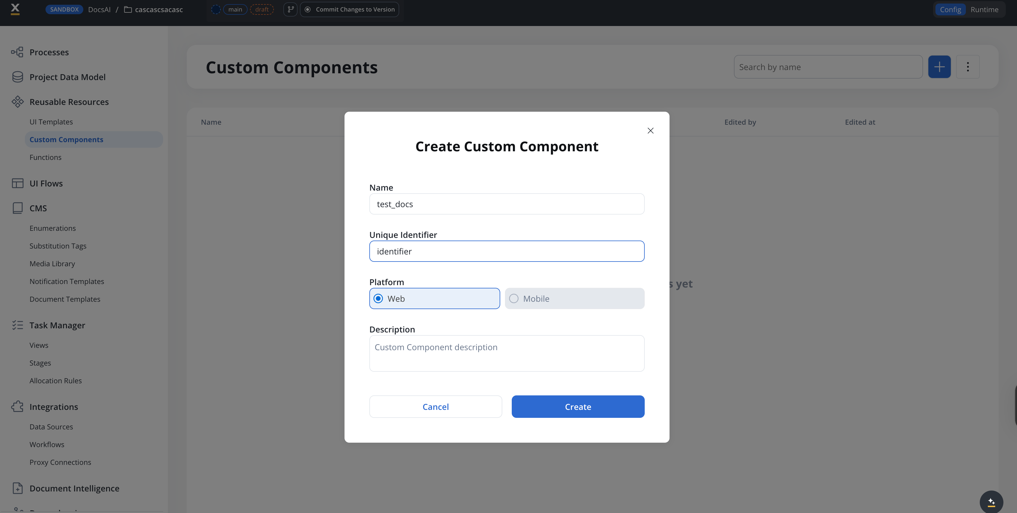
See the Custom Components documentation.
Write React JSX and CSS with a built-in code editor and file tree
React, Emotion, Lodash, Axios, and date-fns available out of the box
Receive process data via input keys and trigger process actions
Export as ZIP and import into other projects
Major Feature
All Deployments
***
### **Advanced Query Builder**
A visual query builder for database operations and metadata filters, replacing manual JSON query writing with a structured interface. Build complex queries with conditions, grouping, and sorting without writing raw queries. The operator set has expanded with NULL checks (`exists`, `is null`), set membership (`not in`), string matching (`contains`, `starts with`, `ends with`), boolean tests (`is true`, `is false`), and date comparators (`before`, `after`). The `between` operator has been removed from the UI.
See the FlowX Database documentation for the full query builder reference.
Build query conditions with a structured UI instead of raw JSON
Combine conditions with AND/OR grouping and configure result sorting
Fields auto-populated from your collection schema with type-aware operators
Switch between visual builder and raw code editor at any time
All Deployments
***
### **Oracle Database integration**
Connect FlowX workflows to externally managed Oracle databases. Configure a connection (Oracle 19c, 21c, or 23ai), save parameterized SQL queries against the schema, and call them from the existing Database Operation node alongside other data sources.
See the Oracle Database integration guide for the full reference.
Connect via Service Name or SID, with an optional SSL toggle
Monaco editor with syntax highlighting, autocomplete, and a side panel for tables, columns, primary keys, and foreign keys
Run SQL with sample parameters: table view for SELECT, affected-row count for INSERT, UPDATE, and DELETE
Pick the Oracle data source and query from the Database Operation node, with no new node type required
All Deployments
***
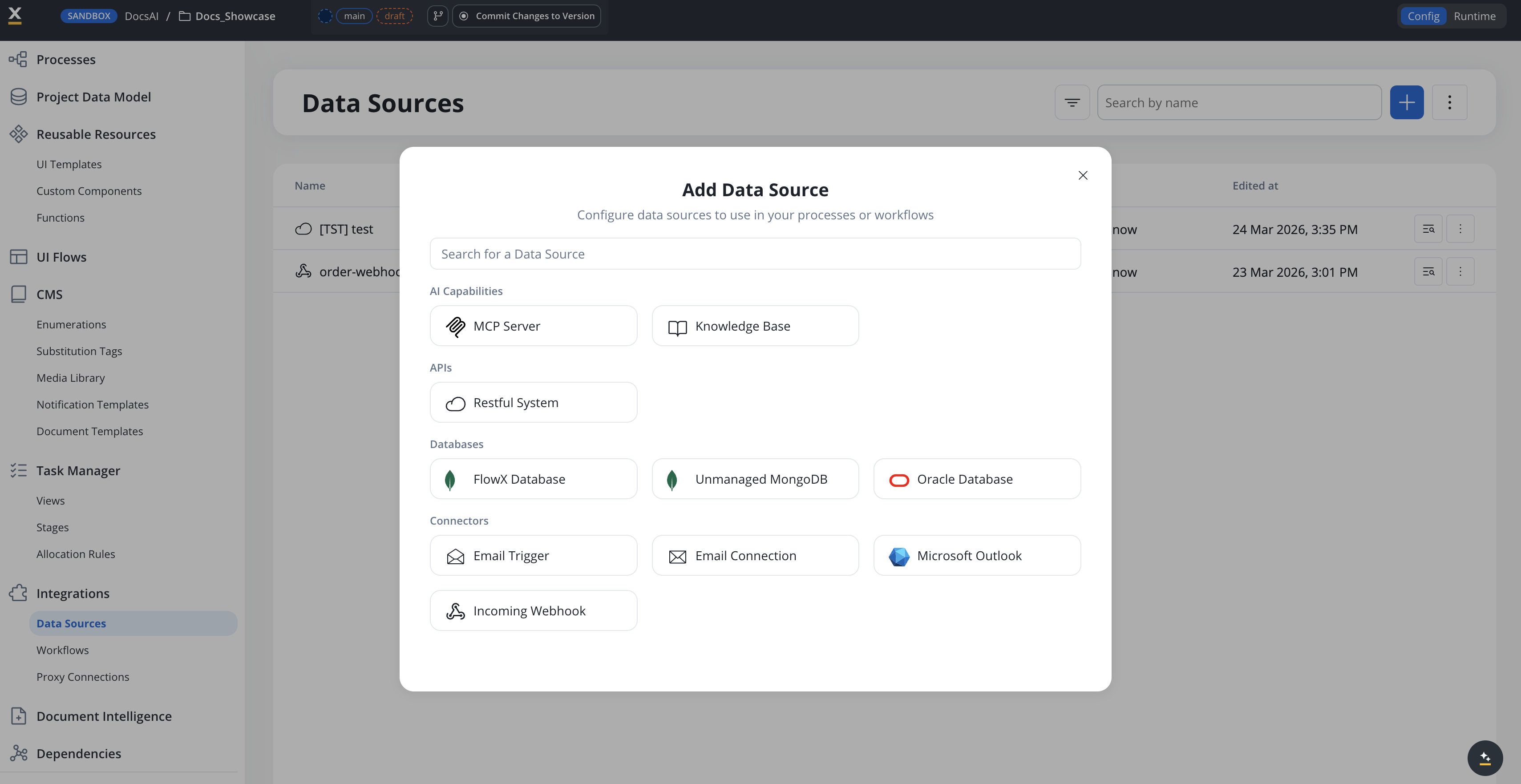
### **Datasource Experience**
The **Add Data Source** dialog now groups data source types into four categories (**AI Capabilities**, **APIs**, **Databases**, and **Connectors**) with a search box for finding a specific type. REST endpoint authoring also suggests common HTTP headers and values to speed up integration setup.
All Deployments
***
### **MongoDB-aware code editor**
Operation editors on MongoDB data sources now use a Monaco language provider tuned for MongoDB. The editor highlights MongoDB operators (Comparison, Logical, Element, Evaluation, Array, Update, Aggregation, Conditional) and `${param}` interpolations, including inside string literals. Three autocomplete flows speed up authoring: typing `$` lists MongoDB operators, opening a quote in a field-name position lists the schema field paths from the linked Project Data Type, and typing inside `${...}` lists the operation's parameter keys.
All Deployments
***
### **Project Data Model authoring**
Three improvements make Project Data Model authoring easier and less error-prone.
A new **Go to source** button on data-model usages and Data Model nodes jumps directly to the source definition without manual navigation.
The example-value input on each attribute now matches its declared type: number inputs for NUMBER, a date picker for DATE, a true/false dropdown for BOOLEAN, single-select for enums, multi-select chips for enum arrays, and so on. CURRENCY values use the currency code rather than the symbol.
The same type-aware inputs apply when running or testing a workflow node and when filling input parameters for a reusable function, replacing the previous generic text inputs.
All Deployments
***
### **Stop Run for workflows**
You can now cancel a running workflow instance directly from the workflow editor. While a workflow is running, the **Run Workflow** button switches to **Stop Run** — clicking it cancels the instance and marks all in-progress and scheduled nodes as cancelled. Cancelled instances show a new **Cancelled** status alongside Started, Finished, and Failed.
See Running and stopping workflows in the Integration Designer reference.
All Deployments
***
### **Merge conflicts UX**
The merge branches experience has been improved with a redesigned merge modal, better form validation with detailed error messages, and keyboard support (submit with Enter). The conflict resolution diff viewer now uses a new CodeMirror theme that matches the Monaco editor styling for a consistent visual experience.
All Deployments
***
## Bug fixes
### AI Platform
| Issue | Description |
| --------------------------------- | ------------------------------------------------------------------------------------------------------------------------------------------------------------------------------------- |
| Custom Agent WebSocket stability | Fixed WebSocket 1006 abnormal closure for Custom Agent nodes with large payloads by upgrading AI SDK to handle Spring Framework 7's 64KB frame aggregation limit |
| Azure OpenAI structured output | Fixed silent hang on Azure OpenAI for Custom Agents, Intent Classification, and Recommended Prompts when the response JSON schema lacked title and description fields {/* MT-2827 */} |
| Custom Agent node stuck | Fixed Custom Agent node getting stuck in running state |
| MCP tool updates not working | Fixed an issue where updating tools on an existing MCP Server did not persist changes |
| KB append performance | Fixed slow execution of the Append Knowledge Base node |
| KB chunking on append | Fixed an issue where appended content via JSON in the Update Knowledge Base node was not chunked |
| REST node with base64 certificate | Fixed error when running a workflow with a REST node using a REST system with a base64 certificate |
| Workflow dependencies copy | Fixed dependencies not being copied for already-copied workflows |
### Core Platform
| Issue | Description |
| ---------------------------------- | --------------------------------------------------------------------------------------------------------------------------------------------------------------------- |
| Import pipeline issues | Fixed API issues in the import pipeline {/* Internal: ZD-1147, CORE-4463 */} |
| Enum CSV import losing changes | Fixed an issue where importing enumerations via CSV on committed resources did not update the resource modified date, causing changes to appear lost {/* RPT-5190 */} |
| Data model duplicate key on import | Fixed a MongoDB duplicate key error when importing data model slices with duplicate entries {/* MT-2653 */} |
| Config params page not loading | Fixed GET config params endpoint not being called when accessing the Configuration Parameters page {/* CORE-4374 */} |
| Enum default values dropdown | Fixed only first-level enum objects being displayed in the default values dropdown {/* MT-2674 */} |
| Data model loading state | Fixed user getting stuck in loading state after an error on data model keep operation {/* MT-2418 */} |
### UI & Renderers
| Issue | Description |
| --------------------------- | ----------------------------------------------------------------------------------------------------- |
| Select component clear icon | Fixed misaligned clear icon on Select components in both Angular and React renderers {/* RPT-5149 */} |
## Additional information
### Deployment information
**Self-hosted deployments:** FlowX 5.7.0 introduces the Organization ID as a mandatory configuration on all services. See the [deployment guidelines](./deployment-guidelines-v5.7) for complete upgrade instructions.
### Compatibility
See the deployment guidelines for supported upgrade paths from 5.1.x LTS, 5.2–5.4, and 5.5–5.6.
See the deployment guidelines for the full component version matrix and third-party dependency support.