> ## Documentation Index
> Fetch the complete documentation index at: https://docs.flowx.ai/llms.txt
> Use this file to discover all available pages before exploring further.
# Indicators
> The indicators (Message UI elements) allow you to display different types of messages.
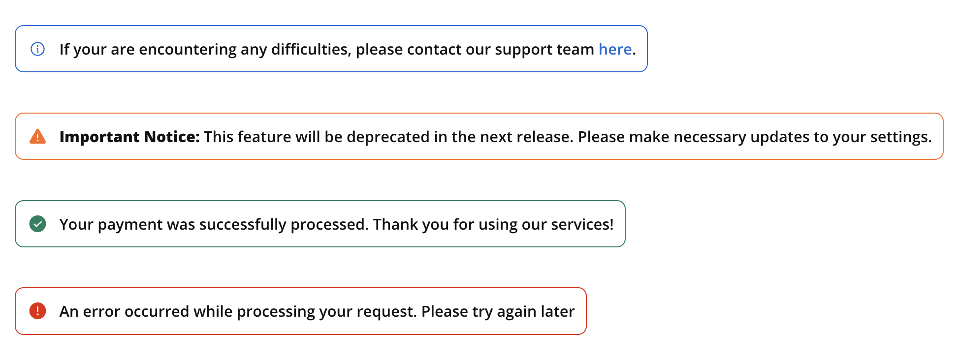
Messages can be categorized into the following types:
* **Info**: Used to convey general information to users.
* **Warning**: Indicates potential issues or important notices.
* **Error**: Highlights errors or critical issues.
* **Success**: Communicates successful operations or completion.
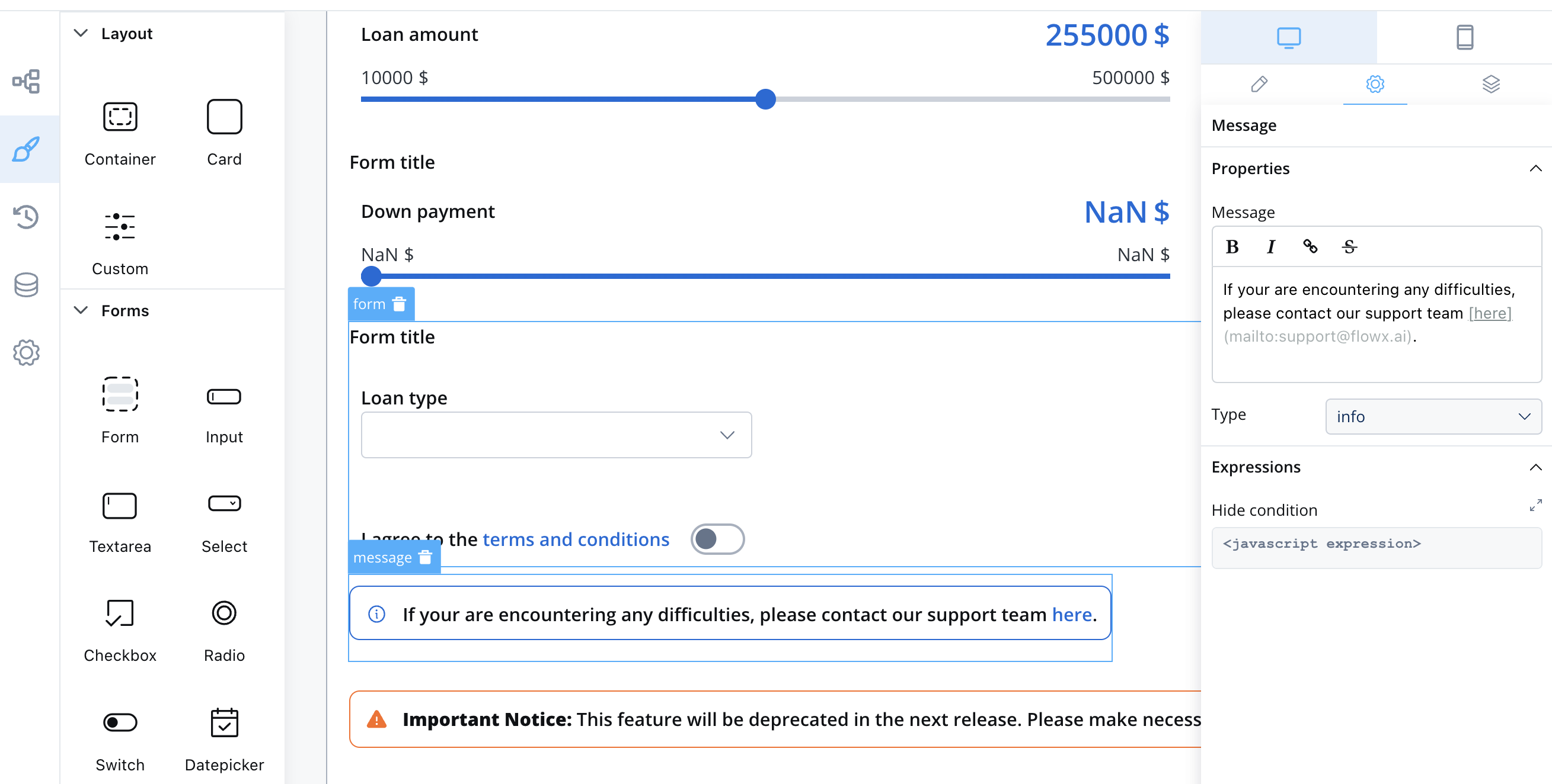
## Properties
When configuring a message, you have the following properties:
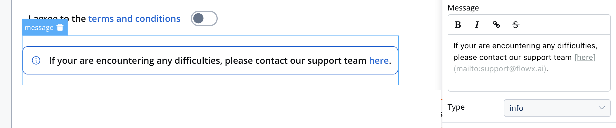
* **Message**: The content of the message body, this property supports markdown attributes such as: bold, italic, bold italic, strikethrough and URLs, allowing you to format the content of the message.
* **Type**: as mentioned above, there are multiple indicators: info, warning, error, success
* **Expressions**: you can define expressions to control when the message should be hidden. This can be useful for dynamically showing or hiding messages based on specific conditions.
Info example with markdown:
```markdown theme={"system"}
If you are encountering any difficulties, please [contact our support team](mailto:support@flowx.ai).
```
When executed, will look like this:
## Types and Usage
Here's how you can use the Message UI element in your UI design:
### Info
If you are encountering any difficulties, please [contact our support team](mailto:support@flowx.ai).
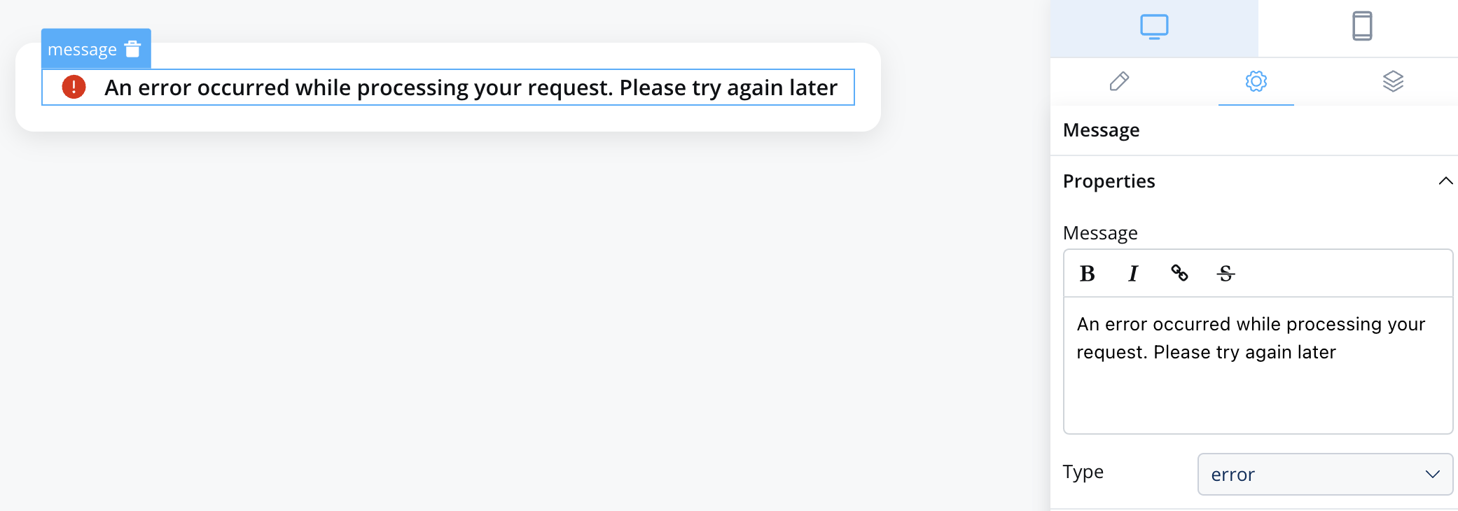
### Error
An error occurred while processing your request. Please try again later.
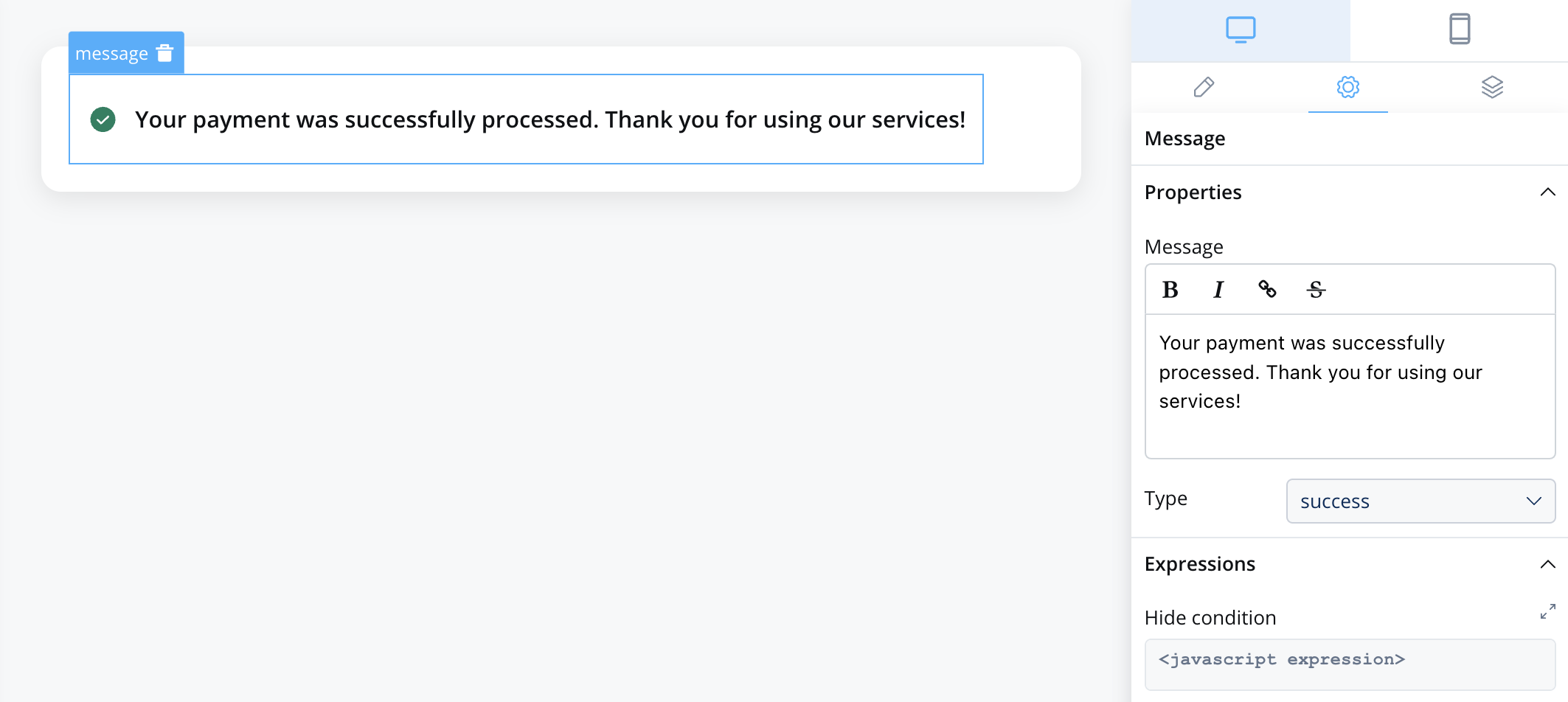
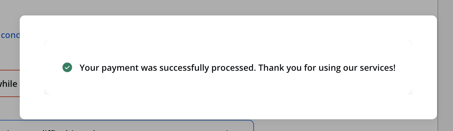
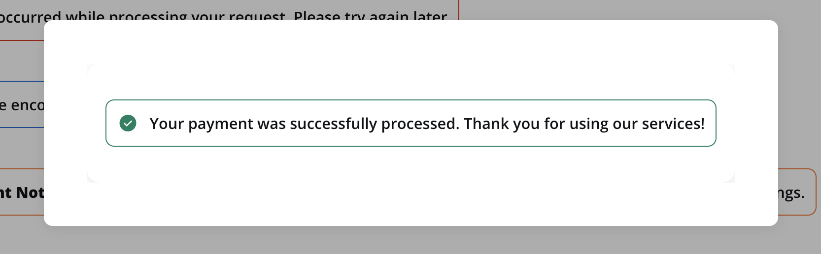
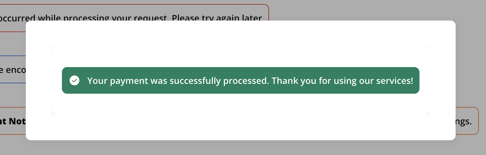
### Success
Your payment was successfully processed. Thank you for using our services!
## Indicators styling
To create an indicator with specific styling, sizing, typography, and color settings, you can use the following configuration:
### Style
The Style section allows you to customize the appearance of your indicator UI element. You can apply the following style to achieve the desired visual effect:
* **Text**: Displays only the icon and the text.
* **Border**: Displays the icon, the text and the border.
* **Fill**: It will fill the UI element's area.
For more information, see the [styling documentation](../../ui-designer/ui-designer#styling).