> ## Documentation Index
> Fetch the complete documentation index at: https://docs.flowx.ai/llms.txt
> Use this file to discover all available pages before exploring further.
# Buttons
> Interactive button components for triggering actions and file uploads with comprehensive styling and configuration options.
Buttons are essential interactive elements that enable users to trigger actions, navigate between sections, and upload files. FlowX.AI provides two specialized button types, each optimized for specific use cases with extensive customization options.
## Button types overview
Choose the right button type for your specific use case:
Trigger actions like process advancement, sending notifications, or opening new content
Enable file selection with built-in validation for file types and sizes
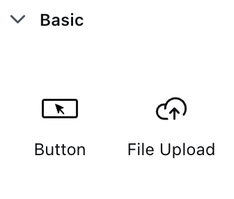
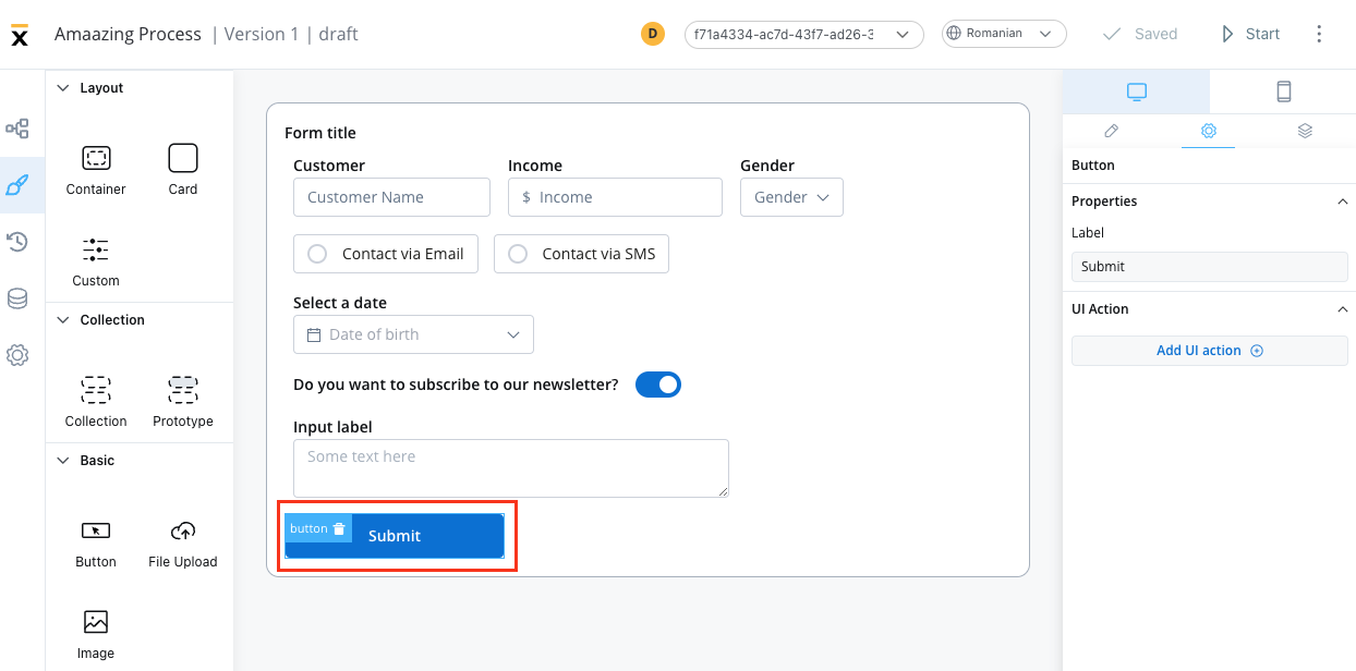
## Basic button
Basic buttons serve as the primary interaction mechanism for users to perform actions within your application. They can trigger process flows, send notifications, navigate to different sections, or execute business logic.
### Configuration overview
Labels and basic settings
Event handling and action types
Visual appearance and icons
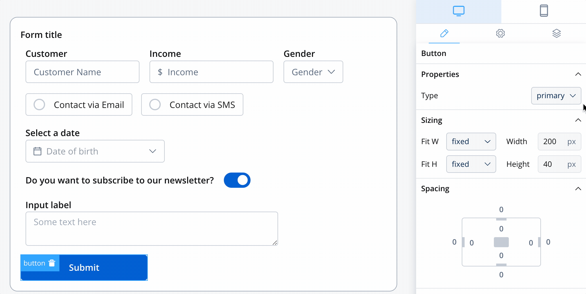
### Basic button properties
**Purpose**: Define the text displayed on the button
**Features**:
* Supports Markdown syntax for rich formatting
* Dynamic text from process data
* Localization support for multi-language applications
* Responsive text scaling
**Best Practices**:
* Use action-oriented language ("Submit", "Continue", "Send")
* Keep labels concise but descriptive
* Consider button context and user expectations
* Use consistent terminology across the application
Action buttons should clearly indicate what will happen when clicked. Use verbs like "Save Changes" instead of generic terms like "OK".
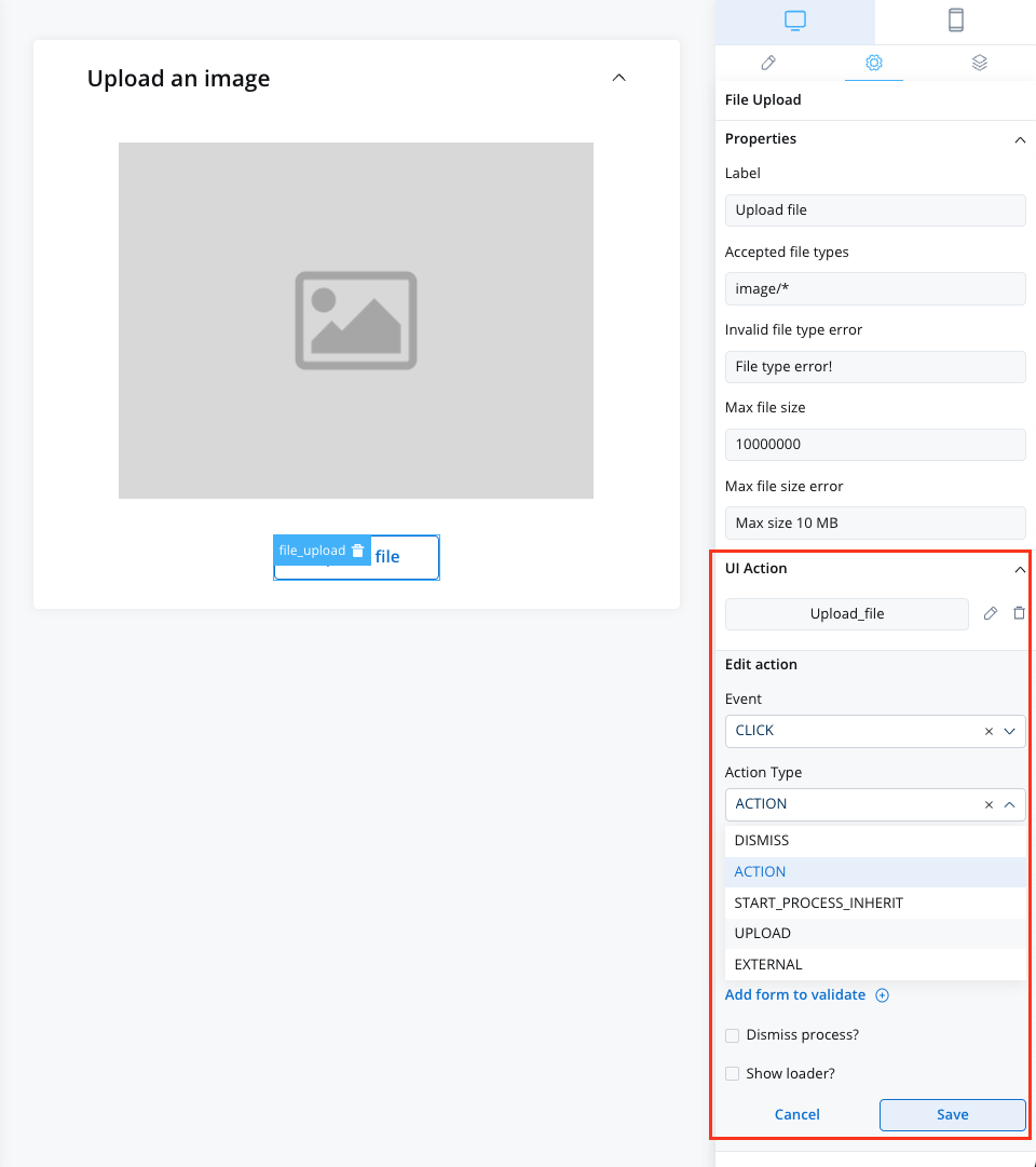
### Event handlers configuration
Define the behavior when users interact with your button:
| Event | Description | Use Cases |
| --------- | --------------------------------------- | ----------------------- |
| **CLICK** | Triggered when button is clicked/tapped | All button interactions |
While CLICK is the primary event, the action type determines what happens when the event occurs.
**Available Actions**:
* **Process Actions**: Advance workflow, complete tasks
* **Navigation**: Move between pages or sections
* **Data Operations**: Save, submit, or validate data
* **External Integrations**: Call APIs, send notifications
* **UI Updates**: Show/hide elements, update content
**Conditional Actions**: Execute different actions based on conditions
* User roles and permissions
* Form validation states
* Process instance data
* External system responses
**Error Handling**: Define fallback behaviors
* Network connectivity issues
* Permission errors
* Validation failures
* System unavailability
For detailed event handler configuration, see the [Event Handlers guide](../event-handlers).
### Button styling & visual design
#### Button types
Choose from four distinct visual styles to match your design system:
**Purpose**: Main call-to-action buttons
**Characteristics**:
* High contrast, prominent appearance
* Usually one per screen/section
* Draws immediate attention
**Use Cases**: Submit forms, confirm actions, proceed to next step
**Purpose**: Supporting actions of moderate importance
**Characteristics**:
* Less prominent than primary
* Complementary to primary actions
* Clear but not dominant
**Use Cases**: Cancel operations, alternative paths, secondary features
**Purpose**: Subtle actions that don't compete with primary content
**Characteristics**:
* Transparent background with border
* Minimal visual weight
* Integrates with content
**Use Cases**: Optional actions, toggles, less critical functions
**Purpose**: Minimal visual impact for tertiary actions
**Characteristics**:
* No background or border
* Looks like clickable text
* Lowest visual hierarchy
**Use Cases**: Links, minor actions, text-based navigation
For comprehensive CSS styling options, check our [Styling Guide](../ui-designer#styling).
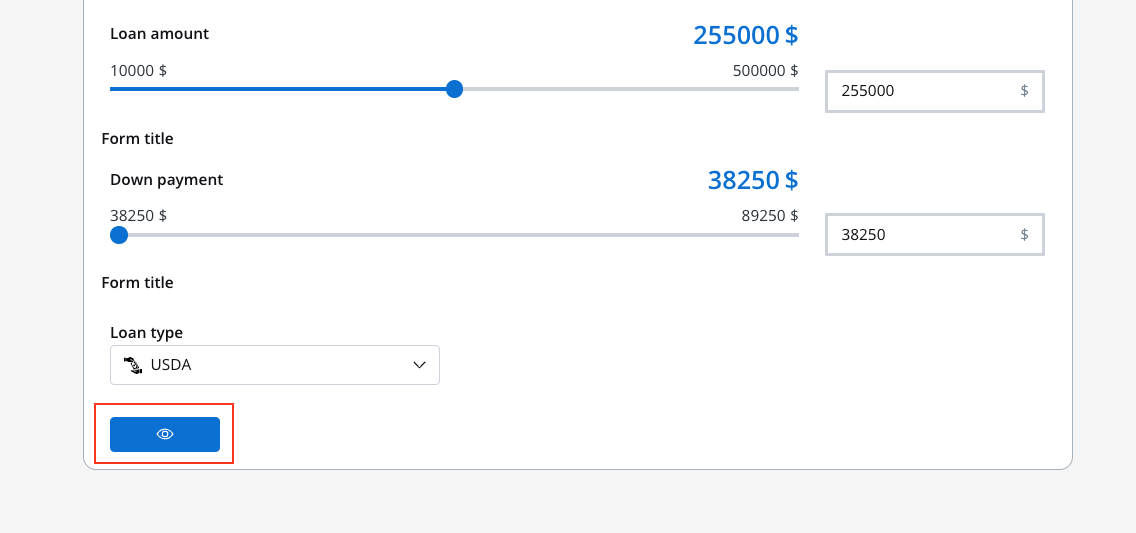
#### Icon integration
Enhance your buttons with meaningful icons:
**Icon Key**: Select from the Media Library
* Consistent icon set across the application
* SVG format for scalability
* Optimized for different screen sizes
**Icon Color**: Customize appearance
* Use color picker for precise control
* Maintain accessibility contrast ratios
* Consider colorblind accessibility
When setting colors, the entire icon fill changes. Avoid color modifications on multicolor icons to prevent visual distortion.
**Available Positions**:
| Position | Description | Visual Result | Best For |
| ---------- | ---------------- | ------------- | ------------------- |
| **Left** | Icon before text | 🔍 Search | Most common layout |
| **Right** | Icon after text | Submit ➤ | Directional actions |
| **Center** | Icon only | 🔍 | Icon-only buttons |
When using center position, the button displays only the icon. Ensure the icon clearly communicates the action to maintain usability.
## File upload button
File upload buttons provide a specialized interface for file selection with built-in validation and user feedback. They're essential for document submission, image uploads, and data import workflows.
### Configuration overview
File upload buttons share many properties with basic buttons but include specialized file handling features:
File type restrictions and validation
Size limits and error handling
Feedback and progress indication
### File upload properties
**Purpose**: Clearly indicate the upload purpose
**Examples**:
* "Upload Document"
* "Select Profile Picture"
* "Import Data File"
* "Attach Receipt"
**Best Practices**:
* Specify what type of file is expected
* Include file requirements in the label if space allows
* Use progressive disclosure for complex requirements
**Purpose**: Control which file types users can select
**Configuration Options**:
| Specification | Example | Purpose |
| ----------------------- | ------------------------------- | -------------------------- |
| **MIME Categories** | `audio/*`, `image/*`, `video/*` | Broad category filtering |
| **Specific MIME Types** | `application/pdf`, `text/csv` | Exact format control |
| **File Extensions** | `.doc`, `.docx`, `.jpg`, `.png` | User-friendly restrictions |
**Common Combinations**:
```
Images: image/*, .jpg, .jpeg, .png, .gif, .webp
Documents: .pdf, .doc, .docx, .txt, .rtf
Spreadsheets: .xls, .xlsx, .csv
Archives: .zip, .rar, .7z
```
Be specific about accepted file types to prevent user confusion and reduce invalid uploads.
**Max File Size**: Set appropriate limits based on:
* Server capacity and processing power
* Network bandwidth considerations
* Storage limitations
* User experience expectations
**Size Guidelines**:
* **Images**: 5-10 MB for high quality
* **Documents**: 25-50 MB for complex files
* **Data Files**: Based on processing requirements
* **Media Files**: 100+ MB for videos
**Error Messages**: Provide clear feedback
* "File size must be under 10 MB"
* "Please compress your image and try again"
* "Large files may take longer to process"
**Invalid File Type Error**: Custom messages for unsupported formats
* Explain what formats are accepted
* Provide guidance on file conversion
* Link to help resources if needed
**Max File Size Error**: Clear size limit communication
* Display the exact limit
* Suggest file compression tools
* Offer alternative upload methods for large files
**Example Configuration**:
```
Invalid Type: "Please upload PDF, DOC, or DOCX files only"
Size Error: "File must be smaller than 25 MB. Current size: 35 MB"
```
### Runtime feedback
File upload buttons now provide feedback hints for success, progress, and error states. Previously, users lacked sufficient feedback when uploading a file unless they had a document preview or image link, making it difficult to know if the file was uploaded successfully or to see the progress.
Optional overlay loader during file upload for both web and mobile
Success and error messages displayed as toasts at runtime, informing users about upload status
Display dynamic values in toast and loading messages for context-aware feedback
#### Configuration properties
The following properties are available in the File Upload button configuration panel:
| Property | Description |
| --------------------------------- | ---------------------------------------------------------------- |
| **Loading behavior** | Controls how the loading indicator appears (`NONE` or `OVERLAY`) |
| **Loading message** | Custom message displayed during upload (supports dynamic values) |
| **Toast notification on success** | Toggle to show success toast when upload completes |
| **Success message** | Custom success message (supports dynamic values) |
| **Toast notification on error** | Toggle to show error toast when upload fails |
| **Error message** | Custom error message (supports dynamic values) |
#### Configuring upload feedback
Configure how loading indicators appear during file uploads:
| Option | Description |
| ----------- | ------------------------------------------------------------- |
| **NONE** | No loading overlay displayed |
| **OVERLAY** | Full-screen overlay with spinner and optional loading message |
**Loading Message Configuration**:
* Configure custom messages using substitution tags or dynamic values
* Works consistently across web and mobile platforms
**Example messages**:
* "Uploading your document..."
* "Processing \${fileName}..."
* "Please wait while we upload your file"
**Success Toast**: Displayed when the file upload completes successfully
* **Enable**: Toggle "Toast notification on success" to show the toast
* **Custom message**: Set a personalized success message with dynamic values
* **Auto-dismiss**: Toast automatically disappears after 3-5 seconds
**Example messages**:
* "File uploaded successfully!"
* "\${fileName} has been uploaded"
* "Your document is ready for processing"
**Error Toast**: Displayed when the file upload fails
* **Enable**: Toggle "Toast notification on error" to show the toast
* **Custom message**: Set a personalized error message with dynamic values
* **Auto-dismiss**: Toast automatically disappears after 3-5 seconds
**Example messages**:
* "Upload failed. Please try again."
* "Unable to upload \${fileName}. Check your connection."
* "File upload error. Please select a different file."
Use substitution tags and dynamic values in your loader and toast messages to provide contextual feedback that includes file names or other relevant data.
#### Theming
The loader and toast components inherit styling from your theme configuration:
| Element | Theme Property |
| ------------------ | -------------------------- |
| Background color | `general.appBackground` |
| Loading text color | `general.generalTextColor` |
| Loading text style | `general.textFont` |
| Spinner tint color | `general.accentColor` |
| Dimmed background | `rgba(0, 0, 0, 0.25)` |
| Toast Type | Theme Property |
| ------------- | ---------------------- |
| Success toast | `Message.fill.success` |
| Error toast | `Message.fill.error` |
#### Custom loader API (SDK)
For advanced customization, developers can provide custom loader components through the SDK. The `customLoader` object supports file upload loaders alongside existing process loaders:
```typescript theme={"system"}
type CustomLoaders = {
startProcess?: Component, // Loader for process start
reloadProcess?: Component, // Loader for process reload
defaultUpload?: Component, // Default loader for file uploads
defaultAction?: Component, // Default loader for actions
actions?: Record // Named action loaders
}
```
**Loader resolution order:**
1. If a named action loader exists (`customLoader.actions?.[actionName]`), use it
2. Otherwise, if `defaultAction` or `defaultUpload` is defined, use that
3. Fall back to the internal SDK loader
Custom loaders allow you to maintain consistent branding and UX patterns across your application while leveraging the FlowX upload infrastructure.
### File upload example
Example configuration for an image upload button:
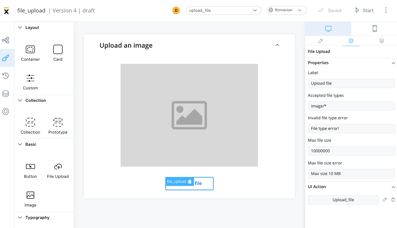
**Configuration Details**:
* **Accepted Types**: `image/*` (all image formats)
* **Max Size**: 5 MB
* **Error Handling**: Custom messages for type and size violations
* **UI Feedback**: Progress indication and preview capabilities
### File upload actions
The File Upload Button only supports the **Upload** action type. For multi-file uploads, see the [Multiple File Upload](./multiple-file-upload) component.
**Event Type**: CLICK (same as basic buttons)
**Action Types for File Upload**:
* **File Processing**: Validate, resize, or convert files
* **Progress Tracking**: Show upload progress and status
* **Data Integration**: Process file content into application data
* **Workflow Advancement**: Continue process after successful upload
The File Upload Button handles **single-file uploads** only. For batch uploads with drag-and-drop, file validation, and progress tracking, use the dedicated [Multiple File Upload](./multiple-file-upload) component.
### File upload styling
File upload buttons have specialized styling options:
| Type | Appearance | Best Used For |
| --------- | -------------------- | ------------------------ |
| **Fill** | Solid background | Primary upload actions |
| **Ghost** | Outlined style | Secondary upload options |
| **Text** | Text-only appearance | Subtle upload links |
**Icon Integration**: Same as basic buttons
* **Icon Key**: Select from Media Library
* **Icon Position**: Left, Right, or Center
* **Icon Color**: Customizable appearance
**Recommended Icons**:
* Upload arrow (↑)
* Cloud upload (☁↑)
* Folder or document icons
* Plus (+) for add file actions
| Option | Behavior | Use Case |
| --------- | -------------------------- | ------------------------ |
| **Fill** | Expands to container width | Full-width upload areas |
| **Fixed** | Maintains specific width | Consistent button sizing |
| **Auto** | Adjusts to content | Compact layouts |
## Best practices
* Use descriptive labels that explain the button's purpose
* Ensure sufficient color contrast for all button states
* For icon-only buttons, set an accessibility label in the UI Designer
See the [Accessibility guide](../../../platform-deep-dive/accessibility) for keyboard navigation, ARIA mapping, and screen reader details.
* Place primary actions prominently and consistently
* Use loading states for actions that take time
* Provide clear feedback for successful/failed actions
* Group related buttons logically
* Avoid too many competing call-to-action buttons
* Consider touch targets for mobile users (minimum 44px)
* Maintain consistent button styling across the application
* Use button hierarchy to guide user attention
* Choose icons that are universally understood
* Test button visibility in different lighting conditions
* Consider color-blind users when relying on color alone
* Ensure buttons look clickable and interactive
* Optimize file upload handling for large files
* Implement proper error handling and retry mechanisms
* Provide progress feedback for long-running actions
* Cache frequently used icons and styling
* Test button responsiveness under load
* Consider offline scenarios for critical actions
## Common use cases
### Basic button scenarios
| Use Case | Button Type | Icon Suggestion | Action Type |
| -------------------- | ----------- | --------------- | ------------------- |
| **Form Submission** | Primary | ✓ (checkmark) | Process advancement |
| **Cancel Operation** | Secondary | ✕ (close) | Navigation back |
| **Delete Item** | Ghost | 🗑 (trash) | Data operation |
| **View Details** | Text | 👁 (eye) | Navigation |
| **Save Draft** | Secondary | 💾 (save) | Data operation |
### File upload scenarios
| Use Case | File Types | Size Limit | Validation Notes |
| ------------------- | ----------------- | ---------- | ----------------------------- |
| **Profile Photo** | `image/*` | 5 MB | Square aspect ratio preferred |
| **Document Upload** | `.pdf,.doc,.docx` | 25 MB | OCR processing available |
| **Data Import** | `.csv,.xlsx` | 50 MB | Column validation required |
| **Media Gallery** | `image/*,video/*` | 100 MB | Thumbnail generation |
| **Backup Files** | `.zip,.rar` | 500 MB | Virus scanning enabled |
## Platform considerations
**Enhanced Features**:
* Drag and drop file upload support
* Keyboard shortcuts for common actions
* Hover states and advanced animations
* Context menus for additional options
* Multi-file selection capabilities
**Mobile Optimizations**:
* Touch-friendly button sizes (minimum 44px)
* Native file picker integration
* Camera access for image uploads
* Simplified button layouts for smaller screens
* Gesture-based interactions
**Consistency Features**:
* Shared styling configurations
* Platform-appropriate animations
* Adaptive button sizing
* Consistent behavior patterns
* Universal icon meanings