> ## Documentation Index
> Fetch the complete documentation index at: https://docs.flowx.ai/llms.txt
> Use this file to discover all available pages before exploring further.
# Custom Components
> Create custom React components that integrate with FlowX process data and actions, extending the built-in component palette with your own UI elements.
## What are Custom Components?
Custom Components are developer-defined React components that you create in FlowX Designer and reference in UI Flows. Unlike [Reusable UI Templates](./reusable-ui) which use the visual component builder, Custom Components let you write actual React code to build complex, interactive UI elements.
Write React TypeScript/JavaScript directly in the Designer code editor
Receive process data through input keys and trigger process actions
Define once in Reusable Resources, use across multiple User Tasks
Export as ZIP and import into other projects
***
## When to use Custom Components
| Use case | Recommended approach |
| --------------------------------------------------------- | ------------------------------------------------------------------ |
| Standard forms, layouts, navigation | Built-in components or [Reusable UI Templates](./reusable-ui) |
| Complex interactive widgets (charts, maps, custom inputs) | **Custom Components** |
| Third-party library integration | **Custom Components** |
| Custom business logic in the UI | **Custom Components** + [Reusable Functions](./reusable-functions) |
| Reusable visual patterns without code | [Reusable UI Templates](./reusable-ui) |
***
## Creating a Custom Component
Custom Components are managed under **Reusable Resources** in your project.
In the Designer, open your project and go to **Reusable Resources** → **Custom Components**.
Click the **+** button to create a new Custom Component. Fill in the creation modal:
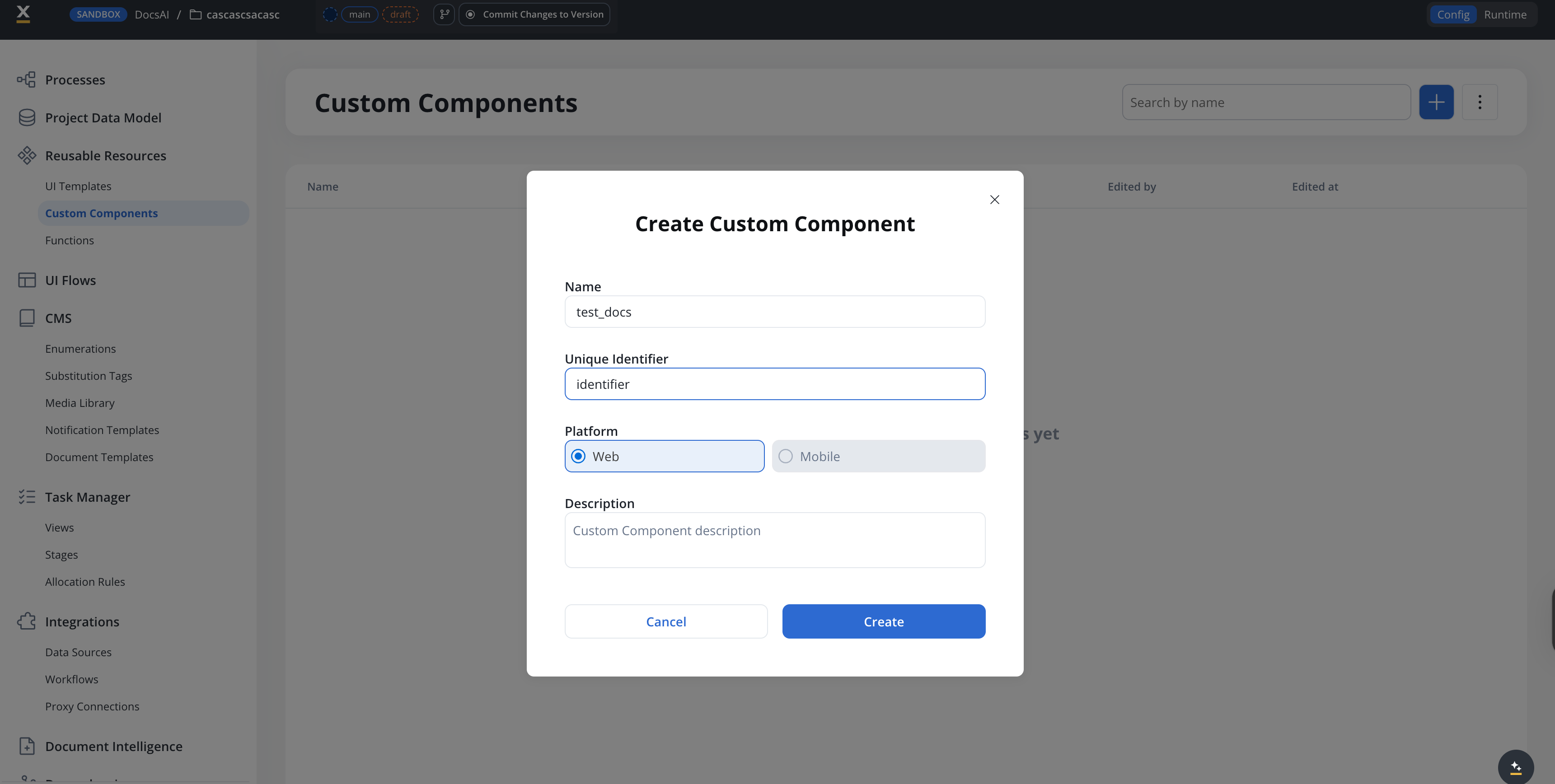
| Field | Description |
| --------------------- | ---------------------------------------------------------------------- |
| **Name** | Display name for the component |
| **Unique Identifier** | A unique string identifier used to reference the component in UI Flows |
| **Platform** | **Web** or **Mobile** |
| **Description** | Optional description of the component's purpose |
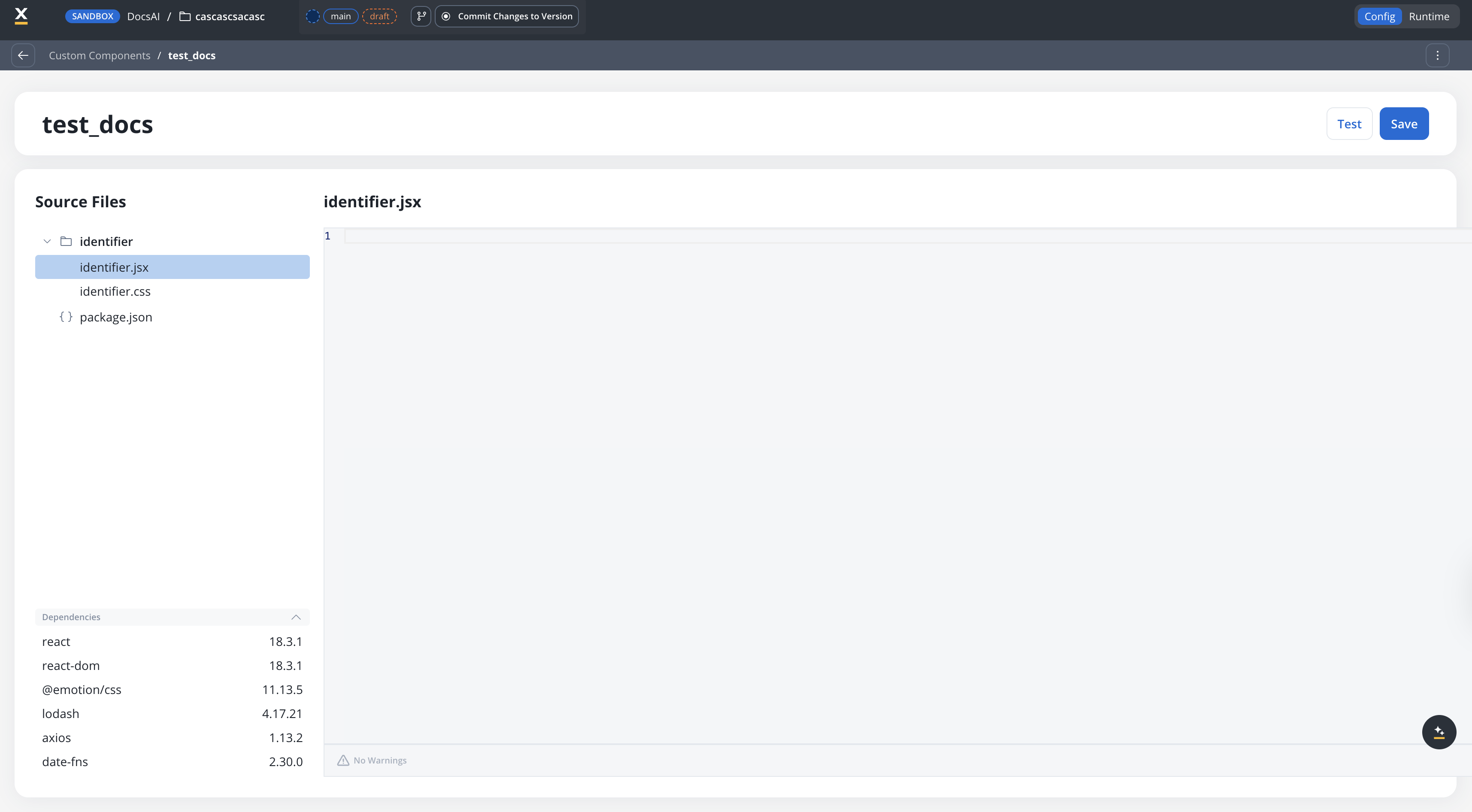
The component editor has three panels:
* **Source Files** (left) — a file tree with your component's JSX, CSS, and `package.json`
* **Code editor** (right) — edit the selected file
* **Dependencies** (bottom-left) — lists available packages
Each component is scaffolded with:
* `identifier.jsx` — your React component code
* `identifier.css` — component styles
* `package.json` — dependency declarations
**Available dependencies:**
| Package | Version | Purpose |
| -------------- | ------- | ------------------ |
| `react` | 18.3.1 | Core React library |
| `react-dom` | 18.3.1 | DOM rendering |
| `@emotion/css` | 11.13.5 | CSS-in-JS styling |
| `lodash` | 4.17.21 | Utility functions |
| `axios` | 1.13.2 | HTTP requests |
| `date-fns` | 2.30.0 | Date manipulation |
Define **Input Keys** to specify which process data paths the component receives. These map process data model attributes to the component's `data` prop.
For example, if your process data model has `application.metrics.revenue`, add it as an input key. The component receives it as `data['application.metrics.revenue']`.
Use the **Test** button to preview your component with sample data. Click **Save** to persist your changes.
You can also test end-to-end by starting a UI Flow that includes the component.
***
## Using Custom Components in UI Flows
Once defined, Custom Components can be added to User Tasks in your UI Flows.
In the UI Designer, drag a **Custom Component** element from the component palette into your User Task layout.
In the properties panel, select your Custom Component by its **Identifier** (e.g., `MyCustomChart`).
Configure which process data paths are passed to the component. Use data model paths like `${application.user.profile}` to bind process data.
If your component triggers actions (e.g., button clicks), connect them to process actions defined on the User Task node.
***
## Using Custom Components in Process User Tasks
The Process User Task host follows the same drag-and-drop authoring flow as UI Flows, with one extra concept: every Custom Component declares its own data model, kept distinct from process data so the component contract stays explicit at each use site.
In the Designer, open a Process and select a User Task node. From the component palette, drag the **Custom Component** element into the User Task layout, and pick your component by its identifier.
On the Custom Component's properties panel, define how process data flows into the component. Map process attributes onto the slots declared on the component's input data model. The React SDK applies these mappings at runtime and the component receives only the data it declared.
For components that trigger actions, define how the component's `saveData` is remapped back to process variables. The React SDK applies the OUTPUT mappings before the action's `saveData` is piped into the process state.
Wire component-triggered actions to the actions defined on the User Task node, the same way you do for built-in components.
The Custom Component editor lets you fill input parameters with sample data and preview the component without leaving the Designer. The same flow works for components that target both UI Flows and Process User Tasks.
Process User Tasks are rendered by the React SDK only in 5.8.0. The Phase 1 React-only limitation in the section below still applies: there is no Angular SDK support for Custom Components yet.
***
## Example: Onboarding checklist
A progress tracker that displays a list of onboarding steps with completion status, driven by process data.
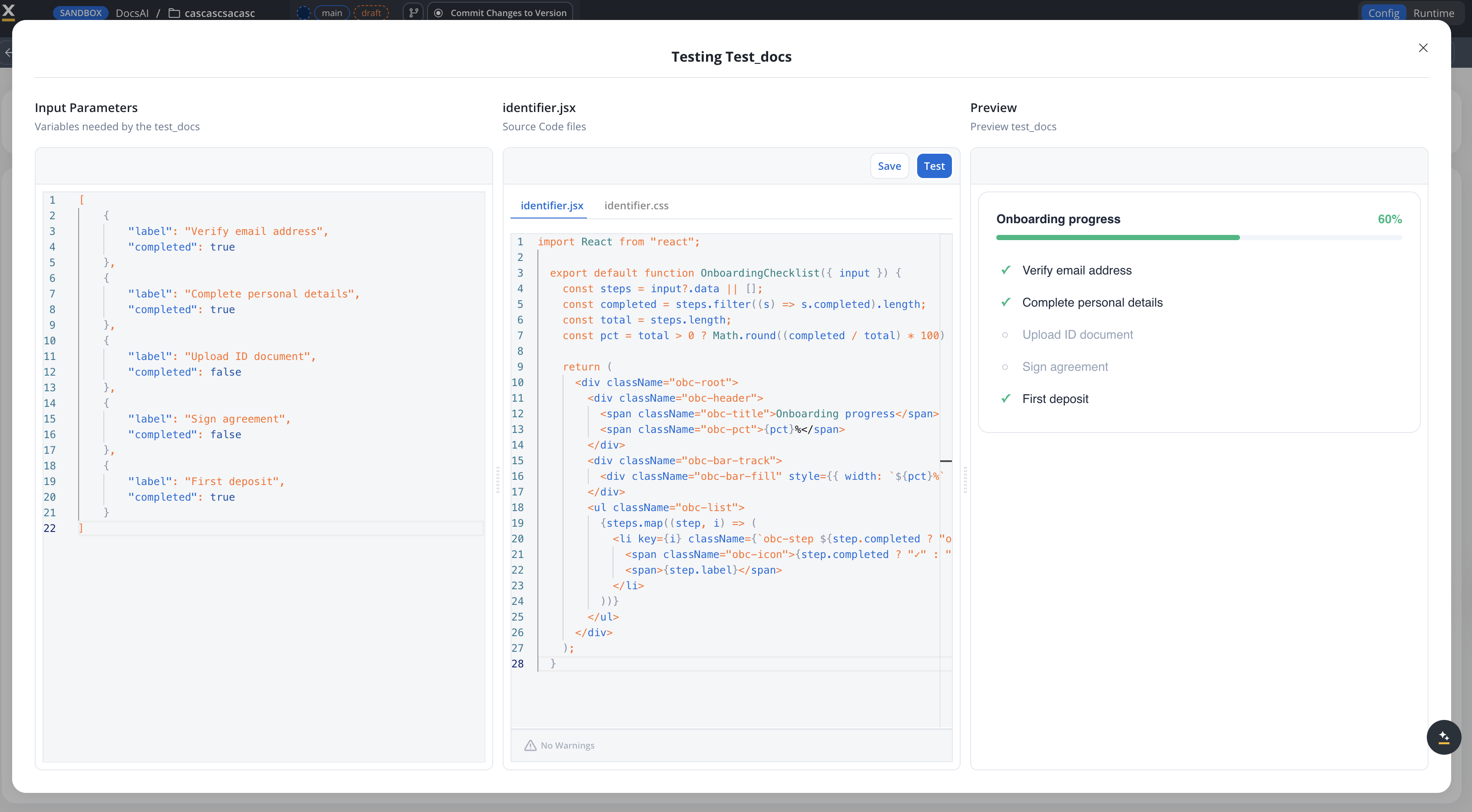
```jsx theme={"system"}
import React from "react";
export default function OnboardingChecklist({ input }) {
const steps = input?.data || [];
const completed = steps.filter((s) => s.completed).length;
const total = steps.length;
const pct = total > 0 ? Math.round((completed / total) * 100) : 0;
return (
Onboarding progress{pct}%
{steps.map((step, i) => (
{step.completed ? "✓" : "○"}{step.label}
))}
);
}
```
```css theme={"system"}
.obc-root {
font-family: sans-serif;
padding: 20px;
border: 1px solid #e2e8f0;
border-radius: 12px;
}
.obc-header {
display: flex;
justify-content: space-between;
margin-bottom: 8px;
}
.obc-title {
font-weight: 600;
font-size: 14px;
color: #1e293b;
}
.obc-pct {
font-weight: 600;
font-size: 14px;
color: #10b981;
}
.obc-bar-track {
height: 6px;
background: #f1f5f9;
border-radius: 3px;
margin-bottom: 16px;
}
.obc-bar-fill {
height: 100%;
background: #10b981;
border-radius: 3px;
transition: width 0.3s ease;
}
.obc-list {
list-style: none;
margin: 0;
padding: 0;
}
.obc-step {
display: flex;
align-items: center;
gap: 10px;
padding: 8px 0;
font-size: 14px;
color: #94a3b8;
}
.obc-step.obc-done {
color: #1e293b;
}
.obc-icon {
width: 20px;
text-align: center;
font-size: 14px;
}
.obc-step.obc-done .obc-icon {
color: #10b981;
font-weight: 700;
}
```
The component's `input.data` expects an array of step objects:
```json theme={"system"}
[
{ "label": "Verify email address", "completed": true },
{ "label": "Complete personal details", "completed": true },
{ "label": "Upload ID document", "completed": false },
{ "label": "Sign agreement", "completed": false },
{ "label": "First deposit", "completed": false }
]
```
### Key patterns in this example
| Pattern | How it's used |
| --------------------------- | ------------------------------------------------------------------- |
| **Guard against undefined** | `input?.data \|\| []` prevents errors before process data loads |
| **Scoped CSS** | All classes prefixed with `obc-` to avoid style conflicts |
| **No CSS import** | The CSS file is loaded automatically by the runtime |
| **Derived state** | Progress percentage calculated from the data, not stored separately |
| **Minimal dependencies** | Only React — no additional packages needed |
**Generating components with AI:** You can use the following prompt template to generate Custom Components with an AI assistant:
*"Create a simple react component as a widget that \[description]. Rules: one jsx file + one css file, scoped CSS (no global styles), don't import the CSS file, contain dimensions, keep it simple. The component receives an `input` prop with a `data` property (initial value is undefined, guard against it). The data value should \[describe the shape]. Output a JSON dependencies list (ignoring react, @emotion/css, lodash, axios, date-fns)."*
***
## Component API reference
Custom Components receive the following props:
| Prop | Type | Description |
| ----------- | ---------------------------------- | ----------------------------------------------------- |
| `data` | `Record` | Process data mapped through the configured input keys |
| `actions` | `ProcessAction[]` | List of available process actions |
| `actionsFn` | `Record Observable>` | Bound action functions keyed by action name |
Custom Components run in the React SDK runtime. They have access to standard React APIs and a set of pre-defined packages (React, Emotion, Lodash, Axios, date-fns). Custom npm packages cannot be added in Phase 1.
***
## Import and export
Custom Components support the standard FlowX import/export workflow:
* **Export**: Select components and export as a ZIP file
* **Import**: Import ZIP files into other projects
* **Conflict resolution**: When importing, choose to **Keep both**, **Replace**, or **Skip** for each component
***
## Permissions
Custom Components are controlled by the `CUSTOM_COMPONENT` resource type in the authorization system.
| Permission | Description |
| ------------------------- | ---------------------------------------------------- |
| `CUSTOM_COMPONENT` read | View custom components in a project |
| `CUSTOM_COMPONENT` write | Create and edit custom components |
| `CUSTOM_COMPONENT` delete | Delete custom components |
| Import/Export | Requires standard resource import/export permissions |
By default, the **Project Owner** role has full Custom Component permissions.
***
## Limitations (Phase 1)
Phase 1 limitations — these will be addressed in future releases:
* **React only** — Custom Components are not supported in Angular SDK
* **Pre-defined dependencies** — A curated set of packages is available (React, Emotion, Lodash, Axios, date-fns). Custom npm packages cannot be added in Phase 1.
* **Browser-side bundling** — Components are bundled in the browser, which limits complexity
* **No server-side rendering** — Components render client-side only
***
## Related resources
Visual, no-code reusable UI patterns
Reusable business logic functions
Building user interfaces with FlowX
Configuring event handlers on components