> ## Documentation Index
> Fetch the complete documentation index at: https://docs.flowx.ai/llms.txt
> Use this file to discover all available pages before exploring further.
# User task node
> This node represents an interaction with the user. It is used to display a piece of UI (defined in the UI Designer or a custom Angular component. You can also define actions available for the users to interact with the process.
## Configuring a user task node

User task nodes allow you to define and configure UI templates and possible [actions](../actions/actions) for a certain template config node (ex: [button components](../ui-designer/ui-component-types/buttons)).
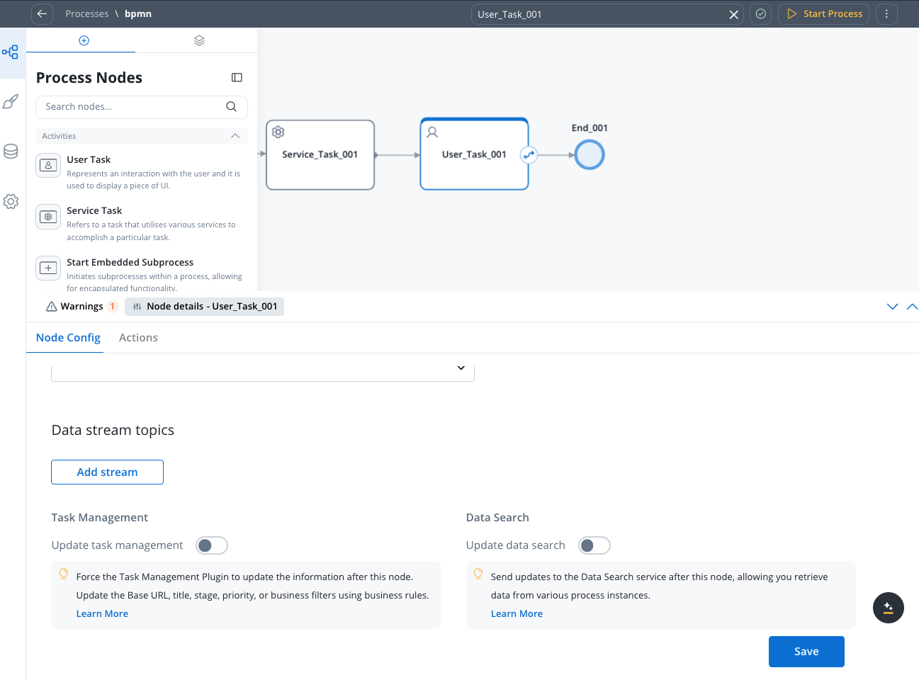
#### General Config
* **Node name**: The name of the node
* **Can go back**: When enabled, allows users to return to this step after completing it. When encountering a step with `canGoBack` false, all steps found behind it will become unavailable.
* [**Stage**](../../platform-deep-dive/core-extensions/task-management/using-stages): Assign a stage to the node
When encountering a step with `canGoBack` switched to false, all steps found behind it will become unavailable.
#### Data stream topics
* **Topic Name**: The topic name where the process engine listens for the response (this should be added to the platform and match the topic naming rule for the engine to listen to it) - available for UPDATES topics (Kafka receive events)
A naming pattern must be defined on the [process engine configuration](../../../setup-guides/flowx-engine-setup-guide/engine-setup#configuring-kafka) to use the defined topics. All events that start with a configured pattern are consumed by the Engine. For example, `KAFKA_TOPIC_PATTERN` is the topic name pattern where the Engine listens for incoming Kafka events.
* **Key Name**: Will hold the result received from the external system, if the key already exists in the process values, it will be overwritten
#### Task Management
* **Update task management** - force [Task Management](../../platform-deep-dive/core-extensions/task-management/task-management-overview) plugin to update information about this process after this node
#### Data Search
* **Update data search**: Send updates to the Data Search service after this node, allowing you retrieve data from various process instances.
## Configuring the UI
The **FlowX.AI Designer** includes an intuitive [UI Designer](../ui-designer/ui-designer) (drag-and-drop editor) for creating diverse UI templates. You can use various elements from basic [buttons](../ui-designer/ui-component-types/buttons), indicators, and [forms](../ui-designer/ui-component-types/form-elements/), but also predefined [collections](../ui-designer/ui-component-types/collection/collection) or [prototypes](../ui-designer/ui-component-types/collection/collection-prototype).
### Accessing the UI Designer
To access the **UI Designer**, follow the next steps:
1. Open **FlowX.AI Designer**.
2. Select a workspace.
3. Select a project.
4. Select a **process**.
5. Select a **user task** **node** then click the **brush** icon to open the **UI Designer**.
### Predefined components
UI can be defined using the available components provided by FlowX.AI, using the UI Designer available at node level.
Predefined components can be split in 3 categories:
These elements are used to group different types of components, each having a different purpose:
* [**Card**](../ui-designer/ui-component-types/root-components/card) - used to group and configure the layout for multiple **form elements.**
* [**Container**](../ui-designer/ui-component-types/root-components/container) - used to group and configure the layout for multiple **components** of any type.
* [**Custom**](../ui-designer/ui-component-types/root-components/custom) - these are Angular components developed in the container application and passed to the SDK at runtime, identified here by the component name
More details in the following section:
The root component can hold a hierarchical component structure.
Available children for **Card** and **Container** are:
* **Container** - used to group and align its children
* **Form** - used to group and align form field elements (**inputs**, **radios**, **checkboxes**, etc)
* **Image** - allows you to configure an image in the document
* **Text** - a simple text can be configured via this component, basic configuration is available
* **Hint** - multiple types of hints can be configured via this component
* **Link** - used to configure a hyperlink that opens in a new tab
* **Button** - Multiple options are available for configuration, the most important part being the possibility to add actions
* **File Upload** - A specific type of button that allows you to select a file
More details in the following section:
This type of elements are used to allow the user to input data, and can be added only in a **Form** Component. They have have multiple properties that can be managed.
1. [**Input**](../ui-designer/ui-component-types/form-elements/input-form-field) - FlowX.AI form element that allows you to generate an input form filed
2. [**Select**](../ui-designer/ui-component-types/form-elements/select-form-field) - to add a dropdown
3. [**Checkbox**](../ui-designer/ui-component-types/form-elements/checkbox-form-field) - the user can select zero or more input from a set of options
4. [**Radio**](../ui-designer/ui-component-types/form-elements/radio-form-field) - the user is required to select one and only one input from a set of options
5. [**Datepicker**](../ui-designer/ui-component-types/form-elements/datepicker-form-field) - to select a date from a calendar picker
6. [**Switch**](../ui-designer/ui-component-types/form-elements/switch-form-field) - allows the user to toggle an option on or off
More details in the following section:
### Custom components
These are components developed in the web application and referenced here by component identifier. This will dictate where the component is displayed in the component hierarchy and what actions are available for the component.
To add a custom component in the template config tree, we need to know its unique identifier and the data it should receive from the process model.
More details in the following section: