> ## Documentation Index
> Fetch the complete documentation index at: https://docs.flowx.ai/llms.txt
> Use this file to discover all available pages before exploring further.
# UI actions
> Control how UI elements respond to user interactions, including loaders, modals, and sending data back to a process.
## Overview
UI actions establish connections between [**UI components**](./ui-component-types/root-components/custom) or custom elements and predefined [**actions**](../actions/actions). These connections ensure that processes are executed efficiently while defining the UI's response. Examples include:
* Showing a loader during an action execution.
* Automatically dismissing a modal after a task is completed.
* Sending default data back to the process.
***
## Types of UI actions
UI actions can be categorized into two main types:
1. **Process UI Actions**: Directly interact with process nodes and manual actions.
2. **External UI Actions**: Perform actions that link to external URLs or open new tabs.
***
### Process UI actions
Process UI Actions (labeled `ACTION`) define how a [**Button**](../ui-designer/ui-component-types/buttons), whether generated or custom, interacts with a manual process action. Before configuring a UI action, ensure the corresponding [manual action](../actions/actions) is set up.
#### Adding a node action
To configure a UI action, first add a node action (type: manual) to a process node. For detailed steps, refer to:
**Example: Configuring a node action (Save Data)**
1. **Add an Action**: Attach an action to a node.
2. **Select the Action Type**: Choose **Save Data**, for instance.
3. **Action Type**: Set it to **manual**.
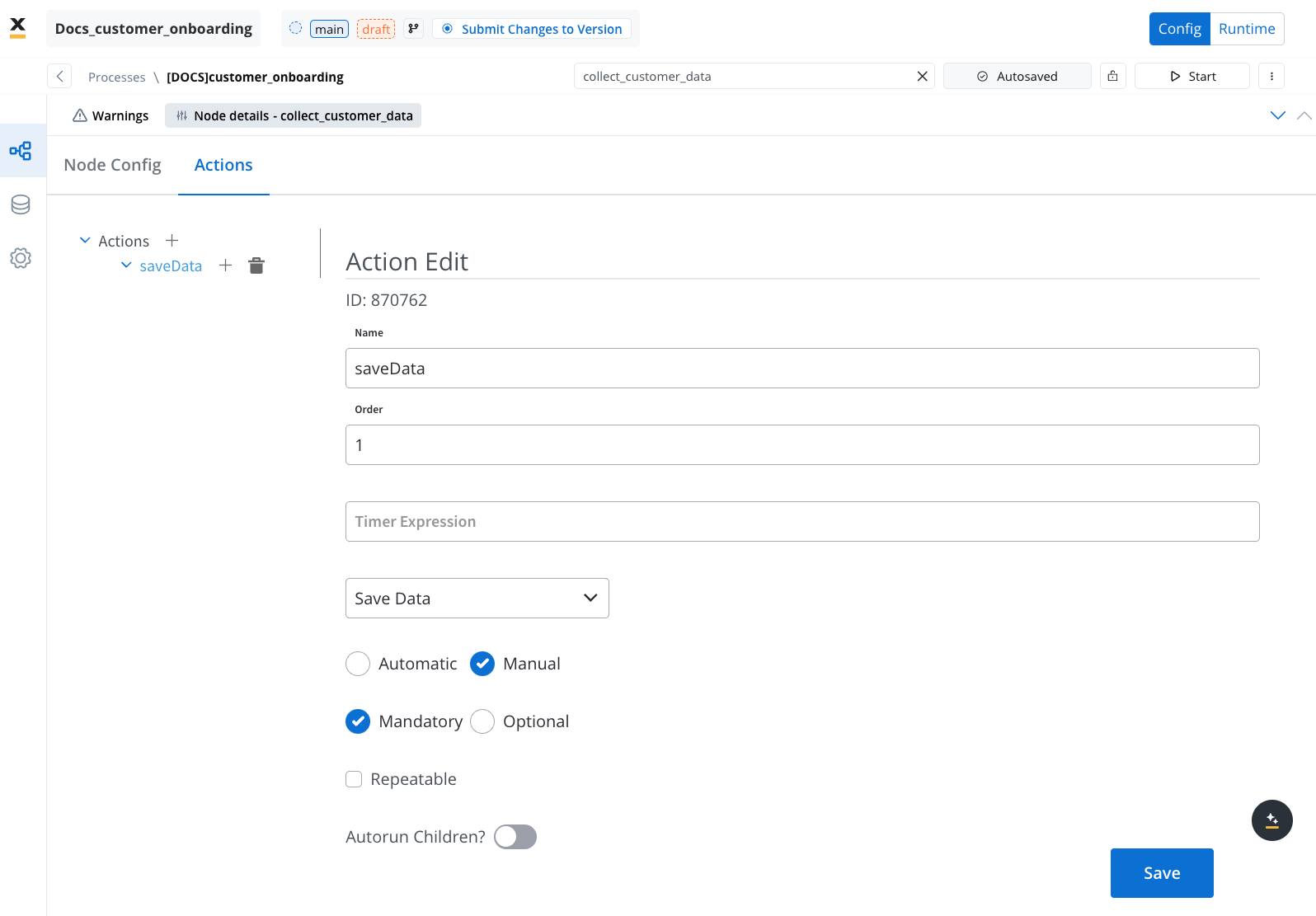
Both UI actions and [node actions](../actions/actions) must be configured on the same user task node.
### Configuring a UI action
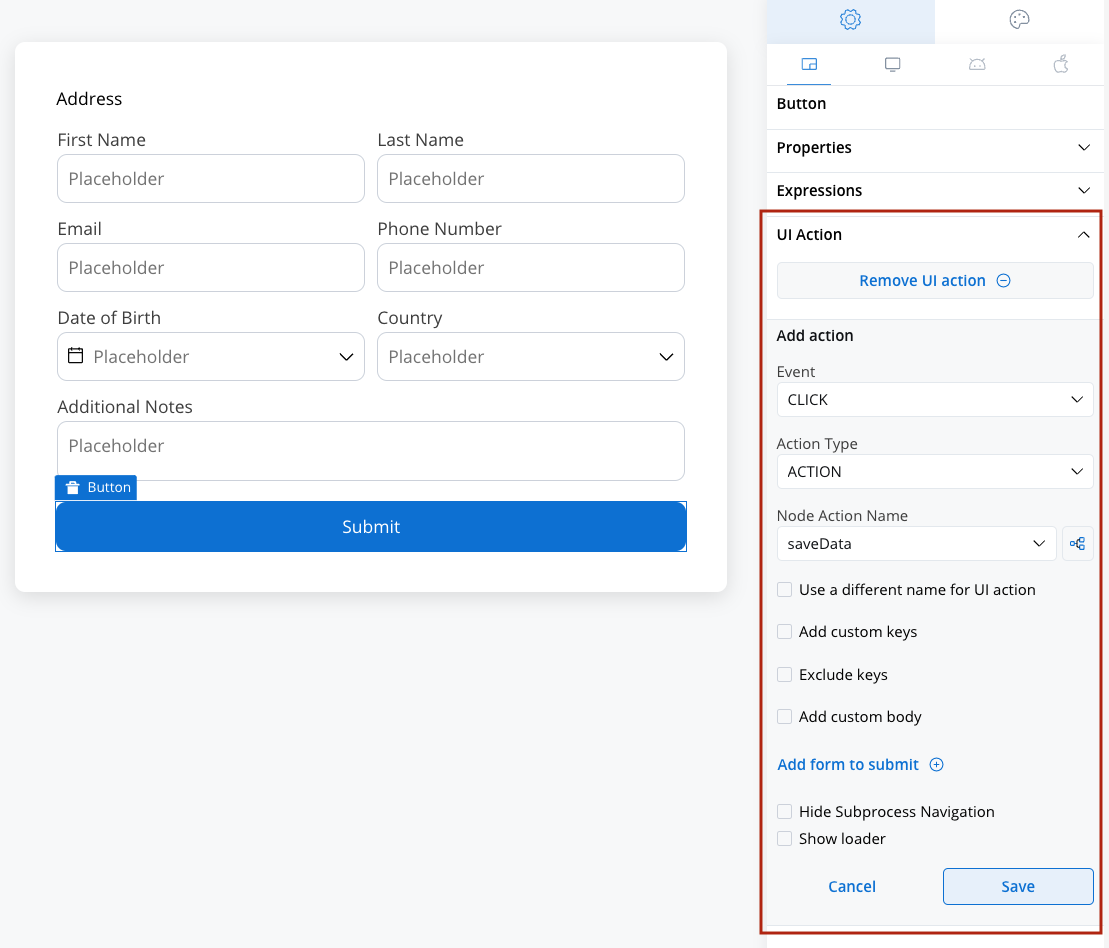
Below are the key configuration options for defining a UI action:
* **Event**: Define when the action should trigger ([Learn about Events](#events)).
* **Action Type**: Specify the type of action ([Explore Action Types](#action-types)).
* **Node Action Name**: Select the corresponding manual action from the dropdown.
* **Use a different name for UI action**: Optionally, define a unique name to trigger the action in [**Custom Components**](./ui-component-types/root-components/custom).
* **Add custom keys**: Restrict the submitted payload to specific data-model paths — an include-list of dot-separated keys (e.g. `application.client.firstName`). Available on Action, Upload, and Start Project action types.
* **Exclude keys**: Remove specific data keys from the submitted payload (applied after the include-list).
* **Add custom body**: A JSON body attached to the action's request; supports `${...}` placeholders resolved from process data at runtime. A custom body on its own is **not** included in the node output — to keep its data, also list those keys under **Add custom keys**.
* **Add form to submit**: Link the action to specific UI elements for validation. Only fields within the selected forms are validated when the action triggers. See [Form validation behavior](#form-validation-behavior) for details.
* **Hide Subprocess Navigation**: Disable navigation to subprocesses.
* **Show loader**: Display a loader until a server-side event (SSE) updates the data or screen.
## UI actions elements
### Events
Events define how user interactions trigger UI actions. The available event types are:
* **CLICK**: Triggered when a button is clicked.
* **CHANGE**: Triggered when input fields are modified.
Events are not applicable for UI actions on [Custom Components](./ui-component-types/root-components/custom).
***
### Action types
The **Action Type** dropdown includes several predefined options:
* **DISMISS**: Dismisses a subprocess or closes a modal. Fires immediately with no form validation or data submission. Sets the process and all subprocesses to DISMISSED state (terminal).
* **ACTION**: Links a UI action to a manual node action.
* **START\_PROJECT**: Initiates a new project instance. This action type is used to trigger a completely new process flow within a different project or application, based on the selected project and process configurations.
* **UPLOAD**: Initiates an upload action.
* **EXTERNAL**: Opens a link in a new browser tab or window.
#### Dismiss action details
The DISMISS action is the simplest action type. When triggered, it:
1. Calls the backend to dismiss the current process instance
2. Sets the process and all active subprocesses to **DISMISSED** state — a terminal state with no further processing
3. Sets all active tokens to DISMISSED
**Configuration:** Only a `name` and optional analytics parameters are required. Unlike other action types, DISMISS does not support form submission, UI blocking, or custom keys.
The DISMISS action type is only available in process context (User Tasks). It is not available in UI Flows.
**Modal dismiss vs DISMISS action:** Modals have a separate **Dismissible** property that controls close-on-backdrop-click and an optional dismiss confirmation alert (with configurable title, message, and button labels). This is a property of the Modal component itself and is independent of the DISMISS UI action type.
For design guidance on modal lifecycle and when a modal should be dismissed, see [Process design principles: Modals are dismissed only by user interaction](../process/design-principles#modals-are-dismissed-only-by-user-interaction). Dismiss-on-completion patterns that follow from a user's click are compliant, since the close is downstream of the user's action.
***
#### Start Workflow action details
The `START_WORKFLOW` action type is configured with the following options:
| Option | Description |
| ----------------- | -------------------------------------------------------------------------------------------------------------------------------- |
| **Workflow** | Select the integration workflow to trigger from a dropdown of available workflows in the current application. |
| **Start params** | Provide input parameters to pass to the workflow at start time. Supports dynamic values from process data. |
| **Dismiss modal** | When a button inside a modal is clicked with this option enabled, the modal is dismissed as part of the action (user-triggered). |
Tab bar components also support a **Load UI** action, which controls what happens when a tab is selected. This is configured separately at the navigation area level, not through the UI actions panel.
**How it works:**
When a user clicks a button configured with `START_WORKFLOW`, the process engine sends a request to the application manager, which locates and starts the specified integration workflow. The workflow runs independently of the current process instance.
The `START_WORKFLOW` action does not pause the current process or wait for the workflow to complete. It is a fire-and-forget trigger. Design your workflows accordingly if you need to act on workflow results.
***
## Form validation behavior
When a UI action has one or more forms linked via **Add form to submit**, the platform validates all visible, enabled fields in those forms before executing the action. If any field fails validation, the action is blocked and error messages are displayed.
### How it works
The user clicks a button (or another event fires) that is linked to a UI action with forms to submit.
The platform collects all form controls from the UI elements listed in the **Add form to submit** configuration.
Each form field is checked against its configured [validators](./validators). Only fields that are **visible and enabled** are validated.
If all validated fields pass, the action executes and sends data to the process. If any field fails, the action is blocked and validation errors are shown.
### Hidden fields and validation
When a form element is **hidden** (via a hide condition), its validation is **completely disabled**. The element's validators are removed and it is treated as disabled. This means:
* Hidden fields **do not block** form submission, even if they contain invalid data.
* Validation errors on hidden fields are **cleared automatically**.
* When the field becomes visible again, validators are **re-applied**.
This behavior is intentional — it prevents invisible fields from blocking user progress. However, it has an important implication: if you rely on validation for data integrity, ensure that hidden fields either have valid default values or are validated through a separate mechanism (such as a business rule on the backend).
**Example scenario:**
| Field | Visible | Has Required Validator | Blocks Submit? |
| ------------ | ----------------------- | ---------------------- | ---------------------------------------- |
| Full Name | Yes | Yes | Yes, if empty |
| Email | Yes | Yes | Yes, if invalid |
| Company Name | Hidden (hide condition) | Yes | **No** — validation disabled |
| Phone | Disabled | Yes | **No** — disabled fields skip validation |
### Disabled fields and validation
Fields that are explicitly **disabled** (not via hide condition, but via the disabled property) also skip validation. Both Angular and React SDKs treat disabled fields as valid during form submission.
### Scoping validation to specific forms
The **Add form to submit** option lets you select which UI elements (forms) are validated when the action triggers. This is useful when a screen has multiple forms but only one should be validated for a specific action.
If no forms are selected in **Add form to submit**, no client-side validation runs — the action executes immediately. Use this intentionally for actions like "Save as Draft" where you want to allow incomplete data.
***
## External UI actions
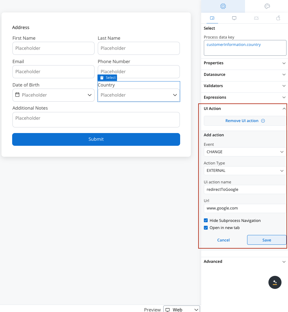
**External UI Actions** enable linking to external URLs and opening links in a new tab or the same tab.
When configuring an external UI action, additional options become available:
1. **URL**: Specify the web URL for the action. Supports dynamic values from process data using the `${variableName}` syntax.
2. **Open in New Tab**: Choose whether to execute the action in the current tab or a new tab.
### Dynamic URL values
You can include process data values in the URL using the `${variableName}` syntax. The placeholders are replaced with actual values from the process data model at runtime.
**Examples:**
* `https://example.com/users/${userId}` - Includes a user ID from process data
* `https://example.com/documents/${documentId}/view?lang=${language}` - Multiple dynamic values
* `${externalSystemUrl}/api/resource` - Dynamic base URL from process data
If a referenced variable is not found in the process data, it will be replaced with `null`.
***
***
## Troubleshooting
**Symptom:** You added validators to form fields but the action still executes with invalid data.
**Possible causes:**
* The form containing the fields is not listed in **Add form to submit** on the UI action. Add it to enable validation.
* The fields are **hidden** by a hide condition. Hidden fields have their validation disabled automatically. Make the fields visible or add backend validation via a business rule.
* The fields are **disabled**. Disabled fields skip validation.
* No forms are selected in **Add form to submit** — this means no client-side validation runs at all.
**Symptom:** A form won't submit even though all visible fields are valid.
**Possible causes:**
* A field's hide condition may be evaluating incorrectly, leaving the field visible when you expect it to be hidden. Check the hide expression in the UI Designer.
* The field may be in an error state from before it was hidden. Try clearing the field value before applying the hide condition.
**Symptom:** The node action name dropdown is empty when configuring a UI action.
**Possible causes:**
* No **manual** action has been added to the current user task node. UI actions can only link to actions of type **manual**.
* The action is on a different node. Both the UI action and the node action must be on the **same user task node**.
***
## Related resources
How to add and configure node actions
Configure validation rules for form fields
Configure button components that trigger UI actions
Use expressions for hide conditions and dynamic behavior
Academy course on building dynamic UI logic with hide and disable conditions
**Academy playground** — explore the [**Academy\_HideAndDisable**](https://designer-workshop-51x.playground.flowxai.dev/workspace/00000000-0000-0000-0000-000000000001/projects/698d604b-904f-4cb9-8d70-68a492b8216d/config/40430d0b-3f16-4146-9231-26cc68e35ccb/processes) project for working examples of hide/disable conditions and validation behavior.
## Related topics
- [Image](/5.1/docs/building-blocks/ui-designer/ui-component-types/image.md)
- [Slider](/5.1/docs/building-blocks/ui-designer/ui-component-types/form-elements/slider.md)
- [Datepicker](/5.1/docs/building-blocks/ui-designer/ui-component-types/form-elements/datepicker-form-field.md)
- [Checkbox](/5.1/docs/building-blocks/ui-designer/ui-component-types/form-elements/checkbox-form-field.md)
- [Radio](/5.1/docs/building-blocks/ui-designer/ui-component-types/form-elements/radio-form-field.md)