> ## Documentation Index
> Fetch the complete documentation index at: https://docs.flowx.ai/llms.txt
> Use this file to discover all available pages before exploring further.
# UI Designer
> The FlowX platform offers a variety of ready-to-use UI components that can be used to create rich web interfaces. These include common form elements like input fields, dynamic dropdown menus, checkboxes, radio and switch buttons, as well as other UI elements like image, text, anchor links, etc. The properties of each component can be customized further using the details tab, and design flexibility is achieved by adding styles or CSS classes to the pre-defined components. The UI templates are built in a hierarchical structure, with a root component at the top.
## Using the UI Designer
The FlowX platform includes an intuitive **UI Designer** for creating diverse UI templates. You can use various elements such as basic buttons, indicators, and forms, as well as predefined [collections](./ui-component-types/collection/collection) and [prototypes](./ui-component-types/collection/collection-prototype). To access the UI Designer, follow these steps:
1. Open **FlowX Designer** and select **Definitions** from the **Processes** tab.
2. Select a **process** from the process definitions list.
3. Click the **Edit** **process** button.
4. Select a **node** or a **navigation area** then click the **brush icon** to open the **UI Designer**.
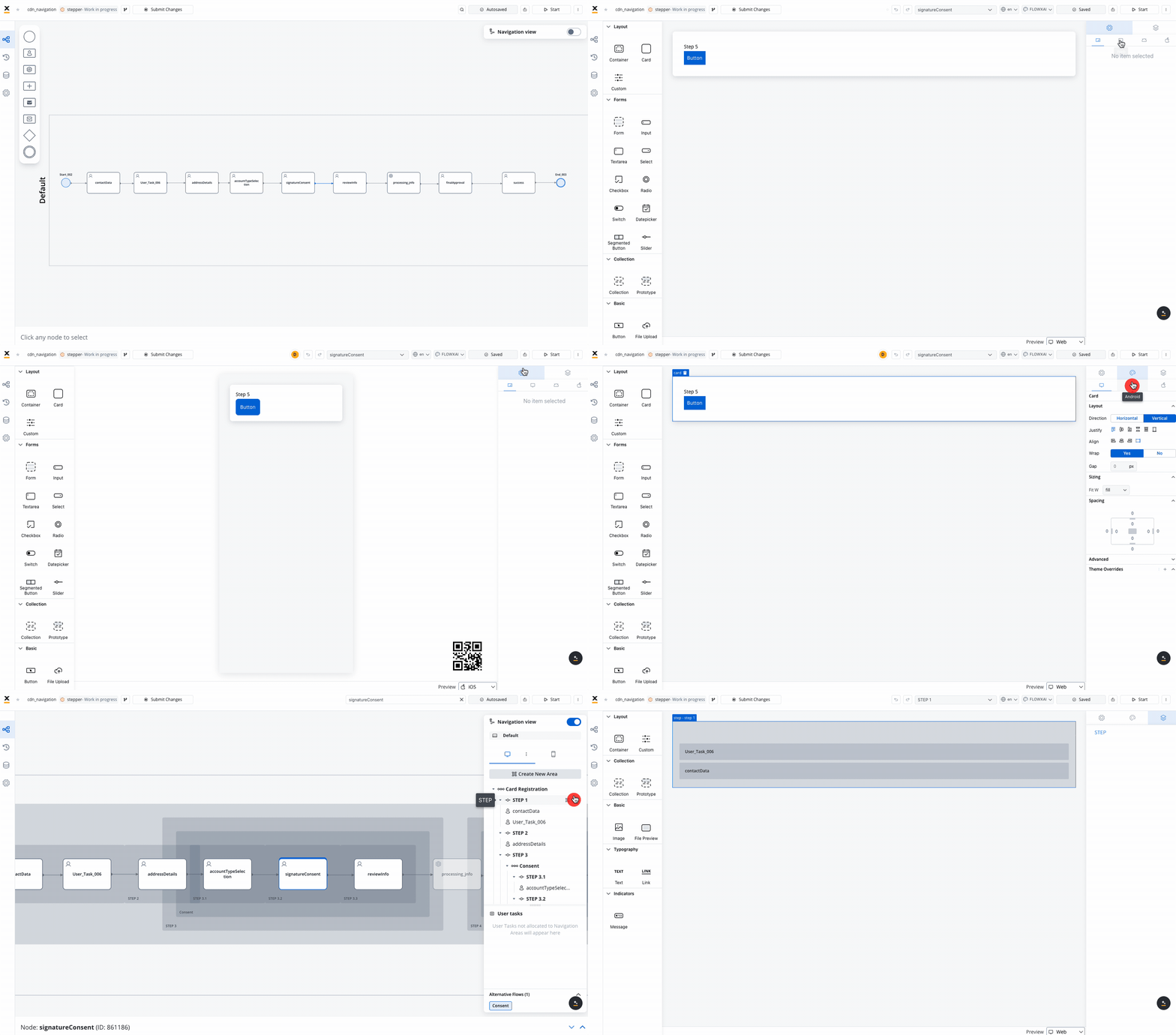
The UI designer is available for [**User task**](../node/user-task-node) nodes and **Navigation Areas** elements.
After adding a specific component to the node, the right-side menu will display more configuration options.
For more flexibility, undo or redo actions are available within the UI Designer. This includes tasks such as dragging, dropping, or deleting elements from the preview section, as well as adjusting settings within the styling and settings panel.
To undo or redo an action, users can simply click the corresponding icons in the UI Designer toolbar, or use the keyboard commands for even quicker access.
## UI components
FlowX offers a wide range of [UI components](./ui-designer#ui-components) that can be customized using the UI Designer. For example, when configuring a [card](./ui-component-types/root-components/card) element (which is a root component), the following properties can be customized:

### Settings tab
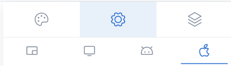
#### Generic tab
This is where you configure the logic and assign process keys, UI actions, and other component settings that are common across all platforms (Web, iOS, Android).
#### Platform-specific settings
For example, on Android, you might want to change the Card title to a shorter one.
To override a general property like a title, follow these steps:
Access the UI Designer and select a UI Element, such as a **Card**.
From the UI Designer navigation panel, select the **Settings** tab, then select the **desired platform**
Click the "+" button (next to "Overrides") and select **Properties -> Title**, then input your desired value.
Settings overrides can always be imported/pushed from one platform to another:
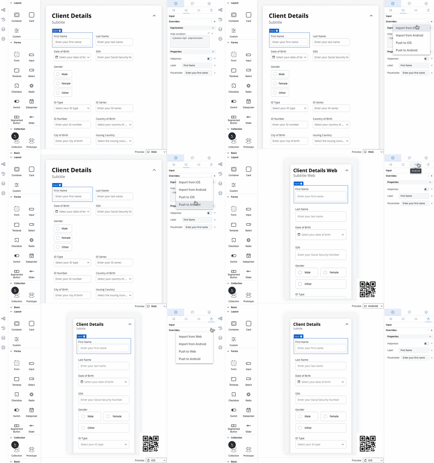
Preview your changes in the UI Designer by navigating from one platform to another or by comparing them.
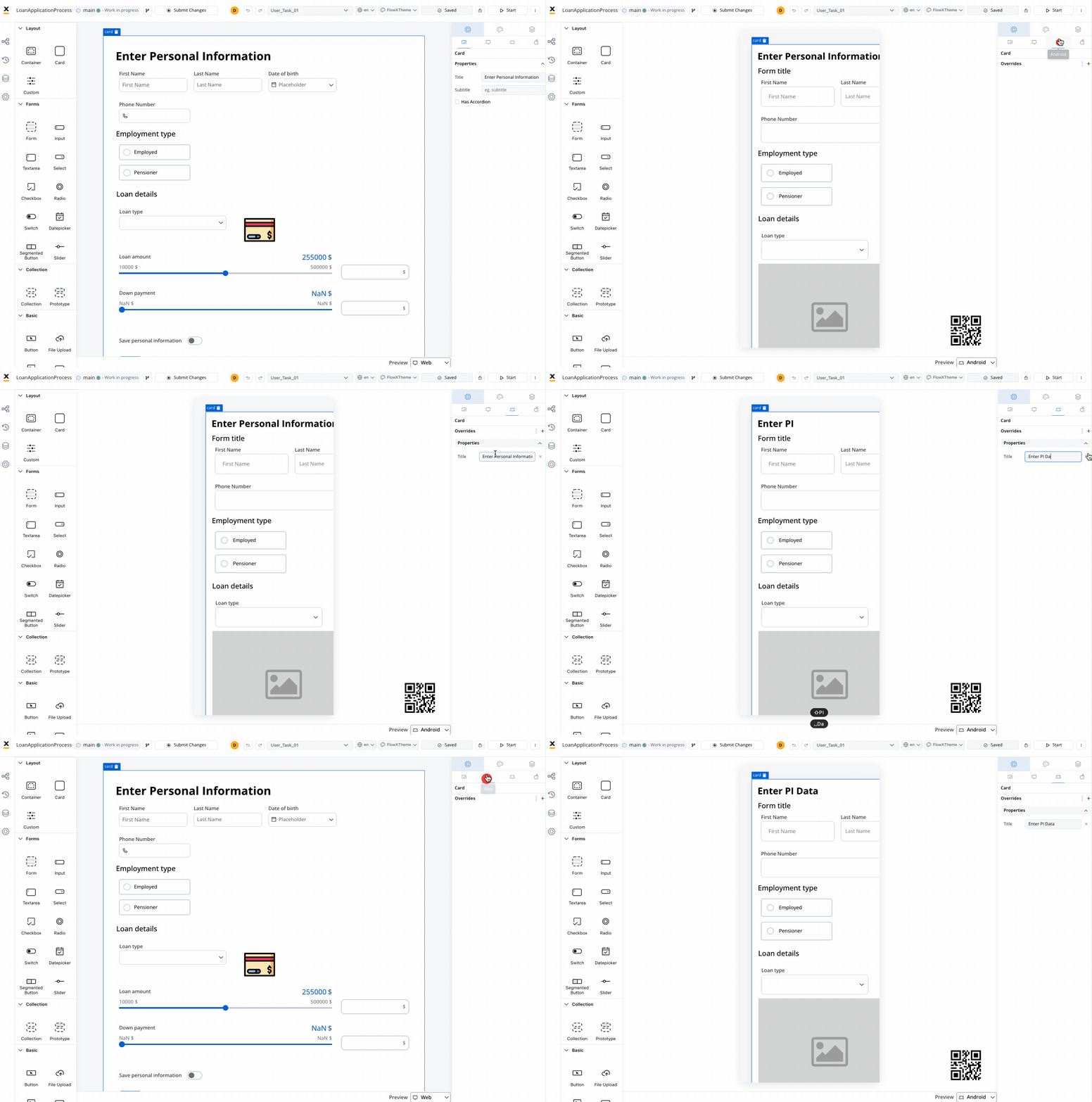
Keep in mind that the preview generated in the UI Designer for iOS and Android platforms is an estimate meant to help you visualize how it might look on a mobile view.
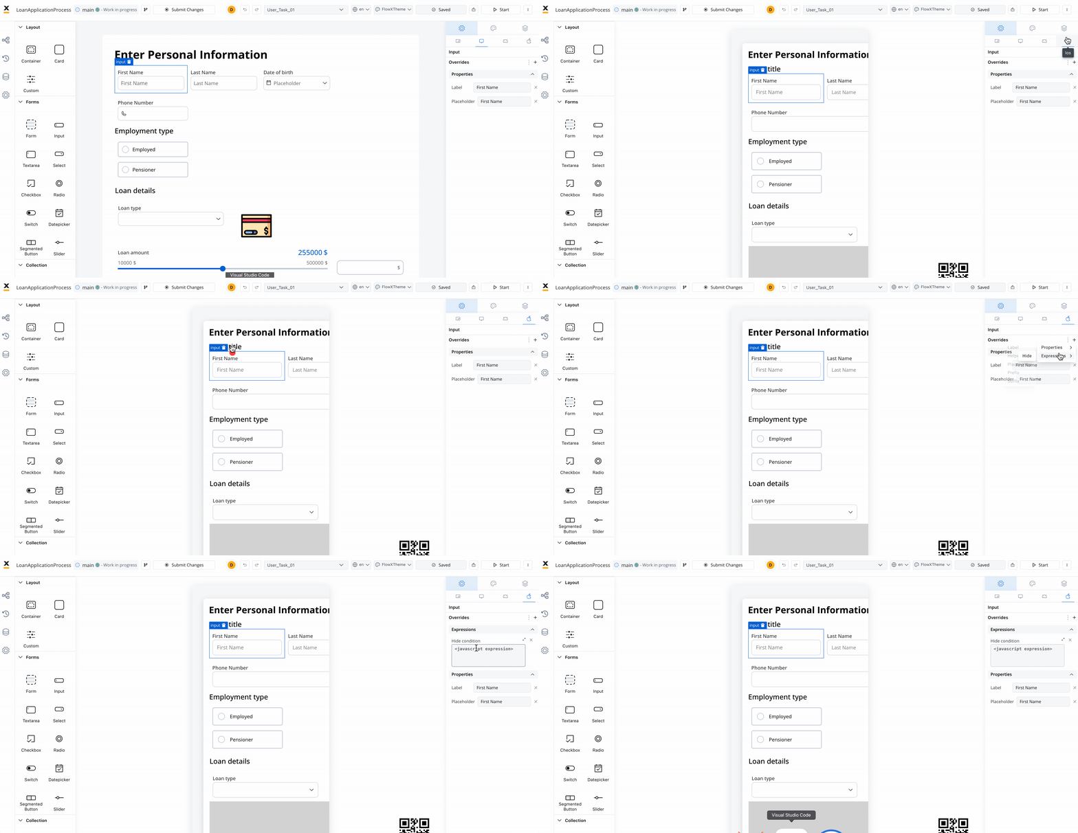
#### Hide expressions
By utilizing **Overrides** in the **Settings** tab, you can selectively hide elements on a specific platform.
To achieve this:
Select a UI component in the **UI Designer**, then navigate to **Settings** -> **your desired platform** -> **Overrides (+)** -> **Expressions** -> **Hide**.
Add your JavaScript Hide condition.
### Styling tab
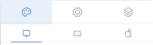
The Styles tab functions independently for three platforms: Web, iOS, and Android. Here, you can customize styles for each UI component on each platform.
If you want to customize the appearance of a component to differ from the theme settings, you must apply a **Theme Override**.
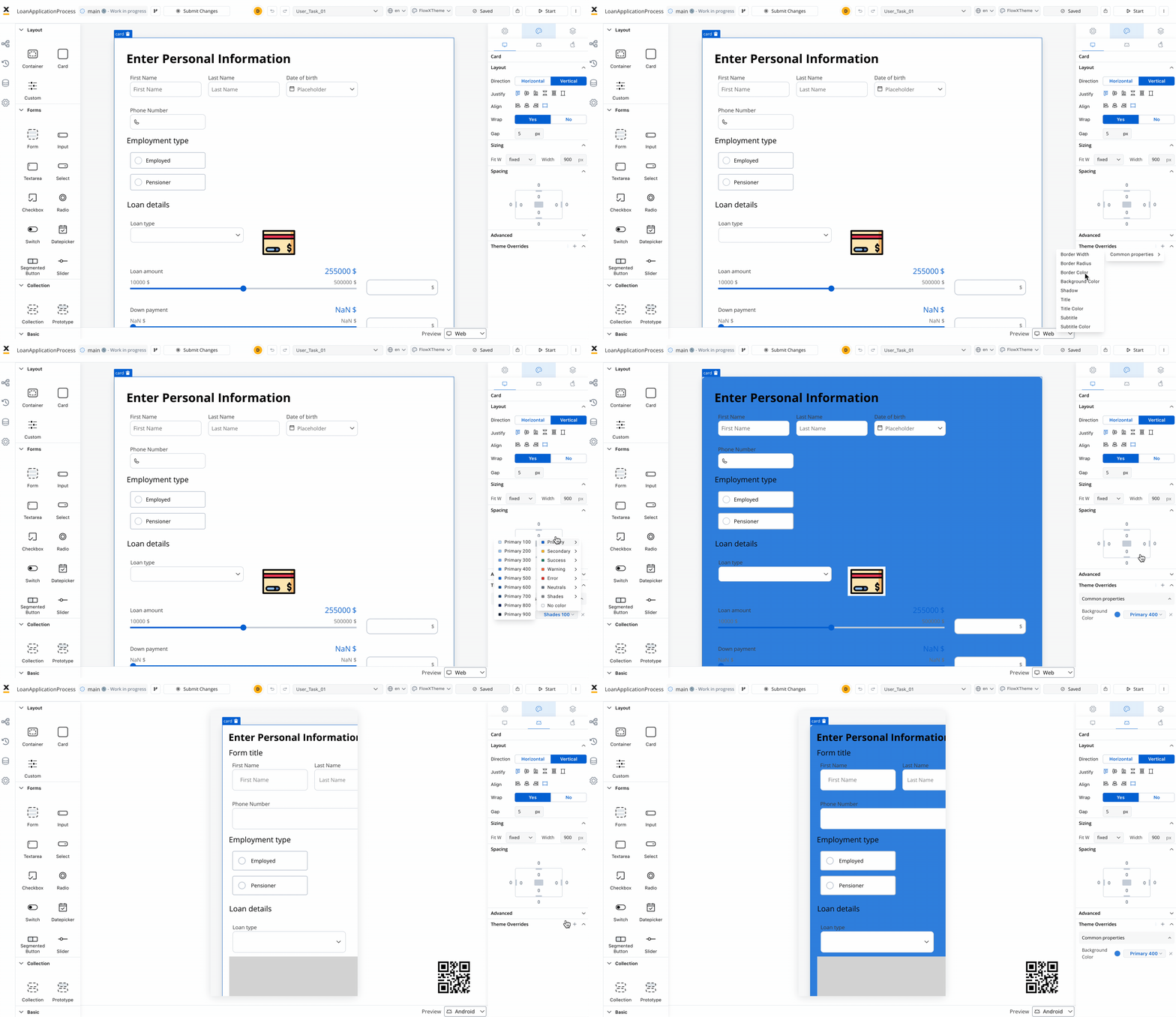
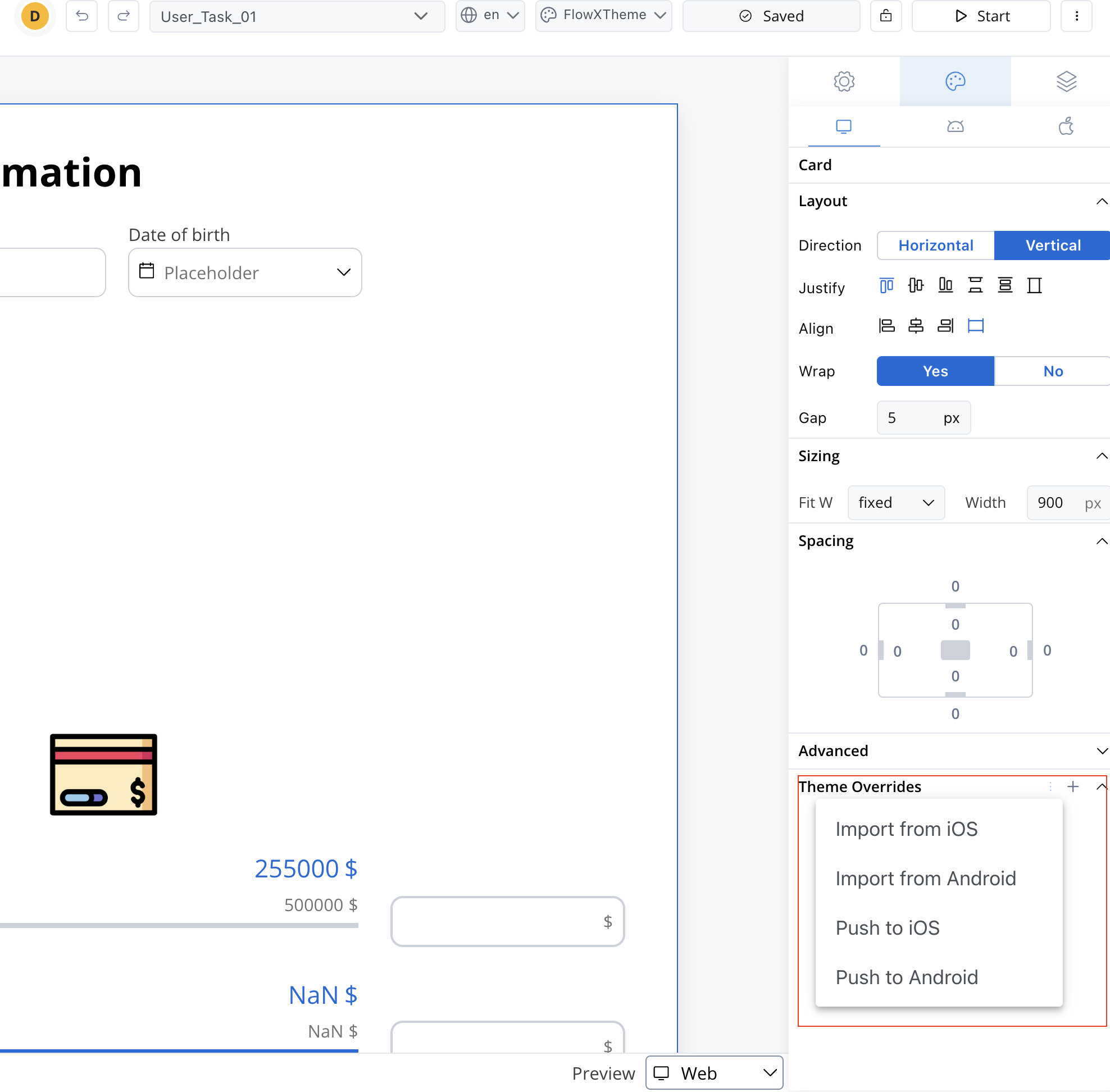
Theme overrides can be imported from one platform to another.
### Preview
When you are editing a process in **UI Designer** you have the possibility of having the preview of multiple themes:
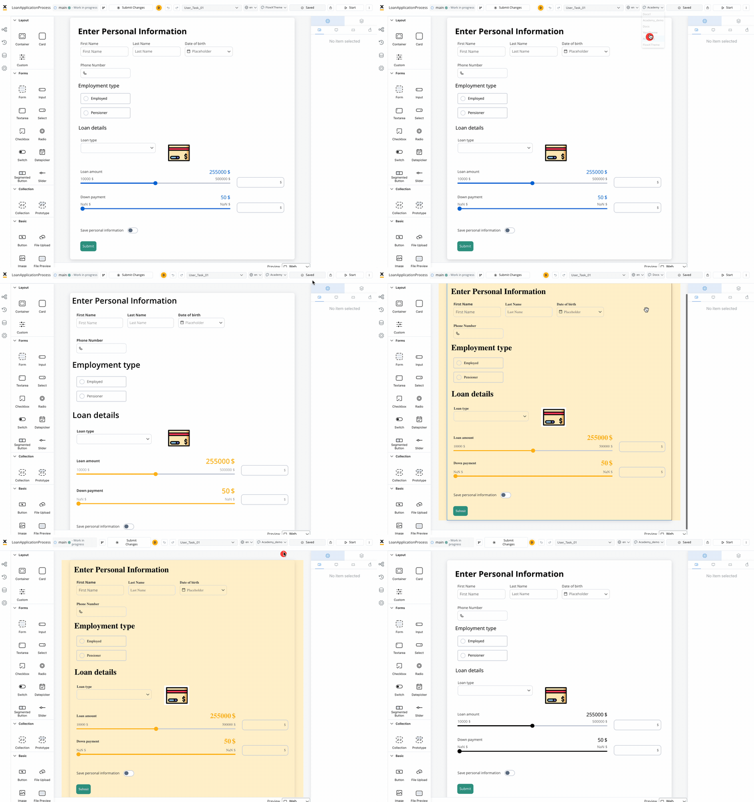
Overrides are completely independent of the theme, regardless of which theme you choose in the preview mode.
### Layout
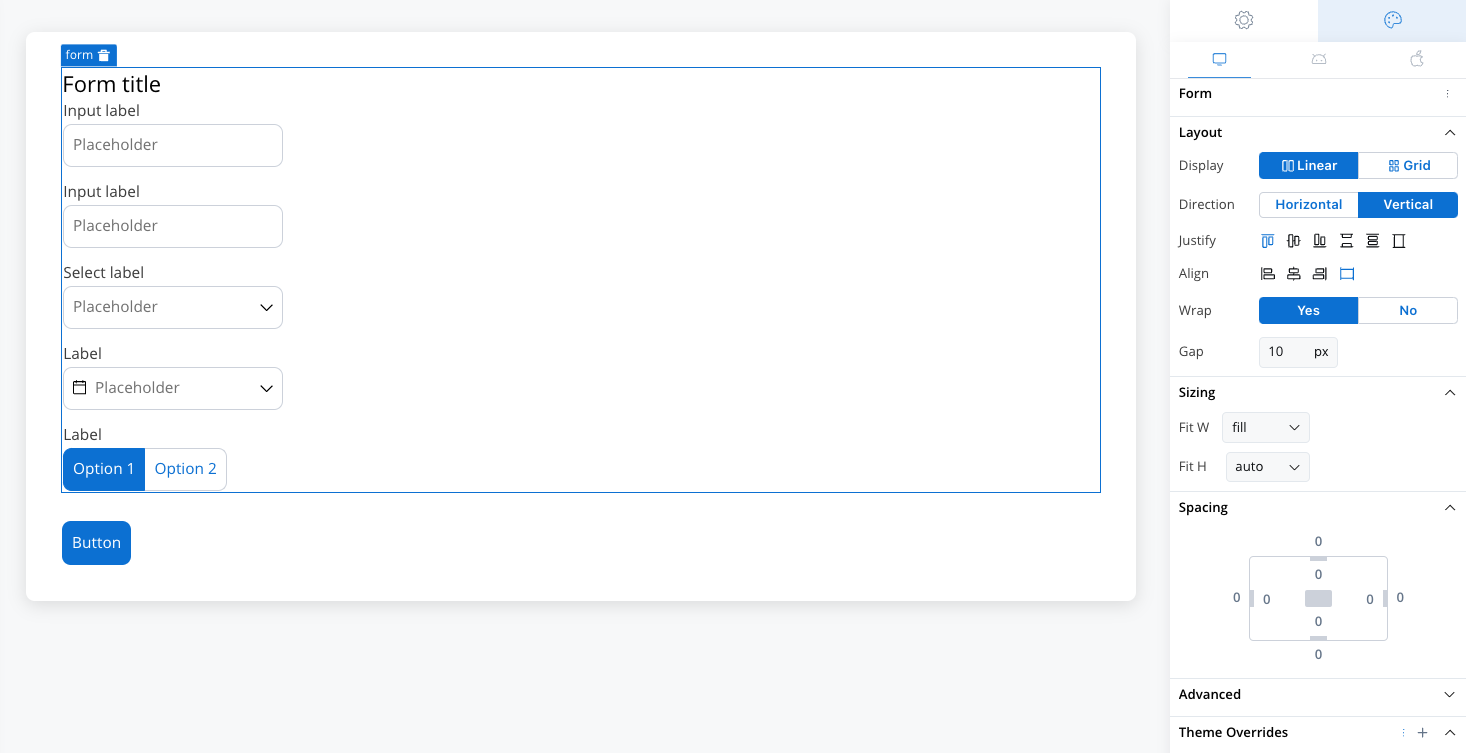
There are two main types of layouts for organizing child elements: **Linear** and **Grid**.
* **Linear Layout**: Arranges child elements in a single line, either horizontally or vertically. Ideal for simple, sequential content flow.
* **Grid Layout**: Organizes elements into a structured grid with multiple columns and rows, useful for more complex, multi-dimensional designs.
* **Platform-Specific Layouts**: You can customize layout settings per platform (e.g., Grid on web, Linear on mobile) to ensure optimal responsiveness.
Both layouts offer options to customize direction, alignment, spacing, and wrap behavior for flexibility in design.
[](./layout-configuration)
### Sizing
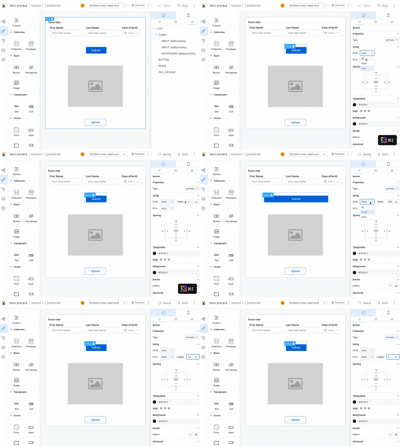
By setting desired values for these props, you can ensure that all UI elements on the interface are the desired size and perfectly fit with each other.
When adjusting the Fit W and Fit H settings, users can control the size and shape of the elements as it appears on their screen:
* Fit W: fill, fixed or auto
* Fit H: fill, fixed or auto
### Spacing
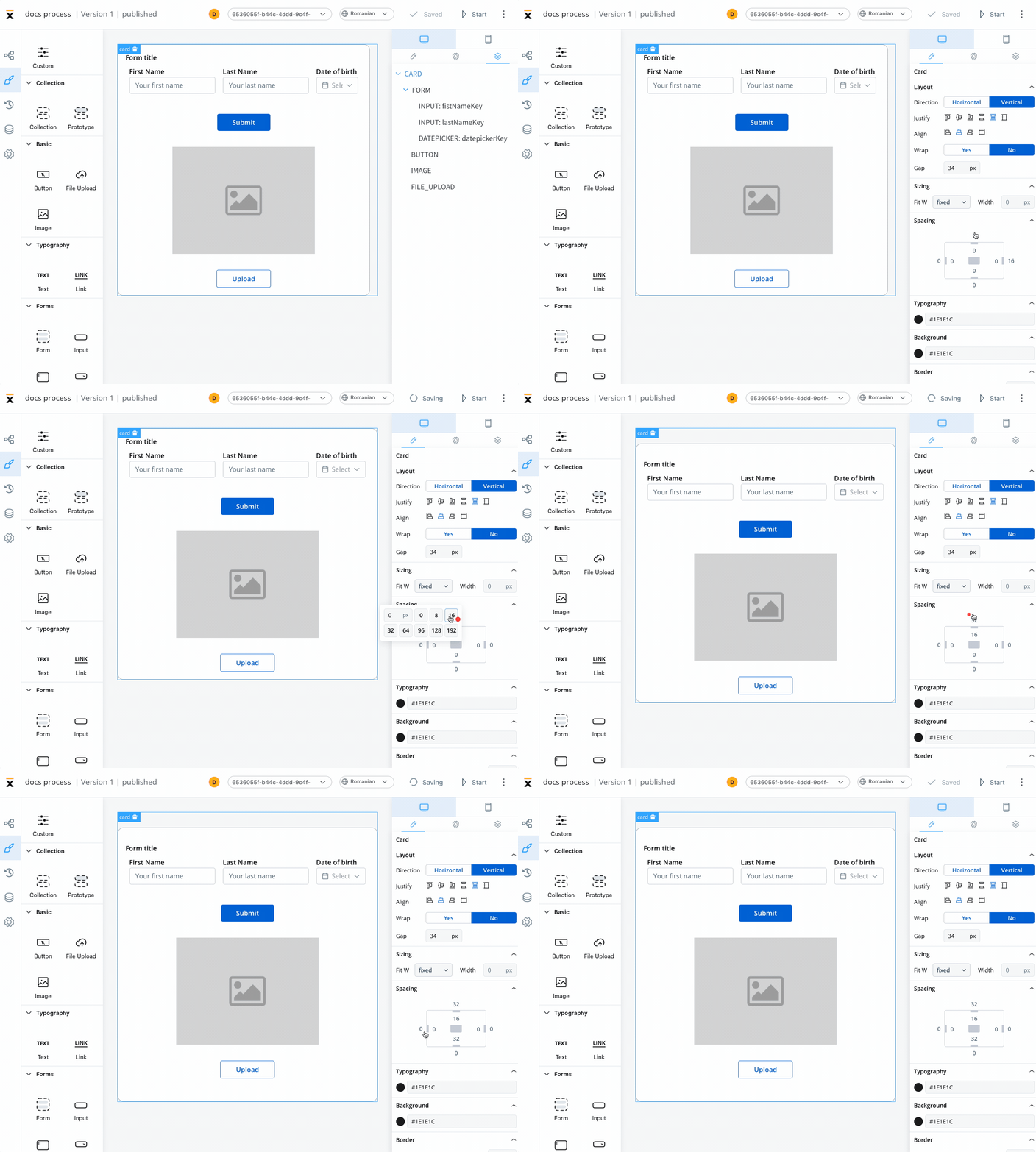
Margin and padding are CSS properties used to create space between elements in a web page:
* **margin** - the space outside an element
* **padding** - the space inside an element
### Advanced
* **Advanced** - for advanced customization, users can add CSS classes to pre-defined components, this option is available under the **Advanced** section
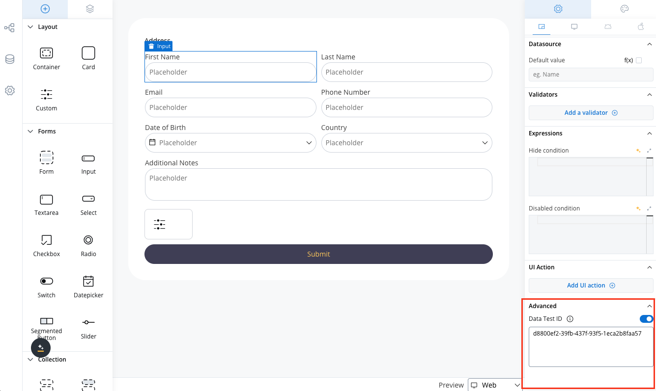
* **Data Test ID** - add custom test identifiers for automated testing and element interaction
By utilizing these styling options in FLOWX.AI, users can create unique and visually appealing interfaces that meet their design requirements.
#### Data Test ID
The Advanced section includes a **Data Test ID** field, allowing you to assign custom identifiers to UI components. This feature enhances automated testing by providing meaningful, easily identifiable selectors for UI elements.
Key benefits:
* Replace auto-generated test IDs with custom, readable identifiers
* Simplify element targeting in test scripts
## Tree view
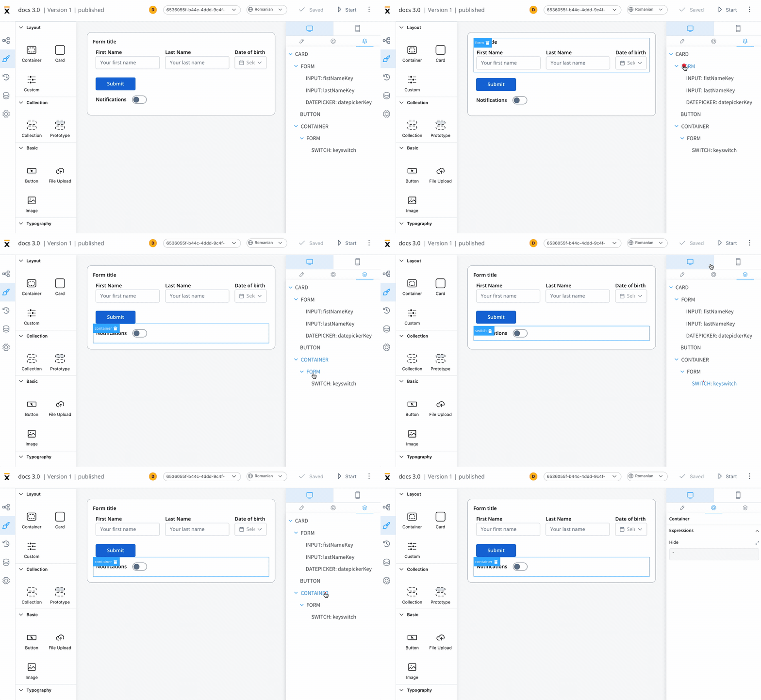
The Tree View panel displays the component hierarchy, allowing users to easily navigate through the different levels of their interface.
Clicking on a specific component in the tree will highlight the selection in the editor, making it easy to locate and modify.
## UI component types
Different UI component types can be configured using UI Designer. The UI components are available and can be configured only using **user task nodes** or **navigation areas**.
Depending on the component type different properties are available for configuration.
Understanding these component types will help you to better utilize the UI Designer tool and create rich web interfaces.
* [Container](./ui-component-types/root-components/container)
* [Card](./ui-component-types/root-components/card)
* [Custom](./ui-component-types/root-components/custom)
* [Collection](./ui-component-types/collection/collection)
* [Collection Prototype](./ui-component-types/collection/collection-prototype)
* [Button](./ui-component-types/buttons)
* [File Upload](./ui-component-types/buttons#file-upload)
* [Image](./ui-component-types/image)
* Text
* Link
Form elements are a crucial aspect of creating user interfaces as they serve as the means of collecting information from the users. These elements come in various types, including simple forms, [inputs](./ui-component-types/form-elements/input-form-field), [text areas](./ui-component-types/form-elements/text-area), drop-down menus ([select](./ui-component-types/form-elements/select-form-field)), [checkboxes](./ui-component-types/form-elements/checkbox-form-field), [radio buttons](./ui-component-types/form-elements/radio-form-field), toggle switches ([switch](./ui-component-types/form-elements/switch-form-field)), [segmented buttons](./ui-component-types/form-elements/segmented-button), [sliders](./ui-component-types/form-elements/slider) and [date pickers](./ui-component-types/form-elements/datepicker-form-field). Each of these form elements serves a unique purpose and offers different options for capturing user input.
* Form
* [Input](./ui-component-types/form-elements/input-form-field)
* [Textarea](./ui-component-types/form-elements/text-area)
* [Select](./ui-component-types/form-elements/select-form-field)
* [Checkbox](./ui-component-types/form-elements/checkbox-form-field)
* [Radio](./ui-component-types/form-elements/radio-form-field)
* [Switch](./ui-component-types/form-elements/switch-form-field)
* [Segmented button](./ui-component-types/form-elements/segmented-button)
* [Slider](./ui-component-types/form-elements/slider)
* [Datepicker](./ui-component-types/form-elements/datepicker-form-field)
* [Message](./ui-component-types/indicators)
Navigation areas
* Page
* Stepper
* Step
* Modal
* Container