> ## Documentation Index
> Fetch the complete documentation index at: https://docs.flowx.ai/llms.txt
> Use this file to discover all available pages before exploring further.
# Card
> A card in Flowx is a graphical component designed for the purpose of grouping and aligning various elements. It offers added functionality by incorporating an accordion feature, allowing users to expand and collapse content as needed.
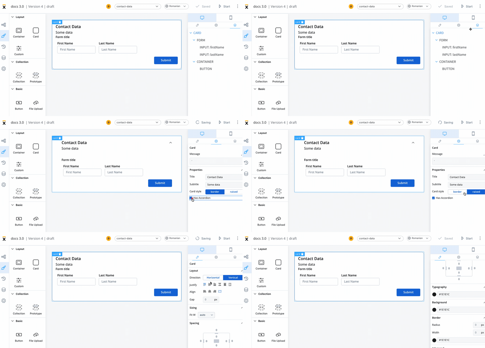The following properties that can be configured:
## Properties and settings
### Settings
#### When used as root
When utilized as the root component, the card provides the following settings:
* **Message**: A valid JSON describing the data transmitted to the frontend when the process reaches a specific user task.
* **Title**: The title of the card.
* **Subtitle**: A subtitle accompanying the card.
* **Card style**: Choose between a border or raised style for the card.
* **Has accordion**: This feature introduces a Bootstrap accordion, facilitating the organization of content within collapsible items. It ensures that only one collapsed item is displayed at a time.
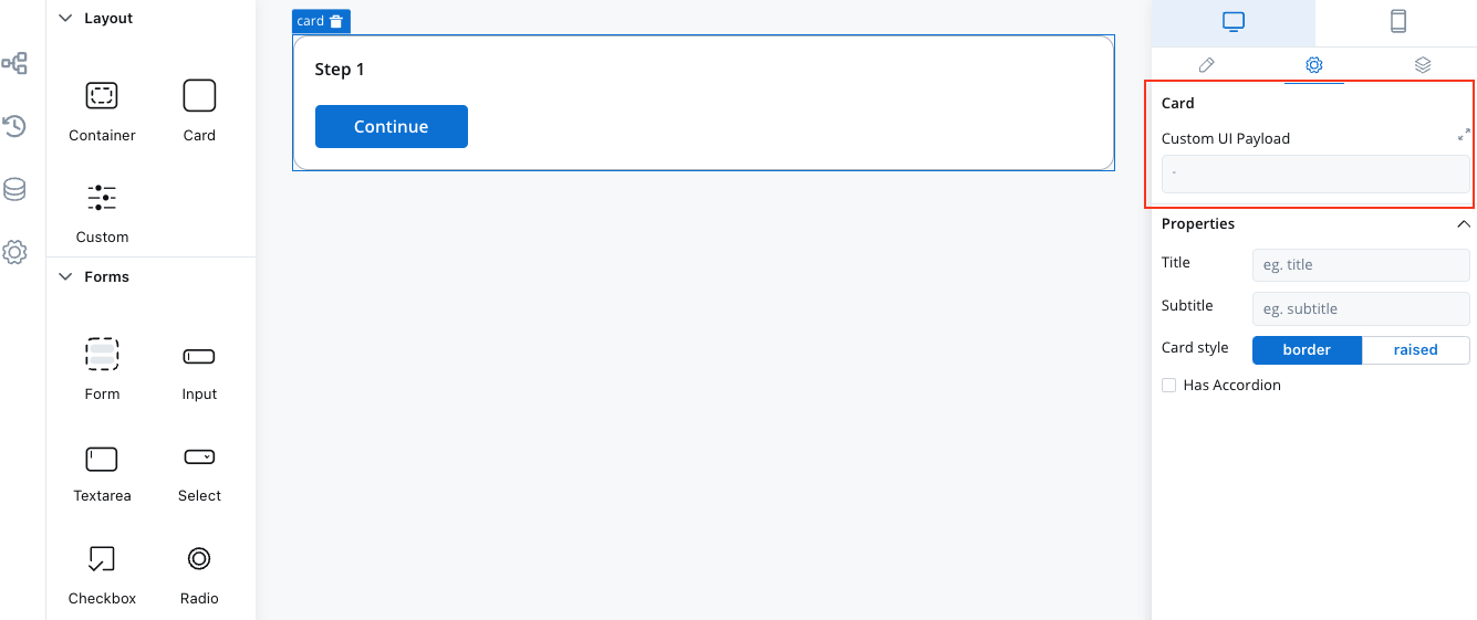
Starting from platform version **3.4.7**, the "Message" property for cards has been replaced with "Custom UI Payload." In User Tasks containing UI Elements, the Backend (BE) automatically dispatches all relevant data as process variables to the Frontend (FE) by default. Explicitly mentioning data to be pushed is no longer required.
#### When not used as root
When the card is not the root, you can configure: **Title**, **Subtitle**, **Card Style** and **Has Accordion**.
The accordion element is not available for mobile devices.
;
By leveraging cards in your design, you can seamlessly organize and present content, enhancing the overall user experience.
## Styling
* **Layout** - This property is available for components that group children and includes the following options:
* Direction - Horizontal / Vertical (for example, select *Vertical*)
* Justify (H) - (for example, select *center*)
* Align (V) - this option allows you to align components vertically
* Gap - you can set the gap between components
More layout demos available below:
[Layout Demos](https://tburleson-layouts-demos.firebaseapp.com/#/docs)
This example will generate a card with the following layout configuration:
For more information about styling and layout configuration, check the following section:
## Validating elements
To validate all form elements under a card, you need to set the key of the form/element on the property of the button: *Forms To Validate.*

## Related topics
- [FlowX.AI 5.4.0 Release Notes](/release-notes/v5.x/v5.4.0-january-2026/v5.4.0-january-2026.md)
- [FlowX.AI 4.7.10 Release Notes](/release-notes/v4.x/v4.7.x-lts/v4.7.10-november-2025/v4.7.10-november-2025.md)
- [FlowX.AI 5.1.6 Release Notes (LTS)](/release-notes/v5.x/v5.1.x-lts/v5.1.6-march-2026.md)
- [FlowX.AI 5.3.0 Release Notes](/release-notes/v5.x/v5.3.0-december-2025/v5.3.0-december-2025.md)
- [FlowX.AI 5.9.0 Release Notes](/release-notes/v5.x/v5.9.0-june-2026/v5.9.0-june-2026.md)